10,000 search results
(0.364 seconds)
- SolKing by Fo Da,
$15.00 Solking is an Arabic typeface of a three weights : Sharp, Curved and Rounded . the main focus is on blending traditional and modern rules in the formulation and design of the Kufi type in new style .
 - Kinver by Greater Albion Typefounders,
$15.00 Kinver owes it’s inspiration to the masthead of a 19th century handbill. It is designed to particularly complement our extensive ‘Imperial Granum’ typeface family. Bring the spirit of Victorian flair to your next design project!
 - Brithania by Rockboys Studio,
$23.00 The Brithania is a new modern brush font, incredibly adaptable to all sorts of designs. It is suitable for any branding, product packaging, invitation, quote, t-shirt, label, poster, logo that you wish to create.
 - Cline by Typomancer,
$20.00 Cline, a family of slab and sans typefaces that seamlessly harmonize with each other. All styles have the same width, so changing font weight will not affect your typesetting. Suitable for both text and headlines.
 - Sablon Class by Roman Cernohous Typotime,
$29.00 Sablon is back! This time on the edge in Thick & Thin version, keeping its significant features especially in letters B, G, M and N. With new expressive figures best suitable in headlines and packaging graphics.
 - Sigeboy by Sulthan Studio,
$12.00 Handwritten font using pen with one line and not thickened, ideal for all things sketch pens, engravings, and foil pens! Sigeboy is perfect for greeting cards, logos, clothing designs, home decor, prints, quotes and more!
 - KampFriendship by Ingrimayne Type,
$9.95 KampFriendship is a casual, informal typeface family with serifs. The circular letters have an odd triangular shape. Because it has no contrast in the strokes, it appears to be neat but somewhat peculiar hand lettering.
 - Auster Slab by Resistenza,
$39.00 Auster Slab, is a new slab version of our reversed contrast sans serif font Auster. This font family works very well on packagings, branding and editorial purposes. More About Opentype Features: https://bit.ly/opentype-rsz
 - Vivala Pix by Johannes Hoffmann,
$5.00 The pixel font is designed based on a 25 grid. Ideal for headlines, but also easy to read in smaller font sizes. The font supports 219 languages and is equipped with a large symbol set.
 - Ambrosine by Hanoded,
$15.00 Ambrosine is a female name, which comes from the Greek. It means ‘immortal’. This handmade didone-ish font may not be immortal, but it is quite divine in appearance. Comes in regular and italic styles.
 - Fander by Roman Melikhov,
$23.00 Fander font family is designed to create minimalist logos, wordmarks, titles, taglines. Each letter of the font has up to 12 alternates. You can mix default characters and alternate characters to get the best combinations.
 - Artiste by ITC,
$29.00A casual, open brush script style designed with a shadow effect for a three-dimensional impression by British designer Martin Wait. This typeface looks best with tight letter and word spacing in large display settings. - Latinaires by Sudtipos,
$39.00Latinaires Pro is a new version of one of the first published Sudtipos typefaces. Now covering more latin languages and extended to 9 fonts, Latinaires is specially designed for modern brand communication and editorial use. - Holo by Missin Glyphs,
$25.00 Inspired by 'Neon Sign' lettering, Holo is a modern, modular, mechanical & industrial display font constructed entirely with polygonal shapes. Holo is suitable for large display settings like sports jerseys, shop fronts, billboards and neon signs.
 - Marlyca Script by Bosstypestudio,
$14.00 Marlyca Script is a new calligraphy font which is fresh, funny, interesting and with a cute heart that can be connected. It is suitable for greeting cards, branding materials, business cards, quotes, posters, and more!
 - Mangarans by Raditya Type,
$13.00 Mangarans is a Modern Victorian Blackletter, which is combining modern and classic typography. It has a vintage feel, and as a result, it matches a wide variety of designs. Get inspired by its retro feel.
 - Bellarosse by Nissa Nana,
$26.00 Bellarosse is a delicate, elegant and flowing handwritten font. Get inspired by its authentic feel and use it to create gorgeous wedding invitations, beautiful stationary art, eye-catching social media posts, and cute greeting cards.
 - Haston Hailey by Bosstypestudio,
$14.00 Haston Hailey is a new calligraphy font which is fresh, funny, interesting and with a cute heart that can be connected. It is suitable for greeting cards, branding materials, business cards, quotes, posters, and more!
 - Shirah Joie by LightHouse,
$49.00The main challenge with Shirah Joie was how not to design just another monoline font, and how to add liveliness while condensing the letters a little bit. Shirah Joie is an OpenType/TTF Unicode font. - Visualism by Arendxstudio,
$15.00 Visualism Font is a free style font that has the characteristics of street art that shows freedom and is filled with unique characters Features : • Character Set A-Z • Numerals & Punctuations (OpenType Standard) • Accents (Multilingual characters)
 - Opportoonity JNL by Jeff Levine,
$29.00Opportoonity JNL is loosely based on lettering from 1940s cartoons. It's the perfect typeface for anything representing fun and carefree situations. There is a slightly limited character set and no kerning on this particular font. - Vulcano by Type-Ø-Tones,
$40.00 Vulcano is the mesmerising creation of Salvador –Tori– Alimbau, the one-type-man who gave us this maze. José Manuel Urós took months to devise a negative-positive system for these characters. Hypnotic, charming sophisticated.
 - Mymoon Stencil by Tour De Force,
$25.00 Mymoon Stencil is an extension of the Mymoon font family. It comes in 3 weights: UltraLight, Regular and Heavy. Contains extended Latin character set with OT features such as OldStyle and Tabelar numerals and fractions.
 - Granding Script by Romie Creative,
$13.00 Granding Script is a very easy to read Script typeface, a beautiful, classy and elegant typeface. Can be used for various purposes such as logos, wedding invitations, t-shirts, letterhead, signage, news, posters, badges etc.
 - Potter Alaska by Aldedesign,
$18.00 Potter Alaska is Nice Bold Script Font - A stylish and quirky new bold script. Potter Alaska font was created to look as close to a readable bold script as possible by including a couple ligatures.
 - Despatxada by Type-Ø-Tones,
$40.00 Despatxada letters are the scans of the alphabet of a manual rubber press. Letter by letter. Real prints. Real textures. You will not find another typeface like this. An heroic font in the digital era.
 - Camonflet by TanveerType,
$12.00 This unique set of letters designed in the style of serif. It's cutting edge and expanded looks carefully designed to feel like classic lettering. It's easy to read and cover a small area to utilize.
 - Rebecca YOFF by YOFF,
$9.00 Rebecca bundle is two fonts, one print and one script. You'll get both in one package. Both fonts are updated with smoother curves and support for more languages. Enjoy this bundle of beautiful handwriting fonts!
 - Redmirable by Mindtype Co.,
$15.00 Redmirable is a new, fresh, and modern font with a calligraphy style. It can used for anything from promotional material, logotype, branding, handwritten quotes, to product packaging, signage, labels, newsletters, posters, merchandise and branding projects.
 - Arkana by Haksen,
$12.00 Arkana is a new bold, retro script. It is very suitable for advertisement products, branding materials, business designs brand, quotes, posters, t-shirt and more! This font are perfect for all brands. Happy Designing, Haksen
 - Alire by Gittype,
$20.00 Alire is a cursive font and inspired from the famous retro typography design. It includes a total of 518 glyphs and includes several OpenType Features such as: Stylistic Alternates, Swashes, Ligatures, Contextual and Stylistic Set.
 - Theatrics JNL by Jeff Levine,
$29.00Theatrics JNL gives a rounded corner treatment to Prismatiq JNL; which in turn was modeled from lettering found in an early 1900s French lettering book displayed at an online image sharing site. Limited character set. - Wintery Mix by DP Fonts,
$35.00 Wintery Mix contains a set of small winter and holiday illustrations collected from years of holiday cards I created. A winter scene or greeting can be created with the tap of an 'a' or 'B'.
 - Honey Notes by Ali Hamidi,
$10.00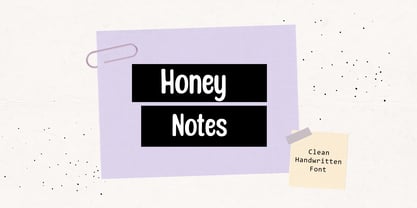 Honey Notes is a simple and neat handwritten font that can be used for all chalkboard quotes or teaching material! Its authentic look and feel will add a personal and realistic feel to your designs.
 - PS Fournier Std by Typofonderie,
$59.00 Style and elegance in 14 styles PS Fournier, created by Stéphane Elbaz, is designed in tribute to Pierre Simon Fournier. Fournier was the prolific Parisian type designer whose work is best known for its iconic representation of French transitional style. PS Fournier elegantly represents the transition to the modern era of typography. Featuring three optical sizes, PS Fournier is designed to perform in any context. The Pierre Simon Fournier heritage Pierre Simon Fournier (1712—1768) was a leading innovative type designer of the mid-18th century. Early in his career, the young Pierre Simon developed a strong aesthetic that he cultivated throughout his life. His art is representative of the pre-revolutionary “Age of Enlightenment” (Siècle des Lumières). Precursor of the Modern style, Fournier’s body of work deeply influenced his times, and created the fertile ground from which the Didot family and Giambattista Bodoni developed their own styles. During the historical period of the 18th century, Fournier exemplified the intellectual pursuits of the times with his own research on type, documenting in detail the typefounding process. He also offered a unique vision: he is the first to clearly comprehend the concept of “type family,” sorting a set of similarly styled alphabets by sizes, width, and by x-heights. In addition, Fournier is one of the earliest advocates of the point system to organize the practice of typography, the point system that contemporary typographers continue to use to this day. The refined and discreet elegance of PS Fournier With a close look at the family, one finds you’ll find that the difference between the optical sizes (Petit, standard and Grand) is more than a contrast variation between the thin and the thick; the eye can also denote a palette of distinct tones: More streamlined and robust in the smaller sizes (Petit), more refined and detailed in the larger sizes (Grand). The PS Fournier standard family is designed to adapt to any situation with its intermediate optical size, from body copy to headlines. With a bit of tracking, PS Fournier Petit will make the smallest captions perfectly readable. However, Petit family is not limited to body and captions — its “slabby robustness” will make a relevant headline choice as well. PS Fournier Grand presents a higher contrast adapted to large text sizes, displays or banners. Its refined elegance makes it a perfect choice for Design, Fashion or Luxury publications. As a “modern” type PS Fournier Grand features a larger x-height than the preexistent old style typefaces such as Garamond or Jenson. These proportions provide any basic text set in PS Fournier Grand a strong typographic texture. As a result, the PS Fournier global family is a versatile alternative to the Modern typefaces commonly used in the publishing industry. The optical sizes, the large range of weights, and the design variations make this family adaptable to captions, paragraphs, and pages, as well as to large texts and displays. A leading-edge typography in the 18th century In the spirit of modernity, Pierre Simon Fournier did not find any use for the conventional swashes still produced by peers such as Caslon or Baskerville. Nevertheless the French designer created many inventive elements to decorate the page and set delightful variations in the text itself. To this regard PS Fournier includes a large set of glyphs variations, ligatures and more than one hundred glyphs for borders, rules and ornaments or — as called in French — “vignettes.” PS Fournier: A tribute to the French modern typography era by Stéphane Elbaz
 - FF Info Pict by FontFont,
$62.99 Erik Spiekermann, working in collaboration with Ole Schäfer, originally designed FF Info® Display for use in the context of wayfinding systems. The variants FF Info™ Text and FF Info™ Correspondence were developed later for text setting and office communication. FF Info Display The sober and clear forms of the sans serif FF Info Display have been deliberately molded to make them perfect for use on wayfinding systems. The font by Ole Schäfer and Erik Spiekermann not only takes the problem of lack of space into account - it is some 15% narrower than comparable typefaces - the characters have also been designed to ensure they remain legible even in adverse conditions for reading. As text on signs often contains words with which readers are unfamiliar and which are thus deciphered letter for letter rather than perceived as whole words, it is essential to provide for a clear differentiation between glyphs. Additional serifs on the lowercase "i" and uppercase "I" and a small arch on the terminal of the lowercase "l" ensure that it is possible to readily discriminate between these particularly problematic letters. Moreover, sharp corners on glyphs can also make it difficult to read signs with backlighting or when driving past. The rounded corners of FF Info Display counteract this effect and make sure that the character forms remain well defined.FF Info Display is available in five carefully coordinated weights, from Regular to Bold. In the corresponding italic variants, the letters appear overall more rounded while the lowercase "a" has a closed form and the "f" has a descender. Also included among the glyphs of FF Info Display are several ligatures and arrow symbols. Pictograms with different themes that complement the typeface are also available in four weights. FF Info Text Thanks to his know-how gained through designing other typefaces, Erik Spiekermann became aware that fonts created for use in problematic environments can be used in many different situations. In smaller point sizes, FF Info Display cuts a fine figure when used to set longer texts. So Spiekermann carefully reworked FF Info Display to produce FF Info Text, a font perfected for use in this context. Not only can the characters be more generously proportioned, certain features, such as additional serifs to aid with the differentiation of problematic letters, are also no longer necessary in textual surroundings. The upright styles have a double-story "g" while Spiekermann has added oldstyle figures and small caps. FF Info Correspondence FF Info Correspondence has also been designed for setting block text although it recalls the style of old typewriter characters and is specifically intended for use in office communication. The characters of this third member of the family are thus more formal, without rounded terminals but with rectangular punctuation marks. The narrower letters are provided with large serifs to give them more space although, at the same time, this reduces the differences in terms of letter width among the alphabet. In contrast with its two siblings, FF Info Correspondence has only three weights, each with corresponding italic.The three styles of the FF Info super family cover an extensive range of potential applications. If the different kerning is adjusted manually, the three styles harmonize happily with each other and can be readily used in combination to set, for example, headlines and texts and also creative display options.
 - Corporatus by Alex Rosario,
$60.00 The legendary retro-futuristic typeface returns, now in digital format! While there may be copycats of varying quality, none of them have taken the time and care to revive, reproduce, and expand the original Roc Mitchell “Corporate” typeface like Corporatus has. Made directly from scans of the original type specimens and expanded to include the full WGL4, Corporatus is YOUR solution for your retro, futuristic, and corporate design needs. Descended from Microgramma and originally designed to be the American competition to distant cousin Eurostile, Corporate and subsequently Corporatus is best known for being the typeface used by video game developer and publisher Nintendo for many NES-related media in the West, including its controllers, and by Colecovision for its logo. With the original Latin character set as well as Greek and Cyrillic lettering available, now you're playing with TYPOPOWER!
 - Olivera by Artisan Studio,
$15.00 Olivera has Stylistic standard, Stylistic Initial, Stylistic Teminal and ligatures and includes uppercase and lowercase letters, numbers and punctuation marks. Multilingual Support OpenType smart programs such as Adobe Photo Shop, Adobe Illustrator, Adobe Indesign, Corel Draw and Microsoft Office. A total of 462 Glyphs: Ligatures: Ju Ct ff Cl all gh of ck tt ut nt ak ll pp il rt it ot st at rr om mm ar ss as or ox ow on tt ut ut Ct st at ot rt it Cl Swashes access: A B C D E F G H I J K L M N O P Q R S T U V W X Y Z 7 alternative sets access: a b c d e f g h i j k l m n o p q r s t u v w x y z
 - Peach Comix_PersonalUseOnly - Personal use only

- Shelter_PersonalUseOnly - Personal use only


