10,000 search results
(0.024 seconds)
- Foot Fight - Unknown license

- BrushtipTexe by JOEBOB graphics,
$19.00 Arrrrrr! A brand new handwritten brush font for all your pirate treasure maps, mateys. And very usable elsewhere of course.
 - Sablon by Roman Cernohous Typotime,
$29.00 Solid all caps display font with a hint of retro expression. Wide language support including complete set of Cyrillic characters.
 - Daphnis by RMU,
$35.00 Walter Tiemann’s elegant display font brought to life again and carefully extended with Baltic, Turkish and Central European character sets.
 - Sheenaz by Khurasan,
$9.00 Sheenaz script is a beautiful handwritten font with a joyful feel. Fall in love with its elegant, yet adorable charm.
 - Numbskull by The Type Fetish,
$25.00 Numbskull contains an expanded character set including: Central, Eastern and Western European languages, The Baltic, Cyrillic, Esperanto, Greek and Turkish.
 - American West by FontMesa,
$20.00 Inspired by an old document from the New York and Western Railroad, American West brings the olden days to mind.
 - RM Serifancy by Ray Meadows,
$19.00 A bit Circus ... a bit Showbiz ... a bit Western ... but completely FANCY Includes: Western European, Central European, Baltic & Turkish sets
 - KD Pempo by Kassymkulov Design,
$19.00 A retro multiline display font for your old-school, nostalgic projects. Supports a large set of characters incl. Cyrillic script.
 - Yule Love It by Just My Type,
$25.00 YuleLoveIt or Yule not. What else can be said about holiday toys that are also letters? We just said it.
 - Cambourne by Studio K,
$45.00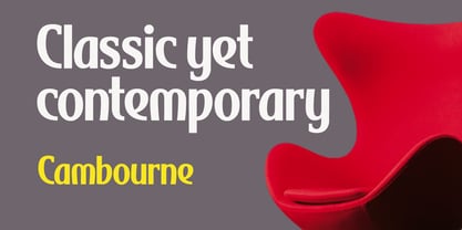 Classic yet contemporary, Cambourne is a crisp, curvaceous and timelessly elegant display font ideal for branding or promoting luxury goods.
 - Tropic Sign by Kern Club,
$10.00 Aloha vibez bruhduh Uppercase Character Set A-Z Numerals & Simple punctuation OTF file format Drawn by Samborghini. Kerned by Dontrealllycare
 - Quilted Butterfly by Hanoded,
$15.00 Quilted Butterfly is a rather elegant, yet messy font. It has some interesting glyphs and comes with all the accents.
 - Starlette by Jonahfonts,
$49.00 Usage recommendations: Captions, fliers, packaging, cards, posters, ads, book jackets, manuals, menus, bulletins, magazines, greetings, announcements. Not suitable for MSWord.
 - Everything by PizzaDude.dk,
$20.00Everything is a simple, yet beautiful handwritten font. You will need to use OpenType supporting applications to use the autoligatures. - Brookhurst JNL by Jeff Levine,
$29.00Brookhurst JNL has strong Art Deco influence, and features an ultra-compressed width to set copy into a tighter space. - La Pica Bonus by RodrigoTypo,
$29.00 La Picá bonus is a new version with lower case letters, styles and dingbats that represents the popular lettering style.
 - Joshico by Supfonts,
$15.00 Joshico - a new fresh handmade calligraphy font. Very suitable for greeting cards, branding materials, business cards, quotes, posters, and more!
 - Wald by Volcano Type,
$19.00A font completely made of nature elements. Pieces of wood, branches and leaves. Do not go limp, use Wald instead! - Caramel Pro-ROB by TypeSETit,
$29.95 Caramel Pro combines the entire Caramel Family into one OpenType font. Use alternates and style sets to customize your work.
 - Hebrew Meyer by Samtype,
$39.00 This is a new beautty classic font. This font is usually use in invitattions, small texts, book covers and monograms
 - Jayce by Michael Browers,
$25.00 Jayce is a hand-drawn, upbeat display font family featuring two fonts: a text face and a set of fleurons.
 - Mrs. Shmelding JNL by Jeff Levine,
$29.00Lighten things up and let your imagination run free with Mrs. Shmelding JNL, a lighthearted novelty font from Jeff Levine. - Counterfact by Haiku Monkey,
$10.00Counterfact is a bold, two-pronged, handwritten font that combines informality and neat imprecision. Especially effective at large point sizes. - Blikfang by Bogstav,
$17.00 All caps font that just want to be your friend, and maybe the font you use for your next project! :)
 - Splasher by GRIN3 (Nowak),
$18.00 Splasher is a set of 94 unique ink, paint and coffee splatters that can be quickly used in your design.
 - PR Swirlies 03 by PR Fonts,
$10.30 This set of swirlies oraments is drawn with a pointed brush, for a higher contrast appearance than Swirlies 1 & 2.
 - TB Matrix by TrueBlue,
$10.00A creative dot matrix font with more likeable and funny types of dots. Also contains an extended set of characters. - Type Drawer JNL by Jeff Levine,
$29.00Type Drawer JNL is an assortment of various letter and number styles for use in novelty headlines. Limited character set. - Warbones by Forberas Club,
$16.00 Introducing Warbones by Forberas, yet playful but still serious. You can use this as decorative material for your upcoming project.
 - Mondawmin JNL by Jeff Levine,
$29.00Here's yet another stencil font based on a vintage source, and part of Jeff Levine's extensive library of stencil typefaces. - Glass Houses - Unknown license

- ALS Script - Unknown license

- Holy Union - Unknown license

- ILS Script - Unknown license

- Storehouse by Creative Toucan,
$15.00 Storehouse Font is an old fashioned typeface with a modern touch. Inspired by tradition, hardworking brewers and 1800s it come up with 10 strong, confident and powerful styles, included: Regular, Italic, Thin, Black, Outline, Shadow, Used, Wide, Soft and Stencil. The font looks great when put on signs, shirts or labels of the bottles. Also, it works perfect as font for a branding and commercial uses. What is included: Shapes: 1.Storehouse Shapes EPS – EPS file 2.Storehouse Shapes PDF – PDF file Fonts: Storehouse Regular - OpenType font file - Regular old fashioned typeface with a modern touch. Full set of uppercase letters, international support, punctuation, and a wide variety of extra characters. Storehouse Thin - OpenType font file - Thin version. Full set of uppercase letters, international support, punctuation, and a wide variety of extra characters. Storehouse Wide - OpenType font file – Wide version, big spaces. Full set of uppercase letters, international support, punctuation, and a wide variety of extra characters. Storehouse Black - OpenType font file - Extra, extra bold version. Full set of uppercase letters, international support, punctuation, and a wide variety of extra characters. Storehouse Outline - OpenType font file – Outline version of regular version, amazing in matching with regular version as a back shadow. full set of uppercase letters, international support, punctuation, and a wide variety of extra characters. Storehouse Shadow - OpenType font file – Old fashioned shadow of regular version. Full set of uppercase letters, international support, punctuation, and a wide variety of extra characters. Storehouse Italic - OpenType font file – Regular version with smooth edges. Full set of uppercase letters, international support, punctuation, and a wide variety of extra characters. Storehouse Soft - OpenType font file - full set of uppercase letters, international support, punctuation, and a wide variety of extra characters. Storehouse Stencil - OpenType font file – Stencil font with amazing old fashioned modern touch. Full set of uppercase letters, international support, punctuation, and a wide variety of extra characters. Storehouse Used- OpenType font file – Softer edges, smooth lines. Full set of uppercase letters, international support, punctuation, and a wide variety of extra characters. Multilanguage Support: English, Albanian, Danish, Dutch, Estonian, Croatian, Bosnian, Slovenian, Finnish, French, German, Icelandic, Italian, Norwegian, Portugese, Spanish, Swedish with a lot of other languages; see Full Character List. Note: To access the extra alternate letters, you will need to use the glyphs panel. Many design programs offer this ability, including Adobe Photoshop CC 2015 , Adobe Illustrator, Adobe Indesign. Works with Cricut, Silhouette, PicMonkey, Photoshop, Illustrator and many more applications!
 - Parisine Std by Typofonderie,
$59.00 Ultra legible forceful sanserif in 32 fonts Parisine was born as official parisian métro signage typeface. This family of typefaces has become over years one of the symbols of Paris the Johnston for the London Underground or the Helvetica for the New York Subway. The Parisine was created to accompany travelers in their daily use: ultra-readable, friendly, human while the context is a priori hostile. Meanwhile, Parisine is now a workhorse and economical sanserif font family, highly legible, who can be considered as a more human alternative to the industrial-mechanical Din typeface family. More human, but not fancy: No strange “swashy” f, or cursive v, w etc. on the italics, to keep certain expected regularity, important for information design, signages, and any subjects where legibility, sobriety came first. Born as signage typeface family, the various widths and weights permit a wider range of applications. In editorial projects, the Compress version will enhances your headlines, banners, allowing ultra large settings on pages. The Narrow version will be useful as direct compagnon mixed to standard width version when the space is limited. The various Parisine typeface subfamilies Parisine is organised in various widths and subsets, from the original family Parisine, Parisine Gris featuring lighter versions of the usual weights and italics, Parisine Clair featuring extra light styles, to Parisine Sombre with his darker and extremly black weights as we can seen in Frutiger Black or Antique Olive Nord. Many years of adjustments were necessary to refine this complex family. Initially, Parisine was designed by Jean François Porchez in 1996 for Ratp to solely fulfil the unique needs of signage legibility. Parisine remain the official corporate typeface of the public transport in Paris, the worldwide capital for tourism, and now integral part of the French touch. Directly related, Parisine Office was initially created for Ratp’s internal and external communication, Parisine Office is available at Typofonderie too. Not connected with Ratp and public transports, Parisine Plus was created as an informal version of Parisine. Parisine: Introducing narrow and compressed families About Parisine Parisine helps Parisians catch the right bus Observateur du design star of 2007
 - TT Rationalist by TypeType,
$39.00 Please note! If you need OTF versions of the fonts, just email us at commercial@typetype.org TT Rationalist useful links: Specimen | Graphic presentation | Customization options We thought, "What if we provide the user with a collection of matching fonts, each of which would still be unique?"—and so we started developing TT Rationalist. For those familiar with the bestsellers TT Norms® Pro and TT Commons Pro, the new font will be intuitive to use. It has similar proportions, characteristics and functionality, but yet it is an independent and original font family. Unlike the geometric sans serifs TT Norms® Pro and TT Commons Pro, TT Rationalist is a slab serif typeface. It is functional and original. Slabs are characterized by massive rectangular serifs, but in TT Rationalist they are trapezoidal and refined, which makes them look modern. Speaking of modernity, when creating the typeface, we wanted to avoid the excessive historicism that can be seen in many slab serif fonts. We have been particularly careful working on the Black style, which in the first sketches had something in common with the Wild West posters. When we balanced out the excessive contrast caused by visual compensation, the font stopped evoking retro associations. Now TT Rationalist Black is perfect for headlines, especially on posters and posters, and works great with Light styles in TT Norms® Pro and TT Commons Pro. The new typeface works well for both headings and text arrays. It looks especially aesthetically pleasing in printed production (books, magazines, brochures). The TT Rationalist typeface consists of 22 two styles: 10 upright, 10 real Italics and two variable fonts, each with over 950 glyphs. It supports over 200 languages and contains 27 OpenType features. In addition to the standard ones, there are Small Capitals for Latin and Cyrillic languages, alternative versions of the ampersand and the letter g. The italics have two stylistic sets allowing to switch the design of style-forming characters (k, v, w, y, z) between italic and classical forms. TT Rationalist font field guide including best practices, font pairings and alternatives. FOLLOW US: Instagram | Facebook | Website
 - Lust Text by Positype,
$29.00 Yes, finally. This one took the most time and the most restarting. Years went into imagining what Lust Text should look like and how it should structurally behave in order to truly improve upon a setting that includes any of the Lust typefaces. I approached it as much from the side of the type designer, as I did a potential user. The flow, the warmth, the personality needed to be there, but all of the excess had to be removed responsibly. In the process, and in need of inspiration, I looked backward to historical artifacts and precedent. In each early Lust Text approach, the solution was lackluster and/or vanilla and not actually a ‘Lust’ typeface. The exercise was not in vain though. By exploring past examples, I found my footing drawing for media now and how it might be used later—all the while, producing seamless, elegant curves and restrained indulgence (that sounds almost silly to say, but I like it). The Lust Collection is the culmination of 5 years of exploration and development, and I am very excited to share it with everyone. When the original Lust was first conceived in 2010 and released a year and half later, I had planned for a Script and a Sans to accompany it. The Script was released about a year later, but I paused the Sans. The primary reason was the amount of feedback and requests I was receiving for alternate versions, expansions, and ‘hey, have you considered making?’ and so on. I listen to my customers and what they are needing… and besides, I was stalling with the Sans. Like Optima and other earlier high-contrast sans, they are difficult to deliver responsibly without suffering from ill-conceived excess or timidity. The new Lust Collection aggregates all of that past customer feedback and distills it into 6 separate families, each adhering to the original Lust precept of exercises in indulgence and each based in large part on the original 2010 exemplars produced for Lust. I just hate that it took so long to deliver, but better right, than rushed, I imagine.
 - Razumec by Igor Petrovic,
$29.00 Razumec is a carefully crafted display serif typeface with a highly unique personality. Its epic yet warm sentiment is established by a skillful blend of slab and wedge serifs, tapered stems, curves with raised center, and creative weight distribution. Proper pronunciation of these style elements influenced wide proportions and medium-to-high contrast. Besides its main typology, it incorporates subtle allusions to a spectrum of typographic and visual traditions, from calligraphy, ordinary handwriting, blackletter, and medieval uncial script to the neoclassical Didone and industrial typefaces. All of these flavors are combined tastefully and consistently throughout the whole set. With its rich visual identity, Razumec is primarily intended for display usage, as shown in the promo images. It's perfect for branding and packaging. Fantastic for projects focusing on storytelling like fairy tales, epic fantasy books, board and video games with historic or adventurous themes. Superb for theme magazines, quotes, headlines, museum and concert brochures. On the other side, its authentic historical voice works great as a strong counterpart point in ultra-modern contemporary designs for print and screen. Web design, motion graphics, conceptual art, posters, and social media material are just the first few ideas. The laborious production process focused on achieving a high level of classical typographic virtues rather than having an extensive character set. Beautiful stylistically consistent characters with balanced weight and width, high-quality curves, meticulous spacing and kerning, well-articulated diacritics, and punctuation were priorities. Special attention is given to solving problematic letter pairs through contextual alternates, which enable better spacing and smooth joints (hence the recommendation to always keep the Contextual alternates feature on for this font. Learn more about it HERE). Razumec is a small but well-executed and thoroughly tested font. Font family comprises nine weights plus variable font.* * Variable font lets you access all the weights through the single font file. In apps that support it, you will find a slider where you can pick any number from 100 to 900 corresponding to 800 possible font weights. Learn more about variable fonts and their support on the following two links: VF ABOUT and VF SUPPORT.


