10,000 search results
(0.121 seconds)
- Gerusa by Scannerlicker,
$33.00 Gerusa is a sans-serif technical typeface family by Loligovulgaris.com. It features a 970+ glyph set per cut, with monospaced uppercase and text-suitable lowercase characters, a very complete set of diacritics, math glyphs and a full range of OpenType features. This family is OCR and ISO inspired, with an engineering/architectural feel, robust and pragmatic, with the usual technical ugliness chopped away.
 - Deco Spot Initials JNL by Jeff Levine,
$29.00 A set of rounded Art Deco initials set inside circular borders was found amongst the pages of the vintage French lettering book "Modèles de Lettres Modernes par Georges Léculier”. Now made into a digital font called Deco Spot Initials JNL, these classic letter forms are available in both the original white-on-black version and as a black-on-white alternate design.
 - Silhouette Signature by Hanzel Space,
$25.00 Here I present a full Aesthetic Silhouette font with original handwriting. The design looks stunning and attractive with a natural touch. I made this font for those of you who are in need for branding purposes, taglines, websites, invitations, logos, cards, magazines and so on. Full Set of standard alphabet and punctuation Extra set of ending swashed lowercase Handwritten ligatures Happy creating! Cheers!
 - Soft Aura by Sarid Ezra,
$15.00 Soft Aura is a minimalist and simple sans family that have four fonts in total. You will get the regular, italic, bold, and bold italic in the package. You can use this font for any purpose, suitable for contrast logotype and branding. Combine the style fonts, italic and bold in one word to get stylish contrast look. This font also support multi language.
 - Suilly La Tour by JBFoundry,
$30.00 Suilly la Tour is an elegant calligraphic and legible font. With his three character sets, Suilly la Tour uses OpenType features (liga, init, fina, isol) especially in second set. Suilly la Tour is available in two versions : -Ot with full OpenType features for OpenType friendly applications. -Office for usual word processors. In every case, use it for cards, invitations, menus, packaging, announcements, jackets...
 - Baileyone by Timurtype,
$14.00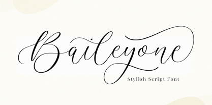 Introducing by Timur type Baileyone, a handwritten script font Baileyone is perfect for product packaging, branding project, magazines, social media, wedding, or just used to express words above the background. This Baileyone font includes: -Full Set of standard alphabet and punctuation & symbol -Extra set Alternate ending lowercase -multilingual support. Embelish your designs with our original fonts. Enjoy the font, thank you!
 - Moonthyu by Skiiller Studio,
$20.00 Moonthy is a beautiful type of script font, There are more than 150 alternate encoded PUAs suitable for graphic design and other needs What's include: Ligature Stylistic set for lowercase Stylistic set for Ending\ PUA Encoded Characters - Fully accessible without additional design software. Basic Latin Language Support (AÀÁÂÃÄÅCÇDÐEÈÉÊËIÌÍÎÏÑOØÒÓÔÕÖUÙÜÚÛWYÝŸÆß ) How to access alternate glyphs? you can see it on this link ( http://goo.gl/1vy2fv )
 - Griffith Initials by Celebrity Fontz,
$19.99The Griffith Initials font was inspired by a set of highly stylized capital letters from the remarkable hand of one of Americas foremost penmen, dating back to 1927. They combine a large degree of accuracy, grace, strength, and freedom. This font includes one set of graceful A-Z initials conveniently assigned to both the upper and lower case alphabet characters. - Show Biz JNL by Jeff Levine,
$29.00 The lettering style of Show Biz JNL is a classic sanserif with Art Deco influences. Slight variations in some letter shapes set it off from similar releases. The basic inspiration for this font was a set of ceramic letters and numbers used for home movie titling, but a few touches were added to give the font its own style and flavor.
 - Roseglow by Timurtype,
$14.00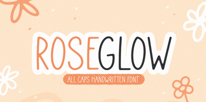 Introducing by Timur type Proudly Present, Roseglow Roseglow A fun Handwritten Font Roseglow is perfect for product packaging, branding project, megazine, social media, wedding, or just used to express words above the background. This Roseglow font includes: -Full Set of standard alphabet and punctuation & symbol -Extra set doodles -multilingual support. Embelish your designs with our original fonts.Enjoy the font,Thank you!
 - Garked by Linecreative,
$16.00 Garked is a font typeface inspired by ancient nordic runes, you want to customize a logo, brand or other design with ethnic or tribal style, this font is perfect for your choice. What you get, you will get: 1. Garked – Clean San serif font including Uppercase & Lowercase (ALL CAPS) characters, 2. Numbers and Punctuation 3. Support Multi language (Western Europe Latin)
 - Soundfest by Namara Creative Studio,
$20.00 modern marker script font, carefully crafted letters / alphabet in a completely natural hand-drawn look. Perfect for logo, branding projects, wedding designs, product packaging or simply as a stylish text overlay to any background image. Features : Full Set of standard characters and punctuations. Over 450+ characters (include : alternate sets, ligatures and multilingual support) PUA Encoded | no special software needed to access extra characters.
 - Synopsis by Vasava Fonts,
$45.00 Synopsis draws inspiration on the classic proportions and letterforms of old romans. In addition to this a new modern twist has been infused to it, giving it a dimensional double stroke or virtual inline that makes the round parts twist in and out. Specially gorgeous in big sizes it brings the best from the past merging it with new ideas.
 - Roti Brown by Alcode,
$19.00 Roti Brown is an realistic handwritten font inspired by natural brush typography. Written in rapid motion using a slightly dry brush pen. This will give you a fresh and elegant design. Roti Brown comes with uppercase and lowercase letters, large sets and small sets, numbers, alternative styles for several lowercase characters are also available that make your text and design more attractive.
 - Alfonsina by Eduardo Dulin,
$20.00 Alfonsina is a high contrast condensed didone typeface well-suited to classy magazines, short text, branding design, packaging and advertising. With a great set of alternates and swashes, allowing for more stylized designs. This font of thin serifs includes italic, strengthening the concept of its design. Alfonsina contains a set of more than 500 characters and supports a variety of languages.
 - Jane Plain NF by Nick's Fonts,
$10.00Here's a clean, simple architectural-blueprint style, eminently suitable for subheads and text blocks. Inspired by and named for a gentlewoman who gave up a career as an architect in Bolivia to care for the elderly in the United States. All versions of this font include the Unicode 1250 Central European character set in addition to the standard Unicode 1252 Latin set. - Sport Numbers by Gerald Gallo,
$20.00 Sport Numbers contains classic sport number designs, similar to those that appear on sport uniforms and competition vehicles, in the proportions of 6 x 10, 8 x 10, 10 x 10, and 12 x 10, both vertical and oblique. The vertical numbers are located under the character set and the oblique numbers are located under the respective keys of the shift + character set.
 - Wanwan by Jipatype,
$30.00 ฟอนต์วันวาน อักษรแบบตัวเขียนอ้างอิงจากสไตล์การเขียนแบบพู่กันให้ความรู้สึกพริ้วไหว มีสไตล์ให้เลือกใช้ 9 สไตล์ตเป็นตัวเอียงทั้งหมด และเพิ่มความน่าสนใจด้วยการไฮไลท์ตัวอักษรที่ต้องการจากนั้นเปิดใช้งาน Stylistic Set 01-09 (ss01-09) หรือ Access All Alternates (aalt) จะมีป็อปอัพเด่งขึ้นมาให้เลือกอักษรทางเลือกอื่นๆ ฟอนต์วันวาน เหมาะสำหรับการผาดหัว ข้อความสั่นๆ หรือจัดวางเป็นกลุ่มคำสั่นๆ - Wanwan, a calligraphy font based on a brush writing style. There are 9 styles with italic. Comes with Stylistic Set 01-09 (ss01-09) or Access All Alternates (aalt). Wanwan suitable for headline wedding cards and other graphic work.
 - Maylane by Raditya Type,
$13.00 Maylane is a beautiful, loving elegant typeface. It is suitable for wedding invitation, quote, greeting and many more. “Maylane” includes the full set of upper and lower case letters, multilingual symbols, numbers, punctuation, stylistic set, and ligature. This font has a smooth texture, so it will be perfect for all types of printing techniques. You can do embroidery, laser cut, gold foil etc.
 - Beagle Sign by Attype Studio,
$14.00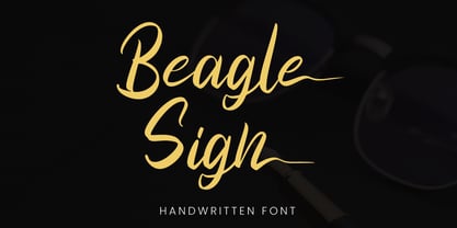 Beagle Sign is a stylish signature font with ending stylistic set that make amazing combination. perfect for any product like branding, invitation, stationery, wedding designs, social media posts, advertisements, product packaging, product designs, label, photography, watermark, special events or anything. Features: - Beagle Sign.otf - Multilingual Support - ligature - Ending stylistic set - Support Opentype features --- Hope you enjoy with our font! Attype Studio
 - Derailer by Aerotype,
$29.00 Derailer’s eclectic character set is comprised mainly of disparate sans serif characters that claim to play well together. OpenType users also benefit from 52 ligature features that automatically substitute a unique pairing of letters when any upper or lower case character is keyed twice in a row. Derailer Pro extends the character set to support Eastern European Latin, Baltic, Greek and Turkish.
 - Henares Street by Arendxstudio,
$15.00 Heares Street - Brush Font inspired by urban fonts with sharp and beautiful letters that create fonts that are modern, trendy and elegant. Heares Street came with opentype features such stylistic alternates, stylistic sets & ligatures good for logotype, poster, badge, book cover, tshirt design, packaging and any more. Features : • Character Set A-Z • Numerals & Punctuations (OpenType Standard) • Accents (Multilingual characters) • Ligature • Alternate
 - Ballistone by Timurtype,
$14.00 Introducing by Timur type Proudly Present, Ballistone Ballistone A Handwritten Script Font Ballistone is perfect for product packaging, branding project, megazine, social media, wedding, or just used to express words above the background. This Ballistone font includes: -Full Set of standard alphabet and punctuation & symbol -Extra set ligature & underline -multilingual support. Embelish your designs with our original fonts.Enjoy the font,Thank you!
 - Shohibul by Arendxstudio,
$15.00 Shohibul - Brush Font with sharp and beautiful letters that create fonts that are modern, trendy and elegant. Came with opentype features such stylistic alternates, stylistic sets & ligatures good for logotype, poster, badge, book cover, tshirt design, packaging and any more. Features : • Character Set A-Z • Numerals & Punctuations (OpenType Standard) • Accents (Multilingual characters) • Ligature • Alternate There it is! I really hope you enjoy it
 - Printers Plant Ornaments by Gerald Gallo,
$20.00 Printers Plant Ornaments was inspired by the decorative motifs used to fill in page space that have been around since moveable type printing commenced in the 15th century. All the ornaments are representations of plants. There is an assortment of 47 ornaments located under the character set keys. Under their respective shift + character set keys are the same 47 ornaments flopped.
 - Niathory by Attype Studio,
$18.00 Niathory is a Modern Calligraphy Font perfect for your wedding dream. Combine Niathory with stylistic set to create amazing script font for wedding! Niathory is perfect for branding, logo, invitation, quotes, apparel design, product packaging, merchandise, game titles, cute style design, Book/Cover Title and more. What's Included : - Ligature - Stylistic Set character - Multilingual Support --- Hope you enjoy with our font! Attype Studio
 - Bix Metric by S6 Foundry,
$20.00 Bix Metric is a stylistic display font developed within a set grid. The mono-spaced first set of the family comes in 3 styles in both upper and lowercase glyphs allowing mixing of infinite combinations. Perfectly suited for headlines, large-format prints, brand identities, social media, advertising, editorial design, posters, magazines, logos, headings, digital and more. With multi-language support.
 - Arum Sans by Australian Type Foundry,
$40.00 A humanist sans-serif family which displays subtle influences of the edged writing tool. Inspired by modern faces such as Chaparral and Enigma, Arum Sans is versatile enough to be used for high-end text setting as well as display purposes. A full international glyph set, extended for European use, allows Arum Sans to play on the field with the big boys.
 - Reina Neue by Lián Types,
$29.00 Hey! See Reina Neue in action here! INTRODUCTION When I designed the first Reina¹ circa 2010, I was at the dawn of my career as a type designer. The S{o}TA, short for the Society of Typographic Aficionados, described it as complex display typeface incorporating hairline flourishes to a nicely heavy romantic letterform². And it was like that; that’s what I was pursuing at that time since I was very passionate about ornaments and accolades of Calligraphy. Why? I felt that Typography, in general, needed more of them. These subtle flourishes could breathe life into letters. Maybe, I thought it was the only way I could propose something new into the field of type. However, after some years, I came across a very interesting quote: –Beautiful things don’t ask for attention– Wow! What did this mean? How could something be attractive if it’s not actually showing it. Could this be applied to my work? Sure. I think every type-designer goes through this process (aka crisis) regarding his or her career. At the beginning we love everything. We are kind of blind, we only see the big picture of a project. And that’s not because we are lazy. We actually can’t see the small mistakes nor the subtleties that make something simpler beautiful. We are not able. But, the small subtleties… They are actually everything: With experience, one puts more attention into the details and learns that every single decision in type has to be first meticulously planned. Here I am now, introducing a new Reina, because I felt there was a lot of it that could be improved, also the novelty of Variable Fonts caught my attention and I had to take that to my type library. THE FONT A thing of beauty is a joy forever Now, a decade later, I’m presenting Reina Neue. This font is not just an update of its predecessor: –A thing of beauty is a joy forever– is the first line of the poem ‘Endymion’ by John Keats, and despite the meaning of “beauty” may vary from person to person, and even from time to time (as read in the last paragraph), with Reina I always wanted to bring joy to the eye. In 2010, and now, in 2020. I believe the font is today much better in every aspect. It was entirely re-designed: Its shapes and morphology in general are much more clean and pure. The range of uses for it is now wider: While the old Reina consisted in just one weight, Reina Neue was converted into a big family of many weights, even with italics, smallcaps and layered styles. The idea behind the font, this kind of enveloping atmosphere made out of flourishes, is still here in the new Reina. This time easier to get amazing results due to the big amount of available alternates per glyph and also more loyal from a systemic point of view. However, and as read in the introduction -Beautiful things don’t ask for attention-, if none of the flourishes are activated the font will look very attractive anyway. Reina Neue is ready to be used in book covers, magazines, wedding cards, dazzling posters, storefronts, clothing, perfumes, wine labels and logos of all kind. Like it happened with the previous Reina, I hope this new font satisfies every design project around the world if used, and can be a joy forever. SOME INSTRUCTIONS Before choosing the right style for your project, hear my advice: -Reina Neue Display was meant to be used at big sizes. If you plan to print the font smaller than 72pt, I suggest using Reina Neue, not Display. Otherwise, if the font will be BIG or used on a digital platform, Reina Neue Display should be your choice. For even smaller sizes, use Reina Neue Small. This style was tested and printed in 12pt with nice results. (Note for variable fonts: Print them in outlines) -Reina Italic is not a slanted version of the roman, and this means some flourishes are different between each other. The Italic version has other kind of swirls. More conservative, in general. -All the styles of Reina Capitals have Small Capitals inside. -Reina Capitals Shine should be used/paired ONLY with Reina Capitals Black. The engraved feeling can be achieved if Reina Capitals Black and Reina Capitals Shine are used as layers, with the same word. Variable fonts instructions: -For more playful versions, choose Reina Neue VF, Reina Neue Italic VF or Reina Neue Capitals VF: With them you can adjust between 3 axes: Weight (will change the weight of the font) – Optic Size (will thicken/lighten the thin strokes and open/close the tracking) – Accolades (will modify the weight of the active flourishes). SOME VIDEOS OF REINA NEUE VF https://youtu.be/8cImmT5bpQM https://youtu.be/1icWfPmKAkg https://youtu.be/YC9GkJDL1a8 NOTES 1. The original Reina, from a decade ago: https://www.myfonts.com/fonts/argentina-lian-types/reina/ 2. In 2011, Reina received an honourable mention by S{o}TA. “Great skill is shown in the detailing, and an excellent feel for the correct flow of curves and displacement of stroke weight.” https://www.typesociety.org/catalyst/2011/ Reina was featured in the “Most Popular Fonts of the year” in MyFonts in 2011 https://www.myfonts.com/newsletters/sp/201201.html In 2012, the font was also selected in Tipos Latinos, the most prestigious competition of type in Latinoamerica. https://www.tiposlatinos.com/bienales/quinta-bienal-tl2012/resultados Also, chose as a “Favorite font of the year” in Typographica. https://typographica.org/typeface-reviews/reina/
 - Maree by Ashton,
$5.00 If you want to write something sincere and genuine but not too formal then this is the font for you. It is based on real handwriting, not some artificial calligraphy made to be either too haphazard or spiky or have loads of elegant flourishes but an ordinary person's writing, and designed to look as natural and as close to the original lettering as possible. Like any person's writing it is individual and distinctive, but so easy going on the eye those differences sit comfortably with you. It is friendly and open with easy to read glyphs both as lowercase and uppercase. The letters are relatively wide with clearly shaped distinct outlines. This font may be ideal for projects where you expect a wide readership with different reading abilities from young to old. When you are using this font a slightly bigger point size usually gives a better result so for a standard letter or similar you should size up to 15 points or more. Maree has been individually crafted to the smallest detail. To create a realistic handwriting font that looks relatively simple but works in a wide variety of languages requires a complexity and attention to detail most fonts will never require. This font in any ordinary business environment would never have been made, the effort required to make it too great, the length of time too long. There have been no shortcuts in this font, no automatic scanning or tracing, no automatic generation, no class kerning. Not only is each glyph individual but the width of letters, the height, the accents and the positions of the accents are all different. Even the line weight of the letters is designed to have natural variation but yet similar enough that the font appears as though it were written effortlessly in the same pen. And in order to keep the spacing consistent even though the letters have different widths, heights, lengths of descenders and so on, there are a vast number of kerning pairs, letter to letter, number to number, letter to number... All kerning has been individually assessed with an eye to proportionality taking in character shape, size and weight. For instance if you write a telephone number the numbers all sit close together but if you write a number before a letter such as in a UK post code or before a unit of measurement an extra little bit of space has been added which makes the number more distinct and therefore readable. That space is so natural to the eye that you don’t even know it is there. However even in the spacing allowance has been made for the fact it can’t be too perfect because when you write by hand the spacing is inconsistent. There have to be some letters which are too close or far apart otherwise the font would look artificial. For similar reasons if you are going to print out this font for a letter, etc, check the print version before you make any letter spacing changes because with the zoom functions in modern applications that uneven spacing and lettering can seem more pronounced than it actually is. When this font is printed out you will find it is surprisingly neat. This font is what it is, simple clear handwriting. You will not go wow. But if you want something unique and different and looks good on the page you won’t be disappointed. This font is not a work of art but it is a work of love. This font has a soul. How many fonts can you say that about?
 - Kick The Font - Personal use only

- Snuggels by Ingrimayne Type,
$9.95 Snuggles began as a set of hexagons and hour-glass shapes that fit together. Letters were formed from these shapes with effort made to preserve as much as possible the original outlines. The result is two sets of letters that by themselves are awkward and misshapen and that only look good when mixed together. The OpenType contextual alternatives (calt) feature automatically alternates the sets in computer programs that support this feature. Snuggles-Lower replaces the letters of Snuggles-Regular with lower-case shapes, but without ascenders or descenders, and the results are jarring. Several of these lower-case shapes (D, N, T, W, and Y) are available as OpenType stylistic-set alternatives in the Snuggels-Regular font. Both Snuggels-Regular and Snuggels-Lower have light versions. Snuggels loves to be noticed so it likes to be large and it considers foolish anyone who would use it as body text.
 - NO culture no SOUL by TypoGraphicDesign,
$9.00 The typeface No Culture No Soul is designed from 2021–2022 for the font foundry Typo Graphic Design by Luise Herke × Manuel Viergutz as a project for support the culture. Special THX to Michael Rütten of soulpatrol.de The display font with 254 glyphs incl. numbers, punctation, marks & symbols is inspired in the past and present. Extras like OpenType-features and 7 sylistic sets. For use in logos, magazines, posters, advertisement plus as webfont for decorative headlines. The font works best for display size. Have fun with this font & use the DEMO-FONT (with reduced glyph-set) FOR FREE! Font Specifications ■ Font Name: No Culture No Soul ■ Font Styles: 1 (Rough) + DEMO (with reduced glyph-set) ■ Font Category: Display for headline size ■ Glyph Set: 254 glyphs incl. extras like icons (decorative extras like dingbats, emojis, symbols) ■ Design Date: 2021–2022 ■ Type Designer: Luise Herke, Manuel Viergutz, THX to Michael Rütten (Soulpatrol)
 - Antipod by Octotypo,
$18.00 Antipod is a versatile sans serif family designed with the stroke of the nib in mind. The early sketches were made with a reed pen and then stabilised to keep the specific junctions between verticals and horizontals shapes. The design of the letters constantly balance between curves and inner sharp corners and the contrast of one is cohabiting with the other to give Antipod its specific design. When Antipod is set at small size its specific are almost unnoticeable but the text has a very particular type colour. And this specificity is useful when setting texts for display, to give your design a strong personality. Each weight includes a set of extra glyphs to make your text settings more singular. It also comes with extended language support, tabular figures, fractions and more. It is suited for any work editorial design, signage, corporate as well as onscreen applications.
 - Structorator by Furiosum,
$15.00 Structorator is a grid-based, experimental display font. This typeface emerged from experiments with generative type design. It evolved from a piece of code into a fully usable opentype font. The two main features are its rigid but playful design and a multitude of alternate glyphs. These features make it possible to create interesting lettering when using the default spacing. The glyphs are constructed from a limited set of patterns which are arranged within a predefined grid. The line thickness corresponds to the different cuts. Due to the rather complex shape this font will look best in larger sizes and resolutions. Its best suited for headline, display or illustrative work. - 3 weights: light, medium and heavy - 5 character sets - 3 number sets - Basic punctuation - Seperate diacrits - Ornamental glyphs - Access via stylistic sets *OT feature - Random access from the whole range of chars *OT feature - Total of 1062 Glyps
 - Gothikka - Unknown license

- Hand Print Stamp Rough by TypoGraphicDesign,
$29.00 The typeface Hand Print Stamp Rough is designed in 2018 for the font foundry Typo Graphic Design by Manuel Viergutz. The rough hand-printed typeface based on old wood letters, rubber-stamps and plastic stamps. 7 font styles (Reg + Mix, Circle, Diamond, Square Star + Icons) each with 1350+ glyphs incl. 200+ decorative extras like icons, arrows, dingbats, emojis, symbols, geometric shapes, catchwords, decorative ligatures (type the word LOVE for ♥ or SMILE for ☻ as OpenType-Feature dlig) and stylistic alternates (9+ stylistic sets). For use in logos, magazines, posters, advertisement and packaging plus as webfont for decorative headlines. The font works best for display size. Character Set: Latin Extended (Adobe Latin 3). 1350+ glyphs with 200+ extra icons like arrows, dingbats, symbols, geomatric shapes, catchwords and many alternative letters. (9× A–Z, 9× a–z, 9× 0–9) For use in magazines, posters, headlines and advertisement, plus as webfont for decorative headlines. Have fun with this font & try-before-buy the DEMO-FONT (with reduced glyph-set) FOR FREE! ■ Font Name: Hand Print Stamp Rough ■ Font Weights: Regular + Mix, Circle, Diamond, Square, Star + Icons + DEMO (with reduced glyph-set) ■ Font Category: Sans Serif + Slab Serif Display for Headline Size ■ Font-Format: .otf (OpenType Font for Mac + Win) + .ttf (TrueType Font) ■ Glyph Set: 1350 glyphs ■ Language Support: 27+ for Latin Extended (Adobe Latin 3). Afrikaans, Albanian, Catalan, Croatian, Czech, Danish, Dutch, English, Estonian, Finnish, French, German, Hungarian, Icelandic, Italian, Latvian, Lithuanian, Norwegian, Polish, Portugese, Romanian, Slovak, Slovenian, Spanisch, Swedish, Turkish, Zulu ■ Specials: 200+ decorative extras like icons for arrows, dingbats, emojis, symbols, geometric shapes, catchwords + German Capital Eszett. Open Type Features: Kerning (kern), Stylistic Set 1 (ss01) … Stylistic Set 16 (ss16), Localized Forms (locl), Superscript (sups), Ordinals (ordn), Slashed Zero (zero), Fractions (frac), Standard Ligatures (liga), Contextual Alternates (calt) e. g. Stylistic Set-Loop and Decorative Ligatures (dlig) e. g. type the word “LOVE” for ❤ or “SMILE” for ☺ ■ Design Date: 2018 ■ Type Designer: Manuel Viergutz
 - Rothenburg Decorative - Personal use only

- Ugly Face - Unknown license

- Marketing Script - Personal use only


