10,000 search results
(0.033 seconds)
- Printed Letters JNL by Jeff Levine,
$29.00Printed Letters JNL is from stamped impressions made by a children's sign making set by the Superior Marking Equipment Company of Chicago - circa the 1940's. The set consisted of individually mounted rubber stamps - easy enough for happy kiddies to print signs, name plates or (unfortunately for their parents) on the walls... Limited character set. - Gothix by GlyphStyle,
$19.00 Gothic is a stylized script style, with a wide selection of characters. A bold script font that looks cool. Gothic is perfect for branding projects. You can access swash by changing numbers 0-9 -Features of fonts Lowercase, Uppercase, Numbers & Punctuation, Lowercase alternatives, swash variant ligature Stylistic set 1 (for the end of the word) Stylistic set 2 (for the middle of the word) Stylistic set 3 (for the beginning of the word) Stylistic set 4 (for the end of the word) multilanguage
 - Cross Stitch Diamond Monogram by Gerald Gallo,
$20.00 Cross Stitch Diamond Monogram is a 25 stitch tall 3-letter diamond monogram. The letter representing the first name is on the left and is located under the character set. The letter representing the surname is in the center and is located under the shift + character set. The letter representing the middle name is on the right and is located under the option + character set or in the case of e, i, n, and u, under the shift + option + character set.
 - Grandezza Xtra by Wiescher Design,
$39.50 Grandezza Xtra is the standalone version of my most elaborate script. It is the script for many countries, good for Basic Latin, Latin Eastern Europe, Turkish, Baltic. I first designed 5 different sets and now this Xtra version which has a second set of capitals in the place of the smallcaps. This Xtra set is sufficient for most design jobs. If you need more you can always buy the standard Grandezza 5-font set for the reduced price. -Your script designer, Gert Wiescher
 - Austrual SRF by Stella Roberts Fonts,
$25.00 Austrual SRF is a collection of star dingbats created by Jeff Levine for Stella Roberts Fonts. There are over sixty images for adding the perfect intergalactic embellishment to any project. The net profits from my font sales help defer medical expenses for my siblings, who both suffer with Cystic Fibrosis and diabetes. Thank you.
 - Lemonado by Melvastype,
$29.00 Lemonado is a type family drawn with a dry brush pen. It includes upright and italic scripts and all caps fonts with brush texture or with smooth edges. Lemonado Script is playful and slightly bouncing connecting script. It includes two sets of lower cases to increase the hand writing effect. By enabling Contextual Alternates from OpenType panel you can cycle these two sets and achieve variation. Lemonado Script also includes set of lowercases without connecting stroke, you can use those in the middle of words or automatically add them at the end of words by enabling Stylistic Set 1 at the OpenType panel. There are also set of lower cases with end swashes, you can automatically add these swashes to end of words by enabling Stylistic Set 2 at the OpenType panel. Also other alternate characters and underlines are included to give you even more possibilities to play with. Lemonado Caps has two sets of upper case letters, high and low ones. You can achieve this fun looking bouncing effect by varying them. Just enable Contextual Alternates from OpenType panel and those two sets will cycle.
 - Nothing You Could Say by Kimberly Geswein,
$5.00 Neat printed handwriting.
 - Boink Rounded by Robert Petrick,
$19.95 Boink Rounded" is a new variation of my classic Boink font. The added softness of this new version extends the function of the easy and fun to use font.
 - 210 Gulim by Design210, Korean Fonts,
$300.00 A round was added to a neat straight line to express a soft sensibility. It is a neat and flexible font using a clean and stable type of module.
 - Weisshorn Brush by Bal Studio,
$12.00 Weisshorn Brush is a new brushed textured font which includes extra swashes. Perfect for brand projects, logos, product packaging, posters, invitations, greeting cards, news, blogs, everything including personal charm.
 - Shilia by Linotype,
$103.99 SHILIA – AN ARABIC FONT THAT LIVES HAND IN HAND WITH LATIN TEXT CHARACTERS A special design principle underlies the Arabic font Shilia created by Mamoun Sakkal: the form of the characters means that they harmonise happily with sans serif Latin fonts, such as Univers. Because of this, Shilia is the ideal choice for any bilingual project and for use in international corporate branding. Shilia™ had its beginnings in the 1970s. Taking one of the oldest variants of Arabic script, the minimalist Kufic, as his inspiration, Mamoun Sakkal fashioned simple stroke shapes that are combined according to a geometric grid. Shilia is at home in both worlds, that of the East and that of the West. And although Shilia has been primarily designed to be used as a display font, it is also ideal for setting shorter texts. Before being published by Linotype, Shilia underwent major adaptation and updating, and is now available in the modern OpenType format. Mamoun Sakkal increased the characters available per individual typeface variant to over 1,800, and his daughter, Aida Sakkal, worked on programming the extensive OpenType features for the font. There are numerous ligatures that can be used to provide suitable variation and avoid repetition within a given context, and many special features such as the dots under the initial and final segments of words being automatically centralised. Shilia not only supports Arabic, but also Persian and Urdu. Special character combinations for setting texts in these languages, particularly Urdu, are provided through OpenType. And there are a total of 19 stylistic sets with additional character variants available to the user. An example of Urdu text Shilia is available in eight weights, from UltraLight to Black. The corresponding condensed versions are in the course of preparation. Along with the Arabic characters, all of the typeface versions include matching Latin alphabet letters of Adrian Frutiger’s Linotype Univers® family, making Shilia intrinsically suitable for setting bilingual texts. A set of ornaments carefully designed to allow for numerous compositions of bands and decorative patterns rounds off the range of characters on offer. With its 21 weights, Shilia is one of the most extensive of Arabic typeface families that is currently on the market. Its clear and well-balanced forms emphasise the linear nature of the font without allowing it to appear sterile or artificial. Shilia not only cuts a good figure as a display font for signage or in artistic projects, thanks to its substantial range of features, the font family can also be used to set texts, such as corporate and administrative documents. In addition, but the full compatibility between the Arabic and Latin characters makes Shilia the perfect choice for international and multilingual design projects.
 - Adieu Mon Ami by Hanoded,
$15.00 No, I am not leaving and none of my friends or relatives have packed up and left. I needed a more ‘letter-like’ name for this font and I found Adieu Mon Ami (farewell, my friend in French). Adieu Mon Ami is a handmade pencil font that will add that extra ‘je ne sais quoi’ to your designs. It comes with joie de vivre, un petit peu de vilain, but can be doux comme de la soie as well. Bonne chance!
 - Korrupt by Typodermic,
$11.95 Introducing Korrupt, the typeface that shatters traditional letterforms and transports you to a bizarre, malevolent post-singularity metadystopia. With its antihumanist design and conflicting angles, this alien font is straight from the future. It’s a psychedelic apparatus that conjures up images of a twisted, eerie world. Korrupt is not for the faint of heart—it’s for those who want to push the boundaries of design and explore the strange and unconventional. If you’re into nanopunk, post-cyberpunk, biopunk or any other twisted science fiction theme, Korrupt is the font for you. Its optimal design will transport you to a world that’s both familiar and yet utterly alien. So don’t settle for the same old boring fonts—embrace the bizarre and choose Korrupt. It’s a typeface that will leave a lasting impression and make your message stand out. Get ready to take your design to the next level with this avant-garde, out-of-this-world typeface. Most Latin-based European writing systems are supported, including the following languages. Afaan Oromo, Afar, Afrikaans, Albanian, Alsatian, Aromanian, Aymara, Azerbaijani, Bashkir (Latin), Basque, Belarusian (Latin), Bemba, Bikol, Bosnian, Breton, Cape Verdean, Creole, Catalan, Cebuano, Chamorro, Chavacano, Chichewa, Crimean Tatar (Latin), Croatian, Czech, Danish, Dawan, Dholuo, Dutch, English, Estonian, Faroese, Fijian, Filipino, Finnish, French, Frisian, Friulian, Gagauz (Latin), Galician, Ganda, Genoese, German, Gikuyu, Greenlandic, Guadeloupean Creole, Haitian Creole, Hawaiian, Hiligaynon, Hungarian, Icelandic, Igbo, Ilocano, Indonesian, Irish, Italian, Jamaican, Kaingang, Kanuri, Kaqchikel, Karakalpak (Latin), Kashubian, Kikongo, Kinyarwanda, Kirundi, Kurdish (Latin), Latvian, Lithuanian, Lombard, Low Saxon, Luxembourgish, Maasai, Makhuwa, Malay, Maltese, Māori, Moldovan, Montenegrin, Nahuatl, Ndebele, Neapolitan, Norwegian, Novial, Occitan, Ossetian (Latin), Papiamento, Piedmontese, Polish, Portuguese, Quechua, Rarotongan, Romanian, Romansh, Sami, Sango, Saramaccan, Sardinian, Scottish Gaelic, Serbian (Latin), Shona, Sicilian, Silesian, Slovak, Slovenian, Somali, Sorbian, Sotho, Spanish, Swahili, Swazi, Swedish, Tagalog, Tahitian, Tetum, Tongan, Tshiluba, Tsonga, Tswana, Tumbuka, Turkish, Turkmen (Latin), Tuvaluan, Uzbek (Latin), Venda, Venetian, Vepsian, Võro, Walloon, Waray-Waray, Wayuu, Welsh, Wolof, Xavante, Xhosa, Yapese, Zapotec, Zarma, Zazaki, Zulu and Zuni.
 - Charbroiled by Typodermic,
$11.95 Picture this: the smell of freshly-grilled shiitake mushroom burgers wafting through the air, the sound of sizzling plant-based steaks on the grill, and a cold drink in your hand. It’s barbecue season, and you want your message to sizzle just as much as your food. Enter Charbroiled, the scorched and antiqued typeface that will take your design to the next level. Inspired by the classic American Italic from 1902, Charbroiled has a rustic and natural design that will add panache to any message. But Charbroiled isn’t just any old font. Custom letter pairings are automatically swapped to achieve a more genuine look, giving your design that extra edge. With its bold and distinctive style, Charbroiled will make your message stand out in any setting. So fire up the grill, crack open a cold one, and let Charbroiled do the talking. Whether it’s for a barbecue invitation, a restaurant menu, or a summer sale flyer, Charbroiled will give your message the perfect touch of authenticity and style. Get your message across with Charbroiled, and make your design sizzle! Most Latin-based European writing systems are supported, including the following languages. Afaan Oromo, Afar, Afrikaans, Albanian, Alsatian, Aromanian, Aymara, Bashkir (Latin), Basque, Belarusian (Latin), Bemba, Bikol, Bosnian, Breton, Cape Verdean, Creole, Catalan, Cebuano, Chamorro, Chavacano, Chichewa, Crimean Tatar (Latin), Croatian, Czech, Danish, Dawan, Dholuo, Dutch, English, Estonian, Faroese, Fijian, Filipino, Finnish, French, Frisian, Friulian, Gagauz (Latin), Galician, Ganda, Genoese, German, Greenlandic, Guadeloupean Creole, Haitian Creole, Hawaiian, Hiligaynon, Hungarian, Icelandic, Ilocano, Indonesian, Irish, Italian, Jamaican, Kaqchikel, Karakalpak (Latin), Kashubian, Kikongo, Kinyarwanda, Kirundi, Kurdish (Latin), Latvian, Lithuanian, Lombard, Low Saxon, Luxembourgish, Maasai, Makhuwa, Malay, Maltese, Māori, Moldovan, Montenegrin, Ndebele, Neapolitan, Norwegian, Novial, Occitan, Ossetian (Latin), Papiamento, Piedmontese, Polish, Portuguese, Quechua, Rarotongan, Romanian, Romansh, Sami, Sango, Saramaccan, Sardinian, Scottish Gaelic, Serbian (Latin), Shona, Sicilian, Silesian, Slovak, Slovenian, Somali, Sorbian, Sotho, Spanish, Swahili, Swazi, Swedish, Tagalog, Tahitian, Tetum, Tongan, Tshiluba, Tsonga, Tswana, Tumbuka, Turkish, Turkmen (Latin), Tuvaluan, Uzbek (Latin), Venetian, Vepsian, Võro, Walloon, Waray-Waray, Wayuu, Welsh, Wolof, Xhosa, Yapese, Zapotec Zulu and Zuni.
 - Textus Receptus by Lascaris,
$60.00 Textus Receptus is a historical revival based on the Roman and Greek types used by Johann Bebel (and later also Michael Isengrin) in Basel in the 1520s. The Roman is a low-contrast medium-to-heavy Venetian reminiscent of Jenson or Golden Type. The unusual polytonic Greek, not previously digitized, is lighter in weight and supplied with all the ligatures and variants of the original. Yet when used without historial forms the Greek has a surprisingly contemporary feel: it’s quirky and playful as a display face, but still easily legible in running text. Bebel’s Greek extended and refined the one used for the first printed Greek New Testament, Desiderius Erasmus’ Novum Instrumentum Omne, published in Basel in 1516 by Johann Froben. The name of the font was chosen in honor of this edition, which was so influential that it was later called the Textus Receptus (the “received text”), serving as the basis for Luther’s German Bible in 1522 and much subsequent scholarship for over 300 years. Following 16th century practice, Textus Receptus contains 130 ligatures and stylistic alternates for Greek, accessible either with OpenType features or with five stylistic sets. The Greek capitals, often printed bare in early editions, have been equipped with accents and breathings for proper polytonic or monotonic typesetting. The Roman includes both standard and historical ligatures along with the abbreviations and diacritics typically employed in early printed Latin. For expanded language coverage it has the entire unicode Latin Extended‑A range and part of Latin Extended-B. The capital A is surmounted by a horizontal stroke, as in some 16th century Italian designs, and the hyphen and question mark have both modern and historical form variants. Mark-to-base positioning correctly renders fifty combining diacritics, and with mark-to-mark positioning the most common diacritics may be stacked, permitting, for example, accents and breathings on top of length-marked vowels. Numerals include old-style, proportional lining and tabular lining. For further details, please download the 31-page Textus Receptus User Guide.
 - Wyvern by Typodermic,
$11.95 Introducing Wyvern—the sans-serif typeface that exudes professionalism and precision. With its high x-height and short descenders, Wyvern is a true testament to the vintage typewriters and daisy wheel printers that inspired its creation. Its sleek and compact design boasts clean edges that give it an open and vibrant appearance, perfect for businesses looking to make a brave statement. But it’s not just its appearance that sets Wyvern apart—its italics are a testament to its strength. With angled stems and altered stem widths, Wyvern maintains a dynamic and natural appearance without the use of cursive forms. This makes Wyvern ideal for businesses that want to convey a sense of innovation and forward-thinking. Wyvern comes in seven weights and italics, providing a range of options for businesses looking to make their mark. Whether you’re creating an audacious new brand identity or refining your existing design, Wyvern is the perfect choice for designers that want to make an impact. So why wait? Experience the power of Wyvern today and take your design to the next level. Most Latin-based European writing systems are supported, including the following languages. Afaan Oromo, Afar, Afrikaans, Albanian, Alsatian, Aromanian, Aymara, Bashkir (Latin), Basque, Belarusian (Latin), Bemba, Bikol, Bosnian, Breton, Cape Verdean, Creole, Catalan, Cebuano, Chamorro, Chavacano, Chichewa, Crimean Tatar (Latin), Croatian, Czech, Danish, Dawan, Dholuo, Dutch, English, Estonian, Faroese, Fijian, Filipino, Finnish, French, Frisian, Friulian, Gagauz (Latin), Galician, Ganda, Genoese, German, Greenlandic, Guadeloupean Creole, Haitian Creole, Hawaiian, Hiligaynon, Hungarian, Icelandic, Ilocano, Indonesian, Irish, Italian, Jamaican, Kaqchikel, Karakalpak (Latin), Kashubian, Kikongo, Kinyarwanda, Kirundi, Kurdish (Latin), Latvian, Lithuanian, Lombard, Low Saxon, Luxembourgish, Maasai, Makhuwa, Malay, Maltese, Māori, Moldovan, Montenegrin, Ndebele, Neapolitan, Norwegian, Novial, Occitan, Ossetian (Latin), Papiamento, Piedmontese, Polish, Portuguese, Quechua, Rarotongan, Romanian, Romansh, Sami, Sango, Saramaccan, Sardinian, Scottish Gaelic, Serbian (Latin), Shona, Sicilian, Silesian, Slovak, Slovenian, Somali, Sorbian, Sotho, Spanish, Swahili, Swazi, Swedish, Tagalog, Tahitian, Tetum, Tongan, Tshiluba, Tsonga, Tswana, Tumbuka, Turkish, Turkmen (Latin), Tuvaluan, Uzbek (Latin), Venetian, Vepsian, Võro, Walloon, Waray-Waray, Wayuu, Welsh, Wolof, Xhosa, Yapese, Zapotec Zulu and Zuni.
 - Systematic J - Unknown license

- Stefano by Signs of Gold,
$25.00 Stefano is a meld of traditional Roman typeface design and calligraphic hand lettering. It is bold yet refined; elegant yet forceful. Stefano will enhance the urbane and elevate the prosaic.
 - Twentytwelve Serif C by ABSTRKT,
$50.00Twentytwelve typefaces are the outcome of my project at the Jan van Eyck Academie in 2012. There're two sets of numbers: lowercase proportional and uppercase tabular (OpenType Stylistic Set 1). - Athena Signature by Viswell,
$18.00 Athena Signature is an authentic and stylish script font. Not too thin and not too thick, balanced and varied, this font was designed to enhance the beauty of your projects.
 - Twentytwelve Slab N by ABSTRKT,
$50.00Twentytwelve typefaces are the outcome of my project at the Jan van Eyck Academie in 2012. There're two sets of numbers: lowercase proportional and uppercase tabular (OpenType Stylistic Set 1). - Twentytwelve Serif N by ABSTRKT,
$50.00Twentytwelve typefaces are the outcome of my project at the Jan van Eyck Academie in 2012. There're two sets of numbers: lowercase proportional and uppercase tabular (OpenType Stylistic Set 1). - Twentytwelve Sans C by ABSTRKT,
$50.00Twentytwelve typefaces are the outcome of my project at the Jan van Eyck Academie in 2012. There're two sets of numbers: lowercase proportional and uppercase tabular (OpenType Stylistic Set 1). - Twentytwelve Sans N by ABSTRKT,
$50.00Twentytwelve typefaces are the outcome of my project at the Jan van Eyck Academie in 2012. There're two sets of numbers: lowercase proportional and uppercase tabular (OpenType Stylistic Set 1). - Twentytwelve Sans G by ABSTRKT,
$50.00Twentytwelve typefaces are the outcome of my project at the Jan van Eyck Academie in 2012. There're two sets of numbers: lowercase proportional and uppercase tabular (OpenType Stylistic Set 1). - Oriental Ornaments by Gerald Gallo,
$20.00 Oriental Ornaments was inspired by the ancient design motifs of the far east. There is an assortment of 85 ornaments located under the character set and shift + character set keys.
 - Twentytwelve Sans R by ABSTRKT,
$50.00Twentytwelve typefaces are the outcome of my project at the Jan van Eyck Academie in 2012. There're two sets of numbers: lowercase proportional and uppercase tabular (OpenType Stylistic Set 1). - Interlaced Ornaments by Gerald Gallo,
$20.00 Interlaced Ornaments is composed of various geometric shapes appearing to be woven together. There is an assortment of 69 ornaments located under the character set and shift + character set keys.
 - Amer by Linotype,
$187.99Amer was originally designed for dry transfer and redrawn and digitized by Adrian Williams. Amer is a modern Arabic headline face, which includes Latin glyphs from Kabel Book, allowing users to set text in both most Western European and Arabic languages without switching between fonts. Amer includes the Basic Latin character set and the Arabic character set, which supports Arabic, Persian, and Urdu. The font also includes tabular and proportional Arabic, Persian, and Urdu numerals, as well as a set of tabular European (Latin) numerals. - Nazari by RodrigoTypo,
$25.00 Nazari is a typeface for titles with personality, character and multiple alternatives to design. Nazarí is inspired by Arabic lettering and calligraphy, but updates its shapes through games of high contrast, geometric design and rounded terminals. The family has 4 styles: Regular, Regular Inline, Sans and Sans Inline. In turn, Nazari is divided into a basic set and an extended set. The basic set supplies all the essential characters to design any graphic piece. The extended set also contains different contextual alternatives, ligatures and swashes.
 - ASV Codar by Linotype,
$187.99ASV Codar is a modern Arabic text typeface with two weights: ASV Codar Light and ASV Codar Bold. Both of the fonts include Latin glyphs (Palatino Roman and Palatino Bold), allowing a single font to set text in both most Western European and Arabic languages. The two ASV Codar fonts include the Basic Latin character set and the Arabic character set, which supports Arabic, Persian, and Urdu. They include tabular and proportional Arabic, Persian, and Urdu numerals, as well as a set of tabular European (Latin) numerals. - Teapoy by Bogstav,
$17.00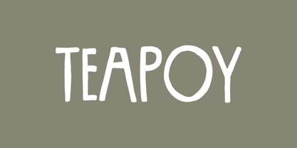 Yet another font candy!
 - KG Call Me Maybe by Kimberly Geswein,
$5.00 Thin, neat handwritten letters.
 - Strichcode by Volcano Type,
$19.00The new digital look. - Riccione Serial by SoftMaker,
$- Times New Roman alternative
 - Christmas Preference by Seemly Fonts,
$12.00 Christmas Preference is a clean, simple, and natural handwritten font. Not too thin and not too thick, balanced and varied, this font was designed to enhance the beauty of your projects.
 - Antidotum by GRIN3 (Nowak),
$20.00 Antidotum is a hand-made letterpress font with two different sets of capital letters. Language support includes Western, Central and Eastern European character sets, as well as Baltic and Turkish languages.
 - Haboro by insigne,
$- Haboro is a powerful workhorse. It’s a neoclassical font developed for numerous uses, ranging from editorial and corporate to web pages and apps. This new face from insigne Design takes a modern twist on the high-contrast typeface genre known as the Didone. Recognized for their ability to convey clarity, the geometric simplification of the Didone genre adds a level-headed rationality to whichever work it’s applied. Didones are used to lend style and sophistication to a wide number of applications—everything from style or cosmetic labels to annual reports. With its unique take on this classic genre, Haboro—with its slight wedge-shaped serifs and unique terminals—is still defined by elegance, tradition and timelessness. Even more to its versatility, this multi-purpose text face features whimsical terminals, which liven up even the most serious texts. If you desire, you can also opt for the more usual ball terminals by activating OpenType alternates. The Haboro family consists of seven weights from a Thin to a Black along with matching italics. The contrast from the letters’ thick strokes and thin strokes draws the eye to your design, making Haboro a powerful visual tool for communicating your message. The typeface also contains numerous ligatures and alternates. Choose between serif variants such as ball terminals or standard serifs by utilizing OpenType alternates. We recommend using the default contextual alternates and discretionary ligatures in order to benefit from all members of this fantastic font family. In addition, Haboro has a sizable set of option glyphs and numerous other OpenType variables to give your text the unique touches it needs. Haboro has all of the attributes you need to undertake your next project. Use its modified elegance to shape and mold your next design, whether a web site, app, branding package, or magazine. You’ll find there’s no job Haboro can’t take on.
 - Boule Plus by Ingo,
$33.00 CAPITALIZED, geometric, bold and round. If the typographer sees a font like that, it's enough to make his toes curl. But sometimes it just has to be that way. Geometrically constructed fonts do not necessarily have to be pointed and angular; It also works consistently around. And if I say it consistently, then in this case, that's done consistently. The basis for the BOULE is the circle. The letters are drawn with constant line width, the “corners“ and endings all have the same radius, the lines are all the same thickness. The BOULE consists only of capitals. There is only one difference in the use of uppercase and lowercase letters: in the uppercase letters, the round letters are circular, while the lowercase letters are narrow. The character set of the Boule contains all letters and accents to support the Western, Northern, Central and Eastern European languages with Latin alphabet. The BOULE is not only very fat, it also runs very tight; that is, the glyphs are very close to each other. To avoid "holes" due to unfortunate letter combinations, the BOULE contains ligatures for FT, ST, TT and TZ. There are also other versions of the font: BOULE Brillant on the one hand. In this version, simple highlights simulate a light incidence from the top right. These light edges give the font a decorative effect that makes it easy to think of wet sausages or balloons in some shapes. And finally the BOULE Contour. As the name implies, it is the outer contour of the letters, combined with a shadow at the bottom left. The name BOULE (French for ball) says it already: this font is globated. Therefore, it is also very suitable for all three-dimensional alienation effects. With simple light and shadow you can achieve a very convincing 3D effect with little effort.
 - FabFours by Ingrimayne Type,
$5.00 A tessellation is a pattern in which a shape or tile fits together with copies of itself to fill the plane with no gaps or overlaps. One type of tessellation is formed with sides of center-point rotation, that is, one half of an edge is rotated 180 degrees to form the other half. If a square template is made with sides of identical center-point rotation, there are exactly four shapes that are possible. If these shapes or tiles are fit together not edge to edge but vertex to vertex, the result is a checkerboard-like pattern of tiles and voids. However, the voids have four edges formed by the four possible shapes that the tiles can have, so the voids are limited to the same four shapes that that make up the tiles. The FabFours have 22 tile families that allow a wide variety of fascinating patterns. They form one, two, three, and four tile tessellation. Eleven of the seventeen symmetry groups can be formed with these patterns. In each tile family two of the shapes have two possible orientations, one shape has four possible orientations, and one has eight, for a total of 16 tiles. Each font has two families, one on letters A-P the other on a-p. For some of the families there are also other tiles using the same edge but using triangular and hexagonal templates. To get proper results, the leading must be set equal to the point size of the font. I discovered these fabulous families and their decorative possibilities as I was working on a book about tessellations. I have not been able to find anyone else who has written about these families of four and their decorative possibilities when arranged vertex to vertex.
