10,000 search results
(1.56 seconds)
- Acting by Ahmad Jamaludin,
$17.00 Introducing Acting! A robust slab typeface that effortlessly combines nostalgia with contemporary boldness. What sets Acting apart is its distinctive circular elements within each letter, adding a unique touch while maintaining clean and balanced shapes. With alternative glyphs, it truly comes to life. Acting offers versatility with three widths: Condensed, Normal, and Expanded, along with an oblique version, resulting in a total of six styles. Whether you're working on branding, titles, or headlines, Acting is your perfect choice for your project! What's included? Acting Main File Unique Letterforms Works on PC & Mac Simple Installations Accessible in Adobe Illustrator, Adobe Photoshop, Microsoft Word even Canva! PUA Encoded Characters. Fully accessible without additional design software. Multilingual Supports: (Afrikaans, Albanian, Catalan, Croatian, Czech, Danish, Dutch, English, Estonian, Finnish, French, German, Hungarian, Icelandic, Italian, Lithuanian, Maltese, Norwegian, Polish, Portuguese, Slovenian, Spanish, Swedish, Turkish, Zulu) Come and say hello over on Instagram! https://www.instagram.com/dharmas.studio/
 - Aloe by ROHH,
$29.00 Aloe is a characterful and friendly display font family inspired by headlines from 1930’s newspapers and calligraphy. The family consists of 9 weights, ranging from Thin to Heavy, with matching ornament fonts. It features a variable font with weight axis. Each weight has over 900 glyphs including advanced typographic features, such as vast number of stylistic alternates, swashes, titling and terminal forms, case sensitive forms, ligatures, symbols, ornaments as well as lining and old style figures, fractions, subscripts and superscripts. This original mixture of display typeface with calligraphy gives a versatile family great for all sorts of uses - from advertising, packaging, branding, wedding invitations, menu cards and other editorial uses to screen and web projects.
 - Alkes by Fontfabric,
$35.00Features: Over 1200 gyphs in 14 styles; True form of italics; Humanist character and proportions; Extended Latin, Extended Cyrillic & Greek scripts; For more than 130 languages Moderate contrast; Perfect for text, headlines and web; Coverage of many OpenType features Ligatures, Small Caps, Case sensitive forms, OldStyle figures, Tabular figures, Fractions Named after a star and inspired by the cosmos, Alkes traveled a long way from a graduation project to a published multiscript serif type family. Designed with the intention of harmonising between three scripts - Latin, Cyrillic and Greek, the contemporary, yet well defined humanist serif combines the best out of the digital and analog worlds. Featuring a generous x-height, wide letter spacing, large open counters and angled stress contrast, Alkes is highly effective for editorials and publishing, where long texts and legibility are the key forces. Its attractive details, calligraphic structure and asymmetrical serifs shine through in the larger sizes and make Alkes suitable for headlines. Alkes has a pull with editorial designers, graphic designers and publishers who aim for a clear structure, hierarchy and coherent non-Latin scripts for both print and on-screen environments, in order to achieve otherworldly designs - Alys by Red Rooster Collection,
$45.00An original design. A memorial typeface by Pat for her mother, Alys, who was tragically killed. - Salt by Grummedia,
$20.00Salt was first conceived as an authentic alphabet of runes, but that was far too serious so it ended up as a lesser spotted version of Pepper. - Alta by Intellecta Design,
$18.90Note: The Alta Bold, Italic, Lined and Outline styles are no longer available due their complexity and the resulting memory and performance issues. - NEC - Unknown license

- Nemo - Unknown license

- Neto - Personal use only

- Neon - Unknown license

- Neon by Superfried,
$32.50 Neon is an experimental, retro display typeface designed by Superfried. Neon features two styles which can be toggled via shift. As the name suggests styling for the typeface started with classic neon signage, but quickly took a new direction of its own leading to a very distinct and versatile display face. Neon has been featured in Computer Arts magazine.
 - Geos by FineDisplayType,
$4.99 FDT Geos has re-invented airport signage. A stylish font with modern features display tech couldn't afford. FDT Geos features ligatures, fractions, numerals, stylistic sets, and even some symbols!
 - Geo by Bogusky 2,
$15.00• - Nero by Skinny Type,
$19.00 Nero is built on the Nero framework, our popular family of geometric types. Like the sans-serif Nero letterform, it has two contemporary look and feel styles. Echoing late 20th-century modernism, the Rounded's overall look is clean and sleek, more ephemeral and dynamic than pared-down bourgeois asceticism. Nero's place in font history is a complex one. Praised for their readability and also at the same time their fashionable qualities, they look very modern and nostalgic, easy to read and very stylish, authoritative and fun. Nero and Nero Rounded when combined, offer 2 styles to suit all text types and sizes. Both are excellent for short texts that require a sense of urgency or playfulness.
 - Nedo by Typogama,
$25.99 Nedo is a retro inspired, single weight display font based on a series of geometric lines. It features a large set of ligatures and some alternate characters that allow a range of possible combinations for text layouts and is best suited for use in large settings.
 - Reo by Our House Graphics,
$9.00 Reo is a novel two layered, display font with a decidedly retro look and feel, inspired by the toothy grins of 1930�s and 40�s era truck grilles and the gleaming, streamlined efficiency of the automat. Reo Front (Foreground) is where all the detail resides, and Reo Back provides a background layer.
 - Leo by Canada Type,
$29.95 Leo is an economic magazine and book face meant for use in sizes suitable for immersive reading, with different cuts optimized for different body copy size ranges, like footnotes and legal text. Designed with the explicit intent of relaying information without calling attention to itself, this typeface places itself squarely on the "function" side of the eternal debate about form versus content. The roman Leo fonts were built with as little ornamentation as possible, with wedge serifs, a high x-height and a skeleton somehwat rooted in the designers' reflections on the modern, post-war Dutch archetype. Rather than follow traditional models with entirely different forms, contracted widths and steep slants, the Leo italics deliver naturally subtle emphasis in reading by closely relating to the forms, stance and rhythm of their roman counterparts. The 12 Leo fonts contain over 700 glyphs each, and include support for the vast majority of Latin languages. Included OpenType features are built-in small caps, lining and oldstyle figures in both proportional and tabular sets, superiors, numerators, denominators inferiors, ordinals, automatic fractions, ligatures, and optional long descenders for optimal counterspace management in book and magazine text layout. For more information on Leo's character set, features and some print tests, please consult the PDF in the gallery section of this page.
 - Geo by words+pictures,
$20.00 - Geo by BA Graphics,
$45.00A Bold Powerful Geometric design. Great headline face; works well in many applications. - Neon by Monotype,
$29.99Neon Extra Condensed was designed by Giulio da Milano and released in 1935. This all-capital typeface is similar to designs released in the early 1990s. The Neon Extra Condensed font is good as a headline face for magazines and book covers. - Ned by Linotype,
$29.99Ned Std. is part of a series of typographic experiments from the young Swiss designer Michael Parson. Using a wide, horizontal hexagonal grid, Parson created the system of letters that make up this font. Text set in Ned Regular takes on a modular, honeycomb-like appearance. For an interesting effect, try overlapping individual letters, or use a few letters together as elements in a logo. A great companion face to Ned Std. is Linotype's Hexatype Bold. Both Ned Std. and Hexatype Bold have been included in the Take Type 5 collection, along with eight further constructions from Parson." - New by hgo,
$15.00
- Aeos by T-26,
$19.00 - Nevo by Meat Studio,
$37.33 Nevo is a 14 style contemporary sans serif designed by Stew Deane. Nevo was specifically designed for a premium feel that is suitable for anything from advertising and branding to web and screen. Its versatility comes from the minimal, subtly unique letterforms that come in 7 weights, with matching italics for each weight making it easily adaptable to brands and market sectors.
 - etch a sketch - Personal use only

- Etch A Sketch by JOEBOB graphics,
$9.00 I finally managed to create a font from the characters I wrote on my Etch A Sketch board. A bit grungy, but definitely something else.
 - Lech Sans Pro by Ingo,
$44.00 A modern sans serif – large x-height, lively forms The Lech Sans Pro is businesslike-modern but at the same time present the effect of liveliness and movement. The shapes of the individual characters follow the "humanistic" form language of modern faces. In this way, Lech Sans Pro offers an attractive alternative to most of the sans serif fonts used today. The proportions have been selected to be very legible even as a body type for longer texts. The font is so robust in detail that a title in large capitals is very eye-catching. It can function positively as well as negatively and is also still legible from a great distance. Lech Sans Pro supports West European languages including Scandinavian, Central and Eastern European languages, also including Turkish, Vietnamese as well as Greek and Cyrillic. Along with ligatures for the letter combinations fi, ff, fl, tt and tz the font also includes stylistic alternates for N, R, f, l as well as for the German sharp s and the figure 3. Additionally, Lech Sans Pro offers several sets of figures: proportional standard figures of equal height lining figures in height of the capitals proportional medieval figures with ascenders and descenders disproportional tabular figures of equal width superior and inferior scientific figures and numerators resp. denominators for fractions circled figures
 - Etched Stencil JNL by Jeff Levine,
$29.00 The American Sign Museum in Cincinnati houses an amazing collection of vintage signage from all kinds of sources and covering many eras of retail advertising. Someone visiting the museum posted online an image of one particular piece of glass with hand lettering saying “gold leaf” in a bold Art Deco stencil style. Etched Stencil JNL was inspired by that image and is available in both regular and oblique versions.
 - Typographer Rotunda Alt - Personal use only

- Freebooter Script - Alts - Unknown license

- Diehl Deco - Alts - Unknown license

- Reload Alt Stencil by Reserves,
$49.00 Reload Alt Stencil is a rounded industrial geometric stencil typeface available in four flexible and distinct weights. Features include: Slashed zero Romanian s accent language feature Extended language support *Requires an application with OpenType and/or Unicode support.
 - Van Alt JNL by Jeff Levine,
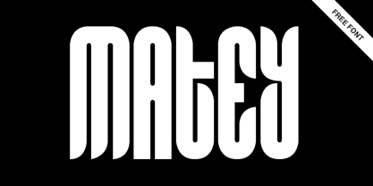
$29.00Looking similar to a Deco-era classic typeface, Van Alt JNL has slightly different character shapes, but pays due respect to its inspiration by the original... - Alt Matey V2 by ALT,
$-
- Alt Ayame Long by ALT,
$10.00 A long version of my Ayame font. Ayame is a display font which looks great on posters, logos, and titles. Ayame Long is a 2-weight family with a heavy retro look. Works great with the regular version of Ayame you can check out the original.
 - Houschka Alt Pro by G-Type,
$72.00 Houschka Alt Pro is a carbon copy of the Houschka Pro family with one key difference: the rounded signature glyphs A & W on the default positions swap places with their straight alternates. Houschka was named after Georg Houschka, a sadly defunct confectioner’s shop in Salzburg, Austria, which had a wonderful 1930s frontage and distinctively rounded letterforms in the sign above the door. Houschka Pro is the follow up to the original Houschka type family which first appeared back in 1999. Character shapes have been improved, kerning and spacing refined, and OpenType features include CE, Baltic, Turkish & Cyrillic language support plus small caps, 3 stylistic sets, contextual alternates, ligatures and 4 sets of numerals. Houschka is a clean and legible modern sans serif typeface which shares the humanist qualities of Gill Sans and Johnston but retains a uniquely charming character of its own (particularly in signature glyphs A, G, Q, W, u & w). The monolinear structure, rounded corners and rolling curves give Houschka a soft and friendly appearance.
 - Alte Schwabacher EF by Elsner+Flake,
$35.00 - Neue Alte Grotesk by VisualWorks,
$20.00 Inspired by German grotesk from XIXth century. Driven by the spirit of 1950s Swiss Style. Designed with a hint of constructivist approach. Neue Alte Grotesk is a minimalistic typeface with a distinct character. It is created to connect both new and old. It will look good in juxtaposition with retro-styled illustrations and ultra-modern graphics.
 - Houschka Rounded Alt by G-Type,
$72.00 Houschka Rounded Alt is a carbon copy of the Houschka Rounded family with one key difference: the rounded signature glyphs A & W on the default positions swap places with their straight alternates. Houschka was named after Georg Houschka, a sadly defunct confectioner’s shop in Salzburg, Austria, which had a wonderful 1930s frontage and distinctively rounded letterforms in the sign above the door. OpenType features include CE, Baltic, Turkish & Cyrillic language support plus small caps, 3 stylistic sets, contextual alternates, ligatures and 4 sets of numerals. Houschka Rounded Alt is a clean and legible modern sans serif typeface which shares the humanist qualities of Gill Sans and Johnston but retains a uniquely charming character of its own. The monolinear structure, rounded terminals and rolling curves give Houschka Rounded Alt a soft and friendly appearance.
 - Oksana Text Alt by AndrijType,
$25.00Oksana Text is the demure version of Oksana, with shorted serifs, higher contrast, more slender proportions. In six weights from Thin to Black and with the real italic, this typeface is suitable for longer text with rich typography.


