10,000 search results
(0.317 seconds)
- Havely by Slide Shoot,
$12.00 Havely Condensed Sans Serif is a balanced, smooth, elegant and stylish sans serif font. He has a beautiful character. It fits perfectly with invitation card designs, company logos, movie titles, movie names, business cards, book titles, brand names and various other designs. Havely Condensed Sans Serif is a subtle sans serif font that exudes sophistication and elegance. Its stylish alternations and ligatures make this font the perfect partner for any project.
 - Volika by Slide Shoot,
$17.00 Volika Sans Serif is a balanced, smooth, elegant and stylish sans serif font. He has a beautiful character. It fits perfectly with invitation card designs, company logos, movie titles, movie names, business cards, book titles, brand names and various other designs. Volika Sans Serif is a subtle sans serif font that exudes sophistication and elegance. Its stylish alternations and ligatures make this font the perfect partner for any project.
 - Grund by SIAS,
$29.90 GRUND is a new fontographic adaption of a remarkable 1920s epigraphical find in the city of Leipsic. This old well-known European trade fair hotspot struggled with a severe shortage of exhibition space around 1920. The solution was to dig deeper into the matter – literally – and 1924 the world’s first underground trade fair exhibition hall was opened right under the city’s central market square. After several changes of use during the past decades the sophisticated Art Deco entrance structure (architect: Otto Droge) was re-opened in December 2013 as a gateway to a new subway rail track. – The original brass lettering of the UNTERGRUNDMESSHALLE MARKT has been retrieved – and served as the inspiration for this new and unique font. If you’d like to see more exceptional Art Deco type, have a look at my Arthur series. __________________________________________________________________________________________
 - Mirava by Din Studio,
$25.00 Hi, Everyone! Ready to make your branding spark? If you need to create a big, bold logo for your business, work on a poster for an event, or whatever your project may be-then this is the perfect font for you. Mirava Sans-A Sans Serif Font Family If we can give you many options then why not? Mirava San is a package that will delight you. With this family you will get many options to maximize your designs with stylish fonts. This font designed to bring your branding to life and add a touch of modernity, fun and style. Mirava paves the way for you to write the information you need to send out to your audience. Perfect to create amazing headings, logos, menus, social media graphics, and many more. Our font always includes Multilingual Support to make your branding reach a global audience. Features: Multilingual Support PUA Encoded Numerals and Punctuation Thank you for downloading premium fonts from Din Studio
 - Altertypo by Popskraft,
$12.00 Altertypo, a font family on a never-ending quest for the "perfect" sans-serif style. Inspired by the early 20th-century pioneers like Gill Sans and Johnston Sans, Altertypo seamlessly blends their classic elegance with contemporary flair. This unique typeface is your passport to creative freedom in graphic design, serving a multitude of purposes from editorial and corporate to web and interaction design. This font allows you to craft compelling designs that transcend the ordinary, providing the versatility and innovation you seek. It invites you to explore a world of creative possibilities, where every character is thoughtfully placed to ensure a smooth, organic flow of words. Step into the realm of Altertypo, and leave behind the constraints of conventional fonts. It's your gateway to exceptional design, where each letter harmonizes effortlessly to deliver a captivating visual experience. Say goodbye to the limitations of standard fonts and embrace the boundless potential that Altertypo offers.
 - Anisha by 38-lineart,
$13.00 “Anisha”. This font is the Great choice for brand identity, branding and just branding ... we have studied various branding of modern products and we found a very interesting style, which is a combination of "calligraphy signature and clean sans". This is like combining two different elements and together in a composition that is very luxurious and elegant. Anisha calligraphy, bold and thin sans, all of which consist of regular and slant versions, so the number of fonts in this package consists of 6 fonts, the more choices the more design combinations you can make. Anisha is a beautiful high fashion font that makes for gorgeous logos, posters, blog posts, social media, and more! I love using them together with layer masks in Photoshop, so it looks like the script is running through the lines of the sans serif. Anisha Script includes 2 alternates for uppercase and 4-5 alternates for lowercase, and additional ligatures to make everything look totally hand-done.
 - Big Bang by Haksen,
$12.00 Big Bang! Cute Sans with Additional Swashes Introducing the elegant "Big Bang!" Cute Sans with Additional Swashes If you are needing a touch of funnies chic cute sans for your designs, this font was created for you! Big Bang was built with OpenType features cute characters for uppercase and lowercase letters, loads of different swash character for numerical, uppercase and lowercase letters in file with the name Big Bang Swashes, in other side for Bing Bang regular and slant version include numbers, punctuation, ligatures and it also supports other languages :) Accessing the swashes / opentype features / glyphs: This font works best in a program that supports OpenType features such as Adobe Indesign, Adobe Illustrator CS, or Adobe Photoshop CC. You can access the swashes and alternates from the 'Glyphs Panel' in these programs. More Questions? Here are some (potential) answers! You are not permitted to resell this font in any way. Multilingual Support is included for Western European Languages Cheers!
 - Percance Fatal - Personal use only

- PAG Smoke by Prop-a-ganda,
$19.99Prop-a-ganda offers retro-flavored fonts inspired by lettering on retro propaganda posters, retro advertising posters, retro packages all the world over. This is perfect font for your retrospective project. PAG Smoke is very heavy geometric font. Its unique shape is like a monster for your design project. - Landry Gothic by E-phemera,
$12.00Landry Gothic is inspired by a wood type alphabet by an unknown designer. It was digitized in order to make prop signage for movies and television. Its imperfect lines and rounded corners are meant to capture the feeling of real wood or metal type that's worn from use. - Blitzplakat by FaceType,
$12.00 Unearthed by our friend Dimitris Karaiskos in an antique shop in Vienna, we digitized it and added more glyphs. Blitzplakat is the name of this pre-Letraset system, where you could make your own little advertising posters by cutting out these letters and sticking them on paper like stamps.
 - Neues Bauen by Hanoded,
$10.00 Neues Bauen is a Bauhaus inspired font with some interesting glyphs. It is slightly rounded in places, but sharp in others and it will most certainly make your designs stand out. Neues Bauen in other words, like the style that emerged in pre-war Germany, is a statement.
 - Green Fairy by Maria Montes,
$39.00 Green Fairy is a chromatic font family highly ornamented for display purposes. Green Fairy’s characters have been specifically designed to accommodate its loops and ornaments following a modern typeface structure. Green Fairy has four chromatic weights: 1. Green Fairy Outline 2. Green Fairy Dots 3. Green Fairy Stencil 4. Green Fairy Full The outline weight has been created as the base or structure for the other weights. You can combine these weights as well as add colours to obtain multiple effects and type styles. Green Fairy has also three combined weights (combos) to simplify your work flow, for these occasions when you only want to use one single colour in your font: 5. Green Fairy Dots Combo 6. Green Fairy Stencil Combo 7. Green Fairy Full Combo GREEN FAIRY ORIGINS The origin of this typeface is the lettering I designed in October 2015 as part of my illustrated cocktail artwork called “Absinthe. La Fée Verte (The Green Fairy)”. Originally, this lettering only featured eight letters “AB·SINTHE” vector drawn in Illustrator. Right after creating the full-colour artwork, I designed a fountain-letterpress print version of it, in collaboration with Ladies of Letters, A.K.A. Carla Hackett and Amy Constable from Saint Gertrude Fine Printing. At the beginning of 2016 –and thanks to the project @36daysoftype– I found the motivation, and most importantly the deadline, to draw the rest of the twenty-six letters of the uppercase alphabet using Illustrator. I started 2017 having my first two calligraphy courses sold out, so I took this amazing opportunity to devote myself to Green Fairy for a few months. In February 2017, I purchased the font software Glyphs and I started to re-draw all twenty-six letters of the uppercase alphabet again. PRODUCTION PROCESS Green Fairy started being one weight, but quickly turned into a layered/chromatic font. Things were going more or less fine till I arrived to the Dots weight: 1) I started drawing squares following a grid; 2) Then, the squares turned into diamonds following the same grid; 3) Then, the grid wasn’t working so well on the round letters so I tried randomising the position of the diamonds but it didn’t work; 4) So I went back to the grid, and this time scaled down the size of the diamonds creating a visual half-tone effect. I spent over four weeks working on the Dots weight and I felt like I was in the middle of a very long tunnel and I couldn’t see the light at the end. I encountered many other problems along the way but by June 2017, I felt I was back on track again. I kept working, tweaking, re-drawing and re-adjusting, and then the diacritics came on board… And then more re-drawing, re-tweaking, re-adjusting and then numbers… And then spacing, symbols, and currencies… And then more spacing, kerning, contextual kerning for triplets… In September 2017 I told myself “that’s it, I’m going to finish it now!” But guess what? More re-tweaking, testing, hinting, testing, rendering, testing… For those of you not familiarized with typeface design, it is extremely time consuming and it requires a lot of hard work, focus and determination. This project could not have been possible without the help of these generous professionals: Jose Manuel Urós, typeface designer based in Barcelona and my teacher twice in the past; Jamie Clarke, freelance letterer and typeface designer who has released a couple of chromatic fonts recently; Troy Leinster, Australian full-time typeface designer living and working in New York City; Noe Blanco, full-time typeface designer and hinting specialist based in Catalonia; And Nicole Phillips, typographer currently relocating from Australia to New Zealand. To all of you: THANK YOU VERY MUCH!
 - Cisalpin by Linotype,
$29.99 The ideal typeface for cartography The Swiss designer/typographer Felix Arnold designed Cisalpin during the late 1990s, after he had challenged himself to create a contemporary typeface that could be used for cartographic uses. Arnold came to the subject of cartographic typefaces after analyzing many maps and atlases, and discovering that there was no standard typeface for these types of documents. Like any good cartographic type, Cisalpin is very legible at small sizes. While he was drawing this typeface on his computer, Arnold used a reduction glass to refine his design, making it work in these situations. Cisalpin is a linear sans serif face, with slight resemblance to renaissance serif types. The various weights are all clearly differentiated from one another. And because space is often a premium on maps, Cisalpin runs narrow. Words close in around themselves to help them become more identifiable. The letterforms in Cisalpin are durable, and can maintain their readability when placed over complex backgrounds. They have open interior forms, flattened curves, tall x-heights, and a capital height that almost reaches the tops of the ascenders. Cisalpin also has pronounced Italics, with a very clear angle of inclination. Each letterform in the family has been optimized so that they cannot be easily mistaken for another. This again helps minimize the misunderstandings that often occur because of illegibility. Although Cisalpin was developed for use in cartography, it may be used for countless other purposes; any font that can work well in small sizes on a map could be used almost anywhere else!
 - Glory Mathilda by Atharuah Studios,
$16.00 Introducing Glory Mathilda! An energetic brush stroke fonts. With two sets of all-caps letters, Glory Mathilda can support your creativity on your logo design, brand imagery, quotes, merchandise, product packaging, music projects, social media posts, etc. Glory Mathilda also has ten swashes that you can access in each alternative letter A-J. That's it! I hope you enjoy it. You can also say hello to me on Instagram: https://www.instagram.com/atharuah_ Thank You!
 - 99 Names of ALLAH Straight by Islamic Calligraphy75,
$12.00 We have transformed the “99 names of ALLAH” into a font. That means each key on your keyboard represents 1 of the 99 names of ALLAH Aaza Wajal. The fonts work with both the English and Arabic Keyboards. We call this Calligraphy "Straight" because of the straight like design. Everything is clear, symmetric and straight. The first "Alef" has a "fatha", this indicates to pronounce the first letter. So instead of saying "R-RAHMAAN" you say "AR-RAHMAN" (in the zip file you will find a pdf file explaining the differences in the "harakat", pronunciation and spelling according to the Holy Quran). We went for the traditional "soukoun" instead of the Quranic "soukoun" & the decorative symbols are at a minimum. Decorative letters used in this calligraphy: "Mim, Aain, Sin, HHe, He & Kaf". Purpose & use: - Writers: Highlight the names in your texts in beautiful Islamic calligraphy. - Editors: Use with kinetic typography templates (AE) & editing software. - Designers: The very small details in the names does not affect the quality. Rest assured it is flawless. The MOST IMPORTANT THING about this list is that all the names are 100% ERROR FREE, and you can USE THEM WITH YOUR EYES CLOSED. All the “Tachkilat” are 100% ERROR FREE, all the "Spelling" is 100% ERROR FREE, and they all have been written in accordance with the Holy Quran. No names are missing and no names are duplicated. The list is complete "99 names +1". The +1 is the name “ALLAH” 'Aza wajal. Another important thing is how we use the decorative letters. In every font you will see small decorative letters, these letters are used only in accordance with their respective letters to indicate pronunciation & we don't include them randomly. That means "mim" on top or below the letter "mim", "sin" on top or below the letter "sin", and so on and so forth. Included: Pdf file telling you which key is associated with which name. In that same file we have included the transliteration and explication of all 99 names. Pdf file explaining the differences in the harakat and pronunciation according to the Holy Quran. Here is a link to all the extra files you will need: https://drive.google.com/drive/folders/1Xj2Q8hhmfKD7stY6RILhKPiPfePpI9U4?usp=sharing
 - 99 Names of ALLAH Pilot by Islamic Calligraphy75,
$12.00 We have transformed the “99 names of ALLAH” into a font. That means each key on your keyboard represents 1 of the 99 names of ALLAH Aaza Wajal. The fonts work with both the English and Arabic Keyboards. We call this Calligraphy "Pilot" because it was the very first one we produced. The first "Alef" doesn't have a "hamzit wasel" nor a "fatha", this indicates to skip the pronunciation of that letter. So instead of saying "AR-RAHMAAN" you say "R-RAHMAN". (in the zip file you will find a pdf file explaining the differences in the "harakat", pronunciation and spelling according to the Holy Quran). Decorative letters used in this calligraphy: "Mim, Aain, Sin, HHe, He, Kaf & Alef". Purpose & use: - Writers: Highlight the names in your texts in beautiful Islamic calligraphy. - Editors: Use with kinetic typography templates (AE) & editing software. - Designers: The very small details in the names does not affect the quality. Rest assured it is flawless. The MOST IMPORTANT THING about this list is that all the names are 100% ERROR FREE, and you can USE THEM WITH YOUR EYES CLOSED. All the “Tachkilat” are 100% ERROR FREE, all the "Spelling" is 100% ERROR FREE, and they all have been written in accordance with the Holy Quran. No names are missing and no names are duplicated. The list is complete "99 names +1". The +1 is the name “ALLAH” 'Aza wajal. Another important thing is how we use the decorative letters. In every font you will see small decorative letters, these letters are used only in accordance with their respective letters to indicate pronunciation & we don't include them randomly. That means "mim" on top or below the letter "mim", "sin" on top or below the letter "sin", and so on and so forth. Included: Pdf file telling you which key is associated with which name. In that same file we have included the transliteration and explication of all 99 names. Pdf file explaining the differences in the harakat and pronunciation according to the Holy Quran. Here is a link to all the extra files you will need: https://drive.google.com/drive/folders/1Xj2Q8hhmfKD7stY6RILhKPiPfePpI9U4?usp=sharing
 - Quartan by Linotype,
$29.99Quartan is an industrial, unicase sans serif family, with three weights. The Austrian designer Maria Martina Schmitt developed this series of typefaces for designers to use when setting chunks of text en masse. Being a unicase design, Quartan¿s letterforms have no ascenders or descenders; lines of text may be stacked virtually on top of one other. This offers a multitude of possibilities for headline, logo, or corporate identity design. - Monto Grotesk by Lucas Tillian,
$28.00 Monto is a superfamily — this is the Grotesk + Grotesk Display part of it. Monto Grotesk is a modern sans serif typeface that combines the strengths of the neo-grotesque and geometric genres. While maintaining an established and trusted look, the design is influenced by a contemporary geometric aesthetic, making it a modern yet timeless companion. The Grotesk is split into two sub-families (Monto Grotesk and Monto Grotesk Display). While Grotesk is intended to be used in long paragraphs and copy text, Grotesk Display is perfect for striking headlines. To achieve maximum legibility, Grotesk emphasizes its characters vertical strokes, focusing on a coherent rhythm and having more open counters in contrast to Display which features a reduced tracking and more geometric and round forms. Furthermore, individual characters change their entire shape to best suit their areas of operation.
 - silent witness - Personal use only

- Wedding Dress by Letterara,
$14.00 Wedding dress is a beautiful light handwritten font with a unique feel and looks stunning. This gentle font will look gorgeous on a variety of design ideas. This font is PUA encoded which means you can access all of the amazing glyphs and swashes with ease! It also features a wealth of special features including alternate glyphs and ligatures.
 - Tinta by NamelaType,
$19.00 Tinta is A Cheerfull font Family. Inspired by handwritten lettering touch. Tinta means ‘ink’, The terminal of each character is formed like flowing ink, Comes with 6 weight variants from Light to ExtraBold, each has Oblique version. Tinta can be use for Headline, branding, packaging, advertising, quotes and where ever you need fun and playful design
 - SF Sultan by Sultan Fonts,
$19.99Sultan is a font family for print and web. It includes four coordinated weights: Light, Regular, Medium, and Bold. Sultan supports Arabic, Latin, Persian, Urdu, and Kurdish. Graphic designers can use the variable Sultan font to reach wider options in working with the text, such as changing the weight, width, and slant of the font to create different effects. - Mikhaella by Stefani Letter,
$12.00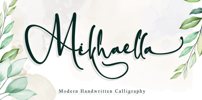 Mikhaella is a beautiful light handwritten font with a unique feel and looks stunning. It will add a luxury spark to any design project! This font is PUA encoded which means you can access all of the amazing glyphs and swashes with ease! It also features a wealth of special features including alternate glyphs and ligatures.
 - Ladylove by Creaditive Design,
$14.00 Ladylove is a beautiful handwritten font. It has an elegant style and it will add a sophisticated look to your designs. It will perfect for wedding invitations, bussiness card, logos, and quotes. Featuring a light weight it looks fantastically elegant. With lowercase Swashes can make your design looks beautiful, also Ligatures make your design more smooth and looks natural.
 - Arya Rounded by Underground,
$19.90 Arya Rounded is a display typeface, based on Roman proportions. It has three versions, differentiated by the amount of the drawn lines. Single is solid. Double is sturdy but light. Triple is versatile and includes alternatives. They can be combined in layers. Capsule versions (White and Black) are designed to do quick, simple and elegant labels.
 - Love Miracle by Letterara,
$12.00 Love Miracle is a beautiful light handwritten font with a unique feel and looks stunning. It will add a personal spark to any design project! This font is PUA encoded which means you can access all of the amazing glyphs and swashes with ease! It also features a wealth of special features including alternate glyphs and ligatures.
 - Monofonto by Typodermic,
$11.95 Introducing Monofonto—a meticulously crafted, technical typeface with a distinct, monospaced sans-serif design. Initially launched in 1999, Monofonto rapidly gained popularity throughout the 2000s and has since become a favorite choice of designers and developers alike. Built for clarity and precision, Monofonto is a compact sans-serif typeface, making it perfect for situations where space is limited. Its heavy strokes provide exceptional legibility even at small sizes, which is ideal for technical and scientific writing. Whether you’re working on a research paper, technical documentation, or programming code, Monofonto has got you covered. But that’s not all; Monofonto’s mathematical characters, currency symbols, and terminal block-draw characters make it the go-to typeface for all your scientific writing needs. Its vast collection of characters ensures that you have everything you need to create accurate and detailed technical documents. Monofonto comes in three styles: Regular, Italic, and Bold-Italic, giving you the flexibility to create different looks and styles for your technical documents. Its unique design and attention to detail make it an excellent choice for designers who want to showcase scientific accuracy and precision in their work. So, if you’re looking for a technical typeface that can help you create precise and accurate scientific documents, look no further than Monofonto. Its clarity, precision, and mathematical characters make it the perfect choice for any project. Try it today and experience the beauty of scientific design in your work. Most Latin-based European, Vietnamese, Greek, and most Cyrillic-based writing systems are supported, including the following languages. Afaan Oromo, Afar, Afrikaans, Albanian, Alsatian, Aromanian, Aymara, Azerbaijani, Bashkir, Bashkir (Latin), Basque, Belarusian, Belarusian (Latin), Bemba, Bikol, Bosnian, Breton, Bulgarian, Buryat, Cape Verdean, Creole, Catalan, Cebuano, Chamorro, Chavacano, Chichewa, Crimean Tatar (Latin), Croatian, Czech, Danish, Dawan, Dholuo, Dungan, Dutch, English, Estonian, Faroese, Fijian, Filipino, Finnish, French, Frisian, Friulian, Gagauz (Latin), Galician, Ganda, Genoese, German, Gikuyu, Greenlandic, Guadeloupean Creole, Haitian Creole, Hawaiian, Hiligaynon, Hungarian, Icelandic, Igbo, Ilocano, Indonesian, Irish, Italian, Jamaican, Kaingang, Khalkha, Kalmyk, Kanuri, Kaqchikel, Karakalpak (Latin), Kashubian, Kazakh, Kikongo, Kinyarwanda, Kirundi, Komi-Permyak, Kurdish, Kurdish (Latin), Kyrgyz, Latvian, Lithuanian, Lombard, Low Saxon, Luxembourgish, Maasai, Macedonian, Makhuwa, Malay, Maltese, Māori, Moldovan, Montenegrin, Nahuatl, Ndebele, Neapolitan, Norwegian, Novial, Occitan, Ossetian, Ossetian (Latin), Papiamento, Piedmontese, Polish, Portuguese, Quechua, Rarotongan, Romanian, Romansh, Russian, Rusyn, Sami, Sango, Saramaccan, Sardinian, Scottish Gaelic, Serbian, Serbian (Latin), Shona, Sicilian, Silesian, Slovak, Slovenian, Somali, Sorbian, Sotho, Spanish, Swahili, Swazi, Swedish, Tagalog, Tahitian, Tajik, Tatar, Tetum, Tongan, Tshiluba, Tsonga, Tswana, Tumbuka, Turkish, Turkmen (Latin), Tuvaluan, Ukrainian, Uzbek, Uzbek (Latin), Venda, Venetian, Vepsian, Vietnamese, Võro, Walloon, Waray-Waray, Wayuu, Welsh, Wolof, Xavante, Xhosa, Yapese, Zapotec, Zarma, Zazaki, Zulu and Zuni.
 - Linotype Ergo Paneuropean by Linotype,
$103.99Linotype Ergo was designed by American Gary Munch, and was a winner in Linotype's Second International Digital Design Contest in 1997. Conceived as a blend of traditional and modern type concepts, it works as a legible text family as well as a lively display or headline font. The word ergo means consequently," but it also comes from the Greek word "ergon" for "work." Consequently, Munch sees this family as full of energy -- an ideal font for working hard to make a point, and able to get it across with friendly vigor. The strokes of the characters are carefully designed to accommodate the tendency of the eye to enlarge horizontals and perceive verticals as lighter. The lowercase forms have open, friendly counters and are enhanced by small quirks, such as the slightly leaning s and the wide t. The deep branching of curves from main strokes helps this humanist sans to be very readable at smaller sizes. Linotype Ergo has four normal-width weights, five condensed weights, and two compressed weights - all with companion Italics! The family also includes a clever "Sketch" font for use in headlines, bringing the total number of font styles to 23. Ergo is available with Greek and Cyrillic and as W2G fonts with Hebrew." - Linotype Ergo W2G by Linotype,
$124.99Linotype Ergo was designed by American Gary Munch, and was a winner in Linotype's Second International Digital Design Contest in 1997. Conceived as a blend of traditional and modern type concepts, it works as a legible text family as well as a lively display or headline font. The word ergo means consequently," but it also comes from the Greek word "ergon" for "work." Consequently, Munch sees this family as full of energy -- an ideal font for working hard to make a point, and able to get it across with friendly vigor. The strokes of the characters are carefully designed to accommodate the tendency of the eye to enlarge horizontals and perceive verticals as lighter. The lowercase forms have open, friendly counters and are enhanced by small quirks, such as the slightly leaning s and the wide t. The deep branching of curves from main strokes helps this humanist sans to be very readable at smaller sizes. Linotype Ergo has four normal-width weights, five condensed weights, and two compressed weights - all with companion Italics! The family also includes a clever "Sketch" font for use in headlines, bringing the total number of font styles to 23. Ergo is available with Greek and Cyrillic and as W2G fonts with Hebrew." - Bion by Type Forward,
$38.00 Bion is a contemporary geometric sans serif with a down-to-earth attitude. It is distinguished by a high x-height, vertically cut terminals, and a minimal stroke contrast, giving it a distinctive, sharp look that is both timeless and universally appealing. Bion comes with 40 weights in a single variable file, ranging from Hairline to Black. We also included Upright, Italic, and Condensed variations to give you a fresh and diverse look for poster and title designs. Whatever message you want to get across, Bion has you covered - with support for 220 languages and 1,220 glyphs in total, as well as Extended Latin, Cyrillic and Greek scripts and an exhaustive list of typographic symbols. Our latest typeface also arrives packed full of OpenType features, including an alternative glyph set that will transform the way your text looks, giving it a more squarish appearance and offering additional visualization options. The Bion type family also includes an extensive set of standard and discretionary ligatures, tabular and small figures, fractions, and language localizations. These features work in static and variable fonts alike, providing a ready-made solution to all your advanced typographic needs. This functional, pragmatic typeface is clean and easily readable, making it an ideal choice for both print and on-screen media.
 - Mayberry by Ascender,
$92.99The Mayberry® is an extensive family of 14 OpenType fonts. Mayberry was initially designed by Steve Matteson to emulate the technical behavior of a font family called Tiresias™ for use in set top TV devices and user interfaces. Mayberry is a significant improvement in aesthetics and functionality over Tiresias. Mayberry includes true italics and a wide range of weights to provide the highest quality and readability on low resolution devices, while also featuring a range of OpenType features that will appeal to creative professionals. Mayberry is a slightly condensed humanist sans serif which allows for more readable text in a narrower column. Open counters and upright stress help keep the design of Mayberry readable at low resolutions. A significant amount of care has been given to design subtleties allowing the design to function well at large sizes. The Mayberry character set supports Cyrillic, Greek, Central and Eastern European, Turkish and Baltic, Mayberry also includes a slashed zero for use where absolute distinction between 'O' and zero is a concern. Also included are typographic features such as old-style figures, fractions, superior and inferior numbers for use with applications that provide advanced OpenType typographic support. A set of closed captioning symbols and arrows add to the font's versatility in interface design. - Garet by Type Forward,
$36.00Garet is a modern geometric sans serif. It is characterised by high x-height, clean and soft letterforms with a smooth masculine tone. Garet derives its distinctive oval shapes from the optically perfect circle and has closed counters to further emphasise that form. The Garet type family consists of 11 weights ranging from quite thin to extremely fat and their corresponding Italics to make a total of 22 fonts. And all of them are combined into one variable font that will give you unlimited opportunities to explore and express without the restrictions of the predefined weights. We understand the need for more extensive language support. That’s why the typeface includes Extended Latin and Cyrillic and covers more than 200 languages. Garet also comes with several alternative stylistic sets that will change the overall look of a paragraph, giving it a slightly different appearance. In addition to that, the type family is enriched with an extensive list of OpenType features for advanced typographic layout, including standard and discretionary ligatures, tabular and small figures, fractions, language localizations, case-sensitive punctuation, and more. Тhe wide variety of weights, characters, and additional features allow Garet to be implemented equally well both in print and on-screen media. - Gogh by Type Forward,
$32.00 Gogh is a geometric sans serif with a modern look and traditional spirit. It blends evenly without overly distracting the reader, yet still keeps a rich and distinctive character. The generous x-height, easily distinguishable glyph forms, and open terminals help the eye perceive a block of text smoothly, making it clearly legible. Gogh thrives when used both on-screen and on print media. Gogh type family consists of 10 weights from Hairline to Black and their matching Italics. Gogh is also available as a fully functional variable font, which gives unlimited opportunity to explore typography without the restrictions of predefined weights. Gogh Variable is also the best option if used on the web as it has a much-reduced size compared to the original font family. Regardless of which Gogh family you choose, the typeface covers a broad spectrum of languages, as it includes Extended Latin and Cyrillic. And it also comes with an alternative stylistic set that will completely change the overall look of a paragraph, giving it a more contemporary and display appearance. In addition to that, Gogh type family is enriched with an extensive list of OpenType features for advanced typographic layout, including standard and discretionary ligatures, tabular and small figures, fractions, language localizations, case sensitive punctuation, and more.
 - Plathorn by insigne,
$24.00 Vast and untamed, the American West once stretched as free and wild as imagination itself. Still beautiful, the Wild West of long ago and the new West of today is now to be found in insigne’s new face, Plathorn. That’s right, folks. When the West called, Jeremy Dooley reached up like Pecos Bill, grabbed it by the reins and pulled it in, then using its wide, roaming elements to design this functional font that still has an unbroken spirit burning deep inside. This down right, no-nonsense, orthodox face leaves off any of that extra fancy stuff that doesn't belong on a ride. Plathorn comes with a family of cowhands as wide as the Rockies, bringing specifically tailored condensed and extended sub-families along with it too. By design, it’s not very obtrusive like its unorthodox reversed tension brethren. Leave those for the next font rodeo. This mount features barely a hint of a serif that hearkens back a hundred years or so to sign painters and package lettering artists of early twentieth century. They're sure to put the sharpness, gumption and grit you need into your copy. So grab a tall glass of Plathorn and drink in the deep taste of America’s big country. Put it in your next magazine. Put it in your brand. This typeface’s offbeat appeal is bound to bring a bit of wild U.S. to your free-spirited work.
 - Sweet Gothic by Sweet,
$39.00 Sweet Gothic is a 2009 addition to the Sweet Collection of engraved lettering styles from the 20th Century. Sweet Gothic Light is closely based on lettering from an engravers pattern from the early 1900s that was used for tracing letterforms with the engraving machine (pantograph) to make steel engraving plates. The design is related to many similar engravers gothics developed in the early 1900s, but as each engraving house created by hand their own patterns for popular styles of the time, there is variation among the models. Sweet Gothic offers contrast in stroke weight and its unique personality. The bolder weights are new designs, based on the characteristics of the Light. A serif variant (Sweet Gothic Serif) has also been developed to expand the usefulness of the family, offering an alternative to Copperplate Gothic. As such, most of the fonts are new designs, yet may seem familiar and ubiquitous given their model. The fonts offer two sizes of figures and monetary symbols: one set is intended for use with upper- and lowercase settings; the second set is the same height as the small caps.
 - Sweet Gothic Serif by Sweet,
$39.00Sweet Gothic Serif is a 2009 addition to the Sweet Collection of engraved lettering styles from the 20th Century. It is a serif variant of Sweet Gothic. Sweet Gothic Light (without serifs) is closely based on lettering from an engravers pattern from the early 1900s that was used for tracing letterforms with the engraving machine (pantograph) to make steel engraving plates. The design is related to many similar engravers gothics developed in the early 1900s, but as each engraving house created by hand their own patterns for popular styles of the time, there is variation among the models. Sweet Gothic offers contrast in stroke weight and its unique personality. The bolder weights are new designs, based on the characteristics of the Light. Sweet Gothic Serif has been developed to expand the usefulness of the Sweet Gothics, offering an alternative to Copperplate Gothic. As such, most of the fonts are new designs, yet may seem familiar and ubiquitous given their model. The fonts offer two sizes of figures and monetary symbols: one set is intended for use with upper- and lowercase settings; the second set is the same height as the small caps. - Jubilee by Red Rooster Collection,
$45.00 Jubilee is a glyphic font family with moderate stress, slightly inclined serifs, and storied history. Its original design was created in 1934 by famous English type designer Eric Gill for the Stephenson Blake type foundry. The development name was “Gill Text,” but this was changed to “Cunard” once the famous steamship company showed interest in using the typeface. The company, however, never utilized it. Stephenson Blake changed the name to Jubilee in 1935 to commemorate George V and Queen Mary’s Silver Jubilee Wedding Anniversary announcement. After International TypeFounders, Inc. acquired the exclusive rights to the Stephenson Blake collection, Paul Hickson (P&P Hickson) and Steve Jackaman (ITF) revived the family exclusively for the Red Rooster Collection in 1994. A new, Medium weight was created to accompany the original Light and Bold weights. Jubilee has an inscribed, Renaissance feel, and performs well at all sizes. Its letterforms are sturdy, yet there is an undeniable delicacy to the face.
 - Garota Serif - Personal use only

- Vacaciones - Personal use only


