10,000 search results
(0.094 seconds)
- Plam by Plamen Atanasov,
$20.00 PLAM is a sans serif font in Geometric style, based on the new concept ofstructure and ratio between the elements of the letters. The proportions are subordinated to the decorative element present inall signs, which creates a sense of rhythm, dynamics and drive. The representation of PLAM in various designs reveals itsartistic touch - a symbiosis between the classical and decorative vision reveals various application options.
 - Thematheka by Almarkha Type,
$29.00 Hello Everyone, Introduce our new collection, Thematheka - Bold Display Sans With 29 Ligatures, Inspired from famous logos of Technology and brands that have very strong characteristics, very suitable for posters, packaging, branding, logotype and more. Thematheka font with strong and challenging nuances. very suitable for the title, typography, Poster, magazines, brochures, packaging,Websites and much more for your design needs, making your designs more modern and professional.
 - Gaude by Trustha,
$19.00 Gaude is a sans-serif typeface. Crafted with care, maximizing neatness in shape. With thickness balancing with negative space. Making it fitting when strung together into words, or sentences. Added with alternative glyphs, to make it more alive. Gaude comes with 3 widths, namely: normal, wide, and expanded. And also a soft version, making it 6 styles. Gaude is perfect for branding, titling, headline, and more.
 - Band Concert JNL by Jeff Levine,
$29.00 A poster circa 1930s-40s designed for the WPA Federal Art Project promoted free band concerts at the Brooklyn Museum in Brooklyn, New York. Its headline (“Free Band Concerts”) was hand lettered in a dual line Art Deco sans serif design. Now recreated digitally, the font takes its name after the poster’s topic. Band Concert JNL is available in both regular and oblique versions.
 - Dustrialize by UICreative,
$23.00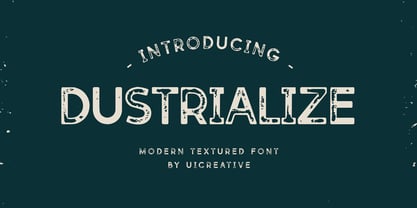 Introducing our new product the name Dustrialize Modern Textured Font. Modern Sans Serif font that feels beautiful classy, elegant, and modern. This font is perfectly suited for a wide variety of projects, such as signature, stationery, logo, wedding, typography quotes, magazine or book covers, website headers, clothing, branding, packaging design, and more. Also for fashion-related branding or editorial design and displays both masculine and feminine qualities.
 - Svarge by Scratch Design,
$9.00 Introducing our new font Svargé A Modern Elegant Sans Serif Font Svargé is a Modern Elegant Classic font with beautiful shape on each character, come with special alternative glyphs, and has multilingual support. Svargé it's a very versatile font that works great in large and small sizes with any background colors. Svargé is perfect for Magazine Headlines, Branding Projects, Logo design, Clothing & Fashion Branding, and Product Packaging.
 - TILT by SzarDesign,
$19.95 With TILT CAPS and lowercase "CAPS" you can shakeup your headlines on the fly. Tilt left or right, bounce up and down to find the right mix for your message, perfect for fun active design projects.
 - Ledare by Mans Greback,
$39.00 Ledare is a dynamic sans-serif typeface. Created by Mans Greback between years 2019-2021, this expressive font leads the way of your message with confidence and determination. It has a soft, easy-going outlook, yet is formal and rigid. The Ledare family consists of 14 fonts: Thin, ExtraLight, Light, Medium, Bold, ExtraBold and Black, with each weight as italic. The font is built with advanced OpenType functionality and has a guaranteed top-notch quality, containing alternates, ligatures and more features; all to give you full control and customizability. It has extensive lingual support, covering all Latin-based languages, from North Europa to South Africa, from America to South-East Asia. It contains all characters and symbols you'll ever need, including all punctuation and numbers.
 - Cream Opera by Factory738,
$10.00 Cream Opera is a bold sans-serif font family. The combination of simple and geometric elements renders a bold design. It can be used to create almost all types of design projects like print materials and web design. Just use your imagination and your project will become more alive and vivid than ever with one of the Opera fonts. You want to make a greeting card or a package design, or even a brand identity? Feel free to play with all font styles, that will lead you to your next successful project. 10 styles (Thin, Light, Regular, Medium, Bold, Black, Outline, Inline, Stencil, and Western) Oblique font is available Numbers & Punctuation Extensive Language Support Thanks for looking, and I hope you enjoy it.
 - Sansmatica by Fontop,
$14.00 Sansmatica is a clean and modern sans serif typeface. It has 28 fonts that work as a multi-purpose design solution. It consists of regular and condensed fonts that can be used for different cases: regular fonts are perfect for copy while Sansmatica condensed fonts are more specific - they make emotional associations and are perfect when you want your headlines or advertising to be noticeable. Also suite great for greeting cards, posters, branding, name card, stationary, design title, blog header, art quote, typography. Sansmatica has 7 weights with light looking more modern, fashionable and the bold giving a more rugged impression is perfect for headlines, logos, quotes, and more! It is interesting to use bold condensed fonts – both vertical lines and weight draw attention.
 - HS Wamda by Hiba Studio,
$40.00 HS Wamda is based on some modern style of Naskh calligraphy which supports Arabic, Persian and Latin with a Sans Serif with subtle round on stems and corners. The typeface has been optimized for corporate identity work, editorial design, book, magazine and modern projects when a contemporary and simple look with a similarity between Arabic and Latin is requested. It features a small number of ligatures. Its proportions allow high impact on the tightly set lines of big and small text alike. This font consists of five weights (Thin, Light, Regular, Mediums and bold). It can constitute a striking addition to the library of Arabic and Latin contemporary fonts models that meet the purposes of various designs for all tastes.
 - Brema by Andrey Sharonov,
$22.00 Brema is a modern Sans Serif typeface with light weight anatomy. Created for using principally in big sizes, there is perfect solution first of all for web design, but also very well for fashion magazine tittles, luxury perfumes and cosmetics, logotypes, outdoor advertising and other design projects. Opentype Brema comes with 38 beautiful Ligatures and 17 Stylistic Alternates. To get Alternate just add number 2 after character (works with activated Standard Ligatures). Or use Stylistic Alternate option for change all available characters. Ligatures works with activated Discretionary Ligatures option. Note that this features only works with lowercase letters. Multilingual Support You can use Brema for following languages: Danish, Dutch, English, Estonian, Faroese, Finnish, French, German, Hungarian, Icelandic, Italian, Norwegian, Polish, Portuguese, Slovene, Spanish, Swedish, Turkish.
 - Forgotten Futurist by Typodermic,
$11.95 Are you ready to travel back in time? To a world of neon lights, high-tech logos, and a retro-futuristic style that defined an era? Then you’re ready for Forgotten Futurist. This industrial typeface is the perfect blend of old and new, with a vintage feel that still looks cutting-edge. Its letterforms are inspired by the 1960s and 1970s, when technology was just starting to take off and the world was full of possibilities. But Forgotten Futurist is more than just a tribute to the past. Its rounded technical corners and sleek lines are timeless classics, just as relevant today as they were decades ago. And with ten different styles to choose from, including Ultra-Light, Extra-Light, Light, Book, Regular, Semi-Bold, Bold, Heavy, Black, and italics, you’ll have all the flexibility you need to create a truly unique design. So if you want to add some retro-futuristic flair to your next project, look no further than Forgotten Futurist. It’s the typeface of the future, inspired by the past. Most Latin-based European writing systems are supported, including the following languages. Afaan Oromo, Afar, Afrikaans, Albanian, Alsatian, Aromanian, Aymara, Bashkir (Latin), Basque, Belarusian (Latin), Bemba, Bikol, Bosnian, Breton, Cape Verdean, Creole, Catalan, Cebuano, Chamorro, Chavacano, Chichewa, Crimean Tatar (Latin), Croatian, Czech, Danish, Dawan, Dholuo, Dutch, English, Estonian, Faroese, Fijian, Filipino, Finnish, French, Frisian, Friulian, Gagauz (Latin), Galician, Ganda, Genoese, German, Greenlandic, Guadeloupean Creole, Haitian Creole, Hawaiian, Hiligaynon, Hungarian, Icelandic, Ilocano, Indonesian, Irish, Italian, Jamaican, Kaqchikel, Karakalpak (Latin), Kashubian, Kikongo, Kinyarwanda, Kirundi, Kurdish (Latin), Latvian, Lithuanian, Lombard, Low Saxon, Luxembourgish, Maasai, Makhuwa, Malay, Maltese, Māori, Moldovan, Montenegrin, Ndebele, Neapolitan, Norwegian, Novial, Occitan, Ossetian (Latin), Papiamento, Piedmontese, Polish, Portuguese, Quechua, Rarotongan, Romanian, Romansh, Sami, Sango, Saramaccan, Sardinian, Scottish Gaelic, Serbian (Latin), Shona, Sicilian, Silesian, Slovak, Slovenian, Somali, Sorbian, Sotho, Spanish, Swahili, Swazi, Swedish, Tagalog, Tahitian, Tetum, Tongan, Tshiluba, Tsonga, Tswana, Tumbuka, Turkish, Turkmen (Latin), Tuvaluan, Uzbek (Latin), Venetian, Vepsian, Võro, Walloon, Waray-Waray, Wayuu, Welsh, Wolof, Xhosa, Yapese, Zapotec Zulu and Zuni.
 - Savattera by Prioritype,
$18.00 Introducing a new script font with a beautiful, uniquely elegant and very charming look, you can click it and can be used in your projects such as wedding invitations, quotes, creative posts, clothing product packaging, promotions, video preview images, logos and much more to explore. because it has many cool variations. As a picture you can see the preview above. Features: -Uppercase -Lowercase -Numeral -Punctuation -Multilingual -Alternate -Ligature -Swash Thanks.
 - Tamword by Prioritype,
$18.00 Introducing a new script font with a bold and clear style. Yes you can use this font in your projects and make it even more classy. It can be applied to logos, video previews, crafts, apparel products, packaging, photographer watermarks, and any of your other awesome projects. for an overview you can see some of the previews above. Features: -Uppercase -Lowercase -Numeral -Punctuation -Multilingual -Alternate -Ligature -Swash Thanks.
 - Pinselschrift by URW Type Foundry,
$39.99 LP Pinselschrift is a new brush handwriting script from German designer Peter Langpeter (lp-design.de). LP has been running his own design studio since 1995, working as a typeface and logo designer, as a calligrapher, cartographer and illustrator. During this time LP created a large number of excellent new typeface designs. Now, we are extremely happy that LP has chosen to let URW digitally produce and market his designs. LP Pinselschrift is the first LP original typeface of this series. It is a light, dynamic-flowing and modern brush script.
 - Weird Words by Sarid Ezra,
$15.00 Weird Words is a weird and trendy font based sans that have unique looks. This font contains uppercase and lowercase that have different form. You can use the lowercase and uppercase in the same word that will make your text more stand out! You can use this font for the social media post, poster, and suitable for headline. This font also support multi language.
 - JetJaneButton by Ingrimayne Type,
$15.00 JetJaneButton has letters on a design that looks like a computer button. Its letters are from JetJane Mono, a sans-serif monospaced font. The typeface contains characters that can add color to letters. There are two ways to do this. One uses layers and the other a combination of characters, some with zero width. This pdf file explains the how this can be done.
 - Blackpast by Sarid Ezra,
$15.00 Introducing, Blackpast, a futuristic logo font with alternates! Blackpast is a sans based font with unique lowercase that will make your design looks futuristic and modern. You can use this font for any purpose, especially to make logotype. You can mix and match the uppercase and lowercase to make your logo more readable. This font also have special alternates that will make your design more stand-out!
 - Bigestar by Mevstory Studio,
$25.00 Bigestar is a sans based font with unique lowercase & uppercase that will make your design looks futuristic and modern. You can use this font for any purpose, especially to make hi-tech logotype. This font is also suitable for science-fiction movie poster. You can mix and match the uppercase and lowercase to make your logo more unique and stand-out. This font also support multi language.
 - Broken Drive by Sarid Ezra,
$15.00 Introducing, Broken Drive, a grunge display font! Broken Drive is a grunge sans based font that have natural textures. This textured font will make your poster and presentations looks more bold and stand out! You can use this font for any purpose, especially for movie poster. You can combine the uppercase and lowercase to make your design more natural and handmade. This font also support multilingual.
 - Variable by MADType,
$34.00 Variable is a sans-serif monoline typeface family that can be used in a variety of typographic environments. The UltraThin weight is perfect for use at large sizes in magazines or anywhere a hairline effect is needed. The Black weight feels reminiscent of wooden router lettering. Variable is very versatile due to its calming curves and can be used in print or on-screen environments.
 - Kid Candy by Zeenesia Studio,
$12.00 Kid Candy is a sweet and friendly handwritten font. Kid Candy is a serif and sans font that can meet your design needs with funny and cheerful themes You can use it in your various designs, clothes, logos, posters, invitations, crafts, and more. Its natural and unique style makes it incredibly fitting to a large pool of designs. The only limit is your imagination!
 - Tamitsa by QubaType,
$20.00 Tamitsa is a condensed display sans font. The font is universal and can be used in different directions of graphic design - Internet, printed materials, clothing, logos, posters, labels, navigation and more. Thanks to character compression, you can place a large amount of information in a compressed space. It will read equally well in large and small sizes. Tamitsa contains 4 fonts: 2 regular and 2 slanted.
 - Garnet by Ksenia Belobrova,
$19.00 Garnet as a modern font kit inspired by fonts and calligraphy of XX centure. It includes Capitals (6 Styles) and Script so you can combine them as you like. Geometric Sans + Handwritten Script is a modern and fresh looking combination which can be used for many tasks. Garnet is good for headlines, posters, packaging, book covers, cards and as a starting point for logotypes.
 - Fastest by Letterara,
$16.00 Fastest is a unique and modern sans serif font, specially designed for headlines, big text, branding, logotypes, marketing graphics, banners, posters, signage, and display usage. It can easily be matched to an incredibly large set of projects, so add it to your creative ideas and notice how it makes them stand out! This font is PUA encoded which means you can access all of the amazing glyphs.
 - CelticEels - Unknown license

- KidTYPE-CrayonA - Unknown license

- My Face by studiocharlie,
$24.00 My Face is a collection of faces. You can find aliens, humans, animals, hybrids... every face you might need!
 - Schism One by Alias,
$55.00 Schism is a modulated sans-serif, originally developed from our Alias Didot typeface, as a serif-less version of the same design. It was expanded to three sub-families, with the thin stroke getting progressively heavier from Schism One to Schism Three. The different versions explore how this change in contrast between thick and thin strokes changes the character of the letterforms. The shape is maintained, but the emphasis shifts from rounded to angular, elegant to incised. Schism One has high contrast, and the same weight of thin stroke from Light to Black. Letter endings are at horizontal or vertical, giving a pinched, constricted shape for characters such as a, c, e and s. The h, m, n and u have a sharp connection between curve and vertical, and are high shouldered, giving a slightly square shape. The r and y have a thick stress at their horizontal endings, which makes them impactful and striking at bolder weights. Though derived from an elegant, classic form, Schism feels austere rather than flowery. It doesn’t have the flourishes of other modulated sans typefaces, its aesthetic more a kind of graphic-tinged utility. While in Schism Two and Three the thin stroke gets progressively heavier, the connections between vertical and curves — in a, b, n etc — remain cut to an incised point throughout. The effect is that Schism looks chiselled and textural across all weights. Forms maintain a clear, defined shape even in Bold and Black, and don’t have the bloated, wide and heavy appearance heavy weights can have. The change in the thickness of the thin stroke in different versions of the same weight of a typeface is called grading. This is often used when the types are to used in problematic print surfaces such as newsprint, or at small sizes — where thin strokes might bleed, and counters fill in and lose clarity, or detail might be lost or be too thin to register. The different gradings are incremental and can be quite subtle. In Schism it is extreme, and used as a design device, giving three connected but separate styles, from Sans-Didot to almost-Grotesk. The name Schism suggests the differences in shape and style in Schism One, Two and Three. Three styles with distinct differences, from the same start point.
 - Schism Three by Alias,
$55.00 Schism is a modulated sans-serif, originally developed from our Alias Didot typeface, as a serif-less version of the same design. It was expanded to three sub-families, with the thin stroke getting progressively heavier from Schism One to Schism Three. The different versions explore how this change in contrast between thick and thin strokes changes the character of the letterforms. The shape is maintained, but the emphasis shifts from rounded to angular, elegant to incised. Schism One has high contrast, and the same weight of thin stroke from Light to Black. Letter endings are at horizontal or vertical, giving a pinched, constricted shape for characters such as a, c, e and s. The h, m, n and u have a sharp connection between curve and vertical, and are high shouldered, giving a slightly square shape. The r and y have a thick stress at their horizontal endings, which makes them impactful and striking at bolder weights. Though derived from an elegant, classic form, Schism feels austere rather than flowery. It doesn’t have the flourishes of other modulated sans typefaces, its aesthetic more a kind of graphic-tinged utility. While in Schism Two and Three the thin stroke gets progressively heavier, the connections between vertical and curves — in a, b, n etc — remain cut to an incised point throughout. The effect is that Schism looks chiselled and textural across all weights. Forms maintain a clear, defined shape even in Bold and Black, and don’t have the bloated, wide and heavy appearance heavy weights can have. The change in the thickness of the thin stroke in different versions of the same weight of a typeface is called grading. This is often used when the types are to used in problematic print surfaces such as newsprint, or at small sizes — where thin strokes might bleed, and counters fill in and lose clarity, or detail might be lost or be too thin to register. The different gradings are incremental and can be quite subtle. In Schism it is extreme, and used as a design device, giving three connected but separate styles, from Sans-Didot to almost-Grotesk. The name Schism suggests the differences in shape and style in Schism One, Two and Three. Three styles with distinct differences, from the same start point.
 - Schism Two by Alias,
$55.00 Schism is a modulated sans-serif, originally developed from our Alias Didot typeface, as a serif-less version of the same design. It was expanded to three sub-families, with the thin stroke getting progressively heavier from Schism One to Schism Three. The different versions explore how this change in contrast between thick and thin strokes changes the character of the letterforms. The shape is maintained, but the emphasis shifts from rounded to angular, elegant to incised. Schism One has high contrast, and the same weight of thin stroke from Light to Black. Letter endings are at horizontal or vertical, giving a pinched, constricted shape for characters such as a, c, e and s. The h, m, n and u have a sharp connection between curve and vertical, and are high shouldered, giving a slightly square shape. The r and y have a thick stress at their horizontal endings, which makes them impactful and striking at bolder weights. Though derived from an elegant, classic form, Schism feels austere rather than flowery. It doesn’t have the flourishes of other modulated sans typefaces, its aesthetic more a kind of graphic-tinged utility. While in Schism Two and Three the thin stroke gets progressively heavier, the connections between vertical and curves — in a, b, n etc — remain cut to an incised point throughout. The effect is that Schism looks chiselled and textural across all weights. Forms maintain a clear, defined shape even in Bold and Black, and don’t have the bloated, wide and heavy appearance heavy weights can have. The change in the thickness of the thin stroke in different versions of the same weight of a typeface is called grading. This is often used when the types are to used in problematic print surfaces such as newsprint, or at small sizes — where thin strokes might bleed, and counters fill in and lose clarity, or detail might be lost or be too thin to register. The different gradings are incremental and can be quite subtle. In Schism it is extreme, and used as a design device, giving three connected but separate styles, from Sans-Didot to almost-Grotesk. The name Schism suggests the differences in shape and style in Schism One, Two and Three. Three styles with distinct differences, from the same start point.
 - Visum by Hanoded,
$15.00 Visum means Visa in Dutch. The name was inspired by Dutch soccer club Vitesse's rather sad decision to leave Israeli player Dan Mori behind, after he was refused a UAE visa because of his nationality. Visum font is a tall and proud all caps typeface. It comes with alternates for the lower case letters, some ligatures and an impressive language support. Of course, upper and lower case glyphs can be freely interchanged.
 - Gothic Gothic by Typeco,
$29.00Gothic Gothic is a fusion of old and new that is both Gothic and Gothic. In typography Gothic can refer to German Blackletter or Old English styles. Gothic can also mean block or sans serif style lettering. By combining and balancing the elements from both of these ideas we have created a contemporary extended block letter typeface. The Gothic Gothic family contains 2 companion fonts. Gothic Gothic Text is a more minimal variation that has a more roman looking style while still retaining some Blackletter feel. Gothic Gothic Black is a bolder version designed to tend more toward the Blackletter style of Gothic with more contrast of stroke and a few of the more unusual Blackletter forms thrown in for flavor. Gothic Gothic has been honored with an award of Excellence in Type Design from Association Typographique International (ATypI) in 2001. Typeco has updated this font and has released it as an expanded family. Gothic Gothic is a crepuscular family of 3 fonts - Quickest by Create Big Supply,
$17.00 Introducing Quickest, a bold and powerful sans serif brush font that will make your designs stand out. With its strong and distinctive characters, Quickest adds a unique touch to your projects, ensuring they grab attention and make an impact. This font is perfect for various design applications, including logos, headlines, posters, and social media graphics. Quickest features both uppercase and lowercase letters, providing flexibility and creative freedom in your typographic compositions. The inclusion of numbers and punctuations allows for seamless integration into your designs, making it suitable for a wide range of projects. With multilingual support, Quickest ensures that your message can reach a global audience. It allows you to express yourself in different languages, opening up new possibilities for your design projects. The font is PUA encoded, enabling easy access to all the glyphs and swashes it offers. This means you can effortlessly incorporate decorative elements and flourishes into your designs, adding a touch of uniqueness and personality.
 - Century Expanded by Bitstream,
$29.99Shortly after the preparation of the original Century, the two Bentons (father Linn Boyd and son Morris Fuller) prepared a wider version for De Vinne’s press and called it Century Broadface. In 1900 ATF released the design for general use as Century Expanded, one of the most popular and effective of typefaces, to this day the text face of the New York Daily News. - FancyPants by Adriprints,
$8.00 FancyPants is the first script font for Adriprints. It is always a challenge to jump into something new, and cursive script was right up that alley. FancyPants is a semi-linking, quirky, cursive script available with extended glyphs for international use.
 - Sailec by Type Dynamic,
$37.00 Sailec is a very clean typeface inspired by type foundry of the International Typographic style. The low contrast makes it very interesting in display. The Sailec family includes 7 weights, from Hairline to Black, with their corresponding italics. Each font includes OpenType Features such as Stylistic Alternates, Proportional Figure, Tabular Figures, Numerator, Superscript, Denominators, Scientific Inferiors, Subscript, Ordinals, Ligatures and Fractions. It’s a totally neutral typeface. Sailec family supports Latin and Cyrillic, all these languages are covered: Latin language support: Afrikaans, Albanian, Asturian, Azeri, Basque, Bosnian, Breton, Bulgarian, Catalan, Cornish, Corsican, Croatian, Czech, Danish, Dutch, English, Esperanto, Estonian, Faroese, Filipino, Finnish, Flemish, French, Frisian, Friulian, Gaelic, Galician, German, Greenlandic, Hungarian, Icelandic, Indonesian, Irish, Italian, Kurdish, Latin, Latvian, Lithuanian, Luxembourgish, Malagasy, Malay, Maltese, Maori, Moldavian, Norwegian, Occitan, Polish, Portuguese, Provençal, Romanian, Romansch, Saami, Samoan, Scots, Scottish, Serbian, Slovak, Slovenian, Spanish, Swahili, Swedish, Tagalog, Turkish, Walloon, Welsh, Wolof Cyrillic language support: Adyghe, Avar, Belarusian, Bulgarian, Buryat, Chechen, Erzya, Ingush, Kabardian, Kalmyk, Karachay-Balkar, Karakalpak, Kazakh, Komi, Kyrgyz, Lak, Macedonian, Moldovan, Mongol, Permyak, Russian, Rusyn, Serbian, Tatar, Tofa, Tuvan, Ukrainian, Uzbek
 - Visine FF by Koral Creative,
$32.00 Visine FF is a typeface that aims to question the geographical borders that in so many ways can define people's lives. It was developed with the experience of advertising and commercial use in mind. The name Visine can be translated most simply as HEIGHTS. Visine FF was developed out of the necessity to make the most of the space on the visual format. With the tall arches and narrow bodies with exceptional, easy-to-read features, Visine FF aims to complement visual languages in many linguistic regions. Visine FF was developed in the Balkans, where Cyrillic, Latin and Glagolitic were the three historical writing systems used in the former Yugoslavia to denote cultural, ethnic, religious and political identities. Today, the languages of the Western Balkans are so similar that they can easily be called dialects, although they are written in different scripts. This is the result of their coexistence and parallel evolutions, which gave a rise to the common traits. This font family celebrates all the languages and scripts of the Western Balkans and is a labour of love. Love of design, love of language and the human need to communicate across borders, cultures and identities.
 - Identa by Sudtipos,
$39.00 Because we know that you will never get tired of using them and that you will always need a new tool for Identity Design, we created Identa. Conceived to translate corporate and humanist ideals in its typographic form, it seeks a dialogue between neutrality and contemporaneity. With a pragmatic attention to functionality that does not forget aesthetics. It is a Sans serif model, accessible and well-founded. All-terrain, workhorse that seeks to be reliable and durable. It solves any type of content with efficiency, intelligence and professionalism. Its clean forms and x-height make it a very competent face for both short identifiers and long text bodies, ideal for display use where legibility and personality must match new design needs within a company. It is available in eight styles, ranging from its White version to the darker Vantablack, each optimally set with its respective italic variables, and a Dingbats font designed to solve everyday cases. Each font contains 737 glyphs, macro and micro aesthetic details inspired by current visual communication systems and trends. The dingbats font includes 303 signs and is a set of icons and symbols that can be used in multiple environments, both for print and digital media. This typeface family seeks to meet the needs of brand designers looking to create an assertive appearance, whatever the case. It is a solid and self-confident typeface, without appearing overly constructed; on the contrary, its nuance makes it look fresh.

