10,000 search results
(0.025 seconds)
- Tecna Dark Up Triangle BNF by Descarflex,
$30.00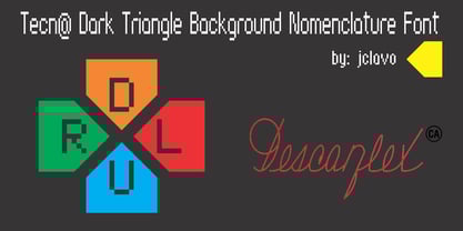 The Tecn@ Dark&Light Triangle Background Nomenclature Font family is differentiated by the direction of the triangle tip in the 4 cardinal points. The family were designed to head, enumerate, indicate or highlight writings or design plans, for this reason, the characters are available only in capital letters and some signs or symbols that can serve such purposes. A triangle or empty character is included so that the user can use it overlaying any character of his choice or to be used alone. What is Lorem Ipsum? Lorem Ipsum is simply dummy text of the printing and typesetting industry. Lorem Ipsum has been the industry's standard dummy text ever since the 1500s, when an unknown printer took a galley of type and scrambled it to make a type specimen book. It has survived not only five centuries, but also the leap into electronic typesetting, remaining essentially unchanged. It was popularised in the 1960s with the release of Letraset sheets containing Lorem Ipsum passages, and more recently with desktop publishing software like Aldus PageMaker including versions of Lorem Ipsum. Why do we use it? It is a long established fact that a reader will be distracted by the readable content of a page when looking at its layout. The point of using Lorem Ipsum is that it has a more-or-less normal distribution of letters, as opposed to using 'Content here, content here', making it look like readable English. Many desktop publishing packages and web page editors now use Lorem Ipsum as their default model text, and a search for 'lorem ipsum' will uncover many web sites still in their infancy. Various versions have evolved over the years, sometimes by accident, sometimes on purpose (injected humour and the like). Where does it come from? Contrary to popular belief, Lorem Ipsum is not simply random text. It has roots in a piece of classical Latin literature from 45 BC, making it over 2000 years old. Richard McClintock, a Latin professor at Hampden-Sydney College in Virginia, looked up one of the more obscure Latin words, consectetur, from a Lorem Ipsum passage, and going through the cites of the word in classical literature, discovered the undoubtable source. Lorem Ipsum comes from sections 1.10.32 and 1.10.33 of "de Finibus Bonorum et Malorum" (The Extremes of Good and Evil) by Cicero, written in 45 BC. This book is a treatise on the theory of ethics, very popular during the Renaissance. The first line of Lorem Ipsum, "Lorem ipsum dolor sit amet..", comes from a line in section 1.10.32. The standard chunk of Lorem Ipsum used since the 1500s is reproduced below for those interested. Sections 1.10.32 and 1.10.33 from "de Finibus Bonorum et Malorum" by Cicero are also reproduced in their exact original form, accompanied by English versions from the 1914 translation by H. Rackham. Where can I get some? There are many variations of passages of Lorem Ipsum available, but the majority have suffered alteration in some form, by injected humour, or randomised words which don't look even slightly believable. If you are going to use a passage of Lorem Ipsum, you need to be sure there isn't anything embarrassing hidden in the middle of text. All the Lorem Ipsum generators on the Internet tend to repeat predefined chunks as necessary, making this the first true generator on the Internet. It uses a dictionary of over 200 Latin words, combined with a handful of model sentence structures, to generate Lorem Ipsum which looks reasonable. The generated Lorem Ipsum is therefore always free from repetition, injected humour, or non-characteristic words etc.
 - TT Lakes Neue by TypeType,
$39.00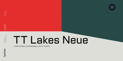 Introducing TT Lakes Neue in version 2.0! Please note that the TT Lakes font has been removed from platforms, but you can still order it by sending a request to the studio's commercial department: commercial@typetype.org We have released a continuation of the geometric sans serif inspired by Finnish functionalism. The new version provides more opportunities, because we not only increased the character set and improved the font technically, but also reworked its visual character. What changed? Font character. TT Lakes Neue 2.0 has become calmer, as we have removed the display details in the characters of the main set, making the font more versatile. New stylistic sets were created, thanks to which the nature of the font can be controlled, making it more expressive. Changed the forms of the characters "Кк", "ЖЖ", "Дд", "Лл", lowercase "b" and alternative "g". Added alternative forms for all types of the number "1", for the characters "Mm", "DD", "Ll". Added technological character sets, with which the font looks stylish and expressive. You may notice that in these sets, the forms of lowercase characters with arches (r, m, n) are changed, and there are gaps in the places of infusions and connections of all characters. Scope of application. The scope of TT Lakes Neue 2.0 have become even more diverse, because the sans serif has become more neutral in character and more functional. TT Lakes Neue 2.0 is the perfect font for the gaming industry. Suitable for game interfaces of different genres. Technological sets can be used in architectural projects, in the headlines of posters and magazines, on outdoor signs. The font is suitable for logo design, looks great in branding. Character set and technical characteristics. We have significantly improved the set of the font, increasing the number of characters from 736 to 921. The font has become more functional due to the updated technical stuffing and new features, of which there are now 36 instead of 24. Added characters of extended Latin, fractions, arrows. Created new kerning and hinting. Updated variable font. Added new OpenType features. The TT Lakes Neue font has 5 subfamilies: Compressed, Condensed, Regular, Extended, Expanded. In total, there are 91 styles in the font: 9 upright and 9 slanted in each subfamily and 1 variable font. Each style has 921 characters and 36 OpenType features.
 - Floopi - Unknown license

- PuffedRice - Unknown license

- Peloponeso by Intellecta Design,
$9.00Note: The Frame style is no longer available due its complexity and the resulting memory and performance issues. - Fridha by Intellecta Design,
$27.90Note: The Shadow style is no longer available due its complexity and the resulting memory and performance issues. - Feosa by Intellecta Design,
$14.95Note: The Lined style is no longer available due its complexity and the resulting memory and performance issues. - Porcupine by Intellecta Design,
$9.00Note: The Shadow style is no longer available due its complexity and the resulting memory and performance issues. - Neshef MF by Masterfont,
$59.00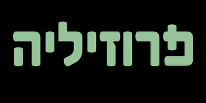 The robust impression of these titles will sure leave no dought as to how serious this book is.
 - Easy Callig by Intellecta Design,
$17.90Note: The Italic style is no longer available due its complexity and the resulting memory and performance issues. - Deco Experiment 3 by Intellecta Design,
$9.00Note: The Decorative style is no longer available due its complexity and the resulting memory and performance issues. - Floresco by Intellecta Design,
$21.90Note: The Lined style is no longer available due its complexity and the resulting memory and performance issues. - Ranger by Ingrimayne Type,
$12.95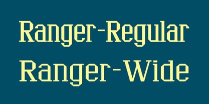 Ranger is a geometric font with no curves. The lower-case letters have an extremely high x-height.
 - Frutisis by Intellecta Design,
$21.90Note: The Lined style is no longer available due its complexity and the resulting memory and performance issues. - Biza by Intellecta Design,
$9.00Note: The Lined style is no longer available due its complexity and the resulting memory and performance issues. - Samantha by Intellecta Design,
$27.90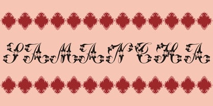 Note: The Shadow style is no longer available due its complexity and the resulting memory and performance issues.
 - Boliche by Intellecta Design,
$12.00Note: The Lined style is no longer available due its complexity and the resulting memory and performance issues. - "Mia's Scribblings ~" is an enchanting font that feels like whispers from a fairy tale. It's as if you've stumbled across a secret diary, pages fluttering with the thoughts and daydreams of a whimsic...
- Oh, if fonts could talk, Growing Script by Nuryanto Dwi would be the charming, smooth-talking poet at the party, captivating everyone with its elegant flourishes and oh-so-expressive curves. Released...
- The "Loud Noise" font, designed by the creative entity known as PizzaDude, stands as a distinctive embodiment of vivacity and audacity in the realm of typography. This font does not whisper; it shout...
- Rayando is a font that seems to capture the essence of creativity and spontaneity with its unique design. Picture a canvas where each character is not just a letter but a piece of art, dancing betwee...
- Ankora, crafted by the creative minds at Apostrophic Labs, embodies a unique blend of artistry and functionality in its design. Apostrophic Labs, known for their innovative and free-spirited approach...
- Getho Semi Sans by deFharo,
$12.00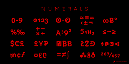 Getho is a Semi Sans family of geometric construction with 6 weights plus the italic versions all include small letters, the symbol of Bitcoin and other monetary symbols. It is an exclusive typography with neo-grotesque modulations and maximum readability in any size. The typeface has alternative letters and numbers, small caps and advanced OpenType functions. The complete Pack includes versions of the Variable Fonts type. The drawn of the vectors is meticulous to obtain smooth curves of elegant aspect to which also contributes the subtle rounding of the corners, the thicker versions have of traps of ink in the knots of the unions to be able to use them in small sizes. The Metric and the Kerning of all the versions I have reviewed individually to obtain a fluent reading in any type of text and size.
 - Patika by Plasebo Studio,
$29.00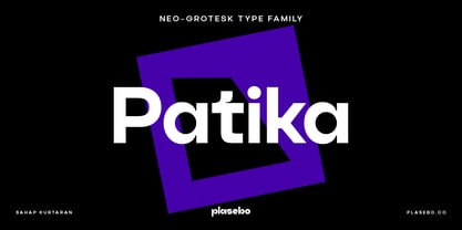 Patika Typeface is a contemporary neo-grotesque font that combines modern aesthetics with functional legibility. Inspired by the timeless elegance of classic typefaces such as Helvetica, Futura, and Avant Garde, Patika offers a fresh take on the genre with its unique blend of clean lines, balanced proportions, and subtle details. Designed with utmost care and precision, Patika Typeface achieves a harmonious balance between width and height, particularly in its lowercase letters, ensuring optimal legibility across various sizes and applications. Its versatile nature makes it an ideal choice for a wide range of typographic needs, from eye-catching headlines to extensive blocks of text. Equipped with a comprehensive set of OpenType features, including alternative glyphs, fractions, arrows, ligatures, and more, Patika offers designers an array of tools to enhance their typographic compositions and add a touch of uniqueness to their designs.
 - Genre by Storm Type Foundry,
$26.00The official terseness and grey of Neo-Classical type faces will stand out when we narrow them. The consistently vertical shading of the letters suppresses one's desire for eccentricity, just like tea with bromine. It would, however, be wrong to consider Bodoni as the originator of this - vertically shaded - trend in type face production. In his Manual we can also find type faces with a slanted axis of shade, picturesque italics and a number of normal, more human type faces. It remains a mystery why his name is connected only with one of his many works. Genre's basic design is fairly light in colour, which is why it looks good in illustrated magazines and short texts and directly calls for graphically striking, contrasting headings. It shows off beautifully next to photographs, on diplomas and on printed materials connected with a person's death. - Helixa by Designova,
$15.00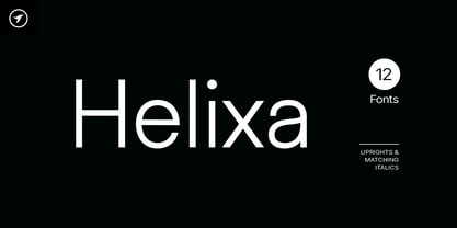 Helixa is a neo-grotesque typeface with a clean & modern design and an enduring appearance. This is a perfect choice for creating logotypes, branding, headlines, corporate identities, and marketing materials for web, digital & print alike. The typeface will be a great option for branding, logo/logotype design projects, marketing graphics, banners, posters, signage, corporate identities and editorial design. Adding extra letter spacing will make this font the perfect choice for minimal headlines and logotypes, as shown in the promo designs attached. Handcrafted and designed with powerful OpenType features in mind, each weight includes extended language support with Western European, Central European and South Eastern European sets. A total of 300 glyphs are available. Helixa typeface includes 12 fonts in total, with seven upright weights (Thin / Light / Book / Regular / Bold / Heavy) and Italic equivalents of all six weights.
 - Monto Grotesk by Lucas Tillian,
$28.00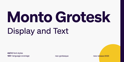 Monto is a superfamily — this is the Grotesk + Grotesk Display part of it. Monto Grotesk is a modern sans serif typeface that combines the strengths of the neo-grotesque and geometric genres. While maintaining an established and trusted look, the design is influenced by a contemporary geometric aesthetic, making it a modern yet timeless companion. The Grotesk is split into two sub-families (Monto Grotesk and Monto Grotesk Display). While Grotesk is intended to be used in long paragraphs and copy text, Grotesk Display is perfect for striking headlines. To achieve maximum legibility, Grotesk emphasizes its characters vertical strokes, focusing on a coherent rhythm and having more open counters in contrast to Display which features a reduced tracking and more geometric and round forms. Furthermore, individual characters change their entire shape to best suit their areas of operation.
 - Goga by Narrow Type,
$42.00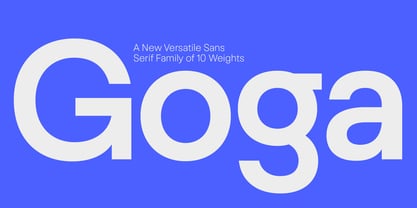 Introducing Goga, a versatile sans serif family available in 10 weights from hairline to black. It is a typeface that combines the best of geometric sans serifs and neo-grotesques. It draws inspiration from typefaces like Avenir on the one hand and Helvetica on the other. Although Goga is a universal and neutral typeface, it is rather warmer and friendly in nature. If you want to add more juice to your project, you can do so by using unusual stylistic alternates of the lowercase g (hence the name Goga). Goga is a typeface suitable for both large sizes and smaller text, thanks to its large x-height. It contains Latin-extended character set, and thus supports most Latin languages. It also offers many open type features such as fractions, old-style figures, tabular figures, discretionary ligatures and more.
 - Paperlight Script by Putracetol,
$20.00 Paperlight Script - Luxury Calligraphy Font. Paperlight Script is calligraphy font with a classic style and a touch of elegance, inspired by the handwriting of ancient manuscripts. This calligraphy harmony gives the impression of being luxurious, free and sophisticated. The body text of Paperlight Script font has been designed with high details, precisely, smooth and flow. Paperlight Script font carefully designed to work together harmoniously making it perfect for wedding media, book covers, greeting cards, logos, branding, business cards and certificates, even for any design work that requires classic, formal or luxurious The alternative characters were divided into several Open Type features such as Swash, Stylistic Sets, Stylistic Alternates, Contextual Alternates, and Ligature. The Open Type features can be accessed by using Open Type savvy programs such as Adobe Illustrator, Adobe InDesign, Adobe Photoshop Corel Draw X version, And Microsoft Word. This font is also support multi language.
 - PF DIN Display Pro by Parachute,
$79.00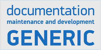 While DIN Display seems to retain DIN’s basic characteristics, it shines with its sharper corners and contemporary look. Completed in 2002, it was first released and published in Parachute’s award-winning 2003 catalog and immediately was a hit. It has been used successfully in magazines, corporate applications and packaging in fields such as music, fashion, technology, visual arts. The ‘Pro’ series has been enhanced with more weights, multilingual support and opentype features in all different styles. Specifically, this superfamily supports simultaneously Latin, Greek and Cyrillic, while each one of its 15 weights contains 1197 glyphs and 20 opentype features. Additionally, every font in this superfamily has been completed with 270 copyright-free symbols, some of which have been proposed by several international organizations. This is a set of very useful daily symbols for packaging, branding and advertising. Symbols for public areas, environment, transportation, computers, fabric care and urban life.
 - Mailuna Pro AOE by Astigmatic,
$24.00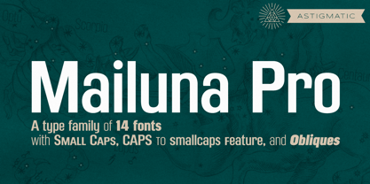 Mailuna Pro is a family of gothic typefaces of weight and oblique stature, finding themselves on a line between modern and historical gothic styles. Originating as a revival and elaboration of a limited lettering specimen from a series of old loose spanish specimen book pages, it finds itself in the visual company of vintage transportation roll signs, wood type gig posters, financial publications, etc. What began as just Capitals, Lowercase and Numerals was expanded to a rich pro glyphset including small caps, unlimited fractionals, superiors & inferiors, ordinals, tabular & proportional figures, a Caps to small caps feature and an expanded language glyph set. From modern letterpress back to historical adverts, book covers, headlines, or anything else you want to give a dash of vintage authenticity to, the Mailuna Pro Family is here to fill your needs. Be sure to download and take Mailuna Pro AOE - Book weight for a spin for free.
 - Diverda Serif by Linotype,
$29.99Diverda Serif is a contemporary typeface that is free from ornament. Created by Swiss designer Daniel Lanz, Diverda Serif is optimized for maximum legibility. In contrast to many other modern typefaces, which try to squeeze the traditional rounder forms of the alphabet into square designs, and which often attempt to equalize the widths of the capital letters, Diverda Serif remains true to the proper proportions of the Roman alphabet. The x-heights of Diverda Serif's characters are low, and the differences between curved, square, and triangular elements are very clear. Like the more calligraphic typefaces of the past, Diverda Serif's strokes exhibit contrast that is inspired by movements of the pen on paper; down strokes are heavier than up strokes. Possible applications for the Diverda Serif include magazine design, as well as advertising for fashion, design, or architectural products. Diverda Serif is also a good fit for Corporate Identity solutions. - Swirl Sensations by Redy Studio,
$17.00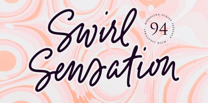 From Lovely Label comes Swirl Sensations inspired by the feeling of the pen stroke. Swirl Sensations fonts will be a treat for your eyes. Combined with the natural flow of handwritten typefaces, this series is a lot of fun and can help bring your design to life. This font is perfect for creating stunning designs in various styles, including vintage, cute, colorful, hand-made, or customized logos. Made manually by the author and it is the best match to put your texts perfectly on the design. In addition, this font is great for numerous types of projects: logos, branding projects, t-shirts, advertising, labels, and other items. Also ideal for invitations for its unique style of writing. Feel free to give me a message if you have a problem or question. Thank you so much for taking the time to look at one of our products.
 - Gamon by Eko Bimantara,
$19.00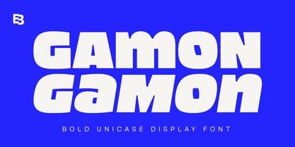 Gamon is an innovative and daring unicase display font that is a perfect example of modern typography. The absence of traditional lowercase letters and the integration of multiple glyphs in the uppercase letters create a distinct and captivating design. The uniform size of the letters adds to the font’s appealing appearance, making it an ideal choice for large display layouts, branding, posters, and titles. Gamon’s typography is perfect for designers who are looking for a fresh and unusual aesthetic. It can transform any digital or print design stand out from the rest. Gamon’s versatility makes it suitable for a broad range of design applications, including logos, packaging, and marketing materials. Gamon’s boldness and uniqueness make it an excellent choice for designers who want to break free from the conventional design constraints. With Gamon, designers can create designs that are not only visually appealing but also memorable and impactful.
 - Silver Queen by VP Creative Shop,
$20.00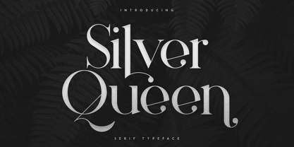 Introducing Silver Queen - Serif Typeface Silver Queen is luxury, vintage typeface with 6 weights loaded alternate glyphs, ligatures and multilingual support. It's a very versatile font that works great in large and small sizes. Silver Queen is perfect for branding projects, home-ware designs, product packaging, magazine headers - or simply as a stylish text overlay to any background image. Uppercase, lowercase, numeral, punctuation & Symbol 6 weights Hairline Light Regular Bold Extra Bold Black Alternate glyphs Ligatures Multilingual support How to access alternate glyphs? To access alternate glyphs in Adobe InDesign or Illustrator, choose Window Type & Tables Glyphs In Photoshop, choose Window Glyphs. In the panel that opens, click the Show menu and choose Alternates for Selection. Double-click an alternate's thumbnail to swap them out. Feel free to contact me if you have any questions! Mock ups and backgrounds used are not included. Thank you! Enjoy!
 - Salty Milky by Yumna Type,
$15.00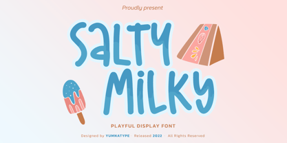 Salty Milky is a display font in thick weights to be your best choice for showing casual, charming, fun expressions. The uneven proportions and forms of the artistic letters add more attractiveness to this font. Furthermore, Salty Milky gives you a special bonus called the clipart. Use this font for big text sizes for a legibility reason and you can make use of the interesting features available here as well. Features: Multilingual Supports PUA Encoded Numerals and Punctuations Salty Milky fits for various design projects, such as posters, banners, logos, magazine covers, quotes, headings, printed products, merchandise, social media, etc. Find out more ways to use this font by taking a look at the font preview. Thanks for purchasing our fonts. Hopefully, you have a great experience using our font. Feel free to contact us for further information when you have a problem using the font. Thank you. Happy designing.
 - Peach Montain by Nathatype,
$25.00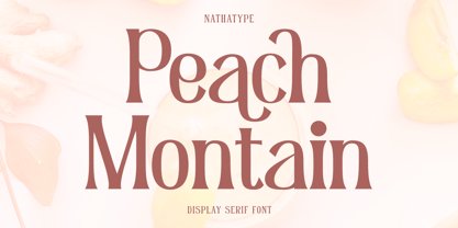 Peach Mountain is an elegant, modern, multipurpose display serif font needed by designers today. The simple letters’ morphology has relatively similar proportions. Furthermore, its high contrasts and wide spaces are truly legible with which you can apply for any text sizes. In addition, you can make use of this font’s available interesting features to beautify your designs. Features: Stylistic Sets Ligatures Multilingual Supports PUA Encoded Numerals and Punctuations Peach Mountain fits best for various design projects, such as posters, banners, logos, magazine covers, quotes, headings, printed products, invitations, name cards, merchandise, social media, etc. Find out more ways to use this font by taking a look at the font preview. Thanks for purchasing our fonts. Hopefully, you have a great time using our font. Feel free to contact us anytime for further information or when you have trouble with the font. Thanks a lot and happy designing.
 - Mighty Party by Nathatype,
$29.00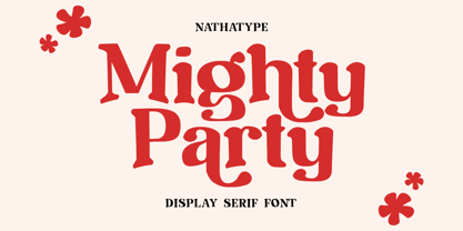 Mighty Party is a display serif font in thick weights to express friendly, modern nuances. It has a high contrast in curvy final wipe details on some of the letters. Its heights and proportions are not the same, but its simple forms are legible in both small and big text sizes. You can also enjoy the lovely features available in this font. Features: Stylistic Sets Multilingual Supports PUA Encoded Numerals and Punctuations Mighty Party fits for various design projects, such as posters, banners, logos, magazine covers, quotes, headings, printed products, invitations, name cards, merchandise, social media, etc. Find out more ways to use this font by taking a look at the font preview. Thanks for purchasing our fonts. Hopefully, you have a great experience using our font. Feel free to contact us for further information when you have a problem using the font. Thank you. Happy designing.
 - Karlotte by Dora Typefoundry,
$18.00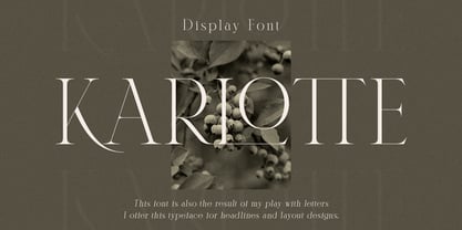 Karlotte is an elegant Modern Serif Font giving a romantic feel to every curve having a smooth edge. This typeface has been carefully crafted to ensure premium quality and a luxurious feel. With 46 Ligatures included, it is a great help in creating the title of any of your projects: such as fashion, magazines, logos, branding, photography, invitations, wedding invitations, quotes, blog headers, posters, advertisements, postcards, books, websites, etc. Features • Full set of uppercase, lowercase letters • 56 Ligatures • 20 Alternates • Numbers, symbols & punctuation • Characters with accents • Supports Multiple Languages • PUA Encoded WHAT’S INCLUDED • Karlotte – Regular • Karlotte – Italic This type of family has become a work of true love, making it as easy and enjoyable as possible. I really hope you enjoy it! I can't wait to see what you do with Karlotte! Feel free to use the #Dora Typefoundry tag and # Karlotte font to show what you've done Thank You!
 - Cutoff Pro by URW Type Foundry,
$49.99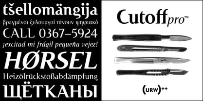 The first plain weight of Cutoff was designed in 2005 to be used in Miele, an independent Italian free magazine. The need was for an elegant, unusual and legible semi-serif with contemporary flavour. I was fascinated by the deconstructivist work of Jeff Keedy (Hard Times Thick), Phil Baines (Can You, You Can) and Otl Aicher (Rotis), so my aim was to get the feeling of a cut transitional typeface; at the same time felt the exigence to work on the whole shape of the glyphs, in order to soften the “90s deconstructivist” effect and obtain a more balanced and readable design. In the last years I further worked on the typeface adding the other styles, extending the character set and refining the letterforms. Finally the precious collaboration with URW++ brought in 2010 to a complete OpenType Pro font family, with multilingual and advanced typographic features. Fulvio Bisca, July 2010

