10,000 search results
(0.027 seconds)
- FM Aloysius by FontMeister,
$24.95 Art Nouveau typeface ‘Aloysius’ draws inspiration from Wiener Secession Movement. You can use this font to create posters, greeting cards, scrapbooks, CD labels, T-shirts, coffee mugs, digital videos websites and banners.
 - Bealiva Vintage by Mevstory Studio,
$15.00 Bealiva is one of my fonts based on a hand lettering project in 2020. It was very inspired from the famous retro typography designs in late 60's until 70's. It includes the extrude look, so you will not have to add it later.
 - Pendraw JNL by Jeff Levine,
$29.00The look and feel of pen lettering is captured in this nostalgically-styled font from Jeff Levine. Add a touch of the 1920's or 1930's to your projects with Pendraw JNL to evoke the look of old-time show cards and signs. - DisneyPark - Unknown license

- Rocklidge Pro by Red Rooster Collection,
$60.00 Steve Jackaman & Ashley Muir. This design was inspired by the 1965 VGC typeface, Jana by Richard D. Juenger. Rocklidge contains all the high-end features expected in a quality OpenType Pro font.
 - Sentic Display by HeadFirst,
$19.90 Designed by Morice Kastoun Sentic Display, s a san-serif font based on geometric patterns with humanist elements. Sentic Display incorporates rounded intersecting forms. The font exploits the common affective patterns associated with natural language, and the patterns associated with text and speech. The name sentic was instigated and named by Austrian neuroscientist Manfred Clynes. Which is the study of waveforms of touch, emotion, and music.
 - Lodestone Pro by Red Rooster Collection,
$60.00 Lodestone is a sans serif decorative typeface, and was created by Steve Jackaman (ITF) in 2017. The original design was known as ‘Marvin,’ and was created by Face Photosetting (London) in the early 1970’s. Since the name ‘Marvin’ was in use by another foundry at time of publication, ‘Lodestone’ was born. Lodestone has a clean, retro feel, and is electrifying at display sizes.
 - Weglly Hauston by Wildan Type,
$17.00 Weglly Hauston is a modern sans serif font with a unique ligature and aletrnate style. A simple serif with special impression. Combaine with high contrast and slat style perfect for feminine logo signs, fashion heads & editorial designs, branding projects, Clothing Branding, packaging, magazine headings, advertising, T-shirts, postcards and much more.
 - Agron by Linecreative,
$16.00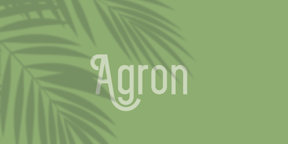 Agron is a display sans serif font designed with a blend of modern and vintage styles and is equipped with ligature, alternative letters and doodles, which gives you unlimited design possibilities. This font is great for posters, logos, magazines, covers, banners , t-shirts and headers, or even large-scale artwork.
 - Innovate P Rounded by NicolassFonts,
$29.00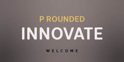 Innovate is a modern versatile sans-serif typeface based on Innovate font family. What differentiates Innovate from the other fonts is an exceptionally distinctive design. It is brilliantly suited for graphic design and display use and perfect for logotypes, t-shirts, packaging, brand identity, books, magazines, newspapers, posters, billboards, and advertising.
 - Katerina P Rounded by NicolassFonts,
$25.00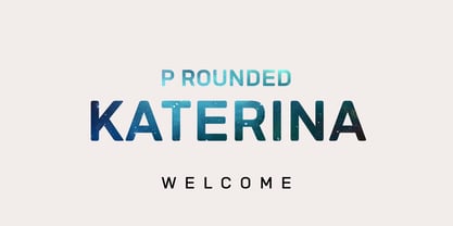 Katerina P Rounded is a modern versatile sans-serif typeface. What differentiates Katerina P Rounded from the other fonts is an exceptionally distinctive design. It is brilliantly suited for graphic design and display use and perfect for logotypes, t-shirts, packaging, brand identity, books, magazines, newspapers, posters, billboards, and advertising.
 - Nippon Note by Hanoded,
$15.00 I just returned from a short holiday in Japan. I stayed in hostels and small guesthouses and noticed a peculiar thing they all had in common: they love little notes, telling you where to go, what to do, how to use the microwave oven and when to check out. These notes were sometimes printed, but more often they were handwritten. I found that the Japanese way of writing roman characters is a little, well, unusual. The letters are correct, but they have that typical ‘Japanese look’ - most notably the a and A the b, d and g, the p and P and the t and T. I can’t really tell you what makes them look different, maybe it’s the proportions, but I do know that a Nippon Note is highly recognisable. So, here is Nippon Note, a highly recognisable, handmade font. You don’t really have to be in Japan to use it, but it will give your designs that extra cachet. And don’t forget Nippon Note Kawaii - the cute doodle font which is free if you download the Nippon Note family! Comes with extensive language support, but unfortunately not Japanese…
 - Blank Manuscript by Aah Yes,
$14.95Blank Manuscript allows you to produce sophisticated musical scoresheets even on basic Word Processors - anything from simple plain staves to complex full-page orchestral scores of your own design, to write in the notation yourself. The basic stuff is really easy and straightforward, but there's some quite advanced things you can do as well. So Copy and Save these Instructions. • The main stuff is simple and tends to follow the initial letter. Treble, Bass and Alto clefs are on upper case T B A (there are more clefs, below). The 5 Lines for the clefs are on L or l. • A small v will give a small vertical line (like a bar line) and a Big U will give a Big Upright - these can start or end a line or piece. • Time Signatures - type the following letters: Think of W for Waltz and it's easy to remember that 3/4 time is on W. Then from that they go up or down together like this: V=2/4 W=3/4 X=4/4 Y=5/4 Z=6/4 Compound Times are on H I J K like this: H=3/8 I=6/8 J=9/8 K=12/8 Common Time and Cut Common symbols can be found on semi-colon and colon respectively (all begin with Co- ). 2/2 3/2 are on lower case a and b, 7/4 and 7/8 are on lower case c and d, 5/8 is on small k (think POL-k-A) • Flat signs are on the numbers. Flat signs on LINES 1 to 5 are on numbers 1 to 5. Flat signs on SPACES 1 to 5 are on numbers 6 to 0 (space 1 being above line 1, space 5 being above the top line of the stave). Sharp signs are on the letters BELOW the long-row numbers. Which is q w e r t for the sharp signs on Lines 1 to 5, and y u i o p for sharp signs on spaces 1 to 5. Doing it this way means it works the same for all clefs, whether Treble, Bass, Alto, Tenor or any other. Sharp and Flat Signs always go in this order, depending on how many sharps or flats your key signature requires: Treble Clef Sharps t i p r u o e Flats 3 9 7 4 2 8 6 Bass Clef Sharps r u o e t i w Flats 2 8 6 3 1 7 = Alto Clef Sharps o e t i w r u Flats 7 4 2 8 6 3 1 • Guitar Chord Boxes are on G and g (G for Guitar) Upper Case G has a thick line across the top Lower case g has an open top, for chords up the fretboard TAB symbols are available: Six-string Tablature is on s & S for Six. Four-string Tablature is on f & F for Four. (Lower case has the "TAB" symbol on it, Upper Case has just the lines to continue.) Five-string tablature, is on lower case "j" (as in BAN-j-O) and of course L or l will continue the 5 lines. •RARE CLEF SIGNS including Tenor Clef, are on various punctuation marks, i.e. dollar, percent, circumflex, ampersand & asterisk, above the numbers 4 to 8. NOTE: The important symbols were kept on the letter and number keys, which are fairly standard all over, but some of the less important symbols are on various punctuation keys, which in different countries are not the same as on my keyboard. If it comes out wrong on your system, all I can say is it's right on the systems we've tried, and they'll be in here somewhere, probably on a different key. CLOSING THE ENDS OF THE LINES and BAR-LINES is done with the 3 varieties of brackets - brackets, brace and parentheses - Left/Right for the Left/Right end of the line. Parentheses L/R () which are above 9, 0 give a clef with a small vertical upright (the same as a bar line). Brace L/R and Brackets L/R (both on the 2 keys to the right of P on my keyboard) will close off a staff line with tall upright bars. Brace gives a double upright - one thick, one thin. Brackets give a single tall upright. A Big Upright is on Big U, (Big U for Big Upright) and a small vertical line is on small v (small v for small vertical). The Big Upright is the maximum height, and the small vertical is exactly the same height as a stave. And there's a tall upright Bar, on Bar (which is to the left of z on my keyboard, with Shift,) which is the same height as the bar on upper case U but twice as broad. • There's a staff intended for writing melodies, which is a little bit higher up than an ordinary treble clef giving a space underneath to put lyrics in - on m and M for Melody line. Lower case has the Treble Clef on, Upper case M has just the higher-up staff lines with no clef. (Use mMMMMMMM etc.) However this clef will be in the wrong place to put in sharp and flat signs, key signatures and so on, so if you use this clef you'll have to write the sharps, flats and key signature yourself. There's also a clef that's smaller (less tall) than the ordinary clef, but with the same horizontal spacing so it will align with other standard-sized clefs - on slash (a plain clef) and backslash (with a Treble Clef). • There are some large brackets for enclosing groups of staves, such as you'd use on large orchestral scores, on Upper Case N O P Q R, which can aid clarity. N and O on the left, Q and R on the right. P is a Perpendicular line to be used on both sides to increase the height of the enclosure, in this way but with the staff lines in between: N Q P P P P P P O R OTHERS —————————————— • Repeat marks are on comma (left) and period/full stop (right). • Hyphen is left as a sort of hyphen - it's a thin line like a single staff line, with the same horizontal spacing as ordinary staff lines - in case you want to draw a line across for a Percussion Instrument, or a Title or Lyric Line. • Space is a Space, but with HALF the width or horizontal spacing as ordinary staff lines, so 2 space symbols will be the same width as a clef symbol or line. • Grave (to the left of 1 on the long row, or hold down Alt and type 0096 then let go) gives a staff line that is one eighth the width of an ordinary staff line. • If you want manuscript in a clef and key which requires a flat or sharp sign in the space underneath the 5 lines, they’re on = equals and + plus . SYMBOLS • Many of these symbols will only be useful if you have worked out in advance which bars will need them, but they are here in case you've done that and wish to include them. • Symbols for p and f (piano and forte) are on 'less than' and 'greater than' < > (above comma and full stop) and m for mezzo is on Question, next to them. They can be combined to make mp, mf, ff, pp, etc. These signs -- and other signs and symbols like Pedal Sign, Coda Sign and so on -- can be found on various punctuation mark keys, including above 1, 2, 3 in the long row, and others around the keyboard. There's a sort of logic to their layout, but in different countries the keys are likely to give different results to what is stated here, so it's probably best to just try the punctuation and see if there's any you might want to use. (But on my keyboard a Coda sign is on circumflex - because of the visual similarity. Pedal sign is on underscore. A "Sign" symbol is on exclamation mark.) They were only included in case you really need them to be printed rather than handwritten. • However, a Copyright symbol is deemed necessary, and also included are a "Registered" symbol and a TradeMark symbol. They are found in the conventional places, and can be accessed by holding down ALT and typing 0169, 0174 or 0153 respectively in the numberpad section and letting go. • Staff lines with arco and pizz. above are on capital C and D respectively ---C for ar-C-o. • An empty circle above a staff line (to indicate sections by writing letters A, B, C or 1,2,3 inside for rehearsal marks) is on n. The actual signs for an A, B, C and D in a circle above the staff line can be produced by holding down ALT and typing 0188, 0189, 0190 and 0191 respectively and letting go. • The word "Page", for indicating page numbers, is on the numbersign key. • The two quotes keys, (quote single and quote double) have symbols representing "Tempo is", and "play as triplets", respectively. • INSTRUMENT NAMES There's a whole lot of Instrument Names built in (over a hundred) which can be printed out above the clef, and you do it like this. Hold down Alt and type in the given number in the numberpad section, then let go. For Piccolo it's 0130, for Flute it's 0131, Cornet is on 0154, Violin is on 0193, and the numbers go up to over 0250, it's a fairly complete set. There's also a blank which is used to align un-named clefs on 0096. Put them at the very beginning of the line for the best results. Here they are: WOODWIND Piccolo 0130 Flute 0131 Oboe 0132 Clarinet 0133 Eng Horn 0134 Bassoon 0135 Soprano Sax 0137 Alto Sax 0138 Tenor Sax 0139 Baritone Sax 0140 Saxophone 0142 Contrabassoon 0145 Recorder 0146 Alto Flute 0147 Bass Flute 0148 Oboe d'Amore 0149 Cor anglais 0152 Pipes 0241 Whistle 0242 BRASS Cornet 0154 Trumpet 0155 Flugelhorn 0156 Trombone 0158 Euphonium 0159 Tuba 0161 French Horn 0162 Horn 0163 Tenor Trombone 0164 Bass Trombone 0165 Alto Trombone 0166 Piccolo Cornet 0167 Piccolo Trumpet 0168 Bass Trumpet 0170 Bass Tuba 0171 Brass 0172 VOICES Vocal 0175 Melody 0176 Solo 0177 Harmony 0178 Soprano 0179 Alto 0180 Tenor 0181 Baritone 0182 Treble 0183 Bass 0197 (see also PLUCKED STRINGS) Descant 0184 Mezzo Soprano 0185 Contralto 0186 Counter Tenor 0187 Lead 0206 BOWED STRINGS Strings 0192 Violin 0193 Viola 0194 Cello 0195 Contrabass 0196 Bass 0197 Double Bass 0198 Violoncello 0199 Violin 1 0200 Violin 2 0201 Fiddle 0252 PLUCKED STRINGS Harp 0202 Guitar 0203 Ac. Gtr 0204 El. Gtr 0205 Lead 0206 Bass 0197 Ac. Bass 0207 El. Bass 0208 Slide Gtr 0209 Mandolin 0210 Banjo 0211 Ukelele 0212 Zither 0213 Sitar 0214 Lute 0215 Pedal Steel 0216 Nylon Gtr. 0238 Koto 0239 Fretless 0244 KEYBOARDS + ORGAN Piano 0217 El. Piano 0218 Organ 0219 El. Organ 0220 Harpsichord 0221 Celesta 0222 Accordion 0223 Clavinet 0224 Harmonium 0225 Synth 0226 Synth Bass 0227 Keyboards 0228 Sampler 0249 PERCUSSION and TUNED PERCUSSION Percussion 0229 Drums 0230 Vibes 0231 Marimba 0232 Glockenspiel 0233 Xylophone 0234 Bass marimba 0235 Tubular Bells 0236 Steel Drums 0237 Kalimba 0240 OTHERS Harmonica 0246 Mouth Organ 0247 FX 0251 Intro 0243 Verse 0245 Refrain 0248 Chorus 0250 un-named 0096 (this is a small spacer stave for aligning clefs without a name) ALSO copyright 0169 registered 0174 TradeMark 0153 Rehearsal marks 0188-0191 (giving A, B, C, D in a circle, an empty circle is on n ) Clef signs for Treble Bass Alto without any staff lines 0253-0255 An Alphabetic List of all signs: a 2/2 time b 3/2 time c 7/4 time d 7/8 time e sharp sign, centre line f Tab sign for 4-string tab g Guitar Chord Box, no nut h half-width stave I sharp sign, third space up j Tab sign for 5-string tab k 5/8 time l Lines - 5 horizontal lines for a stave m Melody Clef - a standard clef but placed higher up, with Treble sign n Stave with an empty circle above o sharp sign, fourth space up p sharp sign, space above stave q sharp sign, bottom line r sharp sign, fourth line up s Tab sign for 6-string tab t sharp sign, top line (fifth line up) u sharp sign, second space up v vertical line (bar-line) w sharp sign, second line up x Fretboard, four strings y sharp sign, first space up z Fretboard, five strings A Alto Clef B Bass Clef C “arco” above stave D “pizz.” above stave E Double Vertical Lines F Four Horizontal lines (for 4-string tab) G Guitar Chord Box with nut H 3/8 time I 6/8 time J 9/8 time K 12/8 time L Lines - 5 horizontal lines for a stave M Melody Clef - a standard clef but placed higher up, plain N Bounding Line for grouping clefs - top left O Bounding Line for grouping clefs - bottom left P Bounding Line for grouping clefs - Perpendicular Q Bounding Line for grouping clefs - top right R Bounding Line for grouping clefs - bottom right S Six Horizontal lines (for 6-string tab) T Treble Clef U tall, thin Upright line V 2/4 time W 3 / 4 time X 4/4 time Y 5/4 time Z 6/4 time 1 flat sign, first line up (the lowest line) 2 flat sign, second line up 3 flat sign, third line up 4 flat sign, fourth line up 5 flat sign, fifth line up (the top line) 6 flat sign, first space up (the lowest space) 7 flat sign, second space up 8 flat sign, third space up 9 flat sign, fourth space up 0 flat sign, space above stave - Peter by Vibrant Types,
$33.00 Peter started as a sketch in the static sans-serif tradition of Helvetica®. Then slight references to the calligraphic origin of type were added, giving it a more distinct character. This neo-grotesque sans has rational and clear basic letterforms, while in its details it unfolds attributes of humanist type. As a neo-grotesque sans it claims a very modest design, yet being a bit wider than its relatives and offering the warmth of humanist drafts. The early sketch grew to a type family of 18 fonts and now supports 700+ glyphs with pro opentype features.
 - Petit-w Font - Unknown license

- Fave by Aerotype,
$48.00 The hand-brushed Fave™ Set has ten informal scripts and other handwritten fonts made up of two subfamilies: Fave and the even-more informal Fave Casual, each have a primary script with a bold version and three other handwritten faces for a total of ten typefaces spanning the casual spectrum. All are optimized for large type use too so they look as good up close as they do set at smaller sizes. OpenType features The Fave family has a few features that happen largely in the background. All of the fonts use the OpenType Standard Ligature feature to automatically differentiate consecutive lowercase letters and numbers (using separate glyphs) and like our previous release Turbinado, they also automatically differentiate like characters that are separated by another letter. Alternate characters The script fonts have alternate uppercase and lowercase characters including multiple t (and double t) crossbar alternates that can be selected from the OpenType glyph table. Enable Contextual Alternates feature to automatically insert a bigger crossbar as the surrounding letters allow throughout a text box or document. You can also make your own custom lowercase t and crossbar to fit any situation–all of the lowercase t ascenders and crossbars are available separately in the OpenType glyph table, and can be combined and moved around manually. Stylistic sets and other goodies Fave Script and its bold counterpart have two Stylistic Sets. When enabled, one automatically substitutes non-connecting alternate characters at the ends of words, the other substitutes even bigger t crossbars than the Standard Ligature feature does. Smart apostrophes and ligatures Other subtle but hopefully helpful features include smart apostrophes, which insert themselves between two script characters in common situations without breaking their connection, and a few ligatures that also make character connections more seamless.
 - Martinail by Picatype,
$12.00 Martinail Script is a contemporary romantic calligraphic typeface, a mixture of retro script and modern sans serif. get a classic and elegant touch. Can be used for various purposes.such as logos, wedding invitation, t-shirt, letterhead, signage, lables, news, posters, badges etc. To enable the OpenType Stylistic alternates, you need a program that supports OpenType features such as Adobe Illustrator CS, Adobe Indesign & CorelDraw X6-X7, Microsoft Word 2010 or later versions. How to access all alternative characters, using Windows Character Map with Photoshop: https://www.youtube.com/watch?v=Go9vacoYmBw How to access all alternative characters using Adobe Illustrator: https://www.youtube.com/watch?v=XzwjMkbB-wQ Martinail Script is coded with PUA Unicode, which allows full access to all the extra characters without having special designing software. Mac users can use Font Book , and Windows users can use Character Map to view and copy any of the extra characters to paste into your favourite text editor/app. Thanks so much for looking and please let me know if you have any questions.
 - Festivo Letters by Ahmet Altun,
$19.00 Festivo Font Family is a handmade layered font which includes several textures, shadows. Different font types can be created using various combinations of Festivo Fonts and colors. All fonts of Festivo letters are created as hand-drawn design based on F.L. NO:8 Font's Letters. The fonts No:16, No:17 and No:19 have the same metric and kerning structure than the other Festivo Fonts except No:18. So each one of these 3 fonts are a layer. But they can also be use as wide spaced fonts. No:18 is specific with its metric and kerning structure which was formed by No:17 but No:18 is its bold version. It was designed as a supplemental font. The fonts No:12 and No:15 can be used as shadows. This font family also includes a few ornaments. For your convenience, the files of the fonts were termed by their numbers. The various possibilities of the Festivo Font Family allows you to create a lot of great works such as posters, magazines, printings, t-shirts etc.
 - Loving Days by Seemly Fonts,
$14.00 Loving Days is a brand new handwritten font perfectly suited for stationery, logos, t-shirts, print design, website headers, photo frames, flyers, music album covers, posters, image sliders, and much more. Add this font to your favorite creative ideas, and notice how it makes them come alive!
 - Bosko by The Northern Block,
$16.70 A robust slab serif typeface that combines classic proportions with contemporary styling. These carefully crafted letterforms are best suited for use on book jackets, news headlines, packaging, posters and t-shirts. Details include four distinct styles, a full character set, manually edited kerning and Euro symbol.
 - Hugehito Brush by ijemrockart,
$13.00 Introducing a lovingly handmade new typeface, Hugehito Brush, a fun and imperfect modern brushed script font with a tough of uniqueness driven. Design like a professional with this typeface that fits perfectly for your wedding invitations, street ads, Instagram posts, t-shirt design, branding, and much more.
 - Brayles by Blankids,
$20.00 Introducing a new layered bold script called Brayles. It is inspired by hand-lettering, bold script logotype and kids fonts. Brayles comes with OpenType features such stylistic alternates, contextual alternates, swash, ligatures good for logotype, poster, badge, book cover, t-shirt design, packaging and any more.
 - Hello Nightmare by Blankids,
$21.00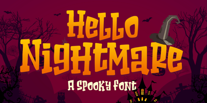 Introducing of our new product the name is Hello Nightmare a Spooky Font inspired by beauty quirky style this font is a fun theme very good for display, T-shirt design, craft, quote sign, logotype and etc FEATURES : Uppercase Lowercase Number Punctuation Multilingual PUA Encode Opentype
 - Summer Dreams by Seemly Fonts,
$14.00 Summer Dreams is a brand new handwritten font perfectly suited for stationery, logos, t-shirts, print design, website headers, photo frames, flyers, music album covers, posters, image sliders, and much more. Add this font to your favorite creative ideas, and notice how it makes them come alive!
 - Orlande by Blankids,
$18.00 Introducing a new script font called Orlande. Orlande was created with a brush pen. It comes with opentype features and multilingual support. Orlande is good for logotype, poster, badge, book cover, t-shirt design, packaging and any more. FEATURES : - Uppercase - Lowercase - Number - Punctuation - Multilingual - PUA Encode - Opentype
 - Vintage Crafted by Edignwn Type,
$18.00 The Vintage Crafted Font is hand drawn typeface with retro themes. This font collections contain script and sans serif font. Every font comes with 3 style typefaces (regular, rough and stamp). This sans serif font includes some ligatures. The Vintage Crafted matches apply in some designs such as the logo, poster, label, badge, packaging, t-shirt, branding, quotes and more custom design. Vintage Crafted includes : 6 fonts (script and sans serif) 3 style typefaces (regular, rough and stamp) Uppercase, lowercase, numeral, symbol and punctuation in script font All-caps, numeral, symbol, punctuation and ligature in sans serif font Multilingual and PUA Encoded
 - Marne by Eurotypo,
$30.00 “Marne” is a new font inspired by letter designs from the 80's but updated. Standing out for its condensation, its angular touch, its slight slant and its thick and thin lines, “Marne” is the perfect mix of elegance and informality. Open Type features include a full complement of international characters, alternatives and ligatures. With all this, the text will look alive and dynamic, without the monotony of repeated letterforms. “Marne” can be the choice to create titles, logos and posters for branding and packaging, invitations, greeting cards, magazine and book covers, children's material, fashion, and wherever you want!
 - Little Birds Script by Senzana,
$13.00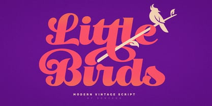 Little Birds is a script that can be used with vintage, simple and modern styles. It is very suitable for logos, posters, t shirts and more. Features Uppercase Lowercase Numerals Ligatures Stylistic Alternates
 - Happy Pumpkin by Nadezda Gudeleva,
$14.00 Happy Pumpkin is a fancy hand drawn font. Aimed for printing greeting cards, especially for quotes with humor. Can also be used on t-shirts design and other print products. Happy Pumpkin season!
 - Grosball by ahweproject,
$10.00 Grosball is a display font devoted to sports design. This font is devoted primarily to football design. Grosball fonts can also be used to design logos, posters, magazines, jerseys, t-shirts, and others.
 - Aretha by Lafontype,
$25.00 Aretha is a classy and beautifully designed sans serif. The main idea of Arteha is to combine the sans serif humanist font style with traditional styles so as to provide a pleasant atmosphere for the reader. The horizontal side of Aretha is designed with a slightly thinner so that the counter can look wider and also looks stiff in some parts to give a firm impression on the letters. Not only for display size, Aretha also works well in text size. Represents multilingual and is equipped with several Open Type features such as tabular figures and stylistic alternates in letters a, g, t and y, so this is very suitable to complement your various design needs.
 - dT Jakob by dooType,
$30.00 dT Jakob started as a revival by Gustavo Soares for Paul van der Laan’s class at the Type and Media Masters, in The Hague, NL – back in 2007. There are quite a few excellent geometric sans typefaces available, but we did want to make our contribution and have a fine geometric face to offer. dT Jakob was born out of Erbar, by Jakob Erbar, one of the very first geometric sans, released in metal around 1926. Our goal was to make a versatile typeface, that handles display and text typography beautifully. To achieve that we designed a complete range of weights, matching italics and lots of OpenType Features. Hope you enjoy it :D
 - PC.DE - 100% free

- Belinsky Text by Tabular Type Foundry,
$32.99 Belinsky is a monospace sans serif typeface inspired by early 20th century geometric sans serifs, architectural letterings, and retro video games to some extent. Its exaggerated proportions and sharp details appear less harsh thanks to the corner rounding. It is comprised of a standard and text families, and the latter is especially suited for small text and programming, with wider spacing and more centralised gravity of certain letters like E. It still gives your codes a lot of personality. The typeface name is a reference to the designer�s favourite animated film, American Pop.
 - Belinsky by Tabular Type Foundry,
$32.99 Belinsky is a monospace sans serif typeface inspired by early 20th century geometric sans serifs, architectural letterings, and retro video games to some extent. Its exaggerated proportions and sharp details appear less harsh thanks to the corner rounding. It is comprised of a standard and text families, and the latter is especially suited for small text and programming, with wider spacing and more centralised gravity of certain letters like E. It still gives your codes a lot of personality. The typeface name is a reference to the designer�s favourite animated film, American Pop.
 - DT Decopolis Hotel by Dragon Tongue Foundry,
$9.00 DT Decopolis Hotel is a sharply stylised Sans Serif Art Deco font, crafted with a wide oval, dissected and contrasted against precision straight edges and pixel sharp corners. The Capitals have a raised centre line, aligning with the tall lowercase height. A nostalgic looking Art Deco font referencing the 1920's to 1940's during the Golden age of Hollywood, Art Moderne and the rise of luxury items from 100 years ago. Totally geometric with great variations in glyph widths designed to attract attention and create Headlines. DT Decopolis Hotel is a display font with clean simple lines, intended to create a sleek elegance that displays the sophistication of a by-gone era. With both upper and lower-case, this font is Great for Logotypes, Headlines, Strap-lines and smaller descriptive text to give that authentic Art Deco look and feel. Evoking the Art Deco Era of the Great Gatsby, glamorous Hotels and Movie Theatres of the period. Packed with over 500 glyphs, you will enjoy the uniqueness of this typeface! Inspired by 1920's Art Deco, Artisual Deco is a 2020's celebration dedicated to the hundred-year-old history of geometric design. This retro typeface will be the perfect fit for your logo designs or graphic project. DT Decopolis Hotel is a perfect choice for designs with a luxurious but minimalist look and feel. Useful in headlines, logos or product packaging it will match perfectly against sloped script fonts. The typeface works perfectly in both All-Caps or full Upper and lower case. Use with Contextual/Standard Ligatures turned on when possible. to allow the letters to match their neighbours. This will also enable larger Caps for the first letter of a new sentence.
 - Eurostile Next by Linotype,
$50.99 Eurostile Next is Linotype's redrawn and expanded version of Aldo Novarese's 1962 design. This new version refers back to the original metal types and to its mid-century modern aesthetic of squarish characters and subtle curves. Eurostile Next brings back the gentle curves, which were lost in other digital versions, therefore regaining the spirit of the original design and its somewhat softer demeanor. The family has been greatly expanded, now consisting of five different weights: ultra light, light, regular, semibold, and bold. Along with the regular width, all weights also have extended and condensed versions. Stylistically, Eurostile Next is well suited for designs in the fashion of the 50's and 60's, yet it still has a remarkably new and contemporary feeling. Its numerous variations and typographic features are invaluable for projects ranging from extensive corporate branding to one-off posters and from large signage to small print text.
 - Eurostile Next Paneuropean by Linotype,
$50.99Eurostile Next is Linotype's redrawn and expanded version of Aldo Novarese's 1962 design. This new version refers back to the original metal types and to its mid-century modern aesthetic of squarish characters and subtle curves. Eurostile Next brings back the gentle curves, which were lost in other digital versions, therefore regaining the spirit of the original design and its somewhat softer demeanor. The family has been greatly expanded, now consisting of five different weights: ultra light, light, regular, semibold, and bold. Along with the regular width, all weights also have extended and condensed versions. Stylistically, Eurostile Next is well suited for designs in the fashion of the 50's and 60's, yet it still has a remarkably new and contemporary feeling. Its numerous variations and typographic features are invaluable for projects ranging from extensive corporate branding to one-off posters and from large signage to small print text. - West Borneo by Warisand,
$17.00 West Borneo is a Vintage 80's Font inspired by beautiful vintage 80's sign art and lettering. The font comes with unique alternate design characters to give your designs an elegant and artistic look. It is perfect for logo and packaging design, short phrases or headlines.
 - Hightide by Atlantic Fonts,
$26.00 Hightide is a rough, hand-lettered script font inspired by brush calligraphy of the 50’s and 60’s. It’s a cinch to use, and adds a welcome splash of salty vintage charm wherever it goes. Shown in posters with other Atlantic Fonts including Began and Reading.


