10,000 search results
(0.018 seconds)
- PF Bulletin Sans Pro by Parachute,
$79.00 This is a grotesque typeface which was derived from an older more simple version designed back in 2000. Bulletin Sans Pro is distinguished by its selective deep cuts which give this typeface a robust and contemporary look. These cuts become more apparent at larger sizes while they create a more subtle effect at smaller sizes. For intense titles try the black version. When space and legibility for long texts are critical, use the lighter versions. The family consists of 10 fonts—from black to light—including true italics. It supports 20 special OpenType features like small caps, fractions, ordinals, etc. and offers multilingual support for all European languages including Greek and Cyrillic. Finally, every font in this family has been completed with 270 copyright-free symbols, some of which have been proposed by several international organizations for packaging, public areas, environment, transportation, computers, fabric care and urban lifestyle.
 - Display Dots Two Sans by Gerald Gallo,
$20.00 Display Dots Two Sans is a display font not intended for text use. It, along with its serif counterpart were designed specifically for display, headline, logotype, branding, and similar applications. Display Dots Two Sans has an uppercase alphabet, numbers, and punctuation.
 - San Remo Casual SG by Spiece Graphics,
$39.00 Now is a great time to dust off your old motor scooter and take a ride along the Italian Riviera. Let’s head to the flower city of San Remo, Italy - the namesake for this versatile, 1950s style script. Try San Remo on your next brochure or flyer project. You may want to consider using it to create a special logo or icon for your personal stationery. It’s perfect for any job that requires linked or connected letters. And for your convenience, this dashing design sports a variety of alternate characters plus lining and old style figures. San Remo Casual is also available as an OpenType font. It contains lining and oldstyle figures, prebuilt fractions, stylistic alternates, and a wide assortment of f-ligatures, plus more. These advanced features currently work in Adobe Creative Suite InDesign and Illustrator. Check for OpenType advanced feature support in other applications as it gradually becomes available with upgrades. Ciao!
 - Grafia Sans 1 Pro by Vanarchiv,
$35.00
- Today Sans Serif SB by Scangraphic Digital Type Collection,
$39.50Since the release of these fonts most typefaces in the Scangraphic Type Collection appear in two versions. One is designed specifically for headline typesetting (SH: Scangraphic Headline Types) and one specifically for text typesetting (SB Scangraphic Bodytypes). The most obvious differentiation can be found in the spacing. That of the Bodytypes is adjusted for readability. That of the Headline Types is decidedly more narrow in order to do justice to the requirements of headline typesetting. The kerning tables, as well, have been individualized for each of these type varieties. In addition to the adjustment of spacing, there are also adjustments in the design. For the Bodytypes, fine spaces were created which prevented the smear effect on acute angles in small typesizes. For a number of Bodytypes, hairlines and serifs were thickened or the whole typeface was adjusted to meet the optical requirements for setting type in small sizes. For the German lower-case diacritical marks, all Headline Types complements contain alternative integrated accents which allow the compact setting of lower-case headlines. - Behind The Nineties Sans by Casloop Studio,
$9.00 Introducing Behind The Nineties Sans - the perfect counterpart to our beloved font, "Behind The Nineties." This new sans-serif addition effortlessly captures the classic vibes of the 80’s and 90’s while infusing a contemporary touch for a timeless yet modern aesthetic. Key Features: Sans Serif Sophistication: "Behind The Nineties Sans" exudes sleek and modern elegance, offering a clean alternative to its serif predecessor. Regular and Italic Styles: Whether you prefer a straightforward look or a touch of italicized flair, this font provides versatility for all your design needs. Classic with a Contemporary Twist: Embrace the spirit of the 80’s and 90’s with a font that seamlessly blends classic elements with contemporary sophistication. Editorial Excellence: Elevate your editorial projects with the precision and clarity of "Behind The Nineties Sans," ensuring a polished and professional appearance. Luxury Serif Companion: Pair it with "Behind The Nineties" serif font for a cohesive design that radiates opulence and luxury. Dramatic Impact: Make a statement with the font's dramatic presence, capturing attention and adding a bold touch to your creative endeavors. Multi-language support including Western European, Central European, South Eastern European, South American, Oceanian, and even Esperanto. "Behind The Nineties Sans" is your go-to font for achieving a harmonious blend of nostalgia and modern flair. It's time to redefine classic design with this exquisite sans-serif typeface.
 - MC Alvesto Sans Font by Maulana Creative,
$16.00 Alvesto is a minimalist sans serif font. Bold stroke, fun character with a bit of ligatures and alternates. To give you an extra creative work. Alvesto font support multilingual more than 100+ language. This font is good for logo design, Social media, Movie Titles, Books Titles, a short text even a long text letter and good for your secondary text font with script or serif. Make a stunning work with Alvesto font. Cheers, Maulana Creative
 - Chamfer Stencil Sans JNL by Jeff Levine,
$29.00 Based on some 1930s-era ‘block chamfer’ gummed paper lettering, Chamfer Stencil Sans JNL is a stenciled treatment of the original design; available in both regular and oblique versions.
 - Gill Sans MT Infant by Monotype,
$43.99The successful Gill Sans® was designed by the English artist and type designer Eric Gill and issued by Monotype in 1928 to 1930. The roots of Gill Sans can be traced to the typeface that Gill's teacher, Edward Johnston, designed for the signage of the London Underground Railway in 1918. Gill´s alphabet is more classical in proportion and contains what have become known as his signature flared capital R and eyeglass lowercase g. Gill Sans is a humanist sans serif with some geometric touches in its structures. It also has a distinctly British feel. Legible and modern though sometimes cheerfully idiosyncratic, the lighter weights work for text, and the bolder weights make for compelling display typography. Gill Sans is also available as Value Pack for Macintosh, PC or as Hybrid CD with both platforms. - AW Conqueror Std Sans by Typofonderie,
$59.00 AW Conqueror Sans was born out of this desire to fuse geometric and humanistic sans. It remains a typeface fundamentally influenced by both Bauhaus spirit — with its simplified geometric forms — and Jan Tschichold’s attempts to link this modular spirit to Eric Gill’s humanist sans serif. AW Conqueror Sans is a claimed French synthesis of Germanic Modernism and English classical tradition. Spheres of influence The core set of capitals are based on the proportions of the Roman capitals like Futura, Erbar, Nobel, Johnston, Gill Sans. During the 1930s, the Futura was a true success. Since then, Monotype offered a geometric version of the Gill Sans, and Linotype added Futura-like variants to WA Dwiggins’ Metro. AW Conqueror Sans is kind of a “fusion” of this approach. The lower case “b, d, p, q” are also directly influenced by Eric Gill’s, while the “y” is influenced by some of Jan Tschichold’s alphabets. In italics, drawn narrower, AW Conqueror Sans reinterprets Gill’s idea: a rigorous italic like a roman but which sometimes reveals some aspects of a Renaissance italic. AW Conqueror Sans and its extensions AW Conqueror Sans is the initial reference point for an extended family, including AW Conqueror Inline, Slab, Carved, Didot. The potential of these mixed families is powerful. Because AW Conqueror typefaces are based on an identical structure, and compatible proportions.
 - PF Square Sans Pro by Parachute,
$79.00 Designer Panos Vassiliou created Square Sans Pro in his quest for a true square-like text typeface which could balance simplicity with vitality and enhance with its subtle power the identity of any product or service, without compromising its characteristics as a text typeface. The family consists of 12 fonts—from extrablack to thin—including true italics. It supports 19 special OpenType features like small caps, fractions, ordinals, etc. and offers multilingual support for all European languages including Greek and Cyrillic. Finally, every font in this family has been completed with 270 copyright-free symbols, some of which have been proposed by several international organizations for packaging, public areas, environment, transportation, computers, fabric care and urban life.
 - European Sans Pro Variable by Bülent Yüksel,
$99.00 EUROPEAN SANS PRO VARIABLE ABOUT FAMILY: What makes "European Sans Pro Variable" elegant, friendly and contemporary is its very rounded curves with very open terminals. "European Sans Pro Variable" has been designed with a higher "x-height" than other fonts in its class to make tiny readability more obvious in any use situation. It will be ideal for use in small sizes such as business cards or mobile applications. This typeface is also equipped with powerful OpenType features to satisfy the most demanding professionals. It has solid features like case sensitivity, small, true capitals, full ligatures, tabular figures for tables, old style figures to elegantly insert numbers into your sentences and more alternative characters to give personality to your projects. The extended, "European Sans Pro Variable" supports around 85 languages in the Latin, Cyrillic and Greek scripts, and its non-Latin components were developed with native consultants. With over 1200+ glyphs per style, "European Sans Pro" cares about localised letterforms and has the OpenType features to match. FEATURE SUMMARY: - 9 weights: Thin, ExtraLight, Light, Book, Regular, Medium, Bold, ExtraBold, and Black. - 4 widths: Normal, Narrow, Condensed, and Extra Condensed. - Matching italics (12º) for all weights and widths . - Matching small caps for all weights and widths. - Lining and old style figures (proportional and tabular). - Alternate characters (A, G, M, N, R, U, a, g, l, m, n, u, y). - Unlimeted fractions. - Automatic ordinals (1st, 2nd, 3rd, etc.). - 24 Dingbats + 19 Social Media and Block Chain icons. - Extended language support: Most Latin-based scripts (including Vietnamese), Cyrillic, and Greek. - Extended currency support. You can contact me at buyuksel@hotmail.com, pre-purchase and post-purchase with questions and for technical support. You can enjoy using it.
 - FF Fago Correspondence Sans by FontFont,
$68.99 German type designer Ole Schäfer created this sans FontFont in 2000. The family contains 4 weights: Regular, Italic, Bold, and Bold Italic and is ideally suited for advertising and packaging, editorial and publishing, logo, branding and creative industries as well as software and gaming. FF Fago Correspondence Sans provides advanced typographical support with features such as ligatures, alternate characters, case-sensitive forms, fractions, super- and subscript characters, and stylistic alternates. It comes with tabular lining figures. This FontFont is a member of the FF Fago super family, which also includes FF Fago, FF Fago Correspondence Serif, and FF Fago Monospaced.
 - FM Bolyar Sans Pro by The Fontmaker,
$29.00 This is Bolyar Sans font family. For us it is a dream-come-true. It took more than 1 year hard work to transform the existing Bolyar Pro from Serif to Sans Serif version. The result really surprised even us from The Fontmaker and we decided to develop it in 9 instead of 7 weights. So at the end we created 7 different styles of Bolyar sans each consisting from 9 precise weights. Bolyar Sans is not just another font family in our portfolio - it is the essence from all our efforts thru the past 5 years to create a powerful type tool that could easily meet very diverse and complex demands of modern design. Furthermore, like all its predecessors, Bolyar Sans is a type concept created by Designers for Designers. If you are in wine and spirits industry, packaging design, or you just love to work with strong headlines that effortlessly could turn into brand logos, then you should definitely try our Bolyar Sans. It is designed for this. Of course there are plenty of different features like multilingual support, ligatures, alternates, we even added adaptive over- and underlining to make it even more complex in its use. Bolyar Sans pairs perfectly with other members of Bolyar Family - Pro , Ornate and Typecraft . So as you see Bolyar is developed as a type platform with own character and style. By using it you could be vintage, classic, modern, soft, even bold, rough and ornate. It is a visual bridge between different typographic periods united under Bolyar name. With our Sans version we aim to be contemporary and to provide powerful type tool to those designers who often love to swim between past and modernity.
 - Rounded Sans Wood JNL by Jeff Levine,
$29.00 Examples of a wood type alphabet for letterpress are the basis for Rounded Sans Wood JNL. Clean and bold, the rounded ends give a softer, more informal look to any display copy.
 - ITC Stone Sans II by ITC,
$45.99 The ITC Stone Sans II typeface family is new from the drawing board up. Sumner Stone, who designed the original faces in 1988, recently collaborated with Delve Withrington and Jim Wasco of Monotype Imaging to update the family of faces that bears his name. Sumner was the lead designer and project director for the full-blown reworking – and his own greatest critic. The collaborative design effort began as a relatively simple upgrade to the ITC Stone Sans family. As so often happens, however, the upgrade proved to be not so simple, and grew into a major design undertaking. “My initial intent,” recalls Sumner, “was to provide ITC Stone Sans with even greater versatility. I planned to add an additional weight, maybe two, and to give the family some condensed designs.” As Sumner began to look more closely at his twenty-year-old typeface, he decided that it would benefit from more extensive design improvements. “I found myself making numerous refinements to character shapes and proportions,” says Sumner. “The project scope expanded dramatically, and I’m pleased with the final result. The redesign has improved both the legibility and the overall appearance of the face.” The original ITC Stone Sans is part of the ITC Stone super family, along with ITC Stone Serif and ITC Stone Informal. In 2005 ITC Stone Humanist joined the family. All of these designs have always offered the same three weights: Medium, Semibold, and Bold – each with an italic counterpart. Over time, Stone Sans has emerged as the godfather of the family, a powerful design used for everything from fine books, annual reports and corporate identity programs, to restaurant menus, movie credits and advertising campaigns. ITC Stone Sans, however, lacked one attribute of many sans serif families: a large range of widths and weights. “These fonts had enjoyed great popularity for many years – during which graphic designers repeatedly asked for more weights and condensed designs in the family,” says Sumner. “Their comments were the impetus.” ITC Stone Sans II includes six weights ranging from an elegant Light to a commanding Extra Bold. An italic counterpart and suite of condensed designs complements every weight. In all, the new family encompasses 24 typefaces. The ITC Stone Sans II family is also available as a suite of OpenType Pro fonts, allowing graphic communicators to pair its versatile design with the capabilities of OpenType. These fonts offer automatic insertion of ligatures, small caps and use-sensitive figure designs; their extended character set also supports most Central European and many Eastern European languages. ITC Stone® Sans II font field guide including best practices, font pairings and alternatives.
 - Novel Sans Hair Pro by Atlas Font Foundry,
$50.00 Novel Sans Hair is the new package of 24 ultra light weights of Novel Sans Pro, the humanist grotesque typeface family within the largely extended award winning Novel Collection, containing Novel Pro, Novel Sans Pro, Novel Sans Hair Pro, Novel Sans Condensed Pro, Novel Mono Pro, Novel Sans Rounded Pro and Novel Sans Office Pro. Novel Sans Hair has a carefully attuned character design and a well balanced weight contrast. Classic proportions and the almost upright italic makes Novel Sans Pro being a modern humanist with the calligraphic warmth of a real italic. Many similarities with the other typeface families within the Novel Collection enable designers to combine the families and reach highest quality in typography. Novel Sans Hair [1020 glyphs] comes in 24 styles and contains small caps, an extra set of alternate glyphs, many ligatures, lining figures [proportionally spaced and monospaced], hanging figures [proportionally spaced and monospaced], small caps figures [proportionally spaced and monospaced], positive and negative circled figures for upper and lower case, superior and inferior figures, fractions, extensive language support, arrows for uppercase and lowercase and many more OpenType™ features.
 - KR Easter No 2 - Unknown license

- Brutal Milk No 1 by Casloop Studio,
$9.00 Introducing Brutal Milk Font Collection where prominence, trustworthiness, and sophistication converge. Brutal Milk is a captivating grotesque typeface that seamlessly blends the robust aesthetics of brutalism with the sleek sophistication of Swiss Design and the nostalgia of Y2K. This collection featuring three distinctive variants – Brutal Milk No1, Brutal Milk No2, and Brutal Milk No3 – offers a unique typographic journey for extraordinary design. Let's break down what we present in this work - Brutal Milk No.1 | Modern Elegance with a Brutal Twist Aims for body text with the perfect balance of elegance and modernity. Brutal Milk No.1 is meticulously crafted for optimal readability, making it an ideal choice for a wide range of applications. - Brutal Milk No.2 | Softened Brutalism for Approachable Headers Aims for display/header text with a gentle and approachable impression. Brutal Milk No.2 is crafted to add a touch of warmth to your designs, making it perfect for conveying a friendly and inviting tone. - Brutal Milk No.3 | Rigid Rebellion for Prominent Headers Make a bold statement with headers that exude firmness. Brutal Milk No.3 is designed to capture attention with its rigid impression, injecting a sense of prominence and confidence into a visual identity. The Features The Brutal Milk Font Collection comes loaded with features such as case-sensitive forms, discretionary ligatures, ordinals, fractions, denominators, numerators, superscripts, and scientific inferiors – ensuring flexibility in design needs. Language Support From Western and Central European languages to South Eastern European, South American, Oceanian, and even Esperanto, Brutal Milk Collections caters to a diverse range of linguistic needs. Brutal Milk stands as a testament to versatility and innovation. Whether you're crafting a sleek logo, establishing a brand identity, adorning decor, creating impactful posters, delivering compelling presentations, designing dynamic websites, refining UI/UX experiences, or engaging in graphic design endeavour. The impressions it imparts—modern, minimal, youthful, funky, groovy, trendy, hip, fly, and undeniably cool—speak volumes about its adaptability to contemporary design trends. Redefine the boundaries of creativity and immerse yourself in the dynamic world of Brutal.
 - Friz Quadrata No. 2 by URW Type Foundry,
$35.00
- Grotesque No. 9 SB by Scangraphic Digital Type Collection,
$26.00Since the release of these fonts most typefaces in the Scangraphic Type Collection appear in two versions. One is designed specifically for headline typesetting (SH: Scangraphic Headline Types) and one specifically for text typesetting (SB Scangraphic Bodytypes). The most obvious differentiation can be found in the spacing. That of the Bodytypes is adjusted for readability. That of the Headline Types is decidedly more narrow in order to do justice to the requirements of headline typesetting. The kerning tables, as well, have been individualized for each of these type varieties. In addition to the adjustment of spacing, there are also adjustments in the design. For the Bodytypes, fine spaces were created which prevented the smear effect on acute angles in small typesizes. For a number of Bodytypes, hairlines and serifs were thickened or the whole typeface was adjusted to meet the optical requirements for setting type in small sizes. For the German lower-case diacritical marks, all Headline Types complements contain alternative integrated accents which allow the compact setting of lower-case headlines. - ITC Caslon No. 224 by ITC,
$40.99 The Englishman William Caslon (1672-1766) first cut his typeface Caslon in 1725. His major influences were the Dutch designers Christoffel van Dijcks and Dirck Voskens. The Caslon font was long known as the script of kings, although on the other side of the political spectrum, the Americans used it as well for their Declaration of Independence. The characteristics of the earlier Renaissance typefaces are only barely detectable. The serifs are finer and the axis of the curvature is almost or completely vertical. The overall impression which Caslon makes is serious, elegant and linear. Next to Baskerville, Caslon font is known as the embodiment of the English Baroque-Antiqua and has gone through numerous new interpretations, meaning that every Caslon is slightly different. ITC Caslon 224 was designed by Edward Benguiat and appeared with ITC in 1982. It is the text font which expanded upon the title font ITC Caslon 223. The alterations in the proportions of the letters make this Caslon 224 a noticeable departure from the original, but make the font overall more legible.
 - Grotesque No. 9 SH by Scangraphic Digital Type Collection,
$26.00Since the release of these fonts most typefaces in the Scangraphic Type Collection appear in two versions. One is designed specifically for headline typesetting (SH: Scangraphic Headline Types) and one specifically for text typesetting (SB Scangraphic Bodytypes). The most obvious differentiation can be found in the spacing. That of the Bodytypes is adjusted for readability. That of the Headline Types is decidedly more narrow in order to do justice to the requirements of headline typesetting. The kerning tables, as well, have been individualized for each of these type varieties. In addition to the adjustment of spacing, there are also adjustments in the design. For the Bodytypes, fine spaces were created which prevented the smear effect on acute angles in small typesizes. For a number of Bodytypes, hairlines and serifs were thickened or the whole typeface was adjusted to meet the optical requirements for setting type in small sizes. For the German lower-case diacritical marks, all Headline Types complements contain alternative integrated accents which allow the compact setting of lower-case headlines. - LTC Village No 2 by Lanston Type Co.,
$39.95
- Really No 2 W2G by Linotype,
$124.99Really No. 2 is a redesign and update of Linotype Really, a typeface that Gary Munch first designed in 1999. The new Really No. 2 offers seven weights (Light to Extra Bold), each with an Italic companion. Additionally, Really No. 2 offers significantly expanded language support possibilities. Customers may choose the Really No. 2 W1G fonts, which support a character set that will cover Greek and Cyrillic in addition to virtually all European languages. These are true pan-European fonts, capable of setting texts that will travel between Ireland and Russia, and from Norway to Turkey. Customers who do not require this level of language support may choose from the Really No. 2 Pro fonts (just the Latin script), the Really No. 2 Greek Pro fonts (which include both Latin and Greek), or the Really No. 2 Cyrillic Pro fonts (Latin and Cyrillic). Each weight in the Really No. 2 family includes small capitals and optional oldstyle figures, as well as several other OpenType features. Really No. 2's vertical measurements are slightly different than the old Linotype Really's; customers should not mix fonts from the two families together. As to the design of Really No. 2's letters, like Linotype Really, the characters' moderate-to-strong contrast of its strokes recalls the Transitional and Modern styles of Baskerville and Bodoni. A subtly oblique axis recalls the old-style faces of Caslon. Finally, sturdy serifs complete the typeface's realist sensibility: a clear, readable, no-nonsense text face, whose clean details offer the designer a high-impact selection. - Bodoni No. 1 SB by Scangraphic Digital Type Collection,
$26.00Since the release of these fonts most typefaces in the Scangraphic Type Collection appear in two versions. One is designed specifically for headline typesetting (SH: Scangraphic Headline Types) and one specifically for text typesetting (SB Scangraphic Bodytypes). The most obvious differentiation can be found in the spacing. That of the Bodytypes is adjusted for readability. That of the Headline Types is decidedly more narrow in order to do justice to the requirements of headline typesetting. The kerning tables, as well, have been individualized for each of these type varieties. In addition to the adjustment of spacing, there are also adjustments in the design. For the Bodytypes, fine spaces were created which prevented the smear effect on acute angles in small typesizes. For a number of Bodytypes, hairlines and serifs were thickened or the whole typeface was adjusted to meet the optical requirements for setting type in small sizes. For the German lower-case diacritical marks, all Headline Types complements contain alternative integrated accents which allow the compact setting of lower-case headlines. - Albion's Marker No.1 by Greater Albion Typefounders,
$16.50 Albion’s Marker No.1, as the name suggests is the first in a series of ‘Marker Pen’ typefaces- merging good type design practice with deliberately casual and hand-drawn letter forms. Inspired by the great classic typefaces such as Bembo and Caslon, the design of Marker No.1 offers a unique blend of legibility and relaxed randomness.
 - Linotype Aroma No. 2 by Linotype,
$40.99 Linotype Aroma No.2 appears straightforward in form, completely sans serif, yet with a trace of humanistic features that gives it that extra edge.
 - Sweet Titling No. 11 by Sweet,
$39.00 Sweet Titling No. 11 is a 2009 addition to the Sweet Collection of engraved lettering styles from the 20th Century. This obscure, art deco design would have been used for engraved letterhead, business cards, etc., and likely first appeared in the 1920s or ’30s.
 - Crazy David No 1 by 066.FONT,
$9.99 Crazy David No 1 is a display font that draws inspiration from the distinctive aesthetic of 90s zines, and exudes a varied and extravagant style that lends a certain nonchalance to projects. Its expressive and daring letters are perfect for creative projects such as posters, invitations or branding materials. Crazy David No 1 perfectly captures the striking look and distinctive character of the text, which is associated with the unique spirit of that decade. Remastered in 2022.
 - Sweet Titling No. 22 by Sweet,
$39.00 Sweet Titling No. 22 is part of the Sweet Collection of engraved lettering styles from the 20th Century, published by MVB Fonts. This obscure, art deco design would have been used for engraved letterhead, business cards, etc., and likely first appeared in the 1920s or ’30s.
 - Nimbus Roman No. 9 by URW Type Foundry,
$35.00
- Brutal Milk No 3 by Casloop Studio,
$9.00 Dear Reviewer Team, Completing the trilogy, Brutal Milk No. 3 Display is our grand finale. This font embodies sophistication and innovation, aiming to provide users with a distinctive and memorable visual element for their creative projects. We believe it enriches the Trilogy font family, offering a comprehensive solution for diverse design needs. We appreciate your time and consideration in reviewing our submission. If you have any questions or require additional information, please feel free to reach out. We look forward to the opportunity to contribute to the marketplace's diverse and high-quality font offerings. Thank you for your attention. Best regards, Nina :)
 - Bart Script No 1 by 066.FONT,
$9.99 Bart Script No 1 is a display font in which each letter has been handwritten, giving it an authentic and original character. It exudes a varied and extravagant style, and with its daring and sophisticated letterforms, Bart Script No 1 attracts attention and gives projects a touch of nonchalance. It is ideal for creative projects such as posters, invitations or branding materials, where a striking and distinctive text finish is sought that stands out. Remastered in 2022.
 - Brewery No 2 Paneuropean by Linotype,
$103.99An entry in the Second Linotype Design Contest, Linotype Brewery, designed by Gustavs Andrejs Grinbergs, became part of the TakeType Collection in 1997. Brewery No 2 represents a significantly improved version of its precursor, and the typeface has been both extended and enhanced. When asked about prototypes, Grinbergs cites German typefaces of the early 20th century. It is thus not surprising that the characters of Brewery™ No 2 are based on geometrical forms. However, this is no mere synthetic Grotesque-derived typeface. It has significant contrasts in line thickness and triangular line terminals that are not unlike serifs, placing it in the middle ground somewhere between a Grotesque and serif font. The contrast between the features of a synthetic Grotesque and an Antiqua gives the characters of Brewery No 2 their distinctive charm and is the distinguishing attribute of this contemporary typeface. Additional vibrancy is provided by bevelled line endings (as in the case of the 'E' and the 'F'), the circular punctuation marks and the slight curve of the descending bar of the 'k'. Thanks to a generous x-height and its open counters, Brewery No 2 is also highly legible in small point sizes. Only in its bolder versions is another aspect of Brewery No 2 apparent; Grinbergs has here made the linking elements more rectangular and has emphasized the counters, so that the Bold variants of Brewery No 2 exhibit elements typical of a broken typeface. Brewery No 2 is available in seven finely graduated weights, ranging from Light to Black. Every variant has a corresponding, slightly narrower Italic version. In addition, the lowercase 'a' is given a closed form, the 'e' is more rounded and the 'f' has a descender. The character sets of Brewery No 2 leave nothing to be desired. In addition to small caps and ligatures, there are various numeral sets with old style and lining figures for setting proportional text and table columns. In its most extensive form (the Pan-European variant), Brewery No 2 can be used to set texts in many languages that employ the Latin alphabet and also texts in international languages that use Cyrillic or monotonic Greek orthography. Although some of the features of Brewery No 2, such as the tiny serifs, are only evident in the larger point sizes, this typeface is not just at home when used to set headlines. Brewery No 2 also cuts a good figure in short or medium length texts. This contemporary typeface with its formally elegant quality looks good, for example, on posters, in newspapers and promotional material. It can also be used for websites as it is also available as a web font. - The Inlines No Inlines by Okaycat,
$19.50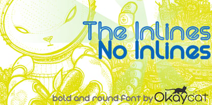
- Garamond No. 2 SH by Scangraphic Digital Type Collection,
$26.00Since the release of these fonts most typefaces in the Scangraphic Type Collection appear in two versions. One is designed specifically for headline typesetting (SH: Scangraphic Headline Types) and one specifically for text typesetting (SB Scangraphic Bodytypes). The most obvious differentiation can be found in the spacing. That of the Bodytypes is adjusted for readability. That of the Headline Types is decidedly more narrow in order to do justice to the requirements of headline typesetting. The kerning tables, as well, have been individualized for each of these type varieties. In addition to the adjustment of spacing, there are also adjustments in the design. For the Bodytypes, fine spaces were created which prevented the smear effect on acute angles in small typesizes. For a number of Bodytypes, hairlines and serifs were thickened or the whole typeface was adjusted to meet the optical requirements for setting type in small sizes. For the German lower-case diacritical marks, all Headline Types complements contain alternative integrated accents which allow the compact setting of lower-case headlines. - Brutal Milk No 2 by Casloop Studio,
$9.00 Introducing Brutal Milk Font Collection where prominence, trustworthiness, and sophistication converge. Brutal Milk is a captivating grotesque typeface that seamlessly blends the robust aesthetics of brutalism with the sleek sophistication of Swiss Design and the nostalgia of Y2K. This collection featuring three distinctive variants – Brutal Milk No1, Brutal Milk No2, and Brutal Milk No3 – offers a unique typographic journey for extraordinary design. Let's break down what we present in this work - Brutal Milk No.1 | Modern Elegance with a Brutal Twist Aims for body text with the perfect balance of elegance and modernity. Brutal Milk No.1 is meticulously crafted for optimal readability, making it an ideal choice for a wide range of applications. - Brutal Milk No.2 | Softened Brutalism for Approachable Headers Aims for display/header text with a gentle and approachable impression. Brutal Milk No.2 is crafted to add a touch of warmth to your designs, making it perfect for conveying a friendly and inviting tone. - Brutal Milk No.3 | Rigid Rebellion for Prominent Headers Make a bold statement with headers that exude firmness. Brutal Milk No.3 is designed to capture attention with its rigid impression, injecting a sense of prominence and confidence into a visual identity. The Features The Brutal Milk Font Collection comes loaded with features such as case-sensitive forms, discretionary ligatures, ordinals, fractions, denominators, numerators, superscripts, and scientific inferiors – ensuring flexibility in design needs. Language Support From Western and Central European languages to South Eastern European, South American, Oceanian, and even Esperanto, Brutal Milk Collections caters to a diverse range of linguistic needs. Brutal Milk stands as a testament to versatility and innovation. Whether you're crafting a sleek logo, establishing a brand identity, adorning decor, creating impactful posters, delivering compelling presentations, designing dynamic websites, refining UI/UX experiences, or engaging in graphic design endeavour. The impressions it imparts—modern, minimal, youthful, funky, groovy, trendy, hip, fly, and undeniably cool—speak volumes about its adaptability to contemporary design trends. Redefine the boundaries of creativity and immerse yourself in the dynamic world of Brutal.
 - Really No 2 Paneuropean by Linotype,
$103.99Really No. 2 is a redesign and update of Linotype Really, a typeface that Gary Munch first designed in 1999. The new Really No. 2 offers seven weights (Light to Extra Bold), each with an Italic companion. Additionally, Really No. 2 offers significantly expanded language support possibilities. Customers may choose the Really No. 2 W1G fonts, which support a character set that will cover Greek and Cyrillic in addition to virtually all European languages. These are true pan-European fonts, capable of setting texts that will travel between Ireland and Russia, and from Norway to Turkey. Customers who do not require this level of language support may choose from the Really No. 2 Pro fonts (just the Latin script), the Really No. 2 Greek Pro fonts (which include both Latin and Greek), or the Really No. 2 Cyrillic Pro fonts (Latin and Cyrillic). Each weight in the Really No. 2 family includes small capitals and optional oldstyle figures, as well as several other OpenType features. Really No. 2's vertical measurements are slightly different than the old Linotype Really's; customers should not mix fonts from the two families together. As to the design of Really No. 2's letters, like Linotype Really, the characters' moderate-to-strong contrast of its strokes recalls the Transitional and Modern styles of Baskerville and Bodoni. A subtly oblique axis recalls the old-style faces of Caslon. Finally, sturdy serifs complete the typeface's realist sensibility: a clear, readable, no-nonsense text face, whose clean details offer the designer a high-impact selection. - Bodoni No. 1 SH by Scangraphic Digital Type Collection,
$26.00Since the release of these fonts most typefaces in the Scangraphic Type Collection appear in two versions. One is designed specifically for headline typesetting (SH: Scangraphic Headline Types) and one specifically for text typesetting (SB Scangraphic Bodytypes). The most obvious differentiation can be found in the spacing. That of the Bodytypes is adjusted for readability. That of the Headline Types is decidedly more narrow in order to do justice to the requirements of headline typesetting. The kerning tables, as well, have been individualized for each of these type varieties. In addition to the adjustment of spacing, there are also adjustments in the design. For the Bodytypes, fine spaces were created which prevented the smear effect on acute angles in small typesizes. For a number of Bodytypes, hairlines and serifs were thickened or the whole typeface was adjusted to meet the optical requirements for setting type in small sizes. For the German lower-case diacritical marks, all Headline Types complements contain alternative integrated accents which allow the compact setting of lower-case headlines.
