10,000 search results
(0.042 seconds)
- XCLV.NEON Pro Cyrillic by Viktor Konovalov,
$9.87 Specially created for high-budget Hollywood blockbusters by well-known ukrainian Ideas Millionaire K. Professional Cyrillic version. Future Neon Signs.
 - Tuned Rompies by Balevgraph Studio,
$12.00 Tuned Rompies is a retro and bold display font. It would look great on headlines, magazines, logos, branding and so much more! What's Included? Uppercase & Lowercase Numbers & Punctuation Alternates Multilingual Support Regular & Slant PUA Encoded
 - Merci by Atlantic Fonts,
$26.00 “Merci” is a playful, cool, hand-drawn font ready to mix things up with interchangeable upper and lower case letters and double letter ligatures. Get artsy, go graphic, feel the groove, and spread some love.
 - Fondest by Prioritype,
$19.00 Introducing. Fondest: A modern and classic look font that is simple and looks luxurious. Great for branding, social media posts, logos, quotes, magazines etc. Features: Uppercase, Lowercase, Numeral, Punctuation, Multilingual, Ligature, Alternates & PUA Encoded. Thanks.
 - Magicpie by Balpirick,
$15.00 Magicpie is a quirky and authentic handwritten font. It has a playful style, making all of your projects more exciting than you ever thought they could be. Let your imagination unleash with the stunning Magicpie!
 - Pier Georad by Fype Co,
$12.00 Pier Georad is a great, casual and playful typeface designed in 2020. This font can be used for anything such as logo, packaging, poster, branding, header, poster, apparel, and other cute or casual design projects.
 - Menthol Signature by Din Studio,
$29.00 Menthol signature is a classy monoline font. Made for any professional project branding. Every letter has a unique and beautiful touch. Includes: Mentol Signature(OTF) Features: Beautiful Ligatures PUA Encoded Multilingual Support Numerals and Punctuation
 - Bakulipack by IbeyDesign,
$18.00 Bakulipack Handwritten Script Font is a lovely script font featuring charming, playful characters that seem to dance along the baseline. Add it to your most creative ideas, and notice how it makes them stand out.
 - Cute Bubble by Creaditive Design,
$14.00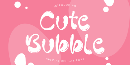 Cute Bubble is a fun, playful and friendly display font. It is perfect for any kid or cute design that need bubble effect. Just choose this font, your special cute project can be more cuteness.
 - Farland by Rillatype,
$15.00 Introducing, Farland. a bold script font that carries the vintage feel. This font is perfect for logo, headline, signage, packaging, branding, etc. Features : uppercase & lowercase numbers and punctuation multilingual alternates / swashes and ligatures PUA encoded
 - Water Melon by Struggle Studio,
$16.00 Water Melon – with Extras is a fun and charming display font. It embodies playfulness and originality and is the perfect choice for children’s or parents’ activities and school projects, clothing, food posters and birthday cards.
 - Maron Rose by Balevgraph Studio,
$12.00 Maron Rose is a luxurious and stylish serif font. It will elevate a wide range of crafting ideas, from cards, to branding, labels, logos and much more. Maron Rose Features: Multilingual Ligatures Alternates PUA encoded
 - Tetra 84 by Fat Hamster,
$25.00 TETRA 84 is a super cool nostalgic retro font in 80s 90s Y2K style TETRA 84 is a 80s 90s Y2k Tetris inspired typeface. It's retro, bold, playful, fun and...Tetris! Have fun using it!
 - Christmas Booster by Creaditive Design,
$12.00 Christmas Booster is a flowing handwritten font, described by an elegant touch, perfect for your favorite projects. This font is PUA encoded which means you can access all of the glyphs and swashes with ease!
 - Sanderling by Atlantic Fonts,
$26.00 Sanderling is irrepressibly cheerful. Turn on discretionary ligatures to access double-letter ligatures for both cases, plus more chirpy ligatures designed to give flight to Sanderling’s lively character. Sanderling has the legs to make waves!
 - Khaollin by madeDeduk,
$16.00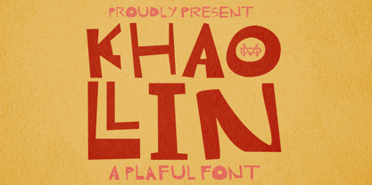 Introducing The Khaollin is a playful font and will be perfect for book, title branding, product packaging, invitation, quotes, t-shirt, label, poster, logo etc. Feature Uppercase & Lowercase Number & Symbol International Glyphs Multilingual support ligature
 - Beautica Dreaming by Letterena Studios,
$9.00 Beautica Dreaming is an elegant script font with a contemporary atmosphere and impeccable form, inspired by timeless classic calligraphy. This font is PUA encoded which means you can access all glyphs and swashes with ease!
 - Tumb by That That Creative,
$18.00 Tumb is a bold quirky modern display font with stylized ink traps. It is perfect for giving your project a fun sophistocated playfulness. Perfect for headlines on posters, Instagram, print projects, branding, and logo design.
 - Valentines Vermouth by Aldedesign,
$25.00 Valentine’s Vermouth is a beautiful and light handwritten font with a unique feel and a stunning impact. This font is PUA encoded, which means you can access all of the glyphs and swashes with ease!
 - Lustig by Juraj Chrastina,
$39.00 In german lustig means funny. Furthermore Mr. Lustig is a character in one of Karel Čapek's miraculous fairy tales. In addition it's also a lively hand-lettered font equipped with playful interlocking ligatures. Have fun!
 - MBF Marcos by Moonbandit,
$14.00 Marcos, a playful vintage display font, bold and quirky, perfect for that retro look. every glyph is uniquely crafted. Marcos is perfect for logo, title, headline, even text, it is versatile and have high exposure.
 - Karline by Rillatype,
$17.00 Introducing, Karline! Karline is a reversed contrast font that will fit perfectly into any of your design such as branding, packaging, headline, tshirt, branding, etc. This font also support multilingual support and PUA encoded already.
 - Orange Gush by PizzaDude.dk,
$20.00Orange Gush is a playful font with curls and unpredictable funky and funny curves! Comes in Open Type with different alternate letters! Note: you will need to use OpenType supporting applications to use the autoligatures. - Sylphe Pro by RMU,
$35.00 Inspired by Schelter & Giesecke’s Sylphide Sylphe Pro comes as an elegant, calligraphic Italic with the touch of the Golden Age of type design. This beautiful font encompasses most European languages, Central and West, plus Turkish.
 - P22 Relax by IHOF,
$24.95 Relax, and its companion font, Relax Mix are two type designs that evoke a playful spirit. The casual shapes of Relax and Relax Mix make it the perfect accompaniment for the Ching Mang picture font.
 - Buttoni by Letterhend,
$9.00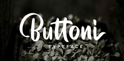 Buttoni is a playful font that you can use for many things. Perfect for quote or anything you want. This font also includes numbers, symbols, and multi-lingual support. Also comes with ligatures and alternates.
 - Benice by DRM Works,
$19.99 Benice is a modern display font that is super bold and perfect for headlines. It is fun and playful, perfect display font for any projects, such as logo, magazine, branding, sticker, sublimation and many more.
 - Hot Sunday by Epiclinez,
$18.00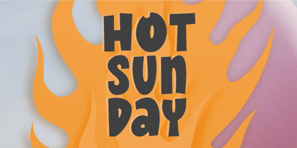 Introducing Hot Sunday, a fresh and playful font ideal for creative headlines. Whether you're designing a logo or crafting an eye-catching poster, this font will energize your designs with its fun personality. Thank You.
 - Petite Smile by Tigade Std,
$35.00 Petite Smile is a cute and friendly display font. Its childish and playful character is perfect for creating a wide spectrum of designs. Add it confidently to your projects, and you will love the results.
 - Edison by HiH,
$12.00 Edison, is it Victorian or is it Art Nouveau? While this typeface may be found in Petzendorfer’s Treasury of Art Nouveau Alphabets, I believe the decorative spirals are more Victorian than “New Art.” To me, they looked tacked on, rather than organic -- with the industrial mechanics of a coiled spring, rather than the tendrils of a growing plant as the philosophical wellspring. Originally released by ATF in 1894 as Houghton, this typeface was re-released shortly thereafter by Bauer and Berthold in Germany as EDISON. Please do not make the mistake of thinking the font we offer here is no better than freeware fonts in cheap rip-off collections. This font has a set 218 characters and represents many hours manipulating the bezier curves to produce acceptable results. Available freeware fonts are often little more than raw scans with little accuracy of letterform. The muddy line intersections are a dead give-away. Frequently all you get is the alphabet itself. No numbers, no punctuation and don't even think about diacriticals. The font we offer represents a tremendous value. Considering the hours of work involved, I have no business charging so little. I could make better money cooking hamburgers or bagging groceries. But we want very much to encourage you to purchase and enjoy these fascinating historical typefaces and are making it as easy as possible for you to do so. So please encourage us and order Edison today.
 - Neue Frutiger Paneuropean by Linotype,
$79.00During planning for the new Roissy Charles de Gaulle airport in Paris at the beginning of the 1970s, it was determined that the airport's signage system had to include the clearest and most legible lettering possible. The development of all signage was put into the hands of Adrian Frutiger and his studio. The team carried out their task so effectively that a huge demand for their typeface soon arose from customers who wanted to employ it in other signage systems, and in printed materials as well. The Frutiger® typeface not only established new standards for signage, but also for a range of other areas in which a clear and legible design would be required, especially for small point sizes and bread-and-butter type. The typeface family that which emerged as a result of this demand was added into the Linotype library as "Frutiger" in 1977. Frutiger Next, created in 1999, is a further development of Frutiger, not necessarily a rethinking of the design itself. It was based on a new concept, the most obvious visual characteristics of which is the larger x-height, as well as a more pronounced ascender height and descender depth for lower case letters in relation to capitals. This new design created a balanced image and included considerably narrower letterspacing. Frutiger Next meets the demand for a space-saving, modern humanist sans. 2009's Neue Frutiger is a rethink of the 1977 Frutiger family, now revised and improved by Akira Kobayashi in close collaboration with Adrian Frutiger. Despite the various changes, this "New Frutiger" still fits perfectly with the original Frutiger family, and serves to harmoniously enhance the weights and styles already in existence. The perfect mix, guaranteed Neue Frutiger has the same character height as Frutiger. As a result of this, already existing Frutiger styles can be mixed with Neue Frutiger where necessary. Likewise, Neue Frutiger is perfect for use alongside Frutiger Serif. Newly added are the "Neue Frutiger 1450" weights. Especially for the requirements of the newly released German DIN 1450 norm we have built together with Adrian Frutiger specific weights of the Neue Frutiger. The lowercase l" is curved at the baseline to better differentiate between the cap "I", additionally the number "0" has a dot inside to better differentiate between the cap "O", and the number "1" is now a serifed 1. The font contains additionally the origin letterforms from the regular Neue Frutiger font which can be accessed through an Opentype feature." - Neue Frutiger Cyrillic by Linotype,
$89.00During planning for the new Roissy Charles de Gaulle airport in Paris at the beginning of the 1970s, it was determined that the airport's signage system had to include the clearest and most legible lettering possible. The development of all signage was put into the hands of Adrian Frutiger and his studio. The team carried out their task so effectively that a huge demand for their typeface soon arose from customers who wanted to employ it in other signage systems, and in printed materials as well. The Frutiger® typeface not only established new standards for signage, but also for a range of other areas in which a clear and legible design would be required, especially for small point sizes and bread-and-butter type. The typeface family that which emerged as a result of this demand was added into the Linotype library as "Frutiger" in 1977. Frutiger Next, created in 1999, is a further development of Frutiger, not necessarily a rethinking of the design itself. It was based on a new concept, the most obvious visual characteristics of which is the larger x-height, as well as a more pronounced ascender height and descender depth for lower case letters in relation to capitals. This new design created a balanced image and included considerably narrower letterspacing. Frutiger Next meets the demand for a space-saving, modern humanist sans. 2009's Neue Frutiger is a rethink of the 1977 Frutiger family, now revised and improved by Akira Kobayashi in close collaboration with Adrian Frutiger. Despite the various changes, this "New Frutiger" still fits perfectly with the original Frutiger family, and serves to harmoniously enhance the weights and styles already in existence. The perfect mix, guaranteed Neue Frutiger has the same character height as Frutiger. As a result of this, already existing Frutiger styles can be mixed with Neue Frutiger where necessary. Likewise, Neue Frutiger is perfect for use alongside Frutiger Serif. Newly added are the "Neue Frutiger 1450" weights. Especially for the requirements of the newly released German DIN 1450 norm we have built together with Adrian Frutiger specific weights of the Neue Frutiger. The lowercase l" is curved at the baseline to better differentiate between the cap "I", additionally the number "0" has a dot inside to better differentiate between the cap "O", and the number "1" is now a serifed 1. The font contains additionally the origin letterforms from the regular Neue Frutiger font which can be accessed through an Opentype feature." - Neue Frutiger 1450 by Linotype,
$71.99 During planning for the new Roissy Charles de Gaulle airport in Paris at the beginning of the 1970s, it was determined that the airport's signage system had to include the clearest and most legible lettering possible. The development of all signage was put into the hands of Adrian Frutiger and his studio. The team carried out their task so effectively that a huge demand for their typeface soon arose from customers who wanted to employ it in other signage systems, and in printed materials as well. The Frutiger® typeface not only established new standards for signage, but also for a range of other areas in which a clear and legible design would be required, especially for small point sizes and bread-and-butter type. The typeface family that which emerged as a result of this demand was added into the Linotype library as "Frutiger" in 1977. Frutiger Next, created in 1999, is a further development of Frutiger, not necessarily a rethinking of the design itself. It was based on a new concept, the most obvious visual characteristics of which is the larger x-height, as well as a more pronounced ascender height and descender depth for lower case letters in relation to capitals. This new design created a balanced image and included considerably narrower letterspacing. Frutiger Next meets the demand for a space-saving, modern humanist sans. 2009's Neue Frutiger is a rethink of the 1977 Frutiger family, now revised and improved by Akira Kobayashi in close collaboration with Adrian Frutiger. Despite the various changes, this "New Frutiger" still fits perfectly with the original Frutiger family, and serves to harmoniously enhance the weights and styles already in existence. The perfect mix, guaranteed Neue Frutiger has the same character height as Frutiger. As a result of this, already existing Frutiger styles can be mixed with Neue Frutiger where necessary. Likewise, Neue Frutiger is perfect for use alongside Frutiger Serif. Newly added are the "Neue Frutiger 1450" weights. Especially for the requirements of the newly released German DIN 1450 norm we have built together with Adrian Frutiger specific weights of the Neue Frutiger. The lowercase l" is curved at the baseline to better differentiate between the cap "I", additionally the number "0" has a dot inside to better differentiate between the cap "O", and the number "1" is now a serifed 1. The font contains additionally the origin letterforms from the regular Neue Frutiger font which can be accessed through an Opentype feature."
 - Gentona by René Bieder,
$25.00 Designed for a wide range of applications, Gentona was intended to support the goals of contemporary design paired with a mostly swiss oriented demand on typography – neutrality. The result is a nine-weight neo-grotesque family ranging from sharp and fine thin cuts to muscle-bound and strong heavy weights. Gentona’s confident and open shapes support legibility especially in small sizes while its alternative shapes and letterforms create flexibility. A wide range of typographic features round up the whole family.
 - HT Arcadia Grotesk Expanded by Hype Type,
$34.00 The versatile neo-grotesk typefamily, inspired by the swiss academia with a contemporary mood. The shape of the letters are more pliable compered to classic grotesk typefaces. The Expanded series enlarges horizons... and type! -- Taking inspirations from classic grotesk letterforms, both from the European tradition (specifically the Swiss school) and the American tradition, HypeType's Arcadia Grotesk is modernized with its shorter ascenders and descenders to give more compact blocks of text and with more contemporary and dynamic forms. -- hype-type.com // kidstudio.it
 - Mohn by Ryan Keightley,
$19.00 Mohn is a sans serif font that draws inspiration from the Bauhaus movement, characterized by its geometric shapes and neo-grotesque elements. With its clear and legible forms, Mohn works as a body copy font, or blow it up larger for headlines to really see its gently rounded corner details which bring a personal and contemporary touch to any design project. Available in 7 weights with italics for each, a variety of accented glyphs, ligatures, and extra stylistic alts on select letters.
 - Andes Condensed by Latinotype,
$29.00 Andes, designed by Daniel Hernández, is a display typeface that has neo-humanist characteristics. Its different terminals, among other elements, give it a look of mixed typography. Andes is a typeface with 10 Upright weights ,10 Italics & Condensed version, ranging from Ultra Light to Black, each of the same x-height. This typeface contains additional italic glyphs (a, y, z, g) that help to emphasise text or words. Andes is based on the design of Merced and both of them share several features.
 - KG Belfort by Krismagraph,
$19.00 Belfort is a modern sans serif family font with a neo-Grotesk touch, it is a sans serif typeface that tends to be easily accepted by readers, has wide usage possibilities, and shows a simple, bold, and strong personality. The Belfort font contains 2 basic shapes: upright and round. Each has 10 different weights (Thin, Extra Light, Light, Regular, Medium, Semibold, Thick, Extrabold, Black, and Heavy). with ligatures and alternating in several letters. and is equipped with a multilingual accent.
 - Schola Serif by StudioJASO,
$56.00 Schola Serif is a neo classic serif font that reinterpret the classic Latin style structure and expression in a modern and intriguing way. Schola Serif looks sharply defined, giving clear-cut impression. It features sharp serif and details and presents its own distinctive character when used in title or sub headline or written with over 16pt. Font with 5 different weights, over 60+ languages, 9 OpenType features. It really does work in everything ranging from editorial design, graphic, and even integrated branding design.
 - Bloery by Runsell Type,
$20.00 Bloery is a neo grotesque font modified with extended proportion. Comes with a modern look, this font suitable for display and body text. Bloery is a good choice for editorial design, branding, app design and web design. Comes with 7 weights from Thin to Bold with each matching Italic. Contain several OpenType features: Stylistic Alternates and Figures Variation (fraction, tabular lining, numerator, denominator). Each style includes 540+ glyphs supporting all western, eastern and central european languages (over 200 languages supported).