10,000 search results
(0.022 seconds)
- Salsa Billa by Sulthan Studio,
$12.00 Salsa Billa is new, fresh, funny, interesting, cute calligraphy font. It includes hearts and cute cords as alternatives. It is suitable for greeting cards, branding materials, business cards, quotes, posters, and more! Salsa Billa is coded with Unicode PUA, which provides full access to all additional characters without having special design software.
 - Avellana Pro by Sudtipos,
$39.00 When it comes to packaging or friendly logotypes, subtle designs are never enough. Avellana Pro is a bit wild but also smooth and creamy for that ultimate client seduction. From headlines to small text, the possibilities are endless with versatile new font. The majority of Latin languages are covered in this Pro version.
 - Grumpy Tiger by Hanoded,
$15.00 I really like tigers! In fact, I like all animals, but the tiger is my favorite! Grumpy Tiger is a ‘kiddie’ font: it is bold and rounded, very legible and doesn’t have complicated glyphs. It would look fantastic on new children’s books, posters and product packaging. Comes with a roaring amount of diacritics!
 - Harpsichord by Jonahfonts,
$35.00 Harpsichord (as I have named it) is from the late 1940s and was designed at Lucian Bernhard Studios in New York for Bernhard's Magnetype Collection. It was originally published as 'Community Low' along with 'Community Condensed'. Many of his Magnetype Fonts have been dormant which I hope to revive in the near future.
 - Black Future by Seventh Imperium,
$37.00 Black Future typeface is a new calligraphy script font combined with street art calligraphy and blackletter, that results in a wide range of calligraphy brush to achieve a typeface with sharp edges that looks brave. Contains almost 480 glyphs with opentype features. Stylistic alternates, swash and more. Can be used for various purposes.
 - Thinkthin by Gassstype,
$27.00 Hello Everyone, introduce our new product Font Thinkthin This Is Display Thin Font.This is a Textured Natural Style and classy style with a clear style and dramatic movement. That is has charming, authentic and relaxed characteristic more natural look to your text. You can activate 2 Ligatures and 42 Alternate glyphs OpenType panel.
 - Alisha Arthur by Letterfreshstudio,
$13.00 Alisha Arthur! A new fresh an modern hand lettered font with decorative characters and a dancing baseline. So beautiful on invitation like handicraft, greeting cards, branding materials, business cards, quotes, posters, and more design concepts. Features : Ligatures Stylistic sets Basic Latin A-Z and a-z Numbers International Symbols included Punctuation Ligature
 - Dainty Lady by Solotype,
$19.95You will see this in the old type catalogs as Dainty. Late in the nineteenth century, type founders developed a number of fonts with a "pen-drawn" look. They wanted to complete with the work of the hand lettering artists who were coming into their own, thanks to the new art of photoengraving - Belle Script by melifonts,
$- Belle Script is the first in a new series of melifonts, created entirely digitally using a pen tablet. A hybrid of script and print, it combines structure and elegance and makes for a stylishly clear typeface. Belle Script is the perfect font for a letter to a friend, printed labels, or graphic logos.
 - Beauty angel Script by Letterfreshstudio,
$13.00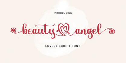 Beauty Angel ! A new fresh an modern hand lettered font with decorative characters and a dancing baseline. So beautiful on invitation like handicraft, greeting cards, branding materials, business cards, quotes, posters, and more design concepts. Features : Ligatures Stylistic sets Basic Latin A-Z and a-z Numbers International Symbols included Punctuation Ligature
 - WIP Money Maker by WIP Fonts,
$49.00WIP Money Maker depicts the handwriting of man with verve, strength of purpose and resoluteness. The (lower case) characters are joined as it is usual in German speaking countries. Originally designed in 1995 the font has been extended by a lot of new characters such as accented characters, punctuation, symbols and currency symbols. - Fanditta by Gassstype,
$27.00 Hello Everyone, introduce our new product Font Fanditta This Is Rough Brush Font.This is a Textured Natural Style and classy style with a clear style and dramatic movement. That is has charming, authentic and relaxed characteristic more natural look to your text. You can activate 20 Ligatures and 21 Alternate glyphs OpenType panel.
 - Art Materials JNL by Jeff Levine,
$29.00 The cover of the 1930s-era “Catalog of Artists’ Materials” from Ernst H. Friedrichs, Inc. (New York) has the words “Artists’ Materials” hand lettered in a stylized Art Deco sans serif type style. This unique design is now the digital font Art Materials JNL, which is available in both regular and oblique versions.
 - DG Zanardini by DubbioGusto,
$35.00 Zanardini it’s a bold serif display font with a high contrast between the stem width and between sharp and curvy terminals and slab / egyptian serifs. All the glyphs was freehand drawn so the curves are strong and they create more interesting shapes in the negative space between the letters. Use it irresponsibly!
 - Pretty Dreaming by Lucky Type,
$18.00 Pretty Dreaming is a new Handwriting font with irregular baselines. a contemporary approach to design, handcrafted in nature, perfect for use in title designs such as clothing, invitations, book titles, stationery designs, quotes, branding, logos, greeting cards, t-shirts, packaging designs, posters and more. Pretty Dreaming also has more than 20 unique swashes.
 - Devils Crew by Gassstype,
$25.00 Hello Everyone, introduce our new product Font Devils Crew it is All Caps Horror Font.This is a Textured Natural Style and classy style with a clear style and dramatic movement. That is has charming, authentic and relaxed characteristic more natural look to your text. You can activate 4 Ligatures glyphs OpenType panel.
 - Sothardjo by Isolatype,
$15.00 Introducing! new typeface by wildan type and Isolatype Sothardjo is a delicate, elegant and flowing handwritten font. It has beautiful and well balanced characters and as a result, it matches a wide pool of designs. Sothardjo is PUA encoded which means you can access all of the glyphs and swashes with ease!
 - Stonekids by Blankids,
$17.00 Introducing a new Layered bold script called Stonekids. Stonekids inspired by handlettering, bold script logotype and kids fonts. Stonekids comes with open type features and multilingual accent good for logotype, poster, badge, book cover, t-shirt design, packaging and any more. Multilingual accents: ŽžŠŒšŸÀÁÂÃÄÅÆÇÈÉÊËÌÍÎÏÐÑÒÓÔÕÖØÙÚÛÜÝßàáâãäåæçèéêëìíîïðñòóôõöøùúûüýÿ Features: - Uppercase - Lowercase - Number - Punctuation - Multilingual - PUA Encode - Opentype
 - Strangeways by Ana's Fonts,
$12.00 Meet Strangeways! A cute handwritten font in 2 weights, bold & italic, with: A-Z, a-z, 0-9, accents punctuation and symbols Ligatures Extra squiggles that can be used to underline, strike through or decorate your text. New! Cyrillic alphabet Strangeways great for any of your cute designs, in quotes, postcards, logos.
 - Brazil Pixo Reto by Just in Type,
$20.00In Brazil, young people sign their gang names on the top of São Paulo City buildings. Their letters are tall and structured just like the buildings that they have to scale. For them, typography has become an extreme sport. The font Brazil Pixo Reto pays homage to these new athletes of design. - Brothers Typeface by Almeera Studio,
$17.00 Introducing the new Brothers Display Typeface!!! is a luxury and glamour display typeface,certainly not the kind of typeface you see everyday and Utterly unique.This font is both modern and nostalgic and works great for logos, magazine, social media,etc. Already matched up and ready to be used together for your next design!
 - AT Glanela by Amera Type,
$15.00 The new fonts from Amera Type are designed in the latest styles and with more inspiration from contemporary typographic art. Glanela was created to complement our visual needs in writing titles, music, fashion and product branding Complete with lowercase and uppercase which have alternate and ligatures to complement every need, support 75+ languages
 - Ablati by Hackberry Font Foundry,
$24.95 Ablati is the commercial release of the font designed during the production of our new font design book, “Practical Font Design”. It is a new serif font in my continuing objective of designing book fonts that I can really use. In many ways, Ablati is a very different direction for me. Designed to produce gaphics to use in the font design book, I was forced to really reconsider many of my working methods to make them work for outside readership. Like all designers, my internal design processes can get really sloppy. The book helped me clean up my act. Taking my inspiration from one of my favorite fonts of all time {though I've never really been able to use it much}, Romic, by Colin at Letraset, I decided to design a unilateral serif font. In most ways, this is a normal serif for me in that it has caps, lowercase, small caps with the appropriate figures for each case. This font has all the OpenType features in the new set developed for the book. There are several ligatures for your fun and enjoyment: bb gg ff fi fl ffi ffl ffy fj ft tt ty Wh Th and more. Several alternative forms, a dozen ornaments, and more. Like all of my fonts, there are: caps, lowercase, small caps, proportional lining figures, proportional oldstyle figures, & small cap figures, plus numerators, denominators, superiors, inferiors, and a complete set of ordinals 1st through infinity. Enjoy! The Oldstyle and Small Cap fonts are an attempt to have most of the OpenType characters available to people still using Type 1 and TrueType fonts.
 - Ranita by Sensatype Studio,
$15.00 Ranita is a Unique Modern Elegant Font with Sharp shape make your design look classy and elegant A new San Serif Font that we created special for Headline, Title and more stand out typography needs, with extra ligature that will add your variations. Ranita Modern Luxury Elegant Sans Serif Font ready with: Any options to get creative variations Preview as a inspirations that you can do with Ranita font Ready Unique with All characters Wish you enjoy our font. :)
 - Kalinga by Microsoft Corporation,
$49.00Kalinga Regular is a new OpenType font with TrueType outlines from Microsoft that supports the Oriya script. Kalinga is a very legible sans serif font. Oriya is structured in a manner similar to Devanagari fonts, and is used to write the Oriya language in the Indian state of Orissa, and minority languages including Khondi and Santali. The Kalinga Regular font, like other Indic fonts, requires an operating system and application program that supports OpenType features for complex scripts. - Blue Bridge by Asenbayu,
$14.00 Blue Bridge is a creative decorative sharp serif display font. This font is an experimental font by combining the aesthetic characteristics of serifs and decorative flow shapes. The combination of sharp serif feet and beautifully curved lines presents a new experience in an elegant and attractive class. You can use this font in both modern and vintage designs. This font is suitable for attractive packaging label designs, unique desired logos, trendy poster designs, fashion and many more.
 - Inkle by Gassstype,
$23.00 Here comes a New font, INKLE is Black Bold Display Font this is strong Font, that is written casually and quickly amazing. Then crafted carefully drawn into vector format. This font is great for your next creative project such as logos, printed quotes, invitations, cards, product packaging, headers, Logotype, Letterhead, Poster, Label, and etc. That is Font INKLE has Stylish,Cool and Unique characteristic more natural look to your text with a more modern look to your text.
 - MC Botes by Maulana Creative,
$17.00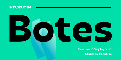 Botes is a modern semi-geo humanist sans serif font. With medium stroke, fun character with a bit of ligatures and alternates. To give you an extra creative work. Botes font support multilingual more than 100+ language. This font is good for logo design, Social media, Movie Titles, Books Titles, a short text even a long text letter and good for your secondary text font with script or serif. Make a stunning work with Botes font. Cheers, Maulana Creative
 - Kaolin Style by Sensatype Studio,
$15.00 Kaolin is a Fancy Retro Serif Font A New Fancy Retro font that we created special for Unique branding needs, . It's so nice to leverage designer or product owner that need solutions to make their design look more unique and vintage. Kaolin Modern Vintage Display font ready with: Lowercase and Uppercase characters Numbers and Punctuations Preview as a inspirations that you can do with Kaolin font Available for PC and Mac Wish you enjoy our font.
 - Times Eighteen by Linotype,
$29.00In 1931, The Times of London commissioned a new text type design from Stanley Morison and the Monotype Corporation, after Morison had written an article criticizing The Times for being badly printed and typographically behind the times. The new design was supervised by Stanley Morison and drawn by Victor Lardent, an artist from the advertising department of The Times. Morison used an older typeface, Plantin, as the basis for his design, but made revisions for legibility and economy of space (always important concerns for newspapers). As the old type used by the newspaper had been called Times Old Roman," Morison's revision became "Times New Roman." The Times of London debuted the new typeface in October 1932, and after one year the design was released for commercial sale. The Linotype version, called simply "Times," was optimized for line-casting technology, though the differences in the basic design are subtle. The typeface was very successful for the Times of London, which used a higher grade of newsprint than most newspapers. The better, whiter paper enhanced the new typeface's high degree of contrast and sharp serifs, and created a sparkling, modern look. In 1972, Walter Tracy designed Times Europa for The Times of London. This was a sturdier version, and it was needed to hold up to the newest demands of newspaper printing: faster presses and cheaper paper. In the United States, the Times font family has enjoyed popularity as a magazine and book type since the 1940s. Times continues to be very popular around the world because of its versatility and readability. And because it is a standard font on most computers and digital printers, it has become universally familiar as the office workhorse. Times™, Times™ Europa, and Times New Roman™ are sure bets for proposals, annual reports, office correspondence, magazines, and newspapers. Linotype offers many versions of this font: Times™ is the universal version of Times, used formerly as the matrices for the Linotype hot metal line-casting machines. The basic four weights of roman, italic, bold and bold italic are standard fonts on most printers. There are also small caps, Old style Figures, phonetic characters, and Central European characters. Times™ Ten is the version specially designed for smaller text (12 point and below); its characters are wider and the hairlines are a little stronger. Times Ten has many weights for Latin typography, as well as several weights for Central European, Cyrillic, and Greek typesetting. Times™ Eighteen is the headline version, ideal for point sizes of 18 and larger. The characters are subtly condensed and the hairlines are finer. Times™ Europa is the Walter Tracy re-design of 1972, its sturdier characters and open counterspaces maintain readability in rougher printing conditions. Times New Roman™ is the historic font version first drawn by Victor Lardent and Stanley Morison for the Monotype hot metal caster." - Times Europa LT by Linotype,
$29.99In 1931, The Times of London commissioned a new text type design from Stanley Morison and the Monotype Corporation, after Morison had written an article criticizing The Times for being badly printed and typographically behind the times. The new design was supervised by Stanley Morison and drawn by Victor Lardent, an artist from the advertising department of The Times. Morison used an older typeface, Plantin, as the basis for his design, but made revisions for legibility and economy of space (always important concerns for newspapers). As the old type used by the newspaper had been called Times Old Roman," Morison's revision became "Times New Roman." The Times of London debuted the new typeface in October 1932, and after one year the design was released for commercial sale. The Linotype version, called simply "Times," was optimized for line-casting technology, though the differences in the basic design are subtle. The typeface was very successful for the Times of London, which used a higher grade of newsprint than most newspapers. The better, whiter paper enhanced the new typeface's high degree of contrast and sharp serifs, and created a sparkling, modern look. In 1972, Walter Tracy designed Times Europa for The Times of London. This was a sturdier version, and it was needed to hold up to the newest demands of newspaper printing: faster presses and cheaper paper. In the United States, the Times font family has enjoyed popularity as a magazine and book type since the 1940s. Times continues to be very popular around the world because of its versatility and readability. And because it is a standard font on most computers and digital printers, it has become universally familiar as the office workhorse. Times™, Times™ Europa, and Times New Roman™ are sure bets for proposals, annual reports, office correspondence, magazines, and newspapers. Linotype offers many versions of this font: Times™ is the universal version of Times, used formerly as the matrices for the Linotype hot metal line-casting machines. The basic four weights of roman, italic, bold and bold italic are standard fonts on most printers. There are also small caps, Old style Figures, phonetic characters, and Central European characters. Times™ Ten is the version specially designed for smaller text (12 point and below); its characters are wider and the hairlines are a little stronger. Times Ten has many weights for Latin typography, as well as several weights for Central European, Cyrillic, and Greek typesetting. Times™ Eighteen is the headline version, ideal for point sizes of 18 and larger. The characters are subtly condensed and the hairlines are finer. Times™ Europa is the Walter Tracy re-design of 1972, its sturdier characters and open counterspaces maintain readability in rougher printing conditions. Times New Roman™ is the historic font version first drawn by Victor Lardent and Stanley Morison for the Monotype hot metal caster." - Times Ten by Linotype,
$40.99In 1931, The Times of London commissioned a new text type design from Stanley Morison and the Monotype Corporation, after Morison had written an article criticizing The Times for being badly printed and typographically behind the times. The new design was supervised by Stanley Morison and drawn by Victor Lardent, an artist from the advertising department of The Times. Morison used an older typeface, Plantin, as the basis for his design, but made revisions for legibility and economy of space (always important concerns for newspapers). As the old type used by the newspaper had been called Times Old Roman," Morison's revision became "Times New Roman." The Times of London debuted the new typeface in October 1932, and after one year the design was released for commercial sale. The Linotype version, called simply "Times," was optimized for line-casting technology, though the differences in the basic design are subtle. The typeface was very successful for the Times of London, which used a higher grade of newsprint than most newspapers. The better, whiter paper enhanced the new typeface's high degree of contrast and sharp serifs, and created a sparkling, modern look. In 1972, Walter Tracy designed Times Europa for The Times of London. This was a sturdier version, and it was needed to hold up to the newest demands of newspaper printing: faster presses and cheaper paper. In the United States, the Times font family has enjoyed popularity as a magazine and book type since the 1940s. Times continues to be very popular around the world because of its versatility and readability. And because it is a standard font on most computers and digital printers, it has become universally familiar as the office workhorse. Times™, Times™ Europa, and Times New Roman™ are sure bets for proposals, annual reports, office correspondence, magazines, and newspapers. Linotype offers many versions of this font: Times™ is the universal version of Times, used formerly as the matrices for the Linotype hot metal line-casting machines. The basic four weights of roman, italic, bold and bold italic are standard fonts on most printers. There are also small caps, Old style Figures, phonetic characters, and Central European characters. Times™ Ten is the version specially designed for smaller text (12 point and below); its characters are wider and the hairlines are a little stronger. Times Ten has many weights for Latin typography, as well as several weights for Central European, Cyrillic, and Greek typesetting. Times™ Eighteen is the headline version, ideal for point sizes of 18 and larger. The characters are subtly condensed and the hairlines are finer. Times™ Europa is the Walter Tracy re-design of 1972, its sturdier characters and open counterspaces maintain readability in rougher printing conditions. Times New Roman™ is the historic font version first drawn by Victor Lardent and Stanley Morison for the Monotype hot metal caster." - Times Ten Paneuropean by Linotype,
$92.99In 1931, The Times of London commissioned a new text type design from Stanley Morison and the Monotype Corporation, after Morison had written an article criticizing The Times for being badly printed and typographically behind the times. The new design was supervised by Stanley Morison and drawn by Victor Lardent, an artist from the advertising department of The Times. Morison used an older typeface, Plantin, as the basis for his design, but made revisions for legibility and economy of space (always important concerns for newspapers). As the old type used by the newspaper had been called Times Old Roman," Morison's revision became "Times New Roman." The Times of London debuted the new typeface in October 1932, and after one year the design was released for commercial sale. The Linotype version, called simply "Times," was optimized for line-casting technology, though the differences in the basic design are subtle. The typeface was very successful for the Times of London, which used a higher grade of newsprint than most newspapers. The better, whiter paper enhanced the new typeface's high degree of contrast and sharp serifs, and created a sparkling, modern look. In 1972, Walter Tracy designed Times Europa for The Times of London. This was a sturdier version, and it was needed to hold up to the newest demands of newspaper printing: faster presses and cheaper paper. In the United States, the Times font family has enjoyed popularity as a magazine and book type since the 1940s. Times continues to be very popular around the world because of its versatility and readability. And because it is a standard font on most computers and digital printers, it has become universally familiar as the office workhorse. Times™, Times™ Europa, and Times New Roman™ are sure bets for proposals, annual reports, office correspondence, magazines, and newspapers. Linotype offers many versions of this font: Times™ is the universal version of Times, used formerly as the matrices for the Linotype hot metal line-casting machines. The basic four weights of roman, italic, bold and bold italic are standard fonts on most printers. There are also small caps, Old style Figures, phonetic characters, and Central European characters. Times™ Ten is the version specially designed for smaller text (12 point and below); its characters are wider and the hairlines are a little stronger. Times Ten has many weights for Latin typography, as well as several weights for Central European, Cyrillic, and Greek typesetting. Times™ Eighteen is the headline version, ideal for point sizes of 18 and larger. The characters are subtly condensed and the hairlines are finer. Times™ Europa is the Walter Tracy re-design of 1972, its sturdier characters and open counterspaces maintain readability in rougher printing conditions. Times New Roman™ is the historic font version first drawn by Victor Lardent and Stanley Morison for the Monotype hot metal caster." - Times by Linotype,
$40.99In 1931, The Times of London commissioned a new text type design from Stanley Morison and the Monotype Corporation, after Morison had written an article criticizing The Times for being badly printed and typographically behind the times. The new design was supervised by Stanley Morison and drawn by Victor Lardent, an artist from the advertising department of The Times. Morison used an older typeface, Plantin, as the basis for his design, but made revisions for legibility and economy of space (always important concerns for newspapers). As the old type used by the newspaper had been called Times Old Roman," Morison's revision became "Times New Roman." The Times of London debuted the new typeface in October 1932, and after one year the design was released for commercial sale. The Linotype version, called simply "Times," was optimized for line-casting technology, though the differences in the basic design are subtle. The typeface was very successful for the Times of London, which used a higher grade of newsprint than most newspapers. The better, whiter paper enhanced the new typeface's high degree of contrast and sharp serifs, and created a sparkling, modern look. In 1972, Walter Tracy designed Times Europa for The Times of London. This was a sturdier version, and it was needed to hold up to the newest demands of newspaper printing: faster presses and cheaper paper. In the United States, the Times font family has enjoyed popularity as a magazine and book type since the 1940s. Times continues to be very popular around the world because of its versatility and readability. And because it is a standard font on most computers and digital printers, it has become universally familiar as the office workhorse. Times™, Times™ Europa, and Times New Roman™ are sure bets for proposals, annual reports, office correspondence, magazines, and newspapers. Linotype offers many versions of this font: Times™ is the universal version of Times, used formerly as the matrices for the Linotype hot metal line-casting machines. The basic four weights of roman, italic, bold and bold italic are standard fonts on most printers. There are also small caps, Old style Figures, phonetic characters, and Central European characters. Times™ Ten is the version specially designed for smaller text (12 point and below); its characters are wider and the hairlines are a little stronger. Times Ten has many weights for Latin typography, as well as several weights for Central European, Cyrillic, and Greek typesetting. Times™ Eighteen is the headline version, ideal for point sizes of 18 and larger. The characters are subtly condensed and the hairlines are finer. Times™ Europa is the Walter Tracy re-design of 1972, its sturdier characters and open counterspaces maintain readability in rougher printing conditions. Times New Roman™ is the historic font version first drawn by Victor Lardent and Stanley Morison for the Monotype hot metal caster." - Code Next by Fontfabric,
$39.00 10 years later, one of the first geometric typefaces in our portfolio and a popular favorite of yours is rising to a whole new level! We’re revealing the stand-alone type family Code Next—a staggering evolution from Code Pro in functionality, versatility, and application. The transformation includes 6 new weights, 10 new Italics, full support of Extended Cyrillic and Greek, full redesign and glyphs refinement, 2 variable fonts, to name but a few. Going back to 2011, the grotesque-inspired Code Pro was designed to complement memorable pieces that make a statement. Balancing between stylization and simplification, it was encoded with the distinct voice of basic organic shapes to stand the test of time. Little did we know, it would expand and live up to the potential of a “font from the future” as the new Code Next. Today, a type family of 22 styles, this geometric sans solidifies its relevance and carries a strong constructive aesthetic through simplified forms with a twist. These fit any modern design in print, web, and display visualization. Developed to go above and beyond, Code Next comes prepared for multi-script projects with Extended Latin, Extended Cyrillic, and Greek. Explore Code Next’s versatility and switch things up with the help of 2 variable fonts, more than 1280 glyphs, and an extensive OpenType features set including small caps, standard and discretionary ligatures, contextual and stylistic alternates, stylistic sets, case sensitive forms, and much more. Overview: • Font family of 22 fonts • 10 weights • Languages - Full support of Extended Latin; Extended Cyrillic; Greek • Entirely refined design and metrics • Glyph count - 1288 • Variable fonts - 2 fonts OpenType features: • Small Caps • Standard Ligatures • Discretionary Ligatures • Contextual Alternates • Stylistic Alternates • Stylistic Sets • Case-Sensitive Forms • Ordinals • Localized Forms • Lining Figures • Proportional Figures • Tabular Figures • Oldstyle Figures • Subscripts • Scientific Inferiors • Superscripts • Numerators and Denominators • Fractions • Roman figures • Extensive mathematical support • Navigation symbols
 - Miver by Sakha Design,
$12.00 Miver is a bold and thick lettered serif font. No matter the topic, this font will be an incredible asset to your fonts’ library, as it has the potential to elevate any creation.
 - Funny Toys by Letterafandi Studio,
$14.00 Funny Toys is a fun and bubble display font. No matter the topic, this font will be an incredible asset to your fonts’ library, as it has the potential to elevate any creation.
 - Avoda by Typefactory,
$14.00 Avoda is an elegant and modern sans serif font. No matter the topic, this font will be an incredibly asset to your fonts’ library, as it has the potential to elevate any creation.
 - Heavier by Creaditive Design,
$12.00 Heavier is a cool, bold and brushed display font. No matter the topic, this font will be an incredibly asset to your fonts library, as it has the potential to elevate strong creation.
 - Rich Monster by Letterafandi Studio,
$14.00 Rich Monster is a fun and casual display font. No matter the topic, this font will be an incredible asset to your fonts’ library, as it has the potential to elevate any creation.