8,119 search results
(0.009 seconds)
- ITC New Baskerville by ITC,
$34.99 ITC New Baskerville is one of many contemporary type families based on the work of John Baskerville (1706-1775), a writing master and printer from Birmingham, England, whose types were cut by the punchcutter John Handy. Baskerville produced a masterpiece folio Bible for Cambridge University, and today, his types are considered to be fine representations of eighteenth-century rationalism and neoclassicism. ITC New Baskerville is a late 20th-century interpretation of Baskerville’s style, designed by John Quaranda. It makes an excellent and very readable text face; its sharp, high-contrast forms make it suitable for elegant advertising settings as well. ITC New Baskerville® font field guide including best practices, font pairings and alternatives.
 - New Year Poster by FontaZY,
$10.00 This display font is perfect choice for the whole variety of New Year greeting cards, advertisements, posters and banners. It has alternative graphic symbols, that fills any word or line with holiday spirit.
 - Risthiya Brush (DEL) by Gatype,
$14.00 Risthiya Brush is textured brush font, contemporary approach to design, handmade natural with an irregular baseline. Suitable for use in title design. Such as apparel, invitations, books tittle, stationery design, quotes, branding, logos, greeting card, t-shirt, packaging design, poster and more. Risthiya Brush includes a complete set of uppercase and lowercase letters, as well as multi-language support, numbers, punctuation, ligatures. Thanks so much for looking and please let me know if you have any questions.
 - Neo Sans Paneuropean by Monotype,
$114.99The branding agency's client wanted an ultra modern"" typeface that was ""futuristic without being gimmicky or ephemeral,"" according to the design brief. Designer Sebastian Lester took on this intriguing custom font assignment, but soon, a bureaucratic decision cancelled the project. ""I was left with a sketchbook full of ideas and thought it would be a shame not to see what came of them,"" says Lester. He decided to finish the design on his own. Lester's research confirmed that the principal ingredient of an ""ultra modern"" typeface was simplicity of character structure: a carefully drawn, monoline form, open letter shapes and smooth, strong curves. To conceive a typeface that crossed the line from modern to futuristic, Lester decided to amplify these qualities. About a year after Lester's initial conceptual work, two highly functional and versatile typefaces emerged. These are Neo Sans and Neo Tech, designs Lester describes as ""legible without being neutral, nuanced without being fussy, and expressive without being distracting."" Both the Neo Sans and the more-minimalist Neo Tech families are available in six weights, ranging from Light to Ultra. Each has a companion italic, and Neo Tech offers a suite of alternate characters. While engineered to look modern as tomorrow, Neo Sans and Neo Tech display the functional and aesthetic excellence that earns them a place in the list of classic designs from the Monotype typeface library. - El Pececito - Personal use only

- El&Font - Unknown license

- el Diablo - Unknown license

- EL-Symbols - Unknown license

- El Guapo by A New Machine,
$19.00 El Guapo is a hand drawn font available in sans serif and script faces. It is suitable for headlines and call outs of all kinds where a hand made look is desired. The letters were drawn by Prissy Pots owner Erin Solomon and include regular and bold versions. Each face also includes an entirely separate set of lowercase letters accessible in your glyphs palette. These extra letter will automatically show up with contextual alternates turned on for a more natural, random look.
 - El Masterico by OKSHUtypeCO,
$14.00 El Maestro - a new fresh unique font. Very suitable for greeting cards, branding materials, business cards, quotes, posters, and more!This font are perfect for wedding postcard. Or you can create perfect and unique design of your logo, blog, stationery, marketing, magazines and more :) Multilingual OK!!!
 - NL Seasalt by Nicky Laatz,
$25.00 A breath of fresh air! Seasalt typeface was designed to emulate natural-looking handwritten notes. Opentype ligatures are included to make the typeface appear more realistic and last but not least, it includes a doodles font - arrows, scribbles and scrawls to help your designs pop! The typeface comes in three different variants to suit the look you are after : Upright, Regular and Slanted.
 - El Hombre by Chank,
$59.00El Hombre is a classic Chank Font from the earlier days of the internet. A consistent fan favorite since its initial release in 1999, this bouncey, blockey font has a sinsister charm and a sassy jaunt to it. It's now available on MyFonts for your personal or commercial use. ¡Muy guapo! - El Greco by Berthold,
$39.99 Günter Gerhard Lange designed El Greco for Berthold in 1964. This script dresses up informal documents and adds lightness to formal documents.
 - El Mariachi by IKIIKOWRK,
$17.00 Introducing El Mariachi - Libre Type, created by ikiiko. El Mariachi is a unique typeface inspired by a Mexican vibe. A simple, bold sans serif typeface combined with attractive ligatures gives this font a strong character. This font is perfect to create layout for vintage design, mexican brand product, movie poster, food packaging, fashion product, and another fun project to a have unique or vintage look. What's included? Uppercase & Lowercase Number & Punctuation Ligature Multilingual Support Get also a good offer & FREEBIE at our site : www.ikiiko.com Enjoy our font and if you have any questions, you can contact us by email : ikiikowrk@gmail.com
 - El Mayor by Typefactory,
$15.00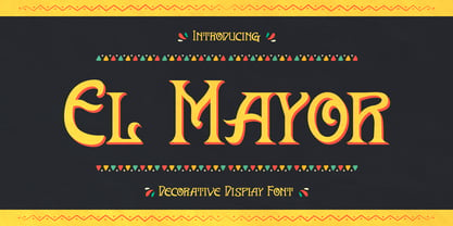 El Mayor is a decorative display font. The font has festival vibes. It will turn any design project into a stand out. El Mayor font is really great for a restaurant menu, business branding, clothing, quotes, headings, birthday invitations, posters, and many others.
 - El Franco by Fonthead Design,
$19.00El Franco is a family designed by Ethan Dunham that represents what Roman lettering looked like in the 16th century. Derived from a typographic sample of Francisco Lucas, 1577, this font captures the feeling of rustic times. It comes in two versions regular and distressed. The distressed version has been weathered to appear old and worn. - El Grosa by Fateh.Lab,
$15.00 El Grosa, this is an amazing work. Why? ... because this is not just talking about fonts, but more than that, with the spirit of Spain, el grosa invites you to explore with your wild ideas, I'm sure this will really make you feel happy in creating the work that you will wake up to the front. Supported by 3 font choices that are very sweet and also strong, el grosa answers all your difficulties in choosing font support that suits your taste. What are you waiting for, have el grosa as soon as possible. Bella Ciao !!
 - El Camio by Lord Typo,
$14.00 El Camio is a throwback display font paying homage to the classic automotive typography of the 50's and 60's. It is an extremely versatile display font that can be used for anything from branding, logo design, beer labels, shirt graphics, playful editorial spreads and much much more. BUY ME!
 - Mundbind NL by Hanoded,
$15.00 I just visited my good friend Jakob Fischer from Pizzadude.dk in Denmark. As always we talked fonts, drank coffee and walked endlessly through Copenhagen, the city where he lives. We thought it would be a fun idea to each create a font from a handmade sign we saw in the city. We only had like 7 glyphs to work with, so the rest was up to our imagination. We also thought it would be nice to give the fonts a similar name. Mundbind means mask in Danish. When you Google translate it, it will give you the wrong translation (it will say 'mouth piece'), so trust me on this one! My font is called Mundbind NL - where the NL stands for Netherlands. Jakob will hopefully call his finished font Mundbind DK - where the DK stands for Denmark. Mundbind NL comes with a monster load of diacritics (including Vietnamese) and two alternate glyphs for the lower case letters that will cycle as you type.
 - KG All Things New - Personal use only

- Old Dog, New Tricks - Unknown license

- SF New Republic SC - Unknown license

- Brave New Era G98 - Unknown license

- SF New Republic SC - Unknown license

- SF New Republic SC - Unknown license

- SF New Republic SC - Unknown license

- New Lincoln Gothic BT by Bitstream,
$50.99New Lincoln Gothic is an elegant sanserif, generous in width and x-height. There are twelve weights ranging from Hairline to UltraBold and an italic for each weight. At the stroke ends are gentle flares, and some of the round characters possess an interesting and distinctive asymmetry. The character set supports Central Europe, and there are three figure sets, extended fractions, superior and inferior numbers, and a few alternates, all accessible via OpenType features. Back in 1965, Thomas Lincoln had an idea for a new sanserif typeface, a homage of sorts, to ancient Roman artisans. The Trajan Column in Rome, erected in 113 AD, has an inscription that is considered to be the basis for western European lettering. Lincoln admired these beautiful letterforms and so, being inspired, he set out to design a new sanserif typeface based on the proportions and subtleties of the letters found in the Trajan Inscription. Lincoln accomplished what he set out to do by creating Lincoln Gothic. The typeface consisted only of capital letters. Lincoln intentionally omitted a lowercase to keep true his reference to the Trajan Inscription, which contains only magiscule specimens. The design won him the first Visual Graphics Corporation (VGC) National Typeface Competition in 1965. The legendary Herb Lubalin even used it to design a promotional poster! All this was back in the day when typositor film strips and photo type were all the rage in setting headlines. Fast forward now to the next millennium. Thomas Lincoln has had a long, illustrious career as a graphic designer. Still, he has one project that feels incomplete; Lincoln Gothic does not have a lowercase. It is the need to finish the design that drives Lincoln to resurrect his prize winning design and create its digital incarnation. Thus, New Lincoln Gothic was born. Lacking the original drawings, Lincoln had to locate some old typositor strips in order to get started. He had them scanned and imported the data into Freehand where he refined the shapes and sketched out a lowercase. He then imported that data into Fontographer, where he worked the glyphs again and refined the spacing, and started generating additional weights and italics. His enthusiasm went unchecked and he created 14 weights! It was about that time that Lincoln contacted Bitstream about publishing the family. Lincoln worked with Bitstream to narrow down the family (only to twelve weights), interpolate the various weights using three masters, and extend the character set to support CE and some alternate figure sets. Bitstream handled the hinting and all production details and built the final CFF OpenType fonts using FontLab Studio 5. - Stempel Sans Print Neo by TypoGraphicDesign,
$9.00 The typeface Stempel Sans Print Neo is designed from 2022 for the font foundry Typo Graphic Design by Manuel Viergutz. The display font based on a original set of 29 old rubber stamps (6 cm height). Digitized via hand-stamped, a scanner and Glyphs app. 3 font-styles (Rough, Misprint, Black) with 321 glyphs incl. decorative extras like icons, arrows, dingbats, emojis, symbols, geometric shapes (type the word #LOVE for ♥︎or #SMILE for ☻ as OpenType-Feature dlig) and stylistic alternates (6 stylistic sets). For use in logos, magazines, posters, advertisement plus as webfont for decorative headlines. The font works best for display size. Have fun with this font & use the DEMO-FONT (with reduced glyph-set) FOR FREE! Font Specifications ■ Font Name: Stempel Sans Print Neo ■ Font Styles: 3 font styles (Rough, Misprint, Black) + DEMO (with reduced glyph-set) ■ Font Category: Display Script for headline size ■ Glyph Set: 321 glyphs (incl. decorative extras) ■ Language Support (36 languages): Asu Bemba Bena Chiga Cornish English German Gusii Indonesian Kalenjin Kinyarwanda Luo Luyia Machame Makhuwa-Meetto Makonde Morisyen North Ndebele Nyankole Oromo Rombo Rundi Rwa Samburu Sangu Shambala Shona Soga Somali Swahili Swiss German Taita Teso Uzbek (Latin) Vunjo Zulu ■ OpenType features (16): aalt calt case ccmp dlig liga lnum onum ss01 ss02 ss03 ss04 ss05 ss06 mark mkmk ■ Design Date: 2022 ■ Type Designer: Manuel Viergutz
 - Happy New Year Party by Putracetol,
$26.00 Happy Ney Year Party is a playful and quirky display font. I made this font especially for New Year and holidays. This font has 8 decoration versions : regular, firework, splash, ribbon, star, trumpet. These decorations are related to New Year decorations, making this font the perfect fit for any new year or holiday themed activity / project. Happy Ney Year Party perfect for crafter, gift, tshirt, card event, anniversary, birthday,greeting cards, logotype, branding, poster, packaging, stationery, website, and any other projects requiring a handwritten and luxurious touch. This font is also support multi language.
 - New Yorker Type Pro by Wiescher Design,
$45.00 New-Yorker-Type was one of the first typefaces I tried my hand at in 1985. I meant it as a revival of the typeface used by the New Yorker magazine. I did not scan it. I just looked at the type and redrew it completely by hand. Only much later did I come to know, that there is a bundle of similar typefaces of that period. Rea Irvin's design for New-Yorker magazine was just one of them, maybe the best. In the next step I repaired some of the mistakes that I made more than thirty years ago. Now on the eve of 2020 I gave the font a complete overhaul and added a set of Swash Initials, Cyrillic and Greek glyphs and many ligatures. The font now has 1075 glyphs and is all set for most latin writing systems. On top of that I made two versions, a Classic one with rounded corners and a pointed Pro version for a more up-to-date look. Take your pick. Yours sincerely, honoring Rea Irvin a great type- and magazine-designer, Gert Wiescher
 - Nela neta script 1 by Sulthan Studio,
$5.00 Nela neta -Nela neta script font, new, fresh, funny, attractive, with a heart to connect. This font has 3 styles in it. Perfect for greeting cards, branding materials, business cards, quotes, posters, and more! Nela neta - includes many alternative characters. Coded with Unicode PUA, which allows full access to all additional characters without having any special design software. Mac users can use Font Book. Windows users can use the Character Map to view and copy any of the additional characters to paste into your favorite text editor. For people who have opentype-capable software: Alternatives can be accessed by activating the "Alternative Styles" and "Ligatures" buttons on Photoshop's Character panel, or via any software with a glyph panel, eg. Adobe Illustrator, Photoshop CC, Inkscape.
 - New Thin Roman JNL by Jeff Levine,
$29.00 The 1912 publication "Essentials of Lettering" has an example of a hand lettered, condensed spurred serif design called "Compressed Roman". This is now available digitally as New Thin Roman JNL in both regular and oblique versions.
 - Bandiera Del Legno NF by Nick's Fonts,
$10.00 This typeface appeared in the William H. Page Woodtype specimen book as Gothic Tuscan Condensed Reversed—quite a mouthful. Banner elements appear in the brace and bracket positions, and reversed spaces can be found in the underscore and bar positions. Both versions of this font support the Latin 1252, Central European 1250, Turkish 1254 and Baltic 1257 codepages.
 - Times New Roman Seven by Monotype,
$67.99In 1931, The Times of London commissioned a new text type design from Stanley Morison and the Monotype Corporation, after Morison had written an article criticizing The Times for being badly printed and typographically behind the times. The new design was supervised by Stanley Morison and drawn by Victor Lardent, an artist from the advertising department of The Times. Morison used an older typeface, Plantin, as the basis for his design, but made revisions for legibility and economy of space (always important concerns for newspapers). As the old type used by the newspaper had been called Times Old Roman," Morison's revision became "Times New Roman." The Times of London debuted the new typeface in October 1932, and after one year the design was released for commercial sale. The Linotype version, called simply "Times," was optimized for line-casting technology, though the differences in the basic design are subtle. The typeface was very successful for the Times of London, which used a higher grade of newsprint than most newspapers. The better, whiter paper enhanced the new typeface's high degree of contrast and sharp serifs, and created a sparkling, modern look. In 1972, Walter Tracy designed Times Europa for The Times of London. This was a sturdier version, and it was needed to hold up to the newest demands of newspaper printing: faster presses and cheaper paper. In the United States, the Times font family has enjoyed popularity as a magazine and book type since the 1940s. Times continues to be very popular around the world because of its versatility and readability. And because it is a standard font on most computers and digital printers, it has become universally familiar as the office workhorse. Times?, Times? Europa, and Times New Roman? are sure bets for proposals, annual reports, office correspondence, magazines, and newspapers. Linotype offers many versions of this font: Times? is the universal version of Times, used formerly as the matrices for the Linotype hot metal line-casting machines. The basic four weights of roman, italic, bold and bold italic are standard fonts on most printers. There are also small caps, Old style Figures, phonetic characters, and Central European characters. Times? Ten is the version specially designed for smaller text (12 point and below); its characters are wider and the hairlines are a little stronger. Times Ten has many weights for Latin typography, as well as several weights for Central European, Cyrillic, and Greek typesetting. Times? Eighteen is the headline version, ideal for point sizes of 18 and larger. The characters are subtly condensed and the hairlines are finer." - New Car Tag JNL by Jeff Levine,
$29.00 Around 2018 or 2019, the State of Florida introduced new letter and number characters on its auto plates. Inspired by this change, Jeff Levine Fonts offers up a digital version of this lettering named New Car Tag JNL, which is available in both regular and oblique versions (for those who want a more sporty look). Some people prefer a rounded 'zero' to differentiate between the regular zero and the letter 'O'. You can find this alternate character located on both the solid bar and broken bar glyphs.
 - New Century Schoolbook LT by Linotype,
$29.99Under the commission of the American Century Magazine"", Linn Boyd Benton designed a new text typeface in 1894 with a design typical of the Neorenaissance movement in typography. Morris Fuller Benton produced various interpretations of this font for American Typefounders and the companies Linotype, Intertype and Monotype quickly took up the typeface. New Century Schoolbook font is a very legible font, fairly narrow and with relatively little stroke contrast. This font is from Morris F. Benton and appeared in 1915. - Iwata News Mincho Std by IWATA,
$199.00 数多くの新聞社で使われてきた伝統ある「岩田新聞明朝体」を再現した「イワタ新聞明朝体」と、かなを現代風にアレンジした「イワタ新聞明朝体新がな」があります。
 - Mic 32 New Stencil by moretype,
$25.00 Mic 32 New Stencil is the third variation of the popular Moretype family Mic 32 New. This stencil version provides an industrial flavour to the futuristic rounded geometry of Mic 32 New. Mic 32 New Stencil still has all the normal Opentype features including small caps, tabular, proportional and old style numerals and ligatures.
 - Iwata News Gothic Pro by IWATA,
$309.00
- Late Breaking News JNL by Jeff Levine,
$29.00 Re-drawn from a screen capture of a vintage newspaper front page, Late Breaking News JNL is a traditional sans serif that's perfect for headlines, titling and other forms of announcements.


