10,000 search results
(0.17 seconds)
- Rotis Sans Serif by Monotype,
$45.99 Rotis is a comprehensive family group with Sans Serif, Semi Sans, Serif, and Semi Serif styles, for a total of 17 weights including italics. The four families have similar weights, heights and proportions; though the Sans is primarily monotone, the Semi Sans has swelling strokes, the Semi Serif has just a few serifs, and the Serif has serifs and strokes with mostly vertical axes. Designed by Otl Aicher for Agfa in 1989, Rotis has become something of a European zeitgeist. This highly rationalized yet intriguing type is seen everywhere, from book text to billboards. The blending of sans with serif was almost revolutionary when Aicher first started working on the idea. Traditionalists felt that discarding serifs from some forms and giving unusual curves and edges to others might be something new, but not something better. But Rotis was based on those principles, and has proven itself not only highly legible, but also remarkably successful on a wide scale. Rotis is easily identifiable in all its styles by the cap C and lowercase c and e: note the hooked tops, serifless bottoms, and underslung body curves. Aicher is a long-time teacher of design and has many years of practical experience as a graphic designer. He named Rotis after the small village in southern German where he lives. Rotis is suitable for just about any use: book text, documentation, business reports, business correspondence, magazines, newspapers, posters, advertisements, multimedia, and corporate design.
 - Linotype Aroma by Linotype,
$29.99From the designer, Tim Ahrens... I started designing this typeface about half a year after learning that Frutiger was not a new brand of sweets and that Garamond is not the name of a fragrance. In time it became clear that designing a sans serif must always be considered as a transformation of traditional serifed typefaces instead of deriving it from typefaces that have been derived from others which have been derived from others again. I did not want Aroma to be one of those odourless and tasteless typefaces wich sacrifice a natural feeling and the characteristic shapes of the letters to neutrality. I think that beauty often evolves unintentionally. For example, I am fascinated by the beauty of airfoils, which are actually a careful transformation of a bird's wing. I love their anorganic and abstract shape which still bears the essence and all the complexity of what they are modelled on. This is exactly the formal concept behind Aroma. Many of the outlines are actually parabolics. The small r, for example, consists exclusively of straight lines and parabolics. I decided to give Aroma more stroke contrast than it is usual for sans serif designs. Many strokes are slightly convex, which gives the font an anorganic feeling. The font was intended to have a feel similar to the antiqua. More specifically, it is based on Old Style Faces. The character of those fonts, which were cut during the Renaissance, is still inherent to Aroma. - Lincoln Electric by Canada Type,
$30.00 Lincoln Electric started its life as an in-house experimental film type Thomas Lincoln drew shortly after concluding his work as part of Herb Lubalin’s famed crew in the late 1960s,. The master alphabet was drawn on illustration boards using pen and ink and press-type lines. The typeface was initially made for use in the branding and promotional material of Lincoln’s new design outfit. This alphabet’s forms are a spin on Bifur, the all-cap deco face designed by Adolphe Mouron (known as Cassandre) in 1929, and published by the Deberny & Peignot foundry in France. Lincoln Electric evolves Cassandre’s idea further by constructing new shapes more in line with minimalist principles rather than art deco geometry — something clearly evident in Lincoln’s minuscules, which exhibit a clear connection to Bauhaus ideas More than 50 years after the typeface’s design, Thomas Lincoln found the original film alphabet tucked away in his archives and brought it over to Canada Type for digital retooling. The result is a modern and thoroughly elaborate set of fonts that belonging prominently in a 21st century designer’s toolbox. The following features are included in Lincoln Electric: • Three fonts for chromatic layering. • More than 1900 glyphs in each font. • Expanded Latin and Cyrillic character sets. • Small caps and Caps-to-small-caps. • Six different sets of stylistic alternates. • Ordinals and case-sensitive forms. For a showing of the stylistic set variations and a sample of demonstration of chromatic layering, please consult this PDF.
 - Golden Clouds by Anastasia Kuznetsova,
$22.00 Say hello to Golden Clouds :) A charming and cute font duo with handwritten letters and doodles!! Bring some irresistible fun to your design with Golden Clouds Font Duo! This playful font duo consists of a fast-flowing signature font and a charming font with small capital letters as the perfect companion. But that's not all - the set also includes a bonus Doodle font containing hand-drawn drawings designed to give your "Golden Clouds" fonts the appeal of handmade. Golden Clouds Script • A clean, smooth handwritten signature font containing uppercase and lowercase characters, numbers and a wide range of punctuation marks. Golden Clouds SmallCaps • Clean, charming handwritten font with capital letters. Golden Clouds Doodles • A set of hand-drawn drawings designed in combination with Script and Small Caps fonts. Just set it as your own font and enter any character to create each drawing. "Golden Clouds" is ideal for everyday use in greeting cards, illustrations, quotes, original branding, book covers, children's books, packaging and much more :) Font Features: A-Z; a-z character set; 1 language (English); numbers and punctuation marks, symbols. Fonts can be opened and used in any software that can read standard fonts, even in MS Word. No special software is required to get started. It is recommended to use it in Adobe Illustrator or Adobe Photoshop. Made with love and magic ♡ Thank you for reading it, and do not hesitate to send me a message if you have any questions! ~ Anastasia
 - Patihan Variable by Jehoo Creative,
$119.00 Introducing Patihan Variable, a variant that makes it easy for you to access fonts with sharp, strong, bold characters. Patihan Variable is a combination of three different styles – Sans, Slab, and Serif – which are united into 2 Axes weight axes and serif axes, where weight axes have instances: Thin, Extra Light, Light, Regular, Medium, Semibold, Bold , Extrabold, and Black. This font has beautiful Ligature and Stylistic Alternate settings, Patihan font is also equipped with the Smallcaps feature which gives more control over typography, allowing you to create elegant and unique typography. The sans version of this typeface is versatile and easy to read, with a minimalist but impactful aesthetic. The Slab version is characterized by its solid and powerful strokes, while the Serif style has that extra classic flair with elegant curves and a stark contrast to the look. Patihan Variable is optimized to make it easier to access each variation, all you have to do is slide the slide in the software, and then you can access the style you want. Without sacrificing easy readability, this makes it a great choice for headlines, titles, and any long-form content. Ligature settings and discretionary styling add an extra layer of sophistication, making this font a great choice for magazines, branding and advertising. Overall, this font is a great choice for those looking to make a lasting impression. Its versatility, readability and unique features make it an excellent choice for any project.
 - Stabia by Eurotypo,
$29.00 Stabia is a multi-purpose typeface with large wedge-angular serifs. It is delicate and highly readable at very small sizes but reveals all its strength and personality when used at big sizes. The contrast of the sharped serifs provides a fresh and very contemporary look. The family has 5 weights, ranging from Light to Black (including italics) and is ideally suited for advertising and packaging, book text, editorial and publishing, logo and branding, small text as well as web and epub. Stabia provides advanced typographical support with features such as ligatures, small capitals, alternate characters, case-sensitive forms, fractions, and super- and subscript characters. It comes with a complete range of figure set options – oldstyle and lining figures, each in tabular and proportional widths. As well as Latin-based, the typeface family also supports Central European languages. Stabiae was an ancient Roman town, located close to the modern town of Castellammare di Stabia approximately 4.5 km southwest of Pompeii. According to the account written by his nephew, Pliny the Elder was at the other side of the bay in Misenum when the Mount Vesuvius eruption started. He travelled by galley ship across the bay, partly to observe the eruption more closely, and partly to rescue people from the coast near the volcano. Pliny died at Stabiae the following day, probably during the arrival of the sixth and largest pyroclastic surge of the eruption caused by the collapse of the eruption plume.
 - Salad by Zetafonts,
$39.00 The island of Fuerteventura is more known for its white sand beaches and windsurf-friendly constant winds than for its typographic marvels. Still, it's on the walls of a ballroom next to its white-sand beaches that Debora Manetti found the hand-painted letterforms that she took as inspiration for her typeface Sala de Fiestas. The resulting font was a condensed sans serif full of curious details and a jumpy latino vibe that many years after still keeps its freshness and vernacular charme. Francesco Canovaro took the original typeface as a starting point for a grand tour into sign-painter aesthetics, developing a reboot of the original into a new type family: Salad. While being faithful to the original proportions and feeling, Salad provides extreme versatility through its five-weights range, its extended charset and its set of Open Type features including stylistic sets, alternates, positional numerals, small capitals and case sensitive forms. While the roman family with its italic counterpart provide a good workhorse tool for informal branding, packaging and editorial projects, the interlocking and the inline weights add additional possibilities for display purposes. This is enriched by the inclusion in the typeface of a set hand-drawn decorative dingbats that further complement the sign painting vibe of the family. All Zetafonts expertise in handmade lettering, typographic design and water sports has been put to test to assure Salad is the best typographical alternative to a a trip to Canary Islands!
 - Mi Negra by Letritas,
$25.00 Mi negra is a funny and hilarious typography designed especially for children, thought and created by Isabel de Gregorio. It could be described as an original combination between a semi-handwright and semi sans-serif font. Thanks to its structure and nice endings "Mi Negra" is recommended for composing short texts (logotypes, packing, posters, etc.). It may similarly be used for illustrations and comics, as well as in printing press works for children from 6 to 13 years old for instance. Mi Negra has been conceived to be a useful support in all kinds of illustrations works (please note that Isabel, the type designer, considers herself primarily an illustrator). The font designer of Mi Negra tells that every time she needed to provide some text data (i.e. in children infographies) and needed to make them more understandable and suitable for children, she used this typography. The former idea was than to create a font who could be a second option to comic sans, but as the project started to reveal its forms, it was clear that it was revealing another connotation and its own character. In this way, Mi Negra went on modifying its forms and the more it developed, the more it was showing its new characteristics and concepts. The family is composed of three weighs: Light, regular and black. It provides also interesting functional ligatures. It also includes a dingbat with nice doggies. It has 434 characters and can work with 208 languages.
 - Planetype by CozyFonts,
$20.00 The Planetype Font Family is Modern. It has 6 Font Styles: X-Light, Light, Medium, Inline, Bold, & X-Bold. Each style has a consistent weight with a square serif of equal weight to its vertical and horizontal strokes. Planetype™ for short or Planet-Type font styles all have extremely clean edges and are sharply defined. There is a standard kerning applied, however evenly letter-spacing these family members give a distinct personality and continues to command the negative space just as in tight kerned examples. The compatible relationship of these font family members, weight to weight, and X-Light to X-Bold is seamless and the overall design coloring of words and sentences is well balanced and extremely legible. The Planetype Family fonts are matching members glyph to glyph. This family works in modern, contemporary and vintage settings. The Planetype Medium matches the outer weight of Planetype Inline. Their are several unique Glyphs that set the character of this family, such as: Caps B, M, Q, R, X and Lower Case a, e, k, r, z to begin with. The numerals and dingbats also have several unique glyphs that flow with the family Style in every matching weight. These characteristics lend well in designing logos, brands, and even monograms. Starting with Planetype X-Light the designer has a command of the clean lines yet expressing Modernism and a touch of Architectural structure. Planetype Medium & Planetype Inline are a dynamic duo giving a positive/negative readability.
 - Fundstueck by Ingo,
$12.00 Inspired by a find a coarse but decorative font was created. "Fundstueck" ist the German term for it. Fonts can be so simple. That is what I was thinking as my attention was turned to this rusty piece of metal. Only a few centimeters in size, I couldn’t imagine which purpose it might truly serve. But my eyes also saw an E, even a well-proportioned E: a width to height ratio of approximately 2/3, black and fine strokes with a 1/2 proportion — could I create more characters on this basis? Thought it, did it. The form is based on a 5mm unit. The strikingly thick middle stroke of E suggests that the emphasis is not necessarily placed on the typical stroke, and likewise with the other characters. But if the font is going to be somewhat legible, then you cannot leave out slanted strokes completely. Eventually I found enough varying solutions for all letters of the alphabet and figures. A font designed in this way doesn’t really have to be extremely legible, which is why I forwent creating lower case letters. Nevertheless, Fundstueck still contains some diverse forms in the layout of upper and lower case letters. Thus, the typeface is a bit richer in variety. By the way — the “lower” letters with accents and umlauts stay between the baseline and cap height. And with that, you get wonderful ribbon-type lines.
 - Sheepman by Dharma Type,
$19.99 Sheepman inspired by and based on retro William Page’s No.506 typeface which is popular wooden type fonts of the 19th century. To make soft and natural impressions, the original polygonal design was changed to rounded design. All glyphs had been designed carefully to be retro-looking of the old time and to fill all with nostalgia. This modern wood type includes 3 weights and their matching slanted style and all style have sprayed ends(beginning) alternates for F, H, L, M, N, P, U, f, h, j, m, n, p, q, and u which can be accessed by using OpenType Stylistic alternates or swash alts. Sheepman will be the best solution for posters, titles and anywhere you need vintage lettering.
 - Soul Drifter by Ana's Fonts,
$15.00 Soul Drifter is a handwritten font collection of 6 fonts that were designed to go together nicely. All six fonts were drawn using the same brush pen, so that their weight and design are consistent, and you can mix and match them easily. Soul Drifter includes: - a brush script font in regular and slant versions, with over 100 ligatures - a matching set of swashes to ornament your texts and designs - a cute sans font in two weights, regular and bold (true bold, drawn separately) - a tall serif font in all caps, with two sets of caps All you need for beautiful and easy designs with a hand-lettered feel, such as postcards and notes, creating logotypes, social media posts, branding and packaging, etc.
 - Somersault by Fontforecast,
$15.00 Somersault is a nonchalant, rough edged, hand painted, brush font, with a spontaneous personality. With its natural charm it brings cheer and lightness to any design. Alternate characters for upper and lowercase letters and lots of ligatures enable you to avoid repetition of identical glyphs.They are managed by Opentype features such as stylistic alternates, swashes and discretionary ligatures. Somersault also comes with some fun extra's like strokes, hearts and splatters to play with. Somersault is PUA encoded, so no special design software is needed to access all glyphs. You can easily access all of them in Fontbook (Mac) or Character map (Windows). Somersault is paired with Somersault Tall, a complementary all caps font. The result is a versatile font duo. A perfect match.
 - House Of Cards by Dharma Type,
$19.99 House of Cards is inspired by and based on retro Hamilton’s Teniers typeface which is popular wooden type fonts of the 19th century. To make natural and contemporary impressions, the original lowercase design was slightly changed from the original but all glyphs had been designed carefully to be retro-looking of the old time and to fill all with nostalgia. This modern wood type includes 2 weights and their matching italic style and all style have sprayed ends(beginning) alternates for F, H, P, U, f, h, m, n, t, u, and w which can be accessed by using OpenType Stylistic alternates or swash alts. House of Cards will be the best solution for posters, titles and anywhere you need vintage lettering.
 - Rainier by Kimmy Design,
$10.00 I was inspired to create the Rainier type family during my summer back home in the Pacific Northwest. The concept behind it may be simple - a hand crafted font family - but what it delivers is quite complex! Here is a breakdown of everything you get: FONT FAMILIES: Two sub-families with unique styles - Rainier North and Rainier West WEIGHTS: 4 weights per family, broken down numerically - 100 (light), 300 (regular), 500 (bold), 700 (black) OPENTYPE: In each family, there are tons of OpenType options, offering lots of customizable opportunities (in order to access all these goodies, you must be using Illustrator, Photoshop, Indesign or Publisher). Because Rainier is 100% handmade, contextual alternatives allow each letter has three subtle variations, this way it keeps that authentic hand-drawn look. Additionally, a full alphabet with special descending swashes, as well as start and end swashes for capitals and small caps. Titling alternatives offer a full character set just to help with readability! Meant for captions or smaller text, these letterforms are easy on the eye and a great complement to the regular alphabet. Stylistic Alternatives add a little fun, providing a unified cap height, no matter what case you are using (all caps, small caps or lowercase.) Discretionary Ligatures are created only for capitals, and takes specific letter pairs and creates a unique ligature between them To get a better understanding of everything, please check out the quicker user guide (http://bit.ly/1W0Bfma) and print if you so desire (http://bit.ly/23W9ZV6) that helps you navigate your way around and get the most out of Rainier! Unfortunately those links aren't working right now and soon I will have them fixed. So sorry! ORNAMENTS: In addition to the font, you get a set of awesomely rustic ornaments designed and drawn to go specifically with Rainier! - Rustic Northwest Illustrations - Banners & Flags - Frames - Flourishes - Lines & Line Breaks - Arrows There are a lot of extras packed in this set, so make sure you check out the Ornaments User Guide to get the most out of it! Check it out here: http://bit.ly/1rRVJRx And that’s all folks! Hope you enjoy Rainier!
 - Postulat Pro by ParaType,
$40.00 Postulat Pro is a contemporary slab serif typeface. The family contains 16 fonts: 8 romans with matching italics, from Hairline to Bold. The character set include contains more than 2100 glyphs which support most Latin and Cyrillic languages including Vietnamese, Greek, as well as small caps, stylistic and local alternates, and many other useful characters. The font uses a combination of smooth and extremely simple straight shapes. The author abandoned the use of teardrop-shaped classical elements, replacing them with straight ones, which makes Postulat Pro more dynamic and modern. These unique features give the font a unique personality. Postulat Pro is the perfect choice for headlines, logos, branding, packaging, publications and websites. The typeface was designed 2021 by Alexey Chekulaev.
 - Auristela Script by Shape Studio,
$12.00 Auristela is a new modern script calligraphy font with an irregular baseline. Auristela Script looks lovely on wedding invitations, thank you cards, quotes, greeting cards, logos, business cards and more. Perfect for using in ink or watercolour. Including initial and terminal letters, alternates, ligatures and multiple language support. To enable the OpenType Stylistic alternates, you need a program that supports OpenType features such as Adobe Illustrator CS, Adobe Indesign & CorelDraw X6-X7, Microsoft Word 2010 or later versions. There are additional ways to access alternates/swashes, using Character Map (Windows), Nexus Font (Windows), Font Book (Mac) or a software program such as PopChar (for Windows and Mac).Thanks so much for looking and please let me know if you have any questions
 - Caitlin Script by Shape Studio,
$12.00 Caitlin is a new modern script font with an irregular baseline. Caitlin Script looks lovely on wedding invitations, thank you cards, quotes, greeting cards, logos, business cards and more. Perfect for using in ink or watercolour. It includes initial and terminal letters, alternates, ligatures and multiple language support. To enable the OpenType Stylistic alternates, you need a program that supports OpenType features such as Adobe Illustrator CS, Adobe Indesign & CorelDraw X6-X7, Microsoft Word 2010 or later versions. There are additional ways to access alternates/swashes, using Character Map (Windows), Nexus Font (Windows), Font Book (Mac) or a software program such as PopChar (for Windows and Mac).Thanks so much for looking and please let me know if you have any questions.
 - Maylafaisha Script by Shape Studio,
$12.00 Maylafaisha is a new modern script calligraphy font with an irregular baseline. Maylafaisha looks lovely on wedding invitations, thank you cards, quotes, greeting cards, logos, business cards and more. Perfect for using in ink or watercolour. Including initial and terminal letters, alternates, ligatures and multiple language support. To enable the OpenType Stylistic alternates, you need a program that supports OpenType features such as Adobe Illustrator CS, Adobe Indesign & CorelDraw X6-X7, Microsoft Word 2010 or later versions. There are additional ways to access alternates/swashes, using Character Map (Windows), Nexus Font (Windows), Font Book (Mac) or a software program such as PopChar (for Windows and Mac).Thanks so much for looking and please let me know if you have any questions
 - Supria Sans by HVD Fonts,
$50.00 Supria Sans™ and Supria Sans Condensed is an extended family of 36 fonts designed by Hannes von Döhren. It contains two widths, six weights and three styles, including the curvy, feminine Italic as well as the more conventional Oblique. Although it is inspired by the utilitarian clarity of Swiss type design, subtle curves and fine detailing impart a more playful character to the whole Supria Sans family. Supria Sans™ is equipped for complex, professional typography. As an exclusively OpenType release, these fonts feature small caps, five variations of numerals, arrows and an extended character set to support Central and Eastern European as well as Western European languages. Supria Sans™ received the “Certificate of Excellence in Type Design” at the TDC2 (2011).
 - Kristalena Script by Shape Studio,
$12.00 Kristalena Script is a new modern calligraphy font with an irregular baseline. Being trendy and feminine, Kristalena Script will look lovely on wedding invitations, thank you cards, quotes, greeting cards, logos, business cards and more. Perfect for using in ink or watercolor. Including initial and terminal letters, alternates, ligatures and multiple language support. To enable the OpenType Stylistic alternates, you need a program that supports OpenType features such as Adobe Illustrator CS, Adobe Indesign & CorelDraw X6-X7, Microsoft Word 2010 or later versions. There are additional ways to access alternates/swashes, using Character Map (Windows), Nexus Font (Windows), Font Book (Mac) or a software program such as PopChar (for Windows and Mac). Thanks so much for looking and please let me know if you have any questions.
 - Banafsha Script by Shape Studio,
$12.00 Banafsha is a new modern script calligraphy font with an irregular baseline. Banafsha looks lovely on wedding invitations, thank you cards, quotes, greeting cards, logos, business cards and more. Perfect for using in ink or watercolour. Including initial and terminal letters, alternates, ligatures and multiple language support. To enable the OpenType Stylistic alternates, you need a program that supports OpenType features such as Adobe Illustrator CS, Adobe Indesign & CorelDraw X6-X7, Microsoft Word 2010 or later versions. There are additional ways to access alternates/swashes, using Character Map (Windows), Nexus Font (Windows), Font Book (Mac) or a software program such as PopChar (for Windows and Mac).Thanks so much for looking and please let me know if you have any questions.
 - LiebeKitty by LiebeFonts,
$19.90 Do you like cats? We love them! Cats do so many crazy things, we thought it was time to design a font for cat lovers and their cat-loving friends. LiebeKitty is just right for greeting cards, birthday invitations and to add pretty details to your photo album. We have spent much time on cat-watching research and included over 50 cats and kittens for a wide range of creative applications. Happy cats, mad cats, bad cats, hungry cats, egyptian walk cats, and more. Plus‚ cats love fish, just like we do. Check out LiebeFish, one of our other popular fonts. And if you're looking for a typeface that perfectly fits the hand-drawn looks of LiebeKitty, check out LiebeErika, #1 Hot New Font in October 2010!
 - Miskiani Script by Shape Studio,
$10.00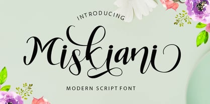 Miskiani is a new modern script calligraphy font with an irregular baseline. Miskiani Script looks lovely on wedding invitations, thank you cards, quotes, greeting cards, logos, business cards and more. Perfect for using in ink or watercolour. Including initial and terminal letters, alternates, ligatures and multiple language support. To enable the OpenType Stylistic alternates, you need a program that supports OpenType features such as Adobe Illustrator CS, Adobe Indesign & CorelDraw X6-X7, Microsoft Word 2010 or later versions. There are additional ways to access alternates/swashes, using Character Map (Windows), Nexus Font (Windows), Font Book (Mac) or a software program such as PopChar (for Windows and Mac).Thanks so much for looking and please let me know if you have any questions.
 - FF Signa Stencil by FontFont,
$68.99 Danish type designer Ole Søndergaard created this display FontFont in 2011. The family contains 3 weights: Book, Bold, and Black and is ideally suited for advertising and packaging, film and tv as well as music and nightlife. FF Signa Stencil provides advanced typographical support with features such as ligatures, alternate characters, case-sensitive forms, fractions, super- and subscript characters, and stylistic alternates. It comes with a complete range of figure set options – oldstyle and lining figures, each in tabular and proportional widths. As well as Latin-based languages, the typeface family also supports the Cyrillic writing system. This FontFont is a member of the FF Signa super family, which also includes FF Signa, FF Signa Correspondence, FF Signa Serif, and FF Signa Serif Stencil.
 - FF Signa Correspondence by FontFont,
$68.99 Danish type designer Ole Søndergaard created this sans FontFont in 2002. The family contains 4 weights: Regular, Italic, Bold, and Bold Italic and is ideally suited for logo, branding and creative industries and small text. FF Signa Correspondence provides advanced typographical support with features such as ligatures, alternate characters, case-sensitive forms, fractions, super- and subscript characters, and stylistic alternates. It comes with a complete range of figure set options – oldstyle and lining figures, each in tabular and proportional widths. As well as Latin-based languages, the typeface family also supports the Cyrillic writing system. This FontFont is a member of the FF Signa super family, which also includes FF Signa, FF Signa Serif, FF Signa Serif Stencil, and FF Signa Stencil.
 - FF Tisa by FontFont,
$68.99 Slovenian type designer Mitja Miklav?i? created this serif FontFont between 2008 and 2010. The family has 14 weights, ranging from Thin to Black (including italics) and is ideally suited for advertising and packaging, book text, editorial and publishing, logo, branding and creative industries, poster and billboards, small text as well as web and screen design. FF Tisa provides advanced typographical support with features such as ligatures, small capitals, alternate characters, case-sensitive forms, fractions, and super- and subscript characters. It comes with a complete range of figure set options – oldstyle and lining figures, each in tabular and proportional widths. In 2007, FF Tisa received the TDC2 award. This FontFont is a member of the FF Tisa super family, which also includes FF Tisa Sans.
 - Magentha by Amelia Studio,
$12.00 Magentha is a modern calligraphy font with a dancing baseline and a clean, classic and elegant touch. It can be used for various purposes such as headings, signature, logos, wedding invitations, t-shirt, letterhead, signage, lable, news, posters, badges etc.Magentha features 350 total glyphs with 150 alternate characters including OpenType Stylistic alternates, ligatures and international language support. To enable the OpenType Stylistic alternates, you need a program that supports OpenType features such as Adobe Illustrator CS, Adobe Photoshop CC (With Glyphs Panel), Adobe Indesign & CorelDraw X6-X7, Microsoft Word 2010 or later versions. Also supported PUA encoded, simply copy and paste the alternate characters using the Character Map (Windows), Nexus Font (Windows), Font Book (Mac) or a software program such as PopChar (for Windows and Mac).
 - Regulation Signature by Shape Studio,
$9.00 Regulation Signature is a new modern script Handwritten font with an irregular baseline. Trendy and feminine style.Regulation Signature Script looks lovely on wedding invitations, thank you cards, quotes, greeting cards, logos, business cards and more. Perfect for using in ink or watercolour. Including initial and terminal letters, alternates, ligatures and multiple language support. To enable the OpenType Stylistic alternates, you need a program that supports OpenType features such as Adobe Illustrator CS, Adobe Indesign & CorelDraw X6-X7, Microsoft Word 2010 or later versions. There are additional ways to access alternates/swashes, using Character Map (Windows), Nexus Font (Windows), Font Book (Mac) or a software program such as PopChar (for Windows and Mac).Thanks so much for looking and please let me know if you have any questions
 - Kattrina Script by Shape Studio,
$10.00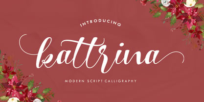 Kattrina is a new modern script calligraphy font with an irregular baseline. Trendy and feminine, Kattrina Script looks lovely on wedding invitations, thank you cards, quotes, greeting cards, logos, business cards and more. Perfect for using in ink or watercolour. Including initial and terminal letters, alternates, ligatures and multiple language support. To enable the OpenType Stylistic alternates, you need a program that supports OpenType features such as Adobe Illustrator CS, Adobe Indesign & CorelDraw X6-X7, Microsoft Word 2010 or later versions. There are additional ways to access alternates/swashes, using Character Map (Windows), Nexus Font (Windows), Font Book (Mac) or a software program such as PopChar (for Windows and Mac). Thank you so much for looking and please let me know if you have any questions.
 - Armalona Script by Shape Studio,
$12.00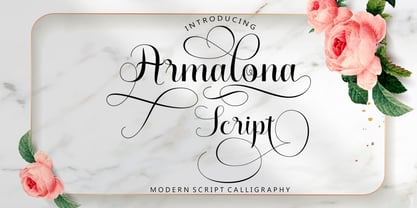 Armalona is a new modern script calligraphy font with an irregular baseline. Trendy and feminine style.Armalona Script looks lovely on wedding invitations, thank you cards, quotes, greeting cards, logos, business cards and more. Perfect for using in ink or watercolour. Including initial and terminal letters, alternates, ligatures and multiple language support.Files included: To enable the OpenType Stylistic alternates, you need a program that supports OpenType features such as Adobe Illustrator CS, Adobe Indesign & CorelDraw X6-X7, Microsoft Word 2010 or later versions. There are additional ways to access alternates/swashes, using Character Map (Windows), Nexus Font (Windows), Font Book (Mac) or a software program such as PopChar (for Windows and Mac).Thanks so much for looking and please let me know if you have any questions
 - Argumentum by Kostic,
$40.00 In December 2013 two new weights - Thin & Ultra (with Italics) were added to the set, Small Caps included! The intention was to make a technical-looking sans with a warmer feel to it, balanced between hard geometric shapes and friendly curves with slightly narrower endings. It should be useful in a wide range of tasks, whether combining the eight weights with distinct italics for editorial design, setting multiple pages of text, making financial reports, or using the highly contrasted lights and blacks for display and packaging design. Argumentum has a character set to support Western and Central European languages, and an extended set for monetary symbols. Each weight includes small caps, ligatures, proportional lining and oldstyle numbers, tabular figures, fractions and scientific superior/inferior figures.
 - Appetite Pro by Serebryakov,
$39.00 Appetite Pro is a total upgrade of the world wide popular display font Appetite (2011). It is based on original lettering and belongs to the upright script like. Appetite Pro consists of 10 weights of the refreshed curves — 5 regular and 5 italic — from Light to Heavy. It’s a multilingual and international font, with a full Western Latin, Cyrillic (Russian, Belarusian, Ukrainian) and basic Greek support. The Appetite Pro font family is specially designed for food identity and packaging design projects. In addition to standard letter cases, Appetite Pro also includes dingbats set. Due to the 10 weights font palette, you can solve a wide variety of professional problems without spending money on extra fonts for titles, subtitles, and main text. Try and buy!
 - Shania Script by Seniors Studio,
$17.00 Shania Script is a modern calligraphy typeface with a free flowing and moving baseline. It has a casual, yet elegant touch. It can be used for various purposes such as logos, wedding invitations, headings, t-shirts, letterheads, signage, labels, news, posters, badges etc. Features 370+ glyphs and 136 alternate characters, including initial and terminal letters, alternates, ligatures and multiple language support. To enable the OpenType Stylistic alternates, you need a program that supports OpenType features such as Adobe Illustrator CS, Adobe Indesign & CorelDraw X6-X7, Microsoft Word 2010 or later versions. There are additional ways to access alternates/swashes, using Character Map (Windows), Nexus Font (Windows), Font Book (Mac) or a software program such as PopChar (for Windows and Mac).
 - Areno by BoxTube Labs,
$24.00 Areno was our first ever font family, released in 2017. We’ve learned a lot since then and made the decision to redraw it from scratch with improved letterforms, better readability and added language support. Most adjustments are very subtle, but some glyphs have gotten a complete makeover. We've also added lowercase letters to the family. Areno is a strong and bold sports block font. These fonts are perfect for sports logos, branding, posters, apparel design, magazine headlines, labels and so much more. Areno now features a full Adobe Latin 1 Character Set with support for most Western European languages including Afrikaants, Basque, Breton, Catalan, Danish, Dutch, English, Finnish, French, Gaelic, German, Icelandic, Indonesian, Irish, Italian, Norwegian, Portuguese, Sami, Spanish, Swahili and Swedish.
 - Hrothberta Script by Shape Studio,
$12.00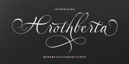 Hrothberta is a new modern script calligraphy font with an irregular baseline. Hrothberta Script looks lovely on wedding invitations, thank you cards, quotes, greeting cards, logos, business cards and more. Perfect for using in ink or watercolour. Including initial and terminal letters, alternates, ligatures and multiple language support. To enable the OpenType Stylistic alternates, you need a program that supports OpenType features such as Adobe Illustrator CS, Adobe Indesign & CorelDraw X6-X7, Microsoft Word 2010 or later versions. There are additional ways to access alternates/swashes, using Character Map (Windows), Nexus Font (Windows), Font Book (Mac) or a software program such as PopChar (for Windows and Mac).Thanks so much for looking and please let me know if you have any questions
 - Hello Bakista Script by madjack.font,
$20.00 Hello Bakista Script is a modern calligraphy font featuring a varied baseline, smooth lines, a classic and elegant touch. Can be used for various purposes such as headings, signatures, logos, wedding invitations, t-shirts, letterheads, signage, labels, news, posters, badges etc. I created this Hello Bakista Font inspired by classic calligraphy concepts and made it into a modern style, and I also added some really interesting binders and alternatives when we applied them. I also tried to execute in a different way so that it resulted in this Bela Yasmine Script font. To enable the OpenType Stylistic alternative, you need a program that supports OpenType features such as Adobe Illustrator CS, Adobe Indesign & CorelDraw X6-X7, Microsoft Word 2010 or a later version. Thank you,
 - Brix Slab Condensed by HVD Fonts,
$40.00 Brix Slab Condensed and Brix Slab is an extended family of 24 fonts. It was designed by Hannes von Döhren & Livius Dietzel in 2011. Brix Slab Condensed is a robust slab serif family with subtle details. It's optimized for longer texts and highly readable in small sizes. Brix Slab Condensed is intended to be used in applications like magazines, newspapers and digital devices. It also works great as a corporate typeface. With more than 700 glyphs in each font, Brix Slab Condensed is equipped for complex, professional typography. As an exclusively OpenType release, these fonts feature small caps, five variations of numerals, arrows and an extended character set to support Central and Eastern European as well as Western European languages.
 - Blackstore Script by Shape Studio,
$12.00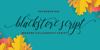 Blackstore Script is a new modern script calligraphy font with an irregular baseline. It looks lovely on wedding invitations, thank you cards, quotes, greeting cards, logos, business cards and more. Perfect for using in ink or watercolour. Including initial and terminal letters, alternates, ligatures and multiple language support. To enable the OpenType Stylistic alternates, you need a program that supports OpenType features such as Adobe Illustrator CS, Adobe Indesign & CorelDraw X6-X7, Microsoft Word 2010 or later versions. There are additional ways to access alternates/swashes, using Character Map (Windows), Nexus Font (Windows), Font Book (Mac) or a software program such as PopChar (for Windows and Mac).Thanks so much for looking and please let me know if you have any questions.
 - Parliament by Hoefler & Co.,
$49.99 The Parliament typeface was designed by Jonathan Hoefler beginning in 1995. A burlesque typeface in the Regency Blackletter style, Parliament was inspired by the ‘Four-line Pica Black No. 1’ typeface of William Caslon Jr (1821), whose enigmatic design for the letters E, G, I, N, V and Y hinted at a broader ambition to modernize the arcane shapes of the gothic alphabet’s capital letters. Parliament completes this project for the first time by including two sets of alphabets, one archaic and one modern, along with a third set of ‘small caps’ that restores to the blackletter the versatility of Roman type. Parliament was first used for the 1998 ATypI Conference in Lyon, and was published by Hoefler&Co in 2022.