3,448 search results
(0.017 seconds)
- Welcome by Solotype,
$19.95This is another of those early 20th century, post art nouveau types from Europe. Probably German. - Schneidler Grobe Gotisch by Intellecta Design,
$24.90a revival of a classic bold blackletter from the great german typedesigner F. H. Ernst Schneidler - Scoto Koberger Fraktur N11 by Intellecta Design,
$9.00digitization of autentic medieval blackletters from Anton Koberger and Otavia Scotus german typographers, from incunabula books - DIN Next Arabic by Monotype,
$155.99 DIN Next is a typeface family inspired by the classic industrial German engineering designs, DIN 1451 Engschrift and Mittelschrift. Akira Kobayashi began by revising these two faces-who names just mean ""condensed"" and ""regular"" before expanding them into a new family with seven weights (Light to Black). Each weight ships in three varieties: Regular, Italic, and Condensed, bringing the total number of fonts in the DIN Next family to 21. DIN Next is part of Linotype's Platinum Collection. Linotype has been supplying its customers with the two DIN 1451 fonts since 1980. Recently, they have become more popular than ever, with designers regularly asking for additional weights. The abbreviation ""DIN"" stands for ""Deutsches Institut für Normung e.V."", which is the German Institute for Industrial Standardization. In 1936 the German Standard Committee settled upon DIN 1451 as the standard font for the areas of technology, traffic, administration and business. The design was to be used on German street signs and house numbers. The committee wanted a sans serif, thinking it would be more legible, straightforward, and easy to reproduce. They did not intend for the design to be used for advertisements and other artistically oriented purposes. Nevertheless, because DIN 1451 was seen all over Germany on signs for town names and traffic directions, it became familiar enough to make its way onto the palettes of graphic designers and advertising art directors. The digital version of DIN 1451 would go on to be adopted and used by designers in other countries as well, solidifying its worldwide design reputation. There are many subtle differences in DIN Next's letters when compared with DIN 1451 original. These were added by Kobayashi to make the new family even more versatile in 21st-century media. For instance, although DIN 1451's corners are all pointed angles, DIN Next has rounded them all slightly. Even this softening is a nod to part of DIN 1451's past, however. Many of the signs that use DIN 1451 are cut with routers, which cannot make perfect corners; their rounded heads cut rounded corners best. Linotype's DIN 1451 Engschrift and Mittelschrift are certified by the German DIN Institute for use on official signage projects. Since DIN Next is a new design, these applications within Germany are not possible with it. However, DIN Next may be used for any other project, and it may be used for industrial signage in any other country! DIN Next has been tailored especially for graphic designers, but its industrial heritage makes it surprisingly functional in just about any application. The DIN Next family has been extended with seven Arabic weights and five Devanagari weights. The display of the Devanagari fonts on the website does not show all features of the font and therefore not all language features may be displayed correctly.
 - DIN Next Devanagari by Monotype,
$103.99DIN Next is a typeface family inspired by the classic industrial German engineering designs, DIN 1451 Engschrift and Mittelschrift. Akira Kobayashi began by revising these two faces-who names just mean ""condensed"" and ""regular"" before expanding them into a new family with seven weights (Light to Black). Each weight ships in three varieties: Regular, Italic, and Condensed, bringing the total number of fonts in the DIN Next family to 21. DIN Next is part of Linotype's Platinum Collection. Linotype has been supplying its customers with the two DIN 1451 fonts since 1980. Recently, they have become more popular than ever, with designers regularly asking for additional weights. The abbreviation ""DIN"" stands for ""Deutsches Institut für Normung e.V."", which is the German Institute for Industrial Standardization. In 1936 the German Standard Committee settled upon DIN 1451 as the standard font for the areas of technology, traffic, administration and business. The design was to be used on German street signs and house numbers. The committee wanted a sans serif, thinking it would be more legible, straightforward, and easy to reproduce. They did not intend for the design to be used for advertisements and other artistically oriented purposes. Nevertheless, because DIN 1451 was seen all over Germany on signs for town names and traffic directions, it became familiar enough to make its way onto the palettes of graphic designers and advertising art directors. The digital version of DIN 1451 would go on to be adopted and used by designers in other countries as well, solidifying its worldwide design reputation. There are many subtle differences in DIN Next's letters when compared with DIN 1451 original. These were added by Kobayashi to make the new family even more versatile in 21st-century media. For instance, although DIN 1451's corners are all pointed angles, DIN Next has rounded them all slightly. Even this softening is a nod to part of DIN 1451's past, however. Many of the signs that use DIN 1451 are cut with routers, which cannot make perfect corners; their rounded heads cut rounded corners best. Linotype's DIN 1451 Engschrift and Mittelschrift are certified by the German DIN Institute for use on official signage projects. Since DIN Next is a new design, these applications within Germany are not possible with it. However, DIN Next may be used for any other project, and it may be used for industrial signage in any other country! DIN Next has been tailored especially for graphic designers, but its industrial heritage makes it surprisingly functional in just about any application. The DIN Next family has been extended with seven Arabic weights and five Devanagari weights. The display of the Devanagari fonts on the website does not show all features of the font and therefore not all language features may be displayed correctly. - DIN Next Cyrillic by Monotype,
$65.00DIN Next is a typeface family inspired by the classic industrial German engineering designs, DIN 1451 Engschrift and Mittelschrift. Akira Kobayashi began by revising these two faces-who names just mean ""condensed"" and ""regular"" before expanding them into a new family with seven weights (Light to Black). Each weight ships in three varieties: Regular, Italic, and Condensed, bringing the total number of fonts in the DIN Next family to 21. DIN Next is part of Linotype's Platinum Collection. Linotype has been supplying its customers with the two DIN 1451 fonts since 1980. Recently, they have become more popular than ever, with designers regularly asking for additional weights. The abbreviation ""DIN"" stands for ""Deutsches Institut für Normung e.V."", which is the German Institute for Industrial Standardization. In 1936 the German Standard Committee settled upon DIN 1451 as the standard font for the areas of technology, traffic, administration and business. The design was to be used on German street signs and house numbers. The committee wanted a sans serif, thinking it would be more legible, straightforward, and easy to reproduce. They did not intend for the design to be used for advertisements and other artistically oriented purposes. Nevertheless, because DIN 1451 was seen all over Germany on signs for town names and traffic directions, it became familiar enough to make its way onto the palettes of graphic designers and advertising art directors. The digital version of DIN 1451 would go on to be adopted and used by designers in other countries as well, solidifying its worldwide design reputation. There are many subtle differences in DIN Next's letters when compared with DIN 1451 original. These were added by Kobayashi to make the new family even more versatile in 21st-century media. For instance, although DIN 1451's corners are all pointed angles, DIN Next has rounded them all slightly. Even this softening is a nod to part of DIN 1451's past, however. Many of the signs that use DIN 1451 are cut with routers, which cannot make perfect corners; their rounded heads cut rounded corners best. Linotype's DIN 1451 Engschrift and Mittelschrift are certified by the German DIN Institute for use on official signage projects. Since DIN Next is a new design, these applications within Germany are not possible with it. However, DIN Next may be used for any other project, and it may be used for industrial signage in any other country! DIN Next has been tailored especially for graphic designers, but its industrial heritage makes it surprisingly functional in just about any application. The DIN Next family has been extended with seven Arabic weights and five Devanagari weights. The display of the Devanagari fonts on the website does not show all features of the font and therefore not all language features may be displayed correctly. - DIN Next Paneuropean by Monotype,
$92.99DIN Next is a typeface family inspired by the classic industrial German engineering designs, DIN 1451 Engschrift and Mittelschrift. Akira Kobayashi began by revising these two faces-who names just mean ""condensed"" and ""regular"" before expanding them into a new family with seven weights (Light to Black). Each weight ships in three varieties: Regular, Italic, and Condensed, bringing the total number of fonts in the DIN Next family to 21. DIN Next is part of Linotype's Platinum Collection. Linotype has been supplying its customers with the two DIN 1451 fonts since 1980. Recently, they have become more popular than ever, with designers regularly asking for additional weights. The abbreviation ""DIN"" stands for ""Deutsches Institut für Normung e.V."", which is the German Institute for Industrial Standardization. In 1936 the German Standard Committee settled upon DIN 1451 as the standard font for the areas of technology, traffic, administration and business. The design was to be used on German street signs and house numbers. The committee wanted a sans serif, thinking it would be more legible, straightforward, and easy to reproduce. They did not intend for the design to be used for advertisements and other artistically oriented purposes. Nevertheless, because DIN 1451 was seen all over Germany on signs for town names and traffic directions, it became familiar enough to make its way onto the palettes of graphic designers and advertising art directors. The digital version of DIN 1451 would go on to be adopted and used by designers in other countries as well, solidifying its worldwide design reputation. There are many subtle differences in DIN Next's letters when compared with DIN 1451 original. These were added by Kobayashi to make the new family even more versatile in 21st-century media. For instance, although DIN 1451's corners are all pointed angles, DIN Next has rounded them all slightly. Even this softening is a nod to part of DIN 1451's past, however. Many of the signs that use DIN 1451 are cut with routers, which cannot make perfect corners; their rounded heads cut rounded corners best. Linotype's DIN 1451 Engschrift and Mittelschrift are certified by the German DIN Institute for use on official signage projects. Since DIN Next is a new design, these applications within Germany are not possible with it. However, DIN Next may be used for any other project, and it may be used for industrial signage in any other country! DIN Next has been tailored especially for graphic designers, but its industrial heritage makes it surprisingly functional in just about any application. The DIN Next family has been extended with seven Arabic weights and five Devanagari weights. The display of the Devanagari fonts on the website does not show all features of the font and therefore not all language features may be displayed correctly. - Livington by Skinny Type,
$12.00 Livington is a handwritten SVG font that has the look and feel of a true hand drawing. The handwritten Livington font requires Photoshop CC 2017 or Illustrator CC 2018 (or later) to work, but the OTF Livington Script doesn't require any special software and can be used on any computer and on any software. INCLUDING: Livington SVG handwriting font Livington All Caps font LANGUAGE SUPPORT: Please note that the Livington SVG Handwritten Font is English only, but Livington's script contains the following characters: aàáâÃäåcçdðeèéêëiìíîïnñoøòóôõöuùüúill, Danish, English, French, German, German (Switzerland), Norwegian Bokmål, Portuguese, Spanish, Swedish, Swiss German. Thank you!!
 - Cristal Bendilar by Gian Studio,
$18.00 About Product Cristal Bendilar, Display Typography with Variable Weight and Width. Cristal Bendilar is an elegant modern variable font. It's basically Sans with a touch of serif to each letter. A Simplicity yet very legible with various widths and weights that you can explore, combine, create and help you design things. Font Styles on OTF files or even more if you use Single File Variables, you can shift weight and width in the sweetest places in Cristal Bendilar. What you get: Language Support: English, French, German, Indonesia, Ireland, Italy, Low German, Norwegian, Portuguese, Swedish, Swiss German. Thank You.
 - Sublime by Coniglio Type,
$19.95 Sublime45-Regular Sublime Revised for 2021. One font in Opentype format as Sublime45. Families and all TT Truetype versions eliminated in this wonderful stand alone. The Spring 1997 original release of Sublime —borne an organic creature of black water soluble ink & digitized by Coniglio Type. Sublime is a fun font to use in commercial layouts. It is soft and fluid as ink. Like the wrinkles of time, it is imperfect. That in itself makes it incredibly attractive, warm and “human factor”. Sublime offers legibility so sorely missed in the current recreational font market. Sublime was inspired by World War II US fighter pilot Donald Alling. He flew missions over Nazi Germany. His squadron also dropped food, medicine and relief supplies over the Netherlands. Known as “the Colonel” to his friends. Don as a civic engineer ruled literally miles of ink letter callout’s with a template device called a LeRoy in peacetime on vellum and mylar across his career as a technical illustrator. You didn't want to screw up inking into a template with wet black permanent ink. You really had to have a steady hand and it was all done by hand. You can say Don worked “unplugged”. And that is cool! He was part of the broad stroke of postwar industrial expansion that helped keep America strong, rendering exploded views on top secret projects. Many of us were not even born yet when all this was going on. Today at over 80 years young Don is like a national treasure, savvy and bright—and the ladies love him! The Colonel remains a dedicated master airbrush man, stand–up man, caricature artist and letterman all without use of a computer! He was lucky enough to retire before a desktop cathode tube was put in his face. Today the Colonel enjoys restoring VW’s, flying and freelance consulting when not being called to supper by his lovely wife Rea.
 - Captain Tall Ship by Alphabet Agency,
$20.00 Captain Tall Ship is the clean version of Captain Tall Shipwreck. The font can be used in many project themes, from birthday party invitations to beer labels. The font could be potentially used is a number of design themes including bars, pubs, pirate, navy, seafarer, alcohol products, western/cowboy, card game/gambling, biker gang, tattoos, emblems and crests, old military & hunting to name a few.
 - Kroeburn - Unknown license

- Divina by Sudtipos,
$35.00 Divina is a Latinized digitization of one of German calligraphy master Rudolph Koch's typefaces. The original typeface, Kurrent, was designed in 1927 and cut in 1935. Its shapes are a variant of the German script to be used as a model for writing in schools at the time. This is the first time Koch's rendition of this particular blackletter calligraphy was ever digitized.
 - The Schwabacher font, revitalized by Dieter Steffmann, is a captivating blend of history and artistry, standing as a tribute to the rich heritage of German typography. Originating from the 15th and 1...
- Yzerfontein by Vic Fieger,
$11.99Yzerfontein is an angular variation on the classic German blackletter that started with a sketch of a lowercase 'g'. - Dorsal by Wordshape,
$20.00 Dorsal is a display typeface that is based on a rare bit of lettering from a 1910 German lettering book.
 - Konsens by Hubert Jocham Type,
$39.00 Germany has a strong heritage of industrial typefaces. These fonts seem like being constructed by engineers. The shapes seem to be built with circles and squares. DIN Mittelschrift is one very famous example, or the font on the old German car number plates. Since the Romain du Roi we know that it is tricky to draw a geometrical typeface. For optical reasons you have to go away from circles and lines with exactly one weight. Therefore the aim is not to construct a typeface but to draw it the way it seems constructed finally. The design of a typeface is like stage production. Like heavily made up actors the characters of a typeface must be exaggerated to work well. Particularly in small sizes.
 - Raldo RE by URW Type Foundry,
$49.99 Quite unusual, Musenberg started his Raldo design with the italic. However, he managed to preserve the temperament and vividness of the italic in the roman without questioning the stability of the individual characters. Raldo is a modern Sans Serif family already quite popular in Germany. The German IGEPA group chose Raldo as corporate typeface family. Now, Marc Musenberg redesigned and extended his Raldo typeface family. The new Raldo RE Pro comprises 10 styles, 5 roman and 5 corresponding italics. All fonts now include the complete Latin character set plus fractions, different sets of figures and fractions as well as small caps and small caps figures for Raldo RE Pro Text, Regular, Semibold and Bold. Raldo RE Pro has been chosen to be part of the URW++ SelecType.
 - Mira by HiH,
$10.00 Mira is a playful, decorative Art Nouveau font, released by Roos & Jung Foundry in Offenbach AM, Germany about 1902. The exaggerated serifs and the sharp contrast between the thick and thin strokes gives the page a whimsical “salt and pepper” look that is very distinctive. Mira uses our new encoding. The Euro symbol has been moved to position 128 and the Zcaron/zcaron have been added at positions 142/158 respectively. Otherwise, MIRA has our usual idiosyncratic glyph selection, with the German ch/ck instead of braces, Western European accented letters, lower case “o” and “u” with Hungarian umlaut and our usual Hand-in-Hand symbol. In addition, black-letter-style upper case “H” and “T” characters are included. Download the PDF Type Specimen for locations.
 - KonsensSten by Hubert Jocham Type,
$39.00 Germany has a strong heritage of industrial typefaces. These fonts seem like being constructed by engineers. The shapes seem to be built with circles and squares. DIN Mittelschrift is one very famous example, or the font on the old German car number plates. Since the Romain du Roi we know that it is tricky to draw a geometrical typeface. For optical reasons you have to go away from circles and lines with exactly one weight. Therefore the aim is not to construct a typeface but to draw it the way it seems constructed finally. The design of a typeface is like stage production. Like heavily made up actors the characters of a typeface must be exaggerated to work well. Particularly in small sizes.
 - FF Bauer Grotesk by FontFont,
$50.99 FF Bauer Grotesk is a revival of the metal type Friedrich Bauer Grotesk, released between 1933 and 1934 by the foundry Trennert & Sohn in Hamburg Altona, Germany. The geometric construction of the typeface, infused with the art déco zeitgeist of that era, is closely related to such famous German designs as Futura, Erbar, Kabel and Super Grotesk that debuted a few years earlier. However, Bauer Grotesk stands out for not being so dogmatic with the geometry, lending the design a warmer, more homogenous feeling. The oval “O” is a good example of that, as well as characteristic shapes like the capital M or the unconventionally differing endings of “c” and “s” which make for a less constructed look. Watch the FF Bauer Grotesk introduction video on Vimeo
 - Cranach by profonts,
$41.99 This picturesque, beautiful German Blackletter typeface was originally released by Benjamin Becker Succ, Frankfurt am Main, then named ?K�nstlergotisch?. Ralph M. Unger redesigned, digitally remastered and completed the font based on old catalogues/specimen. In honor of the famous Cranach family, German artists in medieval times, we renamed the font after them. The shadowed version was added for even more eye-catching purposes, e.g. in headlines.
 - CHILD & MOMSKY by Rhd Studio,
$15.00 Style and Grace personified - say Child Momsky. This typeface has two main styles, Regular and Italic, that are designed to work elegantly in unison and apart. The serif has a boldy different ' f', which sets it apart from regular serifs.....as Child Momsky likes to stand out from the rest. A regular 'f' is included in its alternates, and a extra font style with a regular f is included for projects that require a more staid elegance. The Italic style is dreamy, sultry and light-footed - a perfect partner for the more serious serif. Use them together or apart for stylish, stand-out type designs and projects. For those of you who do not have access to Opentype Software, such as Canva Users, a separately available 'extra letters' font set will be available for purchase soon. Language Supported : Danish, English, French, German, German (Switzerland), Italian, Low German, Luxembourgish, Norwegian Bokmål, Norwegian Nynorsk, Portuguese, Swedish, Swiss German. Enjoy
 - Faber Gotic by Ingo,
$21.00 A ”modern“ Gothic – designed according to principles of modern form in three variations Faber Gotik is a reminiscence of Gutenberg’s first script from around 1450. The heavily broken forms allow further development in the direction of a modern, strongly geometric and less formal type. It should be possible to push the principle of design so far to the limit that a type is created which, from the very start, extinguishes reminders of a dark past. The characters are composed of squares which are lined up straight or in a more or less slanted manner. The resulting corners similar to serifs were removed so that a sans serif type in the true sense without up and down strokes was created. The principle of ”breaking“ was applied according to the historical model. Even the form of the characters is based on the model from the Middle Ages. Only the characters which cannot be created with the principle described were modeled on today's forms. Faber Gotik includes three variations: - Faber Gotik Text — most similar to the historical model - Faber Gotik Gothic — pushes the applied principle of form the furthest - Faber Gotik Capitals —; a Gothic upper case font, contrary to tradition. 555 years after Gutenberg, interest in black-letter typefaces is nearly extinct. They are especially looked down upon in German-speaking countries because they are still associated with ”Nazi“ scripts. But yet, the very forms of blackletter, Gothic, Schwabacher and especially cursive have enormous potential with regard to the development of new advanced font forms.
 - Holz Caps by Authentic,
$39.50 Holz is the German word for wood, since this font has a woodcut character, I thought that would be the right name.
 - Ongunkan Radloff Anglosaxon by Runic World Tamgacı,
$100.00 Vasili Vasilyevich Radlof or Wilhelm Radloff (Russian: Василий Васильевич Радлов; German: Wilhelm Radloff; 17 January 1837 - 12 May 1918) was a German-born Russian orientalist and founder of Turcology. Radloff is a German-born Russian Turcologist who researches the Turkish world from different perspectives, opens a new era in the history of Turkology by bringing them to light, and devoted 60 years of his 81-year life to these studies. He published his work known as Radloff's Atlas with a runic font specially developed for the Old Turkish Runic Alphabet. I made the Turkish Runic Font using Radloff's Atlas. I developed this Anglo Saxon Futhark font based on this font and adapted it to Anglo Saxon script.
 - Oho Julie by PaulaType,
$10.00 Introducing Oho Julie - A Chic Brush Stylist font perfect for high impact headlines This font is a perfect script designed for making your set of invitations, Brand, blog posts, and more completely beautiful Multilingual support for the following languages: Cornish, Danish, Dutch, English, Estonian, Faroese, Filipino, Finnish, French, Galician, German, Icelandic, Indonesian, Irish, Italian, Norwegian Bokmål, Norwegian Nynorsk, Portuguese, Spanish, Swahili, Swedish, Swiss German. Thank you Nursery Art
 - North Shore by Bruised Goods,
$18.00 NORTH SHORE – The ultimate Hawaiian surf spot typeface, both groovy and mid century inspired. Designed by Lauren Kilbane (on the other coast!) in sunny South Florida, USA. USE THIS FONT FOR: ads, album covers, apparel, cards, flyers, invitations, logos, menus, merchandise, packaging, signage, web, and more. 204 Glyphs Total: Uppercase ONLY, Numbers, Symbols, Punctuation, Emojis, & Language Support. Language Support: Danish, English, French, German, Irish, Italian, Portuguese, Spanish, Swedish, & Swiss German.
 - Helvetica Monospaced by Linotype,
$42.99 Born in 1831, Hermann Berthold was the son of a calico-printer. On completion of his apprenticeship as a precision-instrument maker and after practical experience gained abroad in galvanography, Hermann Berthold founded his "Institute for Galvano Technology" in Berlin in 1858. Very quickly he discovered a method of producing circular lines from brass and not, as customary at that time, from lead or zinc. The soldering normally necessary could also be dispensed with. The lines were elastic and therefore highly durable. They produced outstandingly fine results. Most of German's letterpress printers and many printers abroad placed their orders with Berthold. His products became so popular that the print trade popularized the saying "As precise as Berthold brass". In 1878 Hermann Berthold was commissioned to put an end to the confusion of typographic systems of measurement. With the aid of Professor Foerster he succeeded in devising a basic unit of measurement (1m = 2,660 typographic points). This was the birth of the first generally binding system of typographic measurement. It is still used in the trade. Hermann Berthold served as the head of the Berthold type foundry until 1888.
 - Aurora by Bitstream,
$29.99 One of the classic old German large x-height Grotesques revised and still in use, identifiable by the rounded form of certain diagonal strokes.
 - Walbaum Antiqua Pro by RMU,
$40.00 Walbaum Antiqua Pro is an RMU redesign of a German font classic, with three different number forms and small caps throughout all font styles.
 - Tribal Tattoos III by Otto Maurer,
$18.00 Tribal Tattoos comes from the German tattoo artist Otto Maurer. This clean vector Tribal art is best for making good plott or printed art.
 - Mavericks Original by Bruised Goods,
$18.00 MAVERICKS ORIGINAL – A smooth and sturdy, handcrafted font, inspired by California surf culture and all things midcentury modern. Designed by Lauren Kilbane (on the other coast!) in sunny South Florida, USA. Use this font for: ads, album covers, apparel, cards, flyers, invitations, logos, menus, merchandise, packaging, signage, web, and more. 257 Glyphs Total: Uppercase, Lowercase, Numbers, Symbols, Punctuation, & Language Support. Language Support: Danish, English, French, German, Irish, Italian, Portuguese, Spanish, Swedish, & Swiss German.
 - Blauhaus by Hanoded,
$15.00 Yes, you're right. Blauhaus should have been 'Blaues Haus', as that is the proper way of saying Blue House in German. But hey, Blauhaus sounds much better and in writing, it is quite similar to Bauhaus. Blauhaus is a stylish, rounded sans serif font, modeled after some early 20th century German typefaces. It is easy on the eye and it will certainly give your work a sophisticated punch. Comes with a classy collection of diacritics.
 - Nice Trendy by Arendxstudio,
$13.00 Nice Trendy - A Groovy Typeface is a font with distinctive handwritten characters perfect for branding projects, logos, wedding designs, media posts, advertisements, product packaging, product designs, labels, photography, watermarks, invitations, stationery, and any project who need handwritten dishes. Features : • Character Set A-Z • Numerals & Punctuations (OpenType Standard) • Accents (Multilingual characters) • Ligature Multilingual Support : Afrikaans, Albanian, Asu, Basque, Bemba, Bena, Catalan, Chiga, Cornish, Danish, English, Estonian, Faroese, Filipino, Finnish, French, Friulian, Galician, German, Gusii, Icelandic, Indonesian, Irish, Italian, Kabuverdianu, Kalenjin, Kinyarwanda, Low German, Luo, Luxembourgish, Luyia, Machame, Makhuwa-Meetto, Makonde, Malagasy, Malay, Manx, Morisyen, North Ndebele, Norwegian Bokmål, Norwegian Nynorsk, Nyankole, Oromo, Portuguese, Romansh, Rombo, Rundi, Rwa, Samburu, Sango, Sangu, Scottish Gaelic, Sena, Shambala, Shona, Soga, Somali, Spanish, Swahili, Swedish, Swiss German, Taita, Teso, Vunjo, Zulu
 - Bedroom Diaries by Arendxstudio,
$13.00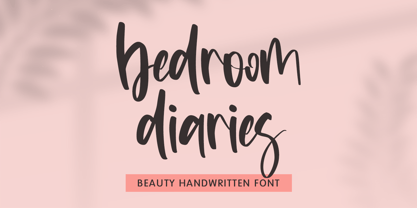 Bedroom Diaries – Beauty Handwritten Font is a font with distinctive handwritten characters perfect for branding projects, logos, wedding designs, media posts, advertisements, product packaging, product designs, labels, photography, watermarks, invitations, stationery, and any project who need handwritten dishes. Features : • Character Set A-Z • Numerals & Punctuations (OpenType Standard) • Accents (Multilingual characters) • Ligature Multilingual Support : Afrikaans, Albanian, Asu, Basque, Bemba, Bena, Catalan, Chiga, Cornish, Danish, English, Estonian, Faroese, Filipino, Finnish, French, Friulian, Galician, German, Gusii, Icelandic, Indonesian, Irish, Italian, Kabuverdianu, Kalenjin, Kinyarwanda, Low German, Luo, Luxembourgish, Luyia, Machame, Makhuwa-Meetto, Makonde, Malagasy, Malay, Manx, Morisyen, North Ndebele, Norwegian Bokmål, Norwegian Nynorsk, Nyankole, Oromo, Portuguese, Romansh, Rombo, Rundi, Rwa, Samburu, Sango, Sangu, Scottish Gaelic, Sena, Shambala, Shona, Soga, Somali, Spanish, Swahili, Swedish, Swiss German, Taita, Teso, Vunjo, Zulu
 - Ninja Quest by Arendxstudio,
$13.00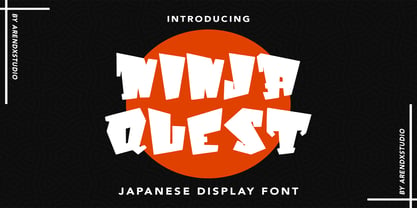 Ninja Quest – Japanese Display Font is a font with distinctive handwritten characters perfect for branding projects, logos, wedding designs, media posts, advertisements, product packaging, product designs, labels, photography, watermarks, invitations, stationery, and any project who need handwritten dishes. Features : • Character Set A-Z • Numerals & Punctuations (OpenType Standard) • Accents (Multilingual characters) • Ligature Multilingual Support : Afrikaans, Albanian, Asu, Basque, Bemba, Bena, Catalan, Chiga, Cornish, Danish, English, Estonian, Faroese, Filipino, Finnish, French, Friulian, Galician, German, Gusii, Icelandic, Indonesian, Irish, Italian, Kabuverdianu, Kalenjin, Kinyarwanda, Low German, Luo, Luxembourgish, Luyia, Machame, Makhuwa-Meetto, Makonde, Malagasy, Malay, Manx, Morisyen, North Ndebele, Norwegian Bokmål, Norwegian Nynorsk, Nyankole, Oromo, Portuguese, Romansh, Rombo, Rundi, Rwa, Samburu, Sango, Sangu, Scottish Gaelic, Sena, Shambala, Shona, Soga, Somali, Spanish, Swahili, Swedish, Swiss German, Taita, Teso, Vunjo, Zulu
 - Every Sunday by Arendxstudio,
$13.00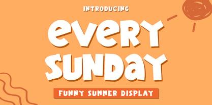 Every Sunday - Funny Summer Display Font is a font with distinctive handwritten characters perfect for branding projects, logos, wedding designs, media posts, advertisements, product packaging, product designs, labels, photography, watermarks, invitations, stationery, and any project who need handwritten dishes. Features : • Character Set A-Z • Numerals & Punctuations (OpenType Standard) • Accents (Multilingual characters) • Ligature Multilingual Support : Afrikaans, Albanian, Asu, Basque, Bemba, Bena, Catalan, Chiga, Cornish, Danish, English, Estonian, Faroese, Filipino, Finnish, French, Friulian, Galician, German, Gusii, Icelandic, Indonesian, Irish, Italian, Kabuverdianu, Kalenjin, Kinyarwanda, Low German, Luo, Luxembourgish, Luyia, Machame, Makhuwa-Meetto, Makonde, Malagasy, Malay, Manx, Morisyen, North Ndebele, Norwegian Bokmål, Norwegian Nynorsk, Nyankole, Oromo, Portuguese, Romansh, Rombo, Rundi, Rwa, Samburu, Sango, Sangu, Scottish Gaelic, Sena, Shambala, Shona, Soga, Somali, Spanish, Swahili, Swedish, Swiss German, Taita, Teso, Vunjo, Zulu
 - Hypeblox by Arendxstudio,
$15.00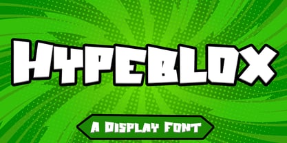 Hypeblox - Display Font is a font with distinctive Display characters perfect for branding projects, logos, media posts, advertisements, product packaging, product designs, labels, photography, watermarks, invitations, stationery, and any project Features : • Character Set A-Z • Numerals & Punctuations (OpenType Standard) • Accents (Multilingual characters) • Ligature Multilingual Support : Afrikaans, Albanian, Asu, Basque, Bemba, Bena, Catalan, Chiga, Cornish, Danish, English, Estonian, Faroese, Filipino, Finnish, French, Friulian, Galician, German, Gusii, Icelandic, Indonesian, Irish, Italian, Kabuverdianu, Kalenjin, Kinyarwanda, Low German, Luo, Luxembourgish, Luyia, Machame, Makhuwa-Meetto, Makonde, Malagasy, Malay, Manx, Morisyen, North Ndebele, Norwegian Bokmål, Norwegian Nynorsk, Nyankole, Oromo, Portuguese, Romansh, Rombo, Rundi, Rwa, Samburu, Sango, Sangu, Scottish Gaelic, Sena, Shambala, Shona, Soga, Somali, Spanish, Swahili, Swedish, Swiss German, Taita, Teso, Vunjo, Zulu There it is! I really hope you enjoy it
 - Cosmic Rock by Arendxstudio,
$13.00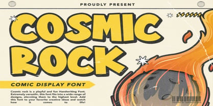 Cosmic Rock - A Comic Display Font is a font with distinctive handwritten characters perfect for branding projects, logos, wedding designs, media posts, advertisements, product packaging, product designs, labels, photography, watermarks, invitations, stationery, and any project who need handwritten dishes. Features : • Character Set A-Z • Numerals & Punctuations (OpenType Standard) • Accents (Multilingual characters) • Ligature Multilingual Support : Afrikaans, Albanian, Asu, Basque, Bemba, Bena, Catalan, Chiga, Cornish, Danish, English, Estonian, Faroese, Filipino, Finnish, French, Friulian, Galician, German, Gusii, Icelandic, Indonesian, Irish, Italian, Kabuverdianu, Kalenjin, Kinyarwanda, Low German, Luo, Luxembourgish, Luyia, Machame, Makhuwa-Meetto, Makonde, Malagasy, Malay, Manx, Morisyen, North Ndebele, Norwegian Bokmål, Norwegian Nynorsk, Nyankole, Oromo, Portuguese, Romansh, Rombo, Rundi, Rwa, Samburu, Sango, Sangu, Scottish Gaelic, Sena, Shambala, Shona, Soga, Somali, Spanish, Swahili, Swedish, Swiss German, Taita, Teso, Vunjo, Zulu
