6,156 search results
(0.013 seconds)
- Leifa by Identity Letters,
$39.00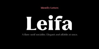 A flare-serif socialite. Elegant and affable at once. Leifa is a flare-serif typeface that strikes a balance between elegant and affable. It’s pleasant to read in text sizes yet takes center stage in headlines and display applications. With its higher-than-usual contrast, Leifa might evoke Didone typefaces at first. However, it differs from strictly Didone designs in the details: flattened serifs and deeply incised, tapered spurs provide an organic effect. These humanist elements are restrained and almost inconspicuous in body copy. It’s in display sizes that they realize their full potential. Set your message in Leifa, set it large, and it will get noticed. A true socialite, Leifa is a most welcome guest on any party. With its dual character and a range of weights that allow for fine-tuning the desired visual voice, it’s a brilliant choice for branding and editorial design. Its good-natured yet sophisticated character makes Leifa the perfect typeface for fashion, sports, lifestyle, social media, food and cooking, health, beauty, architecture, interior design, art, literature, theater, and travel. (And any other topic that you’d love to talk about at a dinner in good company.) The entire font family consists of eight weights. Each comes with an italic counterpart, totaling 16 styles. Leifa’s italics are oblique, optically corrected versions of the upright styles. Each style comprises a character set of 883 glyphs that includes small caps, a set of ligatures, tabular and old-style figures, case-sensitive forms, fractions, symbols, and many other features. Four stylistic sets allow you to adjust the appearance of the Leifa fonts: a single-story a (SS01), a simple f (SS02), a triple-story g (SS03), and thin punctuation marks (SS04) are at your disposal. If you’re looking for a typeface with some debonair spirit, look no further than Leifa.
 - Zamora by Typodermic,
$11.95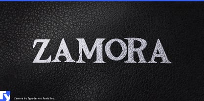 Introducing Zamora, the typeface that embodies the grit and determination of the open road. With its cracked finish and sharp Latin serifs, it’s a font that commands attention and respect. Each cut and scratch on the surface of Zamora is like a battle scar, a testament to the font’s toughness and resilience. Zamora is not just any typeface. It’s a font with a history, a story that’s written into every curve and corner. The sharp Latin serifs give Zamora a strong foothold, and the slew of ligatures that come with it give text a natural, unpredictable appearance, like the twists and turns of a winding mountain road. So whether you’re designing a poster for a rockabilly concert, creating a logo for a biker gang, or just looking to add a touch of rebel flair to your work, Zamora is the font for you. Most Latin-based European writing systems are supported, including the following languages. Afaan Oromo, Afar, Afrikaans, Albanian, Alsatian, Aromanian, Aymara, Bashkir (Latin), Basque, Belarusian (Latin), Bemba, Bikol, Bosnian, Breton, Cape Verdean, Creole, Catalan, Cebuano, Chamorro, Chavacano, Chichewa, Crimean Tatar (Latin), Croatian, Czech, Danish, Dawan, Dholuo, Dutch, English, Estonian, Faroese, Fijian, Filipino, Finnish, French, Frisian, Friulian, Gagauz (Latin), Galician, Ganda, Genoese, German, Greenlandic, Guadeloupean Creole, Haitian Creole, Hawaiian, Hiligaynon, Hungarian, Icelandic, Ilocano, Indonesian, Irish, Italian, Jamaican, Kaqchikel, Karakalpak (Latin), Kashubian, Kikongo, Kinyarwanda, Kirundi, Kurdish (Latin), Latvian, Lithuanian, Lombard, Low Saxon, Luxembourgish, Maasai, Makhuwa, Malay, Maltese, Māori, Moldovan, Montenegrin, Ndebele, Neapolitan, Norwegian, Novial, Occitan, Ossetian (Latin), Papiamento, Piedmontese, Polish, Portuguese, Quechua, Rarotongan, Romanian, Romansh, Sami, Sango, Saramaccan, Sardinian, Scottish Gaelic, Serbian (Latin), Shona, Sicilian, Silesian, Slovak, Slovenian, Somali, Sorbian, Sotho, Spanish, Swahili, Swazi, Swedish, Tagalog, Tahitian, Tetum, Tongan, Tshiluba, Tsonga, Tswana, Tumbuka, Turkish, Turkmen (Latin), Tuvaluan, Uzbek (Latin), Venetian, Vepsian, Võro, Walloon, Waray-Waray, Wayuu, Welsh, Wolof, Xhosa, Yapese, Zapotec Zulu and Zuni.
 - Gaz by Typodermic,
$11.95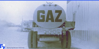 Introducing Gaz, the square display typeface inspired by the gasoline station signs of the twentieth century. Sign painters used to refer to this type of lettering as “stovepipe”, due to its sharp angles and rounded corners. Gaz’s unique squareness exudes a vintage industrial charm, while still maintaining a friendly, almost organic feel. Gaz is available in seven weights and italics, giving you the flexibility to create a wide range of designs. But that’s not all. Gaz also comes in five greasy effect styles, perfect for creating that worn, grungy look. The ligatures contained in these styles are automatically substituted in most applications, projecting a more natural and authentic tone. Whether you’re creating a bold poster, an eye-catching logo, or a sleek website design, Gaz is the perfect choice for adding a touch of vintage industrial style. Try Gaz today and bring a piece of the past into your designs. Most Latin-based European writing systems are supported, including the following languages. Afaan Oromo, Afar, Afrikaans, Albanian, Alsatian, Aromanian, Aymara, Bashkir (Latin), Basque, Belarusian (Latin), Bemba, Bikol, Bosnian, Breton, Cape Verdean, Creole, Catalan, Cebuano, Chamorro, Chavacano, Chichewa, Crimean Tatar (Latin), Croatian, Czech, Danish, Dawan, Dholuo, Dutch, English, Estonian, Faroese, Fijian, Filipino, Finnish, French, Frisian, Friulian, Gagauz (Latin), Galician, Ganda, Genoese, German, Greenlandic, Guadeloupean Creole, Haitian Creole, Hawaiian, Hiligaynon, Hungarian, Icelandic, Ilocano, Indonesian, Irish, Italian, Jamaican, Kaqchikel, Karakalpak (Latin), Kashubian, Kikongo, Kinyarwanda, Kirundi, Kurdish (Latin), Latvian, Lithuanian, Lombard, Low Saxon, Luxembourgish, Maasai, Makhuwa, Malay, Maltese, Māori, Moldovan, Montenegrin, Ndebele, Neapolitan, Norwegian, Novial, Occitan, Ossetian (Latin), Papiamento, Piedmontese, Polish, Portuguese, Quechua, Rarotongan, Romanian, Romansh, Sami, Sango, Saramaccan, Sardinian, Scottish Gaelic, Serbian (Latin), Shona, Sicilian, Silesian, Slovak, Slovenian, Somali, Sorbian, Sotho, Spanish, Swahili, Swazi, Swedish, Tagalog, Tahitian, Tetum, Tongan, Tshiluba, Tsonga, Tswana, Tumbuka, Turkish, Turkmen (Latin), Tuvaluan, Uzbek (Latin), Venetian, Vepsian, Võro, Walloon, Waray-Waray, Wayuu, Welsh, Wolof, Xhosa, Yapese, Zapotec Zulu and Zuni.
 - Turquoise by Resistenza,
$59.00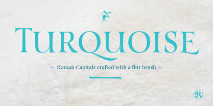 Many calligraphers agree that Roman Capitals is one of the most beautiful yet difficult hands to master. Its beauty lies in its simplicity of form and structure, yet understanding and applying these skillfully can take years of mindful practice. My goal was to design Roman Capitals that were smoothly designed with a brush, not carved. The main concept was based on the fundamental strokes that are commonly studied when you practice Roman letters. That’s why many Serifs have these unfinished terminal serifs. I created the Turquoise typeface based on my Capitalis Romana practice with a flexible broad edged brush and gouache. During the lowercase process I was still following Foundational calligraphy with a flat brush. My Turquoise Capitals were then adjusted and redesigned at the Tipobrda calligraphy workshop in Slovenia. Turquoise contains small caps, many discretionary ligatures, ornaments, swashes as well as several brushy nature-inspired ornaments, accessible via OpenType. Ideally suited for headlines or body text in advertising, packaging and visual identities, its delicate shapes, curves and endings give projects a harmonious elegance and stylistic feel in unique Turquoise style. My inspiration for this font showcase is one of the richest islands in the Mediterranean, the place where my parents are from, Sicily. This southern Italian region has so many unique spots: Stromboli, part of the Aeolian Islands, and the Pelagie Islands is one of my favorite places in Sicily. The pictures I used were taken there this year. So enjoy the sun, the serifs, the water and its Turquoise colors. The brush is mightier than the sword. Opentype Features: https://www.rsztype.com/article/how-to-use-opentype-features-adobe-microsoft-pages Turquoise works very well with Nautica Check also Turquoise Inline
 - FS Pimlico Variable by Fontsmith,
$249.99Born in the 70s Personal influences are unavoidable in type design and usually find their way through into finished fonts. At Fontsmith, one period in particular provides inspiration, according to FS Pimlico designer, Fernando Mello. “Jason and Phil have always known that I’m very into the visual language of the 70s. I know that Jason shares my love of the 70s and Phil will sometimes admit to being a fan, too. I think that’s the reason they were both so supportive in the development of this font. “And, of course, we all share an interest in good-humoured and intelligent design. We like to think it’s a Fontsmith characteristic.” Back from black FS Pimlico started in an unusual place: with a tubby, penguin-like lowercase “a” that Fernando Mello had been sketching. From “a” grew the rest of the alphabet – a bubbly, fat, friendly family with a brush-written quality that became FS Pimlico Black. The black weight certainly isn’t the normal starting point for creating a regular and bold weight, but Fernando pressed on, driven by a glut of influences: brush-writing; Letraset and early digital systems catalogues; the type of Herb Lubalin and Tony di Spigna; 70s clothes and vinyl; and 70s revival disco nights in London’s Pimlico and Vauxhall. Natural or flourished Not often do fonts come along that seem to span the ages. FS Pimlico is at home in an office environment providing a fresh clear identity in communications or providing text that’s clear and easy to read. But it likes to party, too, 70s style. With the OpenType features switched on, a designer can totally change the look of their work, and create point-of-sale, headlines and titles that stand out and get noticed. - LFT Arnoldo by TypeTogether,
$39.00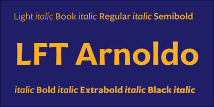 LFT Arnoldo began as an all-caps book cover typeface created during the rebranding of Oscar Mondadori, the most important Italian publisher, with over 4,500 titles from ancient classics to contemporary works, and spanning academic essays to children’s and self-help books. For such a diverse catalogue, it was necessary to find a coherent and flexible paradigm which took into account genre and readership differences and ensured harmony among its works. The main idea was to create a typeface suitable for the branding element and which could be used for each title of the immense catalogue. So what makes LFT Arnoldo a companion to the centuries? Starting with the design of the capital letters, it is first a rational typeface with contemporary proportions. But rationality without style wasn’t enough, so its glyphic nature carries an engraved feeling to resemble letters when chisel is put to stone. Once these two traits were settled, the entire character set was developed as a flared humanist sans in order to complete the family and extend its usage, from titles and display settings to texts. LFT Arnoldo sets titles with dignified authority to appear digitally carved and more arresting than the usual sans or flared sans designs of the past. It is calm and dependable in paragraph use and a captivating vehicle of aesthetic expression in title and display use. At once rugged and syncopated, the slight hourglass stems and incised details make each letter come alive and engrave each paragraph upon our emotions. LFT Arnoldo intends to be a resilient type family for centuries to come. Its seven roman weights have italic counterparts and the entire family is loaded with OpenType features: alternates, ligatures, small caps, oldstyle and lining numerals, and science and math capabilities. In the battle of charisma, where the right voice must project intelligence, influence, and refinement, LFT Arnoldo is the victor.
 - Barrista by Typodermic,
$11.95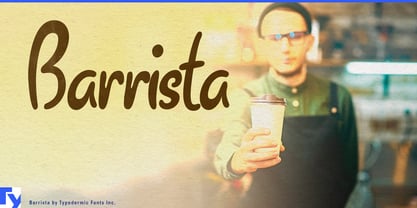 Welcome to our cozy coffee shop! Come on in, take a seat and savor the aroma of freshly brewed coffee. Speaking of coffee, have you seen our new font? Meet Barrista! Its relaxed, curly script perfectly captures the whirling curls of steam rising from a hot cup of Joe. Barrista is not just any font. Thanks to OpenType ligatures, certain letter combinations will automatically be substituted with customer pairings. This creates a natural, relaxed look that’s perfect for our laid-back atmosphere. Imagine jotting down your order in Barrista, watching as our talented baristas create your perfect cup of coffee. As you wait for your order, you can admire the intricate details of Barrista’s flowing script, which is inspired by the art of coffee-making itself. So, come on down to our coffee shop and experience Barrista for yourself. Most Latin-based European writing systems are supported, including the following languages. Afaan Oromo, Afar, Afrikaans, Albanian, Alsatian, Aromanian, Aymara, Bashkir (Latin), Basque, Belarusian (Latin), Bemba, Bikol, Bosnian, Breton, Cape Verdean, Creole, Catalan, Cebuano, Chamorro, Chavacano, Chichewa, Crimean Tatar (Latin), Croatian, Czech, Danish, Dawan, Dholuo, Dutch, English, Estonian, Faroese, Fijian, Filipino, Finnish, French, Frisian, Friulian, Gagauz (Latin), Galician, Ganda, Genoese, German, Greenlandic, Guadeloupean Creole, Haitian Creole, Hawaiian, Hiligaynon, Hungarian, Icelandic, Ilocano, Indonesian, Irish, Italian, Jamaican, Kaqchikel, Karakalpak (Latin), Kashubian, Kikongo, Kinyarwanda, Kirundi, Kurdish (Latin), Latvian, Lithuanian, Lombard, Low Saxon, Luxembourgish, Maasai, Makhuwa, Malay, Maltese, Māori, Moldovan, Montenegrin, Ndebele, Neapolitan, Norwegian, Novial, Occitan, Ossetian (Latin), Papiamento, Piedmontese, Polish, Portuguese, Quechua, Rarotongan, Romanian, Romansh, Sami, Sango, Saramaccan, Sardinian, Scottish Gaelic, Serbian (Latin), Shona, Sicilian, Silesian, Slovak, Slovenian, Somali, Sorbian, Sotho, Spanish, Swahili, Swazi, Swedish, Tagalog, Tahitian, Tetum, Tongan, Tshiluba, Tsonga, Tswana, Tumbuka, Turkish, Turkmen (Latin), Tuvaluan, Uzbek (Latin), Venetian, Vepsian, Võro, Walloon, Waray-Waray, Wayuu, Welsh, Wolof, Xhosa, Yapese, Zapotec Zulu and Zuni.
 - Generis Simple by Linotype,
$39.00The idea for the Generis type system came to Erik Faulhaber while he was traveling in the USA. Seeing typefaces mixed together in a business district motivated him to create a new type system with interrelated forms. The first design scheme came about in 1997, following the space saving model of these American Gothics. Faulhaber then examined the demands of legibility and various communications media before finally developing the plan behind this type system. Generis’s design includes two individually designed styles; each of with is available with and without serifs, giving the type system four separate families. Each includes at least four basic weights: Light, Regular, Medium, and Bold. Further weights, small caps, old style figures, and true italics were added to each family where needed. The Generis type system is designed to meet both optical criteria and the highest possible measure of technical precision. Harmony, rhythm, legibility, and formal restraint make up the foreground. Generis combines aesthetic, technical, and economic advantages, which purposefully and efficiently cover the whole range of corporate communication needs. The unified basic form and the individual peculiarity of the styles lead to Generis’ systematic, total-package concept. The clear formal language of the Generis type system resides beneath the information, bringing appropriate typographic expression to high-level corporate identity systems, both in print and on screen. The condensed and aspiring nature of the letterforms allows for the efficient setting of body copy, and the economic use of the page. A range of accented characters allows text to be set in 48 Latin-based languages, offering maximal typographic free range. This previously unknown level of technical and design execution helps create higher quality typography in all areas of corporate communication. Optimal combinations within the type system: Generis Serif or Generis Slab with Generis Sans or Generis Simple. - Metal Thorn by Alit Design,
$22.00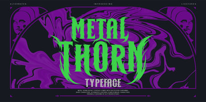 Introducing "Metal Thorn" – a font that seamlessly blends the raw power of metal with the edgy intensity of thorns, all wrapped up in a cutting-edge cyber aesthetic. This font is a manifestation of metal brutalism, designed to make a bold statement with its fierce and avant-garde personality. Metal Brutalism Concept: Inspired by the industrial strength and unapologetic nature of metal, Metal Thorn embodies the essence of brutalism, creating a visual impact that is both commanding and unyielding. Fierce Thorn Design: The thorn elements within the font give it a sharp and aggressive edge, adding an extra layer of intensity. Each character is crafted with precision, making Metal Thorn a formidable choice for those who seek to convey strength and determination through typography. Modern Cyber Feel: Infusing a touch of cyber aesthetics, Metal Thorn transcends traditional boundaries. Its sleek and futuristic design elements make it perfect for projects that demand a contemporary, cutting-edge vibe. Extensive Glyph Set: With a generous set of 1014 characters, Metal Thorn ensures versatility and flexibility in your design projects. From standard Latin characters to multilingual support, this font caters to a wide range of creative needs. Alternate and Ligature Support: Unlock even more design possibilities with alternate characters and ligatures. Metal Thorn allows you to experiment with different letterforms, providing options for a customized and dynamic typographic experience. Multilingual Support: Metal Thorn breaks language barriers, offering comprehensive multilingual support. Communicate your message globally with ease, as this font accommodates a diverse range of languages. Whether you're working on a poster, branding, digital art, or any other creative endeavor, Metal Thorn is your go-to choice for a font that demands attention. Elevate your designs with the raw energy of metal, the fierceness of thorns, and the modern sophistication of cyber aesthetics – all encapsulated in the captivating Metal Thorn font.
 - ChefScript by Andinistas,
$79.95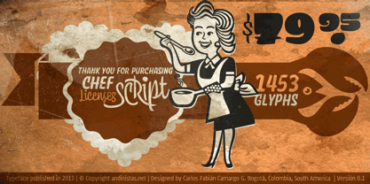 Chef Script is an experimental font designed by Carlos Fabian Camargo G. Its fantasy design contains 1463 glyphs to compose words, phrases and short messages on small and large sizes. The idea was born in a sketchbook that was perfected again by hand and achieving "non-neutral drawings" on tracing paper. With bezier digitization the empty and full parts of letters appeared with soft and eloquent curves as calligraphic result produces optimal readability. Chef Script combines warmth and good humor running in countless design applications such as labels and base plates, covers, posters, movie titles, seals and any printed design that needs an unusual typographic tool. In that sense, Chef Script is influenced by Speedball lettering manual (1957), Ross F. George. The illustrative nature of "ChefScript-complete" does not look anything like the traditional type design hierarchies. Therefore offers 7 hierarchical resource groups to design comfortable contexts flavored with illustration and typography: • ChefScript-Basic: Letters with horizontal and vertical thrifty proportions mimic an uninterrupted calligraphy brush made with flat tip. Thus its letters have ascenders and descenders strokes perpendicular to its base line and equal to the height of the lowercase. • ChefScript-Swashes: Letters expressive and unique flourishes to design highlighted words or phrases. • ChefScript-Caps: Uppercase with lowercase height give the impression of interrupted uppercase italics writing within what is written with uninterrupted lowercase letters producing strong contrast within a paragraph fragment. • ChefScript-Containers: Container drawings designed to exchange with infinite possibilities each order so that its inferior serve to store information written or drawn. • ChefScript-Dingbats: Pictograms that communicate: kitchen, chef, restaurant, food, etc. • ChefScript-Numbers: Bulky and useful numbers to highlight prices or figures containing points or dollar signs. • Chef Script-Words: Predesigned words with uninterrupted letters diagonally leveled highlighting various thoughts in writing.
 - Flyswim by Typodermic,
$11.95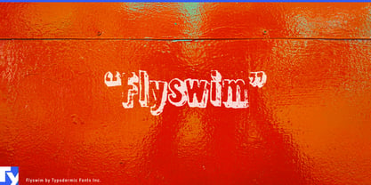 Introducing Flyswim, the font that’s as wild and rough as your message! This typeface was born to break the rules and stand out from the crowd, with its unique lackadaisical definition and pencil-drawn style. Flyswim is the perfect choice for anyone who wants to add a touch of raw, unpolished energy to their designs. But don’t let its casual tone fool you—Flyswim is packed with features that make it a versatile and professional font. In OpenType-aware apps, some letter combinations are automatically replaced with bespoke pairs, resulting in a more natural and organic appearance. And with its eraser-like texture, Flyswim adds a touch of handmade charm to any design. So whether you’re designing a poster, a website, or a product label, Flyswim is the font that will help you stand out from the pack. Download it today and unleash your wild side! Most Latin-based European writing systems are supported, including the following languages. Afaan Oromo, Afar, Afrikaans, Albanian, Alsatian, Aromanian, Aymara, Bashkir (Latin), Basque, Belarusian (Latin), Bemba, Bikol, Bosnian, Breton, Cape Verdean, Creole, Catalan, Cebuano, Chamorro, Chavacano, Chichewa, Crimean Tatar (Latin), Croatian, Czech, Danish, Dawan, Dholuo, Dutch, English, Estonian, Faroese, Fijian, Filipino, Finnish, French, Frisian, Friulian, Gagauz (Latin), Galician, Ganda, Genoese, German, Greenlandic, Guadeloupean Creole, Haitian Creole, Hawaiian, Hiligaynon, Hungarian, Icelandic, Ilocano, Indonesian, Irish, Italian, Jamaican, Kaqchikel, Karakalpak (Latin), Kashubian, Kikongo, Kinyarwanda, Kirundi, Kurdish (Latin), Latvian, Lithuanian, Lombard, Low Saxon, Luxembourgish, Maasai, Makhuwa, Malay, Maltese, Māori, Moldovan, Montenegrin, Ndebele, Neapolitan, Norwegian, Novial, Occitan, Ossetian (Latin), Papiamento, Piedmontese, Polish, Portuguese, Quechua, Rarotongan, Romanian, Romansh, Sami, Sango, Saramaccan, Sardinian, Scottish Gaelic, Serbian (Latin), Shona, Sicilian, Silesian, Slovak, Slovenian, Somali, Sorbian, Sotho, Spanish, Swahili, Swazi, Swedish, Tagalog, Tahitian, Tetum, Tongan, Tshiluba, Tsonga, Tswana, Tumbuka, Turkish, Turkmen (Latin), Tuvaluan, Uzbek (Latin), Venetian, Vepsian, Võro, Walloon, Waray-Waray, Wayuu, Welsh, Wolof, Xhosa, Yapese, Zapotec Zulu and Zuni.
 - Geometria by Brownfox,
$44.99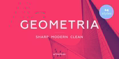 Although geometric Sans Serifs have been in vogue for nearly a century, they have never been as ubiquitous. It is not improbable that the old adage would be phrased: “When in doubt, set it in geometric sans”, had it been composed today. Have we not had enough? We think, not. Postmodern times demand a variety of expressions. The vision behind Geometria was to revisit the perennial favorite to lend subtle individuality to its tried and true forms. Geometria stands out in the crowd of similar fonts thanks to its complicated nature. It combines dynamic elements with a certain degree of stability. A slightly higher waistline of the capitals contributes to their distinctive appearance. If the upper case refers to the American grotesques of the 19th century, the lower case tends toward the forms of the Renaissance in its proportions. Geometria is a typeface of clean shapes that is well-suited for continuous reading, and it sets remarkably well. At the same time, it can be friendly, even flirtatious. Its distinct personality combines seeming opposites. At times it may appear serious, at times playful. On occasion, it may be deliberate, other times dynamic. It could seem rigid, then elegant. It is a typeface that could be perceived either as cutting-edge, or as nostalgic. A careful and discerning typographer will bring out and emphasize those aspects of its multifaceted personality that are needed to solve the problem at hand. Geometria consists of 24 fonts — eight weights with matching italics and narrow styles. The font includes multiple sets of figures and currency signs, alternate glyphs, a variety of experimental ligatures, and punctuation marks for the two cases. The 835 glyphs support 72 languages. Granshan 2013 award.
 - Generis Sans by Linotype,
$29.00The idea for the Generis type system came to Erik Faulhaber while he was traveling in the USA. Seeing typefaces mixed together in a business district motivated him to create a new type system with interrelated forms. The first design scheme came about in 1997, following the space saving model of these American Gothics. Faulhaber then examined the demands of legibility and various communications media before finally developing the plan behind this type system. Generis’s design includes two individually designed styles; each of with is available with and without serifs, giving the type system four separate families. Each includes at least four basic weights: Light, Regular, Medium, and Bold. Further weights, small caps, old style figures, and true italics were added to each family where needed. The Generis type system is designed to meet both optical criteria and the highest possible measure of technical precision. Harmony, rhythm, legibility, and formal restraint make up the foreground. Generis combines aesthetic, technical, and economic advantages, which purposefully and efficiently cover the whole range of corporate communication needs. The unified basic form and the individual peculiarity of the styles lead to Generis’ systematic, total-package concept. The clear formal language of the Generis type system resides beneath the information, bringing appropriate typographic expression to high-level corporate identity systems, both in print and on screen. The condensed and aspiring nature of the letterforms allows for the efficient setting of body copy, and the economic use of the page. A range of accented characters allows text to be set in 48 Latin-based languages, offering maximal typographic free range. This previously unknown level of technical and design execution helps create higher quality typography in all areas of corporate communication. Optimal combinations within the type system: Generis Serif or Generis Slab with Generis Sans or Generis Simple. - Parma by Monotype,
$29.99Giambattista Bodoni (1740-1813) was called the King of Printers; he was a prolific type designer, a masterful engraver of punches and the most widely admired printer of his time. His books and typefaces were created during the 45 years he was the director of the fine press and publishing house of the Duke of Parma in Italy. He produced the best of what are known as modern" style types, basing them on the finest writing of his time. Modern types represented the ultimate typographic development of the late eighteenth and early nineteenth centuries. They have characteristics quite different from the types that preceded them; such as extreme vertical stress, fine hairlines contrasted by bold main strokes, and very subtle, almost non-existent bracketing of sharply defined hairline serifs. Bodoni saw this style as beautiful and harmonious-the natural result of writing done with a well-cut pen, and the look was fashionable and admired. Other punchcutters, such as the Didot family (1689-1853) in France, and J. E. Walbaum (1768-1839) in Germany made their own versions of the modern faces. Even though some nineteenth century critics turned up their noses and called such types shattering and chilly, today the Bodoni moderns are seen in much the same light as they were in his own time. When used with care, the Bodoni types are both romantic and elegant, with a presence that adds tasteful sparkle to headlines and advertising. Parma was designed by the monotype Design Team after studying Bodoni's steel punches at the Museo Bodoniana in Parma, Italy. They also referred to specimens from the "Manuale Tipografico," a monumental collection of Bodoni's work published by his widow in 1818. - Wild Loops by Michael Rafailyk,
$9.00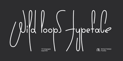 Wild Loops is a handwritten monolinear typeface for wild ideas. Inspired by the marker sketches and graffiti on the walls, the font perfectly complements Doodle illustrations. It speaks to a young audience and looks a bit crazy with stretched Ascenders and Descenders. At the same time, the font is elegant and will work well for invitations, greetings, clothing brands and jewelry. The main feature of the font is a smart Contextual Alternates that substitute different versions of letters depending on its position in the word (at the beginning, middle, and the end of a word), which makes the writing more natural. View PDF Specimen: https://michaelrafailyk.com/typeface/specimen/WildLoops.pdf Contextual Alternates: ACDEFGHIJKMRSUWZabcdefghjlmnqrstvwxyzАДЕЁЗІЇКЛМНСШЩЯгдеёжзклмнстухцщьΑΕΖΗΙΚΛΜΞΥΆΈΉΪϲÀÁÂÃÄÅĄĂĀẢẠẮẰẲẴẶẤẦẨẪẬȦĎĐÐÈÉÊËĚĒĖẺẼẾỀỂỄƐĞǦĠÌÍÎÏĮĪĨỈỊİṂŘŔŠŚȘŽŹŻçğģǧġņṇřŕŗşṣýỳÿỷỹỵžźżЈјЅѕўӯ123456789. Stylistic Alternates: ABCDEFGHIJKLMNQRSUVWXZabcdefghjklmnqrstvwxyzАВДЕЁЗІЇКЛМНСТШЩЯгдеёжзклмнстухцщьΑΕΖΗΙΚΛΜΞΥΆΈΉΪκϲÀÁÂÃÄÅĄĂĀẢẠẮẰẲẴẶẤẦẨẪẬȦĎĐÐÈÉÊËĚĒĖẺẼẾỀỂỄƐĞǦĠÌÍÎÏĮĪĨỈỊİṂŘŔŠŚȘŽŹŻçğģǧġņṇřŕŗşṣýỳÿỷỹỵžźżЈјЅѕўӯ123456789&. Ligatures: jj ll. Superscript, Subscript, Fractions: ⁰¹²³⁴⁵⁶⁷⁸⁹ ₀₁₂₃₄₅₆₇₈₉ ½ ¼ ¾. Glyph count: 994. Languages count: 104. Languages: Afar, Afrikaans, Albanian, Asturian, Azerbaijani (Latin), Basque, Belarusian, Bislama, Bosnian, Breton, Bulgarian, Catalan, Chamorro, Chewa (Latin), Croatian (Latin), Cornish, Corsican, Czech, Danish, Dinka, Dutch, English, Erzya, Estonian, Faroese, Finnish, French, Frisian, Friulian, Fula, Gaelic (Scottish), Galician, German, Greek, Greenlandic, Guarani, Hausa (Latin), Hungarian, Icelandic, Igbo (Latin), Indonesian, Irish, Italian, Karelian, Kashubian, Kinyarwanda (Ruanda), Kirundi (Rundi), Kumyk, Kurdish (Latin), Ladin, Latvian, Lithuanian, Luxembourgian, Macedonian, Malagasy (Latin), Malay (Latin), Maltese, Maori, Marshallese, Moksha, Mongolian (Cyrillic), Northern Sotho, Norwegian, Occitan, Oromo (Afan, Galla), Papiamentu, Polish, Portuguese, Quechua, Rhaeto-Romance, Romani (Latin), Romanian, Russian, Rusyn, Sami, Samoan, Sardinian, Serbian, Shona, Slovak, Slovene, Somali, Sorbian, Spanish, Swahili (Kiswahili), Swedish, Tagalog, Tatar (Cyrillic, Latin), Tongan, Tsonga, Tswana, Turkish, Turkmen (Latin), Ukrainian, Ulithian, Uzbek (Latin, Cyrillic), Venda, Vietnamese, Walloon, Welsh, Wolof (Latin), Xhosa, Yapese, Yoruba (Latin), Zulu. The promo images used illustrations from the city walls of Groningen and Wrocław, photos of Cottonbro, Karolina Grabowska, Marlene Leppänen, Zhugewala from Pexels, and photos of Kevin Grieve, Liwei Zhang, Nathan Dumlao from Unsplash.
 - Modern Love by Resistenza,
$39.00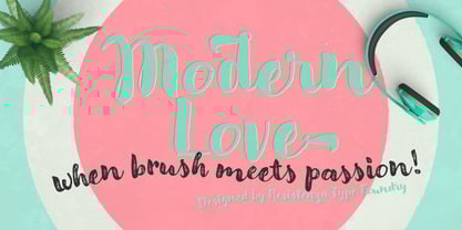 Breaking from our catalog of typefaces to create a new handwritten font family, Modern Love was born out of our desire to see what would happen if we took a step back from the norm. We weren’t looking for the perfection of the many calligraphy techniques, but more of a natural way of writing with the same tools. Our escapist experiment into casual lettering culminated into 4 fonts: Modern Love Regular, Grunge, Rough and Caps. Modern Love Regular is a hand-painted script, each glyph individually designed with a pointed brush and walnut ink. The aim was to create an effortless hand-drawn feel while keeping the contrast high density. Playful, yet polished, this font works very well when accentuated with the family’s two distinctive styles: Modern Love Grunge, simulating a washed-out effect, perfect to add a vintage look to your projects; and Modern Love Rough, with its crunchy borders, makes letters visibly rough-around-the edges and gives large letters an unmistakeable pop. All three fonts include a hand-painted set of ornaments, swashes and alternates to limitlessly customize and decorate your texts, accessible through Opentype features. Modern Love Caps is the fourth font, a handwritten Sans Serif that ties the family together with its simplicity and readability. Designed with a pointed nib and Indian ink, this font boasts a different style that perfectly complements Modern Love Regular, Grunge and Rough. The result is a fresh font family perfect to create headlines, posters, DIY hand-lettered artwork, books, holiday cards, wrapping paper, invitations, T-shirts, labels, packaging for cosmetics, fashion supplies, food products, artisanal goods, and an endless array of options for your projects. Modern Love…when brush meets passion. Check out also ‘Modern Love Slanted’ Turquoise Nautica
 - Garelina by Riasyletter_Studio,
$19.00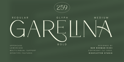 Looking for a minimalist and luxurious serif font for logos, web design, clothing promotions, brochures, and more? Garelina is the answer. This font has thin and smooth lines that make it look elegant and luxurious. Garelina is perfect for branding and promotion purposes. With its delicate typography, this font can add aesthetic value to your design. Garelina also has several letter variants making it easy to use for various design types. With Garelina, you can create minimalist designs that still look luxurious and elegant. This font is perfect for companies that want to display a professional and stylish image. Do not hesitate to try Garelina on your design now. You will be surprised how easy it is to make elegant and luxurious designs with this serif font. Garelina, the elegant and luxurious serif font for your branding needs. What's Included : - Garelina OTF - More than 250 of glyphs (include Uppercase, Lowercase, Numerals & Punctuations,Ligatures and Stylistic) - Multilingual support - Works on PC & Mac - Simple installations - Accessible in the Adobe Illustrator, Adobe Photoshop, Adobe InDesign, even work on Microsoft Word. - PUA Encoded Characters (fully accessible without additional design software) Support For Language : Albanian, Basque, Breton, Chamorro, Danish, Dutch, English, Finnish, French, Frisian, Galician, German, Italian, Malagasy, Norwegian, Portuguese, Spanish, Alsatian, Aragonese, Arapaho, Arrernte, Asturian, Aymara, Bislama, Cebuano, Corsican, Fijian, French_creole, Genoese, Gilbertese, Greenlandic, Haitian_creole, Hiligaynon, Hmong, Hopi, Ibanag, Iloko_ilokano, Indonesian, Interglossa_glosa, Interlingua, Irish_gaelic, Jerriais, Lojban, Lombard, Luxembourgeois, Manx, Mohawk, Norfolk_pitcairnese, Occitan, Oromo, Pangasinan, Papiamento, Piedmontese, Potawatomi, Rhaeto-romance, Romansh, Rotokas, Sami_lule, Samoan, Sardinian, Scots_gaelic, Seychelles_creole, Shona, Sicilian, Somali, Southern_ndebele, Swahili, Swati_swazi, Tagalog_filipino_pilipino, Tetum, Tok_pisin, Uyghur_latinized, Volapuk, Walloon, Warlpiri, Xhosa, Yapese, Zulu, Latinbasic, Ubasic, Demo
 - Bakemono by Zetafonts,
$39.00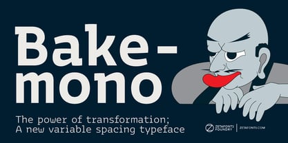 Francesco Canovaro created Bakemono as a way to explore the design space around the duality of fixed/proportional width. He was also interested in the concept of monowidth design, inherent in monospaced typefaces, that can bring flexibility and ease of use also to proportional type - allowing you to change the weight of a word without losing the text alignment. In his research on fixed width type design he mixed the lessons of mechanical typewriter technology with the intuitions of eastern brush calligraphy, which has been dealing with for centuries with fixed space grids. The name of the typeface comes from the Japanese shape-shifter yokais that could change their form freely between human and animal, and aptly describes the metamorphic nature of this wide superfamily coming in proportional, monospace and intermediate subfamilies. With a design mixing the expansion principles of the brush with the sharp technicality of typewriter and system fonts, Bakemono can both excel at text size in its regular widths optimized for legibility as well as owning the page at display size with its uncommon design details. Bakemono reflects its multicultural nature with its extended latin + cyrillic charset, soon to be expanded with Bakemono Arabic (exploring the fascinating world of monospaced arabic script) and Bakemono Kana (our first experiment in cjk scripts). • Suggested uses: born to allow you to change the weight of a word without losing the text alignment, Bakemono can both excel at text size in its regular widths optimised for legibility as well as owning the page at display size with its uncommon design details. Perfect for contemporary branding, web design, packaging and countless other projects; • 21 styles: 7 weights x 3 different styles + 1 variable font; • 839 glyphs in each weight; • Useful OpenType features: Access All Alternates, Contextual Alternates, Case-Sensitive Forms, Glyph Composition / Decomposition, Denominators, Fractions, Localized Forms, Mark Positioning, Mark to Mark Positioning, Alternate Annotation Forms, Numerators, Ordinals, Scientific Inferiors, 7 Stylistic Sets, Subscript, Superscript, Slashed Zero • 217 languages supported (extended Latin and Cyrillic alphabets): English, Spanish, Portuguese, French, Russian, German, Javanese (Latin), Vietnamese, Turkish, Italian, Polish, Afaan Oromo, Azeri, Tagalog, Sundanese (Latin), Filipino, Moldovan, Romanian, Indonesian, Dutch, Cebuano, Igbo, Malay, Uzbek (Latin), Kurdish (Latin), Swahili, Hungarian, Czech, Haitian Creole, Hiligaynon, Afrikaans, Somali, Zulu, Serbian, Swedish, Bulgarian, Shona, Quechua, Albanian, Catalan, Chichewa, Ilocano, Kikongo, Kinyarwanda, Neapolitan, Xhosa, Tshiluba, Slovak, Danish, Gikuyu, Finnish, Norwegian, Sicilian, Sotho (Southern), Kirundi, Tswana, Sotho (Northern), Belarusian (Latin), Turkmen (Latin), Bemba, Lombard, Lithuanian, Tsonga, Wolof, Jamaican, Dholuo, Galician, Ganda, Low Saxon, Waray-Waray, Makhuwa, Bikol, Kapampangan (Latin), Aymara, Ndebele, Slovenian, Tumbuka, Venetian, Genoese, Piedmontese, Swazi, Zazaki, Latvian, Nahuatl, Silesian, Bashkir (Latin), Sardinian, Estonian, Afar, Cape Verdean Creole, Maasai, Occitan, Tetum, Oshiwambo, Basque, Welsh, Chavacano, Dawan, Montenegrin, Walloon, Asturian, Kaqchikel, Ossetian (Latin), Zapotec, Frisian, Guadeloupean Creole, Q’eqchi’, Karakalpak (Latin), Crimean Tatar (Latin), Sango, Luxembourgish, Samoan, Maltese, Tzotzil, Fijian, Friulian, Icelandic, Sranan, Wayuu, Papiamento, Aromanian, Corsican, Breton, Amis, Gagauz (Latin), Māori, Tok Pisin, Tongan, Alsatian, Atayal, Kiribati, Seychellois Creole, Võro, Tahitian, Scottish Gaelic, Chamorro, Greenlandic (Kalaallisut), Kashubian, Faroese, Rarotongan, Sorbian (Upper Sorbian), Karelian (Latin), Romansh, Chickasaw, Arvanitic (Latin), Nagamese Creole, Saramaccan, Ladin, Kaingang, Palauan, Sami (Northern Sami), Sorbian (Lower Sorbian), Drehu, Wallisian, Aragonese, Mirandese, Tuvaluan, Xavante, Zuni, Montagnais, Hawaiian, Marquesan, Niuean, Yapese, Vepsian, Bislama, Hopi, Megleno-Romanian, Creek, Aranese, Rotokas, Tokelauan, Mohawk, Onĕipŏt, Warlpiri, Cimbrian, Sami (Lule Sami), Jèrriais, Arrernte, Murrinh-Patha, Kala Lagaw Ya, Cofán, Gwich’in, Seri, Sami (Southern Sami), Istro-Romanian, Wik-Mungkan, Anuta, Cornish, Sami (Inari Sami), Yindjibarndi, Noongar, Hotcąk (Latin), Meriam Mir, Manx, Shawnee, Gooniyandi, Ido, Wiradjuri, Hän, Ngiyambaa, Delaware, Potawatomi, Abenaki, Esperanto, Folkspraak, Interglossa, Interlingua, Latin, Latino sine Flexione, Lojban, Novial, Occidental, Old Icelandic, Old Norse, Slovio (Latin), Volapük
 - Woodford Bourne PRO by Monotype,
$25.99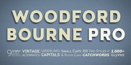 Woodford Bourne PRO is the evolution of my original Woodford Bourne typeface that was inspired by the iconic stone cast letters on the façades of the 19th century Woodford, Bourne & Co. buildings in Cork City, Ireland. Woodford Bourne PRO has matured with numerous improvements to make it an even more versatile font family. The fonts have been completely redrawn and spaced, there are now an additional 500 glyphs for you to use across 9 stylistic sets. The additions include underlined caps, small caps, petite caps, catchwords, discretionary ligatures and more. Please view the specification sheet before you purchase to see all the glyphs and features. Key features: • Woodford Bourne PRO is a vintage geometric sans, optically adjusted for improved aesthetics and legibility 2 FONTS IN 1 – Use the default contemporary character set, or switch to vintage style with stylistic sets 9 Weights in Roman and Italic Thin | ExtraLight | Light | Regular | Medium | SemiBold | Bold | Black | Ultra Underlined Caps, Small Caps, Petite Caps, Catchwords, Discretionary Ligatures Full European character set 1000+ glyphs per font UPDATED JULY 2021 (v.3) Woodford Bourne PRO v.3 update includes numerous improvements including rebalanced /S/s/ glyphs to make them less ‘top heavy’. Italics have been redrawn to smoothe out irregularities. Improvements have been made to diacritics and glyph coverage now supports all Latin European languages.
 - Tichy by NoCommenType,
$20.00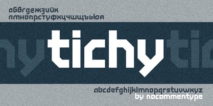 The "Tichy" typeface is intended for use in titles, headlines and in short text blocks, like citates. However, the typeface is legible even in larger text blocks. It's strong appeal allows the typeface's usage mixed with other graphic elements of the layout without compromising it's readability and it's presence. The typeface's simple initial module (double braked at 135 degrees straight line), the strict rules of forming the letters lead to an unique typeface - masculine, strong and still legible. The Cyrillic glyphs are influenced by the work of the great Bulgarian typographers Boris Angelushev, Vassil Yonchev and Alexander Poplilov, who developed Cyrillic further in 60-s and 70-s of the XX century. Western, East European, Cyrillic, Baltic and Turkish codepages are supported. The font file contains all the basic ligatures, alternate glyphs and kern pairs. It can be used both on Windows and MacOS based computers. The history of "Tichy" typeface began many years ago with a project for logotype design for a small company. It was a kind of designer's game to try making some letters just using one single module. Development of the other glyphs of the latin alphabet was for many years a mandatory exercise for the young colleagues in our studio. Suddenly we realized that this project matured and creation of a new typeface started.
 - BF Corpa Gothic Pro by BrassFonts,
$39.00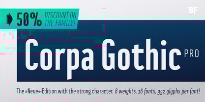 BF Corpa Gothic™ Pro is a kind of “Neue”-Edition of the beloved typeface designed by Guido Schneider. Inspired by hand-drawn geometric fonts from 1920s posters, this sans serif typeface is slightly condensed, and it appears compact and captivates with its expressive shapes and unique details, despite its pronounced Grotesque character. With its rather constructed, technical – but also vivid – appearance, the BF Corpa Gothic™ Pro is not only suitable for headlines and display applications, but is also pleasant to read in short and middle length text. The type family is engineered for exciting, professional but unusual designs. It is equipped with OpenType Features like 4 figure sets (LF, TF, OSF, SC), nice ligatures, many currency symbols, fractions, alternates, special characters, arrows and symbols – and small caps. 9 style sets give you the option to individualize and adjust the typeface to the requirement of your design, without changing the general visual feeling. In this way you can also switch the simply slanted styled Italic into a “real Italic”. Each of the 16 fonts (Upright and Italic) contains more than 940 glyphs and supports up to 220 Latin-based languages.
 - Jumping Jess by The Mafia Rabbit Foundry,
$9.99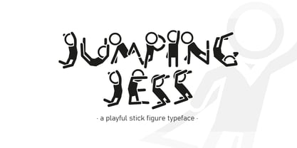 Jumping Jess is a high quality decorative typeface making use of Stick Figures in various playful jumping poses to depict the letters A-Z. Numbers, symbols and punctuation are composed of elements from the Stick Figure design to visually complement the letters of the alphabet. With a comprehensive set of Ligatures and hundreds of Hand-kerned pairs, Jumping Jess was developed to look great with any string of letters. This font is suitable for greeting cards, sports posters, logos, signage, menus, wedding invitations, product packaging, craft, children's writing, t-shirts, quotes, social media page covers, large format event banners, book covers, magazine title pages and so much more. We highly recommend using an application that supports Open Type features. Ligatures will better display double consonants like "TT" and "LL" and other character combinations like "SH" and "ZY". Ligatures are enabled by default on some applications like Notepad and Photoshop but disabled by default on others like Word and Paintshop. FEATURES Uppercase alphabet 50+ Ligatures, 400+ Kerning Pairs Full range of numbers, symbols & punctuation Comprehensive language support* * ISO-8859-1, ISO/IEC 8859-15, Windows-1252 (e.g. French, German, Polish, Spanish, Italian, Portuguese, Finnish, Norwegian, Swedish, ...)
 - Amitale by Hackberry Font Foundry,
$24.95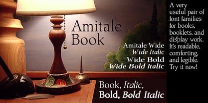 Amitale (A-mi-tah'-lay) is the union of Amitale Book and Amitale Wide into a new 8-font book family in my continuing objective of designing a better font family for readability in booklets. My goal here is for a full range of styles from light, regular, bold, and black without the plugged counters and clunky feel of most bold fonts. In my use, personally. I do not use Amitale Book Bold. I use Wide for the bold and Wide-Bold for the black style. In many ways, Amitale is Brinar with bracketed serifs. Many people find Brinar to be an exceptionally readable and beautiful humanist sans. This new serif font family has many of the same characteristics. This is also the debut of my new OpenType features set for 2009. There are more and more ligatures for your fun and enjoyment: bb gg ff fi fl ffi ffl ffy fj ft tt ty Wh Th and more. Like all of my fonts, there are: caps, lowercase, small caps, proportional lining figures, proportional oldstyle figures, & small cap figures, plus numerators, denominators, superiors, inferiors, and a complete set of ordinals 1st through infinity.
 - Aero Blend by Design A Lot,
$25.00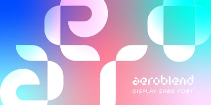 Meet AeroBlend Display Font, a modern and futuristic typeface that brings a touch of sleekness to your creative projects. With its clean lines, intersecting curves, and contemporary vibe, AeroBlend is the perfect typography solution for bold and innovative projects. Designed with precision, this font strikes the right balance between style and readability. It offers a single weight/style that effortlessly combines elegance with a touch of technological sophistication. This makes it incredibly versatile and suitable for a wide range of design applications. From attention-grabbing headlines to memorable branding projects, AeroBlend Display Font helps you make an impact. Its strong presence adds a sense of modernity to your designs, ensuring that your message stands out from the crowd. With AeroBlend Display Font, you have access to an extensive character set. It includes lowercase and uppercase letters, numerals, special characters, accented characters, and a variety of symbols. This comprehensive collection gives you the freedom to express your creativity and bring your vision to life with clarity and precision. Crafted with meticulous attention to detail, this font is available in the .OTF (OpenType) file format, ensuring compatibility across various design software and platforms. One of the notable features of it is its set of alternates. Certain letters have carefully designed alternatives, adding even more versatility and creative possibilities to your designs. Whether you’re a graphic designer, web developer, or simply a typography enthusiast, AeroBlend Display Font is a must-have in your toolkit. It’s crafted to meet the demands of modern design, offering versatility, legibility, and a hint of futuristic charm. It’s perfect for branding, headlines, posters, packaging, monogram designs and more. Take your projects to the next level with AeroBlend Display Font and unleash your creative potential. Let AeroBlend add a touch of modern sophistication to your designs and create an unforgettable visual experience.
 - Canturiana by Latinotype,
$39.00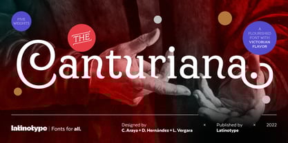 According to the Dictionary of the Spanish Royal Academy, «canturía» is the exercise of singing, and a way of singing musical compositions. Canturiana Type (derived from «canturía») has a romantic and musical air, as well as a clear sensuality thanks to its sinuous construction. The curves seduce us, conquer us, hypnotize us and the letters acquire a resounding lightness, and a very earthly presence that is complemented by a certain aerial, spiritual expressiveness. Canturiana Type is inspired by Canterbury, a font designed in the 1920s by the legendary American type designer and engineer Morris Fuller Benton and published by the American Type Founders (ATF). Canturiana Type collects all this heritage and transforms it into a digital typeface perfectly functional and adapted to the visual communication of the 21st century. Its elegant art deco essence provides it with a unique and heterodox imprint that works in very different media, giving them distinction and depth. The creative process of Canturiana Type has gone through various mutations to a point where each episode of its creation has left its mark, a multiple imprint that makes it unique, singular in its essence and plural in its possibilities. For this reason, Canturiana Type expresses itself with several voices without any variation in its essence. A conceptual ambiguity that makes it truly versatile. Canturiana Type is a typographic choir, a complex entity that has infinite nuances and tones. Classic and cool. Disruptive and romantic. Literary and musical. Canturiana Type is composed of 5 weights, and has a large number of swashes, alternate characters, ligatures and various visual elements to make compositions as titles or for use in short texts. Canturiana Type has more than a thousand glyphs and offers a wide range of languages that use the Latin alphabet.
 - Let's Jazz by Unio Creative Solutions,
$9.00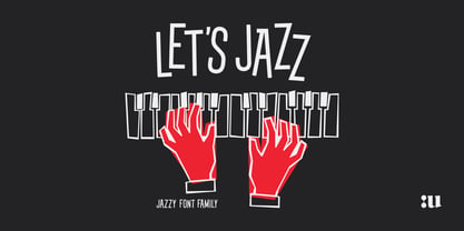 Introducing “Let’s Jazz” - a playful typeface which is inspired by iconic mid-century American advertising and lettering. With this project we wanted to homage the dazzling graphics of those booming years and the result is a jazzy typeface that provides a condensed aspect with a bouncy rhythm. As previously said, Let’s Jazz gives the spontaneous vibe of this sensational music genre but it has been also designed with a strong focus to the very distinct look of Saul Bass graphics, which are honestly still fresh and convincing, even nowadays. Let’s Jazz offers two versions, Regular and Stamp. Each version contains more than 450 glyphs and covers several languages based on the Latin alphabet; the jazzy experience is enhanced with OpenType (OTF) support for small caps and includes some neat ligatures and alternates plus the oldstyle bouncy numerals*. This package is a powerful tool in a wide variety of design purposes: headlines, packaging, logotypes, badges, posters and much more. *Let’s Jazz has built-in OpenType features enabled for Adobe® Creative Suite® and any other opentype capable software. All the extra characters has been additionally coded with “PUA Unicode”, which basically means that this font duo is totally accessible without any additional design software. All the extra characters can now be copied straight out the FontBook (Mac) or CharacterMap (Win) and pasted into your favorite text editor. Official mini-tutorials available here: - How to access alternates, ligatures and swashes in Font Book®: https://youtu.be/mGKlvKr0ReI - How to use alternates, ligatures and swashes in Photoshop®: https://youtu.be/46ZtDbHwUAc Specifications: - Multi-language Support (Central, Eastern, Western European languages) - OpenType features (Standard and Discretionary Ligatures, Alternates, Small Caps, OldStyle Numerals) - PUA Coded Extra Characters Thanks for viewing, Unio.
 - Hand of Hannah by TypoGraphicDesign,
$19.00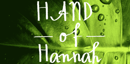 The typeface Hand of Hannah is designed from 2021 for the font foundry Typo Graphic Design by Hannah Englisch & Manuel Viergutz. The character of the handwritten script typeface is rough, ruggend and raw. With state-of-the-art OpenType-Feature (like Contextual Alternates (calt) and Stylistic Alternates (salt)). Each uppercase and each lowercase letter has automatically alternated two variations to bring humanly-random characteristics of handwriting to life. 4 font-styles (Regular, Bold, Heavy & Icons) with 732 glyphs (Latin 3) incl. 100+ decorative extras like icons, arrows, catch words, dingbats, emojis, symbols, geometric shapes (type the word #LOVE for ♥︎ or #SMILE for ☺ as OpenType-Feature dlig) and stylistic alternates. For use in logos, magazines, posters, advertisement plus as webfont for decorative headlines. The font works best for display size. Have fun with this font & use the DEMO-FONT (with reduced glyph-set) FOR FREE! ■ Font Name: Hand of Hannah ■ Font Styles: 4 font-styles (Regular, Bold, Heavy, Icon) + DEMO (with reduced glyph-set) ■ Font Category: Display Script for headline size ■ Font Format:.otf (Mac + Win, for Print) + .woff (for Web) ■ Glyph Set: 732 glyphs (Latin 3 incl. decorative extras like icons) ■ Language Support: 80 languages: Afrikaans Albanian Asu Basque Bemba Bena Breton Catalan Chiga Colognian Cornish Croatian Czech Danish Dutch English Estonian Faroese Filipino Finnish French Friulian Galician German Gusii Hungarian Indonesian Irish Italian Kabuverdianu Kalenjin Kinyarwanda Latvian Lithuanian Lower Sorbian Luo Luxembourgish Luyia Machame Makhuwa-Meetto Makonde Malagasy Manx Morisyen North Ndebele Norwegian Bokmål Norwegian Nynorsk Nyankole Oromo Polish Portuguese Quechua Romanian Romansh Rombo Rundi Rwa Samburu Sango Sangu Scottish Gaelic Sena Serbian Shambala Shona Slovak Soga Somali Spanish Swahili Swedish Swiss German Taita Teso Turkish Upper Sorbian Uzbek (Latin) Volapük Vunjo Zulu ■ Design Date: 2021 ■ Type Designer: Hannah Englisch, Manuel Viergutz
 - P22 Kilkenny by IHOF,
$69.95Kilkenny is a decorative, Victorian-style font based on the metal type named Nymphic that was designed by Hermann Ihlenberg. Ihlenburg was born in Germany in 1843 where he studied art and worked for several German type foundries. He moved to the USA in 1866 and worked for the L. Johnson & Co. foundry, later MacKellar, Smiths & Jordan. American Type Founders acquired this typeface when they took over the MacKellar, Smiths & Jordan foundry and Nymphic appears in the ATF catalog of 1896. For this digital version, the character set has been expanded to include accented characters, punctuation, and currency symbols—and most everything you would expect to find in a digital font. The original metal font consisted of swash caps, upper case characters, and a “morticed” lower case, which was raised off the baseline. This mortcied form was designed to nestle inside the ornate swash caps as well as to work with the upper case. The five digital versions contained in this set are basically different configurations of these different alphabet sets, they differ as follows: Kilkenny—the original upper case version with a modified lower case that has been enlarged, shifted to align along the baseline, and given taller ascenders to give it a more “regular” appearance. Kilkenny Eureka—true to the original design with the “morticed” or superior lowercase forms. Kilkenny Swash—original swash caps with the modified lower case. Kilkenny Swash Caps—original swash caps with the original caps as the lower case. Kilkenny Swash Eureka—swash caps that have been adjusted to match the weight of the original lower case forms. The OpenType version contains all of the above, plus additional Central European and Cyrillic characters for a total of almost 1000 glyphs. - Inkarus by Scratch Design,
$10.00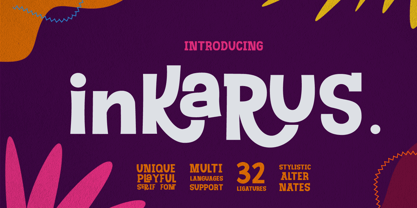 Introducing Inkarus a playful font with a bold and all uppercase characters style. This font is perfect for posters designs, packaging, logotype, title, label, print ads, gift card, magazine title, movie title, sign, and the beautiful and curvy shape will give your designs that alternative look to your creative work looks innovative. Amazing curvy was hand-drawn and make the outlines look irregular and beautiful. This font has a lot of hand-lettered looks and the characters give a retro or urban feel. Inkarus has a serif style but can collaborate with sans-serif style together because the modern bold sans serif typeface has been the alternatives and ligatures of this font. Combine that bold shapes together will make your work a more unique, retro attitude. Ligatures Inkarus has 32 ligatures that you can turn on via the glyphs panel in Adobe applications. The ligatures make a innovative difference in the look of this font. It switches out between serif and sans serif styles that make your designs look still unity. Opentype The Alternatives and Ligatures use OpenType features. First, you will need a design app to access these options an application such as Adobe Photoshop, Illustrator, or InDesign. Alternatives All lowercase a,d,e,h, I, j,k,l,m,n, p,r, t, r you can switch out letters for other and makes your design look more like hand-lettering and innovative although you using in a repetitive way. Inkarus font includes; All uppercase characters 32 ligatures option Support for multi-languages characters Punctuation, Symbols, and Numbers Alternative lowercase characters ( a,d,e,h, I, j,k,l,m,n, p,r, t, r ) The font format is OTF So what you are waiting for? Grab it fast this font and make your innovative design. If you have any questions drop me a message.
 - Rhythm by Positype,
$42.00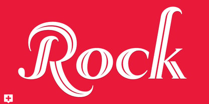 I hate the idea of revivals. I have publicly said I choose not to do revivals because they make me uncomfortable. This is as close as I have been to crossing my own line. To be direct, Rhythm is based on the ATF typeface, Ratio (I just recently learned the foundry of origin). I came across this typeface from a printed specimen years ago when I was in school and held onto it. It was unique and I loved how well integrated the inline worked within both the flourish and serif of the glyphs—it was old, but not, reminiscent, but fresh. My specimen was limited in the glyph offering (it was c. 1930ish) and I realized a lot would need to be done to ‘finish’ it and bring it to contemporary expectations. I didn't want to do ‘retro’ and tried to avoid the visual trappings associated with it. What I did want to do is interpret what I had in the specimen and reinterpret it digitally, refining its construction and extending its typographic equity along the way. The ‘One’ and ‘Two’ (and their matching ‘Solids’) styles diverge providing various elaborations that coordinate well between rigid bracketed serifs and compact tails. I further expanded the glyph offering to include a full diacritic set, old style numerals, fractions, stylistic alternates, swashes, titling alternates and controlled flourishes that adhere to the efficient framework of the script. And yes, I refer to it as a ‘script’ because calling it a ‘cutesy serif’ seems wrong :) I hope this is seen less as a slavish revival and more as a championing of a really unique typeface. The Original Typeface was Adastra, designed by Herbert Thannhaeuser for the Foundry D. Stempel AG in Frankfurt, Germany.
 - Hand Of Evouli by TypoGraphicDesign,
$9.00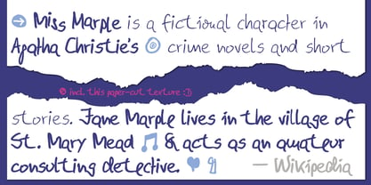 The typeface Hand Of Evouli is designed from 2022 for the font foundry Typo Graphic Design by Manuel Viergutz. The display font based on the original Handwriting. Digitized via handwritten template. Thanks to Evouli. 6 font-styles (Light Pen, Bold, xBold, Black Marker, Black Bounce, Mix) + 1 icon-style with 567 glyphs (Adobe Latin 3) incl. 100+ decorative extras like icons, arrows, dingbats, emojis, symbols, geometric shapes (type the word #LOVE for ❤️ or #SMILE for 🙂 as OpenType-Feature dlig) and stylistic alternates (4 stylistic sets). For use in logos, magazines, posters, advertisement plus as webfont for decorative headlines. The font works best for display size. Have fun with this font & use the DEMO-FONT (with reduced glyph-set) FOR FREE! Font Specifications ■ Font Name: Hand Of Evouli ■ Font Styles: 6 font styles (Light Pen, Bold, xBold, Black Marker, Black Bounce, Mix) + DEMO (with reduced glyph-set) ■ Font Category: Display Script for headline size ■ Font Format:.otf (Mac + Win, for Print) + .woff (for Web) ■ Glyph Set: 567 glyphs (Latin 3 incl. decorative extras like icons) ■ Language Support: 87 languages: Afrikaans Albanian Asu Basque Bemba Bena Breton Catalan Chiga Colognian Cornish Croatian Czech Danish Dutch English Estonian Faroese Filipino Finnish French Friulian Galician Ganda German Gusii Hungarian Inari Sami Indonesian Irish Italian Jola-Fonyi Kabuverdianu Kalenjin Kinyarwanda Latvian Lithuanian Lower Sorbian Luo Luxembourgish Luyia Machame Makhuwa-Meetto Makonde Malagasy Maltese Manx Morisyen Northern Sami North Ndebele Norwegian Bokmål Norwegian Nynorsk Nyankole Oromo Polish Portuguese Quechua Romanian Romansh Rombo Rundi Rwa Samburu Sango Sangu Scottish Gaelic Sena Serbian Shambala Shona Slovak Soga Somali Spanish Swahili Swedish Swiss German Taita Teso Turkish Upper Sorbian Uzbek (Latin) Volapük Vunjo Welsh Western Frisian Zulu ■ Design Date: 2022 ■ Type Designer: Evouli & Manuel Viergutz
 - Rolling Pen by Sudtipos,
$79.00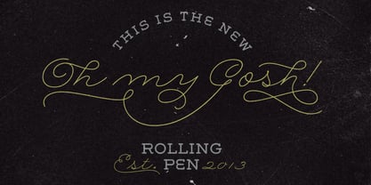 After doing this for so many years, one would think my fascination with the old history of writing would have mellowed out by now. The truth is that alongside being a calligraphy history buff, I'm a pop technology freak. Maybe even keener on the tech thing, since I just can't seem to get enough new gadgets. And after working with type technologies for so many years, I'm starting to think that writing and design technologies as we now know them, being about 2.5 post-computer generations, keep becoming more and more detached from what the very old humanity arts/tasks they essentially want to facilitate. In a world where command-z is a frequently used key combination, it’s difficult to justify expecting a Morris-made book or a Zaner-drawn sentence, but accidental artistic “mutations” become welcome, marketable features. When fluid pens were introduced, their liquid saturation influenced type design to a great extent almost overnight an influence professional designers tend to play down. Now round stroke endings are a common sight, and the saturation is so clean and measured, unlike any liquid-paper relationship possible in reality. Some designers even illustrate their work by overlaying perfect circles at stroke ends, in order to illustrate how “geometric” their work was. Because if it’s measured with precise geometry, it’s got to be meaningful design. And once in a while, by a total freak accident, the now-cherished mutations prove to have existed long before the technology that caused them. Rolling Pen was cued by just such a thing: A rounded, circular, roll-flowing calligraphy from the late nineteenth century seemingly one of those experimental takes on what inspired Business Penmanship, another font of mine. Looking at it now it certainly seems to be friendlier, more legible, and maybe even more practical and easier to execute than the standard business penmanship of those days, but I guess friendliness and simplicity were at odds with the stiff manner business liked to present itself back then, so that kind of thing remained buried in the professional penman’s oddities drawer. It would be quite a few years before all this curviness and rounding were thought of as symbolic of graceful movement, which brought such a flow closer to the idea of fine art. Even though in this case the accidental mutation just happens to not be a mutation after all, the whole technology-transforms-application argument still applies here. I'm almost sure “business” will be the last thing on people’s minds when they use this font today. One extreme example of that level of disconnect between origin and current application is shown here, with the so-called business penmanship strutting around in gloss and neon. Rolling Pen is another cup of mine that runneth over with alternates, swashes, ligatures, and other techy perks. To explore its full potential, please use it in a program that supports OpenType features for advanced typography. Enjoy the new Rolling Pen designed by Ale Paul with Neon’s visual poetry by Tomás García.
 - FS Kitty by Fontsmith,
$50.00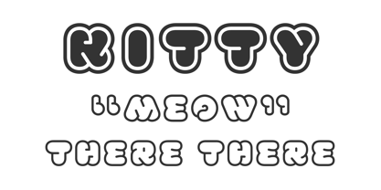 Cute FS Kitty is the type equivalent of Bagpuss: plump, cute, cuddly and not fond of exercise. So don’t go giving it a run-out on body copy; FS Kitty is an all-caps font made for showing off in posters and headlines, and on products, point-of sale and especially sweets. Blubber Kitty had been quietly curled up in Phil Garnham’s sketchbook for a year before he brought it out to be brushed up. “It was in the mix as a basic form when I started thinking about FS Lola. It was a twisted, bubbly beauty – quite squishable and huggable. The working file was called Blubber. “At that time it was a basic construction of strokes. I created the ‘A’ first, purely as a shape to play with, not as type. I flipped it for ‘V’, and copied that for a ‘W’. I flipped the ‘W’ for an ‘M’... I thought, ‘This looks a bit wacky, but I like it,’ and just carried on. The most tricky characters were the ‘B’ ‘P’ and ‘R’. I must have drawn about 20 kinds of B for this, just to get it to fit.” Variety “When the regular weight of Kitty had been designed,” says Jason Smith, “it just felt like a natural progression to go on and explore how far we could go with it: Light, Solid, Headline, Shadow.” Phil Garnham thinks there’s still more to come. “There are some really individual characters in this font that I think have yet to be exploited: the Greek Omega symbol, the strange face in the ampersand. Like Bagpuss, Kitty has kept a low profile so far. “We know people are using Kitty. In fact, it was the first of any of our fonts that we sold on the day it was released. But I still haven’t seen it out there in the wild. It’s going to be a exciting moment.”
 - Aldero by R9 Type+Design,
$48.00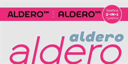 Aldero™ strives to be as useful to any design environment as Alder trees are to the forest. Wildlife and insects feed on Alder leaves and seeds. The tree also provides shelter for animals in winter while its shades keep streams from getting too hot in summer. The trunks and branches are excellent habitats for lichens and mosses. The nitrogen-rich leaves help fertilize the soil where they landed. Alder’s utilitarian nature inspires us to create Aldero™, a handy, versatile, go-to type family for all professional designers. To achieve what we set out to do, we gave Aldero™ the two-in-one looks, doubled the sets of ligatures, and loaded it with plenty more of Opentype features. We put in long hours, months after months, until we are proud of the outcome. And we truly believe that you will enjoy working with this typeface as much as we do. With five weights, ten styles, and 1,100+ glyphs per style, this versatile typeface comes with virtually two looks. The standard glyph set is perfect for formal, corporate design, while the stylistic alternate set elicits a fun, friendly, and casual feel. You can use each style separately or mix and match them to achieve your design aesthetic. Thanks to these options, a wide range of design possibilities are at your fingertips. In addition to the two large sets of ligatures (for both the standard and the stylistic glyph sets), we also pack tons of Opentype features into Aldero™ to improve your user experience while working with this typeface. To activate the case-sensitive features, for example, highlight the phrase with the type tool, then hit the “All Caps” button; or select each mark, punctuations, or symbols with the type tool, then choose the case-sensitive option from the Opentype popup window. Hope you enjoy working with Aldero™ as much as we do! To find out more about Aldero™ Opentype features and type specimen, please visit https://r9typedesign.com/aldero-features
 - Funboy by Typodermic,
$11.95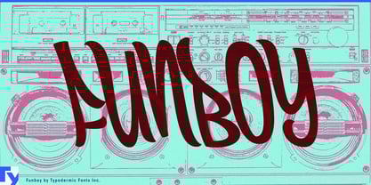 Introducing Funboy—the typeface that brings the bold, wild style of San Francisco’s graffiti right to your fingertips. With its thick lines and natural, flowing strokes, Funboy is perfect for adding an edgy, old-school hip hop vibe to any design. But this font isn’t just about style—it’s also about customization. With custom pairs and substitute characters, you can elevate your writing to a new level of polish and sophistication. And if you’re looking for even more personalization, simply play around with the uppercase and lowercase variants to create a unique look that’s all your own. Whether you’re designing a flyer for a block party or creating album art for your latest mixtape, Funboy is the typeface that will make your work stand out. So why settle for a boring, generic font when you can add some graffiti-inspired flair to your designs? Try Funboy today and see the difference for yourself. Most Latin-based European writing systems are supported, including the following languages. Afaan Oromo, Afar, Afrikaans, Albanian, Alsatian, Aromanian, Aymara, Bashkir (Latin), Basque, Belarusian (Latin), Bemba, Bikol, Bosnian, Breton, Cape Verdean, Creole, Catalan, Cebuano, Chamorro, Chavacano, Chichewa, Crimean Tatar (Latin), Croatian, Czech, Danish, Dawan, Dholuo, Dutch, English, Estonian, Faroese, Fijian, Filipino, Finnish, French, Frisian, Friulian, Gagauz (Latin), Galician, Ganda, Genoese, German, Greenlandic, Guadeloupean Creole, Haitian Creole, Hawaiian, Hiligaynon, Hungarian, Icelandic, Ilocano, Indonesian, Irish, Italian, Jamaican, Kaqchikel, Karakalpak (Latin), Kashubian, Kikongo, Kinyarwanda, Kirundi, Kurdish (Latin), Latvian, Lithuanian, Lombard, Low Saxon, Luxembourgish, Maasai, Makhuwa, Malay, Maltese, Māori, Moldovan, Montenegrin, Ndebele, Neapolitan, Norwegian, Novial, Occitan, Ossetian (Latin), Papiamento, Piedmontese, Polish, Portuguese, Quechua, Rarotongan, Romanian, Romansh, Sami, Sango, Saramaccan, Sardinian, Scottish Gaelic, Serbian (Latin), Shona, Sicilian, Silesian, Slovak, Slovenian, Somali, Sorbian, Sotho, Spanish, Swahili, Swazi, Swedish, Tagalog, Tahitian, Tetum, Tongan, Tshiluba, Tsonga, Tswana, Tumbuka, Turkish, Turkmen (Latin), Tuvaluan, Uzbek (Latin), Venetian, Vepsian, Võro, Walloon, Waray-Waray, Wayuu, Welsh, Wolof, Xhosa, Yapese, Zapotec Zulu and Zuni.
 - Subroc by Typodermic,
$11.95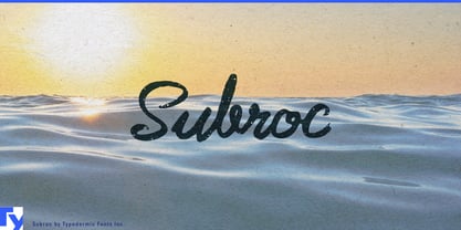 As I contemplate the beauty of Subroc, my mind drifts to a melancholic state, reminiscing the memories of a bygone era. This debonair joined-marker script typeface embodies a nostalgic charm that is difficult to resist. If your application supports ligatures, Subroc’s custom letter pairs automatically substitute for a more natural look. The resulting effect is akin to a handwritten note from a long-lost lover, carefully crafted with every stroke. But what truly sets Subroc apart is its inconspicuous, granular texture. The grittiness of its design transports you to a different time, evoking feelings of nostalgia and carefree abandon. Subroc’s beauty is not for the faint of heart, as it carries the weight of a thousand emotions with it. But for those brave enough to embrace it, the result is a breathtaking amalgamation of history, art, and emotion. So let Subroc be your muse, and let your words flow freely, imbued with the essence of a bygone era. Let your message carry the weight of history, and leave a lasting impression on all who see it. Most Latin-based European writing systems are supported, including the following languages. Afaan Oromo, Afar, Afrikaans, Albanian, Alsatian, Aromanian, Aymara, Bashkir (Latin), Basque, Belarusian (Latin), Bemba, Bikol, Bosnian, Breton, Cape Verdean, Creole, Catalan, Cebuano, Chamorro, Chavacano, Chichewa, Crimean Tatar (Latin), Croatian, Czech, Danish, Dawan, Dholuo, Dutch, English, Estonian, Faroese, Fijian, Filipino, Finnish, French, Frisian, Friulian, Gagauz (Latin), Galician, Ganda, Genoese, German, Greenlandic, Guadeloupean Creole, Haitian Creole, Hawaiian, Hiligaynon, Hungarian, Icelandic, Ilocano, Indonesian, Irish, Italian, Jamaican, Kaqchikel, Karakalpak (Latin), Kashubian, Kikongo, Kinyarwanda, Kirundi, Kurdish (Latin), Latvian, Lithuanian, Lombard, Low Saxon, Luxembourgish, Maasai, Makhuwa, Malay, Maltese, Māori, Moldovan, Montenegrin, Ndebele, Neapolitan, Norwegian, Novial, Occitan, Ossetian (Latin), Papiamento, Piedmontese, Polish, Portuguese, Quechua, Rarotongan, Romanian, Romansh, Sami, Sango, Saramaccan, Sardinian, Scottish Gaelic, Serbian (Latin), Shona, Sicilian, Silesian, Slovak, Slovenian, Somali, Sorbian, Sotho, Spanish, Swahili, Swazi, Swedish, Tagalog, Tahitian, Tetum, Tongan, Tshiluba, Tsonga, Tswana, Tumbuka, Turkish, Turkmen (Latin), Tuvaluan, Uzbek (Latin), Venetian, Vepsian, Võro, Walloon, Waray-Waray, Wayuu, Welsh, Wolof, Xhosa, Yapese, Zapotec Zulu and Zuni.
 - Acarau Display by Tipogra Fio,
$30.00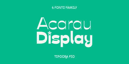 Acarau is a 6 fonts display typeface with high reverse contrast—since from Roman capitals and calligraphy, usually Latin alphabet letters have thiner horizontal steams and thicker verticals, these features being optical or visual—quite adequate for logos, headlines and posters. Moreover, the style of the typeface is inspired by Italics form factor: lowercase letters having less strokes to make their shapes; A has one story; E has one stroke shape, such as K, G, Y and Z; F has a descent. To give it more calligraphic feeling, there is contrast for uppercases as well, this is very perceived by the diagonal letters like A, K, M, N, V, W, X, Y and Z. J also has a descent. Q and R have natural swashes, but they have alternates in case the costumer want to go for more usual forms—including accent marked letters. Acarau is a 12 months project, the contrast for uppercases were increasing as the process was made. In the middle it is found suitable blend the letter shapes with the history of Brazilian music from the 70’s and 80’s, since the font has a tropical, warm, spicy and nostalgic feeling. Songs from bands and singers that emerged on Rio de Janeiro like Paralamas do Sucesso, Cazuza, Lulu Santos and Kid Abelha bring the beach accent and rhythm that this font has. OpenType features complement the set, which has Multi-Lingual support for a comprehensive Latin set, including Vietnamese—meaning more than 640 glyphs: Case-Sensitive forms, so symbols can properly align to uppercase letters; Ligatures, to better reading for z_y and L_I, and style for s_s, w_w_w; also for ease arrows and punctuation typing; Stylistic Set 1: two story a—including accent marked letters; Stylistic Set 2: two story g—including accent marked letters; Stylistic Set 3: diagonal (usual) z—including accent marked letters; Stylistic Set 4: flower i and j dots; Contextual alternates; Terminal forms, for R and Q; Ordinals.
 - Charbroiled by Typodermic,
$11.95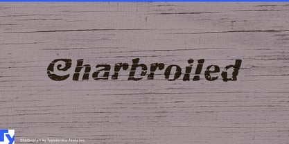 Picture this: the smell of freshly-grilled shiitake mushroom burgers wafting through the air, the sound of sizzling plant-based steaks on the grill, and a cold drink in your hand. It’s barbecue season, and you want your message to sizzle just as much as your food. Enter Charbroiled, the scorched and antiqued typeface that will take your design to the next level. Inspired by the classic American Italic from 1902, Charbroiled has a rustic and natural design that will add panache to any message. But Charbroiled isn’t just any old font. Custom letter pairings are automatically swapped to achieve a more genuine look, giving your design that extra edge. With its bold and distinctive style, Charbroiled will make your message stand out in any setting. So fire up the grill, crack open a cold one, and let Charbroiled do the talking. Whether it’s for a barbecue invitation, a restaurant menu, or a summer sale flyer, Charbroiled will give your message the perfect touch of authenticity and style. Get your message across with Charbroiled, and make your design sizzle! Most Latin-based European writing systems are supported, including the following languages. Afaan Oromo, Afar, Afrikaans, Albanian, Alsatian, Aromanian, Aymara, Bashkir (Latin), Basque, Belarusian (Latin), Bemba, Bikol, Bosnian, Breton, Cape Verdean, Creole, Catalan, Cebuano, Chamorro, Chavacano, Chichewa, Crimean Tatar (Latin), Croatian, Czech, Danish, Dawan, Dholuo, Dutch, English, Estonian, Faroese, Fijian, Filipino, Finnish, French, Frisian, Friulian, Gagauz (Latin), Galician, Ganda, Genoese, German, Greenlandic, Guadeloupean Creole, Haitian Creole, Hawaiian, Hiligaynon, Hungarian, Icelandic, Ilocano, Indonesian, Irish, Italian, Jamaican, Kaqchikel, Karakalpak (Latin), Kashubian, Kikongo, Kinyarwanda, Kirundi, Kurdish (Latin), Latvian, Lithuanian, Lombard, Low Saxon, Luxembourgish, Maasai, Makhuwa, Malay, Maltese, Māori, Moldovan, Montenegrin, Ndebele, Neapolitan, Norwegian, Novial, Occitan, Ossetian (Latin), Papiamento, Piedmontese, Polish, Portuguese, Quechua, Rarotongan, Romanian, Romansh, Sami, Sango, Saramaccan, Sardinian, Scottish Gaelic, Serbian (Latin), Shona, Sicilian, Silesian, Slovak, Slovenian, Somali, Sorbian, Sotho, Spanish, Swahili, Swazi, Swedish, Tagalog, Tahitian, Tetum, Tongan, Tshiluba, Tsonga, Tswana, Tumbuka, Turkish, Turkmen (Latin), Tuvaluan, Uzbek (Latin), Venetian, Vepsian, Võro, Walloon, Waray-Waray, Wayuu, Welsh, Wolof, Xhosa, Yapese, Zapotec Zulu and Zuni.
 - Kamasunday by Alit Design,
$21.00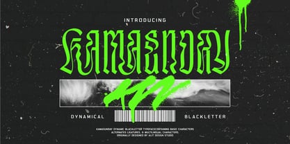 Introducing Kamasunday Dynamic Blackletter, a typeface that seamlessly blends the timeless elegance of blackletter script with a modern, dynamic twist. This font is a perfect fusion of tradition and innovation, offering an impressive array of 837 meticulously crafted glyphs, ligatures, and alternates that will elevate your designs to new heights. Key Features: Dynamic Wave Design: Kamasunday Dynamic Blackletter features a captivating wave-like design that adds a sense of movement and energy to your text. Each character flows seamlessly into the next, creating a visually stunning and cohesive text. Modern Elegance: This font embodies the essence of modern elegance, making it perfect for a wide range of design projects, from branding and packaging to invitations and posters. Extensive Glyph Set: With a whopping 837 glyphs at your disposal, you have access to a vast selection of characters, including uppercase and lowercase letters, numerals, punctuation, and a variety of special characters, ensuring your design needs are met with versatility. Ligatures: Kamasunday Dynamic Blackletter includes an extensive set of ligatures, allowing you to achieve a more fluid and natural look in your text. These ligatures create seamless connections between characters for a polished and sophisticated appearance. Alternates: The font offers an abundance of alternate characters and swashes, giving you the creative freedom to experiment and customize your text. These alternates add an extra layer of uniqueness to your designs. Versatile Usage: Whether you're designing a vintage-inspired logo, a Gothic-themed poster, or a contemporary Music event poster, Kamasunday Dynamic Blackletter adapts beautifully to various design contexts. Timeless Appeal: While embracing modernity, this font retains the timeless charm of traditional blackletter script, making it a versatile choice for projects that demand a touch of history and sophistication. Elevate your design projects with Kamasunday Dynamic Blackletter, where the past and present merge into a harmonious typographic masterpiece. This font promises to breathe life into your creative visions, making your designs stand out with its unique style and extensive character set.
 - Amienne by Typodermic,
$11.95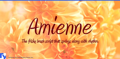 Looking for a typeface that’s full of life and energy? Look no further than Amienne! This charmingly informal brush script typeface is perfect for all your creative projects. With a nimble rhythm that moves gracefully across the page, Amienne is sure to capture attention and add a touch of whimsy to any design. But that’s not all—Amienne also features ligatures, which means that certain letter combinations will be replaced with custom glyphs to create a more natural-looking brush flow. This gives your text a unique and organic feel that’s perfect for everything from invitations to packaging design. And with both Regular and Bold styles available, you can choose the perfect weight to suit your project. Whether you’re creating a bold headline or a delicate script, Amienne has you covered. So why settle for a boring font when you can add a touch of charm and personality with Amienne? Try it out today and see the difference for yourself! Most Latin-based European, Greek, and some Cyrillic-based writing systems are supported, including the following languages. Afaan Oromo, Afar, Afrikaans, Albanian, Alsatian, Aromanian, Aymara, Bashkir (Latin), Basque, Belarusian (Latin), Bemba, Bikol, Bosnian, Breton, Bulgarian, Cape Verdean, Creole, Catalan, Cebuano, Chamorro, Chavacano, Chichewa, Crimean Tatar (Latin), Croatian, Czech, Danish, Dawan, Dholuo, Dutch, English, Estonian, Faroese, Fijian, Filipino, Finnish, French, Frisian, Friulian, Gagauz (Latin), Galician, Ganda, Genoese, German, Greek, Greenlandic, Guadeloupean Creole, Haitian Creole, Hawaiian, Hiligaynon, Hungarian, Icelandic, Ilocano, Indonesian, Irish, Italian, Jamaican, Kaqchikel, Karakalpak (Latin), Kashubian, Kikongo, Kinyarwanda, Kirundi, Komi-Permyak, Kurdish (Latin), Latvian, Lithuanian, Lombard, Low Saxon, Luxembourgish, Maasai, Macedonian, Makhuwa, Malay, Maltese, Māori, Moldovan, Montenegrin, Ndebele, Neapolitan, Norwegian, Novial, Occitan, Ossetian, Ossetian (Latin), Papiamento, Piedmontese, Polish, Portuguese, Quechua, Rarotongan, Romanian, Romansh, Russian, Sami, Sango, Saramaccan, Sardinian, Scottish Gaelic, Serbian, Serbian (Latin), Shona, Sicilian, Silesian, Slovak, Slovenian, Somali, Sorbian, Sotho, Spanish, Swahili, Swazi, Swedish, Tagalog, Tahitian, Tetum, Tongan, Tshiluba, Tsonga, Tswana, Tumbuka, Turkish, Turkmen (Latin), Tuvaluan, Uzbek (Latin), Ukrainian, Venetian, Vepsian, Võro, Walloon, Waray-Waray, Wayuu, Welsh, Wolof, Xhosa, Yapese, Zapotec Zulu and Zuni.