923 search results
(0.016 seconds)
- Deco Drop Caps JNL by Jeff Levine,
$29.00 From the pages of the 1939 French lettering book “Modèles de lettres modernes par Georges Léculier” (“Models of Modern Lettering”) comes an attractive and unusual set of initial drop caps made from square letters adorned with multiple vertical lines. Originally designed as white letters on black backgrounds, an additional set with black letters on white backgrounds comprise Deco Drop Caps JNL; available in both regular and oblique versions.
 - Plasma Drip BRK - Unknown license

- Vampire Bloods Drip by Sipanji21,
$12.50 Vampire Bloods is an incredibly unique horror display font with 2 style Font are Dripping and solid style with jagged Outline. Add this font to your favorite Halloween themed ideas and notice how it makes them come alive. Vampire Bloods is perfect for posters, packaging, banners, advertising, apparel, and more.
 - Ron Dror MF by Masterfont,
$59.00 - Hila Dror MF by Masterfont,
$59.00 - Fallaxe Drip Graffiti by Sipanji21,
$13.00 Fallaxe Graffiti is a spectacular, with bold graffiti display font, there are two style font inside, normal style and dripping style. It will elevate a wide range of design projects to the highest level, be it branding, headings, wall art illustration, apparel, labels, and much more!
 - Typist Slab Prop by VanderKeur,
$25.00 The Typist SlabSerif is part of a big family, the Typist Family. The family consists of a monospaced, a SlabSerif and a SansSerif version. The idea behind this family originated from the research into the design of typewriter typestyles, which is also the reason why the monospaced version was released first. Since it was decided from the start to make a SlabSerif and a SansSerif version of these monospaced fonts, it was also a logical consequence that the proportional variants also became available in these versions. The monospaced SansSerif fonts have been given the name 'Code' since they are designed to be used while writing code for a software program, for example. The proportional variants with each 6 weights of the Typist Slab Serif and Code (SansSerif) are now available. Although the name may seem a bit strange, it is a logical consequence from the monospaced variant. The SlabSerif variant therefore has Typist Slab Prop, written in full the Typist SlabSerif Proportional. After all, who wants to be bothered with long font names in their font menu. The entire Typist family is designed as a font for use in editorial and publishing publications. A lot of attention has been paid to the spacing and kerning of the fonts. Due to the many variants and weights, this font is versatile. Typist Font Family was designed by Nicolien van der Keur and published by vanderKeur design. Typist Slab Prop and Typist Code Prop contains each 6 styles (Thin, Light, Regular, Medium, SemiBold and Bold, each weight also designed as a true italic) and has family package options. The links to the monospaced version of The Typist are here: https://www.myfonts.com/collections/typist-slab-font-vanderkeur https://www.myfonts.com/collections/typist-code-font-vanderkeur
 - Typist Code Prop by VanderKeur,
$25.00 The Typist Code SansSerif is part of a big family, the Typist Family. The family consists of a monospaced, a Slab Serif and a SansSerif version. The idea behind this family originated from the research into the design of typewriter typestyles, which is also the reason why the monospaced version was released first. Since it was decided from the start to make a SlabSerif and a SansSerif version of these monospaced fonts, it was also a logical consequence that the proportional variants also became available in these versions. The monospaced SansSerif fonts have been given the name 'Code' since they are designed to be used while writing code for a software program, for example. The proportional variants with each 6 weights of the Typist Slab Serif and Code (SansSerif) are now available. Although the name may seem a bit strange, it is a logical consequence from the monospaced variant. The SansSerif variant therefore has Typist Code Prop, written in full the Typist Code Proportional. After all, who wants to be bothered with long font names in their font menu. The entire Typist family is designed as a font for use in editorial and publishing publications. A lot of attention has been paid to the spacing and kerning of the fonts. Due to the many variants and weights, this font is versatile. Typist Font Family was designed by Nicolien van der Keur and published by vanderKeur design. Typist Slab Prop and Typist Code Prop contains each 6 styles (Thin, Light, Regular, Medium, Semi-Bold and Bold, each weight also designed as a true italic) and has family package options. The links to the monospaced version of The Typist are here: https://www.myfonts.com/collections/typistslabfont-vanderkeur https://www.myfonts.com/collections/typist-code-font-vanderkeur
 - CONFLICT DRIPS PERSONAL USE - Personal use only

- Plasma Drip Empty BRK - 100% free

- Crop©Bats AOE - Unknown license

- Glenda by Hubert Jocham Type,
$39.00 Since I designed Mommie you can see a lot of script typefaces with big contrast for big sizes. With Narziss I created a roman interpretation with the very expressive Swirls version. Glenda is again an italic script like Mommie. In the Regular the characters join and it looks like a neatly written sprencerian handwriting. But like Narziss it has got a Swirls version too. Every glyph and swirl is carefully designed to work in every connection. Use Glenda at only very large sizes.
 - Bloody - Unknown license

- Ruthless Drippin ONE - Personal use only

- Celticmd - Unknown license

- Bleeding Freaks - Unknown license

- Bourton Hand by Kimmy Design,
$10.00 Bourton Hand is a new typeface by Kimmy Design. It’s the hand drawn version of Bourton and a sans-serif cousin to Burford. In addition to a new look, it boasts more layering options, stylistic alternatives, graphic extras and even comes with its own script font! Okay...so here’s everything you get with Bourton Hand: • 6 Base Layer Fonts (Base, Inline, Marquee, Stripes A, Stripes B, Stripes C, Sketch A, Sketch B) • 6 Top Layer Fonts (Base Drop, Dots, Line Light/Medium/Bold, Outline Light/Medium/Bold) • 6 Extrude Fonts (Extrude, Outline, Shadow, Extrude Outline) • 5 Drop Shadow Fonts + 5 solo styles (Drop Shadow, Drop Extrude, Drop Line, Drop Stripes A, Drop Stripes B) • 2 Line Fonts for secondary text (Line Medium, Line Bold) • Bourton Hand Script Light • Bourton Hand Script Bold • Bourton Hand Extras - Ornaments, banners, frames, borders, flags and line break • Bourton Hand Extras - Flourishes Happy Creating!
 - Bourton by Kimmy Design,
$10.00 Bourton is the sans-serif cousin to Burford. In addition to a new look, it boasts more layering options, stylistic alternatives, graphic extras and even comes with its own script font! For a hand-drawn look, check out Bourton Hand Okay… so here’s everything you get with Bourton! Bourton Layering Fonts • 6 Base Layer Fonts (Base, Inline, Marquee, Stripes A, Stripes B, Stripes C) • 6 Top Layer Fonts (Base Drop, Dots, Line Light, Outline Light, Outline Medium, Outline Bold) • 6 Extrude Fonts (Extrude, Outline, Shade A, Shade B, Shade C, Shadow) • 5 Drop Shadow Fonts + 5 solo styles (Drop Shadow, Drop Extrude, Drop Line, Drop Stripes A, Drop Stripes B) • 2 Line Fonts for secondary text (Line Medium, Line Bold) Bourton Script • Light • Bold Bourton Extras Ornaments, banners, frames, borders, flags and line break (OTF, EPS, AI with User Guide for OTS) Flourishes (OTF, EPS, AI with User Guide for OTS). Happy Creating!
 - Motora Sans by Hubert Jocham Type,
$39.00 Many of my typefaces like Narziss and Mommie and also NewLibris or Verse are rather feminine. With Motora Sans I wanted to be the opposite. Masculine with a smell of gasoline and sweat. Technical and angular. Strong and self-confident. The weights are laid out in the usual way I create my families. 9 weights up to a strong UltraBold, all with italics. What was the inspiration for designing the font? A typeface you would long for in a men's magazine. What are its main characteristics and features? Legible constructed sans serif with German industrial and heritage. Usage recommendations: Corporate branding and magazines and other publications.
 - HKF Gold Queen DLC by Harry Kasyanov,
$5.00 Gold Queen is a vintage font family with features opentype with extension svg. Perfect for the vintage tattoo studio logos, barbershops, alcohol labels and many other. Includes a full set of character A-Z, numerals, and punctuation. Product content: HKF Gold Queen Regular - (OTF) HKF Gold Queen Drop line - (OTF) HKF Gold Queen Drop shadow (B&W) - (OTF) Color fonts (available only with Adobe illustrator CC 2018 and Photoshop CC from 2017) HKF Gold Queen Drop line (color) - (OTF SVG) HKF Gold Queen Drop shadow (color) - (OTF SVG)
 - Gotische Frame by Intellecta Design,
$9.00a gothic drop caps typeface - Gothic 16 CG Decorative by Intellecta Design,
$17.90a gothic drop caps font - Ameche Pisa by Bogusky 2,
$15.00Outline drop-shadow italic font - Ameche Padua by Bogusky 2,
$20.00Outline font with drop shadoww - Tareto by Intellecta Design,
$13.90Tareto is a drop caps beautiful family - Sinfonia by Intellecta Design,
$14.95fancy arrangements of a classic font in drop caps - Decorative Tuscanian by Intellecta Design,
$16.90a drop caps joining a barocque frame plus tuscanian caps - Ornatis by VSF,
$15.00 A drop cap ornamental font. Pro version includes the Basic one.
 - Glimmer by Device,
$29.00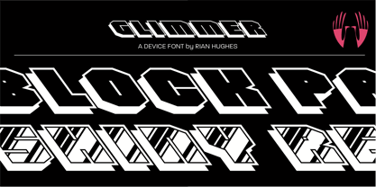 A backslanted outline font with a drop shadow and a glossy variant.
 - Runaway by PizzaDude.dk,
$20.00A heavy graffiti-inspired font! Don't drop it, 'cos it's weight might crush the floor! - Jayhawker by Context,
$10.00 A super-stylized retro display face for headlines, posters, drop caps and other basic-but-oversized uses.
 - Hata MF by Masterfont,
$59.00 As personal as a handwriting can be, the ink drops add much of genuine touch to this childish script.
 - Rubens by Wooden Type Fonts,
$15.00 A sans serif with splayed ends, descenders of the lower case dropping below the baseline, very tall x-height.
 - Lobby Poster JNL by Jeff Levine,
$29.00 The hand lettered cast credits for the 1932 George Arliss film “The Man Who Played God” inspired Lobby Poster JNL, which is available in both regular and oblique versions. A bold and playful Art Deco poster alphabet, its nonconformist character widths and shapes are casual enough for informal designs yet bold enough to get any point across.
 - Geistig by Michael Browers,
$15.00 Geistig is a set of 26 individual letter monogram designs. Geistig works great for monograms, drop caps, and unique display settings.
 - LHF Centennial Banker by Letterhead Fonts,
$42.00 A bold currency typeface that's perfect for replicating the style of money and old stock certificates. Includes drop caps on lowercase characters.
 - Rubens Expanded Regular by Wooden Type Fonts,
$15.00 A sans serif with splayed ends, descenders of the lower case dropping below the baseline, very tall x-height. The expanded version.
 - Stay With Me by PizzaDude.dk,
$20.00Slightly grungy and blurred-edged combined with a thick stroke and a fat drop shadow. This font is eye catching in many ways! - Lotter by Kaer,
$19.00 Lotter blackletter with Drop caps One fine day I found a vintage book, it called “A treatise by the Dominican friar-writer Marcus von Weida on the Brotherhood of the Holy Rosary”. It was printed in 1515 by Melchior Lotter in Leipzig. The text was illustrated by hand-colored engravings on religious and liturgical themes and beautiful initials I like. Lotter was the last name of a family of German printers, intimately connected with the Reformation. An innovation by the elder Lotter was his use of Roman types for Latin, reserving the Gothic types for German. I'm happy to present to you my new font family. Lotter font family has Drop cap and Regular styles. It's all you need to precisely imitate medieval style text. Use Drop cap style as a decorative element at the beginning of a paragraph or section, other part of the paragraph should be in Regular style. You’ll get: * Drop cap & Regular styles * Uppercase and lowercase * Multilingual support * Numbers * Symbols * Punctuation * Ligatures Please feel free to request any help you need: kaer.pro@gmail.com Best, Roman.
 - Omnidirectional Arrows JNL by Jeff Levine,
$29.00Omnidirectional Arrows JNL is a series of arrow dingbats in different shapes and directions in both solid and outlined drop shadow versions from Jeff Levine.


