10,000 search results
(0.019 seconds)
- Roney JNL by Jeff Levine,
$29.00If it's at all possible to "Deco-ize" an Art Deco font even more, it's been done with Roney JNL. Named for one of the classic hotels built during the heyday of Miami Beach, this font is a stylized version of Jeff Levine's Metalet Modern; a design derived from an actual 1940s home movie titling set. - Gancio by Funk King,
$39.00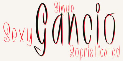 Gancio is my first fully realized hand-drawn font and has a robust character set. Its simple lines and sophisticated curves are contemporary, but recall vintage and retro cool. The font is very adaptable and flexible and can be used effectively in a number of themes. Also included are the dingbats used in the poster art.
 - Digitany by Zealab Fonts Division,
$10.00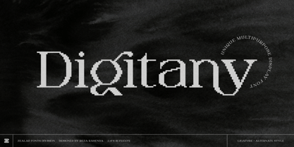 Digitany is a multipurpose display font, its a combination between luxury serif font and 8bit/pixel art style. Effortlessly re-create the classic fun vibes of the 80's using this display typeface that goes well with retro t-shirt designs, posters, illustrations, logos, and more. Digitany include uppercase and lowercase, ligature and alternate style, and also multilingual support.
 - Day Tripper NF by Nick's Fonts,
$10.00An undeniably Art Deco font with some unexpected twists and turns, this typeface is based on a design originally called "Dignity Roman", a product of the fevered imagination of the rather unconventional 30s lettering artist Alphonse E. Tripp. Both versions of the font include the 1252 Latin and 1250 CE character sets (with localization for Romanian and Moldovan). - Home Christmas by ahweproject,
$14.00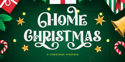 Home Christmas is a rustic serif font in Christmas theme, perfect for sleigh rides and caroling. It’s very suitable for Christmas cards, wedding invitations, branding, stationery, blog design, custom art, custom stamps, custom embossers, or any design purpose. This font is PUA encoded which means you can access all of the glyphs and swashes with ease!
 - Bleecker Street NF by Nick's Fonts,
$10.00This late Victorian typeface flirts with Art Nouveau sensibilities, as evidenced by the graceful curves and the decorative crossmembers in several of the uppercase letters. The result is a font that combines simple, understated elegance with a no-nonsense, workmanlike stance. Both versions of the font include 1252 Latin, 1250 CE (with localization for Romanian and Moldovan). - Midnight Rookie by Hatftype,
$15.00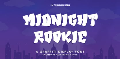 Midnight Rookie - A Graffiti Display Font is a free style font that has the characteristics of street art that shows freedom and is filled with unique characters. Features : • Character Set A-Z • Numerals & Punctuations (OpenType Standard) • Accents (Multilingual characters) • Ligature • Alternate. There it is. I really hope you enjoy it. Comments & likes are always welcome and accepted.
 - Red Square by Letterhead Studio-YG,
$40.00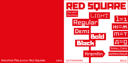 Red Ring and Red Square - the super-family of two families of fonts. The super-family includes sanserif Red Ring and geometric font Red Square. Families are synchronized by the number and weight of the typefaces and can be used either separately or together. Together Ring and Square produce a cumulative effect of Art Deco and Constructivism.
 - Odalisque Stencil NF by Nick's Fonts,
$10.00Here's a stencil version of another Nick's Fonts typeface based on Chic, a Morris Fuller Benton creation for American Type Founders from the 1920s. Stylish and sophisticated as always, and now with an arts-and-crafts flair. Both versions of this font include the Unicode Latin 1252 and 1250 Central European character sets, with localization for Moldovan and Romanian. - Picadyll by T4 Foundry,
$21.00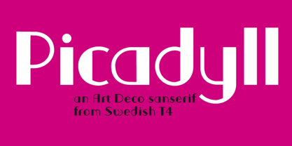 Picadyll is a sanserif that flirts with the 1920s Art Deco tradition but adds a modern touch. The sober letter design brings old movie posters and packaging to mind. Picadyll is a sophisticated and fun font from Swedish type designer Bo Berndal and the T4 font foundry. It is an OpenType creation, for both PC and Mac.
 - Island Time JNL by Jeff Levine,
$29.00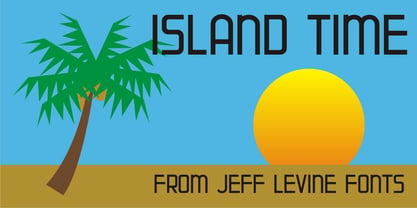 Island Time JNL is based on the hand-lettered title from a piece of 1940s sheet music called "An Island Melody". This Art Deco typeface is perfect for projects where a clean, yet attractive headline font is needed. The font's name is based on the euphamism popular amongst Caribbean Islanders that when someone is excessively late for an appointment, date or event they are running on "island time".
 - Westpart by Garisman Studio,
$20.00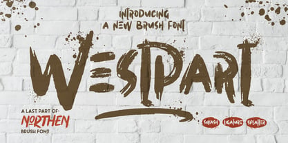 Westpart was born from the previous three brush fonts: 1. Northen, 2. Easttalia and 3. Southen. This font is part of the 4 directions that cannot be separated. It has a styling brush that is very different from before, because the Westpart has its own advantages. Westpart has a bonus splatter, ligature, and swash that has a very detailed brush effect. In addition, Westpart is very supportive of the use of 27 languages.
 - Spindletop NF by Nick's Fonts,
$10.00One in the series of fonts called Whiz-Bang Wood Type, intended to be set large and tight. Spindletop’s ultra-condensed letterforms allow a lot of information to be packed into little horizontal space. Named for a famous East Texas oil field that made a lot of people rich in the early part of the twentieth century. Both versions of this font include the complete Unicode 1252 Latin and Unicode 1250 Central European character sets. - HU Geulwoll by Heummdesign,
$15.00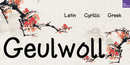 Geulwoll is a Korean word for letters. HU Geulwoll is a handwritten font that conveys a calm feeling by creating a lyrical and old atmosphere. In order to emphasize the feeling of writing with a marker, each end was made to fall diagonally, a characteristic of the marker. It is a highly readable font with a curve applied to the bent part to save the stroke order. There is 1 weight of HU Geulwoll : Medium
 - Linotype Seven by Linotype,
$29.99Linotype Seven is part of the Take Type Library, chosen from the contestants of Linotype’s International Digital Type Design Contests of 1994 and 1997. This prize-winning font was designed by the German artist Christian Vornehm. The font looks as though hastily drawn with a wide, bristly brush, as though the scribe was in a hurry. Linotype Seven is loaded with energy and spontaneity. It is intended exclusively for short headlines in larger point sizes. - Benton Sans RE by Font Bureau,
$40.00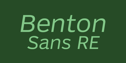 A redesign of drawings of News Gothic from the Smithsonian, Cyrus Highsmith and the Font Bureau studio created Benton Sans, one the most popular and versatile families in this genre. This version of the family is part of the Reading Edge series of fonts specifically designed for small text onscreen, having been adjusted to provide more generous proportions and roomier spacing, and having been hinted in TrueType for optimal rendering in low resolution environments.
 - MTC Quinnie by Martype co,
$15.00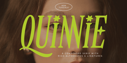 MTC Quinnie a condensed serif typeface with many alternates and ligature features good choice for designers and editorials. The use of many alternates and ligatures in these fonts adds visual interest and variety, allowing designers to create unique and customized typography. One notable aspect of these fonts is the smoothness of their serifs. The serifs, or small decorative flourishes at the ends of letter strokes, are an essential part of serif typefaces.
 - Sandborg by Mightyfire,
$15.00 Looking for a font which has a modern futuristic looks? Yes, you come to the right place. We have Sandborg to cover your needs. The characteristic of Sanborg is the digital looks of each letter. If you want to write a headline or title about technology or digital content, we suggest you to try this font. We're honored and proud if we can be the part of your special works. Thank you.
 - Killernuts by Dharma Type,
$14.99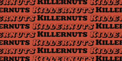 Wood type for display. Serifs like brush strokes are associated with Japanese calligraphy ‘Shodo’. East meets West. There are two styles, Regular for ordinary use and 3D for more eye-catchy part.
 - Renelemon by URW Type Foundry,
$39.99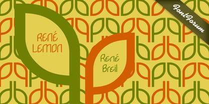 RenéLemon is a design where the basic design idea is part of its name – Lemon. Every glyph is derived from the form of a lemon, splashing and dashing – a typographic vitamin pill!
 - FF Sizmo by FontFont,
$50.99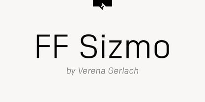 FF Sizmo™ is available in two flavors. One is an honest, industrial strength, somewhat condensed, sans serif family. The other builds on the first, and is a display design with horizontally connecting baseline strokes. The five weights of basic the FF Sizmo typefaces are ideal for print and digital projects. Character spacing is generous, counters are open and apertures are wide and clear. Banners, navigational links, sub heads, and short blocks of contextual copy are natural on-screen uses for the design. Print projects from branding to way-finding also fall easily into FF Sizmo’s range of applications. The “line” versions of FF Sizmo can be arresting stand-alone typefaces – or distinctive complements to the basic roman and italic designs. In either instance, the line designs make powerful statements in headlines, subheads, posters and cover art. OpenType® fonts automatically insert beginning, middle or ending line element characters into the copy. Drawn by Verena Gerlach, both designs were inspired by the same source, a commercial signage system that enabled quick and easy copy changes. “The idea for the typeface,” explains Gerlach, “is a housing complex index board, on which movable white plastic capital letters were fixed by a thick line to the wooden board. This line is an important part of the font’s appearance.”
 - Crypick by Grontype,
$14.00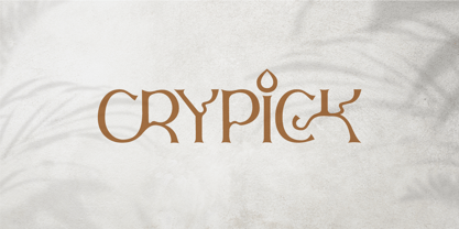 Crypick is a Modern Serif Font, created with unique design. the parts of the font is simply watery looks inspired by ocean wave. this font comes with some ligatures and alternates, and already PUA encoded for easily accessed into optional Glyphs. Crypick Font is simply designed to ease any design project such as invitational card, logo tagline, attentional flyer, magazine header, and much more Features : Complete standard glyphs ligatures and alternates PUA encoded Numeral and Punctuation Multilingual Support Thankyou for your attention, Regard : Grontype
 - Rocket Pop by astroluxtype,
$20.00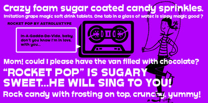 Rocket Pop and Rocket Pop Outline are influenced by product packaging and cereal box art from the 1960's and 1970's. The fonts will work as companions or separate. Best used over 36pt as a headline display face, these fonts will bring a bold playfulness to any project where a vintage or retro style is in the concept. The style reflects the era when things were indeed, mad, where men (and some women) did crazy art for vinyl records, food packaging and kiddie products. Sugar frosted blue donut cereal is yummy for your tummy like... Rocket Pop and Rocket Pop Outline. Buy both and get the discount! Watch for the Cerealboxx Set coming soon that will include the astroluxtype fonts, Sugarbang! Koo Koo Puff and Rocket Pop together in one box.
 - Organetto by Latinotype,
$25.00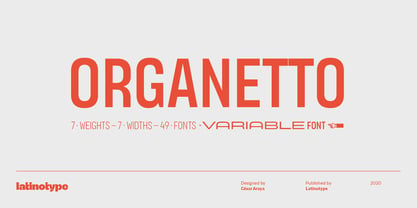 Organetto is a typeface, inspired by the lettering found on Art Deco posters, whose design embraces latest digital font technology. This versatile font contains multiple widths which make it an ideal solution to fit every design need. In addition to its functional geometric style and different widths, Organetto also includes alternate characters that provide even more design options. All these features make the font a great choice for graphic designers and art directors, logos, wordmarks, short text, etc. Organetto is a sans-serif typeface with modern proportions and straight-edge terminals. It comes in 7 weights, ranging from Hair to Ultrabold, and 7 widths (from Ultra Condensed to Expanded) and contains a set of 397 characters that support 180 different languages. Organetto also includes OpenType features- 3 sets of alternates, catchwords and titling.
 - Patmos Serif by DimitriAna,
$35.00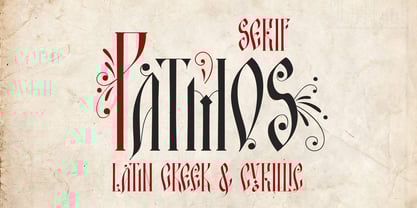 Patmos Serif is a hand drawn serif font, inspired by the art of the cyrillic calligraphy, as well as the script of the Greek Orthodox art. The font contains Latin, Greek and Cyrillic alphabets and it is delivered in Opentype and Truetype format. It supports Central, Eastern, Western European, Baltic, Turkish, Greek and Russian languages. Patmos Serif has a variety of stylistic alternates and classes, titling altrenates, discretionary and standard ligatures and it is fully unicode-mapped (PUA encoded). The standard ligatures of the font are 4 decorative ornaments, that you may add at the end of a word and they match perfectly with the titling alternates. All you have to do is to make sure that ‘standard ligatures’ are activated in your application and then type "d" and a number from 1 to 4.
 - Inferno Corner by Sipanji21,
$15.00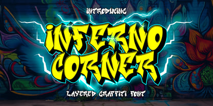 "Inferno Corner" is a 3D layered graffiti font characterized by sharp corners. Fonts like this incorporate multiple layers to create a three-dimensional effect and emphasize angular or pointed edges, often enhancing the font's dynamism and visual impact. This font is particularly fitting for various street-related projects where a bold and edgy typographic style is desired. Whether used in posters, street art, or any design endeavor aimed at the urban environment, "Inferno Corner" can lend a striking and attention-grabbing aspect to your text, contributing to the overall street-style aesthetics of your project.
 - Hello Love by Tigade Std,
$10.00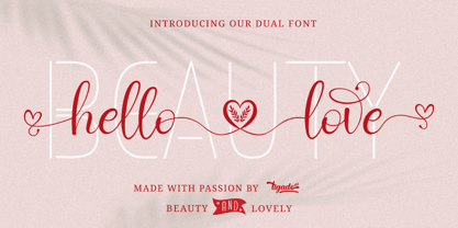 Hello Love is an elegant and flowing handwritten font. It is PUA encoded which means you can access all of the glyphs and swashes with ease! It features a varying alternates for head and tail, gorgeous glyphs and stunning heart in between. It maintains its classy calligraphic influences while feeling contemporary and fresh. Fall in love with this font and bring your projects to the highest levels! Wait, not only that. This font come with an additional sans serif bonus font as part of its family. So yeah, it is a dual font!
 - Bant by Kufic Studio,
$15.00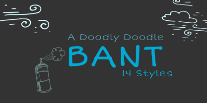 Bant - A modern comic font that compliments any sort of graphic and web design. A doodly doodle font, this font is perfect for comics, doodle, whiteboard animation, branding, wedding invitations, magazines, business cards, quotes, posters, and websites. The complete font set includes; Bant will bring a unique and comic look to your overall design, as any typeface is a major part of the design. Kufic Studio is a platform that provides professional and high-quality designs & fonts to fill the gap that has been missing in the market.
 - Racesky by ZetDesign,
$20.00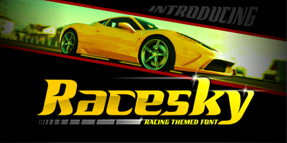 Racesky is a racing-themed font but is still suitable for other purposes. This font is created in two bevel styles to give different choices to each user. This font is also accompanied by open type features in the form of kerning, ligature, and stylistic alternate to make it easier to choose styles and shapes. Consistent lettering is also an advantage that makes it easier for you to produce a perfect and stylish work. don't hesitate to choose this font as part of your collection ... happy working and enjoy your font ...!
 - VanderHand by JOEBOB graphics,
$29.00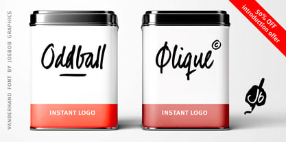 The 'VanderHand' font is a friendly and easy to use handwritten font. It is so loaded with ligatures it could easily pass for actual handwriting. The font was created with a felt-tip brush pen and so there are natural thick and thin parts in the characters. All writing was done upright with tightly fit characters. As a result this font has a unique 'instant logo' quality. But you should really try this out for yourself. O, and the font was written by Jeroen van der Ham. It's his handwriting. That's why it's called VanderHand.
 - Behiner by Twinletter,
$17.00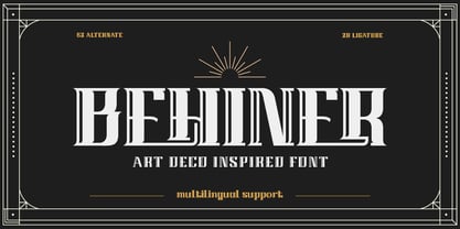 Behiner is a font created to offer your varied design projects a classic art deco flair. This font is sleek and modern, with simple yet appealing letterforms. The ligature function and its equivalents offer design freedom in character choices. You may use Behiner to provide a retro feel to your commercials, posters, brochures, business cards, and other creative projects. Behiner also supports several languages, allowing you to use it in multilingual projects. Get Behiner now and join a legendary art deco saga with the current and exquisite touch that this font offers! What’s Included : - File font - All glyphs Iso Latin 1 - Alternate, Ligature - Simple installations - We highly recommend using a program that supports OpenType features and Glyphs panels like many Adobe apps and Corel Draw so that you can see and access all Glyph variations. - PUA Encoded Characters – Fully accessible without additional design software. - Fonts include Multilingual support
 - Linotype Venezia by Linotype,
$29.99Linotype Venezia Initiale is part of the Take Type Library, selected from the contestants of Linotype’s International Digital Type Design Contests of 1994 and 1997. Designed by German artist Robert Kolben, the font is based on the classic forms of Roman writing in the 1st and 2nd centuries found chiseled on countless buildings and monuments. Linotype Venezia Initiale is a timeless, elegant font particularly well-suited to headlines or as initials in combination with other fonts, working especiall well with sans serif alphabets. - Litto by VladB,
$12.00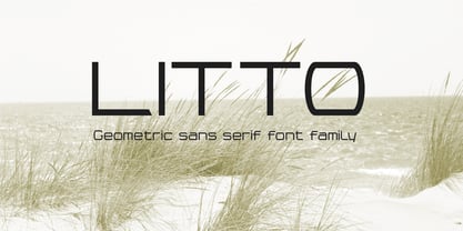 The name of the font is taken from the concept "Littoral zone" - this is the part of the sea that is close to the shore. The width of the shore varies as a result of the tides. Hence the idea of my font family — changing the width of a character from condenced to extra expanded. Litto is a modern sans serif geometric font, includes upper and lower case characters, Latin and Cyrillic. Graphically, the characters have uniform thickness for all family.
 - Shotgun by Bitstream,
$29.99Sets of Art Deco capitals shot full of holes for display effect by by J. Looney at VGC. - TA Bankslab by Tural Alisoy,
$33.00 The building of the Northern Bank of St. Petersburg's Baku branch was built in 1903-1905. It was the first Art Nouveau-style building in Baku, Azerbaijan. Later the bank was transformed into the Russian-Asian Bank. After the oil boom in Baku in the 19th century, branches of many banks and new banks were opened in the city. The branch of the Northern Bank of St. Petersburg was among the first banks that was opened in Baku. N.Bayev was the architect of the building for the branch of the Northern Bank of St. Petersburg located at Gorchakovskaya 3 in 1903-1905. The building currently houses the Central Branch of the International Bank of Azerbaijan. My purpose in writing this is not to copy and paste the information from Wikipedia. What attracted me to the building was the word "Банкъ" (Bank) written in Cyrillic letters, which was also used in Azerbaijan during the Soviet era. The exact date of the writing is not known. Every time I pass by this building, I always thought of creating a font of this writing someday. I had taken a photo of the building and saved it on my phone. I did a lot of research on the font and asked a lot of people. However, some did not provide information at all and some said they did not have any information. I was interested in the history of this font but I do not know if this font really existed or it was created by the architect out of nowhere. If there was such a history of this font, I wanted to recreate this font and make it available. If not, I had to create it from scratch in the same way, using only existing letters on the building. Finally, I made up my mind and decided to develop the font with all letters I have got. It was difficult to create a font based on the word, Банкъ. Because in the appearance of the letters, the midline of the letters on A, H, K was very distinct, both in the form of inclination and in more precise degrees. The serif part of the letters, the height of the upper and lower sides, differed from each other. I don't know whether it was done this way when the building was constructed or it happened over time. I prepared and kept the initial version of the font. I took a break for a while. I started digging on the story of the font again. Meanwhile, I was researching and got inspired by similar fonts. Unfortunately, my research on the font's history did not yield any results. I decided to continue finishing up the font. After developing the demo, I created the font by keeping certain parts of these differences in the letters. In addition, I had to consider the development of letters in the Cyrillic, as well as the Latin alphabet, over the past period. Thus, I began to look at the appearance of slab-serif or serif fonts of that time. In general, as I gain more experience in developing fonts, I try to focus on the precision of the design for each font. In recent years, I specifically paid attention to this matter. YouTube channel and articles by Alexandra K.'s of ParaType, as well as, information and samples from TypeType and Fontfabric studios on the Cyrillic alphabet were quite useful. I gathered data regarding the Latin alphabet from various credible sources. I do not know if I could accomplish what I aimed at but I know one thing that I could develop the font. Maybe someday I'll have to revise this font. For now, I share it with you. I created the font in 10 styles. 7 weight from Thin to Extra Black, an Outline, Shadow, and Art Nouveau. The Art Nouveau style was inspired by the texture in the background used for the text on the building. The texture I applied to capital letters adds beauty to the font. If you like the font feel free to use it or simply let me know if your current alphabet doesn't support this font.
 - HoTom by Linotype,
$29.99Linotype Ho Tom is part of the Take Type Library, which features winners of Linotype’s International Digital Type Design Contest from 1994 to 1997. Designed by Thomas Hoffman, this font’s historical roots are easily traced to the slab serif style. Ho Tom was originally intended as a lettering system for a project in the center of the old East Berlin. This explains the stable, angular characters and the consistent rectangular base forms, which also makes Ho Tom a very legible font, suitable for longer texts. - Plinc Flourish by House Industries,
$33.00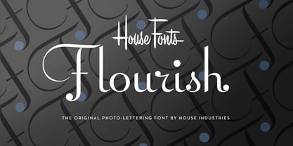 Flourish breaks the mold of traditional typography. Part italic, part roman, this iconoclastic font is all style. William Millstein casts the contours of formal pen strokes in a taut upright framework to create a typeface that nods back to its origins while looking defiantly forward. The neat and light semi-serif flaunts crisp geometric touches without conceding warmth or personality. A sophisticated design solution that isn’t stuck up, Millstein Flourish makes invitations, identities, and editorial settings thrive. Originally offered by Photo-Lettering in the early 1940s, Millstein Flourish was digitally updated by Jeremy Mickel in 2011. Like all good subversives, House Industries hides in plain sight while amplifying the look, feel and style of the world’s most interesting brands, products and people. Based in Delaware, visually influencing the world.
 - WolfieBoy - Unknown license

- Ciseaux by Wilton Foundry,
$29.00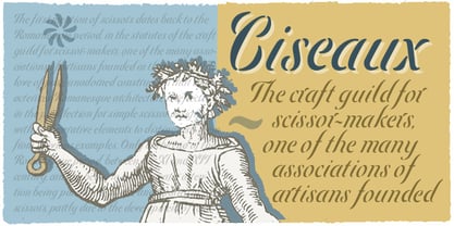 Ciseaux was inspired and is dedicated to the art of paper cutting. Early paper cutting artists were often royalty, but it soon became a folk art practiced by commoners whose cutouts decorated their homes. By the seventeenth century it had spread throughout the world. The Japanese called it Mon-kiri, the German's Scherenschnitte and Turkey even boasted a guild devoted to the art form. In Poland the designs were traditionally symmetrical and often used layers of colors to form pictorial collages. When Russian invaders confiscated scissors, villagers were found to cut their intricate designs with sheep shears! The art form later developed into cutting out elaborate designs of nature scenes and people, celebrating special occasions and even decorating legal documents. Ciseaux letterforms mimic paper cutting art in its shapes with a rather loose and almost joyous rhythm. The overall effect is somewhat earthy and natural yet it has an element of sophistication that cannot be ignored. Just like paper cutting, Ciseaux can be used for special occasions like invitations, brochures, identities, restaurant menus, and if you dare, some awesome looking paper graffiti. Available in TT, PS and Opentype for Mac and Windows.
 - constructor by Fontop,
$11.00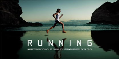 Introducing a new bold CONSTRUCTOR font family. Perfect combination of 2 fonts (Light and Shadow) to create your own layered 3D headlines, eye-catching texts, logotypes, design, posters for sports, music, street culture, modern arts, industries and many more other themes. 2 more fonts (Emboss and Regular) have bold 3D effects thanks to their design and shapes. Fonts have extensive Latin multilingual support, uppercase, small-caps, numbers and basic punctuations.
