5,613 search results
(0.063 seconds)
- Sancoale Narrow by insigne,
$22.00 Sancoale Narrow is a carefully honed and meticulously crafted new family member for the Sancoale series. Sancoale Narrow has been specially designed to allow for even more versatility for the Sancoale Family. Sancoale Narrow continues with Sancoale's successful simple, geometric and legible structure. It is a contemporary design that is distinctive and unique. This new narrow addition can be used in conjunction with the original Sancoale, but it can also stand on its own. Narrow type comes in a handy in a myriad of situations, from poster design to book covers, web pages to editorial layouts. Sancoale Narrow's six weights make for a typeface family that is very useful for many applications, and also includes a set of true italics. The design is simplified without stems or spurs in the default character set. OpenType alternates do include alternates with stems, Small Caps, Fractions, Tabular Figures, and plenty of alts, including "normal" capitals and lowercase letters. Please see the informative .pdf brochure to see these features in action. Sancoale Narrow also includes a full array of Latin diacritics for multilingual support. OpenType capable applications such as Quark or the Adobe suite can take full advantage of the automatically replacing ligatures and alternates. This family also includes the glyphs to support a wide range of languages. The Sancoale superfamily is suitable for a wide range of uses and is a very economical and versatile addition to any designer's font collection.
 - Crox Narrow by NumidiaType,
$25.00 Crox™ Narrow is the second family of Crox™, designed for long texts and gaining paragraph spaces. It's available in 19 styles, including upright and italic, and the majority of glyphs are compressed to make a different spacing between characters. The basic English characters are provided as both numerator and denominator sets in the narrow version too; this feature may assist with the creation of fractions with letters and numbers, such as in advanced scientific fraction form scripting. Within each style, all weights support over 25 professional OpenType features, with significant coverage of western languages. and include multi-alternative characters in Styles 1, 2, 4, 10, and 11, which were initially intended for advanced usage. Specimen Crox™ is a trademark of Yassine Abdi.
 - Metroflex Narrow by GarageFonts,
$39.00 - Ginza Narrow by Positype,
$22.00 Here's what I said about the original Ginza: Sometimes you get an idea stuck in your head and the only way to get rid of that demon is to put something down on paper. A year later the doodles became a skeleton, and then the skeleton had a body, then the body had a name, then the name got a personality. What was left was a clean set of fonts that encompass a very simple skeleton with a lot of visual appeal. And now with Ginza Narrow: Once Ginza was released, I immediately wanted to commit the time to create a narrower version—if for nothing else but to add additional versatility to the skeleton, but my schedule just would not allow it until a client recently asked me to. There was no need to ask twice as I had already started and then shelved the initial builds. I also had the opportunity to expand the localization of the fonts by adding Cyrillic.
 - Narrow Way by Ingrimayne Type,
$9.00 NarrowWay is a family of 18 condensed and ultra-condensed sans-serif typefaces. The family started with the ultra-condensed widths, then the condensed and regular widths (the regular is still quite condensed) were added. All widths have three weights and each weight has an italics style. These 18 styles lack a true lowercase but rather have a set of alternative characters, some based on lower-case forms, on the lower-case keys. Some alternative letters can be reached with the OpenType feature of stylistic sets. The character spacing in most of the styles is quite loose and it can be tightened with an application's character spacing if needed. These typefaces are display faces that can be useful for squeezing tall lettering into tight spaces. They are not readable at small point sizes.
 - Obvia Narrow by Typefolio,
$29.00 'Obvia' appeared as a result of direct observation on typefaces classified as geometric and the plan to explore for the first time width axes Condensed, Narrow, Normal, Wide and Expanded. The idea behind 'Obvia's design was to create a distancing from geometrically pure shapes, in this case, square shapes. Then some details were added, such as subtle inktraps, concave endings of the stems and carefully drawn alternate characters, giving a 'geohumanist' tone to the font. This first family of 'Obvia' has 9 weights ranging from Thin to Black, delivering a strong typographic identity, from the paper to the pixel.
 - Brim Narrow by Jamie Clarke Type,
$15.00 Brim is inspired by antique woodtype and chromatic type from the 1800s. Its various styles stack together creating a variety of decorative combinations. Each style can be assigned its own colour, resulting in a rich assortment of eye-catching combinations. The font began as a handful of letters created for a logotype. It became clear that it would make an excellent display typeface, so it was expanded to include all uppercase letters, numbers, European accents and more. Warm and tactile, Brim produces punchy headlines and decorative titles. Perfect for posters, packaging and logotypes. The name Brim accurately describes the expanded outer edge designed to produce its distinctive outlines. This overlapping structure couldn’t function correctly in wood or metal type; however for digital typography this system produces a more efficient solution for colour type, both in design and smaller file size, important for web typography. Many thanks to Dave Foster, Toshi Omagari, & Terrance Weinzierl, who generously gave their time to guide the design of this typeface. For a flattened version, see Brim Combined
 - MB Narrow by Ben Burford Fonts,
$20.00 MB Narrow is a very compressed display font that comes in three weights. with is full use of the 20 stylistic sets it gives the user a lot of scope to how it look. without using them it has a very rounded and geometric look but with alternates for the Capital A, M, N, V, W, X, Y and the lowercase a, f, g, v, w, x & y you can create a more traditional 'movie poster' look. with standard & discretional ligatures and oldstyle figures there are plenty of opentype features.
 - Stencil by Monotype,
$36.99Stencil™ was designed by Gerry Powell for American Type Founders in 1938. It's a faithful imitation of a stenciled alphabet, much like those used on boxes and crates, with rounded edges and thick main strokes. The font is composed of capital letters and figures; there is no lowercase. Use Stencil™ for graphic designs that call for a rough-and-ready look, a military look, or even to create real stencils for signs and marking boxes or luggage. Alexei Chekulaev made a Cyrillic version of Stencil™ in 1997. - Stencille by Bogusky 2,
$34.50Stencille Une is that long-sought delicate and refined stencil font. Unique but not gimmicky, giving it the legibility often lost in most stencil fonts. Totally kerned pairs, including puncuation. - Stencil by Mecanorma Collection,
$45.00 - Stencil by URW Type Foundry,
$35.99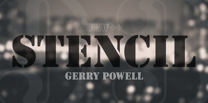
- Stencil by Bitstream,
$29.99Gerry Powell’s stencil version of Clarendon designed for ATF in 1938. - Stencil by Adobe,
$35.00 - Stencil by Tilde,
$39.75 - Bold Metal Stencil JNL by Jeff Levine,
$29.00 An image of a vintage, hand-cut metal stencil with just a set of bold numerals inspired the design of Bold Metal Stencil JNL. The typeface is available in both regular and oblique versions.
 - Antique Stencil Borders JNL by Jeff Levine,
$29.00 Antique Stencil Borders JNL collects twenty-six vintage border designs from various sources for complementing copy set in stencil lettering or in stand-alone decorative projects. NOTE: The purchase of this font does NOT include license to replicate the designs as commercial products for resale. To do so, a Derivative Products License must be obtained by contacting Jeff Levine. Contact information is found within the End User License Agreement.
 - French Stencil Moderne JNL by Jeff Levine,
$29.00 French Stencil Moderne JNL is modeled from an alphabet found in the 1930s publication "100 Alphabets Publicitaires" by M. Moullet, and is available in both regular and oblique versions. Strongly resembling the stencil motif of Futura Black, this French stencil alphabet has enough variations to give it a unique design flavor all its own.
 - Cut Paper Stencil JNL by Jeff Levine,
$29.00Playing around with a previous design, Jeff Levine came up with Cut Paper Stencil JNL, a typeface with both an Art Deco flair and the look of letters made from cut paper. - Belle Epoque Stencil JNL by Jeff Levine,
$29.00 An old ad for Cointreau Triple Sec Liquor featured a bolder variant of the lettering style found in a set of vintage tin stencils that were the model for French Stencil JNL. This is now available as Belle Epoque Stencil JNL, in both regular and oblique versions. “Belle Epoque” means “beautiful era” in French.
 - Rail Route Stencil JNL by Jeff Levine,
$29.00 Rail Route Stencil JNL is based on a hand-cut paper stencil depicting a logo for the Baltimore and Ohio (B&O) Railroad. The lettering is from the motto encircling an image of the Capitol dome: "Linking 13 Great States with the Nation". This motto was not present on some other versions of the B&O logo.
 - Maitre d Stencil JNL by Jeff Levine,
$29.00 Maître d' Stencil JNL is based on an alphabet example found in the 1949 French lettering book “Album de Lettres Arti”, and is available in both regular and oblique versions.
 - Old Brass Stencil JNL by Jeff Levine,
$29.00 An antique barrel lid stencil spotted in an online auction for a company once located in Guttenberg, NJ provided the hand-cut sans serif lettering which inspired Old Brass Stencil JNL; available in both regular and oblique versions.
 - Old Spur Stencil JNL by Jeff Levine,
$29.00 A partial set of antique brass stencils inspired Old Spur Stencil JNL, which is available in both regular and oblique versions. The lettering is based on a traditional Roman stencil design with Western-style spurs added to the approximate centers of each character.
 - Ultra Thin Stencil JNL by Jeff Levine,
$29.00 Online auctions offer a treasure trove of lost or forgotten merchandise, and many items pertaining to lettering just beg to be digitized into a typeface. Case in point is a partial set of brass stencils that were the visual model for Ultra Thin Stencil JNL. While most of the brass interlocking stencils available now and in the past have bold lettering for easy readability, this particular set consisted of condensed letters with thin lines. Available in both regular and oblique versions, they join a long list of stencil designs available from Jeff Levine Fonts.
 - Print Shop Stencil JNL by Jeff Levine,
$29.00 Print Shop Stencil JNL was created from the few letters spotted on the packaging of a 1960s-era toy printing press set.
 - Sussex Semi Stencil JNL by Jeff Levine,
$29.00 A set of oil board stencils from Great Britain (probably from the 1950s) was the model for Sussex Semi Stencil JNL, which is available in both regular and oblique versions. Because many of the characters are ‘solid’ rather than containing the breaks [known as ‘islands’] of a traditional stencil letter, this is why the type design was given the ‘semi stencil’ designation.
 - Dual Line Stencil JNL by Jeff Levine,
$29.00 A set-aside work file featuring a bold sans serif typeface that may or may not have had a vintage source history was given a new treatment. Initially, the solid design was converted to a stencil format and an experiment was undertaken to see what the alphabet would look like with a dual line treatment. Surprisingly, it turned out quite well and the end result is Dual Line Stencil JNL; available in both regular and oblique versions.
 - Dive Gear Stencil JNL by Jeff Levine,
$29.00 Some vintage 1960s-era packaging for dive gear (masks, swim fins, etc.) manufactured by the Voit division of AMF had various merchandise boxes hand-lettered [with some variation of design] in an interesting sans stencil. These packages formed the inspiration of Dive Gear Stencil JNL. Thanks once again to Gene Gable, whom on many occasions has provided Jeff Levine material for type design inspiration.
 - Hand Cut Stencil JNL by Jeff Levine,
$29.00 Hand Cut Stencil JNL is a condensed Roman typeface modeled from an antique tin stencil hand cut for shipping merchandise. The design is available in regular and oblique versions.
 - Jazz Beat Stencil JNL by Jeff Levine,
$29.00 The 1960 British film “Beat Girl” (released in the U.S. as “Wild for Kicks”) was a typical [for its time] story of a teenage girl looking to have some fun by hanging out with SoHo beatniks and going against parental authority. One of the posters for the film features the title in a condensed slab serif stencil form, with eroded edges. The basic letter forms were smoothed out and cleaned up resulting in Jazz Beat Stencil JNL, which is available as in both regular and oblique versions.
 - French Shipping Stencil JNL by Jeff Levine,
$29.00 The hand punched lettering of an antique French shipping stencil was the inspiration for French Shipping Stencil JNL; available in both regular and oblique versions.
 - Deco Geometric Stencil JNL by Jeff Levine,
$29.00 Deco Geometric Stencil JNL was inspired by an example of a vintage Art Deco stencil type design seen in the Steven Heller-Louise Fili book "Stencil Type" (published by Thames and Hudson).
 - French Stencil Serif JNL by Jeff Levine,
$29.00 Spotted for sale online, a partial set of antique tin stencils from France had a distinctively handmade look about them. Many of the characters were inconsistently wider than others, some characters were missing and one was damaged. Despite the obvious flaws, the image of these stencils served as the model for a digital font revival once the characters took on a more uniform appearance. French Stencil Serif JNL is available in both regular and oblique versions.
 - Parking Lot Stencil JNL by Jeff Levine,
$29.00 At first glance Parking Lot Stencil JNL look quite similar to many sans stencil fonts, but rest assured there are numerous subtle nuances that give the typeface its own unique flavor. Modeled after the plastic stencils used for marking numbers and directional information on paved surfaces, the lettering is clean yet industrial.
 - Stamped Brass Stencil JNL by Jeff Levine,
$29.00 Up until the advent of modern packing and shipping methods, the common way to mark merchandise or other items to be transported was through the use of a brass stencil. These marking devices were hand stamped (or punched) using metal dies that were struck against sheets of brass to create the letters, numbers and other symbols [unlike the steel rule die cutting method used for manufacturing paper stencils]. One such example of an antique marking stencil had letters and numbers approximately one quarter of an inch in height, and Stamped Brass Stencil JNL recreates the design complete with the unusual variations of character shapes and widths.
 - French Stencil Sans JNL by Jeff Levine,
$29.00 French Stencil Sans JNL is another typeface based on vintage French tin/zinc stencils. Slightly rounded corners and a "hand-cut" look add an interesting and charming variation that breaks away from the "standard" design of other metal stencil sets.
 - Dry Goods Stencil JNL by Jeff Levine,
$29.00 An antique Bradley stencil cutting machine’s letters and numbers were the basis for Dry Goods Stencil JNL, which is available in both regular and oblique versions.
 - More Antique Stencils JNL by Jeff Levine,
$29.00 More Antique Stencils JNL is another collection of wonderful decorative stencil designs from antique sources. Included in this font are floral, bird and nautical motifs in both singular and border designs as well as an ornate embellishment. This font is a companion to Antique Stencils JNL.
 - Vintage Stencil Art JNL by Jeff Levine,
$29.00 Vintage Stencil Art JNL collects another twenty-six charming designs, all re-drawn from antique and vintage stencil sources. These images make for the perfect embellishment to typographic projects which utilize stencil type, or the designs can be applied as decorative thematic backgrounds (such as a flower show, nature walks and so forth). For reproduction as saleable commercial products such as stencils, decals, stickers, transfers, etc. please refer to the terms and conditions which are clearly stated in the font's End User License Agreement regarding specialized licensing.