10,000 search results
(0.139 seconds)
- Graffiti Xenoa by Nirmana Visual,
$22.00 Graffiti Xenoa is a fun, urban-style display font. This font is suitable for designs like logos, advertising, apparel, jerseys, sportswear, skateboard designs, and more. Take your concepts to the next level with this stunning font!
 - Reymond by Rockboys Studio,
$18.00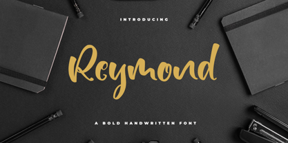 Reymond is a lovely and timeless handwritten font. It is the best choice for creating eye catching logos, branding and quotes. Every letter has a unique and beautiful touch, which will make your design come alive!
 - Conmersa by AEN Creative Studio,
$16.00 Conmersa is a minimal and neat sans serif font. It can easily be matched to an incredibly large set of projects, so add it to your creative ideas and notice how it makes them stand out!
 - Kyouking by Seventh Imperium,
$25.00 The Kyouking design is basically the structural century blend with a modern feel approach to make it a flexible and epic, effective font for the creation of ambitious poster headlines, Book covers, logos and so on.
 - Billa Brush by Lafitte 58,
$16.00 Billa Brush is a thin and clean handwritten font. It can easily be matched to an incredibly large set of projects, so add it to your creative ideas and notice how it makes them stand out!
 - Aperture Display by Mi Chen,
$5.99 Aperture Display is a san-serif typeface which combines the “standard” forms of grotesks and the modern takes on the use of ink traps. It is a display typeface designed mainly for branding and printed matter.
 - Willpower Slab by Sign Studio,
$9.00 Willpower Slab is made to write neatly and to make it easy to read properly. Smooth design and balanced thickness. Each character has been set kerning. You can just write comfortably with him 5 thickness options.
 - Dolphinero by Murisa Studio,
$10.00 Dolphinero is a modern and adaptable sans serif font. It can easily be matched to an incredibly large set of projects, so add it to your creative ideas and notice how it makes them stand out!
 - Mr Palker by Letterhead Studio-YG,
$35.00 A slab serif Mr Palker and grotesque Mr Palkerson build one superfamily together. These are blank types. In a way even the display ones. Typefaces for newspapers, announcements, cheap advertising and police posters. Mr Palker and Mr Palkerson will turn every language into a fence. And due to six types of faces one can choose what material should the fence be made from — from Thin steel rods to the Black stone blocks. In their simplest appearance Mrs P&P are intended for the solid blank composition in victorian or industrial style. They are quite decent, a bit old-fashioned slab serif and grotesque with closed aperture. All my types have layers. Walker and Palkerson also do. Besides the standard set of symbols, they have 4 add-ons. 1. Alternate glyphs, including unicase ones. 2. Ligatures with A letter. 3. Extra tall small caps. 4. Two-storey ligatures. All this options are intended for the complex composition. The additional letters are rather eccentric as their main function here is to imitate the victorian oddities. Imitate, parody, just not repeat. There are lower-case As and Es in the set in height of small caps and uppercases. They can turn every writing into the unicase. The lower-case A (as well as uppercase and small caps version of it) has deliberately by my taste grown a ludicrous tail. To compensate it I’ve built all the possible ligatures - ад, ал, ая. There are 35 of this ligatures all together. Take a closer look at the Russian letters D, L, K, Ya from the main set as well as their alternates. The additional glyphs are one more comic than the other — on purpose to imitate (not to repeat!) the victorian set. This sets have lowercase numbers. And small caps numbers as well. What a modern typeface without them. They also have an У-letter with a generously curvy tail. As if before the WWI. The Latin of course has alternates as well. It has letters to make the perfect French sound more like the russian provincial version of it. The tails of Js and Ts can be made a little bit more open — or a little bit closed. My favorite feature here, an invention of a kind - extra tall small caps. It allows to compose logos with the small caped uppercases directly from the keyboard. The small caps of this typefaces are usually much taller than the customary ones. This is the kind of small caps that Palker and Palkerson have. More to that, the strokes’ weight and the letters width are corresponded to the uppercases. Just a ready set for making a logo a la 1913 style. With a unicase, one has to mind! One more trick with the tall small caps is a possibility to make them work like lower uppercases. Their height is just in between of lower- and uppercases. Isn’t it great to have an additional set of uppercase working ponies in stock for the case of emergency. And finally — the trademark of Palkers family, two-storey ligatures. They are made in the height of uppercases and turn every writing into an ornament or a puzzle of a kind, while at the same time making them much shorter. Each face has 90 of them. Mainly those are twins: CC, BB, DD and so on. ll this things are for the unhasty compositing, even for lettering. Which means that for the things which are not there you always should have Command+Option+O and some patience. Also — among the two storey ligatures one also can find some belvedere villas. All my types are glasses from the one kaleidoscope. The P&Ps family was preliminary part of the victorian set, which already has 1 Cents and Clarendorf - optionally one can add Costro, Gordoni, Handy, Guardy, Surplus, Red Ring, Red Square, Babaev to the list. And also Sklad, Odessa, Dreamland, Romb, Platinum - here, at Letterhead’s, every second one is victorian. All together our typefaces can allow one to set advertisement of any kind, even the trickiest one, and compose everything, from the coffee place’s menu to the antiquarian magazine.
 - Mr Palkerson by Letterhead Studio-YG,
$35.00 A grotesque Mr Palkerson and slab serif Mr Palker build one superfamily together. These are blank types. In a way even the display ones. Typefaces for newspapers, announcements, cheap advertising and police posters. Mr Palker and Mr Palkerson will turn every language into a fence. And due to six types of faces one can choose what material should the fence be made from — from Thin steel rods to the Black stone blocks. In their simplest appearance Mrs P&P are intended for the solid blank composition in victorian or industrial style. They are quite decent, a bit old-fashioned slab serif and grotesque with closed aperture. All my types have layers. Walker and Palkerson also do. Besides the standard set of symbols, they have 4 add-ons. 1. Alternate glyphs, including unicase ones. 2. Ligatures with A letter. 3. Extra tall small caps. 4. Two-storey ligatures. All this options are intended for the complex composition. The additional letters are rather eccentric as their main function here is to imitate the victorian oddities. Imitate, parody, just not repeat. There are lower-case As and Es in the set in height of small caps and uppercases. They can turn every writing into the unicase. The lower-case A (as well as uppercase and small caps version of it) has deliberately by my taste grown a ludicrous tail. To compensate it I’ve built all the possible ligatures - ад, ал, ая. There are 35 of this ligatures all together. Take a closer look at the Russian letters D, L, K, Ya from the main set as well as their alternates. The additional glyphs are one more comic than the other — on purpose to imitate (not to repeat!) the victorian set. This sets have lowercase numbers. And small caps numbers as well. What a modern typeface without them. They also have an У-letter with a generously curvy tail. As if before the WWI. The Latin of course has alternates as well. It has letters to make the perfect French sound more like the russian provincial version of it. The tails of Js and Ts can be made a little bit more open — or a little bit closed. My favorite feature here, an invention of a kind - extra tall small caps. It allows to compose logos with the small caped uppercases directly from the keyboard. The small caps of this typefaces are usually much taller than the customary ones. This is the kind of small caps that Palker and Palkerson have. More to that, the strokes’ weight and the letters width are corresponded to the uppercases. Just a ready set for making a logo a la 1913 style. With a unicase, one has to mind! One more trick with the tall small caps is a possibility to make them work like lower uppercases. Their height is just in between of lower- and uppercases. Isn’t it great to have an additional set of uppercase working ponies in stock for the case of emergency. And finally — the trademark of Palkerson family, two-storey ligatures. They are made in the height of uppercases and turn every writing into an ornament or a puzzle of a kind, while at the same time making them much shorter. Each face has 90 of them. Mainly those are twins: CC, BB, DD and so on. ll this things are for the unhasty compositing, even for lettering. Which means that for the things which are not there you always should have Command+Option+O and some patience. Also — among the two storey ligatures one also can find some belvedere villas. All my types are glasses from the one kaleidoscope. The P&Ps family was preliminary part of the victorian set, which already has 21 Cents and Clarendorf - optionally one can add Costro, Gordoni, Handy, Guardy, Surplus, Red Ring, Red Square, Babaev to the list. And also Sklad, Odessa, Dreamland, Romb, Platinum - here, at Letterhead’s, every second one is victorian. All together our typefaces can allow one to set advertisement of any kind, even the trickiest one, and compose everything, from the coffee place’s menu to the antiquarian magazine.
 - Boxed Round by Tipo Pèpel,
$18.00 Boxed Round is a rounded version of the popular Boxed font, a typeface whit 18 weights, brightly conceived and designed to look good on small screen devices, but offering also enlightened looks on paper. The semi-modular geometric font shapes seek to be fully responsive to the grid of screen’s pixels to deliver a crisp, fluid reading rate. The rounded version offers a more warm, sweet, edible appearance that will give more freshness to your texts. Due to its extensive range of weights and subtle difference in thickness, compensating for the stain of characters between different CSS styles is really easy. It offers an extensive set of Latin characters, even the Cyrillic.
 - Andron 2 ABC by SIAS,
$44.90 Andron 2 ABC is a product developed especially for children’s literature. It is an ideal choice for primers and other books for the age when children are learning to read. The typeface has the same peak typographic quality as any other font of the praised Andron series—the very best is just good enough for our kids, is it not? As a difference from the normal glyph set (as in Andron 1 Latin or Andron Mega), the letters a, g and y have those simpler single-story shapes that resemble the forms usually taught in writing, which are sometimes called infant letterforms. Now, Andron 2 ABC is available in a full four-font family set.
 - Tallitha by alphArt,
$15.00 Tallitha, a stylish handwritten font that looks cute, elegant, stylish and is perfect for any awesome projects that need lettering taste. Tallitha could be perfect for watermark, social media posts, advertisements, logos & branding, invitation, product designs, label, stationery, wedding designs, product packaging, special events and more. Tallitha also includes a full set of uppercase and lowercase letters, multilingual symbols, numerals, punctuation. The font has a smooth wet ink texture, so would be perfect for all types of printing techniques and you can do embroidery, laser cut, gold foil etc. Features : ligature alternate multi lingual I hope you enjoy this font. If you have any questions please don't hesitate to drop me a message :)
 - Happy Brain Creepy Thalamus by TypoGraphicDesign,
$19.00 CONCEPT/ CHARACTERISTICS The base was a head-vein illustration. This served as a design grid. Novel letterforms were sought and found. Hand-drawn analog and digitized later. Experimentally, novel, fresh and an eye-catcher. Completely new insights into the human brain. A font for happy thoughts. ghostly visions, or simply for the next freshen party flyers. APPLICATION AREA The happy, creepy, Horror handmade font »Happy Brain Creepy Thalamus« with many language support would look good at headlines. Magazines or websites, party flyer, movie posters, music Poster, music covers or webbanner. TECHNICAL SPECIFICATIONS Headline Font | Display Font | Handmade Horror Font "Happy Brain Creepy Thalamus" OpenType Font with 283 glyphs, alternative letters and ligatures (with accents & €) & 1 style (regular).
 - Carilliantine by Device,
$39.00 Carilliantine updates the organic curves of Art Nouveau typefaces typified by John F. Cumming's Desdemona, designed around 1886. A contemporary monoline sans reinterpretation rather than a more traditional serif, its high-waisted emphasis lends it an elegance and class. Carilliantine is replete with hundreds of two- and three-letter ligatures that bring a customised uniqueness to any headline. These are on by default, and can be toggled on or off in the Opentype palette of Adobe apps, or chosen individually according to taste from the Glyphs menu. Suitable for upmarket food packaging, wine labels, restaurants, folk bands, sword and sorcery trilogies, cosmetics and fashion brands that nod to the refinement of yesteryear, but are very much of today.
 - Amoretti by IKIIKOWRK,
$17.00 Proudly Present Amoretti - Handwriting Type, created by ikiiko. Amoretti is an expressionist handwritten typeface whose ethereal and flowing strokes perfectly reflect the soul of a poet's work. The erratic twists and turns give the appearance of an authentic, passionate, and emotional handwritten message. This font have a different iterations of each character were made to accentuate the font's organic appearance and to convey a sense of spontaneity and randomness. This typeface is perfect for an nature design, feminine layout, wedding & invitation, book cover, and also good for quotes, or simply as a stylish text overlay to any background image. What's included : Uppercase & Lowercase Number & Punctuation Alternates & Ligature Multilingual Support Works on PC & Mac
 - Blue Parrot JNL by Jeff Levine,
$29.00The original inspiration for Blue Parrot came from a short scene in the classic film Casablanca. For just a few seconds, the exterior of Ferrari's Blue Parrot night club is shown, complete with a wonderful hand-lettered sign... all in capital letters. Blue Parrot JNL was originally released in 2006, and it wasn't long before a few people noted that the font would also look good with a lower case alphabet. The idea of adding in lower case kicked around for a couple of years until Jeff Levine finally completed a revision of the font. In this version there's also an expanded character set thanks to the creative input of Michael Hagemann of Font Mesa. - Khews by Invasi Studio,
$15.00 Are you ready to add some fun to your designs? Khews is the perfect font for you! It has a modern and playful vibe with its unique cutoff letterform and inspiration from graffiti tagging. You'll love the casual and bubbly twist that Khews brings to any project. And here's the best part: Khews comes in two styles - regular color and outline - so you can mix and match to create the perfect design. Give it a try and see the magic for yourself! Ideal for posters, flyers, logos, and headlines. It pairs well with sans-serif and serif fonts. Despite its imperfections, it is casual yet legible and has a good blend of modern and casual styles.
 - Quat by Ani Dimitrova,
$29.00 Quat is a sans serif type family designed by Ani Dimitrova. The family comes in 22 weights, ranging from Hairline to Black with extra drawn italics and small caps versions, and each style contains more than 700 glyphs. The Regular and Medium weights are perfect for body text while the extra drawn Italic gives an interesting texture to the text. The lightest weights work well in subtle headlines while the heaviest ones are perfect for posters, short texts, web, branding and screen design. All weights contain ligatures, proportional figures, tabular figures, old style figure, numerals and arrows, matching currency symbols and fraction. The range of styles give a good flexibility to this family.
 - Flamouse by Ilhamtaro,
$23.00 FLAMOUSE is a beautiful, retro-style script font, characterized by a fat font and has a halftone texture at the bottom. This font is of course very suitable for supporting retro designs on food or beverage brands, classic American style restaurants, promos at supermarkets and can also be used as a sign for hotels. A font that is quite unique and different from other scripts, as display text on a t-shirt design will also be very good, with the Baseball style I think it will be more suitable. To enable the OpenType Stylistic alternates, you need a program that supports OpenType features such as Adobe Illustrator CS, Adobe Indesign & CorelDraw X6-X7. Cheers!
 - Reimbrandt by IKIIKOWRK,
$19.00 Proudly Present Reimbrandt - Art Nouveau Type, created by ikiiko. Reimbrandt is a classic typeface that is a perfect representation of the timelessness and romance of the past, inspired by the beautiful Art Nouveau era. This alluring typeface transports you back to a time when elegance and grace were the norm. This font exudes beauty and romance with its simple, decorative shapes reminiscent of the painstaking craftsmanship of the Art Nouveau era. This typeface is perfect for an vintage vibes, classic & vintage poster layout, fashion look book, book cover, packaging, food & beverages and also good for quotes, or simply as a stylish text overlay to any background image. What's included? Uppercase & Lowercase Number & Punctuation Multilingual Support Works on PC & Mac
 - Valet by Canada Type,
$29.95 Valet is deco moderne the way it was meant to be: Big, bold, classy, flashy, and clean at the seams. Its message is rich, strong, confident and reliable. Valet tells you that it’s used to thorns being part of every rose, that it can handle sharp objects just fine, and that it'd much prefer buying the tuxedo rather than renting it. This font grew out of an uncredited early 1970s all-cap film type called Expression. An appropriate deco lowercase was added, along with small caps, zippy titling caps, and Pan-European language support. With over 9250 glyphs, we bow our heads with the admission that we kind of got carried away with it.
 - Glora Sans by Khaiuns,
$15.00 Glora is a modern sans serif with a soft touch made at Warkop for fun. Glora has strong upper and lowercase letters that are subtle and effective in a variety of designs for your project. This font is very good in my opinion, you must think I praise my own work, you are not mistaken I also think the same as you. It is perfect for graphic design and any display use. It can easily work for web, signage, corporate as well as for editorial design. Have fun designing with the Glora font, because I have the quotes "don't forget to be happy while you're alive" Thanks for use this font ~ Khaiuns
 - Assox by Alit Design,
$15.00 Introducing assox Typeface. This font is inspired by the design styles of the 70s. The style is funny, groovy, classic, not serious but has aesthetic and unique value, besides that the assox font is very easy to remember and becomes the image of a design. assox is very good for being your font collection because this font is very unique and easy to apply to any media that has a design concept that is not so serious, groovy, classic, funny and unique. Besides that, it can be used for the design of t-shirts, posters, sign boards, and social media needs. Features: A-Z Character Set Numerals & Punctuations (OpenType Standard) Stylistic Alternates Multilingual
 - Silly Girls by HIRO.std,
$16.00 Silly Girls is a Monoline font. This font describes about girly, feminist, dynamic, easy to use and easy to use and will bring a good harmony when the letters are connected and paired each other. FEATURES - Support Opentype Features - Support Ligatures bb dd ee ff gg kk ll mm nn oo pp rr ss tt st at att et ett it itt ot ott ut utt yt gt lt rt The - Uppercase - Lowercase - Numbering and Punctuations - Multilingual Support - Works on PC or Mac USE Silly Girls works great in any branding, logos, magazines, wedding designs, social media posts, quotes, invitation, stationery, craft and any projects that need monoline handwriting taste. Enjoy using! Thanks. HIRO.std
 - Masche by Epiclinez,
$18.00 Add a touch of whimsy and charm to your designs with Masche, the ultimate fun handwritten font. With its quirky and playful style, this font is bursting with a personality that will instantly bring your designs to life. Whether you're crafting eye-catching quotes, captivating posters, or eye-popping headlines, Masche has got you covered. Its versatility knows no bounds - perfect for product packaging that needs that extra pop or any design project that calls for a dose of creativity. With Masche, unleashing your inner artist has never been so effortless! Masche features : Standard Latin Numbers, symbols, and punctuations Multilingual Support. Fully accessible without additional design software Simple Installations Works on PC & Mac Thank You.
 - Guitarist by SAMUEL DESIGN,
$19.00 Guitarist, a symbol of freedom and self-confidence. A good font must be enduring and of high quality. This font is simple in shape, and at the same time pays attention to changes in thickness, and strives to be classic and timeless. This font is great for music, fashion, magazines and is very eye-catching. GUITARIST can be matched with various fonts, and the visual effect is very strong. This font is modern and elegant with high-quality details. Designers like listening to jazz very much, looking for freedom, passion, independence, and change in jazz, and integrating these spirits into this font. I hope this font will help your brand be more visible.
 - Great Copper by Pixesia Studio,
$19.00 Introducing Great Copper - An Old Handcraft Display Font With a perfect combination of its unique yet classic shapes, Great Copper greatly portrays the familiar feeling that you are looking for. This typeface suits the nostalgic feeling you want to evoke through words. It comes as if Great Copper is written personally as letters to deliver good news. As splendid it curves in delivering the sweet vibe, Great Copper comes also with its firm shape to emphasize how valuable the messages and stories that it brings. Enchanting yet emphatic, Great Copper typeface will be perfect to depict the great story about the past you'd be delighted to tell and share. Hope you Like it. Thanks.
 - Train Of Thought by Pesic,
$29.00 Train of thought is a decorative font based on vintage and retro posters of the 19th and 20th centuries. Contains all Latin and Cyrillic glyphs. It is very modern, and it is intended for the use of creating logos and T-shirt designs as well as highlighting the essential elements on billboards, magazines, etc. Today's digital designers can use these stencil patterns to embellish text set in other alphabet stencils or by themselves to evoke the feeling of rustic Americana. Train of the thought is extremely detailed, and looks good in both small and large dimensions. It also contains a set of symbols, which you can use to further emphasize the essential elements.
 - LTC Creepy Ornaments by Lanston Type Co.,
$24.95 In researching historic decorative material offered by Lanston Monotype as well as other metal foundries such as Barnhart Brothers and Spindler, there were occasionally ornaments that defied description. Perhaps it was a Victorian sense of humor or someone really thought these were a good idea or perhaps popular taste has just changed so much over the last hundred years, or our forbearers were completely insane. In any case, LTC is somewhat proud to present a collection of the most bizarre, disturbing and baffling printers ornaments we could find. Along with mutant fowl-children and frolicsome amphibians, there are also Masonic and other secret fraternal symbols that may not be creepy to everyone, but just enough to be moderately disturbing.
 - Thorletto by HandletterYean,
$13.00 Presenting Thorletto! Created with the influence of the background story of the great franchise Fast and Furious, this font are meant to remind you to not give up, be brave, do your best, fight the good fight and fight for the best thing(s) in your life. This unique font characterized by its stroke of brush on every glyph, it made intentionally with a real brush resulting in a unique, bold, and rough looking font. Thorletto includes a complete set of uppercase and lowercase letters in regular and italic style, also support multi-language, numbers, punctuation, and ligature. It is suitable for various kind of design like clothing, poster, quote, branding, logo, packaging, greeting card, invitation, and many more.
 - Metuo by Twinletter,
$12.00 For the younger generation, San Serif has been modernized. Metuo is a modern font available in four weights. Easy to read with eye-catching graphics. It goes well with tech and futuristic themes and may be used for a variety of things, including business logos, packaging, and posters, as well as smaller items like banners, advertisements, apparel design, and letterheads. If you choose this typeface, your project will instantly be engaging and enjoyable, so get started right now! of course, your various design projects will be perfect and extraordinary if you use this font because this font is equipped with a font family, both for titles and subtitles and sentence text, start using our fonts for your extraordinary projects.
 - Yearling by Chank,
$99.00 The Yearling fonts are inspired by old propaganda poster letter forms of the 20th century. However, they're also intended to work well in modern communications as well. Yearling was originally created to look good via fax (LOL!), and because it's based on a very rigid grid (like pixels on your screen), this font family also works well on smartphones and modern tablets, too. Short on curves and diagonals, these letterforms are a celebration of horizontal and vertical. But most importantly, this font is simple and clean and clear and direct. Nothing fancy here, just the facts, as modern as can be. Recently updated with extra language support for many voices across the world.
 - Leakpaint by Andrew Tomson,
$10.00 Hello friends! Drawing is a great way to pass the time. Sometimes, clumsy people can spill paint on paper or on an already completed drawing. What do we end up with? A ruined drawing or a new work of art? I think the latter. After all, every drawing is unique and a unique thing. Even if you are drawing a stick man! This font presents the opportunity to see what happens if invisible ink is spilled on it. This font is great for your new and unique projects for social media, lettering and just for home use! A little sloppy, a little bouncy, so it's so lively and magical! I wish you good luck and love!
 - Oksana Sans Compressed by AndrijType,
$33.00 Oksana Sans Compressed is the most skinny part of Oksana Sans font family, but still it retains most features of this humanist sans serif. The Compressed version is designed to get most of your page and fill a minimum space with maximum information. It can be useful in multiple columns typesetting — like magazines, newspapers or business documentation. Oksana Sans Compressed could be a good minor companion for other Oksana fonts as well. It has six weights from Thin to Heavy plus free and funny Fat Compressed Italic face, supports Western, Central European, Baltic Latin and Slavic Cyrillic codepages. Old-style digits, some ligatures, alternative characters and modern currency signs are also included.
 - Orbi by ParaType,
$30.00 The Orbi type system is a low contrast antiqua of elegant design with a well developed set of members. It consists of 10 roman and italic faces of different proportions and weights and 3 decorative calligraphic fonts. It also contains 3 additional fonts with various decorated initials. The roman includes small capitals. Thanks to its variety of styles the font is suitable for a wide range of applications - the basic styles are good for books and periodicals; the narrow styles work well in the columns and tables of business papers; the decorative styles are ideal for ceremonial typography where swashes, calligraphy and initials are usual. The fonts were designed by Natalia Vasilyeva. Released by ParaType in 2010.
 - Stencil Patterns JNL by Jeff Levine,
$29.00Stencil Patterns JNL collects into one digital file a number of decorative stencil patterns from decades past. These charming illustrations were re-drawn by Jeff Levine using images of vintage oilboard stencils made over fifty years ago. While these are useful as stand-alone embellishments for any print projects, they can also be scaled and printed out onto card or acetate stock for hand-cutting as new stencil templates. A special note of thanks goes to fellow type designer and author, Leslie Cabarga. He supplied the bulk of the images used in designing this font file. There are left and right pointing hands on the parenthesis keys, and a decorative ampersand on its respective key. - Dirty Deo Hand Ink by TypoGraphicDesign,
$19.00 CONCEPT/CHARACTERISTICS Experimental analog handwritten style. Handwritten in ink in a conventional roll-on deodorant. The dirty, grimmy Grunge-Look and the sloppy, rough Handwritten-Look script character, gives the typeface a high recognition value and uniqueness. The motto is handmade, rough & experimental. APPLICATION AREA The rough, ink-like, handwritten look of the handmade font „dirty deo hand ink“ would look good at logos, display size for poster, flyer, comics and graphic novel lettering, headlines in magazines or websites, packaging, music covers or webbanner etc. TECHNICAL SPECIFICATIONS Headline Font | Display Font | Raw Trash Script Font „dirty deo hand ink“ OpenType Font with & 282 glyphs & 1 style (regular). Symbols and ligatures (with accents & €)
 - Okoye by XO Type Co,
$40.00 Okoye occupies a liminal space between the bonkers curviness of 19th-century grotesques and the sandblasted neutrality of 20th-century models. Both extremes are nice, but there’s something to be said for some neutrality with character left in place, yes? Okoye comes in 9 weights, Thin to Black. If you’re using it for interfaces, each weight lines up from 100-900 in the CSS specification you already know, with Regular sitting at 400 and Bold at 700. You’ll see what you expect to see without extra font-weight specification. There’s extensive Latin language support, a set of small caps which mirrors full-size caps (good for control labels), and arrows. Okoye will be your quirkhorse: hardworking, with personality.
 - Motobreath by Epiclinez,
$18.00 Introducing Motobreath, the bold typeface that is sure to turn heads. This font is inspired by the energy and power of hard rock music and the thrill of the racing car scene. With Motobreath as your secret weapon, you'll instantly add excitement and attitude to any design project. The simple angles yet energetic lines give this typeface an unmistakable edge that sets it apart from other fonts on the market. Whether you're looking to create a bold headline that demands attention or a logotype that conveys strength and power, Motobreath has got you covered. Motobreath features : Standard Latin Numbers, symbols, and punctuations Multilingual Support. Fully accessible without additional design software Simple Installations Works on PC & Mac Thank You.