10,000 search results
(0.026 seconds)
- Signwriter Standard by Greater Albion Typefounders,
$16.50 Typeface for posters and signage. An extensive range of opentype features are incorporated:- Small Capitals, Title forms, stylistic alternates, old-style and lining numerals, ‘small capitals’ numerals, ligatures and so forth. A touch of flair an distinction is given to these solid letter forms by the provision of tiny serifs. Why not use Signwriter Standard and make an emphatic statement today!
 - Majidah by insigne,
$21.99Majidah is an attempt to replicate the look and feel of an ancient script taken from the pages of an antique document. It has a Middle Eastern feel to it, but could be used for a wide range of applications. Majidah includes a number of OpenType features, including alternatates, ligatures and old style figures, and includes accents for wide range of languages. - Fluse by Pesotsky Victor,
$10.00 «Fluse» is an accidental sans-serif font. It has an angular design but smooth and sleek shapes. The font is suitable for both active titles and medium-sized texts. It can also be an accent in a poster or the basis of a corporate identity. Fluse supportsBasic Latin, Cyrillic and more than 100 languages all together. The font was designed by Viktor Pesotsky.
 - Macaroni Sans by Type Associates,
$30.00 Macaroni Sans evolved from our search for an extended font family consisting of a range of weights in both uprights and obliques, with a contemporary appeal. The desired character was to be sympathetic with a range of high-tech consumer products so a friendly, soft approach was called for. The resulting mix of geometric shape, rounded terminals, subtle italic angle of just six degrees and a few quirky stroke endings met with an enthusiastic response. As its subject product line exhibits brilliant color and imagery, a style was called for that conveyed contemporary appeal and readability but would not compete with the savvy products. We arrived at a clean, modern, sociable look that would suit a broad subject field in either text, semi display or signage. Its simple lines and monoline strokes fit well with logo usage or screaming posters, enhancing letterheads or websites, for foodstuffs to autos, insurance to swimming pools, lawfirms to babyfood. Macaroni Sans is the perfect typeface for branding, logotypes, may even flatter challenging viewing conditions. Rounded types have been around (pardon the pun) for centuries; numerous examples can be seen on old wood type posters, which in a small way prompted the name: in fashion Macaroni was a term used in mid-eighteenth century Europe to describe a dandy, a chap who displayed flamboyance in dress and hairstyle and spoke outlandishly or in an effeminate manner. Hence the term macaronic verse.
 - Prangs by Sudtipos,
$59.00 The late-19th-century Prussian-American printer and publisher Louis Prang, the “father of the American Christmas card”, was well-known for his efforts to improve art education in the United States. He published many instructional books and even founded a training school for art teachers. One of the books he published included a series of alphabets for sign painters, lithographers, illuminators, architects and civil engineers. There was nothing truly original there — in the book’s preface, Prang says that the alphabets were “based on foreign forms and adapted for American taste”. The one alphabet that caught my attention in that book was one simply called “Italic”. It’s a high- contrast modern, a Didone really, but with an interesting little twist: the lowercase is almost entirely connected, which makes for an interesting mix of modern typography and classic calligraphy. That stuff is right up my alley now. Whenever my eyes happen on a modern, it’s easy, even almost impulsive for me to envision swashes coming out of serifs and terminals. The caps melt and the minuscules dance with them. And so I brought my vision to life. Prangs is an italic set of three weights, each containing more than 1400 glyphs with plenty of OpenType features and Latin language support. This set celebrates the convergence of three centuries of fancy display alphabets. These fonts should work wherever moderns are used to elevate and scripts are used to appeal — namely today’s branding, packaging and glossy publications.
 - Ongunkan Camunic Script by Runic World Tamgacı,
$60.00 The Camunic language is an extinct language that was spoken in the 1st millennium BC in the Valcamonica and the Valtellina in Northern Italy, both in the Central Alps. The language is sparsely attested to an extent that makes any classification attempt uncertain - even the discussion of whether it should be considered a pre–Indo-European or an Indo-European language has remained indecisive. Among several suggestions, it has been hypothesized that Camunic is related to the Raetic language from the Tyrsenian language family, or to the Celtic languages. The extant corpus is carved on rock. There are at least 170 known inscriptions, the majority of which are only a few words long. The writing system used is a variant of the north-Etruscan alphabet, known as the Camunian alphabet or alphabet of Sondrio. Longer inscriptions show that Camunic writing used boustrophedon. Its name derives from the people of the Camunni, who lived during the Iron Age in Valcamonica and were the creators of many of the stone carvings in the area. Abecedariums found in Nadro and Piancogno have been dated to between 500 BC and 50 AD. The amount of material is insufficient to fully decipher the language. Some scholars think it may be related to Raetic and to Etruscan, but it is considered premature to make such affiliation. Other scholars suggest that Camunic could be a Celtic or another unknown Indo-European language.
 - Neoro by Lurinzu Studios,
$16.50 Neoro is an Art Deco condensed display typeface with an emphasis on its legibility to work as a “workhorse” typeface. Neoro is developed with the intention to be used in almost all media and sizes. By combining the characteristics of an Art deco type with an emphasis with it’s legibility, this typeface is versatile in almost all medias you can think of! Magazines, body text, captions, headlines, display, albums and almost any media you can think of! *This font includes letters, numbers, multi-language, and all essential marks needed.
 - Ribka by Craft Supply Co,
$20.00 Ribka - The Elegant Pointed Serif Font harmoniously blends the classic appeal of sharp serifs with an exquisite sense of sophistication. This typeface radiates timeless charm, making it an excellent choice for projects that seek a touch of enduring beauty and grace. Whether you're creating invitations, developing branding materials, or curating editorial content, Ribka seamlessly instills a sense of opulence and distinction into your work. With its precise and pointed serifs, Ribka stands as an emblem of timeless sophistication in the realm of typography, elevating any project with an essence of refinement and exclusivity
 - Pipeline by URW Type Foundry,
$39.99 Pipeline is a futuristic and technical looking typeface. But as the name suggest it’s also earthly, (literally). Deep down underneath villages, city’s everywhere and even oceans there’s a network of pipelines. Providing us all sorts of supplies, like water and oil. Sewers wash fluid waste away. They are never to be looked upon as pretty or beautiful but purely functional. The soil peeled off and looked upon from above, a greater industrial infrastructure is revealed, cluttered like spaghetti, complex as the maze of corridors of termite colonies. I present two pipelines to you; one naked and one dressed. This typeface is very suitable for graphic, logo and poster design. It is quadratic shaped with round curves. It is modern and classic at the same time. It could be appealing for young, technical, digital, inventive and urban (sub) culture (at any age).
 - Archive Modern II by Archive Type,
$19.95An antiquated modern display typeface. - Everlasting by Bogstav,
$17.00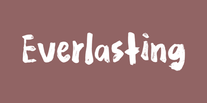 Handmade with an organic feeling.
 - Lemonism by Bogstav,
$17.00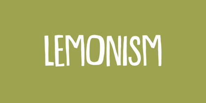 Handmade with an organic feeling.
 - Ahorn by Bogstav,
$17.00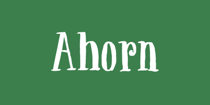 Handmade with an organic feeling.
 - Children Block Letters by m u r,
$15.00An child's 3D block letters. - Falcon Casual by TypeArt Foundry,
$45.00 An even more casual script.
 - Cassjor by Wooden Type Fonts,
$15.00 An avant garde design, geometric.
 - Talkback by Bogstav,
$17.00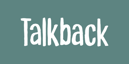 Handmade with an organic feeling.
 - Osculate by Bogstav,
$17.00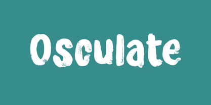 Handmade with an organic feeling.
 - Avoda by Typefactory,
$14.00 Avoda is an elegant and modern sans serif font. No matter the topic, this font will be an incredibly asset to your fonts’ library, as it has the potential to elevate any creation.
 - Sandalwood JNL by Jeff Levine,
$29.00 An example of an antique sans serif wood type displayed in Rob Roy Kelly’s “American Wood Type” was the working model for Sandalwood JNL, which is available in both regular and oblique versions.
 - Love Affair by Gleb Guralnyk,
$12.00 Love Affair is an art nouveau vintage style font. It's an old-school typeface, perfect for creating some classic lettering compositions. Love Affair includes lots of ligatures to create more organic text shape.
 - Vessagio by Rockboys Studio,
$23.00 Vessagio is an elegant and modern sans serif font. No matter the topic, this font will be an incredible asset to your fonts’ library, as it has the potential to elevate any creation.
 - Intentness by Seemly Fonts,
$12.00 Intentness is an incomparable display font. It can easily be matched to an incredibly large set of projects, so add it to your creative ideas and notice how it makes them stand out!
 - Great Sage NF by Nick's Fonts,
$10.00This pseudo-Egyptian fantasy originally was named Karnac, and was unearthed in the pages of the 1888 American Type Founders Specimen Book. This version derives it name from a continuing character from Johnny Carson's stint on the Tonight show. Both versions of this font include the Unicode Latin 1252 and 1250 Central European character sets, with localization for Moldovan and Romanian. - Kenosha Antique NF by Nick's Fonts,
$10.00 The inspiration for this elegant, willowy typeface was found in the 1903 type specimen catalog of Barnhard Brothers & Spindler. The original version was named "Racine"; this version takes its name from another town in Wisconsin. The Postscript and Truetype versions contain a complete Latin language character set (Unicode 1252); in addition, the Opentype version supports Unicode 1250 (Central European) languages as well.
 - Cleveland Litho NF by Nick's Fonts,
$10.00This quirky charmer appeared in the 1898 specimen book of the Cleveland Type Foundry, under the name of "Litho", so it's no mystery where it got its name. It's a perfect choice for engaging headlines, anytime, anywhere. The PC PostScript, TrueType and OpenType versions contain the complete Latin language character set (Unicode 1252) plus support for Central European (Unicode 1250) languages as well. - Ongunkan Elder Futhark Viking by Runic World Tamgacı,
$50.00 Vikings or Norses are Scandinavian pirate and merchant tribes. Actually, "Viking" or "Nors" is not a nation name; It is the name given to Dans, Norwegians, Swedes and other Scandinavians regardless of who they are. The Elder Futhark here is a runic script - a version of the Viking script. I will upload other versions over time. Write nice things with pleasure.
 - Crowd Pleaser by Hanoded,
$15.00 Crowd Pleaser is a pleasant, handmade font. I hoped its lively looks, slightly crooked glyphs and overall happy appearance would appeal to many people - so I named it Crowd Pleaser. Well… not entirely true, as I have a list of font names and Crowd Pleaser was the next one up… ;-) I do hope, however, that you will like this font!
 - Schnorr Gestreckt by HiH,
$12.00 Peter Schnorr was a German artist/illustrator of Art Nouveau period (called Jugendstil in Germany and Austria). He was quite adept at calligraphy and did a variety of commercial work, including business signs. He designed at least four different alphabets and collaborated with Bruce Rogers on advertising work and title page designs for books. One of their clients was the publishing house of Houghton Mifflin. I have not been able to discover anything else about him, but I suspect he might be the grandson of the Bavarian artist Jules Schnorr von Carolsfeld, who was once commissioned to do a mural by Ludwig II of Bavaria (whose famous castle was copied by Disneyland). Schnorr did not give individual names to his fonts. Where there is no historical name, we like to follow the tradition initiated by Bauer and name fonts after their designer, with a descriptive adjective in the designer’s native language. Gestreckt is German for stretched or elongated. An interesting deign detail of this typeface is the cross bar of the “T” --it is NOT symetrical. The right hand side extends only 88% as far as the left hand side (a ratio of 9:8). I presume this was done for a more pleasing letter fit. Today Schnorr’s design is frequently offered under the name “Ambrosia.” However. close inspection will usually reveal that the serifs have been treated differently. I believe our font has a greater fidelity to the original design. Please also compare the design of the various auxiliary characters to those in other fonts. Often they are either borrowed from an inappropriate font of a different period or are missing altogether. We make every effort to design characters that are in keeping with the overall design and spirit of the typeface. For example, see the superscript Registered Trademark symbol (0174) and the Double s (0223). I think both are quite successful. Schnorr Gestreckt ML represents a major extension of the original release. In addition to the standard 1252 Western Europe Code Page with character slots up to decimal position 255, there are glyphs for the 1250 Central Europe, the 1252 Turkish and the 1257 Baltic Code Pages. There are also two alternate letter forms, one ornament and seven ligatures with Unicode codepoints (Private Use Area) and OpenType aalt, ornm & liga GSUB layout features. There are a total of 318 glyphs and 351 kerning pairs. Please note that some older applications may only be able to access the Western Europe character set (approximately 221 glyphs). This release also incorporates a redesign of several glyphs: the comma, quotes, acute accent, and grave accent.
 - Ardena by Julien Fincker,
$34.99 About the design: Ardena is a modern sans-serif typeface family. While neutral and clear at first glance, it can be characterized as both pleasant and confident due to its open, rounded forms and vertical terminals. It can be used in both a restrained and expressive way. The thinner and thicker weights are particularly suitable for strong headlines, while the middle weights can be used for typographic challenges and body text. Completed with an extensive character collection, it becomes a real workhorse. A versatile allrounder that is up to all challenges – for Corporate Identity, Editorial, Branding, Orientation and Guidance systems and much more. Features: The Ardena family has a total of 20 styles, from thin to heavy with matching italics. With over 1064 characters, it covers over 200 Latin-based languages. It has an extended set of currency symbols and a whole range of Open Type Features. There are alternative characters as stylistic sets, small caps, automatic fractions – just to name a few. Arrows and numbers: In particular, the extensive range of arrows and numbers should be highlighted, which are perfectly suited for use in orientation and guidance systems. Thanks to Open Type Features and an easy system, the various designs of arrows and numbers can also be simply "written" without first having to select them in a glyph palette. The principle is easily explained: If a number is placed in round or square brackets, it will automatically be displayed in an outlined circle or square. If you add a period to the number, it is displayed in a full circle or square. The same principle also applies to the arrows. The arrows themselves are combinations of greater/less symbols with the various slashes or hyphens. Get the Variable Font here: https://www.myfonts.com/fonts/julien-fincker/ardena-variable/
 - Maiandra by Galapagos,
$39.00The Maiandra family of typefaces were inspired by an early example of Oswald Cooper's hand-lettering, as seen in an advertisement for a book on home furnishing, circa 1909. Although many of Oz Cooper's letterform designs were cast in metal type, this particular one was not. Cooper's design itself was inspired by examples of letterforms he had admired in his study of Greek epigraphy (inscriptions). Cooper combined those ancient forms with the flair characteristic of design styles of his time. The result was an attractive design possessing subtle, purposeful irregularities, or "meanders" in his skilled brushwork. The Cooper design exhibits a unique warmth and harmony in text, while presenting a compelling rhythm, color and texture on the page. "Realizing the presence of this uniform warmth and readability," notes Dennis, "I decided to expand the design into a family of three weights with companion italics." The weights for the Maiandra family were selected for their versatility in usage over a broad range of output device resolutions. Indeed, "the consideration of eventual display resolutions, be they for screen or printer, provided the greatest challenge in the design of this typeface family," explains Dennis. Creating shapes that conform to the rigors of digital letterforms and modern rendering environments, without losing the unique characteristics of Oz Cooper's original design, is what Dennis has accomplished with his tribute to this great designer of the past. Maiandra, whose name derives from the Greek 'maiandros', meaning 'meander,' is intended for extended text use, as well as for informal subject matter, such as business correspondence, brochures and broadsides. "An example of a good use for Maiandra," notes Dennis, "is in printed matter relating to the turn-of-the-century art period known as the Arts and Crafts Movement. It can stand alone or be used with designs that complement its shape and color." - Ardena Variable by Julien Fincker,
$185.00 About Ardena: Ardena is a modern sans-serif typeface family. While neutral and clear at first glance, it can be characterized as both pleasant and confident due to its open, rounded forms and vertical terminals. It can be used in both a restrained and expressive way. The thinner and thicker weights are particularly suitable for strong headlines, while the middle weights can be used for typographic challenges and body text. Completed with an extensive character collection, it becomes a real workhorse. A versatile allrounder that is up to all challenges – for Corporate Identity, Editorial, Branding, Orientation and Guidance systems and much more. Variable Font The Variable Font contains 2 axes: weight and oblique – all in just one file. Features: With over 1064 characters, it covers over 200 Latin-based languages. It has an extended set of currency symbols and a whole range of Open Type Features. There are alternative characters as stylistic sets, small caps, automatic fractions – just to name a few. Arrows and numbers: In particular, the extensive range of arrows and numbers should be highlighted, which are perfectly suited for use in orientation and guidance systems. Thanks to Open Type Features and an easy system, the various designs of arrows and numbers can also be simply "written" without first having to select them in a glyph palette. The principle is easily explained: If a number is placed in round or square brackets, it will automatically be displayed in an outlined circle or square. If you add a period to the number, it is displayed in a full circle or square. The same principle also applies to the arrows. The arrows themselves are combinations of greater/less symbols with the various slashes or hyphens. Get the static version of the Ardena family here: https://www.myfonts.com/fonts/julien-fincker/ardena/
 - Casandra Lie by IbraCreative,
$17.00 Casandra Lie – A Chic Monoline Script Font Casandra Lie, a name like a whispered secret, perfectly embodies the essence of this chic monoline script font. Imagine the delicate stroke of a fine penmanship teacher gliding across paper, leaving behind an effortless trail of ink that dances and twirls with understated elegance. Every letter whispers tales of romance and intrigue, their slender forms adorned with graceful swashes and subtle flourishes that hint at a hidden passion. Think vintage Parisian boudoirs illuminated by candlelight, secret love letters penned under twilight skies, and the airy charm of handwritten invitations to soirees under the stars. Casandra Lie is not merely a font; it’s an invitation to a world of whispered dreams and unspoken promises, etched in ink as delicate as a spider’s web, yet strong enough to capture the beating heart of a story waiting to be told. Casandra Lie is perfect for branding projects, logo, wedding designs, social media posts, advertisements, product packaging, product designs, label, photography, watermark, invitation, stationery, game, fashion and any projects. Fonts include multilingual support for; Afrikaans, Albanian, Czech, Danish, Dutch, English, Estonian, Finnish, French, German, Hungarian, Italian, Latvian, Lithuanian, Norwegian, Polish, Portuguese, Slovak, Slovenian, Spanish, Swedish.
 - Bembo MT by Monotype,
$45.99 The origins of Bembo go back to one of the most famous printers of the Italian Renaissance, Aldus Manutius. In 1496, he used a new roman typeface to print the book de Aetna, a travelogue by the popular writer Pietro Bembo. This type was designed by Francesco Griffo, a prolific punchcutter who was one of the first to depart from the heavier pen-drawn look of humanist calligraphy to develop the more stylized look we associate with roman types today. In 1929, Stanley Morison and the design staff at the Monotype Corporation used Griffo's roman as the model for a revival type design named Bembo. They made a number of changes to the fifteenth-century letters to make the font more adaptable to machine composition. The italic is based on letters cut by the Renaissance scribe Giovanni Tagliente. Because of their quiet presence and graceful stability, the lighter weights of Bembo are popular for book typography. The heavier weights impart a look of conservative dependability to advertising and packaging projects. With 31 weights, including small caps, Old style figures, expert characters, and an alternate cap R, Bembo makes an excellent all-purpose font family.
 - Bembo Infant by Monotype,
$45.99The origins of Bembo go back to one of the most famous printers of the Italian Renaissance, Aldus Manutius. In 1496, he used a new roman typeface to print the book de Aetna, a travelogue by the popular writer Pietro Bembo. This type was designed by Francesco Griffo, a prolific punchcutter who was one of the first to depart from the heavier pen-drawn look of humanist calligraphy to develop the more stylized look we associate with roman types today. In 1929, Stanley Morison and the design staff at the Monotype Corporation used Griffo's roman as the model for a revival type design named Bembo. They made a number of changes to the fifteenth-century letters to make the font more adaptable to machine composition. The italic is based on letters cut by the Renaissance scribe Giovanni Tagliente. Because of their quiet presence and graceful stability, the lighter weights of Bembo are popular for book typography. The heavier weights impart a look of conservative dependability to advertising and packaging projects. With 31 weights, including small caps, Old style figures, expert characters, and an alternate cap R, Bembo makes an excellent all-purpose font family. - Vellvé by ITC,
$29.99For over 30 years, Tomás Vellvé created beautiful graphics and distinctive typefaces in his native homeland of Spain. First drawn as a phototype display design in 1971, Vellvé’s only typeface in digital form is an uncommon solution to the problem of creating a new sans serif design. The end result, which bears his name, is a design that stands out from the crowd of other sans serif typefaces. The phototype version was only available in a single, light weight. With the release of the digital fonts, however, three additional weights as well as a companion italic for the light weight were created.The typeface designs were originally drawn for Agfa Monotype (now Monotype Imaging) in 1996 as part of the company’s “Creative Alliance” initiative. Through an exclusive licensing arrangement, the Vellvé™ family has now been added to the ITC Typeface Library.ITC Vellvé is a wide design with strong calligraphic overtones. This is no “anonymous” design like so many modern sans. Letters like the `R, `e and `s clearly show the hand of Tomás Vellvé in the design process. Vellvé provides a fresh choice between geometric sans serifs such as Helvetica® and industrial sans serifs like Futura®. - Tsotsi by Scholtz Fonts,
$19.00Tsotsi, a recent addition to the Scholtz Fonts range, is highly legible, strong, African and contemporary in design. It is a sans serif font, however, the gently splayed terminals to the strokes subtly hint at a serif. It has been designed to be easy on the eye and readable at all font sizes and can be used either as a body (text) font or in headings and larger scale design. The font has an irreverent insouciance which is suggested by the verticals which all vary from true perpendicular by a few degrees, and by the slightly top-heavy nature of all characters - hence the name "Tsotsi" -- a rascal who is very sure of himself (and a little big-headed). Above all, however, the Tsotsi (both the font and the person) has an appealingly cheeky and mischievous style. It includes characters for English, French, Italian, German, and Portugese. all upper and lower case letters, all special characters as well as all numerals and punctuation. The numerals are mono-spaced so that they will line up correctly in columns of figures. The letters of the alphabet are correctly kerned so that they appear correctly in text. - Quijote Sauvage by Lián Types,
$45.00 It was in the beginning of 2008 when I designed a font named Quijote, its predecessor. In the middle of 2009, I looked at it again and thought it could be a good idea to make an update of it. Variables and Features: Quijote Sauvage Pro is the most complete variable. It includes all the ligatures, alternates and swashes. It has the OpenType function in order to alternate glyphs easily when running applications which support this. The font is also offered separately. Quijote Sauvage Standard has the right glyphs to get an equilibrium between wildness and softness. It includes standard and discretionary ligatures. Quijote Sauvage Stylistic has the sharpest glyphs. Its decorative traces are discreet in order not to have problems as regards legibility. Its upper case are less wild than the other variables. Quijote Sauvage Text is the most discreet of its partners. This one was thought in order to improve legibility. Its ascenders and descenders are shorter, so the words are easier to read in small sizes. Quijote Sauvage Contextual, Swash and Titling, are the ones with wonderful terminals. They decorate words, adding a wonderful look of wildness or passion.
 - Cavole Slab by insigne,
$22.00 Cavole Slab is a new slab serif, designed in early 2011, that has a strong influence from Dutch typography. The name is an altered form of the Portuguese word for feather, emphasizing the typefaceís soft and friendly character. Slab serifs give this face plenty of impact and make it an excellent choice for contemporary designers. The font family includes a very dark and powerful black all the way down to a hairline thin weight, giving a tremendous versatility. The family also features dynamic italics that add plenty of emphasis and momentum. Cavole Slab is suitable for both headline and text settings and should easily find its place in a number of different settings, from corporate identity to magazine body copy. There are six weights that come with complementary italics, and each font includes over 450 characters and extended Latin-based language support. The typeface family comes in OpenType format, and OpenType alternates are easily accessible through OpenType enabled applications such as the Adobe suite or Quark. Please see the informative .pdf brochure to see what OpenType features are available and to see them in action.
 - Oh Crap - Personal use only

