2,494 search results
(0.016 seconds)
- Poster Contoured JNL by Jeff Levine,
$29.00 Sheet music for a selection from the 1928 musical “New Moon” had the show’s title hand lettered in a bold sans serif that reflected the upcoming Art Deco movement, along with a contoured outline around the letters. This served as the model for Poster Contoured JNL, which is available in both regular and oblique versions.
 - Kaleko 105 by Talbot Type,
$19.50 Kaleko 105 is inspired by the classic, geometric sans-serifs such as Gill Sans, but has shallower ascenders and descenders for a more compact look. It’s a well-balanced, versatile, modern sans, highly legible as a text font and with a clean, elegant look as a display font at larger sizes. It includes old style non-aligning (lower case) numbers, both proportional and tabular as well as accented characters for Central European languages. The Kaleko 105 family comprises of six weights, and is closely related to Kaleko 205. The most notable differences between the two variations, are the single-storey lower case a and g in Kaleko 105, where they are two-storey in Kaleko 205.
 - Kaleko 205 by Talbot Type,
$19.50 Kaleko 205 is inspired by the classic, geometric sans-serifs such as Gill Sans, but has shallower ascenders and descenders for a more compact look. It’s a well-balanced, versatile, modern sans, highly legible as a text font and with a clean, elegant look as a display font at larger sizes. It includes old style non-aligning (lower case) numbers, both proportional and tabular as well as accented characters for Central European languages. The Kaleko 205 family comprises of six weights, and is closely related to Kaleko 105. The most notable differences between the two variations, are the two-storey lower case a and g in Kaleko 205, where they are single-storey in Kaleko 105.
 - Halifax by Hoftype,
$49.00 Halifax represents a new interpretation of classic English Sans types such as Gill and Johnston. The main focus in this approach is on a more open appearance and balanced proportions, which results in an even line flow. Although Halifax adds some of the rationality of the central-European sans tradition, it still preserves a distinctly English flavor. The Halifax family consists of 16 styles and comes in OpenType format with extended language support. Halifax is very well suited for ambitious typography. All weights contain semi-ligatures (design optimized single characters), proportional lining figures, tabular lining figures, proportional old style figures, lining old style figures, matching currency symbols, fraction- and scientific numerals and arrows.
 - Curwen Sans by K-Type,
$20.00 Curwen Sans is a monoline sans-serif dating from the early twentieth century. Though contemporary with Johnston’s Underground and Gill Sans, and emerging from the same artistic milieu, Curwen Sans was created solely for in-house use at the Curwen Press in London so never achieved a wide audience or recognition. The original face was cut only in a Medium weight, but the new digital family consists of four weights, each with an optically corrected Oblique, and all containing a full complement of Latin Extended-A characters. K-Type Curwen Sans comprises three packages: • Basic Family (Regular, Oblique, Bold, and Bold Oblique) • Light (Light and Light Oblique) • Medium (Medium and Medium Oblique)
 - Frames 1 by Intellecta Design,
$34.90Frames 1 consists of a series of frames scanned at a low resolution. The result when magnified is a bitmapped image that looks like a black and white mosaic. - Railway Station by Jeff Levine,
$29.00 The hand lettered title on the 1911 sheet music for “That Railroad Rag” was designed in a block style letter with spurred serifs. This simple typographic layout evokes the imagery of early rail transportation although the song itself is was a ‘modern’ composition of then-popular ragtime music. Railway Station JNL is available in both regular and oblique versions.
 - Jungle Drums JNL by Jeff Levine,
$29.00 Jungle Drums JNL is based on the hand-lettered title on the 1929 sheet music of its musical namesake. A bold, free form design with a hint of the Art Deco movement of the coming decades, this casual typeface has the vintage charm to enrich many design projects. Jungle Drums JNL is available in both regular and oblique versions.
 - Mordova by Holis.Mjd,
$14.00 The font is done with a minimalist touch of gothic and blackletter, inspired by several music and bands that I was currently enjoying and often listened to throughout the day, where the music depicts a little visually in the form of font characters like this Mordova font, feels loud, vibrant , dark but simple and easy to read.
 - Scandals JNL by Jeff Levine,
$29.00 Scandals JNL is free-form hand lettering with an Art Nouveau influence showing up on a 1928 piece of sheet music for the song "American Tune", and is based on the cover text noting the song was from the popular (9th Edition) of George White's Scandals; a Broadway musical-variety show. Available in both regular and oblique versions.
 - Frenda by Blankids,
$17.00 Introducing a new monoline layered font family called Frenda font. Frenda inspired by 80's music poster, automotive poster, funk music poster. Frenda came with opentype features you can mix and match with as you like and many choices of alternative character. Frenda good for logotype, poster, badge, book cover, tshirt design, packaging and any more.
 - Nouveau Years JNL by Jeff Levine,
$29.00 Sheet music at the beginning of the 20th Century reflects both the musical and artistic tastes of the times in often colorful ways. It seemed to be a favorite thing amongst songwriters of that era to come up with very wordy song titles. The cover of the sheet music for 1907’s “Every Little Bit Added to What You’ve Got Makes Just A Little Bit More” checks in at fourteen words, but the hand lettered title (done in an Art Nouveau style) made it worthy of transposition into a digital type face. Nouveau Years JNL is available in both regular and oblique versions.
 - LetterOMatic! - Personal use only

- Delancey JNL by Jeff Levine,
$29.00 Inline lettering from a vintage piece of sheet music inspired Delancey JNL, an Art Deco-flavored design.
 - Anthology SG by Spiece Graphics,
$39.00 Anthology is a contemporary design with a faintly mystical flavor. A curious collection of miscellaneous parts including blade-like curved crossbars, angle-cut serifs, and egg-shaped glyphs make for an intriguing futuristic blend. Great for games, science-fiction, or high-technology projects. Anthology is now available in the OpenType Std format. Some additional characters have been added to this OpenType version as stylistic alternates. This advanced feature works in current versions of Adobe Creative Suite InDesign, Creative Suite Illustrator, and Quark XPress. Check for OpenType advanced feature support in other applications as it gradually becomes available with upgrades.
 - Oracul Decorative by Struvictory.art,
$16.00 Oracul is a modern display font with Bohemian motives. The font is created in a psychedelic retro style and decorated with the stars. Oracul includes stylistic alternates and ligatures. The font is suitable for the design on the theme of astrology, mysticism, spirituality, witchcraft, magic, esotericism, fortune-telling, tarot. Oracul has extensive language support, it includes English, French, German, Italian, Spanish, Portuguese, Danish, Norwegian, Swedish, Finnish, Estonian, Turkish. Oracul font includes stylistic alternates for symbols: E, H, I, J, L, O, Q, T, U, Y. There are also ligatures: MA, RA, KA, XA, AA, AM, RM, OO.
 - Beluga LT by Linotype,
$29.99 Linotype Beluga is a part of the Take Type Library, winners of Linotype’s International Digital Type Design Contest. The font was designed by Hans-Jürgen Ellenberger to suggest the writing of the Middle Ages but without any specific models from that time. A distinguishing characteristic of the font is its pointed, effusive serifs, which give Beluga its feel of the Middle Ages or of mysticism. In spite of its dynamic character, Beluga is legible even in smaller point sizes, which makes it equally good for headlines as for shorter texts. Beluga combines well with sans serif, slab serif and constructed fonts.
 - LetterOMatic! - Personal use only

- LetterOMatic! - Personal use only

- Dance Hall JNL by Jeff Levine,
$29.00 The hand-lettered title of a vintage piece of sheet music is the basis for Dance Hall JNL.
 - Infantry SRF by Stella Roberts Fonts,
$25.00 Infantry SRF was originally a freeware dingbat font from Jeff Levine from 1999 featuring twenty-six cute baby expressions. Jeff has cleaned up the images, improved the font file and has now made it part of the Stella Roberts Fonts collection. The net profits from my font sales help defer medical expenses for my siblings, who both suffer with Cystic Fibrosis and diabetes. Thank you.
 - Transaction SRF by Stella Roberts Fonts,
$25.00 Leave it to Ray Larabie to come up with an interesting typeface that looks as if it were printed straight out a store's register. Stella Roberts Fonts presents Transaction SRF, the perfect font for emulating cash register receipts and adding machine tapes. The net profits from my font sales help defer medical expenses for my siblings, who both suffer with Cystic Fibrosis and diabetes. Thank you.
 - Concert Series JNL by Jeff Levine,
$29.00 The design of Concert Series JNL is based on hand-lettering for a 1930s-era WPA (Works Progress Administration) poster for the Federal Music Project of New York City’s symphony concerts. Held every Sunday at the Theater of Music [located at 254 West 54th Street], the admission in those Depression-era days was 25 cents and 60 cents, with all seats reserved.
 - Pantano by Los Andes,
$29.00 Pantano is a handmade grunge typeface inspired by the rustic style of Amazonia. Alternate characters and ligatures give a sensual and naturalistic touch to the written word. Photography by Damien Vignaux (www.elroy.fr)
 - Stillhouse by Surplus Type Co,
$16.00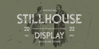 Stillhouse is a vintage serif font that features 2 styles - Textured & Solid. This typeface is great for achieving that rustic aesthetic which is popular in restaurant branding, apparel designs and product packaging.
 - JazzText - Unknown license

- Debutante JNL by Jeff Levine,
$29.00 1920s Art Nouveau hand lettering from the sheet music for Puccini's "Madame Butterfly" is the inspiration for Debutante JNL.
 - Silent Seas by Dismantle Destroy,
$19.00 This font was inspired by music from the band Silverstein. The main characteristics are the incredibly thin, orgainic lines.
 - Batcave by Neoglyph Studio,
$5.00 A futuristic cyberpunk display font design. Ideal for: music advertising comic books videogames book cover design toy package design
 - Pencil Pusher JNL by Jeff Levine,
$29.00 The unusual hand lettering found on a piece of 1940s sheet music forms the basis for Pencil Pusher JNL.
 - Tunesmith JNL by Jeff Levine,
$29.00 A "tunesmith" is one so nicknamed because the person or persons craft (compose) a song from scratch. When the area of Broadway known as Tin Pan Alley was in its heyday, every music publisher's office would have sounds emanating from the various cubicles of men and women trying for the next big hit. Sheet music was the main source of songwriter's royalties during those days, and to please the general public with a song destined to be a popular piece was a lofty goal. It's then only fitting that the lettering inspired by a 1920s-era piece of sheet music for a song called "Jerry" would be named Tunesmith JNL.
 - Whitenow by Proportional Lime,
$15.99 In the year 1528 Pierre Attaignant led a revolution in music printing. His method of once-press moveable type, greatly simplifying the original 3 impression process developed by Petrucci, remained in use till near the end of the 17th century. The method could only realize one line of music per staff, and the introduction of barlines as a common means of aligning multiple staves brought this method to a close after nearly two centuries of use. This font is meant to allow the printing of music using that method with the notation of that era. It is largely based on an exemplar printed by Snodham of London.
 - Justus Pro by URW Type Foundry,
$49.99 Justus Pro is a modern Egyptienne with a humanistic touch. It avoids the slightly rustic character of older Egyptienne designs and, despite its distinctive forms, develops a high level of elegance and readability.
 - Gaultier by Borutta Group,
$39.00 Gaultier is the result of over 5 years of work on a typeface inspired by my favourite creators in European typography – Claude Garamond, Robert Granjon and Eric Gill. The main idea of the project was to create a sans-serif antiqua with all features reserved for serif typefaces. In addition to the rich set of characters, Neuropa includes: Small Caps, Superscript, Subscript, Ligatures, Discretionary Ligatures, Contextual Alternates, Swash Variants and 5 different styles of digits. Upright styles with delicate contrast corresponds with the expressive form of italics inspired by Granjon italic construction. Gaultier will work wherever we want to emphasize modernity without forgetting tradition. The sharp character of the whole family is perfect for longer texts, visual communications and branding purposes.
 - Suggestion Box JNL by Jeff Levine,
$29.00 The 1929 sheet music for Cole Porter's "You Do Something to Me" (from the musical stage comedy "Fifty Million Frenchmen") has the name of the play hand lettered in a bold sans with an intersecting inline. This design was the inspiration for Suggestion Box JNL. Not quite Art Nouveau, and not yet Art Deco, the typeface is nonetheless timeless in its clean, appealing style.
 - Song Publisher JNL by Jeff Levine,
$29.00 Song Publisher JNL features a design based on the 1945 Art Deco-era hand lettered sheet music title "When the Old Gang's back on the Corner (Singin' Sweet Adeline Again)". It's a good thing sheet music wasn't sold by the word count found in song titles, because this twelve word example would have been more costly than titles such as "Nola", "Tenderly" or "Ciribiribin".
 - Cumbanchera by JVB Fonts,
$5.00CUMBANCHERA, inspired by the old albums cover art of Latino music. Cumbanchera reminds of the iconic, classic, and recognized musical theme «El Cumbanchero» composed by Rafael Hernández Marín «El Jibarito». CUMBANCHERA can be used mainly in titles, display and short texts. Supports East Europe languages. Includes standard and discretionary ligatures, alternative style of upper and lowercase, fractions, numerators and denominators, and other OpenType features. - Juke Joint JNL by Jeff Levine,
$29.00 Although many pieces of sheet music used standardized backgrounds and metal type for their titles and information, there are hundreds of songs with innovative illustrations and clever typography beckoning potential buyers with their cover art. Whether the era was Post-Victorian, Art Nouveau or Art Deco, the sheer variety of eye-catching images offered visual enticement to the potential customer whilst browsing the local music shop.
 - Labours by Akufadhl,
$15.00 Labours is a bold strong handcrafted typeface, inspired by an old and rustic signs on the street. Designed for any vintage purpose. suitable for Posters, Logotype, T-Shirt design, and many other vintageous design!
 - Virile by Monotype,
$29.99The Virile and Virile Open fonts are late nineteenth-century typefaces in a rustic style. Use the Virile fonts to add charm to book covers and posters relating to natural history and decorative arts.


