4,893 search results
(0.026 seconds)
- Maltiner Display by Arterfak Project,
$28.00 Introducing Maltiner Display: A versatile, elegant, and sophisticated condensed serif font inspired by classic typography and newspaper headlines. Designed to excel in display settings, Maltiner Display prioritizes typographic excellence, offering a bold yet refined aesthetic. With unique letterforms and sharp edges, Maltiner Display provides ligatures and special characters, the perfect choice for luxury projects.
 - Linotype Markin by Linotype,
$29.99 Markin is named after the writing utensil with which it looks like it was drawn, the marker. Its even strokes display characteristics similar to those of a sans serif typeface, but the stroke endings with their typical handwritten look give Markin a personal touch. Extremely versatile, it is the perfect choice for any work where individuality and spontaneity are the emphasis.
 - Alterica Monchins by Maulana Creative,
$16.00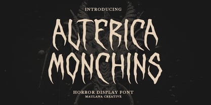 Alterica Monchins horror display font. Bold stroke, fun character with a bit of ligatures and alternates. To give you an extra creative work. Alterica Monchins horror display font support multilingual more than 100+ language. This font is good for logo design, Social media, Movie Titles, Books Titles, a short text even a long text letter and good for your secondary text font with script or serif. Make a stunning work with Alterica Monchins horror display font. Cheers, Maulana Creative
 - Macklin Variable by Monotype,
$156.99Designed by Malou Verlomme of the Monotype Studio, Macklin is a superfamily, which brings together several attention-grabbing styles. Macklin is an elegant, high contrast typeface that demands its own attention and has been designed purposely to enable brands to appeal more emotionally to modern consumers. Macklin comprises four sub-families —Sans, Slab, Text and Display— as well as a variable. The full superfamily includes 54 fonts with 9 weights ranging from hairline to black. The concept for Macklin began with research on historical material from Britain and Europe in the beginning of the 19th century, specifically the work of Vincent Figgins. This was a period of intense social change--the beginning of the industrial revolution. A time when manufacturers and advertisers were suddenly replacing traditional handwriting or calligraphy models and demanding bold, attention-grabbing typography. Typographers experimented with innovative new styles, like fat faces and Italians, and developed many styles that brands and designers continue to use today, such as slabs, serifs, and sans serifs. Verlomme pays respect to Figgins’s work with Macklin, but pushes the family to a more contemporary place. Each sub family has been designed from the same skeleton, giving designers a broad palette for visual representation and the ability to create with contrast without worrying about awkward pairings. With Macklin, Verlomme shows us it’s possible to create a superfamily that allows for complete visual expression without compromising fluidity. - Martin Bold by Wooden Type Fonts,
$15.00 Unusual sans serif with some rounded portions.
 - Martin Gothic by URW Type Foundry,
$35.99
- Neue Aachen by ITC,
$40.99 Impressed by the quality of the Aachen typeface that was originally designed for Letraset in 1969 and extended to include Aachen Medium in 1977, Jim Wasco of Monotype Imaging has extended this robust display design to create an entire family. Derived from the serif-accented Egyptienne fonts dating to the early 20th century, Aachen has serifs that are very solid but considerably shorter than those of its precursor. The incorporated geometrical elements, such as right angles and straight lines, provide the slender letters of Aachen with a slightly technological, stencil-like quality. Despite this, the effect of Aachen is by no means static; its dynamism means that this typeface, originally designed for use in headlines, has come to be used with particular frequency in sport- and fitness-related contexts. Jim Wasco, for many years a type designer at Monotype Imaging, recognized the potential of Aachen and decided to extend the typeface to create an entire typeface family. He appropriated the existing Aachen Bold in unchanged form and first created the less heavy cuts, Thin and Regular. Wasco admits that he found designing the forms for Thin a particular challenge. It took him several attempts before he was able to achieve consistency within the glyphs for Thin and, at the same time, retain sufficient affinity with the original Aachen Bold. But he finally managed to adapt the short serifs and the condensed and slightly geometrical quality of the letters to the needs of Thin. The weights Light, Book, Medium and Semibold were generated by means of interpolation. Supplemented by Extralight and Extrabold, the new Neue Aachen can now boast a total of nine different weights. Wasco initially relied on his predilection for genuine cursives in his designs for the Italic cuts. But it became apparent with these first trial runs that the soft curves of cursives did not suit Aachen and led to the loss of too much of its original character. Wasco thus decided to compromise by using both inclined and cursive letters. Neue Aachen Italic is somewhat narrower than its upright counterparts; the lower case 'a' has a closed form while the 'f' has been given a descender, but the letters have otherwise not been given additional adornments. The range of glyphs available for Neue Aachen has been significantly extended, so that the typeface can now be used to set texts not only in Western but also Central European languages. Wasco has also added a double-counter lowercase 'g' while relying on the availability of alternative letters in the format sets for the enhancement of the legibility of Neue Aachen when used to set texts. The seven new weights and completely new Italic variants have enormously increased the potential applications of Aachen and the range of creative options for the designer. While the Bold weights have proved their worth as display fonts, the new Book and Regular cuts are ideal for setting text. And the subtlety of Ultra Light will provide your projects with a quite unique flair. The new possibilities and opportunities in terms of design and applications that Neue Aachen offers you are not restricted to print production; you can also create internet pages thanks to its availability as a web font.
 - Margin Notes by The Arborie,
$11.00 Margin Notes font offers a natural handwriting look. It had imperfect, organic curves and off set lines that imitate natural hand written writing. Give this handwriting font a try with note-taking, organization or even a back to school poster.
 - Vaccine Sans by ParaType,
$30.00 Vaccine Sans is a humanist sans-serif font family with soft terminals, but stem junctions on the contrary use hard constructions. Such combination of basic design features makes the font distinct and strong in setting and delicate and soft in appearance. This design peculiarity, together with very low contrast, produces a range of qualities needed for small sizes, low quality print and bad reading conditions. Vaccine Sans has a modern stylish design and takes its rightful place among popular faces. The family consists of 10 members — five weights with the corresponding italics. It can be used in a wide range of applications — magazines, advertising, corporate identity, urban navigation, packaging, children books, etc. Designed by Manvel Shmavonyan with the participation of Alexandra Korolkova and Gayaneh Bagdasaryan.
 - Aachen SH by Scangraphic Digital Type Collection,
$26.00Since the release of these fonts most typefaces in the Scangraphic Type Collection appear in two versions. One is designed specifically for headline typesetting (SH: Scangraphic Headline Types) and one specifically for text typesetting (SB Scangraphic Bodytypes). The most obvious differentiation can be found in the spacing. That of the Bodytypes is adjusted for readability. That of the Headline Types is decidedly more narrow in order to do justice to the requirements of headline typesetting. The kerning tables, as well, have been individualized for each of these type varieties. In addition to the adjustment of spacing, there are also adjustments in the design. For the Bodytypes, fine spaces were created which prevented the smear effect on acute angles in small typesizes. For a number of Bodytypes, hairlines and serifs were thickened or the whole typeface was adjusted to meet the optical requirements for setting type in small sizes. For the German lower-case diacritical marks, all Headline Types complements contain alternative integrated accents which allow the compact setting of lower-case headlines. - Magical Mystery Tour Outline Shadow - Unknown license

- Pea Mystie - Personal use only

- Anderson The Mysterons - Unknown license

- Macho Moustache by CAST,
$45.00 Macho Moustache is closely related to Macho Modular , the parent type with which it shares modular widths and most letterforms. The difference is that Macho Moustache follows the ‘Grotesque' tradition of tight apertures for a, c, e and s as well as some of the numerals. Original design work started together with Macho Modular in 2008. Now the range and communication potential of the Macho family has been developed with five weights. Since the Macho family was designed bearing in mind the idea of Themerson's semantic typography, Macho Moustache features all sets of modular brackets and underlinings.
 - Macho Rogers by Crumphand,
$30.00 Introducing the new font, Mighty Rogers. Mighty Rogers is a bubble font. If you tracking this font, this font looks like a graffiti. Match for your business food, drink, branding design, typography, video motion etc. Whats Included Inside The Fonts ? Uppercase Lowercase Symbols Numerals European Multilingual Thank You, Regards.
 - Macho Modular by CAST,
$45.00 Macho was designed in 2010 for MAN, Museo d'Arte Provincia di Nuoro, as a part of the corporate identity designed by Sabina Era. Macho is based on the idea of modular widths of the 20th-century typesetting systems, as the Olivetti Margherita and the hot-metal Linotype machine. The basic module is 7,5 percent of the body size (75 upm units) and every letter width is up to 20 modules. Every letter has the same width across different weights. Macho includes a large set of boxes and underlines that can be overlapped on the letters.
 - Macon Tracks by Elemeno,
$- - SF Funk Master - Unknown license

- Mister Belvedere 3D - Unknown license

- Mister Belvedere Oblique - Unknown license

- Mister Belvedere Upper - Unknown license

- SF Funk Master - Unknown license

- Japanese Brush Master by Okaycat,
$29.95 Japanese Brush Master was developed directly from the hand-written brushstrokes of experienced calligrapher, Shigeru Nomura. Feel the artistic brushstrokes. Japanese Brush Master is extended, containing West European diacritics & ligatures, making it also suitable for multilingual environments & publications.
 - Mister Bones NF by Nick's Fonts,
$10.00Alpha Midnight, reconstructed from an unnamed source by Dick Pape for Solotype, provided the pattern for this big, bold, unconventional stencil face, sure to grab your readers' attention. Both versions include the complete Latin 1252, Central European 1250 and Turkish 1254 character sets, as well as localization for Moldovan and Romanian. - Mister Slasher Halloween by Sipanji21,
$15.00 Hello, this is Mister Slasher, a Unique display font which is prepared to welcome Halloween. Mister Slasher comes with an awesome horror style, make it very perfect to use for quotes, logotypes, badges, labels, packaging, t-shirts, or simply use it in your next design project. Especially in Halloween celebrations.
 - Mister Rii PB by Pink Broccoli,
$19.00 A spunktastic offbeat latin typeface inspired by numerous Caribbean travel brochures & retro album covers from the mid 50’s. This font really dances off the page! Opentype features include Stylistic Alternates that change the scale of monetary symbols, and Contextual Alternates that modifies the second letter when typing double letters in lowercase.
 - FF Mister K by FontFont,
$69.99 Finnish type designer Julia Sysmäläinen created this script FontFont inspired by Franz Kafka’s manuscripts in 2008. The family contains several styles and is ideally suited for unique visual identities, festive occasions, music and nightlife as well as software and gaming. FF Mister K provides advanced typographical support with features such as ligatures, alternate characters, case-sensitive forms, fractions, super- and subscript character, and stylistic alternates. This FontFont is a member of the FF Mister K super family, which also includes FF Mister K Dingbats , FF Mister K Informal , and FF Mister K Splendid . Find more information on FF Mister K’s very own Website ffmisterk.com .
 - ITC Mister Chuckles by ITC,
$29.99Round, firm, and bursting at the seams with good humor, ITC Mister Chuckles is based on the premise that barrel shapes have pleasant associations. Think: beer-barrel polkas, a barrel of fun, or a barrel of laughs, and you'll get the idea. Designer Nick Curtis has combined sans serif sturdiness, a hint of 1930s deco and a handful of giggles in this remarkably versatile all-cap face. If the typographic occasion calls for mirth and merriment, invite Mister Chuckles to the party. You'll have more fun than a barrel of monkeys! - Art Materials JNL by Jeff Levine,
$29.00 The cover of the 1930s-era “Catalog of Artists’ Materials” from Ernst H. Friedrichs, Inc. (New York) has the words “Artists’ Materials” hand lettered in a stylized Art Deco sans serif type style. This unique design is now the digital font Art Materials JNL, which is available in both regular and oblique versions.
 - Mister Giacco Pro by Sudtipos,
$39.00 Mister Giacco Pro, designed by Diego Giaccone, is a simple stroke sans serif font designed with a solid structure that is ideal for corporate use, branding and any design where legibility and personality are required. It is available in 3 weights including small caps and italics.
 - Master of Magic by NJ Studio,
$19.00 Hi...Thank for your visit :) Master of Magic a magical script font. It features ligatures characters that will take your projects to the next level! This font is PUA code which means you can easily access all the glyphs that are full of magic! It also features many special features including glyphs. font designs that are made for various vector designs, printing such as digital wedding blogs, online shops, social media, while printing can be used in the field of product clothing, accessories, bags, pins, logos, business cards, watermarks and many others ... so it can make your product look beautyful and attractive, and also Multilingual support!!! Happy design ...
 - DB Post Master by Illustration Ink,
$3.00DB Post Master combines the vintage feel of history with a unique style. This DoodleBat makes great adornments to cards, letters, or just a fun scrapbook page. - Jack Martine Duo by Zamjump,
$17.00 Jack Martine font duo is a textured, hand-drawn slab font in a regular style with upper and lowercase letters and bounching italic script style solid proportions that works great for a variety of display uses. Carefully drawn for quality and legibility, but still rough enough to show handcrafted details. Jack Martine is great for display, branding, packaging, advertising, food, sports, craft, titles and more. Jack Martine Features: Regular and Script Style Different uppercase and lowercase characters Simply switch between upper and lower case for alternatives Hand-drawn details and textures Extensive multilingual character support This font has broad Latin support for Western, Central, and Southeastern Europe. Includes: Uppercase Numbers Punctuation Symbols Multilingual support Begin and ending alternate
 - LTC Nicolas Cochin by Lanston Type Co.,
$24.95 Nicolas Cochin (not to be confused with another font named simply "Cochin") was originally designed by Georges Peignot in the early 20th Century and was based on engraved letters of the 17th Century artist Charles Nicholas Cochin. Many foundries including Lanston released versions in the 1920s. Several digital versions can now be found, but none have kept the irregular details of the metal type which include strokes that cross over each other as if hand drawn (see letters K & y). The new Lanston digitization is the only digital version to retain the idiosyncratic treatment which makes the metal type so alluring. The Opentype version included an expanded Central European character set as well as ligatures, alternates, fractions, superior/inferior numerals (the Italic also has swash characters).
 - Mechanical Stencil JNL by Jeff Levine,
$29.00 For well over a century, stencil machines allowed manufacturers, shippers and even the military to quickly mark and identify objects. Mechanical Stencil JNL was created from examples from one of these machines.
 - Marginal Notes SRF by Stella Roberts Fonts,
$25.00 Marginal Notes SRF is from the creative pen of Ray Larabie whose Typodermic foundry graces MyFonts.com. Designed to emulate the look of handwritten words using a felt tip pen, this font can be perfectly applied to any project where notations, subtext, memos or other forms of personalization with a human touch is required. The net profits from my font sales help defer medical expenses for my siblings, who both suffer with Cystic Fibrosis and diabetes. Thank you.
 - Mechanic Gothic DST by Red Rooster Collection,
$60.00 Based on character shapes with origins rooted in the work of 19th Century American wood type makers, DST Mechanic Gothic draws influence from the poster types found in the impactful advertising during the Industrial revolution. It has several classic condensed sans-serif elements, and although Darren Scott has injected a contemporary twist to refresh the character shapes, this typeface does not deny its roots. Darren Scott's original Mechanic Gothic design has been adapted and re-crafted to give a more conventional range of weights and italics for this exclusive re-release.
 - K&T Martine by K and T,
$70.00 This is an angular typeface inspired by axonometric construction diagrams (for flat-pack furniture), particularly the way their lines impart a sense of 3-D space. The horizontal, vertical, and diagonal constraints of stroke direction produce interesting results in characters such as the 'R', 'S', and 'V' and contribute the mechanical appearance of this typeface. There is a high degree of repetition amongst different characters (upper and lower case) for instance the ’M’ and ‘W’ are similar and so are the ’m’ and ‘w’.
 - Martin Medium Regular by Wooden Type Fonts,
$15.00 Medium weight, sans serif.
 - Remachine Script Arabic by Mans Greback,
$59.00 Remachine Script Arabic is a retro typeface with support for Arabian and Persian Languages, in addition to support for all Latin European languages. The font contains all characters you'll ever need, including all punctuation and all types of Arabic numbers.


