7,939 search results
(0.029 seconds)
- Norman Variable by Resistenza,
$110.00 Norman Variable contains all the weights in between Norman Regular and Norman Fat. Get to know Norman, elegant and fashion forward. This new condensed and high contrast serif font is based on expansion giving a sense of self confidence. The oblique ax was specially added to get a contemporary and innovative sense. Norman is young and idealist, he has a distinctive sense of style. A complete set of ligatures and stylistic alternates is included, this will help the designer to customize and give a special look to any layout. We recommend to use it for big title, magazine, editorial purposes and display.
 - Norman Fat by Resistenza,
$49.00 Get to know Norman Fat a new version of our best seller Norman, elegant and fashion forward. This new condensed high contrast and heavy weight serif font is based on expansion giving a sense of self confidence. The oblique ax was specially added to get a contemporary and innovative sense. Norman Fat is young and idealist, he has a distinctive sense of style. A complete set of ligatures and stylistic alternates is included, this will help the designer to customize and give a special look to any layout. We recommend to use it for big title, magazine, editorial purposes and display.
 - Norman Stencil by Resistenza,
$39.00 Norman Stencil, is a new Norman. An high contrast, serif and narrow font. 2 styles and 2 weights. Norman Stencil it works perfectly on big texts, logos, headline and others display purposes. Activate your opentype features and you will enjoy all the ligatures and alternates.
 - Agatized Formal by ULGA Type,
$25.00 Agatized Formal is a chunky stencil typeface with slightly condensed letterforms and tight spacing. Designed primarily for display use, it’s ideal for posters, logos, advertising, book cover designs or small chunks of text such as pull-out quotes. It exudes authority without taking itself seriously, like a plump jolly uncle in charge of a brass band. Agatized Formal is a big, bold typeface with a charismatic presence that commands attention – in a friendly way, of course. But what really makes this typeface come alive is its arsenal of alternative characters and ligatures. There is a saying: Use sparingly. Whoa! Not here, no, no, no. Make your Glyphs palette earn its money. Flex your OpenType muscles: get stylized, contextualized, indulge in some ligaddiction. This typeface is a peacock that likes to put on a show, spread its plumage and strut around in all its blazing glory. Agatized, according to Wiktionary, means: A living thing converted into the form of agate; fossilized. I felt the name suited the solid, almost rock-like letterforms, but most of all I just wanted a typeface name that began with the letter A. Although Agatized Formal is a single-weight typeface it has a sibling, Agatized Informal, an older, more casual brother, rougher round the edges with craggy good looks and an altogether more jaunty style.
 - Mortal Claws by Krakenbox Studio,
$27.00 Corogh Gorge is a Blackletter Font. It has gothic, mysterious, brave, classic. It’s a great font for fashion, apparel projects, signature, album cover, logo, branding, magazine, social media, & advertisements, but also works great for other projects.
 - Formal 436 by Bitstream,
$29.99 - Journal Republica by Wildan Type,
$15.00 Journal Republica is a serif typeface inspired by the beauty of classic serif and calligraphic style, fused with modern appeal to blend with modern needs. His family is Regular, Italic, and Bold. Journal Republica offers many possibilities to be applied in many graphic or editorial projects. The Regular weights are suitable for short paragraph, and Bold weight are perfect for headlines, perfectly suitable for display purpose such as branding, editorial, book covers, and packaging.
 - OK Corral by FontMesa,
$20.00 OK Corral is a revival of a very old Italian font that you may have seen in the past under the original name of Italian Print. The Lined version of this font has never been known to have a lower case set of letters until now.
 - Crivar Formal by Scriptorium,
$12.00 - Formal 436 by Tilde,
$39.75 - Black Mortal by Yoga Letter,
$30.00 "Black Mortal" is an elegant and unique block font. This font is perfect for logos, movie titles, business branding, stickers, book titles, banners, posters, Halloween, Black Friday, and more. Equipped with uppercase, lowercase, numerals, punctuation, and multilingual support
 - Foundry Journal by The Foundry,
$90.00 Foundry Journal is appropriately named for its intended purpose in journals, magazines and publications, where narrow column measures require a more condensed typeface, for the most economic use of page space. Foundry Journal has a characteristic subtle angularity, accentuated by well-defined curve to stem junctions, facilitating legibility and making it an ideal typeface when set at small point sizes.
 - Baroque Mortale by Letterhead Studio-YG,
$45.00 Letterhead Studio makes both fonts and design with own fonts. The studio is started in 1998 by Yuri Gordon, Valery Golyzhenkov and Olga Vassilkova. We work in graphic design, branding and type design. Our collection of Cyrillic fonts includes more than 330 faces, generally it is display fonts. Letterhead is one of leading developers of custom-made fonts, lettering and digital calligraphy in Russia. Among clients of studio are magazines like Rolling Stone, Esquire, GQ, Empire, Interni, Harpers Bazaar. Also we develop corporate fonts, more often for banks. Letterhead co-operated with Gazprombank, Rosbank, the Alpha-group, Trust, Menatep, Orgres-Nordea and others.
 - Corvallis Sans by ITC,
$29.99 - Provan Formal by Matteson Typographics,
$19.95 Provan is a contemporary humanist sans serif with roots in calligraphy and incised letters. These timeless inspirations result in a typeface family that transcends fashion and adds a strong sense of authenticity to brands. The regular version of Provan has angled stem endings and oblique stress in curved shapes which add to its friendly and legible warmth. Provan Formal straightens these stroke endings to bring a more refined alignment of letters. The typefaces include swash capitals, small capitals, old style figures and special Celtic capital variants. The Inline version of Provan is useful for drop capitals, book covers and posters. Provan bucks the ubiquitous neutrality of geometric typefaces and exudes a sense of humanity, craftsmanship and warmth.
 - Journal Sans by ParaType,
$30.00 The typeface was designed at the Polygraphmash type design bureau in 1940-56 (project headed by Anatoly Shchukin) based on Erbar-Grotesk typeface of Ludwig & Mayer company, 1929 by Jakob Erbar, and on Metro typeface of Mergenthaler Linotype, 1929 by William A. Dwiggins. A sans serif of geometric style. For use for text and display typography. In 2014 designer Olexa Volochay made some corrections in original digital data and extended character set. The family was rereleased in ParaType in 2014.
 - Grunge Formal by Scholtz Fonts,
$15.00 Grunge Formal started out as a more upright, formal version of one of my fonts, Figment. A most versatile contemporary typeface, Grunge Formal works equally well from funky to formal, from giant size headers to pint size body text, from movie posters to wedding invitations. If you've ever needed a font that has a grungy, deconstructed look but works well for all sizes, a font that you can use for funky, gritty designs, and also for formal wedding stationery, Grunge Formal is a perfect choice. From the formal viewpoint, the font presents as a regular serif typeface with deconstructed edges, giving the antique look popular in wedding stationery design. Here it can be used from header to body size. For in-your-face design, Grunge Formal, when oversized, is really powerful and its deconstructed outline provides a raw, rough contrast to your background images. Grunge Formal has all the features usually included in a fully professional font. Language support includes all European character sets, Greek symbols and all punctuation.
 - New Journal by ParaType,
$30.00The typeface was designed at the Polygraphmash type design bureau in 1951-53 by Lev Malanov, Elena Tsaregorodtseva et al. Based on Cyrillic version of Excelsior, 1931, of Mergenthaler Linotype, by Chauncey H. Griffith. Excelcior Cyrillic was developed in 1936 in Moscow by Professor Michael Shchelkunov, Nikolay Kudryashev et al. A low-contrast text face of the Ionic – "Legibility" group. - Mortal Wave by Stringlabs Creative Studio,
$29.00 Mortal Wave results out of a stunning pairing of a brush pen and pencil that makes it look incredibly endearing and authentic. Use this gorgeous and unique display font to bring any DIY project to life!
 - Mosquito Formal by Monotype,
$29.00Mosquito Formal, by Éric de Berranger, takes the original jaunty design of Mosquito and dresses it in a tuxedo. The stressed character strokes, simple, straightforward shapes, relatively large x-height, open counters and hint of Peignot are still there, but the cursive strokes and lively terminals have been replaced with traditional designs. The result is a more serious-and more sophisticated typeface. The idea," says Éric de Berranger, "was to assuage the drawing of Mosquito. To 'calm' it; and eliminate its idiosyncrasies while preserving character structure and general appearance." Although still distinctive, as Éric de Berranger puts it, "Mosquito Formal is more to be read than seen, it is more invisible and thus, more readable than my earlier design." He does, however, use both typefaces in his graphic design projects: Mosquito for headlines and in applications where the lively design is appropriate, and Mosquito Formal for those instances that require a quieter more sophisticated look. Mosquito Formal is available in three weights with complementary italic designs in addition to a suite of small caps and old style figures. " - Riads Script by Arsa Visual,
$9.00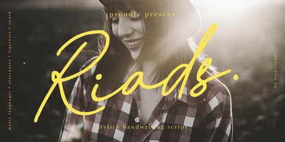 Introducing "Riads - Stylish Handwriting Font" with a signature style look. "Riads Script" very recommended for you who want to make some designs with natural handwriting style. This font easy to use and perfect for elegant branding, greeting cards, wedding design, name card design, invitation design, poster, packaging, romantic book cover designs, handwritten quotes, unique social media post, and so much more. Feature and what inside: • Uppercase and Lowercase • Uppercase and Lowercase Alternates • Number and Punctuation • Ligature • Swashes • Multi Languages
 - Maria Aishane Script by Dora Typefoundry,
$14.00 Maria Aishane is a bold new type of modern modern calligraphy script that has an alternative. make your designs beautiful and look great. Maria Aishane includes all the basic characters and additional and alternative Latin characters, nice fonts for your invitation. Maria Aishane is just a simple typeface, all uppercase, lowercase letters, and only includes all the basic characters, numbers and punctuation. It is perfect for logo, greetings, branding, quotes, prints, invitations and crafting. All lowercase letters include alternates, beginning & end swashes, that makes the font look fabulous! These are all coded with PUA Unicode. Mac users can use Font Book and Windows users can use Character Map to view and copy any of the extra characters to paste into your favourite text editor/app. Thanks and have a wonderful day
 - Maria-Ballé-Initials by ARTypes,
$35.00Maria-Ballé-Initials are derived from the Ballé series I made by the Bauer foundry. When set at 60 pt this font will match the size of the original 48-pt Didot design. - Nora - Unknown license

- Narrow Roman Stencil JNL by Jeff Levine,
$29.00 Narrow Roman Stencil JNL was modeled from a vintage brass sign for identification of a ballroom.
 - New Thin Roman JNL by Jeff Levine,
$29.00 The 1912 publication "Essentials of Lettering" has an example of a hand lettered, condensed spurred serif design called "Compressed Roman". This is now available digitally as New Thin Roman JNL in both regular and oblique versions.
 - PB Roman Uncial Vc by Paweł Burgiel,
$32.00 PB Roman Uncial Vc is a font face designed for imitate Roman uncial writing style found in manuscripts from 4th to 5th century. All characters are handwritten by use ink and reed pen (calamus), scanned, digitized and optimized for best quality without lost its handwritten visual appearance. Character set support codepages: 1250 Central (Eastern) European, 1252 Western (ANSI), 1254 Turkish, 1257 Baltic. Include also additional characters for Cornish, Danish, Dutch and Welsh language, spaces (M/1, M/2, M/3, M/4, M/6, thin, hair, zero width space etc.), historical characters (overlined Roman numerals, abbreviations, I-longa, historical ligatures for "nomina sacra" and "notae communes") and wide range of ancient punctuation. OpenType TrueType TTF (.ttf) font file include installed OpenType features: Access All Alternates, Localized Forms, Fractions, Alternative Fractions, Ordinals, Superscript, Tabular Figures, Proportional Figures, Stylistic Alternates, Stylistic Set 1, Historical Forms, Historical Ligatures. Include also kerning as single 'kern' table for maximum possible backwards compatibility with older software. Historical ligatures for "nomina sacra" and "notae communes" are mapped to Private Use Area codepoints.
 - Times New Roman Seven by Monotype,
$67.99In 1931, The Times of London commissioned a new text type design from Stanley Morison and the Monotype Corporation, after Morison had written an article criticizing The Times for being badly printed and typographically behind the times. The new design was supervised by Stanley Morison and drawn by Victor Lardent, an artist from the advertising department of The Times. Morison used an older typeface, Plantin, as the basis for his design, but made revisions for legibility and economy of space (always important concerns for newspapers). As the old type used by the newspaper had been called Times Old Roman," Morison's revision became "Times New Roman." The Times of London debuted the new typeface in October 1932, and after one year the design was released for commercial sale. The Linotype version, called simply "Times," was optimized for line-casting technology, though the differences in the basic design are subtle. The typeface was very successful for the Times of London, which used a higher grade of newsprint than most newspapers. The better, whiter paper enhanced the new typeface's high degree of contrast and sharp serifs, and created a sparkling, modern look. In 1972, Walter Tracy designed Times Europa for The Times of London. This was a sturdier version, and it was needed to hold up to the newest demands of newspaper printing: faster presses and cheaper paper. In the United States, the Times font family has enjoyed popularity as a magazine and book type since the 1940s. Times continues to be very popular around the world because of its versatility and readability. And because it is a standard font on most computers and digital printers, it has become universally familiar as the office workhorse. Times?, Times? Europa, and Times New Roman? are sure bets for proposals, annual reports, office correspondence, magazines, and newspapers. Linotype offers many versions of this font: Times? is the universal version of Times, used formerly as the matrices for the Linotype hot metal line-casting machines. The basic four weights of roman, italic, bold and bold italic are standard fonts on most printers. There are also small caps, Old style Figures, phonetic characters, and Central European characters. Times? Ten is the version specially designed for smaller text (12 point and below); its characters are wider and the hairlines are a little stronger. Times Ten has many weights for Latin typography, as well as several weights for Central European, Cyrillic, and Greek typesetting. Times? Eighteen is the headline version, ideal for point sizes of 18 and larger. The characters are subtly condensed and the hairlines are finer." - Show Card Roman JNL by Jeff Levine,
$29.00 Art Nouveau serif capitals and numerals in the 1917 instructional book “A Roman Alphabet and How to Use It” were the inspiration for Show Card Roman JNL; available in both regular and oblique versions.
 - HWT Roman Extended Fatface by Hamilton Wood Type Collection,
$24.95 The design of the first "Fat Face" is credited to Robert Thorne just after 1800 in England. It is considered to be the first type style designed specifically for display or jobbing, rather than for book work. The first instance of Fat Face in wood type is found in the first wood type specimen book ever produced: Darius Wells, Letter Cutter 1828. This style was produced by all early wood type manufacturers. The style is derived from the high contrast, thick and thin Modern style of Bodoni and Didot developed only decades previously. The extended variation makes the face even more of a display type and not at all suitable for text. This type of display type was used to compete with the new Lithographic process which allowed for the development of the poster as an artform unto itself. This new digitization by Jim Lyles most closely follows the Wm Page cut. The crisp outlines hold up at the largest point sizes you can imagine. This font contains a full CE character set.
 - Roman Wood Type JNL by Jeff Levine,
$29.00 Roman Wood Type JNL is based on a partial set of wood type in the style of Clarendon Condensed that was seen in an online auction.
 - Nimbus Roman No. 9 by URW Type Foundry,
$35.00
- PB Roman Uncial IIc by Paweł Burgiel,
$32.00 PB Roman Uncial IIc is a font face designed for imitate Roman uncial writing style found in manuscripts from 1st to 2nd century. All characters are handwritten by use ink and reed pen (calamus), scanned, digitized and optimized for best quality without lost its handwritten visual appearance. Character set support codepages: 1250 Central (Eastern) European, 1252 Western (ANSI), 1254 Turkish, 1257 Baltic. Include also additional characters for Cornish, Danish, Dutch and Welsh language, spaces (M/1, M/2, M/3, M/4, M/6, thin, hair, zero width space etc.), historical characters (overlined Roman numerals, I-longa, historical ligatures for "nomina sacra" and "notae communes") and wide range of ancient punctuation. OpenType TrueType TTF (.ttf) font file include installed OpenType features: Access All Alternates, Localized Forms, Fractions, Alternative Fractions, Ordinals, Superscript, Tabular Figures, Proportional Figures, Stylistic Alternates, Stylistic Set 1, Historical Forms, Historical Ligatures. Include also kerning as single 'kern' table for maximum possible backwards compatibility with older software. Historical ligatures for "nomina sacra" and "notae communes" are mapped to Private Use Area codepoints.
 - Dual Line Roman JNL by Jeff Levine,
$29.00 Spotted amongst the online page scans from a vintage lettering book, the typeface originally called “Didot Moderne” served as the basis for Dual Line Roman JNL, which is available in both regular and oblique versions. Caps Only Fonts.
 - Times New Roman WGL by Monotype,
$67.99 In 1931, The Times of London commissioned a new text type design from Stanley Morison and the Monotype Corporation, after Morison had written an article criticizing The Times for being badly printed and typographically behind the times. The new design was supervised by Stanley Morison and drawn by Victor Lardent, an artist from the advertising department of The Times. Morison used an older typeface, Plantin, as the basis for his design, but made revisions for legibility and economy of space (always important concerns for newspapers). As the old type used by the newspaper had been called Times Old Roman," Morison's revision became "Times New Roman." The Times of London debuted the new typeface in October 1932, and after one year the design was released for commercial sale. The Linotype version, called simply "Times," was optimized for line-casting technology, though the differences in the basic design are subtle. The typeface was very successful for the Times of London, which used a higher grade of newsprint than most newspapers. The better, whiter paper enhanced the new typeface's high degree of contrast and sharp serifs, and created a sparkling, modern look. In 1972, Walter Tracy designed Times Europa for The Times of London. This was a sturdier version, and it was needed to hold up to the newest demands of newspaper printing: faster presses and cheaper paper. In the United States, the Times font family has enjoyed popularity as a magazine and book type since the 1940s. Times continues to be very popular around the world because of its versatility and readability. And because it is a standard font on most computers and digital printers, it has become universally familiar as the office workhorse. Times?, Times? Europa, and Times New Roman? are sure bets for proposals, annual reports, office correspondence, magazines, and newspapers. Linotype offers many versions of this font: Times? is the universal version of Times, used formerly as the matrices for the Linotype hot metal line-casting machines. The basic four weights of roman, italic, bold and bold italic are standard fonts on most printers. There are also small caps, Old style Figures, phonetic characters, and Central European characters. Times? Ten is the version specially designed for smaller text (12 point and below); its characters are wider and the hairlines are a little stronger. Times Ten has many weights for Latin typography, as well as several weights for Central European, Cyrillic, and Greek typesetting. Times? Eighteen is the headline version, ideal for point sizes of 18 and larger. The characters are subtly condensed and the hairlines are finer."
 - HWT Roman Extended Lightface by Hamilton Wood Type Collection,
$24.95 The Roman alphabet has seen endless variations in interpretations of its classical form, and various wood type styles managed to explore everything from XXX condensed to hyper extended and expanded. This delicate and handsomely proportioned extended Roman was issued by Page Manufacturing Co. in 1872 and released as simply “No. 251” after Page was acquired by Hamilton. It is a rare font to find in print shops, most likely due to the very fine lines that would no doubt be less durable that bolder gothic jobbing fonts. While being quite wide, it still holds the elegant grace of wide Romans such as Craw Modern. This new digitization features a full Western and Eastern European Character set as well as ligatures and alternate characters.
 - Sackers Solid Antique Roman by Monotype,
$29.99Sackers Roman is an engraver, all-capitals family for invitations and stationery. The letters have strong contrast between thin and thick strokes. See also Sackers Gothic, Sackers Square Gothic, Sackers Script, and Sackers Classic Roman. - Johnny The Hook Roman by Letterhead Studio-VV,
$29.99
- Times New Roman PS by Monotype,
$67.99In 1931, The Times of London commissioned a new text type design from Stanley Morison and the Monotype Corporation, after Morison had written an article criticizing The Times for being badly printed and typographically behind the times. The new design was supervised by Stanley Morison and drawn by Victor Lardent, an artist from the advertising department of The Times. Morison used an older typeface, Plantin, as the basis for his design, but made revisions for legibility and economy of space (always important concerns for newspapers). As the old type used by the newspaper had been called Times Old Roman," Morison's revision became "Times New Roman." The Times of London debuted the new typeface in October 1932, and after one year the design was released for commercial sale. The Linotype version, called simply "Times," was optimized for line-casting technology, though the differences in the basic design are subtle. The typeface was very successful for the Times of London, which used a higher grade of newsprint than most newspapers. The better, whiter paper enhanced the new typeface's high degree of contrast and sharp serifs, and created a sparkling, modern look. In 1972, Walter Tracy designed Times Europa for The Times of London. This was a sturdier version, and it was needed to hold up to the newest demands of newspaper printing: faster presses and cheaper paper. In the United States, the Times font family has enjoyed popularity as a magazine and book type since the 1940s. Times continues to be very popular around the world because of its versatility and readability. And because it is a standard font on most computers and digital printers, it has become universally familiar as the office workhorse. Times?, Times? Europa, and Times New Roman? are sure bets for proposals, annual reports, office correspondence, magazines, and newspapers. Linotype offers many versions of this font: Times? is the universal version of Times, used formerly as the matrices for the Linotype hot metal line-casting machines. The basic four weights of roman, italic, bold and bold italic are standard fonts on most printers. There are also small caps, Old style Figures, phonetic characters, and Central European characters. Times? Ten is the version specially designed for smaller text (12 point and below); its characters are wider and the hairlines are a little stronger. Times Ten has many weights for Latin typography, as well as several weights for Central European, Cyrillic, and Greek typesetting. Times? Eighteen is the headline version, ideal for point sizes of 18 and larger. The characters are subtly condensed and the hairlines are finer." - Loo Snoo Roman NF by Nick's Fonts,
$10.00Here's a fresh version of an old favorite, Loose New Roman, from the Schaedler Studio of New York. Easy, breezy and carefree, it's a natural for happy headlines. Both versions of the font contain the complete Unicode Latin 1252 and Central European 1250 character sets.
