7,087 search results
(0.034 seconds)
- Road Work JNL by Jeff Levine,
$29.00 The October 5, 1935 issue of “Universal Weekly” (a publication detailing current film releases from Universal) was promoting the film “Remember Last Night”. Hand lettering used for this advertisement was an ultra-bold sans serif design with chamfered corners and some stylized characters. This is now available digitally as Road Work JNL in both regular and oblique versions.
 - Lord Jamet Graffiti by Sipanji21,
$19.00 "Lord Jamet" is an urban graffiti font characterized by sharp edges and a bold look. Ideal for music posters, apparel designs, shirts, and streetwear, this font brings a touch of edginess to your projects. The unique style of "Lord Jamet " makes it the perfect choice for death metal or urban graffiti themes. Whether you want to create a strong and powerful statement or simply add a touch of attitude to your designs "Lord Jamet " is the font for you.
 - The Lord Music by Java Pep,
$19.00 Introducing, proudly present the newest and fresh product from the oven. The Lord Music font is a decorative serif font made with collaborating of beauty and elegant looks. This font made with a lot of alternate features that every letter has a minimal 3 alternates for change and mix with your style do you want. This font will to giving more valuable projects that outstanding and elegant. The Lord Music font is perfect for a title, headline, logo, branding, quote, tagline, and etc. The font also supports more than 20 languages.
 - Road Race Extra by Craft Supply Co,
$19.00 Road Race Extra Font Family includes 4 Style Fonts. It can be used to create almost all types of design projects like print materials. Just use your imagination and some graphic design set in Extras, your project will become more alive and look great than ever with one of the Road Race Extra font. You want to make a greeting card or a package design, or even a brand identity, craft design, any DIY project, book title, wedding font, pop vintage design, retro design or any purpose to make your art / design project look pretty and trendy? Feel free to play with all the patterns and shape!
 - Road Vanders Graffiti by Sipanji21,
$15.00 "Road Vanders" is an urban graffiti font characterized by sharp edges and a bold look. Ideal for music posters, apparel designs, shirts, and streetwear, this font brings a touch of edginess to your projects. The unique style of "Road Vanders" makes it the perfect choice for death metal or urban graffiti themes. Whether you want to create a strong and powerful statement or simply add a touch of attitude to your designs, "Road Vanders" is the font for you.
 - Road Repair JNL by Jeff Levine,
$29.00 Road Repair JNL is a bold (hand lettered) sans serif stencil font based on the opening credits from the 1954 film “Drive a Crooked Road” – and is available in both regular and oblique versions.
 - Road Picture JNL by Jeff Levine,
$29.00 Road Picture JNL was modeled after the hand lettered title and credits for the 1940 Bob Hope-Bing Crosby semi-musical comedy “Road to Singapore”, and is available in both regular and oblique versions. Although the lettering design doesn’t resemble anything that was probably used in Singapore at the time, its faux “exotic” look still makes for an interesting revival. Bob Hope and Bing Crosby made a total of seven “road” pictures, hence the homage in the name of this type font.
 - Lord Rat AOE by Astigmatic,
$19.95 LordRat is a rugged unicase typestyle built for childish and off kilter purposes. A mix of heavy and light with quickcut appearance makes this typestyle offbeat and even festive. Put some dignified childish offbeat flavor into your designs today with LordRat. If you've been looking for a playful yet bold typestyle with papercut looks, LordRat is what you've been looking for. Get it today!
 - Abbey Road NF by Nick's Fonts,
$10.00Here's a fresh take on an old favorite, originally named Abbott Old Style, which exudes antique charm, and also suggests exotic locales. - Hot Road Brush by Saffatin.co,
$10.00 It's a bold, It's HOT ROAD! A realistic hand brushed font just raring to get going. HOT ROAD is handwritten made with a wet brush, dynamic spontaneous flow and natural. It's perfect to leave a realistics impression on social media posts, advertisements, posters, products packaging & more. HOT ROAD FONT comes with several alternates character, ligature, punctuation, numerals. Also included is a bonus extras swashes. Use it for magazines, t-shirt, packaging, logos, advertising, quotes, branding, posters, editorials, cover artwork, movies, websites, etc HOT ROAD Font is coded with Unicode PUA, Allows full access to all the extra characters without having special software designing. Mac users can use Font Book, and Windows users can use Character Map to view and copy any of the extra characters to paste into your favorite text editor / app. Thanks so much for looking and Enjoy it!
 - Jolgoria in Town - Personal use only

- Dusk Til Dawn by Scholtz Fonts,
$19.95 As with Nocturne, Dusk til Dawn recalls the romantic, sophisticated Zeitgeist of the early 20th century, that nostalgic time "between the wars". It as a number of attractive ligatures and upper-case alternates. I have used Nocturne as a basis for Dusk til Dawn, given the font really bold down-strokes, reduced the width of some upper case characters and changed the shape of many lower case characters. Dusk til Dawn comes in two styles: Dusk til Dawn Regular, which uses the Art Deco convention of small x height, and long ascenders. This Display style is perfect for headers, posters, labels etc. Dusk til Dawn Book, which, with its higher x-height and slightly wider characters, is extremely legible and suitable for longer passages of smaller size text.
 - Dusk Till Dawn by Comicraft,
$19.00 The Vampires have risen from their graves! Innocent young virgins (also goats, sheep, sheep dogs, cows and other sundry farmyard animals) may not see out the night. DUSK TILL DAWN has been exhumed, lightly dusted in dry earth and exsanguinated for your convenience. Bury your tombstones in Gothic Chic with a font that may very well be worth dying for. We cannot guarantee you will come back to life however. We waited to unleash this font until the midnight hour, so grab your wooden stakes, silver bullets, crossbows, slingshots and any supernatural weaponry you may have at hand. Garlic capsules and Holy Bibles are also recommended!
 - Clear Prairie Dawn by Quadrat,
$25.00Clear Prairie Dawn is an original humanist sans serif family based on the designer's own printing. Designed for use as a text face, as a humanist sans it shares some of the characteristics you might notice in other such faces as Optima, Gill Sans or Stone Sans. The italic is a designed italic, rather than merely a slanted roman, and incorporates many of the ideas that the designer found too lively for the roman fonts. The complete CPD package consists of three weights with italics, and a set of original ornaments. - The Vintage Town by Nathatype,
$29.00 Looking for a font that will make your branding stand out? Do you sometimes have an appetite for a bit more wholesome typography? Looking for a fabulous, retro, and adventure font? We've got what you want. The Vintage Town- A Script Font The Vintage Town is a script font that has a varied base line, fine lines, retro, and fun touches. This font features thick and angular letters that easy on the eyes and nice to look while it’s also easy to read. It is becomes more special with extruding version option. Fall in love with it's authentic feel and use it to create gorgeous titles., beautiful poster designs, eye-catching social media posts, cute logos, and many more. Our font always includes Multilingual Support to make your branding reach a global audience. Features: Ligatures Stylistic Set Swashes PUA Encoded Numerals and Punctuation Thank you for downloading premium fonts from Natha Studio
 - Evening Gown JNL by Jeff Levine,
$29.00 Evening Gown JNL comes from the lettering displayed on a printed ad for the fictional "Gowns by Roberta" in a scene in the 1935 film of the same name. "Roberta" starred Fred Astaire and Ginger Rogers and was based on the successful 1933 stage play.
 - Old Towne Pro by RMU,
$40.00 Classic Western-style slab serif font extended to include Cyrillic and Greek letter forms.
 - Funky Chicken Town by Comicraft,
$19.00 Ripped from the pages of the Art and Crazy Paving Lettering of The Lord of THE BEEF, SHAKY KANE, Comicraft Proudly Presents a font so wacky, so snakey, so achy-breaky, we could only call it FUNKY CHICKEN TOWN. And if that isn’t wacky ENOUGH — FUNKY CHICKEN TOWN features three — count ‘em — THREE versions of each letter!!! Opentype will automatically cycle between the alternates of each letter. FUNKY CHICKEN TOWN features solid and outline weights which can be layered in any number of funky ways, and features Comicraft’s trailblazing — often imitated never equalled -- Crossbar I Technology™ which automatically places capital “I” in i words like i, I’m, I’ll and I, and removes them from words like Chicken and Comics! Artwork by Shaky Kane from THE BEEF, available on Comixology.com
 - Town Meeting JNL by Jeff Levine,
$29.00 Town Meeting JNL (available in both regular and oblique versions) is a modified version of Mud Creek JNL (which was based on Tuscan Egyptian – a classic wood type). The side spurs were removed and the split serifs were replaced by slab serifs.
 - Chi Town NF by Nick's Fonts,
$10.00A 1931 poster for the film The Man from Chicago provided the pattern for this quirky Deco delight. Although the fonts is all uppercase, tasty variants have been added in the lowercase positions, and all possible letter combinations have been kerned, so you can mix the forms freely. This font contains the complete Latin language character set (Unicode 1252) plus support for Central European (Unicode 1250) languages as well. - Cattle Town JNL by Jeff Levine,
$29.00 In the 1946 French lettering book “100 Alphabets Publicitaires” (“100 Advertising Alphabets”) is a hand-lettered “Western” font called “Italian". This served as the basis for Cattle Town JNL, which is available in both regular and oblique versions.
 - Groove Town Sans by Dino Feed,
$20.00 Fonts should be living, breathing organisms. Dino Feed wanted to see a font with character, so we created Groove Town Sans. This hand-drawn font has 122 glyphs and is made for Latin-based languages. Play around with the font and make it original; we like to keep everything lowercase. See more @dinofeed on Instagram or at dinofeed.com.
 - Riads Script by Arsa Visual,
$9.00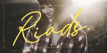 Introducing "Riads - Stylish Handwriting Font" with a signature style look. "Riads Script" very recommended for you who want to make some designs with natural handwriting style. This font easy to use and perfect for elegant branding, greeting cards, wedding design, name card design, invitation design, poster, packaging, romantic book cover designs, handwritten quotes, unique social media post, and so much more. Feature and what inside: • Uppercase and Lowercase • Uppercase and Lowercase Alternates • Number and Punctuation • Ligature • Swashes • Multi Languages
 - Maria Aishane Script by Dora Typefoundry,
$14.00 Maria Aishane is a bold new type of modern modern calligraphy script that has an alternative. make your designs beautiful and look great. Maria Aishane includes all the basic characters and additional and alternative Latin characters, nice fonts for your invitation. Maria Aishane is just a simple typeface, all uppercase, lowercase letters, and only includes all the basic characters, numbers and punctuation. It is perfect for logo, greetings, branding, quotes, prints, invitations and crafting. All lowercase letters include alternates, beginning & end swashes, that makes the font look fabulous! These are all coded with PUA Unicode. Mac users can use Font Book and Windows users can use Character Map to view and copy any of the extra characters to paste into your favourite text editor/app. Thanks and have a wonderful day
 - Maria-Ballé-Initials by ARTypes,
$35.00Maria-Ballé-Initials are derived from the Ballé series I made by the Bauer foundry. When set at 60 pt this font will match the size of the original 48-pt Didot design. - Just Me Again Down Here - Personal use only

- KR Down By The Sea - Unknown license

- Just Me Again Down Here - Personal use only

- Hand Me Down O (BRK) - Unknown license

- Hand Me Down O BRK - Unknown license

- Hand Me Down S BRK - 100% free

- Hand Me Down S (BRK) - Unknown license

- Tecna Dark Down Triangle BNF by Descarflex,
$30.00 The Tecn@ Dark&Light Triangle Background Nomenclature Font family is differentiated by the direction of the triangle tip in the 4 cardinal points. The family were designed to head, enumerate, indicate or highlight writings or design plans, for this reason, the characters are available only in capital letters and some signs or symbols that can serve such purposes. A triangle or empty character is included so that the user can use it overlaying any character of his choice or to be used alone.
 - Tecna Light Down Triangle BNF by Descarflex,
$30.00 The Tecn@ Dark&Light Triangle Background Nomenclature Font family is differentiated by the direction of the triangle tip in the 4 cardinal points. The family were designed to head, enumerate, indicate or highlight writings or design plans, for this reason, the characters are available only in capital letters and some signs or symbols that can serve such purposes. A triangle or empty character is included so that the user can use it overlaying any character of his choice or to be used alone.
 - Narrow Roman Stencil JNL by Jeff Levine,
$29.00 Narrow Roman Stencil JNL was modeled from a vintage brass sign for identification of a ballroom.
 - New Thin Roman JNL by Jeff Levine,
$29.00 The 1912 publication "Essentials of Lettering" has an example of a hand lettered, condensed spurred serif design called "Compressed Roman". This is now available digitally as New Thin Roman JNL in both regular and oblique versions.
 - PB Roman Uncial Vc by Paweł Burgiel,
$32.00 PB Roman Uncial Vc is a font face designed for imitate Roman uncial writing style found in manuscripts from 4th to 5th century. All characters are handwritten by use ink and reed pen (calamus), scanned, digitized and optimized for best quality without lost its handwritten visual appearance. Character set support codepages: 1250 Central (Eastern) European, 1252 Western (ANSI), 1254 Turkish, 1257 Baltic. Include also additional characters for Cornish, Danish, Dutch and Welsh language, spaces (M/1, M/2, M/3, M/4, M/6, thin, hair, zero width space etc.), historical characters (overlined Roman numerals, abbreviations, I-longa, historical ligatures for "nomina sacra" and "notae communes") and wide range of ancient punctuation. OpenType TrueType TTF (.ttf) font file include installed OpenType features: Access All Alternates, Localized Forms, Fractions, Alternative Fractions, Ordinals, Superscript, Tabular Figures, Proportional Figures, Stylistic Alternates, Stylistic Set 1, Historical Forms, Historical Ligatures. Include also kerning as single 'kern' table for maximum possible backwards compatibility with older software. Historical ligatures for "nomina sacra" and "notae communes" are mapped to Private Use Area codepoints.
 - Times New Roman Seven by Monotype,
$67.99In 1931, The Times of London commissioned a new text type design from Stanley Morison and the Monotype Corporation, after Morison had written an article criticizing The Times for being badly printed and typographically behind the times. The new design was supervised by Stanley Morison and drawn by Victor Lardent, an artist from the advertising department of The Times. Morison used an older typeface, Plantin, as the basis for his design, but made revisions for legibility and economy of space (always important concerns for newspapers). As the old type used by the newspaper had been called Times Old Roman," Morison's revision became "Times New Roman." The Times of London debuted the new typeface in October 1932, and after one year the design was released for commercial sale. The Linotype version, called simply "Times," was optimized for line-casting technology, though the differences in the basic design are subtle. The typeface was very successful for the Times of London, which used a higher grade of newsprint than most newspapers. The better, whiter paper enhanced the new typeface's high degree of contrast and sharp serifs, and created a sparkling, modern look. In 1972, Walter Tracy designed Times Europa for The Times of London. This was a sturdier version, and it was needed to hold up to the newest demands of newspaper printing: faster presses and cheaper paper. In the United States, the Times font family has enjoyed popularity as a magazine and book type since the 1940s. Times continues to be very popular around the world because of its versatility and readability. And because it is a standard font on most computers and digital printers, it has become universally familiar as the office workhorse. Times?, Times? Europa, and Times New Roman? are sure bets for proposals, annual reports, office correspondence, magazines, and newspapers. Linotype offers many versions of this font: Times? is the universal version of Times, used formerly as the matrices for the Linotype hot metal line-casting machines. The basic four weights of roman, italic, bold and bold italic are standard fonts on most printers. There are also small caps, Old style Figures, phonetic characters, and Central European characters. Times? Ten is the version specially designed for smaller text (12 point and below); its characters are wider and the hairlines are a little stronger. Times Ten has many weights for Latin typography, as well as several weights for Central European, Cyrillic, and Greek typesetting. Times? Eighteen is the headline version, ideal for point sizes of 18 and larger. The characters are subtly condensed and the hairlines are finer." - Show Card Roman JNL by Jeff Levine,
$29.00 Art Nouveau serif capitals and numerals in the 1917 instructional book “A Roman Alphabet and How to Use It” were the inspiration for Show Card Roman JNL; available in both regular and oblique versions.
 - HWT Roman Extended Fatface by Hamilton Wood Type Collection,
$24.95 The design of the first "Fat Face" is credited to Robert Thorne just after 1800 in England. It is considered to be the first type style designed specifically for display or jobbing, rather than for book work. The first instance of Fat Face in wood type is found in the first wood type specimen book ever produced: Darius Wells, Letter Cutter 1828. This style was produced by all early wood type manufacturers. The style is derived from the high contrast, thick and thin Modern style of Bodoni and Didot developed only decades previously. The extended variation makes the face even more of a display type and not at all suitable for text. This type of display type was used to compete with the new Lithographic process which allowed for the development of the poster as an artform unto itself. This new digitization by Jim Lyles most closely follows the Wm Page cut. The crisp outlines hold up at the largest point sizes you can imagine. This font contains a full CE character set.


