9,249 search results
(0.031 seconds)
- Morocco by Linotype,
$29.99Morocco is a round, curvaceous font from Swiss designer Michael Parson. Many of the letterforms in Morocco are inspired by the Modern Greek alphabet. Five of the lowercase letters have additional ascenders/descenders that are not typical in the Roman alphabet (h, n, s, u, x). This experimentation continues into the uppercase as well; many capital letters in this font have been bequeathed with ascender or descender-like elements, and some capital letters, like the Q", only come up to the x-height of the lowercase letters. This experiment in type design is one of ten from Parson that has been included in the Take Type 5 collection from Linotype GmbH." - Bookman Old Style Paneuropean by Monotype,
$92.99The origins of Bookman Old Style lie in the typeface called Oldstyle Antique, designed by A C Phemister circa 1858 for the Miller and Richard foundry in Edinburgh, Scotland. Many American foundries made versions of this type which eventually became known as Bookman. Monotype Bookman Old Style roman is based on earlier Lanston Monotype and ATF models. The italic has been re drawn following the style of the Oldstyle Antique italics of Miller and Richard. Although called Old Style, the near vertical stress of the face puts it into the transitional category. The Bookman Old Style font family is a legible and robust text face. - Floridium Pro LV by No Bodoni,
$35.00 Floridium grew out of an affection for the old wood types of the 1800s. Painters Roman* was the initial inspiration. It was the source for the �banana� and �snake head� serifs. But the design�released by Adobe as Juniper�was too quirky to be useful. I tried to make it more sophisticated and modern while keeping the original personality of the 19th century types. The name resulted from a trip to Miami while the initial drawings were being made. Not the best way to name a typeface, but while we were in Miami Beach there was this tall blonde in a bright yellow bikini sitting on this bright yellow Porsche and...
 - Abadi by Monotype,
$29.99 Designed by Malaysian designer, Ong ChongWah, Abadi is a versatile sans serif typeface whose style lies between the humanist Gill Sans and the more rigid lineales such as Monotype Grotesque and Helvetica. These humanist characteristics give the Abadi fonts a friendliness in use and contribute as much to its legibility as the generous 'x' height. The italic font relates to the roman, yet has sufficient character to be effectively used independently. The range of weights and widths available give Abadi a wide spectrum of graphic applications, from small quantities of text in magazines and newspapers, to display use in packaging, advertising and even television.
 - Chianti BT by Bitstream,
$29.99 Chianti was designed at Bitstream by senior designer Dennis Pasternak in 1991 and initially released in 1995. The intent behind the design was to provide a humanist sanserif of high readability at a wide range of sizes and weights. Humanist sanserifs (others that fall into this category are Linotype’s Frutiger and Optima, and Monotype’s Gill Sans) are an attempt to improve the readability of sanserifs by applying classical roman structure to the letterforms. To enhance its versatility, Mr. Pasternak designed a wide variety of alternate characters, rare ligatures, ornaments and swashes. Chianti is a friendly sanserif useful for a broad range of typographic needs.
 - Clay Handwriting Pro by SoftMaker,
$7.99 Digitized handwriting fonts are a perfect way to give documents the “very special touch”. Invitations look simply better when handwritten than when printed in bland Arial or Times New Roman. Short handwritten notes look authentic and appealing. There are numerous occasions where handwritten text makes a better impression. Clay Handwriting Pro is a beautiful typeface that mimics true handwriting closely. Use Clay Handwriting Pro to create stunningly beautiful designs easily. This typeface comes with alternative characters for sophisticated typography – all easily accessible as OpenType features. A “random” feature even allows for automated random switching between variations of the same character, resulting in type that looks authentically handwritten.
 - Mero Thai by Deltatype,
$59.00 Mero inspired by the Roman Capital Proportions which we have seen in Trajan Inscription. With different widths; There are applied each letter to visual proportion. Mero inspired by this measurement method and would like to create the primary typeface in terms of simple form. This sans serif typeface designed to use for any media with a little notice from designer eyes. You won't notice much about style, but something will let you feel extraordinary and trust. Mero has supported over 30 languages and come with nine weights for a complete family. With the standard of CSS font-weight, Mero complete family will map beautifully for your digital layout.
 - Van Den Velde Script Pro by Intellecta Design,
$59.95 Van den Velde Script Pro is the definitive edition of the original Van den Velde Script, by Intellecta Design, a free interpretation of the work of the famous master penman Jan van den Velde, to be found in the “Spieghel der schrijfkonste, in den welcken ghesien worden veelderhande gheschrifften met hare fondementen ende onderrichtinghe. ” (Haarlen, 1605). This font has evocative ancient ligature forms from the XVII Century Dutch master penman Jan van den Velde. Your indescritible writing-book was important not only with regard to the specific period it represents, but also in relationship to the entire history of calligraphy as an art: Van den Velde is rightly credited with having introduced and perfected a new trend in Dutch calligraphy. Our font, Van den Velde Script, merges modern necessities or better legibility without loosing the taste of his archaic origins. This enhanced OpenType version is a complete solution for producing documents and artworks whith an evocative and voluptuous style of calligraphic script: Van den Velde Script PRO has - more glyphs than the original Van den Velde Script. We created hundred of new glyphs, deactivated old non-representative glyphs and redesign the remaining library of original glyphs. Van den Velde Pro is more functional, soft and beauty than the original. - to keep the powerful of this unusual kind of script we make a tour-de-force kerning work: 771 glyphs in this font was adjusted in 5400 kerning pairs handly. - hundreds of contextual alternates combinations, some of them with three or more letters, - historical ornaments and fleurons in the typical style (and motifs) from the XVII century at the Lower Countryes accessed with the glyph palette using the Ornaments feature); - an extensive set of ligatures (100s of contextual alternates plus discretionary ligatures) providing letterform variations that make your designs really special, resembling real handwriting on the page; .... and, much better, Van den Velde Scriopt PRO is plus cheap than the original font !!! In non-OpenType-savvy applications it works well as an unusual and beautiful script style font. Because of its high number of alternate letters and combinations (over 700 glyphs), we suggest the use of the glyph palette to find ideal solutions to specific designs. The sample illustrations will give you an idea of the possibilities. You have full access to this amazing stuff using InDesign, Illustrator, QuarkXpress and similar software. However, we still recommend exploring what this font has to offer using the glyphs palette: principally to get all the power of the Contextual Alternates feature. Van den Velde Script PRO has original letters designed by Iza W and overall creative direction plus core programming by Paulo W.
 - Orto by LetterPalette,
$20.00 Orto is a type family of sans serif fonts in eight weights. It's a humanist typeface with real cursive, containing both Roman and Italic styles. The letters are designed to look good on screen, they have a bit narrower proportions and simple shapes. Their structure is based on flat horizontal and vertical strokes, which are emphasized wherever possible. That’s where the name comes from: Orto is an abbreviation of the word orthogonal. Thanks to its narrow width, the typeface is less space-consuming and adapts well to the screens of smaller devices. It is legible in small sizes, thanks to the larger x-height. The characteristic details, like bent ends of diagonal strokes, stand out when used in larger sizes. Orto can be used equally good in print and its overall neutral look fits different contexts. However, its character is pretty recognizable. Orto contains Latin and Cyrillic script and covers six codepages: Latin 1, Latin 2, Cyrillic, Turkish, Windows Baltic and MacOS Roman. It has basic OpenType features like ligatures, oldstyle numerals, proportional and tabular lining figures, fractions, superiors, etc. Capital German sharp S shows up when the lowercase is typed between two uppercase letters, and the Contextual Alternates feature is turned on. The Stylistic Set 01 changes the shape of the Cyrillic b. The Stylistic Set 02 is a shortcut for using Serban Cyrillic alternatives that differ from Russian in cursive.
 - Iranica by Naghi Naghachian,
$64.00 Iranica is a new creation of Naghi Naghashian. It is extremely legible even in very small size. "Iranica" is reminiscence to my birthplace and my cultural root. Iranica is a modern Sans Serif font family. This innovation is a contribution to modernisation of Arabic typography, gives the font design of Arabic letters real typographic arrangement und provides more typographic flexibility. Iranica supports Arabic, Persian and Urdu. The highest degree of calligraphic grace and the clarity of geometric typography. This typeface offers a fine balance between calligraphic tradition and the Roman aesthetic common in Latin typography. It also includes proportional and tabular numerals for the supported languages. Iranica design fulfills the following needs: A. Explicitly crafted for use in electronic media fulfills the demands of electronic communication. B. Suitability for multiple applications. Gives the widest potential acceptability. C. Extreme legibility not only in small sizes, but also when the type is filtered or skewed, e.g., in Photoshop or Illustrator. Iranica's simplified forms may be artificial obliqued in InDesign or Illustrator, without any loss in quality for the effected text. D. An attractive typographic image. Iranica was developed for multiple languages and writing conventions. Iranica supports Arabic, Persian and Urdu. It also includes proportional and tabular numerals for the supported languages. E. The highest degree of calligraphic grace and the clarity of geometric typography. This typeface offers a fine balance between calligraphic tradition and the Roman aesthetic common in Latin typography.
 - Adobe Caslon by Adobe,
$35.00The Englishman William Caslon punchcut many roman, italic, and non-Latin typefaces from 1720 until his death in 1766. At that time most types were being imported to England from Dutch sources, so Caslon was influenced by the characteristics of Dutch types. He did, however, achieve a level of craft that enabled his recognition as the first great English punchcutter. Caslon's roman became so popular that it was known as the script of kings, although on the other side of the political spectrum (and the ocean), the Americans used it for their Declaration of Independence in 1776. The original Caslon specimen sheets and punches have long provided a fertile source for the range of types bearing his name. Identifying characteristics of most Caslons include a cap A with a scooped-out apex; a cap C with two full serifs; and in the italic, a swashed lowercase v and w. Caslon's types have achieved legendary status among printers and typographers, and are considered safe, solid, and dependable. Carol Twombly designed this Caslon revival for Adobe in 1990, after studying Caslon's own specimen sheets from the mid-eighteenth century. This elegant version is quite true to the source, and has been optimized for the demands of digital design and printing. Adobe Caslon? makes an excellent text font and includes just about everything needed by the discriminating typographer: small caps, Old style Figures, swash letters, alternates, ligatures, expert characters, central European characters, and a plethora of period ornaments. - Pinel Pro by URW Type Foundry,
$39.99 The characteristic ‘French face’ was originally made in 1899 under the supervision of Joseph Pinel. Thus, what was originally French 10 pt. Nº 2, got its present name. The Frenchman Joseph Pinel called himself a "typographical engineer", but was at the time employed as a type draughtsman at the Linotype Works in Altrincham. It appears that this and some other faces that he supervised, were, except for use on the Linotype, also meant for manufacturing matrices for the Dyotype. This composing machine was an invention of Pinel. The Dyotype was a rather complicated machine and consisted, like the Monotype, of two separate contraptions, a keyboard which produced a perforated paper ribbon and a casting machine which produced justified lines of movable type. Unlike the Monotype which has a square matrix carrier, the Dyotype had the matrices on a drum (in fact two drums, hence the name of the machine). A Pinel Diotype company was founded in Paris and a machine was built with the help of the printing press manufacturer Jules Derriey. As is often the case, a lack of sufficient capital prevented the commercializing of this ingenious composing machine. Coen Hofmann digitized the font from a batch of very incomplete, damaged and musty drawings, which he dug up in Altrincham. He redrew all characters, bringing up the hairstrokes somewhat in the process. The result is a roman and italic, while the roman font also includes Small Caps
 - Bank Sans EF by Elsner+Flake,
$35.00 With its extended complement, this comprehensive redesign of Bank Gothic by Elsner+Flake offers a wide spectrum for usage. After 80 years, the typeface Bank Gothic, designed by Morris Fuller Benton in 1930, is still as desirable for all areas of graphic design as it has ever been. Its usage spans the design of headlines to exterior design. Game manufacturers adopt this spry typeface, so reminiscent of the Bauhaus and its geometric forms, as often as do architects and web designers. The creative path of the Bank Gothic from hot metal type via phototypesetting to digital variations created by desktop designers has by now taken on great breadth. The number of cuts has increased. The original Roman weight has been augmented by Oblique and Italic variants. The original versions came with just a complement of Small Caps. Now, they are, however, enlarged by often quite individualized lower case letters. In order to do justice to the form changes and in order to differentiate between the various versions, the Bank Gothic, since 2007 a US trademark of the Grosse Pointe Group (Trademark FontHaus, USA), is nowadays available under a variety of different names. Some of these variations remain close to the original concept, others strive for greater individualism in their designs. The typeface family which was cut by the American typefoundry ATF (American Type Founders) in the early 1930’s consisted of a normal and a narrow type family, each one in the weights Light, Medium and Bold. In addition to its basic ornamental structure which has its origin in square or rectangular geometric forms, there is another unique feature of the Bank Gothic: the normally round upper case letters such as B, C, G, O, P, Q, R and U are also rectangular. The one exception is the upper case letter D, which remains round, most likely for legibility reasons (there is the danger of mistaking it for the letter O.) Because of the huge success of this type design, which follows the design principles of the more square and the more contemporary adaption of the already existing Copperplate, it was soon adopted by all of the major type and typesetting manufacturers. Thus, the Bank Gothic appeared at Linotype; as Commerce Gothic it was brought out by Ludlow; and as Deluxe Gothic on Intertype typesetters. Among others, it was also available from Monotype and sold under the name Stationer’s Gothic. In 1936, Linotype introduced 6pt and 12pt weights of the condensed version as Card Gothic. Lateron, Linotype came out with Bank Gothic Medium Condensed in larger sizes and a more narrow set width and named it Poster Gothic. With the advent of photoypesetters and CRT technologies, the Bank Gothic experienced an even wider acceptance. The first digital versions, designed according to present computing technologies, was created by Bitstream whose PostScript fonts in Regular and Medium weights have been available through FontShop since 1991. These were followed by digital redesigns by FontHaus, USA, and, in 1996, by Elsner+Flake who were also the first company to add cursive cuts. In 2009, they extended the family to 16 weights in both Roman and Oblique designs. In addition, they created the long-awaited Cyrillic complement. In 2010, Elsner+Flake completed the set with lowercase letters and small caps. Since its redesign the type family has been available from Elsner+Flake under the name Bank Sans®. The character set of the Bank Sans® Caps and the Bank Sans® covers almost all latin-based languages (Europe Plus) as well as the Cyrillic character set MAC OS Cyrillic and MS Windows 1251. Both families are available in Normal, Condensed and Compressed weights in 4 stroke widths each (Light, Regular, Medium and Bold). The basic stroke widths of the different weights have been kept even which allows the mixing of, for instance, normal upper case letters and the more narrow small caps. This gives the family an even wider and more interactive range of use. There are, furthermore, extensive sets of numerals which can be accessed via OpenType-Features. The Bank Sans® type family, as opposed to the Bank Sans® Caps family, contains, instead of the optically reduced upper case letters, newly designed lower case letters and the matching small caps. Bank Sans® fonts are available in the formats OpenType and TrueType.
 - Balboa by Parkinson,
$20.00 Balboa is a display design combining elements of early sans serif and grotesque types with contemporary types. It evolved from ATF Headline Gothic, Banner (a headline typeface I drew for the San Francisco Chronicle), and Newsweek No.9, a Stephenson Blake-like grotesque I designed for Roger Black's 1980 redesign of Newsweek Magazine. There are nine styles, including the three new styles that have been added in 2014: Medium, Light and Ultra Light.
 - Raffadyn by Attype Studio,
$16.00 Raffadyn is a wedding font perfect for your wedding dream. Combine Raffadyn with stylistic set to create amazing script font for wedding! Fall in love with its incredibly versatile style and use it to create spectacular designs! Raffadyn is perfect for branding, logo, invitation, quotes, apparel design, product packaging, merchandise, game titles, cute style design, Book/Cover Title and more. What's Included : - Stylistic Set character - Multilingual Support --- Hope you enjoy with our font! Attype Studio
 - Kfontz by 066.FONT,
$9.99 Kfontz is a display font that simulates the appearance of typewritten text. Each letter in Kfontz has been carefully designed to resemble the effect you get with a typewriter. This effect adds a sense of nostalgia to the text, as if it were from a bygone era, adding an authentic charm to the designs. Kfontz retains its varied and extravagant style, giving the text a lightness and a certain nonchalance. Remastered in 2023.
 - Auline by Sensatype Studio,
$15.00 Auline is Modern Luxury Serif Font is a well-balanced contemporary font with a fancy, unique, and versatile Luxury serif, font that you can combine to get any variations and unique shapes easily just in seconds with choose alternates of them. What's Included: Character set A-Z Normal & Italic Style Numerals & Punctuation Accented Characters (West Europe) Stylistic alternates Works on PC & Mac Recommended using Adobe Illustrator or Adobe Photoshop. Wish you enjoy our font. :)
 - Laureen pro Arabic by Zaza type,
$29.00 Laureen pro typeface Laureen pro is an Arabic typeface that has a very particular appearance. It combines the characteristics of different genres; most notably the contrast of serif faces. While its design is influenced by Kufic and the Naskh style. Laureen pro consists of two typefaces, text and display, and 4-weights. It’s a perfect choice for bold headlines, oversize typography, fashion logos, branding, identity, website design, album art, covers, posters, advertising, etc.
 - Allergic to Waffles by PizzaDude.dk,
$15.00 Luckily, I am not allergic to waffles - but a guy named Ethan Tremblay is...and if you know the story about that guy, you know the name of this font is from! What can I say? A handmade font full of quirkiness and a rough outline. Comes in both Regular (outline) and Solid. Use both versions as they are, or combine them. I've added 4 different versions of each lowercase letter and multilingual support!
 - Simppeli by Morganismi,
$9.00 Simppeli is a simple-lined but rough font. As written text it gives an impression of drawn lines on cross-ruled paper. You can fill the entire text area: the space key gives an "empty" grid. You may have to change the settings of some text applications in order to eliminate the marginals and/ or the line spacing. Combining glyphs provides you with endless assortment of patterns for ornamental decoration, prints etc.
 - Sidewalk Cafe BF by Bomparte's Fonts,
$40.00 Sidewalk Cafe will serve up a look from your Font Menu that’s delectably deco. Though developed from a few hand-lettered words found on a 1930s poster, it retains a contemporary flavor. The shaded version is designed to be layered over Sidewalk Cafe Underlay, to create contrasting color possibilities, as both share the same kerning values. Supports Western and Central European Latin languages, in addition to Baltic, Celtic, Esperanto, Romanian and Turkish.
 - Rose Mask by Viswell,
$19.00 RoseMask is a capvitating combination font with three distinct style that seamlessly complement each other. The uppercase style featured elegant serif for a timeless appeal, the lowercase style offers a playful monoline approach, and the alternates presented in a bubbly gravity font, infuse creativity and dynamism. Mix and macth this versalite font effortlessly transitions between elegance and playfulness, making it a must have for diverse design project, from branding to editorial layout.
 - Raventame by Viaction Type.Co,
$16.00 Raventame font with original handwriting brush style, looks very natural and beautiful. It is suitable for boutique brand, photography, magazine, quote, business card, logo, poster and many more. Script is equipped with multilingual support and PUA Encoded. This font is equipped with the Raventame Swash version which is very easy to combine with the Raventame font. Very many swash options with a variety of original hand strokes. I hope you enjoy and thank you.
 - Prosty by Fontsphere,
$12.00 PROSTY is a family of minimalistic and geometric fonts. It follows the style of other Fontsphere's forms, but goes one step further. It contains both uppercase and lowercase characters, which makes it useful for display, titling, captions but also for composing short, intermediate and longer texts, which is a very interesting and useful combination here. It was created carefully with details in mind. PROSTY contains a large number of characters as well as multilingual support.
 - Humble Nostalgia by Arterfak Project,
$18.00 Experience the classic feel with Humble Nostalgia! A classy and elegant serif font that will bring you to the 80s era. Specially crafted with a modern touch, designed with tight kerning and spacing to achieve a more aesthetic appearance. An amazing combination of regular and italic styles that looks great in both large and small sizes, making it the perfect choice for your special designs. A perfectly versatile font pair suitable for lifestyle!
 - Luna Love by Attype Studio,
$10.00 Introducing Luna love - Inspired by Star on the space & cute display, Luna love is handwritten font cursive that perfect for children product. come with star layered font, make combination of this font to create amazing design! Two style Font: regular & Display Luna love is perfect for children product, branding, logo, invitation, stationery, wedding, product packaging, merchandise, monogram, blog design, game titles, cute style design, Book/Cover Title and more. Features : - Multilingual Support - stylistic set
 - Copal by Adobe,
$29.00Inspired by the carvings on meso-American monuments, David Lemon of Adobe's type staff created Copal. It is named after a resin that was burned as incense by ancient cultures and which is used today as a binding agent in printer inks and varnishes. The fonts in Copal can be used individually or combined to achieve chromatic effects. Try the decorated letters in headlines when you are in need of a burst of primitive energy. - Luftayah by Popkern,
$20.00 Luftayah is a modern display typeface, designed by Anna Seslavinskaya in 2018. The typeface was inspired by the sociological concept of the “melting pot”, by a fusion of different cultures, isolated in a geometric form. Two traditions, Kufic script and German fraktur blend into a new symbiotic form. Luftayah adapt it for use in display contexts, as headings and book blurbs, through the use of a range of unusual combined characters and ligatures.
 - Birani by Attype Studio,
$16.00 Birani is lovely script font with swash on beginning & ending word. This font perfect for valentine & wedding theme design. Combine it with Birani beginning, ending swash & ligatures to make perfect design for yor projects. Birani perfect for valentine promotion, wedding invitation, branding, logo, invitation, stationery, social media post, product packaging, merchandise, blog design, game titles, cute style design, Book/Cover Title and more. What's Included : - Birani Family Font - Ligature - Multilingual Support - Beginning & Ending Swash
 - Delicia Pro by Wiescher Design,
$69.50 Delicia Pro Script is a versatile fat script designed with delicatessen shops in mind, it has lots of variations. There are for example seven different versions for the uppercase letters that can be accessed with opentype savy software. different ampersands, @-signs, Th combinations, lots of different lowercase letters and so on. The font can be used in all of Europe, Turkey and the Baltic countries (sorry no Greek and Cyrillic). Yours very versatile Gert Wiescher
 - Softmachine by Shinntype,
$39.00 Everything about Softmachine—the rounded terminals, the bold weight, the letter forms and proportions—is designed with one objective: to create a uniform distance between letter strokes, in and between characters. This is achieved by the shape, spacing and kerning of letters, and by using contextual alternates to control adjacent glyph combinations. The effect translates, in the Outline font, into an overlapping outline of remarkably even thickness. Also included: an alternate stylistic set.
 - Rick Veitch by Comicraft,
$39.00 For our latest Master of Comic Book Art, Roarin' Rick Veitch, we've created a Brat Pack of fonts worthy of a Maximortal! This is The One! This will make your Heartburst! If you Can't Get No Rick Veitch between 1941 and 1963, wipe that Swamp Thing off America's Best Greyshirt, because this font is nothing short of A Miracle, Man! It's Epic! Abraxas and the Earthman and your Army @ Love recommend it.
 - Howlett by Greater Albion Typefounders,
$22.95 Howlett combines great character with extreme legibility. It's a simple display face that offers a sense of coziness and order, that speaks of all being well with the world. It is a modern design which pays due Acknowledgment to the past. An extensive range of Opentype features, including old-style numerals, terminal forms, ligatures and stylistic alternatives are included. Use it for headings and titles as well as eye catching poster work.
 - Guainne by Sensatype Studio,
$15.00 A Modern Classy Beauty Elegant Font that we created special for Luxury and Fashion branding needs, And specially for this font, We prepared any alternate characters to help you create unlimited variations for your creative needs. Guaine - Modern Beauty Elegant Font ready with: Any options to get creative variations (combination of Any Alternates) Preview as a inspirations that you can do with Guaine font Ready with Lowercase and Uppercase characters Wish you enjoy our font. :)
 - Tenby by Paragraph,
$12.00 Tenby is a series of modular geometric display sans serif fonts with a hint of Art Deco combined with a 1980s finish. The fonts' underlying grid is ten squares high. Their widths correspond to condensed (Tenby Four), normal (Tenby Five) semi-extended (Tenby Six), extended (Tenby Seven), and extra-extended (Tenby Eight). Each contains two weights, light and regular. Although smaller text sizes are still quite legible, the fonts work better at large sizes.
 - Gmbh Sans by EchadType,
$9.99 GMBH SANS The architectural sans-serif in sharp junctions silhouette. Designed as a display typeface for headline sizes. Typeface maintains it's unique identity even in all lowercase letters due to 21 degrees slanted stems (vertical strokes of letters). Variable typefaces provides subtle gradation of 6 weights. Each weight retains the same character width (except character i and l). Typeface supports: Latin characters with diacritical marks; Cyrillic characters (Ukrainian, Russian); Hebrew; Contains additional monetary symbols (₿Ξ₴₹₪)
 - ITC American Typewriter by ITC,
$40.99 ITC American Typewriter was designed by Joel Kaden and Tony Stan. It is an ode to the invention that shaped reading habits and the idea of legibility, the typewriter. A compromise between the rigidity of its ancestor and the expectations of the digital age, ITC American Typewriter retains the typical typewriter alphabet forms, lending the font a hint of nostalgia. ITC American Typewriter™ font field guide including best practices, font pairings and alternatives.
 - Marcheile by Arterfak Project,
$15.00 Marcheile is a display font, inspired by Gatsby & Vintage looks. The All-Caps font which comes from a combination of art deco and retro style. Luxury shapes, clean & solid that very possible to apply in many design project. Marcheile also has some OpenType features to gives you many alternatives in your creative process. There's some ligatures, many alternates, and 18 accents. Great choice for your headline, editorial, logotype, quotes, typography and more!
 - Winky Milky by Graphicxell,
$19.00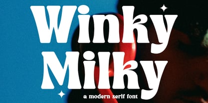 Winky Milky is a unique and very elegant font for branding and logo designs Elegant serif typeface combined with a classy and modern style. This type of font is very suitable for your various needs such as branding projects, logos, wedding designs, social media posts, advertisements, product packaging, product designs, labels, photography, watermarks, invitations, stationery, and any project, created with high level of readability. you will not be disappointed if you buy this font!!
 - Kailey Force by Great Lakes Lettering,
$30.00 Kailey Force contains 3 powerful effects for her kissing cousin: Kailey. The Bold (Drop Shadow), the Brave (Distressed), and the Beautiful (Combined). Kailey is a hand lettered, voluptuous typeface that is very special to the Great Lakes Lettering team. This oblique font is inspired by Molly Jacques’ “signature” lettering style, using bold brush strokes, fluid flourishes, and distinctive characters. Kailey has a distinct feminine feel that takes on a bold attitude to match her curves.