10,000 search results
(0.064 seconds)
- Emblema Headline by Corradine Fonts,
$15.00 Based on Corradine Fonts font Emblema 65, Emblema Headline is a powerful tool for modern designers who need a vintage art deco style font with personality and high quality. The Emblema Headline family has four layers, each one with three or four different looks, for a total of thirteen different variations. Non-OT-users can select a font from these thirteen variations, also with specific flavors: Basic, Deco, Swash or Extraswash. Explore the great possibilities of Emblema Headline in your next project.
 - Bitra by Creativemedialab,
$20.00 Bitra is a beautiful, elegant, and versatile serif family. It has tons of alternative characters with Excessive flourishes, giving a playful feel to your design. Ornaments are inspired by the beauty of the bird of paradise tail. Bitra comes with seven weights with its matching italic, ornaments, and variable format.
 - Gorus by Smartfont,
$19.00 Gorus is a variable width sans serif type family that's been created to give a powerful but flexible tool to create strong headlines, posters, logos, and display text with tight spacing and maximum space coverage. A contemporary geometric family in 15 styles brings a modern and strong impression to your design.
 - First Class by TypeClassHeroes,
$19.00 Really excited to introducing First Class is a new luxury serif family. It's clean and smooth with 9 variable weight much ligature and alternative inside. Suitable to create any branding, product packaging, invitation, quotes, t-shirt, label, poster, logo etc. Feature - Uppercase & Lowercase - Number & Symbol - International Glyphs - Multilingual support - Alternative - Ligature
 - Korolev Military Stencil by Device,
$39.00 A stencil variant of last year's bestselling Device font family, Korolev . Named after Sergei Korolev, father of Soviet astronautics, and based on signs from the Red Army parade of 1932.
 - Jana Thork by Outras Fontes,
$26.90 Jana Thork is a synthesis of stone engraved capital letterforms and uncial and half-uncial calligraphic styles. The idea of the typeface designer Ricardo Esteves was to seek for the limits between our uppercase and lowercase mental concepts. This family can be useful to compose titles, short texts, labels and letterings that need to look attractive to the eye. The family includes Regular and Bold styles, so it can be used in graphic designs that need more complex hierarchic relations or greater visual impact.
 - MBF Quadria by Moonbandit,
$17.00 Quadria, is an experimental square font. With many alternative and ligature, this typeface is more than capable to fulfill all the square variant you need in a font. Use this font for title, headline, logo, poster and many other design projects.
 - Bassidle by Josstype,
$24.00 Bassidle Font is a sans serif font family that is simple but strong, defined by sharp edges with a modern touch. It is designed to exude a sense of strength and toughness as well as optimal readability. t’s a perfect choice for branding, magazines, posters, advertising, packaging, headlines, logos, web, print etc. 14 styles: 7 uprights and matching italics. 222 glyphs. Latin based languages. OpenType features, including ligatures. OTF, TTF files. Variable Font Includes. Thank you for your purchase! and please let me know if you have any questions. via email: joelpopon@gmail.com
 - Eulogy Family by pentagonistudio,
$9.00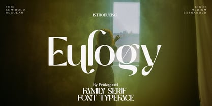 Eulogy Is A Serif Family Font and Variable Display Inspired By Retro and Vintage Style. . SOFTWARE REQUIREMENTS : Fonts and alternate : No special software required they may be used in any basic program /website apps that allows standard fonts That's it folks! You can go ahead and get cracking :) Follow My Shop For Upcoming Updates Including Additional Glyphs And Language Support. And Please Message Me If You Want Your Language Included or If There Are Any Features or Glyph Requests, Feel Free to Send me A Message. Have a Good Day !
 - Dona by Harbor Type,
$30.00 🏆 Selected for Tipos Latinos 9. Dona is a non-boring sans serif. While very legible in text sizes, its friendly details really come to life on headlines, packaging and visual identities. To make it even more interesting, Dona Alt brings a different feeling with just a few different glyphs. The Dona type family comes in 5 weights, from Regular to Black, matching italics and an Alt version, totalling 20 fonts. If you need even more control, variable fonts are also available. Each font contains 528 glyphs and supports over 200 languages.
 - SK Dusha by Shriftovik,
$32.00 SK Dusha is a playful geometric decorative font based on the combination of the modern Cyrillic alphabet and Glagolitic characters — the ancient Eastern European alphabet. Each letter and number of this font has a stylistic alternative, which increase the variable capabilities of this typeface. In addition, the font supports a multilingual set — extended Latin and Cyrillic, which makes it available to almost the whole world. Now in every corner it will be possible to get acquainted with the unique forms and geometry of Slavic writing, which is available for use in modern design.
 - Boink Rounded by Robert Petrick,
$19.95 Boink Rounded" is a new variation of my classic Boink font. The added softness of this new version extends the function of the easy and fun to use font.
 - WEAR FAT SHIRT by TypoGraphicDesign,
$15.00 CONCEPT/ CHARACTERISTICS A display font that allows you to »Kleckern und Klotzen« (modified German proverb »to not take half-measures«) The fat and square character to the font, a bold and loud statement. The motto is square, practical, fat. The font styles ranging from high-contrast line difference "beanpole" over mediocrity "slim" to the fattest and blackest "okay" style. A font with humor ^^ APPLICATION AREA The modern, square lightweight »Fat Wear Shirt« would be happy as a display typeface in headline size on the following areas and would find this very real bold: Editorial Design (Magazine or Fanzine) or Webdesign (Headline Webfont for your website), party flyer, movie poster, music poster, clothing, fashion, t-shirts, music covers or webbanner. And and and… TECHNICAL SPECIFICATIONS Headline Font | Display Font | Fat Techno Font »Wear Fat Shirt« OpenType Font (Mac + Win) with 3 styles (okay, slim, beanpole) & 268 glyphs. Alternative letters and ligatures (with accents & €) Desktop Font (.otf) + Web Font (.svg, .eot, .woff) KONZEPT/BESONDERHEITEN Eine Display-Schrift bei der Kleckern und Klotzen erlaubt ist! (Verändertes deutsches Sprichwort »nicht kleckern sondern klotzen«) Der fette und eckige Charakter verleihen der Schrift eine plakative und laute Aussage. Das Motto lautet quadratisch, praktisch, fett. Die Schriftschnitte reichen von kontrastreichen Linienunterschied »beanpole«, über mittelmaß »slim« bis zum fettesten und schwärzesten »okay« Style. Eine Schrift mit Humor ^^ EINSATZGEBIETE Das moderne, quadratische Leichtgewicht »Wear Fat Shirt«, würde sich als Auszeichnungsschrift in Headlinegröße über folgende Einsatzgebiete sehr freuen und fände dies echt fett: Logos/Wortmarken aller Art, Flyer für fast jede Party, Platten Cover, CD-Cover und Icon Design, Plakat Design, Kleidung, T-Shirts, Comics und Graphicnovels, Game– und Videospiel Design aller Genres, als Headlineschrift für print und digitale Magazine, Bücher und Webseiten u.v.m. TECHNISCHE INFORMATIONEN Headline Font | Display Font | Fat Techno Font »Wear Fat Shirt« OpenType Font (Mac + Win) mit 3 Schriftschnitten (okay, slim, beanpole) & 268 Glyphen. Inkl. diakritisches Zeichen, alternative Buchstaben, Ligaturen & €. Desktop Font (.otf) + Web Font (.svg, .eot, .woff)
 - Pershal by insigne,
$29.00 Pershal is something of an oddball, and that's the point. Dynamic and fast, Pershal attracts interest. Its architecture evokes growth and progress. Inspired by the futuristic styles of the 1990s, Pershal started on an aircraft ride as a sketch on a napkin. I set the concept aside for almost a decade before I went back to play with the typeface. Pershal is planned to complement applications in consumer finance, technology firms or biotechnology. As such, it has a complete set of both tabular and proportional figures. For the lowercase, Pershal features a distinctive shape that emphasizes its x-height. Its horizontal movement is highlighted by some of its other features, such as its crossbars. To emphasize growth, acceleration and inventiveness, crossbars and other elements are cut at a dynamic angle. It's a sans serif without a lot of contrast. Another unique feature of this typeface is the vast number of OpenType alternates. If you prefer a more conventional appearance to your sans, with stylistic alternates, you have that option. Altogether, there are more than seven separate sets of stylistic alternates and about 250 alternates for characters. This enables you to mix-and-match and create your own personal typeface. For branding, this makes it very useful. For your next project that requires a dynamic and technological appearance, give Pershal a shot.
 - Sullya by MonoLIne Calligraphy,
$19.00 Sullya is interesting because the typeface is pleasing to the eye, clean, feminine, sensual, glamorous, simple and very easy to read, because there are many fancy letter connections. I also offer a number of decent stylistic alternatives for multiple letters. Classic styles are very suitable to be applied in various formal forms such as invitations, labels, restaurant menus, logos, fashion, make up, stationery, novels, magazines, books, greeting / wedding cards, packaging, labels or all kinds of advertising purposes. . . Sullya has alternative characters, including support for multiple languages. With OpenType features with an alternative style and elegant binding. The OpenType feature does not work automatically, but you can access it manually and for the best results required for your creativity in combining these Glyph / Character variations. Font Features : * Lowercase beginning and ending swash * Uppercase beginning swash * Initials * International Language I heavily use programs that support OpenType features and the Glyphs panel such as Adobe Illustrator, Adobe Photoshop CC, Adobe InDesign, or CorelDraw, so that you can view and access all the variations of the Glyph. Sullya is coded with Unicode PUA, which allows full access to all additional characters without having any special design software. Mac users Mac users, and Windows users can use Character Map to view and copy any of the additional characters to paste into your favorite editor / application.
 - Santhiya by MonoLIne Calligraphy,
$21.00 Santhiya is interesting because the typeface is pleasing to the eye, clean, feminine, sensual, glamorous, simple and very easy to read, because there are many fancy letter connections. I also offer a number of decent stylistic alternatives for multiple letters. Classic styles are very suitable to be applied in various formal forms such as invitations, labels, restaurant menus, logos, fashion, make up, stationery, novels, magazines, books, greeting / wedding cards, packaging, labels or all kinds of advertising purposes. . . Santhiya has alternative characters, including support for multiple languages. With OpenType features with an alternative style and elegant binding. The OpenType feature does not work automatically, but you can access it manually and for the best results required for your creativity in combining these Glyph / Character variations. Font Features : * Lowercase beginning and ending swash * Uppercase beginning swash * Initials * Intenational Language Support I heavily use programs that support OpenType features and the Glyphs panel such as Adobe Illustrator, Adobe Photoshop CC, Adobe InDesign, or CorelDraw, so that you can view and access all the variations of the Glyph. Santhiya is coded with Unicode PUA, which allows full access to all additional characters without having any special design software. Mac users Mac users, and Windows users can use Character Map to view and copy any of the additional characters to paste into your favorite editor / application.
 - Rastilya by MonoLIne Calligraphy,
$17.00 Rastilya is interesting because the typeface is pleasing to the eye, clean, feminine, sensual, glamorous, simple and very easy to read, because there are many fancy letter connections. I also offer a number of decent stylistic alternatives for multiple letters. Classic styles are very suitable to be applied in various formal forms such as invitations, labels, restaurant menus, logos, fashion, make up, stationery, novels, magazines, books, greeting / wedding cards, packaging, labels or all kinds of advertising purposes. . . Rastilya has alternative characters, including support for multiple languages. With OpenType features with an alternative style and elegant binding. The OpenType feature does not work automatically, but you can access it manually and for the best results required for your creativity in combining these Glyph / Character variations. Font Features : * Lowercase beginning and ending swash * Uppercase beginning swash * Initials * Intenational Language Support I heavily use programs that support OpenType features and the Glyphs panel such as Adobe Illustrator, Adobe Photoshop CC, Adobe InDesign, or CorelDraw, so that you can view and access all the variations of the Glyph. Rastilya is coded with Unicode PUA, which allows full access to all additional characters without having any special design software. Mac users Mac users, and Windows users can use Character Map to view and copy any of the additional characters to paste into your favorite editor / application.
 - Liaison by URW Type Foundry,
$39.99 Liaison is a beautiful non-connecting handwritten script for headlines and display typesetting, e.g. for perfumes, reports of the glamour world, magazines about gardening and recipes, covers for romance novels and alike.
 - Mr & Mrs Konky by Rocket Type,
$12.00 Bet your sweet donkey it’s Mr. and Mrs. Konky! A causal, cartoony concoction made by hand! Marital bliss has been achieved with tons of alternates, ligatures and a full Vietnamese character set.
 - Ribbons by Positype,
$20.00 Ribbon type. Holy grail of complex-lettering-turned typeface or an elusive Loch Ness monster that is often teased, possibly seen in the wild, but never confirmed? From the amazing lettering artist and author Martina Flor and masterful type designer Neil Summerour, comes the aptly named Ribbons. Ribbons is a sincere and well-conceived approach to providing a reliable solution to ribbon and ribbon-styled type for creative professionals when a lettering artist just isn’t available. Ribbons provides both flat and ‘folded’ options with the Regular and Fold styles, but then raises the bar with separate layer styles that will allow you to easily create the elegant back and forth movements produced with ribbon-style lettering we have all come to appreciate. These layer options are provided in both ‘smooth’ and ‘pleated’ connected styles. Flor and Summerour didn’t stop there. Each typeface was expanded with a number of stylistic alternates, additional swashed and flourished letters, ligatures, and even more in order to provide as many decorative options as possible to the creative. To round out the nine fonts available in the typeface and to ‘put a bow on it’, they’ve added a separate Shadow style and two different color fonts (available exclusively with family purchases).
 - Walonka by TripleHely,
$18.00 Hello! Let me introduce Walonka – a modern calligraphy font. With its natural, elegant shapes Walonka is the perfect choice for logos, branding, web, blog headlines, invitations, magazine and book design, product packaging – or for any text on postcards and on your favorite photos. Walonka includes: a standard set of characters with wide multilingual support: Western-, Central- and Eastern-European, Baltic, Turkish, Latin-type Africans, and Asian (94 languages in total) two additional character sets: lowercase letters with alternates shapes and lowercase letters without a connection stroke - for the position at the end of a word another two additional lowercase character sets – initial and final swashed forms 75 ligatures for double letters and frequent combinations Walonka has a large number of embedded context-dependent auto-replacement features that give the text a natural, handwritten look and correct inharmonious combinations of letters. These features work well in many apps (even simple ones like Notepad/TextEdit), and if you need to customize their application – you could use programs that support OpenType features (for example, Adobe apps or CorelDraw). All these additional glyphs are PUA-encoded, so if your software does not support OpenType — you could access them through Character Map (Windows) or Font Book (Mac). I hope you will like Walonka and create great designs with it!
 - Boxer Punch by Putracetol,
$28.00 Boxer Punch - Soft Bold Font Boxer Punch - Soft Bold Font is a stylish and modern font designed to catch the attention of your audience. The font's unique design combines a soft bold shape with a cute sans serif, making it perfect for creating eye-catching designs. The idea behind creating Boxer Punch was to incorporate the concept of understated realism into the font. This is evident in the font's smooth and elegant lines, which make it perfect for a variety of design projects. The font is ideal for those looking to create a professional touch in their designs, while also maintaining a stylish and modern feel. Boxer Punch is an excellent choice for anyone looking for a font that is versatile and can be used in a variety of different contexts. It is perfect for sports-themed work projects, as well as branding, packaging, logo design, album covers, posters, and social media graphics. One of the standout features of Boxer Punch is its versatile OpenType features, including alternates and ligatures, which allow for even more creative freedom when designing with the font. Additionally, the font comes with uppercase and lowercase characters, as well as support for multilanguage, numbers, punctuation, and symbols. Inside the font package, you'll find three different file formats: Boxer Punch otf, Boxer Punch ttf, and Boxer Punch woff. This means that no matter what platform you are using, Boxer Punch will work seamlessly with your software. Boxer Punch is a font that is sure to make your designs stand out from the crowd. Its unique design and versatile features make it perfect for anyone looking to add a touch of elegance and style to their work. If you're looking for a stylish and modern font that is perfect for sports-themed work projects or a variety of other design projects, then Boxer Punch is the font for you. In summary, Boxer Punch - Soft Bold Font is a versatile and modern font that combines a soft bold shape with a cute sans serif to create a unique and stylish design. With its versatile OpenType features, multilanguage support, and uppercase and lowercase characters, Boxer Punch is perfect for a wide range of design projects.
 - Deadfall by Mofr24,
$11.00 Discover Deadfall, the ultimate horror display font that will send shivers down your spine! What sets Deadfall apart is its unique blend of fear-inducing aesthetics and multilingual capabilities. This Monospace typeface exudes a captivating dripped and splash style, adding an extra layer of terror to your designs. Notably, Deadfall supports the Cyrillic alphabet, making it an ideal choice for a global audience. Deadfall offers both regular and italic variations, granting you even more creative possibilities. Whether you're designing posters, crafting marketing materials, conjuring chilling movie titles, creating Death metal logotypes, or working on Halloween-themed crafts, Deadfall will infuse your projects with a bone-chilling atmosphere. To ensure versatility, consider pairing Deadfall with related font families or other typefaces that complement its macabre charm. Its functional aspects include an extensive character set and special features, making it suitable for a wide range of applications. The design concept behind Deadfall revolves around the idea of capturing the essence of horror. The font's distinctive dripped and splash style adds a sense of chaos and unease to any composition, immersing the viewer in a world of terror. The inclusion of the Cyrillic alphabet reflects our commitment to providing a font that caters to diverse audiences, bringing fear to every corner of the globe. We created Deadfall to meet the demand for a truly spine-tingling font that conveys a sense of horror and foreboding. Whether you're a graphic designer looking to evoke fear or a Halloween enthusiast seeking to amplify the spooky atmosphere, Deadfall is here to unleash terror in your designs. Get ready to embrace the darkness with Deadfall - the ultimate font for all things haunting and macabre!
 - Tempting by RGB Studio,
$19.00 Tempting Script is one of the Elegant script fonts that comes with a very beautiful character change, a kind of classic copper decorative script with a modern touch, designed with high detail to present an elegant style. Files Include : Basic Latin A-Z and a-z Numbers Symbols PUA Encode Multilanguage Support Tempting Script is interesting because the typeface is pleasing to the eye, clean, feminine, sensual, glamorous, simple and very easy to read, because of the many luxurious letter connections. I also offer a number of decent stylistic alternatives for some of the letters. This font perfectly made to be applied especially in logo, and the other various formal forms such as invitations, labels, logos, magazines, books, greeting / wedding cards, packaging, fashion, make up, stationery, novels, labels or any type of advertising purpose. Tempting has 349+ , including multiple language support. With OpenType features with alternative styles and elegant. The OpenType features don't work automatically, but you can access them manually and for best results your creativity will be required in combining variations of these Glyphs. I highly recommend using a program that supports OpenType features and the Glyphs panel such as Adobe Illustrator, Adobe Photoshop CC, Adobe InDesign, or CorelDraw, so that you can view and access all variations of Glyphs. Thanks and have a wonderful day, If you have any questions, please get in touch with us Don't forget to check out our other products.
 - PF Benchmark Pro by Parachute,
$79.00 Benchmark Pro is a carefully structured geometric typeface which works amazingly well in body text due to its simplistic nature and large x-height. The design of Benchmark Pro started out as an attempt to convert the minimalistic structure of a technical and purely geometric design into a readable modern and friendly sans serif. This was achieved by selectively changing and turning the straight lines of the initial drawings into curves and applying legibility techniques to the transformed letterforms. These letterforms have a distinct personality which is bolstered by its angular curves and open counter terminals. The result is a contemporary text typeface that looks quite fashionable. Benchmark Pro gets away from the ultra modern and mechanical structure but keeps its display nature, it gets away from the classical but still remains legible. This robust san serif type family offers an extended character set which supports simultaneously Latin, Cyrillic and Greek. All Benchmark Pro font variants have a companion italic, rounding the total family members at 14 fonts. Each font includes more than 750 glyphs and is powered with 17 opentype features. PDF Specimen Benchmark on Behance
 - Tenez by Plau,
$30.00 Big News! Tenez has been selected for the Tipos Latinos Biennial 2016 and Typographica’s Favorite Typefaces of 2015! Tenez is a Grand Slam display didone typeface from Plau. We designed it for a branding project, further developing the resulting logotype into a typeface we felt could solve many designers’ needs. Its origins are rooted in pointed nib calligraphy which can be seen in contemporary Didot and Bodoni inspired typefaces. But Tenez’s shapes are organic (these modern typefaces were originally cut by hand after all) – in fact that was the challenge we set from the start: to make a typeface as organic in construction as possible. This echoes some of late 19th century typefaces and advertising, yet we thought of it for contemporary uses. One of the several unique features of Tenez is its unusual Thin weight, in which the contrast between thin strokes and the black area left by the serifs makes for a typewriter-like personality. The italics provide a perfect counterpoint to the roman weights. Tenez was unapologetically conceived as a display typeface meant to be used large as in magazine openings, drop caps or everywhere there’s a need for elegant impact. The family includes support for almost all Latin languages available, figure sets for almost every conceivable occasion (tables, text, you name it), alternates for the quirky beautiful R (sometimes simpler is better, but not always!) and Q (with a nice big tail for that article opener). Tenez pairs really well with our no-frills sans-serif Motiva Sans and our cute vertical connected script Primot.
 - DIST Inking Bold - Unknown license

- HS Elham by Hiba Studio,
$59.00 HS Elham is a modern Kufi font with a new idea with round shapes. It is a decorative font with mathematical proportions. It is based on Hasan Elham font with a new idea for connecting letters one another. It also includes new shapes for many letters. It may be considered a new modification version of Hasan Elham. It is useful for titles and graphic projects and supports Arabic, Persian and Urdu.
 - Sweet Gelatos by Abo Daniel,
$13.00 introducing SWEET GELATOS - a catchy cuteness font - SWEET GELATOS is natural handwritten font. It is great for branding, packaging, quotes, cards, banners, books, cutting, silhouettes, social media content, and anything about your project. This font is unique. The lowercase and uppercase match each other, so you can combine them as you want. Features: Uppercase Lowercase Number & punctuations Ligatures Multilingual PUA encoded I hope you love it. regards, Abo Daniel Studio
 - Chilli Peppers by Letterara,
$12.00 Chilli Peppers is a stylish, quirky, and incredibly distinct script font. Its stand-out feel makes this font incredibly versatile, fitting a wide range of contexts. Whether you’re using it for crafting, digital designing, presentations, poster, logos, events, or greeting card making, it’s perfect! This font is PUA encoded which means you can access all of the awesome glyphs with ease! It also features a wealth of special features including ligatures.
 - Dragon Heroes by Letterara,
$16.00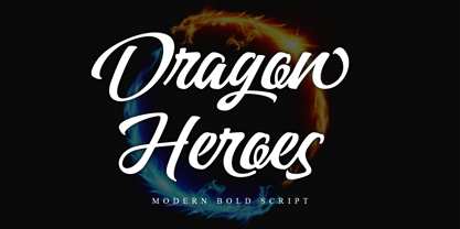 Dragon Heroes is a modern bold script font, carefully handcrafted to become a true favorite. Its casual charm makes it appear wonderfully down-to-earth, readable, and, ultimately, incredibly versatile. This font will look outstanding in any context, whether it’s being used on busy backgrounds or as a standalone headline! This font is PUA encoded which means you can access all of the glyphs and swashes with ease!
 - Blacker Script by Letterara,
$14.00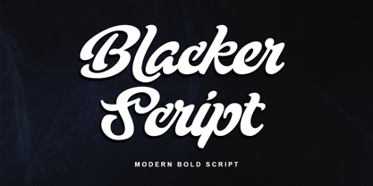 Blacker Script is a modern bold script font, carefully handcrafted to become a true favorite. Its casual charm makes it appear wonderfully down-to-earth, readable, and, ultimately, incredibly versatile. This font will look outstanding in any context, whether it’s being used on busy backgrounds or as a standalone headline! This font is PUA encoded which means you can access all of the glyphs and swashes with ease!
 - Gardening by Letterara,
$10.00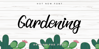 Gardening is a stylish, fun, quirky, whimsical, and incredibly distinct script font. Its friendly feel makes this font incredibly versatile, fitting a wide range of contexts. Whether you’re using it for crafting, digital designing, presentations, or greeting card making, it’s perfect! This font is PUA encoded which means you can access all of the awesome glyphs with ease! It also features a wealth of special features including ligatures.
 - Bodyhand by Bodyhand,
$10.00 The main problem with handwritten fonts is the limited use in body text. Bodyhand is specifically designed to remedy this, for example when designing children's books with a larger amount of text or in similar contexts. Bodyhand is especially adapted to read comfortably even when used in small font size and requires approximately the same space as the fonts we usually use in body text, such as Times or Helvetica.
 - Littler Serifada by Intellecta Design,
$21.90a bold sans serif family with many variants - Ongunkan Younger Futhark One by Runic World Tamgacı,
$40.00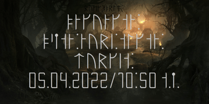 A variant of the young futhark runic script.
 - Adelphi PE by Rosetta,
$70.00 Adelphi is a geometric sans, redefined for the northern side of the English Channel. Typographic modernism was a late arrival in Britain — due partly to the Second World War and to the strong local type tradition. This delay provided for fruitful divergence, thus modernism was not adored in quite the same way as it had been in Germany and central Europe. It was instead rethought and repurposed against the backdrop of the bleak British weather and postwar social reform – a continental fashion statement reshaped into a more humanist variant. Likewise, when crafting Adelphi, Nick Job reimagined the constraints that defined the geometric sans as a genre. Whereas other typefaces seem overly bound by the rules, Adelphi feels relaxed and approachable. Elementary square and circular shapes are merely implied. A keen observer may notice that the uncomplicated letterforms occasionally reveal a subtle naïveté associated with early Grotesques. Brunel’s bridges and Harry Beck’s tube map spring to mind alongside the Bauhaus and Futura. But Adelphi is by no means nostalgic! It is a contemporary, comprehensive, and durable system with a pragmatic set of features. These include a wide array of weights, ‘uniwidth italics’, and variable extenders that go from tall and flat in Adelphi Text to short and sharp in Adelphi Display, with default Adelphi standing midway between these two extremes. You can set the extenders to your preference in the all-inclusive variable font or use one of the three static fonts that come packed together, priced as a single font. The pan-European support for Latin, Cyrillic and Greek scripts already makes for a vast character set, but Adelphi takes things a step further by including alternate glyphs to satisfy the DIN1450 legibility norm, a range of ordinals that can be used to create specialist compositions in all three scripts and two kinds of fractions and arrows. Play with the alternates or use it as-is. Either way, this understated beauty will carry you through.
 - Eubie Script by Dai Foldes,
$30.00 A casual semi-connected script, Eubie Script’s letterforms rise and drop to create surprising word shapes, helped by position-specific ligatures and contextual alternates. With tenacious rhythm and dynamic connections, Eubie Script gives power to your headings and overlays. To meet its design goals, Eubie Script draws from the many lettering styles of Harry Knorr, an artist at Globe Poster for over 50 years. The script’s contours are drawn (impossible to write with any tool) like the work of Knorr, who occasionally cut his captions directly into the printing linoleum backwards without preliminary sketching.
 - Tompouce by Hanoded,
$15.00 A Tompouce (also know as Tompoes) is a typical Dutch pastry. It consists of a thick layer of pastry cream, sandwiched between two layers of puff pastry. It usually comes with pink icing, except on the king’s birthday, when the icing is orange. Tompouce is also a very nice connected script, with a lot of curly letters, some double letter ligatures and all the diacritics you can throw a pastry at. If it is an elegant, yet fun connected script you’re looking for, well… Tompouce may just be what you need!
 - Typist Slab Prop by VanderKeur,
$25.00 The Typist SlabSerif is part of a big family, the Typist Family. The family consists of a monospaced, a SlabSerif and a SansSerif version. The idea behind this family originated from the research into the design of typewriter typestyles, which is also the reason why the monospaced version was released first. Since it was decided from the start to make a SlabSerif and a SansSerif version of these monospaced fonts, it was also a logical consequence that the proportional variants also became available in these versions. The monospaced SansSerif fonts have been given the name 'Code' since they are designed to be used while writing code for a software program, for example. The proportional variants with each 6 weights of the Typist Slab Serif and Code (SansSerif) are now available. Although the name may seem a bit strange, it is a logical consequence from the monospaced variant. The SlabSerif variant therefore has Typist Slab Prop, written in full the Typist SlabSerif Proportional. After all, who wants to be bothered with long font names in their font menu. The entire Typist family is designed as a font for use in editorial and publishing publications. A lot of attention has been paid to the spacing and kerning of the fonts. Due to the many variants and weights, this font is versatile. Typist Font Family was designed by Nicolien van der Keur and published by vanderKeur design. Typist Slab Prop and Typist Code Prop contains each 6 styles (Thin, Light, Regular, Medium, SemiBold and Bold, each weight also designed as a true italic) and has family package options. The links to the monospaced version of The Typist are here: https://www.myfonts.com/collections/typist-slab-font-vanderkeur https://www.myfonts.com/collections/typist-code-font-vanderkeur
