10,000 search results
(0.063 seconds)
- The Quality Brave by Alit Design,
$19.00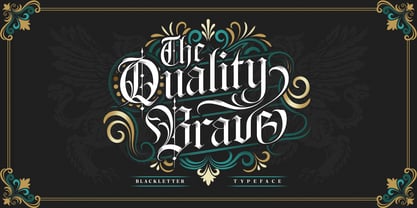 ✒️The Quality Brave✒️is a font inspired by the Blackletter typeface, made with a modern impression but still looks strong and unique. Supported by alternative options such as swash, ligature and alternative characters, making The Quality Brave font very easy to create designs with strong or dark themes. In addition, The Quality Brave font is also supported with multilingual characters that can be used in several international languages. The Quality Brave font is very suitable for use in making music album cover designs, tattoo logos, wishkey labels, packaging pomades and so on which are made with dark and strong concepts.
 - Duck Footprint by AaAAaAlena,
$10.00 This font looks like a natural gel pen handwriting. It supports both uppercase and lowercase Cyrillic and Latin alphabets, numeral, punctuation, symbols, currencies. The story of creating is short: I made a font that would support the concept of the website. And then it seemed to me that this font could have more uses, so I decided to share it. You can use it for any creative project, I’m not going to list examples not to limit you. I am sure that with this font you will convey the vibe you want. Just use imagination, and your masterpiece will look perfect)
 - Millie by Kyle Wayne Benson,
$10.00 Millie is a stressed, geometric script who spends her days as industrial lettering and her nights paired with blackletter on the patches of motorcycle gangs. Millie was weighted by the conventions of broad nib calligraphy, inspired by the Milwaukee Tools logo, and finds herself best used in logos and titles. She was designed to be used on about a 20 degree angle, though she looks just fine on a level plane. By using opentype, many ligatures, and two sets of stylistic alternates, Millie was developed to look great with any string of letters. Access the first stylistic set for a disconnected script look, and the second set for even more connections and fluid script than standard. Millie Round takes the edge off a bit, giving the entire set a more approachable and versatile feel.
 - Victoria Park by kapitza,
$99.00 Inspired by the diverse and dynamic neighborhoods around their studio, kapitza’s most recent work is about observing and recording the transient nature of inner-city populations. This visual research results in vibrant sets of silhouettes with site-specific names like ‘Liverpool Street’, ‘Victoria Park’ and ‘Brick Lane’. This ongoing project charts the visual component of local transformation, managing to reflect something that is deeper, invisible and beyond the surface. These fresh, creative typologies make sense of sensory overload. Though stark and simple, these silhouettes make the increasingly complex connections between people (s) and place(s). Somehow identities are represented in the absence of context and locations are curiously referenced without surroundings. By focusing on an area’s inhabitants, their work highlights distinct subtleties regarding the interplay time and place.
 - Breach by Device,
$39.00 Beach is a geometric stencil font in two variants. Powerful, futuristic and unique.
 - Anulika by Bosstypestudio,
$12.00 Anulika is a new calligraphy font which is fresh, funny, interesting and with a cute heart that can be connected. It is suitable for greeting cards, branding materials, business cards, quotes, posters, and more!
 - Backstay by Ali Hamidi,
$14.00 Backstay is a casual and relaxed single line script font. It matches any branding project such as logos, t-shirt printing, creative products, and more. It will look extraordinary in a variety of contexts.
 - Laureen by aRc,
$10.00 Laureen is a clean, smooth-edge, casual script with many potentials made possible by its 429 glyphs and great legibility. This TrueType font was manually kerned & edited for its semi-connected and informal look.
 - Salut by Monotype,
$29.99 Designed by Heinrich Johannes Machler and released in 1931, the Salut font is a bold, upright connecting script for headline use. Salut is a good face for logotypes where a modern style is desired.
 - Glaudusa by Bosstypestudio,
$12.00 Glaudusa is a new calligraphy font which is fresh, funny, interesting and with a cute heart that can be connected. It is suitable for greeting cards, branding materials, business cards, quotes, posters, and more!
 - Alphonse Mucha by K-Type,
$20.00 Alphonse Mucha is a decorative display font in the Art Nouveau style which originated over a century ago. The font is extrapolated from just nine capital letters in Mucha's 1913 concert poster for the cellist Zdeňka Černý. Letters and numerals are consistently top-heavy, imbuing text with a graceful uniformity and evenness of type color. A full repertoire of Latin Extended-A characters is contained within the font.
 - VG Sans by Vitaliy Gotsanyuk,
$25.00 VG Sans is a distinctive grotesque font that preserves the features of old grotesques while incorporating new conceptual solutions. Working on the font, its shape has been completely transformed, corrected, and the glyph set has been expanded. The font has a light contrast that increases with weight. VG Sans includes 5 weights, 670 glyphs, an extended Cyrillic/Latin character set, multiple stylistic sets, ligatures, numeral sets, and more.
 - Byzantus by Tower of Babel,
$10.00 Byzantus is a versatile blackletter-inspired font that was designed primarily with legibility in mind. Byzantus can be used in many situations that could use a bit of style, whether it be an informal concert poster, or a more formal wedding invitation. Its versatility allows Byzantus to shine in many applications. Byzantus also works well not only as an uppercase/lowercase font, but also as an all caps font.
 - Hawkes by Kimmy Design,
$15.00 Hawkes is an extensive handmade typeface family that comes with a bundle of weights, widths and styles, all designed to work cohesively. Here is a breakdown of the Hawkes family. Hawkes Sans: The primary subfamily is a sans-serif typeface that includes nine fonts: three weights (light, medium and bold) and three widths (narrow, regular and wide). Within this set are an array of stylistic features; including small capitals, character style alternatives, discretionary ligatures and contextual alternatives. See details below for more information on OpenType Features. Hawkes Variable Width Sans: The secondary subfamily is the same base sans-serif fonts but combined in variating widths. Essentially, it takes all three widths of each weight and randomly mixes them together. This creates a funky and creative alternative to the more traditional sans-serif set. The variations are for the uppercase, lowercase, small capitals, ligatures and numbers. Hawkes Script: The last subfamily is the script typeface. It’s a quirky script with variations of its own, including ligatures, swashes and contextual alternatives (again, see below for further details.) The script font works great as a complimentary style to the sans-serif, or on it’s own. FEATURES Alright, let’s get into all the extra goodies this typeface has to offer. Small Capitals: Small caps are short capital letters designed to blend with lowercase text. These aren’t just capital letters just scaled down but designed to fit with the weight of both the lowercase and capitals. With Hawkes, small caps can either sit on the baseline (in line with the base of the capital and lowercase) or to be lifted to match the height of the capital letters by applying the discretionary ligature setting in the OpenType panel. These small capitals have a dot underlining them that sit along the baseline. The feature offers a unique display affect that is great for logos, titles and other headline needs. Discretionary Ligatures: A discretionary ligature is more decorative and unique combination than a standard ligature and can be applied at the users discretion (as the name indicates.) The specific styling for these ligatures varies for different fonts. With Hawkes, they are used as an all capital styling feature, or to lift the small capitals to align with the height of the capitals. In the former setting, both lowercase and uppercase letters are first changed to all capitals, then a specialized set of letter combinations are transitioned so small characters are positioned within a main capital letter. These combinations only happen with main characters that include an applicable stem, such as C F K L R T Y. Some of these combinations include two or three characters. When Small Caps is turned ‘on’, this feature will lift the small caps to the height of the capital letter. For more information, please check out the user guide! Stylistic Alternatives: Stylistic alternates are a secondary form of a character, often used to enhance the look or style of a font. For Hawkes, these alternatives provide a slightly more handmade feel. A - the capital and small capital A will lose its pointed apex and become rounded. Think of it more as an upside-down U than an up-side-down V ;-) Oo, G, Ss, Cc- these characters’ topmost terminal becomes a loop. The O is applied automatically, the G S and C need to be turn on individually. Titling Alternatives: This feature does sort of the opposite of what it intends. Instead of being used for titling purposes, this feature makes the text look better in paragraph text settings. Kk Rr h n m - curved terminals on the are straightened e - the counter stroke also gets straightened from a more looping motion y - the shape of y is changed from a rounded character to a sharper apex (think more like a ‘v’ than ‘u’) Contextual Alternatives: Contextual alternates are glyphs designed to work within context of other adjacent glyphs. With Hawkes Sans, there are three slightly different variations per character. The feature rotates the application of each variation. This helps with organic authenticity, so if you have two e’s next to each other, they won’t look identical (reflecting the natural variations in handwriting and lettering.) With Hawkes Variable width fonts, I have created a contextual pattern that randomizes the widths of each character. So, when the feature is turned ‘on’ in the OpenType panel, the widths would alternate in a pattern such as: Narrow, Wide, Regular, Narrow, Regular Wide, Narrow, etc. It happens automatically so the user doesn’t have to think or worry about getting a random seed. With Hawkes Script, contextual alternates allow strokes to connect properly from one character to the next while maintaining a believable, natural flow. Connecting strokes are present for two letters next to each other but are replaced by a shorter stroke when located at the end of a word or sentence. Some characters have in-strokes when located at the start of a word. When a character is preceded by a capital letter that doesn’t connect, it too needs an in-stroke or altered spacing. This feature is complicated and messy, but luckily you don’t really have to think about it! I’ve done all the coding so all you have to do is turn ‘on’ the feature in the OpenType panel and you are off to the races! I’m just letting you know what’s happening behind the scenes. Swashes: These are just for Hawkes Script and provide tail swashes to the start and ends of letters. There are three different options. You can pick the basic option by turning ‘on’ the swash feature in the OpenType panel, or you can pick using the Glyph panel. Stylistic Sets: This feature work in new versions of Illustrator CC and InDesign CC. You can pick specific styling sets instead of turning on an entire feature. For example, let’s say you want to have a loopy S, but not a loopy C or O, you can just turn on the S in the Style Set. It also helps create the little drop box that pops up when you hover over a character, showing you the alternates associated with that character. This makes it easy to pick and choose specific styles you want in a word or headline. ---------- And there it is folks! That’s all the basic info on Hawkes, I know it’s been a lot and I appreciate you hanging on. If you are like me and need more of a visual reference to accessing all these goodies, I’ve made a user guide to help navigate Hawkes and everything it has to offer. Altogether this extensive family boasts 14 total fonts in a wide array of styles, weights and widths, making it a great addition to any handmade type collection. Enjoy!
 - Reloaded by Almarkha Type,
$25.00 Reloaded - Military Serif Font, first conceptualize was inspired by the classic vintage military stencil design . I wanted a typeface that could be a solid base for any military inspired project Reloaded Fonts can be used for wallpaper, pattern fills, web page background, surface textures. Perfect for making army posters , scrapbooking,invitation cards, stationary, gift wrap, packaging, buttons, pendants, holiday gifts, print on fabrics and so much more.
 - STCO Prescissa by Shaltype Co,
$15.00 Prescissa is inspired by Textualis, also known as textura or Gothic bookhand, which was the most calligraphic form of blackletter, and today is the form most associated with “Gothic”. Written manually by hands, and reform into clean Typeface. Natural stroke from original handwriting. It can be used for just Title or even writing. In this font, you will get : Over 449 Glyphs 12 OpenType features Multilingual languages. Get Prescissa now! It will best use for any design requirement, many fonts will coming with a unique concept. Thank you! Best Regards, FM-STCO.
 - Linotype BioPlasm by Linotype,
$29.99Linotype BioPlasm is a display face created by Italian design Mauro Carichini in 2002. It distorts and deletes parts of letters, creating the appearance of a living, typographic organism in pages of text. Lines set in Linotype BioPlasm seems bubble to the surface, and always hints at some sort of unrevealed secret. Although only parts of most letterforms are visible, the high x-heights of Linotype BioPlasm's letters make its text surprisingly legible for such a concept-font. For usage in products ranging from Sonic to Science, Linotype BioPlasm may be the font for you! - PGF Strange by PeGGO Fonts,
$36.00 Multilayer Roman font with 8 levels, inspired on ’70-80s, it wears sharp edges and compact proportions, with a way fresh contemporary retro volumetric style, ideal for branding & packaging, logotype, headlines, covers, sign letters, label, ticket design, and even 3D lettering. It contains a variety of design resources like stylistic alternates, sensitive case adaptations, old-style numbers, fractions, ordinals, ligatures, localized forms, all of them are accessible via character set panel. Design period: 2019 & 2021. Release: 2021 Graphic interpretation: Pedro González Concept: Bruno Jara Development: Peggo Fonts Foundry.
 - Great Squater Graffiti by Sipanji21,
$10.00 "Great Squater" is a graffiti font with two layers: solid and shadow. By using both of these layers in your design, you can create a three-dimensional (3D) effect on your text. Fonts like this are often used in street art, posters, or other designs that aim to add depth and dimension to their typography. With "Great Squater," you have the flexibility to make your text appear more dynamic and three-dimensional by using different layers. This allows you to customize the text's appearance to fit your design concept.
 - Bogani Gottan by Yeen Studio,
$19.00 Introducing Bogani Gottan This Font can be used for any variety of purposes, such as: Photography, Wedding Invitation, Packaging Product, Logo Type, Brand, and also can be used for personal purpose. This Font Template contains Modern, Elegant, creative, Professional and Unique Concept. FEATURES - Uppercase & Lowercase letters - Numbering and Punctuations - Ligatures - Multilingual Support - Works on PC or Mac - Simple Installation - Support Adobe Illustrator, Adobe Photoshop, Adobe InDesign, also works on Microsoft Word. All images on the demo is just for preview purpose only and not actually included on the files Hope you Like it. Thanks.
 - Houstonville by Veteran Type,
$14.00 Houstonville is the debut letterfrom of Veteran Type. Design by Abdul Rochman a.k.a Veteran Type. This font is inspired by ancient letters in the 19th century. This font is very suitable for designs with ancient concepts, such as print, logo design, and others. This consists of : 20 stylistic set 520 ± glyph count Multilingual support Support for multiple languages Math Symbol Numerals & Punctuation I am very grateful, to my friend and mentor, namely Spencerandsons a.k.a Gilang Purnama, for sharing their knowledge, time, and teaching me. Thank you again Spencer and Sons, always be great !!!
 - Hollister by Arendxstudio,
$18.00 Hollister is a modern script font created with a natural brush. This font is very beautiful when combined with era now design concepts. Hollister comes with OpenType features such stylistic alternates, stylistic sets & ligatures which are good for logotype, poster, badge, book cover, t-shirt design, packaging and much more. Features : Character Set A-Z, Numerals & Punctuations (OpenType Standard), Accents (Multilingual characters), Ligatures, Swashes. There it is! I really hope you enjoy it - comments & likes are always welcome and accepted. More importantly, don't hesitate to send a message if you have a problem or question.
 - Heartwave by Shaltype Co,
$12.00 Heartwave is a handcraft display typeface that's inspired by old signs, 70's posters, and mixed with modern trend design. Build manually by hands, and reform into clean Typeface. Natural stroke from original hand-lettering. It can be used for just Title or even writing. In this font, you will get : Over 276 glyphs, 49 ligatures in 3 OpenType features, Support for 67 languages. Get HEARTWAVE now! It will best use for any design requirement, many fonts will come with a unique concept. Thank you! Best Regards, PUDJI PANGESTOE STUDIOS
 - AT Move Nath! by André Toet Design,
$75.00 NATH !* Is a peculiar typeface. It’s design came by the fascination of Optical Illusions and 3D on a flat surface, like with Holborn and Powerplay. The typeface is named after a girlfriend of André Toet. *Made in the UK, 1974, London (Central School of Art & Design). (Redesigned 2013 by André Toet / Jasper Terra). Concept/Art Direction/Design: André Toet © 2017
 - Bolognia by Craft Supply Co,
$15.00 Bolognia is a classic serif typeface with high-contrast leaning to the concept of contemporary typefaces. Bolognia has a tall x-height value, modern proportion, transitional serif and extreme stroke contrast with vertical stress. Available in 6 weights, this typeface is a good choice to provide clear solutions for a variety of situations and settings such as editorials and headlines.
 - Cascabel by Sudtipos,
$39.00 Cascabel was built on a modular harmony and creates visibly maze-like geometric structures. When typeset in complete words, it conveys an unmistakable architectural approach to a design project. Ideal for magazines, posters or flyers, Cascabel is an alphabet functionally defined by a concept similar to that of building blocks. Designed by Ariel Di Lisio and digitized by Ale Paul.
 - Marlin by Komet & Flicker,
$15.00 NEW! Includes a set of 42 connecting word character glyphs along with 23 alternate lowercase glyphs. MARLIN is a condensed vintage style serif display font that works great for logos, packaging, branding, menus, advertising, and posters. The lowercase letter set has different letterforms allowing you to mix and match upper and lowercase for a variety of looks. In Illustrator, the custom connecting word set can easily be accessed in the "Type → Glyphs" panel and in Photoshop through "Type → Panels → Glyphs Panel".
 - Linotype Dummy by Linotype,
$29.00Linotype Dummy is a part of the Take Type Library, chosen from the contestants of Linotype’s International Digital Type Design Contests of 1994 and 1997. The Canadian artist Tad Biernot based the design of his font on optical illusions like those of M. C. Escher. The reader cannot always exactly decide if a character is twisting toward or away or both. Linotype Dummy is available in black and outline weights and is suited exclusively to short headlines in large point sizes. - Linotype Graphena by Linotype,
$29.99Linotype Graphena is part of the Take Type Library, selected from the contestants of Linotype’s International Digital Type Design Contests of 1994 and 1997. It is a handwriting font designed by the Italian artist Giancarlo Barison. Consciously irregular and erratic, the letters dance across a page, large and small, tilted and erect. Linotype Graphena could be described as angular, restless, even mischievous. It should be set in point sizes no smaller than 12 and is best used for headlines and displays. - Grit Gothic by Baseline Fonts,
$39.00 You can hear the wheels of imagination turning within this font - Grit Gothic, from Grit History™ B Series, by Baseline Fonts. Both highly stylized and very legible, the extreme height of this font can give even a goblin vertigo. Extended X heights create lowercase that adventurously reach up through extended shoulders and spines while persistent grunge warns of skinned knees that may result along the climb. It’s easy to envision children’s rallying cries in Grit Gothic, perfect for book titles, film titles, poster headlines, and any other epic that needs a strong font with a dark edge of mystery and wonder. This font is rife with personality, including large and daunting punctuation, whittled wood-look vertical bars that berate and argue with beveled bowls, ascenders that attempt to intimidate one another with their height variances, and tittles that bully one another, as they're a variety of context dependent sizes. Grit Gothic is available in Regular and Bold with full Greek-lettered foreign language support.
 - Rosalline Handwritten by Ditatype,
$29.00 Rossaline Handwritten is a lovely script font of which characteristics are the connections between letters to look like a naturally connected handwriting that leaves the impression of this font being organically, spontaneously written in order to add a firm personal touch. This font has various line thicknesses to show high letter contrasts to strengthen the font’s firm, clear impressions. Besides, the letters’ height variety, meaning that some of the letters are higher than the others, makes Rossaline Handwritten more interesting and dynamic. However, the connected letters can cause difficulty to read in small text sizes, so that you need to be more careful to use this font by adjusting it to your needs. In addition, you may enjoy the available features here as well. Features: Ligatures Multilingual Supports PUA Encoded Numerals and Punctuations Rossaline Handwritten fits best for various design projects, such as brandings, quotes, invitations, name cards, greeting cards, printed products, merchandise, social media, etc. Find out more ways to use this font by taking a look at the font preview. Thanks for purchasing our fonts. Hopefully, you have a great time using our font. Feel free to contact us anytime for further information or when you have trouble with the font. Thanks a lot and happy designing.
 - Remix by Intellecta Design,
$20.00a typewriter font with many style variations - Star Hound - Unknown license

- Tidy Mom by Seemly Fonts,
$12.00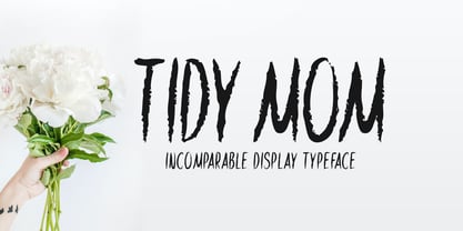 Tidy Mom is a unique display font. This font is a great choice for a wide variety of contexts! It looks stunning on thank you cards, quotes, greeting cards, logos, business cards, and every other design which needs a creative spark.
 - Timework by Seemly Fonts,
$14.00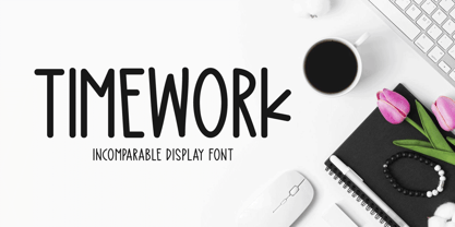 Timework is a unique display font. This font is a great choice for a wide variety of contexts! It looks stunning on thank you cards, quotes, greeting cards, logos, business cards, and every other design which needs a creative spark.
 - Propeller by Gleb Guralnyk,
$15.00 Introducing a script font named "Propeller". This font has a trendy look inspired by vintage aircraft ads. It has connected letters with smooth shape and round endings. Intersecting lines are made with a small overlay that gives a tiny volume effect.
 - Honey Jar by Typefactory,
$14.00 Honey Jar is a bold and modern display font, carefully handcrafted to become a true favorite. This font will look outstanding in any context, whether it’s being used on busy backgrounds or as a standalone headline, especially on natural farm theme !
 - Request by Din Studio,
$29.00 Request is a bold and authentic display font. It celebrates abstract shapes in all their eclectic beauty. This font will look truly outstanding in a wide range of contexts. Featured : Accents (Multilingual characters) PUA encoded Numerals and Punctuation (OpenType Standard)
 - Lawson by Okaycat,
$29.50 Okaycat Font Foundry proudly presents "Lawson"! A retro classic style font, perhaps futuristic, containing European accents. Beautifully connected cursive with high legibility and style for your design, great for print and publication. See the new textured version Lawson Vintage please.
 - New Hotinok 2D by 2D Typo,
$36.00 The type family New Hotinok 2D continues Ukrainian tradition and in the same time connects it with Art Deco style. It is good for presentation, literary, arts and foods, especially sweets and coffee. Connection of geometry and ornamental effect can help in logo design. Includes four styles, Latin diacritics for many languages.
