10,000 search results
(0.148 seconds)
- Arabetics Aladdin by Arabetics,
$34.00 Arabetics Aladdin is a monoshape font family with a fixed single shape per each Arabic Unicode character. Glyphs are designed to incorporate the traditional Arabetic visual characteristics found in all four varying shapes, isolated, initial, medial, and final, for each letter. The overall design also emphasizes the line-like (khat) horizontal look and feel of the Arabetic scripts without sacrificing legibility. This font family supports all Arabetic scripts covered by Unicode 6.1, and the latest Arabic Supplement and Extended-A Unicode blocks, including support for Quranic texts. It includes two weights: regular and bold, each of which has normal and left-slanted (Italic) versions. The design of this font family follows the Arabetics Mutamathil style design principles utilizing varying x-heights and no glyph substitutions. The Mutamathil type style was introduced by the designer more than 18 years ago. The Arabetics Aladdin font family includes all required Lam-Alif ligatures in addition to all soft vowel diacritics (harakat), which are selectively positioned with most of them appearing on similar high and low levels—top left corner—to clearly distinguish them from the letters. The Tatweel or Kashida lengthening character is a zero-width glyph.
 - Khatt by Arabetics,
$39.00 Khatt tries to mimic the concept behind the meaning of the Arabic word Khatt: a straight horizontal line. The word Khatt is also the word for calligraphy in the Arabic language. Even though Khatt is a cursive style font it offers clearly distinguished and visually unified letter shapes in every position of a word. Khatt supports all Arabetic scripts covered by Unicode 6.1, and the latest Arabic Supplement and Extended-A Unicode blocks, including support for Quranic texts. It comes with five weights, regular, medium, bold, light, and ultra-light. Each weight has normal and left-slanted “italic” styles. The script design of this font family follows the Arabetics Mutamathil Taqlidi style and utilizes varying x-heights. The Mutamathil Taqlidi type style uses one glyph per every basic Arabic Unicode character or letter, as defined by the Unicode Standards, and one additional final form glyph, for each freely-connecting letter in an Arabic text. Khatt includes the required Lam-Alif ligatures in addition to all vowel diacritic ligatures. Katts’s soft-vowel diacritic marks (harakat) are positioned with most of them appearing on similar lower or upper positions to emphasize they are not part of letters.
 - Tokoloshe by Scholtz Fonts,
$17.95Tokoloshe is a name in African mythology for a mischievous leprechaun-like figure that loves practical jokes and tricking people. There are many books of such African stories, for example Tales of the Tokoloshe by Pieter Scholtz. The letter shapes that I used in the Tokoloshe font have inspiration from two sources: -- the spiky character of the font was derived from the wonderfully imaginative, wooden carvings of the Makonde people of beings called "shetani". The word "tokoloshe" is used by other tribes, but from his behaviour, he is certainly a type of shetani. -- some of the letter shapes were informed by Art Deco styles of fonts, for example: Kunjani, Black Tie SF, Selznick Normal, Zaire SF, Binner Gothic and ITC Anna. But the Tokoloshe font, like its namesake, is much more freespirited. Use this font whenever you want to suggest the rich artistic, cultural and spiritual heritage of Africa. The font is fully professional in terms of its character set. It contains over 235 characters - (upper and lower case characters, punctuation, numerals, symbols and accented characters are present). In fact, it has all the accented characters used in the major European languages. - Helvetica Monospaced by Linotype,
$42.99 Born in 1831, Hermann Berthold was the son of a calico-printer. On completion of his apprenticeship as a precision-instrument maker and after practical experience gained abroad in galvanography, Hermann Berthold founded his "Institute for Galvano Technology" in Berlin in 1858. Very quickly he discovered a method of producing circular lines from brass and not, as customary at that time, from lead or zinc. The soldering normally necessary could also be dispensed with. The lines were elastic and therefore highly durable. They produced outstandingly fine results. Most of German's letterpress printers and many printers abroad placed their orders with Berthold. His products became so popular that the print trade popularized the saying "As precise as Berthold brass". In 1878 Hermann Berthold was commissioned to put an end to the confusion of typographic systems of measurement. With the aid of Professor Foerster he succeeded in devising a basic unit of measurement (1m = 2,660 typographic points). This was the birth of the first generally binding system of typographic measurement. It is still used in the trade. Hermann Berthold served as the head of the Berthold type foundry until 1888.
 - VVDS Big Tickle by Vintage Voyage Design Supply,
$15.00 To the sound of smooth jazz 50's and incendiary Rock'n'Roll dance of 60's Im glad to Introduce you the new product in my Vintage Voyage — The Big Tickle Font Family! Absolute useful collection! Firstly is playful serif. The range of weights can be used to maintain an even colour across different sizes. Use it normally or all caps and play with baseline, give more bounce to composition. Or try to use Caps alternates and get really bouncing letters. Alternates has every uppercase letter. Also, for more variety I add a few versions for decoration: Inner hatched and Offset with Shadow. Okay, folks! The second one is Script. I really love them, they look like was signed with true brush. It can be perfectly used both independently and in tandem with the serifs. And the last one is Retro Graphic! Authentic collection of typical design elements of 50's and 60's style of Poster, Books or Ads. You can create awesome retro patterns or use them individually. 124 graphic elements total. A-Z; a-z; 0-9. Multilingual. Grab this stuff and have a good time with Mid Century Modern Adventure!
 - Standard CT by CastleType,
$59.00 CastleType was commissioned in 1991 by San Francisco Focus magazine to digitize three members of the Standard family. This is a Continental lineale that was popular in Switzerland in the 1950s and later in the United States. A cousin to the classic sans serifs, Standard is an alternative that is considerably warmer and a bit more idiosyncratic. In 2008, CastleType released additional members of the Standard CT family to make it a complete typographic solution with three widths (normal, condensed, extended) of four weights each (Regular, Medium, Bold, and Extra Bold). Some of the original Standard fonts, particularly Standard Regular, appear to have been hastily designed (or perhaps too closely imitated Helvetica); these have been greatly improved in the CastleType versions with more harmonious proportions and other refinements. The three lighter weights of the Extended subfamily were designed from scratch based on the new Standard CT Regular and Standard CT Extended Extra Bold. More recently, four light weights (Light, Extra Light, Ultra Light, and Hairline) have been added to each of the three widths. The entire Standard CT family includes support for most European languages, OpenType features, arbitrary fractions, and a collection of geometrics, dingbats & fleurons.
 - Ainslie Contrast by insigne,
$35.00 Ainslie Contrast is the newest in the Ainslie series, named for the famous mountain overlooking the Australian city of Canberra. The Ainslie series currently consists of four typefaces. The Ainslie design is very unique and originally began life as a semi-serif. Also available are a normalized sans serif and slab variants. This contemporary typeface’s high contrast catches the eye. The design flows with ease and sophistication. There are a mix of influences from Australia, which gives it a unique flavor. The original Ainslie was designed for the Canberra Australia Centennial Typeface Competition and named for the mountain that overlooks the beautiful capital city of Australia. Ainslie takes Canberra's distinct geometric design and blends it with the organic, flowing essence of aboriginal art and the smooth aerodynamic design of the boomerang. The typeface includes a multitude of alternates that can be accessed in any OpenType application. There are swashes and other details such as small caps, alternative titling caps and swash alternates. If you’re searching for a contemporary high contrast typeface with geometric simplicity and a hint of antipodean flair, Ainslie Contrast is fair dinkum.
 - Aderos by Eko Bimantara,
$22.00 Aderos is a refined and professional slab serif font family that offers a fresh take on the modern and bold aesthetic of its predecessor, Adero. This font family introduces a range of styles that provide versatility and visual impact. With its four width variations – Normal, Extended, Wide, and Stretch – Aderos delivers an exciting array of extreme wide letterforms that command attention. Designed with precision and attention to detail, Aderos is particularly well-suited for branding projects, where it can lend a distinctive and authoritative presence. Its strong and bold letterforms make it an excellent choice for titles and headings that demand impact and legibility. The spacious layout of Aderos further enhances its professional appeal, allowing for clear and organized content presentation. Whether used in print or digital applications, Aderos brings a sense of sophistication and professionalism to a variety of design projects. Its versatility and range of styles make it a valuable asset for designers seeking to create visually compelling and memorable visuals. With Aderos, you can elevate your designs with its refined slab serif style and confidently communicate your message to your audience.
 - Ardentia by Asritype,
$19.00 Ardentia is a serif typeface, supporting a wide range of Latin based languages and Greek (see TechSpecs). Ardentia was created inspired by most serif text font used in book printing. Smooth curves help the flow for long text reading. Ardentia is designed with medium contrast in order to have all parts of the letter’s shape well printable in book size printing, for high or low resolution printers, high or low paper quality. Other than book printing, the medium contrast also gives good visibility in display thanks to its clearness. Thus, Ardentia will work well for both printing and display, webpage or electronic/digital display. Ardentia consist of 4 weights: Light, Regular, Semi-bold and Bold, plus matching italics. The thickness of the lowercases (vertical stem) of the regular font is drawn at about the middle of the thickness of similar kind (serif) and similar size fonts. So Ardentia is the right choice for both textbook and display altogether. Being a normal serif typeface, Ardentia is applicable to a wide range of usage. From book typing, news, magazines notes, cards, sticker texts, banners, to logos and the others design mean. Enjoy using Ardentia for your projects.
 - Nagham by Arabetics,
$45.00 Nagham was designed using uniform glyph thickness throughout and exaggerated letter heights to offer a vertical look and feel. It supports all Arabetic scripts covered by Unicode 6.1, and the latest Arabic Supplement and Extended-A Unicode blocks, including support for Quranic texts. This font family includes two letter spacing flavors: isolated for small text and overlapped for large or display text. The two flavors come with two weights, regular and bold, each of which has normal and left-slanted Italic versions. The script design of this font family follows the Arabetics Mutamathil Taqlidi style utilizing varying x-heights. The Mutamathil Taqlidi type style uses one glyph per every basic Arabic Unicode character or letter, as defined by the Unicode Standards, and one additional final form glyph, for each freely-connecting letter of the Arabic cursive text. Nagham includes the required Lam-Alif ligatures in addition to all vowel diacritic ligatures. Soft-vowel diacritic marks (harakat) are selectively positioned with most of them appearing on similar high and low levels—top left corner—, to clearly distinguish them from the letters. Tatweel is a zero-width glyph.
 - Blorp by Missy Meyer,
$12.00 I had a totally different name assigned to this font at first. Then, while drifting off to sleep one night during the creation process, my sleepy brain said, "You know, BLORP would be a great name to go with these letter shapes." Normally when I have those half-asleep ideas and look at them in the morning, they make no sense. But I decided to make a sample image for BLORP, and it turns out I really like it! So ... BLORP it is! This font is extensively edited for super-smooth lines and curves, so it'll cut like butter in your Cricut or Silhouette machine. Though it's also super cute for print projects, logos, branding, or anything else you want to use it for! It has a funky mix of letter sizes and heights, and two sets of uppercase letters, so you can mix everything together JuSt LikE tHIs, and it'll still look great! BLORP includes over 300 extended Latin characters for language support, including, but not limited to: Catalan, Czech, Danish, Esperanto, Estonian, Finnish, French, Gaelic, German, Icelandic, Irish, Italian, Latvian, Lithuanian, Norwegian, Polish, Portuguese, Romanian, Serbian (Latin), Slovak, Slovenian, Spanish, Swedish, Turkish, Welsh, and more!
 - Jannson Map by RM&WD,
$35.00 For best results, use of OpenType features is strongly recommend. This font is inspired by Johannes Janssonius, well know as Jan Janszoon o Jan Janssonius (Arnhem, 1588 – Amsterdam, 1664), was a Dutch cartographer, publisher and engraver. Married to Hondius's daughter. He was the author of many masterpieces of cartography of the 1700s like Willem Blaeu and Hondius, famous maps with heavy use of decorations in the letterig to fill the spaces of oceans, seas, lakes and scrolls. Now you can easily recreate not just ancient maps without effort, but you can use this font creatively, to make unique, modern logos, product names, fresh packaging, hip fashion outfits, refined labels, signs, coordinated images ... Hundreds of alternatives to choose from and maybe to combine with other fonts in an original way. One extra font with 27 castles in Janszoon style are also usefull for map, of course, but also for many different creative artworks. Warning: Jannson Map having oversized swashes compared to the normal standards cannot be used with Windows Word because Word does not give the possibility to manage the line spacing professionally. Jannson Map works great with applications like Illustrator, In Design, quark Xpress, mac Text etc ...
 - Kreepshow 'Frigid' - Personal use only

- Carelia by My Creative Land,
$29.00 Carelia is a modern multilingual (including cyrillic) serif family with classic forms, enhanced by extended OpenType features. It is well suited for all sorts of design - starting from web, to editorial and branding. Its stylistic alternates, swashes and ligatures (more 1200 glyphs in each font) will make your design even more stylized and unique. Carelia comes in two styles Upright and Italic - each has it's own character but both share the same curves and style. Both fonts are fully unicode mapped - can be used in any application of your choice.
 - Kumba by AukimVisuel,
$9.00 Kumba is inspired by classic typography and brings its own unique style to any design project. This fantastic sans serif font is best suited for headlines of all sizes, as well as for blocks of text that have both maximum and minimum variations. Whether it’s for web, print, moving images or anything else – Kumba will look spectacular. It is a great sans serif font. Whether you’re looking for fonts for Instagram or calligraphy scripts for DIY projects, Kumba will turn any creative idea into a true piece of art!
 - Benacio by Keristyper Studio,
$14.00 Introducing Benacio Display Font is a handmade font style dance and then traces of life to have a Grungy brush and unique calligraphic shape, the writing style is very natural and simple. Benacio Handwriting Font multilingual support: Afrikaans, Albanian, Catalan, Danish, Dutch, English, Estonian, French, Finnish, German, Icelandic, Indonesian, Italian, Malay, Norwegian, Portuguese, Spanish, Swedish, Zulu, and many more. What’s Included : Web Fonts Standard & Multilingual glyphs Ligature Works on PC & Mac Simple installations Accessible in Adobe Illustrator, Adobe Photoshop, Adobe InDesign, even work on Microsoft Word. Hope you enjoy with our font!
 - Corbel by Microsoft Corporation,
$49.99OpenType Layout features: Smallcaps, stylistic alternates, localized forms, standard ligatures, uppercase-sensitive forms and spacing, oldstyle figures, lining figures, smallcap figures, arbitrary fractions, superscript, subscript. Corbel is designed to give an uncluttered and clean appearance on screen. The letter forms are open with soft, flowing curves. It is legible, clear, and functional at small sizes. At larger sizes, the detailing and style of the shapes is more apparent, resulting in a modern sans serif type with a wide range of possible uses. This font is suitable for business documents, email, web design. - Reaktif by Plasebo Studio,
$14.90 Reaktif type family has been created with a new and modern approach to the popular geometric sans serif type. It has a very legible, multifunctional, contemporary and dynamic design. Sharp-angle details in minuscule letters “a, b, d, f, g, m, n, p, q, r, t, u” boosts its' characteristics in the Reaktif font family. Reaktif type family contains 24 fonts and 550+ glyphs. Stylistic alternatives come with 30+ ligatures and many opentype features. It can meet your needs in many medium such as Reaktif branding, editorial, web and printing.
 - Breksit Brush by Keristyper Studio,
$14.00 Introducing Breksit font made from natural brush hand-drawn look, with adventure concept and bold character. This Font is perfect for traveling and adventure design, badges, logos, posters, branding, packaging, signage, book cover. Multilingual support: Afrikaans, Albanian, Catalan, Danish, Dutch, English, Estonian, French, Finnish, German, Icelandic, Indonesian, Italian, Malay, Norwegian, Portuguese, Spanish, Swedish, Zulu, and many more. What’s Included : Web Fonts Standard & Multilingual glyphs Ligature Works on PC & Mac Simple installations Accessible in Adobe Illustrator, Adobe Photoshop, Adobe InDesign, and even work on Microsoft Word. Hope you enjoy our font!
 - Mrs Lollipop by Hipopotam Studio,
$20.00 Mrs Lollipop is a hand drawn narrow typeface designed for one of our books. You can layer different styles over the background style to achieve lots of colorful effects. Check out the manual for details. Mrs Lollipop has upper and lowercase characters with up to three alternate glyphs. Build in OpenType Contextual Alternates feature will automatically set alternate glyphs depending on frequency of appearance of the same character (even in web font but only in HTML5 browsers). The script doesn’t throw random glyphs. It has lines, frames, hearts, stars, ladybird and two rabbits.
 - Stelashild by Skinny Type,
$16.00 Stelashild Duo is a majestic, luxurious and impactful handwritten script font, serif font with clean ligatures and alternates making for a harmonious pair. Handwritten scripts come with a large number of ligatures giving you several options for your designs. Stelashild Duo supports western, southern, southern, and southeastern America. Stelashild Duo is perfect for branding, web titles, logos, quotes, movie titles and more... Promote your next project today with this powerful duo and differentiate your message from the rest. I'm so excited and excited to see what you can do with the Stelashild Duo!
 - Clover Display by FoxType,
$10.00 Clover Display is a Unique Modern Elegant Typeface with Web-fonts which derived from Olive Font Family. It's a very versatile font that works great in large and small sizes. Clover Font would perfect for branding, logos, headlines, Captions. or simply as a stylish text overlay to any background image. Strong capitals and a smooth, open lowercase are effective in a variety of applications. It's shown a clean, minimalist, warmth, quirky, yet still purposed to be versatile and easy to read. 08 Weights with 16 Styles Included. Free updates and feature additions.
 - Destructive Decisions by Chank,
$99.00 Destructive Decisions is a font based upon the inherent flaws of human nature—presented under the guise of complete legibility. At first impression this font is very readable, but upon closer examination you'll notice the edges are fuzzy and some of the lines are off-kilter. You can read it, but it is also a bit foggy. No matter how hard it strives for perfection. This font was originally designed for a cable tv show about substance abuse, but is now available for use in your web and print designs, too.
 - Bogue Slab by Melvastype,
$29.00 Bogue is a slab serif type family of 8 weights and matching italics. Bogue Slab comes with a lots of stylistic alternates that makes it very versatile in various uses like logos, editorial design, branding, web design, package design and much more. You can use it to create short powerful phrases and headlines and also use it in longer text like lead paragraphs and body texts. So if you are looking for a versatile slab serif font you have found it! Bogue Slab is a slab serif version of Bogue
 - Astrobia by Keristyper Studio,
$9.00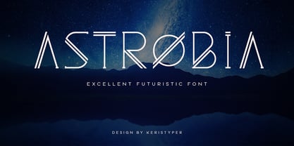 The Astrobia is a modern and futuristic display family with a simple and elegant style. It includes 6 styles in 3 weights, which makes it perfect to create multiple unique designs. Astrobia Font multilingual support: Afrikaans, Albanian, Catalan, Danish, Dutch, English, Estonian, French, Finnish, German, Icelandic, Indonesian, Italian, Malay, Norwegian, Portuguese, Spanish, Swedish, Zulu, and many more. What’s Included : Web Fonts Standard & Multilingual glyphs Ligature Works on PC & Mac Simple installations Accessible in Adobe Illustrator, Adobe Photoshop, Adobe InDesign, and even work on Microsoft Word. Hope you enjoy our font!
 - Evie Sans by KTStudio,
$23.99 Evie Sans was developed in 2020 by Katy Thompson as a typeface to be used for her customisable planner / diary company PLANNER.STUDIO. The fonts have geometric proportions and subtle Art Deco influences in several of the uppercase characters, including a lowered crossbar on the H, lowered middle arm on the F and deepened bowl on the P. The family includes 6 weights in regular, italic and condensed variations, each with 216 glyphs. Evie Sans is perfect for modern branding and logo design, editorial design, web design, packaging and other projects.
 - FF Videtur by FontFont,
$62.99 German type designers Axel Bertram and Andreas Frohloff created this serif FontFont in 2012. The family contains 4 weights: Light, Regular, Medium, and Bold and is ideally suited for film and tv, editorial and publishing, small text as well as web and screen design. FF Videtur provides advanced typographical support with features such as ligatures, alternate characters, case-sensitive forms, fractions, super- and subscript characters, and stylistic alternates. It comes with a complete range of figure set options – oldstyle and lining figures, each in tabular and proportional widths.
 - Gilroy by Radomir Tinkov,
$25.00 Gilroy is a modern sans serif with a geometric touch. A younger brother of the original Qanelas font family. It comes in 20 weights, 10 uprights and its matching italics. The Light & ExtraBold weights are free of charge, so you can use them to your heart’s content. Designed with powerful opentype features in mind. Each weight includes extended language support (+ Cyrillic), fractions, tabular figures, arrows, ligatures and more. Perfectly suited for graphic design and any display use. It could easily work for web, signage, corporate as well as for editorial design.
 - Orleen Arabic by Zaza type,
$24.00 Orleen is an Arabic typeface from Lina type family, with an elegant and modern feeling. It's luxurious, strong, legible, Clear, Simple, and contemporary. With a handful set of OpenType features and alternatives. The design is inspired by the Kufic calligraphic style and influenced by the Naskh style. Lina type family consists of Lina soft, Lina sans, Lina round. and Orleen. Orleen has a wide range of use possibilities headlines, logotypes, branding, books, magazines, motion graphics, and use on the web and Tv. Orleen consists of 7-weight versions from thin to bold.
 - Bassidle by Josstype,
$24.00 Bassidle Font is a sans serif font family that is simple but strong, defined by sharp edges with a modern touch. It is designed to exude a sense of strength and toughness as well as optimal readability. t’s a perfect choice for branding, magazines, posters, advertising, packaging, headlines, logos, web, print etc. 14 styles: 7 uprights and matching italics. 222 glyphs. Latin based languages. OpenType features, including ligatures. OTF, TTF files. Variable Font Includes. Thank you for your purchase! and please let me know if you have any questions. via email: joelpopon@gmail.com
 - Blog Cube by Say Studio,
$17.00 Blog Cube - Display Typeface Blog Cube is a bold and strong display typeface from rectangle shape that is perfect for your work such as posters, logos, branding, covers, banners, t-shirts and headers, or even large-scale artwork. Creative & Decorative Typography Web Design, Try this font on any surface it will look Stunning!. happy creating. hope you like it! well, Blog Cube also has an Outline style, is a strong and bold typeface, it has multilingual language, it is useful for your coolest and coolest project up next. Thanks, Have a wonderful day Say Studio
 - Standard Shaded Sans by Yes Please,
$35.00 The Standard Shaded family is an homage to the grandiose Woodtypes of yesteryear. Standard blends a contemporary sense of craft and proportion with a dash of Woodtype-era personality to keep things interesting. The Standard Shaded family features OpenType conventional ligatures, discretionary ligatures and stylistic alternates as well as a standard set of accents and symbols to provide a versatile end-user experience. The Standard Shaded family has seen action in the print, web and motion arenas for clients such as IFC, Showtime, Nike Women's Training, Nike Sportswear, Target and Starbucks.
 - RealScore Script by NorFonts,
$28.00 RealScore Script was inspired from the old west-coast music copyists. It is a handwritten font coming in 8 weights: Realscore Script Light Realscore Script Light Italic Realscore Script Light Oblique Realscore Script Regular Realscore Script Italic Realscore Script Oblique Realscore Script Bold Realscore Script Bold Italic Realscore Script Bold Oblique RealScore Script fonts can be used with any word processing program for text and display use, print and web projects, apps and ePub, comic books, graphic identities, branding, editorial, advertising, scrapbooking, cards and invitations and any casual lettering purpose… or even just for fun!
 - Blanquotey by Sartstudio,
$10.00 Blanquotey is a simple and modern font. Whether it�s for web, print, moving images or anything else � Blanquotey will look spectacular. This font is very suitable for the needs of branding, logos, technology themes and others. very easy to use and can be installed on any graphics software such as Adobe illustrator, photoshop, Microsoft Office and others. Works on PC & Mac Simple installation Can be accessed in Adobe Illustrator, Adobe Photoshop, Adobe InDesign, and even works in Microsoft Word. Long-term support, Can be accessed completely without additional design software.
 - Quenbach by Brenners Template,
$25.00Quenbach is a classy and geometric font family that includes 36 weights. Especially, this Font family has elaborated the Kerning Process to be useful in Editorial Design. It also supports Cyrillic Basic Charset and OpenType Features including Small Caps. Basically, the glyphs were geometrically designed, and some glyphs were customized to improve readability. Of these fonts, the thin weight font is designed to be thinner than the other products. This thinnest stroke can be useful in editorial design. And Qunbach Condensed Font Family will be used more accurately for editorial and web designer's needs. - Simah Zaza Arabic by Zaza type,
$24.00 Simah zaza typeface - خط سمة ظاظا Simah Zaza is an Arabic typeface that has luxury yet warm and humane feelings. It's legible, soft, clear, flexible, simple, and contemporary. The design is inspired by the Kufic calligraphic style and influenced by the Naskh style. Simah Zaza is highly crafted in order to perform well both on screen and in print. it functions well even on small font sizes. It has a wide range of use possibilities headlines, logotypes, branding, books, magazines, motion graphics, and use on the web and Tv. Simah Zaza consists of five weights.
 - San Marco by Linotype,
$29.99San Marco is a part of the 1990 program Type before Gutenberg, which included the work of twelve contemporary font designers and represented styles from across the ages. Linotype offers a package including all these fonts on its web page, www.fonts.de. San Marco was designed by Karlgeorg Hoefer and brings to mind the style of the Italian Gothic found on the cathedrals of Milan and Florence as well as on the facade of St. Mark’s Cathedral in Venice. Its highly stylized characters make San Marco a good choice for extravagant typography. - Sys 2.0 by FSD,
$60.27Sys is a condensed font designed to work well at small sizes (i.e. phone books, maps, or the like) but it has enough personality to be used at big sizes, too. The TrueType version, thanks to its incredibly accurate hinting, may be used to replace amazingly well TrueType system fonts in every platforms, in web or other screen applications. After the succcess by the first version designed ten years ago, the version 2.0 has numerous improvements in the design of the glyphs, new Unicode ranges, useful OpenType features and enhanced readability. - FF Sari by FontFont,
$65.99 German type designer Hans Reichel created this sans FontFont in 1999. The family has 12 weights, ranging from Light to Black (including italics) and is ideally suited for advertising and packaging, festive occasions, editorial and publishing, logo, branding and creative industries, poster and billboards as well as web and screen design. FF Sari provides advanced typographical support with features such as ligatures, small capitals, alternate characters, case-sensitive forms, fractions, and super- and subscript characters. It comes with a complete range of figure set options – oldstyle and lining figures, each in tabular and proportional widths.
 - Mitram by JAM Type Design,
$14.00 The Mitram family has 7 weights, ranging from Thin to ExtraBold (including italics) and is ideally suited for advertising and packaging, book text, logo, branding and creative industries, small text, way finding and signage as well as web and screen design. Mitram provides advanced typographical support with features such as ligatures, alternate characters, case-sensitive forms, fractions, and super—and subscript characters. It comes with a complete range of figure set options—old style and lining figures, each in tabular and proportional widths. The typeface supports Western, Central and South-Eastern European and Vietnamese languages.
