10,000 search results
(0.027 seconds)
- FM Bolyar Sans Pro by The Fontmaker,
$29.00 This is Bolyar Sans font family. For us it is a dream-come-true. It took more than 1 year hard work to transform the existing Bolyar Pro from Serif to Sans Serif version. The result really surprised even us from The Fontmaker and we decided to develop it in 9 instead of 7 weights. So at the end we created 7 different styles of Bolyar sans each consisting from 9 precise weights. Bolyar Sans is not just another font family in our portfolio - it is the essence from all our efforts thru the past 5 years to create a powerful type tool that could easily meet very diverse and complex demands of modern design. Furthermore, like all its predecessors, Bolyar Sans is a type concept created by Designers for Designers. If you are in wine and spirits industry, packaging design, or you just love to work with strong headlines that effortlessly could turn into brand logos, then you should definitely try our Bolyar Sans. It is designed for this. Of course there are plenty of different features like multilingual support, ligatures, alternates, we even added adaptive over- and underlining to make it even more complex in its use. Bolyar Sans pairs perfectly with other members of Bolyar Family - Pro , Ornate and Typecraft . So as you see Bolyar is developed as a type platform with own character and style. By using it you could be vintage, classic, modern, soft, even bold, rough and ornate. It is a visual bridge between different typographic periods united under Bolyar name. With our Sans version we aim to be contemporary and to provide powerful type tool to those designers who often love to swim between past and modernity.
 - RQND Pro V.2 by Tondi Republk,
$25.00 Introducing RQND Pro 2 - The Futuristic and Industrial Sans Serif Font Welcome to the world of RQND Pro 2, a cutting-edge sans serif font designed to elevate your designs to new heights. With its industrial aesthetic and futuristic appeal, this font is the perfect choice for projects seeking a bold and contemporary look. Key Features: 1,201 Glyphs: RQND Pro 2 boasts an extensive character set, offering you a vast array of design possibilities. Supports 123 Languages: No matter where your audience is, this font ensures that your message is conveyed clearly and effectively. 20 Font Styles: With 5 font weights and 5 font widths, RQND Pro 2 offers 20 unique styles to suit every creative vision. Expanded to Extra Condensed: Whether you need a spacious layout or a compact design, this font delivers unmatched versatility. 18 OpenType Features: Unlock the full potential of RQND Pro 2 with various OpenType features, including small caps, alternate characters, standard numerals, circled numerals, fractions, and more. All Caps Font: Embrace the power of uppercase letters with this font, enhancing the impact of your message. Full Character Set: From standard numerals to punctuation marks, mathematical symbols to special characters, RQND Pro 2 has everything you need for seamless communication. Latin and Cyrillic Support: Perfect for international projects, this font provides complete support for both Latin and Cyrillic languages. RQND Pro 2 empowers designers, creatives, and typographers to explore new design territories. Its sleek and modern appearance makes it ideal for tech branding, UI design, editorial projects, advertisements, web design, and more. Discover a font that combines sophistication with contemporary flair. Elevate your designs with RQND Pro 2 and leave a lasting impression on your audience. Explore the full range of styles and unleash your creativity today.
 - Iwata New Reisho Pro by IWATA,
$199.00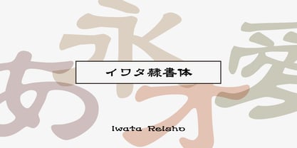 中国で古くから使用されていた伝統的な隷書を源流にする「イワタ隷書体」と、 新しい感覚の「イワタ新隷書体」の2種類があります。
 - MTF Dear Santa Pro by Miss Tiina Fonts,
$9.00 If you’re writing Santa a letter, use this adorable, handwritten childlike font! Dear Santa PRO not only gives you inspiration on how to start the letter, but it also has neat and original characters. This typeface duo also comes with some cute Christmas doodles to complement your writing. Have fun, and create something spectacular this Christmas!
 - Data Error AOE Pro by Astigmatic,
$24.00 The Data Error AOE Family was one of my earliest typefaces, at a time when I had become obsessed with all forms of "digital/techology" typestyles. It's been awhile since the early 2000's, but I've had a hankering for awhile now to revisit this typeface, giving it a more expansive language character set and fill it out with some Opentype features. Inspired by some old printouts of BASIC programs and an Atari 1050 Disk Drive manual with pin printer examples, comes the familiar yet oddly restricted style with this Data Error family. This family comes complete with Regular and Bold versions with their respective Oblique versions. Odd pin printer restrictions inherent in this typeface are: no characters extend below baseline or above ascender line, (except international accents). A nostalgic typeface for computer programmers everywhere, strong and legible at any size, Data Error is perfect for so many purposes, get it today!
 - Novel Sans Hair Pro by Atlas Font Foundry,
$50.00 Novel Sans Hair is the new package of 24 ultra light weights of Novel Sans Pro, the humanist grotesque typeface family within the largely extended award winning Novel Collection, containing Novel Pro, Novel Sans Pro, Novel Sans Hair Pro, Novel Sans Condensed Pro, Novel Mono Pro, Novel Sans Rounded Pro and Novel Sans Office Pro. Novel Sans Hair has a carefully attuned character design and a well balanced weight contrast. Classic proportions and the almost upright italic makes Novel Sans Pro being a modern humanist with the calligraphic warmth of a real italic. Many similarities with the other typeface families within the Novel Collection enable designers to combine the families and reach highest quality in typography. Novel Sans Hair [1020 glyphs] comes in 24 styles and contains small caps, an extra set of alternate glyphs, many ligatures, lining figures [proportionally spaced and monospaced], hanging figures [proportionally spaced and monospaced], small caps figures [proportionally spaced and monospaced], positive and negative circled figures for upper and lower case, superior and inferior figures, fractions, extensive language support, arrows for uppercase and lowercase and many more OpenType™ features.
 - Iwata GKyoukasho Pro N by IWATA,
$199.00 2010年に改定された常用漢字表に対応し、教科書、学習書、参考書などのあらゆる教材に使用できます。 筆やペンの入り、押さえ、ハネ、トメ、筆順などが理解しやすいようデザインしています。
 - Stephanie Marie JF Pro by Jukebox Collection,
$36.99
- Maiers Nr 21 Pro by Ingo,
$42.00 A handwritten ”font for technicians“ from ca. 1900. Very geometrical, rigid forms borrowed from the typical characteristics of Jugendstil / Art Nouveau. This script is found in a magazine from the Otto Maier publishing house, Ravensburg, which was issued sometime in the years shortly before WWI. The magazine is entitled ”Schriften-Sammlung für Techniker: Verkleinerte Schriften der wichtigsten Alphabete“ (Collection of scripts for technical specialists: reduced scripts of the most significant alphabets) and published by Karl O. Maier. The original copy, produced by means of a galvanized plate, is just 7 centimeters wide. It served as the model for technical professions in which, at that time, the captions of drawings were still done by hand. The characters have been scanned, digitized and greatly magnified. Special attention was given to ensure the ”uneven“ edges, typical of handwritten script, remained effectively noticeable even in the digitized form. As a result, this ”technical“ font retains a handmade touch. Especially worthy of note are the Jugendstil forms characteristic at the turn of the19th century. In comparison, many alleged ”ultramodern“ font types of today suddenly look quite old-fashioned. Maier’s Nr. 21 Pro is suitable for all European languages. It includes ”Latin Extended-A,“ for Central and Eastern Europe incl. Turkish, and even Cyrillic and Greek, too. The font includes several stylistic alternates as well as a number of ligatures.
 - Eleme S Sans HBold - Unknown license

- Stocks and Bonds JNL by Jeff Levine,
$29.00 The hand lettered opening title for the 1935 movie “Thanks a Million” is rendered in a condensed, thick and thin Art Deco sans serif design. It is now available as the digital typeface Stocks and Bonds JNL – in both regular and oblique versions.
 - HKF Gold Queen DLC by Harry Kasyanov,
$5.00 Gold Queen is a vintage font family with features opentype with extension svg. Perfect for the vintage tattoo studio logos, barbershops, alcohol labels and many other. Includes a full set of character A-Z, numerals, and punctuation. Product content: HKF Gold Queen Regular - (OTF) HKF Gold Queen Drop line - (OTF) HKF Gold Queen Drop shadow (B&W) - (OTF) Color fonts (available only with Adobe illustrator CC 2018 and Photoshop CC from 2017) HKF Gold Queen Drop line (color) - (OTF SVG) HKF Gold Queen Drop shadow (color) - (OTF SVG)
 - M Gothic Gold HK by Monotype HK,
$523.99 M Gothic Gold HK is a modulated style Traditional Chinese typeface. Modulated font designs have apparent thick-thin contrast at the strokes, and often include special design characteristics at entry, finial and transitional points of the strokes. Modulated Traditional Chinese font design category includes traditional Song, Ming or Fang Song style typefaces which are popular for continuous reading.
 - Gold Year Personal Use - Personal use only

- PR8 Charade - Unknown license

- Pho Twice by Baqoos,
$18.00 Pho Twice is a boisterous neoteric handwritten typeface apt for headline, editorial, branding, packaging, printed materials and typographic applications. 200+ glyphs including punctuation and numerical.
 - Rhinos Pero by Sipanji21,
$20.00 "Rhinos Pero" is a quirky graffiti font that embodies a playful and unconventional style. Fonts in this category often feature eccentric and unique letterforms, incorporating creative elements that deviate from traditional typographic norms. This particular font might showcase irregular shapes, whimsical characters, or unconventional design traits, offering a distinct and unconventional appearance. With its quirky attributes, "Rhinos Pero" is suitable for designs aiming to convey a fun and offbeat visual impression. It could be applied in various creative projects seeking a playful and distinct graffiti-inspired typographic style. **Uppercase
 - MSung PRC by Monotype HK,
$523.99 Song style typefaces originated in the age of woodblock printing in Song Dynasty. Being an essential Chinese type style for printing and publishing all since Ming Dynasty. Based on the Kaishu calligraphic script, its structure has evolved, regularised and standardised with thick stems (豎), thin horizontal strokes (橫) and triangular finials. Dots (點), hooks (勾) and downstrokes retained some features of calligraphy, hence an appropriate choice for continuous reading. The typeface is equipped with a variety of stroke weights, all highly legible .
 - Bros Signage by Blankids,
$20.00 Are you looking for a vintage layering display font? Do you want of creating Something that stand out and inspire creativity, imagination, and endless fun? Wait no more, we will give you the best choice. Bros Signage a Vintage Layered Font Bros Signage a Vintage Layered Font, Inspiring from old signage typography. This font is perfect for a design that makes it more attractive and playful. made with a very good level of aesthetics making this font suitable for book cover, poster, packging, merchandise, logotype and much more. Bros Signage font includes Multilingual Support, among others : Afrikaans, Albanian, Asu, Basque, Bemba, Bena, Breton, Catalan, Chiga, Cornish, Danish, Dutch, English, Estonian, Faroese, Filipino, Finnish, French, Friulian, Galician, German, Gusii, Indonesian, Irish, Italian, Kabuverdianu, Kalenjin, Kinyarwanda, Luo, Luxembourgish, Luyia, Machame, Makhuwa, Meetto, Makonde, Malagasy, Manx, Morisyen, North Ndebele, Norwegian Bokmål, Norwegian Nynorsk, Nyankole, Oromo, Portuguese, Quechua, Romansh, Rombo, Rundi, Rwa, Samburu, Sango, Sangu, Scottish Gaelic, Sena, Shambala, Shona, Soga, Somali, Spanish, Swahili, Swedish, Swiss German, Taita, Teso, Uzbek (Latin), Volapük, Vunjo, Zulu FEATURES : Uppercase Lowercase Number Punctuation Multilingual PUA Encode Opentype
 - Hernandez Bros by Latinotype,
$29.00 Hernández Bros, is a typeface designed by Daniel and Eli Hernández. Born in the year 2021, in the midst of the Covid pandemic, from a collaborative spirit where everything called them to work together as family, in order to obtain better results in such trying times. The Hernández siblings, started a ping pong of drawings based on Bulfinch found in the 1912 ATF catalogue. From this exercise, Hernández Bros was designed, a modern Sans Serif, with 8 weights ranging from Extralight to Black. This is an elegant font, with beautiful and harmonious contrasts, which makes it ideal for titles, brands, editorial design, magazines among others.
 - 19-PRA by ILOTT-TYPE,
$29.00 Inspired by the elegance of Herman Zapf’s designs crossed with the readability of early 20th century Gothic fonts by Morris Fuller Benton, 19-PRA is a sans-serif with a visible stroke contrast and a humanist tone of voice. The large x-height seen in fonts like News Gothic and Palatino increases legibility and condensed proportions give excellent readability making it perfect for newspaper and magazine publishing. A typeface that can serve for both body text and titling the uppercase excels for headlines and renders beautiful brand names when tracked out. It sets well with both a serif or sans serif and has various open type features including: 12 standard ligatures, 3 discretionary ligatures, tabular figures, old stye figures as well as European accents.
 - Mad Props by Graffiti Fonts,
$19.99Classic & clean tag style lettering that's easy to read & flexible. Mad Props includes 2 full alphabets, full numbers, punctuation & other symbols. This style works well with outlines & effects. - Cro Aloha by FontHaus,
$19.95
- Choco Bro by Sipanji21,
$18.00 "Choco Bro" is a cute and chubby display font characterized by truncated or shortened characters. Fonts with truncated characters often feature letterforms where certain parts are cut off or abbreviated, giving them a unique and distinctive appearance. This font can be a delightful choice for various design projects, especially those targeting children's themes or playful designs. The truncated characters add a quirky and playful touch to the font, making it suitable for posters, invitations, children's books, or any project that aims for a fun and whimsical typographic style.
 - Chartu Poo by Enfeeltype,
$15.00 Chartu Poo is a stunning modern sans serif font that exudes a sense of luxury and sophistication. Its futuristic concept is truly unique, and makes it stand out from other fonts in its class. The sleek lines and bold curves of Chartu Poo give it a sense of elegance and refinement, while also conveying a sense of modernity and innovation. One of the things that sets Chartu Poo apart is its versatility. It can be used in a wide range of design projects, from logos and branding materials to website designs and advertising campaigns. Whether you're looking to create a bold and impactful headline, or a subtle and understated body copy, Chartu Poo is the perfect font for the job. Another great feature of Chartu Poo is its readability. Despite its bold and unique design, this font is incredibly easy to read, making it a great choice for both print and digital media. Whether you're designing a brochure or a website, Chartu Poo will ensure that your message is conveyed clearly and effectively. In short, if you're looking for a modern sans serif font that combines luxury, sophistication, and innovation, look no further than Chartu Poo. Its unique and futuristic concept, combined with its versatility and readability, make it the perfect choice for any design project.
 - Banzai Bros by Fenotype,
$20.00 Banzai Bros is a deadly efficient multidisciplinary all-caps assault font. It's highly recommended for posters, signs, flags & banners. Banzai Bros comes with a small set of ornaments. Available as a single font or in packs with other Fenotype fonts.
 - Prop Ten by Galapagos,
$39.00Some years ago we developed a monospaced 12 pitch sans serif for a client. We also created a 10 pitch version that was later discarded. PropTen is the 10 pitch version modified to proportional widths. The name PropTen refers to 'Proportional 10 Pitch'- which is a technical impossibility. It does have a slight 'its time to vote' twist to it. You know, after you pick your candidate you also need to vote yes or no on the following Propositions, don't forget Prop10, the team needs those uniforms. - Bros Rover by Blankids,
$27.00 Introducing a new font is Bros Rover Classic Sans Serif. Bros Rover good for logotype, poster, badge, wedding invitation, book cover, tshirt design, packaging and any more.
 - Poing by Authentic,
$34.50 Poing is an exceptionally elegant script, I took my fathers Penn font and pimped it to a higher level. It is perfect for invitations and business cards.
 - Final Frontier Old Style - 100% free

- Old printing press_free-version - Personal use only

- SF Old Republic SC - Unknown license

- Old Dog, New Tricks - Unknown license

- SF Old Republic SC - Unknown license

- YY Old English Dingbats - Unknown license

- SF Old Republic SC - Unknown license

- SF Old Republic SC - Unknown license

- Ye Olde Block NF by Nick's Fonts,
$10.00Lewis F. Day, in his book Alphabets Old and New, offered this typeface as an example from sixteenth-century England of lettering incised in wood. The font is essentially monocase, but there several lowercase letters are alternate letterforms. Please note that, due to the ornate nature of the letterforms, this font does not contain math operators, fractions or superior numbers. Both versions of the font include 1252 Latin and 1250 CE (with localization for Romanian and Moldovan) character sets. - Scripps College Old Style by Monotype,
$49.00The story of Scripps College Old Style is a heart-warming and inspiring chronicle about a young librarian, a handful of students, a wealthy grandmother, a dedicated educator -- and two eminent American type designers. The story begins in 1938, when Dorothy Drake, the newly hired librarian at Scripps College, a small women's college in southern California, became an impromptu dinner companion of the American type designer Fred Goudy. By the 1990s, the original fonts that Goudy had created for Scripps College in the 1940s had become prized -- but they were seldom-used antiques. Scripps needed digital versions of the metal fonts. This goal posed two immediate challenges: finding a designer familiar with letterpress printing who was skilled at creating digital fonts, and locating the money to commission the designer's services. The first challenge was the easiest to conquer. Sumner Stone was my first and only choice," recalls Kitty Maryatt, the current curator of the Scripps College Press. "I knew he had letterpress experience, was an accomplished calligrapher, and that his typeface designs were simply exquisite. The choice was easy."The second challenge was more difficult. It took the dedication, hard work and tenacity of Maryatt to bring the beautiful Goudy designs into the twenty-first century. While Stone was eager to begin work on the project, the college had no more money for new typeface designs in the 1990s than it did in the1930s. Years of lobbying, cajoling and letter writing were necessary to obtain the college's approval for the design project. Once she had the necessary funding, the design brief posed yet a third challenge. Goudy had provided two sizes of type to the Press: 14 point and 16 point. Which would serve as the foundation for Stone's work? In addition, the Goudy fonts were quite worn. Should Stone use printed samples as his design master, or base his work on the original Goudy renderings? The 14-point master drawings were the ultimate choice, with the stipulation that the finished fonts would provide both a seamless transition from the worn metal versions and a faithful representation of the original Goudy designs. Once the budget and design brief were established, the process of converting the original Goudy drawings into digital fonts took just a little over two months. Stone delivered finished products to Scripps in the fall of 1997. The first official use of the fonts was to set an announcement for a lecture by Stone at Scripps in February of 1998. But the story is not quite finished. Maryatt was so pleased with the new digital fonts, she wanted to share them with the graphic design community. At Stone's suggestion, she contacted Monotype Imaging with the hope that the company would add the new designs to its library. An easy decision! Now Monotype Imaging is part of the story. We are proud to announce the release of Scripps College Old Style as a Monotype Classic font. The once exclusive font of metal type is now available in digital form for designers around the world. " - Cheltenham Old Style SB by Scangraphic Digital Type Collection,
$26.00Since the release of these fonts most typefaces in the Scangraphic Type Collection appear in two versions. One is designed specifically for headline typesetting (SH: Scangraphic Headline Types) and one specifically for text typesetting (SB Scangraphic Bodytypes). The most obvious differentiation can be found in the spacing. That of the Bodytypes is adjusted for readability. That of the Headline Types is decidedly more narrow in order to do justice to the requirements of headline typesetting. The kerning tables, as well, have been individualized for each of these type varieties. In addition to the adjustment of spacing, there are also adjustments in the design. For the Bodytypes, fine spaces were created which prevented the smear effect on acute angles in small typesizes. For a number of Bodytypes, hairlines and serifs were thickened or the whole typeface was adjusted to meet the optical requirements for setting type in small sizes. For the German lower-case diacritical marks, all Headline Types complements contain alternative integrated accents which allow the compact setting of lower-case headlines.


