10,000 search results
(0.025 seconds)
- Geonica by Struvictory.art,
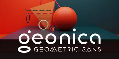
$16.00Geonica is minimalistic geometric sans serif font with different line width. Geonica is suitable for the design on the theme of architecture, game industry, minimalism ect. Geonica includes stylistic alternates for symbols: A, E, K, M, O, Q, T, V, W, g. There are also ligatures: AA, AJ, AM, LA, LM, MA, MM, OO, VV, fi, gg, gi, gj, oo, ri, rr, ti, vv, yy. - British Empire by Alan Meeks,
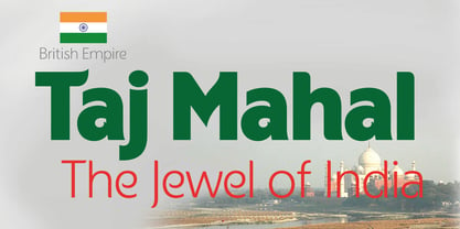
$45.00British Empire is an attempt to re-create some of the typographic characterisics of countries within the former British Empire. It is a sans-serif with unusual up-facing serifs on some of the caps and the lower case round characters have flick round terminals Though designed as a headline face it still works well in limited text. There are four weights with four corresponding italics. - Selene by Flanker,
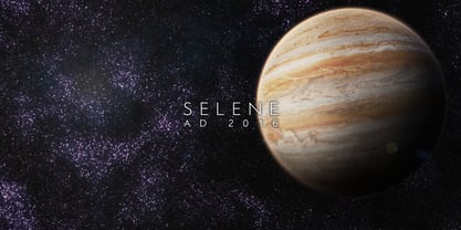
$17.99Selene is a sans-serif font family designed by Leonardo Di Lena. The font is based on geometric forms with as few improving legibility optical corrections as possible. If you need a minimalist font, technical but friendly and elegant, this is your choice. There are glyphs for all languages with Latin, Greek and Cyrillic alphabets, all the basic ligatures, old style numerals and alternates. - Lisboa Hebrew by Vanarchiv,
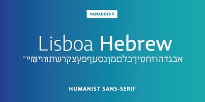
$52.00Lisboa Hebrew is humanist sans-serif typeface base on the same design as the original Lisboa (2005). The main structure is more close to the Sephardic proportions, where the letterforms contains reverse contrast and the terminals following the same calligraphic approach (Humanist). There are some characters and figures designed as small caps which have the same proportions from Hebrew. Latin transliteration characters were also included. - Lisboa Tamil by Vanarchiv,
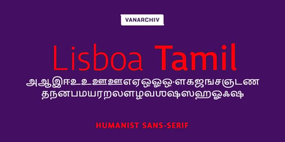
$85.00Lisboa Tamil is a humanist sans-serif typeface based on the same design as the original Latin version (2005). Originally designed for small sizes, this font family can work as display typeface where there own calligraphic style gives elegant low contrast personality between organic and solid design approach. Tamil is an Indic script, spoken in southern India, Sri Lanka and Singapore. Latin transliteration characters were also included. - Santeli by Melvastype,
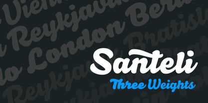
$35.00 - FT Brush by Fenotype,
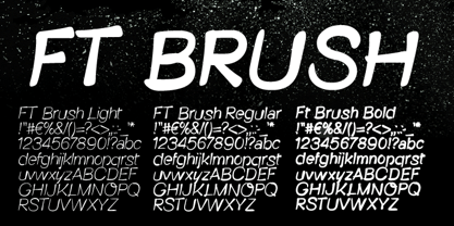
$14.95 - Market JNL by Jeff Levine,
$29.00Market JNL is based on lettering found on a circa 1940s office supply product. There is a distinct Art Deco feel to this font, and it lends itself perfectly to all retro projects. - Atrium by Alex Jacque,
$20.00Atrium, designed by Alex Jacque, is a strong, linear, geometric sans-serif display typeface based off century-old pen art by W.E. Dennis. Atrium's stubbornly geometric letterforms are set off with a few softening flourishes on a few glyphs. It's sharp corners, straight verticals and horizontals make Atrium pack some punch when used in headlines, pull quotes, and logotypes. Atrium was released in 2012 in OpenType format and comes in three different weights: light, regular, and bold, with a regular and oblique version of each for a total of 6 styles in the family. - Dephion by Locomotype,
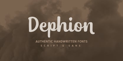
$15.00In many ways, handmade items fit as collectibles, because they look unique and not boring. Dephion is one of the handmade fonts we made to give a casual and natural impression that brings modern style calligraphy made in a very manual way. We want to get out of the habit of seeing perfect font types by making the shape imperfect and irregular. Dephion presents three styles: Dephion Script Regular, Italic and Dephion Sans. You can pair them to create a variety of attractive designs with a sense of casual. - Niemeyer by Latinotype,
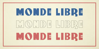
$36.00Oscar Niemeyer is one of the greatest architects of our time—his unique way of mixing straight lines and abstract curves gives rise to an unmistakable and characteristic style. This typeface is my own tribute to Brazilian architect Oscar Niemeyer. The design process started when my wife and I visited Brazil while she was running a series of workshops on calligraphy. In my spare time, I would walk through the streets of beautiful cities like Rio de Janeiro or São Paulo, enjoying the local architecture and urban life. I had also the opportunity to attend to some of the workshops during which I was able to observe the organic of calligraphy and people. Then, I started to draw some shapes that reflected everything about this beautiful place: Niemeyer’s architecture and work and, in his own words ‘the curves on the body of the beloved woman’. This versatile typeface comes in 8 weights with matching italics, alternative characters, oldstyle figures and much more! Niemeyer is well-suited for logotypes, advertising, publishing, branding and corporate use. Special thanks to everyone in the Latinotype Team (especially to César Araya) for their support, help with corrections and digital editing. - Monde Libre by Elyas Beria,
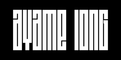
$12.00 - Alt Ayame Long by ALT,
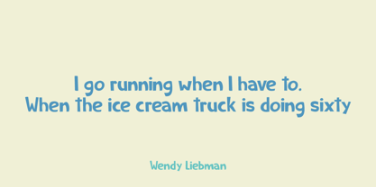
$10.00 - Ice Cream Man by Hanoded,
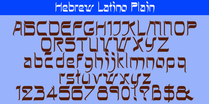
$10.00 - Hebrew Latino by Wiescher Design,
$39.50 - Nakata by Hanoded,
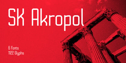
$15.00 - SK Akropol by Salih Kizilkaya,
$9.99 - Griezelig by Hanoded,
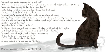
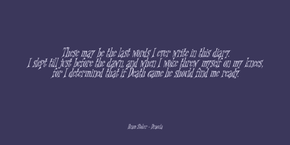
$15.00I love creating fairytale fonts, but for some reason I haven’t made one for quite a while. So, without further ado, I present Griezelig! Griezelig in Dutch means ‘scary’ or ‘creepy’. The word itself even looks kind of creepy! Griezelig was loosely based on two of my favourite (but unfortunately rather inconspicuous) fonts called Hexenhammer and Bronwen. - Raque by madeDeduk,
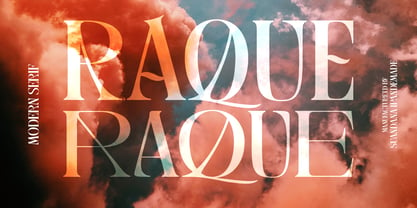
$15.00Introducing Raque is a Capital Modern Serif, use this font for any branding, product packaging, invitation, quotes, t-shirt, label, poster, logo etc. Feature Uppercase & Lowercase Number & Symbol International Glyphs Multilingual support Alternative Ligature Shoot me on email at: dedukvic@gmail.com and find more previews on my Instagram here : https://www.instagram.com/acekelgondolayu/?hl=en Hope you enjoy it. - Vida Bandida by Vozzy,
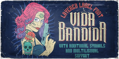
$20.00Introducing vintage label font named Vida Bandida. It is based on my other font, Black Widow. All available characters you can see at the screenshots. This font has six styles: Regular, Full, Shadow, Shadow FX, Texture and Texture FX. This font will look good on any vintsge styled designs like a poster, T-shirt, label, logo, etc. - Probeta by deFharo,
$11.00Probeta is an exclusive Sans Serif typeface family, condensed in proportion into three styles: Regular, Italic & Small Caps. Each family consists of 7 weights (Extra Light, Light, Regular, Medium, Semi Bold, Bold and Extra Bold). Plus three bonus fonts: Circle, Cube & arrows • Includes a bonnus font with the purchase of each style! After defining all the proportions of the new typeface, and starting from the drawing of the lowercase letter «o», in an exercise of minimalist construction, I have built all the characters, contributing with this technique, morphological coherence and a balanced reading. I have put special interest in defining the width of each character, depending on the relationship with others, then the configuration of the metrics and the exhaustive definition of Kerning, provide maximum readability in paragraph texts and titles. The use in graphic design, editorial or advertising guarantees originality and difference. Very versatile fonts for billboards, video games, movie titles, logos, publications, etc. They include the symbol of Bitcoin and other Cryptocurrencies. - FabFours by Ingrimayne Type,
$5.00A tessellation is a pattern in which a shape or tile fits together with copies of itself to fill the plane with no gaps or overlaps. One type of tessellation is formed with sides of center-point rotation, that is, one half of an edge is rotated 180 degrees to form the other half. If a square template is made with sides of identical center-point rotation, there are exactly four shapes that are possible. If these shapes or tiles are fit together not edge to edge but vertex to vertex, the result is a checkerboard-like pattern of tiles and voids. However, the voids have four edges formed by the four possible shapes that the tiles can have, so the voids are limited to the same four shapes that that make up the tiles. The FabFours have 22 tile families that allow a wide variety of fascinating patterns. They form one, two, three, and four tile tessellation. Eleven of the seventeen symmetry groups can be formed with these patterns. In each tile family two of the shapes have two possible orientations, one shape has four possible orientations, and one has eight, for a total of 16 tiles. Each font has two families, one on letters A-P the other on a-p. For some of the families there are also other tiles using the same edge but using triangular and hexagonal templates. To get proper results, the leading must be set equal to the point size of the font. I discovered these fabulous families and their decorative possibilities as I was working on a book about tessellations. I have not been able to find anyone else who has written about these families of four and their decorative possibilities when arranged vertex to vertex. - Celtic-BA by Bannigan Artworks,
$19.95This is my interpretation of the writing in ancient Celtic manuscripts such as the Book of Kells. - Sadey Ann by Borges Lettering,
$35.00 - Rosa Love by PizzaDude.dk,
$20.00Rosa Love is a laid back and legible handwritten font. Dedicated with love to my daughter, Rosa! - Easy Game by PizzaDude.dk,
$18.00 - Drum Shake by PizzaDude.dk,
$16.00 - Config Rounded by Adam Ladd,
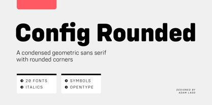
$25.00Config Rounded is a condensed geometric sans with rounded corners. Config’s sibling, this typeface was influenced by geometric sans with circular forms on the tops and bottoms of characters, but the proportions have been condensed by incorporating straight sides for a design that is efficient yet friendly. Use it for a subtle softness that still looks modern and strong. With 10 weights, there are options to fit the need—black and thin for extreme uses and intermediates for more common needs. - Instrumenta - Personal use only
- Stripelane - Personal use only
- Polymoda - Personal use only
- Hertzace - Personal use only
- Básica-Unicode - Personal use only
- Gravitron - Personal use only
- The·Fire - Personal use only
- YT Deal Latin by Yangtype,
$9.00The concept of this letter is calmness. I created a variety of sans-serif fonts, and when I listed the fonts I had created, I was surprised that their shapes were not very different from each other. Among them, this font calmly caught my eye. The power of quiet progress is felt in this unremarkable form. - Comforting Sounds by PizzaDude.dk,
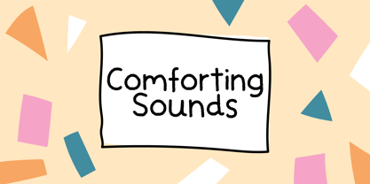
$17.00Sometimes the way forward is simplicity. That goes for your personal life as well as designing. Sometimes what catches the eye is something simple. My Comforting Sounds font is a handmade sans serif font. It has a crunchy line, an organic look and legibility even at very small sizes. And in a charming way, it is quite simple! - Corpo Serif by Borutta Group,
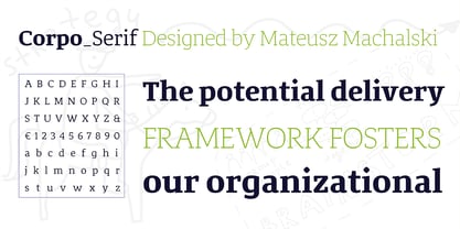
$19.00Corpo Serif is REFRESHED version of my old font Korpo Serif. Corpo Serif, designed by Mateusz Machalski, is a serif type family with a friendly feel. This type comprises 12 variants with 6 weights. The high contrast and high x height is perfect for headlines and display uses. Corpo Serif is a great complement for Corpo Sans. - Norma by Linotype,
$29.99Norma was my second sans serif. You can find a few details in common with Dialog, but the graphic impression of Norma is totally different.Every typeface has some characters that are the favourites. In Norma I simply love the lowercase roman a. Don't you, too, think that it is perfection itself? Norma was released in 1994. - Kopi Senja by Orenari,
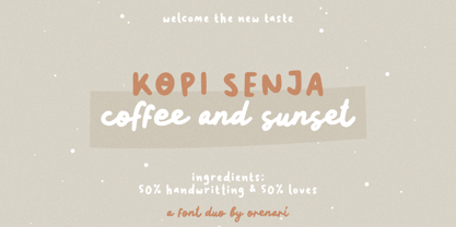
$10.00Kopi means coffee, and Senja means sunset. The inspiration of Kopi Senja Font Duo is indie music fans. Every curves of the character is originaly drawn by my hand with heart. Kopi Senja has sans and script version, mix and match it with your own imagination. Be creative and make your project stand out with Kopi Senja.
