10,000 search results
(0.036 seconds)
- Amoonk by Product Type,
$18.00 techno, fancy, racing, super, movie, race, superhero, tech, film, automotive, calendar, font, motor, running, typography, futuristic, speed, drive, display, fast, power, action, game, branding, logotype, rally, sport, modern, car, esport
 - Tweed SG by Spiece Graphics,
$39.00 Tweed is a journey into the 1930s world of hand-lettering. The design looks very much like the personal scribblings of an old-fashioned cartoon animator. It’s the sort of sketch-style you might find describing a goofy caterpillar or laughing willyworm. Tweed is fun and light-hearted with open and rounded letters of a somewhat musical quality. Derived from old letterforms popularized by Carl Holmes in his wonderful book on the subject, Tweed is basically friendly in nature. This typeface is great for personal greeting cards and stationery - any kind of casual correspondence. It works well in display situations, too. And yes, there is an alternate to the funny-looking “w” character. Just press option l (el) on Mac. Or Alt 0172 on Windows. Tweed is now available in the OpenType Std format. Some new stylistic alternates have been added to this OpenType version. Advanced features work in current versions of Adobe Creative Suite InDesign, Creative Suite Illustrator, and Quark XPress. Check for OpenType advanced feature support in other applications as it gradually becomes available with upgrades.
 - ITC Medea by ITC,
$40.99The designer of ITC Medea , Silvio Napoleone said: “I've always had an interest in early letter shapes, particularly how they influenced modern typographic designs. While I was on vacation in Greece, I had a chance to see, first-hand, examples of early letterforms and typography. They really made an impression on me.” The idea of combining the ancient and the modern to create something new was the primary inspiration behind ITC Medea. ITC Medea is essentially a careful blending of the modern sans serif with the elegant forms of the uncial. At first glance, Medea appears to be constructed of geometric shapes. However, closer inspection reveals many calligraphic subtleties. Stroke terminals are flared slightly in characters like the 'e' and 'c.' The top curve of the 'd' is more pronounced than the bottom, and characters like the 'o' are elliptical rather than round. “I gravitated towards the simplicity and legibility of the uncial and half-uncial,” Napoleone recalls. “I thought it would make a great titling font, and I was surprised at how attractive ITC Medea looked in a body text.” - As of my last update in early 2023, the font named "Insert 2 by 2 The Left Typefaces" doesn't appear to be a widely recognized or documented typeface in popular type design references or font librari...
- LeakorLeach by Ingrimayne Type,
$9.95 An early drawing tablet was largely responsible for the LeakorLeach typefaces. They resemble hand lettering using cake icing or done with an ink pen that leaves lots of ink blobs or ink blots. The family has two widths, plain and condensed, and in addition to each having an oblique style, each also has a leftward-inclined style. There may not be many uses for a leftward-inclined typeface, but for those needing one, the LeakorLeach family offers two. The LeakorLeach typefaces are unlike any other faces from IngrimayneType.
 - Architype Ingenieur by The Foundry,
$50.00 Architype Ingenieur was inspired by Wim Crouwel’s late 1950s exhibition catalogues and posters, for which he had created a few geometrically constructed, simplified letterforms. In the 1960 Venice Biennale Dutch entry poster, he drew grid-based letters with 45-degree angles for ‘olanda’, the style influenced by his boyhood fascination with naval lettering. A subtle variation appeared in the Stedelijk Museum catalogue for painter Jean Brusselmans. Several dot matrix versions followed. The themes and systems in these early letterforms are encapsulated in this new four weight family Architype Ingenieur.
 - Mochaik by Say Studio,
$15.00 Mochaik - Psychedelic Display Font Here's a lettering style that just might be exactly on your wavelength. Add just the right dose of vintage freak-a-delia to your retro graphics with this original psychedelic-style design. Great for music posters, album graphics, book titles, etc. Evoke a warpy, wavy, whimsical vibe that harks back to the carefree 1960s or early 1970s era with Sixties Flashback; it's pure hippie, trippy fun! Whats Includes : - Mochaik Regular, Outline, Italic - Multilingual Support If you want any Question, let me know Have a wonderful Day, Saystudio
 - Academy by ParaType,
$30.00 Academy was designed circa 1910 at the Berthold type foundry (St.-Petersburg). It was based on Sorbonne (H. Berthold, Berlin, 1905), which represented the American Type Founders rework Cheltenham of 1896 (designers Bertram G. Goodhue, Morris F. Benton) and Russian typefaces of the mid-18th century. A low-contrast text typeface with historical flavor. The modern digital version was designed at Poligrafmash type design bureau in 1989 by Lyubov Kuznetsova. Corrections and additions were done later in ParaType in early 2000th. Reworked version with Bold Italic style was released in 2009.
 - Florati by Proportional Lime,
$19.99 Can you imagine the delight that the printers of the Incunabula era would have had if they had such a tool as this font with a hundred and fifty glyphs of decorative capitals. The printers of that era were lucky to have more than a handful such delights. These Decorated initials and drop caps are all based on early period exemplars, dating to prior to 1525, from a wide range of printers such as Thomas de Blavis to Günther Zainer. Every Proportional Lime Font comes equipped with a complete character map.
 - HWT Catchwords by Hamilton Wood Type Collection,
$24.95 Catchwords have always been offered alongside standard alphabets in wood type catalogs and so often appear on posters as a decorative punch that they have become part of the wood type vernacular. Words like 'The', 'And', 'To', 'For', and less common abbreviations could be inserted into a design along with decorative ornaments or stars when space was tight or to add variety in the design. HWT Catchwords features over 80 words based directly on designs offered by Hamilton and other wood type manufacturers of the 19th and early 20th Century.
 - Thorowgood by Linotype,
$29.99Thorowgood was originally released by the Stephenson Blake typefoundry in the UK. The types were first cut by the English typefounder Robert Thorne, predecessor of William Thorowgood, and first shown in his specimen books in the early nineteenth century. The fat face was revived in roman (1953) and italic. The S and the C appear to be smaller than the other capitals. Most serifs are flat and thin horizontals. In the italic the main strokes of h, k, m, n, and r are curved inwards at the foot. - Defused - Personal use only

- PetalGlyph - Unknown license

- Al Manverse Norm by Aluyeah Studio,
$95.00 Hallo Aluyeaholic! Introducing Manverse, a bold manly typeface. Inspired by the things that make up the world of men. With a bold, strong, and firm vibe. Coming with 2 styles, all caps and multilingual support. Very suitable for magazine, headline, website, ads, product package and all type of design project you have. Thanks for checking out my font. I really hope you enjoy using it! If you have any questions I'd be more than happy to answer them, just send me a message!
 - Kattys by Flawlessandco,
$9.00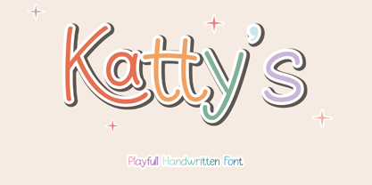 Introducing "Kattys" - a delightful and playful handwritten font that adds a touch of whimsy to any project. An Original typeface that suitable for any graphic designs such as branding materials, t-shirt, print, business cards, logo, poster, t-shirt, photography, quotes .etc This font support for some multilingual. Modern Sweet Retro that contains uppercase A-Z and lowercase a-z, alternate character, numbers 0-9, and some punctuation. If you need help, just write me! Thanks so much for checking out my shop!
 - Casuallity by Zamjump,
$17.00 Introducing “Casuallity,” a stunning calligraphy-style font meticulously crafted by hand, designed to infuse elegance and charm into your creative projects. Casuallity Font embodies a perfect blend of fluidity and sophistication, making it an ideal choice for a wide range of design applications, including logo design, branding, book covers, and more. __________________________________________________________________________________ HOW TO ACCESS THE ALTERNATIVE CHARACTERS Open the glyph panel: In Adobe Photoshop go to Window – glyphs In Adobe Illustrator, open Type – glyphs Follow my shop for upcoming updates thank you
 - Grasond by Just Font You,
$19.00 A new reopening of an Art-Deco gate. Different vibes of the Gatsbyesque era, sculpted with the touch of lavish modernism for an everywhere and every timeline of the multiverse purpose. Inspired by the purpose above, here's an attempt to resurrect the great from the past. Please welcome, GRASOND. A vintage art-deco display sans serif fonts. Perfectly fit for your luxury branding, logo, vintage design, beer labels, signage, anytime you need a massive throwback, please, be my guest, oldsport.
 - Joufflou NF by Nick's Fonts,
$10.00REALLY fat faces seem to be popular these days, so here's my take on one. The strokes have been expanded to the brink of illegibility, but the letters remain distinguishable, especially in context. Also included are alternate versions of the letter A—suitable for use as first and last letters in a word— in the ASII circumflex and ASCII tilde positions. This font contains the complete Latin language character set (Unicode 1252) plus support for Central European (Unicode 1250) languages as well. - American Beauty by Bilberry Create,
$17.00 Meet my new AMERICAN BEAUTY calligraphy script. This handwritten script has been attentively written, with gentle curves to produce a font thats completely distinctive and original. Perfect for adding a elegant and unique touch to your lettering projects and branding Also with their help, you can create a Wedding lettering or beautiful frame for your home. Or just use for your small business, book covers, stationery, marketing, magazines and more. Zip included: - American Beauty OTF - American Beauty TTF - American Beauty MULTILINGUAL
 - Woly Wonka by Flawlessandco,
$9.00 Introducing "Woly Wonka" - A Display Sans Font. Step into a world of whimsy and imagination with "Woly Wonka," a captivating display sans font that adds a touch of playfulness to your designs. There's some connected letters and some alternates that suitable for any graphic designs. This font support for some multilingual. Also contains uppercase A-Z and lowercase a-z, alternate character, numbers 0-9, and some punctuation. If you need help, just write me! Thanks so much for checking out my shop!
 - Flower Island by Flawlessandco,
$9.00 Flower Island - A Playful Bubble Display Font. Immerse yourself in the whimsical world of Flower Island, a delightful bubble display font that adds a touch of fun and playfulness to your designs. There's some connected letters and some alternates that suitable for any graphic designs. This font support for some multilingual. Also contains uppercase A-Z and lowercase a-z, alternate character, numbers 0-9, and some punctuation. If you need help, just write me! Thanks so much for checking out my shop!
 - As of my last update in early 2023, there is no widely recognized or mainstream font specifically known as "Veruca." It is possible that Veruca could be a custom or less widely distributed typeface, ...
- Tailwind by Grype,
$19.00 The world of aviation is filled with clean and iconic logotypes, yet some of the earlier logotypes were friendly and simple. The Tailwind family finds its origin of inspiration in an early Air Jamaica company logo, and from there is expanded into a small but comprehensive font family. Tailwind celebrates the typographic stylings of the 70’s, with the soft rounded terminals and open geometric feel, transcending its brand inspired origin to give birth to a family that feels both retro and modern. It inherited the friendly stylings of the mostly lowercase logo that inspired it, and goes on to include a full standard character set with expansive international support of latin based languages, small caps styles, and three weights jumping from light to regular to a heavyweight black. This family is ready to chart a course for your designs towards that of a modern, comfortable appeal. Here's what's included with the Tailwind Collection bundle: 382 glyphs per style - including Capitals, Lowercase, Numerals, Punctuation and an extensive character set that covers multilingual support of latin based languages. (see the 6th graphic for a preview of the characters included) 6 fonts in 3 weights: Light, Regular, Black . Small Caps versions available in all weights. Fonts are provided in TTF & OTF formats. The TTF format is the standard go to for most users, although the OTF and TTF function exactly the same. Here's why the Tailwind Collection is for you: You're in need of a soft rounded font with a variety of weights with small caps for your designs You're a retro airline junkie and have to have anything inspired by Air Jamaica You love VAG Rounded, but you really want something just a little different You really dig the Akademics & Bloomingdales logos, but would like a softer type in that genre You just like to collect quality fonts to add to your design arsenal
 - Pixel Engine by Sronstudio,
$23.00 Unleash a nostalgic vibe with 'Pixel Engine', a font that pays homage to the golden era of gaming. This pixel-inspired typeface effortlessly blends the charm of retro aesthetics with a touch of modern design. Ideal for gaming logos, pixel art, or any project that craves a vintage arcade feel, 'Pixel Enginel' brings a playful nod to the past while staying firmly rooted in the present. Features: - Uppercase & Lowercase - Numeral & Punctuation - PUA Encoded - Multilingual support - Simple Installation - Work both on Mac and Windows Thank you very much :)
 - Victorian by ITC,
$39.00Freda Sack and Colin Brignall collaborated to produce the Victorian typeface. Their work was inspired by late 19th century display letterforms, and they sought to create a new ornate font in the same style. Victorian superbly reflects the refinement of the late 19th Century. Victorian Inline Shaded was designed by Nick Belshaw. He was inspired by late 19th century display letterforms, and sought to create a new ornate font in the same style. Victorian Inline Shaded superbly reflects the refinement of the late 19th Century. - Plakato Pro by Underware,
$50.00 Plakato, a stencil love affair Plakato is a family of display fonts, consisting of various eye-catching styles, each of them very bold. Plakato is an identity toolkit, a heavyweight building block in case you need a strong personality, a small stencil font family to cut out your best ideas and grab all the attention. But just as with many other creations, its outcome is as divers as its multiple origins. Plakato comes in 16 eye-catching styles. The default stencil style comes in Regular & Italic. They both have 2 variations: one version, named Plakato Stencil, automatically creates borders around the text, putting any text into a graphic stencil in this way. Another version, the extruded three-dimensional version, guarantees even more attention for your message. Next to this there is also the Inline version, which is an optical play with a lot of lines. Plakato Inline has a supportive background layer, a separate font in case you want to add a background in a different colour. Then there is Plakato Paper, a manually teared version of Plakato offering a more physical look. This small family of eye-catching display fonts also contains a Neon font, an independent design in Plakato style, which can actually be used for making neon signs due to its construction. Plakato Neon comes with its own Dingbat font for that extra flush-flush. Plakato has also been redrawn on a C64, and with all its accompanying limitations been ported back and turned into a font: Plakato Game. Also this font comes with its own Dingbat font, full of emoji’s and icons for oldskool pleasure. Last but not least there is Plakato Build, constructed out of blocks. As if that wasn’t enough, there are various dynamic versions in the Plakato Play package, which offer a whole new range of possibilities for typographic expression, with new animation and interaction opportunities.
 - Ambiguity by Monotype,
$50.99 Ambiguity is a type family with five distinct personalities or ‘states’, created as a tool for coaxing designers and brands out of their comfort zone. It embraces both tradition and radicality, as well as generosity and thrift, encouraging us to question our beliefs about the intersection of style and meaning. The family is designed by Charles Nix, who describes Ambiguity as “as much thought experiment as typeface.” Its five states—Tradition, Radical, Thrift, Generous and Normate—each express or subvert different aspects of typographic tradition. Tradition is conservative, relying on historical letter shapes. Radical rejects inherited ideas of proportion, making typically slender letterforms wide, and wide letterforms slender. “It’s contrarian,” says Nix. Thrift cherry picks the condensed shapes from Tradition and Radical, while Generous does the same for wide forms. Normate sits at the center, a synthetic blend of all of the others. “Tradition is very comforting,” says Nix. “It’s the mask of conservatism. It’s calming because it delivers the proportions we expect. With Thrift more fits into a smaller space, so it’s great where words want to get large, like gigantic headlines, or text needs to cram in, like small screen type. You get a sense of carefree and luxury from the Generous cut. One would expect the Radical to be used in a sort of Dadaist way, but in a classic context it provides an enjoyable jolt.” Ambiguity is a litmus test. Designers could spend hours trying on typefaces that offer just one of these voices. Ambiguity provides five different personalities—ideas—beliefs—each of which also work seamlessly together. “It’s a palettea, like idea cards,” he says. “It’s a way of making yourself see differently. My hope is that traditionalists will try on radical clothes and vice versa. It’s a way of exploring outside your comfort zone, breaking out of the doldrums, by stepping through a variety of voices.”
 - Tourist Spot JNL by Jeff Levine,
$29.00 Tourist Spot JNL is the same lettering style as Old Tijuana JNL, but with the squiggly inside lines stripped away. The original design was modeled from the hand lettered title on the cover of the 1939 sheet music for "Class Will Tell" and is available in both regular and oblique versions. Casual and playful in nature, the font can be used by itself or combined with Old Tijuana JNL for any project that promotes festive occasions.
 - Aragon Sans by Canada Type,
$24.95 Designed as a companion to its roman namesake, Aragon Sans is a novel approach to the humanist sans serif. Using the underlying blueprint of true and trusted 16th century forms, its humanism is deeply rooted in fine typographic tradition. By also using the same idea as its roman counterpart, where the stems gradually thicken as they go higher, it becomes a unique breed of sans serif, conservative, and legible in small text, and attractively modern in titling setting.
 - Momotaro by Hanoded,
$20.00 Momotarō is a Japanese legend about a boy who came to earth inside a giant peach. He was found by a childless woman and grew up to be a hero. I'm in a Japanese mood - mainly because lately I have been working with brushes and ink a lot. Momotaro font is a very detailed brush font. It doesn't come with a hero inside a giant peach, but it does give your design work that extra oomph, ahh and wow.
 - FF Elementa Rough by FontFont,
$47.99 Lithuanian type designer Mindaugas Strockis created this display FontFont in 2002. The family contains 2 weights: Regular and Bold and is ideally suited for advertising and packaging, film and tv as well as software and gaming. FF Elementa Rough provides advanced typographical support with features such as alternate characters, case-sensitive forms, and stylistic alternates. It comes with tabular lining figures. This FontFont is a member of the FF Elementa super family, which also includes FF Elementa.
 - FF Droids by FontFont,
$41.99 Dutch type designer Donald Beekman created this display FontFont in 1999. The family has 6 weights, ranging from Light to Bold (including italics) and is ideally suited for music and nightlife, poster and billboards as well as software and gaming. FF Droids provides advanced typographical support with features such as ligatures and case-sensitive forms. It comes with proportional lining figures. This FontFont is a member of the FF Droids super family, which also includes FF Droids Sans.
 - Gatara by Tour De Force,
$30.00 Gatara is serif font family with elements of Didone available in 6 weights and matching Italics. It is high contrasted typeface with some distinctive details such as stemmed shape of “h”, “n”, “m” and “a” letters, unique “f” and “k” in same style. Comes with Standard Ligatures and Fractions with Extended Latin character map. As Gatara contains dose of decoratively design, beside editorial use, branding or web font usage, it can be used effectively for titles as well.
 - Comet Bloom by Scratch Design,
$14.00 Comet Bloom is an abstract geometric font that has a unique style, modern but has nostalgic vibes. It is a carefully crafted design that combines modern style with retro style to make the font more aesthetic. This font will be suitable for logo design, packaging, eye-catching headlines, branding, urban and retro style design, game and movie posters, and other dynamic designs. What you'll get: Uppercase and lowercase Numbers & punctuation Multilingual support Unique Kernings Hope you enjoy our font!
 - Spilled Ink by Michael Rafailyk,
$15.00 Spilled Ink is a handwritten typeface designed to complement illustrations. Inspired by the idea of spilled ink that spreads and fills the shape of letters. Therefore, the symbols do not have sharp corners and looks smooth, soft and cute. Spilled Ink is intended for use in headlines, so lowercase have the same height as uppercase, allowing them to be used as alternates. Make your stories fabulous with Spilled Ink! Scripts: Latin, Greek, Cyrillic, Hebrew Language count: 480+
 - Devil Tail by Attype Studio,
$14.00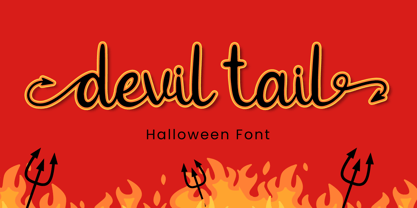 Devil Tail is a delicate and incredibly distinct handwritten font. Fall in love with its incredibly versatile style and use it to create spectacular designs! Devil Tail is perfect for branding, logo, invitation, stationery, social media post, product packaging, merchandise, blog design, game titles, cute style design, Book/Cover Title and more. What's Included : - Devil Tail.otf - Beginning & Ending Swash - Multilingual Support (Afrikaans, Albanian, Catalan, Danish, Dutch, English, Estonian, Finnish, French, German, Icelandic, Italian, Norwegian, Portugese, Spanisch, Swedish, Zulu)
 - Ratushy by Sealoung,
$19.00 Ratushy is a serif-based display font with lowercase letters that have connecting characters for a unique look and crafted with care that will make your designs stand out and modern. You can use this font for any purpose, especially to make your business more attractive. This font is also suitable for sports, e-sport logos, games or hi-tech company logos. This font also supports multilanguage. Featured Fonts: Uppercase Lowercase Numbers & Punctuation Accented characters: ÀÁÂÃÄÅÆÇÈÉÊËÌÍÎÏÑÒÓÔÕÖØÙÚÛÜÝÞŒŠŽßàááâãäåæçèéêëìíîïñòóôõöøùúûüýþÿœš ž
 - WORKSHOP Pencil by Posterizer KG,
$19.00 WORKSHOP Pencil is one more of WORKSHOP handwritten fonts, created to imitate a manuscript written with crayon or pencil. You can use the alternates and ligatures to give your design a realistic, hand painted look. If you find a single repeating glyph, you can change that by toggling between Stylistic Alternates. There are Cyrillic glyphs and few Dingbats in the same style. WORKSHOP Pencil is the perfect choice for children's literature, posters and other naturaly beautiful things.
 - FF Droids Sans by FontFont,
$41.99 Dutch type designer Donald Beekman created this display FontFont in 1999. The family has 6 weights, ranging from Light to Bold (including italics) and is ideally suited for music and nightlife, poster and billboards as well as software and gaming. FF Droids Sans provides advanced typographical support with features such as ligatures and case-sensitive forms. It comes with proportional lining figures. This FontFont is a member of the FF Droids super family, which also includes FF Droids.
 - Geshana by Attype Studio,
$16.00 Geshana is a Modern Calligraphy Font. Perfect font for your wedding ceremony. Combine Geshana stylistic set to create amazing script font for wedding! Fall in love with its incredibly versatile style and use it to create spectacular designs! Geshana is perfect for branding, logo, invitation, quotes, wedding invitation, cricut font, silhouette font, product packaging, merchandise, game titles, cute style design, Book/Cover Title and more. What's Included : - Ligatures - Multilingual Support --- Hope you enjoy with our font! Attype Studio

