5,673 search results
(0.011 seconds)
- Krupkrop by Jipatype,
$25.00 Krupkrop is a font that uses straight lines as the main structure of the font design. Rotate a little bit vertical line, give a feeling Informal, hard, crisp, fun, lively, suitable for headlines on various media such as billboards, packages. There are 9 weights and italics of each weight total, 18 styles. - ฟอนต์ กรุบกรอบ แบบอักษรที่ใช้เส้นตรงเป็นหลักในการออกแบบโครงสร้างอักษร มีการเอียงเส้นแนวตั้งเล็กน้อย ให้ความรู้สึกไม่เป็นทางการ แข็งกรอบ สนุกสนาน มีชีวิตชีวา เหมาะกับผาดหัวบนสื่อต่างๆ เช่น ป้ายโฆษณา แพ็คเกจ มีทั้งหมด 9 น้ำหนัก และตัวเอียงของแต่ละน้ำหนัก รวม 18 สไตล์
 - Rivalries by Epiclinez,
$18.00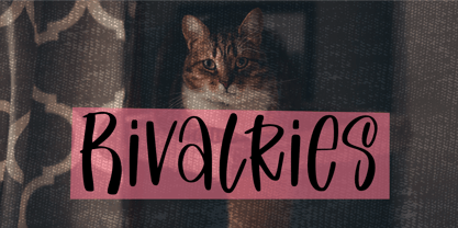 Rivalries is a font for anyone who wants to use a font that's endearing, cute, and friendly. It's the perfect font for children's products, quotes, or any time you need that little extra happiness. So what’s included : Basic Latin Uppercase and Lowercase Numbers, symbols, and punctuations Multilingual Support. Accented Characters : ÀÁÂÃÄÅÆÇÈÉÊËÌÍÎÏÑÒÓÔÕÖØŒŠÙÚÛÜŸÝŽàáâãäåæçèéêëìíîïñòóôõöøœšùúûüýÿžß PUA Encoded and fully accessible without additional design software Simple Installations works on PC & Mac Thank You!
 - PolkaDot Wrench by Deniart Systems,
$20.00 An eye-catching modern, angular design with a little dottiness to add a wee bit of naughtiness to your designs. This font is a partner to PocketWrench and both can be used to complement each other in your designs. This typeface features over 90 extended characters for setting European languages such as Czech, Danish, Dutch, Esperanto, Finnish, French, German, Italian, Hungarian, Polish, Portuguese, Romanian, Spanish, Swedish, Turkish & Welsh.
 - Splash by TypeSETit,
$24.00 Inspired by the splatters that come from a heavily inked architectural ruling pen gliding along the surface of a highly textured watercolor page—Splash. Just as droplets of water splash the ocean’s shore, little control can be predicted and no two splashes are exactly alike. The result is wonderfully organic and natural surprises. This display font touts flowing design potential. All glyphs are PUA encoded for ease of use.
 - Scrapt Script by Brainware Graphic,
$12.00 ScraptScript is a classic casual script typeface inspired by signpainter and autotechno typography, developed with a little bit bold and contrast on horizontal stroke. Comes with a lot of opentype features, ScraptScript also supports multilingual covering Latin based language (Latin Extended-A & Latin Extended Additional), including Celtic, Sami, Maltese, Turkish, England, USA, Germany, France, Italy, Poland & etc. ScraptScript would be nice on logo design, posters, etc. with any design characteristic.
 - PuffiClaude BT by Bitstream,
$50.99PuffiClaude by Matt Desmond is a real piece of work. Great for funky display stuff, its got some jive junk hanging around every character. This OpenType font has many goodies including extra ligatures, superiors and inferiors, unlimited fractions, and a hip little smiley face. Hey, maybe it's a portrait of Claude! There are so many funky glyphs that it even supports Central European languages. Man, that's hip! Hook up. - MFC Carnivale Monogram by Monogram Fonts Co.,
$69.00 The inspiration source for Carnivale Monogram is an elegantly sexy antique of typographic history. Known as Romantiques No. 3 or Ornate No. 2, this fantastic typefaces has been digitally revived and expanded for monogram designs. While this typestyle was never originally intended for monograms, its ornate nature lends itself so wonderfully to the craft. Download and view the MFC Carnivale Monogram Guidebook if you would like to learn a little more.
 - Lovelope by Ridtype,
$10.00 Lovelope is a cute handwriten font sans serif style. This font is inspired by the expression of happiness from the activities carried out by a little girl in the expression of joy. So we created these fonts to get and feel what they feel. This font is perfect for stickers, printing, logos and other purposes. Thanks for your support of our product, and using it in your project.
 - Orion Radio NF by Nick's Fonts,
$10.00A 1930s ad for—believe it or not—Orion radios provided the inspiration for this ultrabold and slightly sassy face. The radio brand didn't make it into the twenty-first century, but its signature typeface has, ready and willing to add a little pizazz to your next project. This font contains the complete Latin language character set (Unicode 1252) plus support for Central European (Unicode 1250) languages as well. - Uplink by Sudtipos,
$59.00 Uplink is decorative upright lettering with heavy calligraphic influences and clear friendly forms. Alternate forms with artificial "tail" connections, swashing their way from one letter across the vertical stroke of the next, add an unusual yet distinctly human detail to the forms that shape the words. Uplink's reserved humor can be a little tolerant of mechanical abuses like shearing or stretching, which makes it ideal for food product packaging design.
 - Herzchen by Font-o-Rama,
$25.00Herzchen is a well developed sans serif font. The curving and swinging letter forms remind a little of serif fonts, on closer inspection, however, they rather remind of upright italics. Playful details give charm to the typeface and make Herzchen lively and distinctive. With four cuts the typeface is suitable for simple corporate and editorial design projects. In addition there are many ligatures in the expert-set for individual use. - Chipper by ITC,
$29.99Chipper is the work of British designer Andrew Smith, an adorably awkward typeface resembling the first printing of a child. Shaky lines and irregular forms combine for this naive look, which is completed by tiny specks surrounding each form as well as a number of illustrations. Chipper reflects an innocent fun and is perfect for children's greeting cards, certificates, or magazines and advertising for or about the little ones. - Siggy by Typogama,
$19.00 The Siggy typeface family has all the traits of a serious serif typeface, but with a little wobble. Originally created as a display typeface, this family of fonts contains 4 styles that allow varied and clear compositions in both text or display settings. For an added twist, play with the Opentype features and watch how various letter combinations allow surprising substitutions through the use of alternate letters or ligatures.
 - Wusel by Loreley Design,
$28.00 Named by the german word for bustling around, to scurry or swarming the Wusel has a very active appearance. It's completely handmade and doodely because of all the crisscrossing lines, which forms big, bold, sanserif letters. These are very good to read wether they're big or small. Just a very playful, fun and simple font to use for headlines, tags and all kind of things which need al little attention.
 - Facegraph by hiroki kanda,
$14.00 If you are looking for a more individual typeface, This font is the best choice. This font is a very useful typeface for situations where you want to be a little playful, products for children, brands that want to give a soft impression, and those that want to stand out on social media posts. I'm sure that just using this typeface will create a graphic with a fun atmosphere.
 - Helena Handbasket NF by Nick's Fonts,
$10.00The 1888 edtion of James Conner's Sons United States Type Foundry specimen book listed this little gem simply as "Antique Light". Its original, rather anemic outlines have been beefed up and its serifs have been rounded, with the result that this face will get noticed wherever it goes. Both versions of this font include the complete Latin 1252 and CE 1250 character sets, with localization for Romanian and Moldovan. - Odell by The Organic Type,
$29.99 Odell is a fun, whimsical, yet elegant handwritten font that was created in a light-hearted manner for use in things like menus, invitations, bed and breakfast collateral and whatever else you can dream up. Odell features extra thin letters and it is designed to be creative, a little fancy, and very legible. There are tons of foreign characters to choose from so you can write in other languages as well.
 - Kuloko by Parker Creative,
$18.00 Bring a little tropical island vibe to your next project with Kuloko (Hawaiian for 'Inline')! Kuloko features offset handwritten characters with a bold marker like aesthetic, which gives the font a nice tropical tiki appearance. Kuloko's funky look is sure to capture attention in headlines on websites, social media graphics, logos, branding and so much more! Also included is a handwritten inline version of Kuloko for greater design variety!
 - BN-FishEye - Unknown license

- BN-ArNoN - Unknown license

- BN-Snake - Unknown license

- BN-Rock - Unknown license

- BN-Buzz! - Unknown license

- Cake! - Unknown license

- vinceHand II by JOEBOB graphics,
$19.00 This is what my good friend and painter Vincent’s handwriting looks like. I have put in a couple of ligatures and I hope you like it.
 - Lelet Script by aRc,
$10.00 Lelet Script is a TrueType font inspired by my mother’s exquisite handwriting. It has a graceful, smooth look that makes it very legible for any project.
 - Amaro Fleurie by Autographis,
$29.50 Amaro Fleurie is the first decorative addition to my Amaro font. Yes the font can be mixed with all Amaro fonts. Enjoy and cheers to you!
 - Empty Fridge by PizzaDude.dk,
$15.00 Empty Fridge is my crazy, wacky and totally unpredictable comic font. Forget about typographic rules, but play along with the goofiness in each and every letter!
 - Quanta by Alphabets,
$17.95Quanta was designed without reference to existing sansserif faces. As an original design, Quanta draws on principles of letterform developed during my studies of lettercarving (in Wales with Ieuan Rees) and Roman proportion. My intention was to produce a highly legible and adaptable sans-serif, initially intended to be a TrueType GX font, then as a Multiple Master font, later as a five weight range from extremely thin to extra black. A related uncial design will be released shortly. - Orchard Trees by Supfonts,
$15.00 Hello dears! I fulfilled my old dream and drew (wrote it to whom as you like :) a font in the Modern Calligraphy style. Also I added Ligatures and Swashes, have fun :) Orchard Trees will look beautiful on holiday invitations, wedding invites and stationery, logos, and more. Test it out below to see how it could look for your next project! Includes: Uppercase and lowercase Numbers and punctuation Foreign language support Check out my blog: https://www.instagram.com/zloillev pinterest.com/dmitriychirkov7
 - Forgotten Playbill by Lauren Ashpole,
$15.00 Years ago, I came across a vintage playbill and was struck by its lettering. The detailed floral pattern surrounded by thick outlines stayed in my mind even though the play's name and cast have faded. I finally tried to recreate the style from memory and Forgotten Playbill is the result. While all letters are actually capitals, the uppercase rotate slightly counterclockwise and the lowercase slightly clockwise. I suggest alternating between the two to reproduce my mystery inspiration.
 - Mancave SRF by Stella Roberts Fonts,
$25.00 Mancave SRF is the perfect font for the ultimate party Neanderthal. Holding court in his den with a case of beer, wide screen TV and all of his sports buddies, he is safe and secure in his lair. Bold, brash and angular, this typeface was designed for Stella Roberts fonts by Jeff Levine. The net profits from my font sales help defer medical expenses for my siblings, who both suffer with Cystic Fibrosis and diabetes. Thank you.
 - Getaway Car by Hanoded,
$15.00 When I am working on a new font, I usually play some music, or have a song in my head. When I was working on this font, an Audioslave song called Getaway Car was playing in my head. Again: naming a font is not that difficult! Getaway Car was made with a cheap brush and expensive Chinese ink. It is an all caps font, ideally suited for posters, book covers and designs that need a bold, rough & ready look.
 - Doyotama by Nirmalagraphics,
$18.00 Doyotama is my first font that I created in a graffiti style. the font that I made with a sketch with a ballpoint pen then I became the font as it is now. In this font, uppercase and lowercase letters are the same, the only difference is the size. You can use this font for all your needs, such as drawing posters, murals or logos Don't forget to give Feedback after buying my product, thank you very much, Nirmala
 - Xanas Wedding by Pedro Teixeira,
$9.00 This font family has derived from a lettering creation for my wedding stationery. One of the most significant momentos for me and my wife Xana (hence the font name - Xanas Wedding). I hope this typography can give a touch of informal elegance and discreet beauty to your projects. There can be multiple applications, since this font is flexible enough to appear as a custom text or a variable, organic, handwritten work. Designed by Pedro Alexandre Teixeira
 - Marginal Notes SRF by Stella Roberts Fonts,
$25.00 Marginal Notes SRF is from the creative pen of Ray Larabie whose Typodermic foundry graces MyFonts.com. Designed to emulate the look of handwritten words using a felt tip pen, this font can be perfectly applied to any project where notations, subtext, memos or other forms of personalization with a human touch is required. The net profits from my font sales help defer medical expenses for my siblings, who both suffer with Cystic Fibrosis and diabetes. Thank you.
 - Coffee Chalk by Kaer,
$19.00 Hey Guys! I’m happy to present my new typeface hand-drawn by chalk on a blackboard. This font is perfect for a school signboard, advertising of a coffee shop, retro logos, handwritten posters, bar identity, etc. What's included? * Uppercase and lowercase * Multilingual support * Numbers * Symbols * Punctuation I hope you enjoy this font. Follow my shop to receive updates of products and the very hottest news! If you have any question or issue, please contact me: kaer.pro@gmail.com Thank you!
 - Blackstripe by Mirror Types,
$15.00This font was inspired by the bricks of my wall, I stared at them all the time thinking, wouldnt be great if fonts live in cooperation with bricks, and then, it came to my mind…A font family that shows naked bricks, like it is RIGHT on the middle of design process. The main features are the informal and wired look that make it worthwhile for bands and informal invitations, flyers, for concerts or infantile designs. - Coin Ding Dong by Inumocca,
$18.00 Coin Ding Dong pixel Font inspired from 8 bit game with beautiful stylized pixelized, game machine really reminds me of my childhood, with coins you can play it, in my country machine games are called "dingdong", inspired me to create this pixel font name. Really Beautiful font to covering your Project, like For Game Names, Poster art, Magazine, Branding, Logos, and more your project design. - Unique glyphs - Multilingual Characters - UPPERCASE - Lowercase - Numeric - Symbol - Punctuation Character - PUA encoded inumoccatype
 - Victory History by madeDeduk,
$15.00 Introducing Victory History is a Modern Sans, use this font for any branding, product packaging, invitation, quotes, t-shirt, label, poster, logo etc. Feature otf. and ttf. file Uppercase & Lowercase Number & Symbol International Glyphs Multilingual support Alternative Ligature Feel free to drop us a message any time and follow my shop for upcoming updates Shoot me on email at: dedukvic@gmail.com and find more previews on my Instagram here : https://www.instagram.com/acekelgondolayu/?hl=en Hope you enjoy it.


