5,131 search results
(0.011 seconds)
- Hybi11 Amigo by Hybi-Types,
$12.50 You can’t reinvent the wheel When it comes to designing a sans serif, many designers stick closely to existing models. How boring! Others try to demonstrate self-reliance by special stylistic elements – at the cost of readability or aesthetics, or both. I did chose a different way: My Font should just look pretty and friendly, being the good buddy for all days. This is how the name is explained.
 - Fan Script by Sudtipos,
$99.00 A friend of mine says that sports are the ultimate popular drug. One of his favorite things to say is, “The sun’s always shining on a game somewhere.” It’s hard to argue with that. But that perspective is now the privilege of a society where technology is so high and mighty that it all but shapes such perspectives. These days I can, if I so choose, subscribe to nothing but sports on over a hundred TV channels and a thousand browser bookmarks. But it wasn't always like that. When I was growing up, long before the super-commercialization of the sport, I and other kids spent more than every spare minute of our time memorizing the names and positions of players, collecting team shirts and paraphernalia, making up game scenarios, and just being our generation’s entirely devoted fans. Argentina is one of the nations most obsessed with sports, especially "fútbol" (or soccer to North Americans). The running American joke was that we're all born with a football. When the national team is playing a game, stores actually close their doors, and Buenos Aires looks like a ghost town. Even on the local level, River Plate, my favorite team where I grew up, didn't normally have to worry about empty seats in its home stadium, even though attendance is charged at a high premium. There are things our senses absorb when we are children, yet we don't notice them until much later on in life. A sport’s collage of aesthetics is one of those things. When I was a kid I loved the teams and players that I loved, but I never really stopped to think what solidified them in my memory and made them instantly recognizable to me. Now, thirty-some years later, and after having had the fortune to experience many cultures other than my own, I can safely deduce that a sport’s aesthetic depends on the local or national culture as much as it depends on the sport itself. And the way all that gets molded in a single team’s identity becomes so intricate it is difficult to see where each part comes from to shape the whole. Although “futbol” is still in my blood as an Argentinean, I'm old enough to afford a little cynicism about how extremely corporate most popular sports are. Of course, nothing can now take away the joy I got from football in my childhood and early teens. But over the past few years I've been trying to perceive the sport itself in a global context, even alongside other popular sports in different areas of the world. Being a type designer, I naturally focus in my comparisons on the alphabets used in designing different sports experiences. And from that I've come to a few conclusions about my own taste in sports aesthetic, some of which surprised me. I think I like the baseball and basketball aesthetic better than football, hockey, volleyball, tennis, golf, cricket, rugby, and other sports. This of course is a biased opinion. I'm a lettering guy, and hand lettering is seen much more in baseball and basketball. But there’s a bit more to it than that. Even though all sports can be reduced to a bare-bones series of purposes and goals to reach, the rules and arrangements of baseball and basketball, in spite of their obvious tempo differences, are more suited for overall artistic motion than other sports. So when an application of swashed handlettering is used as part of a team’s identity in baseball or basketball, it becomes a natural fit. The swashes can almost be visual representation of a basketball curving in the air on its way to the hoop, or a baseball on its way out of the park. This expression is invariably backed by and connected to bold, sleak lettering, representing the driving force and precision (arms, bat) behind the artistic motion. It’s a simple and natural connective analysis to a designer, but the normal naked eye still marvels inexplicably at the beauty of such logos and wordmarks. That analytical simplicity was the divining rod behind Fan Script. My own ambitious brief was to build a readable yet very artistic sports script that can be a perfect fit for baseball or basketball identities, but which can also be implemented for other sports. The result turned out to be quite beautiful to my eyes, and I hope you find it satisfactory in your own work. Sports scripts like this one are rooted in showcard lettering models from the late 19th and early 20th century, like Detroit’s lettering teacher C. Strong’s — the same models that continue to influence book designers and sign painters for more than a century now. So as you can see, American turn-of-the-century calligraphy and its long-term influences still remain a subject of fascination to me. This fascination has been the engine of most of my work, and it shows clearly in Fan Script. Fan Script is a lively heavy brush face suitable for sports identities. It includes a variety of swashes of different shapes, both connective and non-connective, and contains a whole range of letter alternates. Users of this font will find a lot of casual freedom in playing with different combinations - a freedom backed by a solid technological undercurrent, where OpenType features provide immediate and logical solutions to problems common to this kind of script. One final thing bears mentioning: After the font design and production were completed, it was surprisingly delightful for me to notice, in the testing stage, that my background as a packaging designer seems to have left a mark on the way the font works overall. The modern improvements I applied to the letter forms have managed to induce a somewhat retro packaging appearance to the totality of the typeface. So I expect Fan Script will be just as useful in packaging as it would be in sports identity, logotype and merchandizing. Ale Paul
 - Vinyle by Lián Types,
$37.00 Bold, rounded and super cool. Those are the attributes of my latest font “Vinyle”, french for vinyl. In this epoque where all fields of Design are giving a lot of importance and attention to Typography and Lettering, I felt it was my duty to contribute with something that could really stand alone and ‘say something else’ that just words to be read. I've found that lately in the world, regarding a finished piece of design, the role of Typography (and of letters in general) went from being secondary, (like a minor player or a supporting actor) to the most important one. People are starting to understand the beauty of a well-done letter: they want their storefronts with unique scripts, they want to drink coffee surrounded by lettered blackboards, they want to buy books with astonishing covers with swashes ‘por doquier’. I'm more than happy to be alive in a present where even the most unimaginable friends of mine, (who couldn't spot differences between comic sans and helvetica before) are now conscious of the importance of a letter, or let’s say: Of the ‘voice’ of Typography. With Vinyle I tried to make a font with power. Following the nowadays trend of, let me say, “the vintage sans renaissance”. This time I put my brushes and nibs aside and experimented with something new. It wasn't easy, if you will pardon, for me to see swashes all over the place withouth the classic calligraphic ‘thick and thins’, but with after some weeks of work I started to love them. Like I already showed you in other creations (1) let me finish with the phrase: GEOMETRY IS SEXY! TIPS Vinyle has a lot of attitude, it shouts “here I am!” it really can ‘design an entire piece’ for you with just a word or two: It was designed with a 10 degree slant on purpose so the user may rotate it (like on the posters) that amount of degrees in order to see better results. Use Vinyle with the ‘fi’ standard ligatures activates for better kerning and ligatures! NOTES (1) See my font Selfie , the ‘little sister’ of Vinyle.
 - Ice Creamery by FontMesa,
$29.00Ice Creamery is a new variation of our Saloon Girl font family complete with italics and fill fonts which may be used to layer different colors into the open parts of each glyph. We don’t recommend using the fill fonts for Ice Creamery as stand alone solid fonts, Ice Creamery Chocolate was designed as a the stand alone solid font for this font family. Fill fonts go back to the 1850's where they would design matched sets of printing blocks and the layering of colors took place on the printing press, they would print a page in black then on a second printing they would print a solid letter in red or blue over the letters with open spaces to fill them in. Most of the time the second printing didn't line up exactly to the open faced font and it created a misprinted look. With the fill fonts in Ice Creamery and other FontMesa fonts you have the option to perfectly align the fill fonts with the open faced fonts or shift it a little to create a misprinted look which looks pretty cool in some projects such as t-shirt designs. I have some ice cream making history in my family, my Grandfather Fred Hagemann was the manager of the ice cream plant for thirty years at Cock Robin Ice Cream and Burgers in Naperville IL. In the images above I've included an old 1960's photo of the Cock Robin Naperville location, the ice cream plant was behind the restaurant as seen by the chimney stack which was part of the plant. If you were to travel 2000 feet directly behind the Cock Robin sign in the photo, that's where I started the FontMesa type foundry at my home in Naperville. My favorite ice cream flavor was their green pistachio ice cream with black cherries, they called it Spumoni even though it wasn't a true Spumoni recipe. Their butter pecan ice cream was also incredibly good, the pecans were super fresh, their Tin Roof Sundae ice cream was chocolate fudge, caramel and peanuts swirled into vanilla ice cream. One unique thing about Cock Robin and Prince Castle was they used a square ice cream scoop for their sundaes. - Sonata Allegro by Tamar Fonts,
$35.00 “The Emperor Has Clothes” Like in music — the Allegro Sonata form consists of three main sections—the Exposition (section), the Development, and the Recapitulation — so in regard to this Allegro Sonata font family — there is an Exposition (font), a Development, and a Recapitulation—in which each theme is restated alongside its development material. While the Recapitulation font is perfect for titling and branding, the Exposition is perfect for branding {as demonstrated in the Inspiration Gallery pertaining this font} as well as being a comfortable read in long runs of text. The Exposition rounded, mono-line, with great x height, contemporary—A Synthesis Between Geometric & Hand-drawn—font, is at times geometric and at times hand drawn; in the end it all came down to finding the balance in a typeface between the robustness needed to function as a text face and enough refinement to look good as a display font. Following the Exposition, comes the Development (section), decorative, botanic-like, exuberant and playful font, signifying ABUNDANCE [of possibilities] & BENEVOLENCE—in regard to each theme/character, and to demonstrate—that 'structures' in music, are solid structures—like architecture {contrary to the words of J. W. von Goethe, who said: “Music is liquid architecture; Architecture is frozen music”}, just in some spiritual domain that is far beyond one's physical senses to grasp. Like in my art and music works in which I consider its 'Texture' element of vital importance, so is the case when it comes to type, as apparent in my previous Phone Pro/Polyphony font, as well as in this current Sonata Allegro/Development font. Each glyph has its own uniqueness, and when meeting with others, will provide dynamic and pleasing proximity. And due to the [individualistic] nature of this Development font, just a minimal amount of kerning/pairing were necessary... The development font is an extravagant design that looks best when used at large sizes—perfect for titling, logo, product packaging, branding project, wedding, or just used to express words against some [light or dark] background. Finally, “The (Exposition Font) Emperor Has (the Development Font) Clothes!” As said, there are three fonts/styles altogether in this Sonata Allegro type family, designed with the intention of harmonizing between Latin and Hebrew, which makes it an ideal font for the side-by-side use of Latin and Hebrew characters. However, they are being sold separately (kindly search for “Sonata Allegro Hebrew” on this MyFonts site), so they are economical for those interested just in either one of them. My aim is to shake up the type-design world with a range of distinctive fonts which break away from the generic letterforms, to make your design projects stand out—as a graphic designer, add this font to your most creative ideas for projects. This typeface has [lots of ligatures /] OpenType features, to enhance your designs even more — happy designing! Sonata Allegro Features: · 3 Weights/Styles · Multilingual Support · Proportional Figures & Ligatures While using this product, if you encounter any problem or spot something we may have missed, please don't hesitate to write to us; we would love to hear your feedback—in order to further fine-tune our products. Copyright Tamar Fonts/Hillel Glueck 2022 ALL RIGHTS RESERVED Any unauthorized distribution of my work is strictly prohibited, and will be prosecuted; do the right thing, and do not participate in the piracy of my typefaces; if you appreciate my work, then please pay for it and help me prosper — thank you!
 - Sonata Allegro Hebrew by Tamar Fonts,
$35.00 “The Emperor Has Clothes” Like in music — the Allegro Sonata form consists of three main sections—the Exposition (section), the Development, and the Recapitulation — so in regard to this Allegro Sonata font family — there is an Exposition (font), a Development, and a Recapitulation—in which each theme is restated alongside its development material. While the Recapitulation font is perfect for titling and branding, the Exposition is perfect for branding {as demonstrated in the Inspiration Gallery pertaining this font} as well as being a comfortable read in long runs of text. The Exposition rounded, mono-line, with great x height, contemporary—A Synthesis Between Geometric & Hand-drawn—font, is at times geometric and at times hand drawn; in the end it all came down to finding the balance in a typeface between the robustness needed to function as a text face and enough refinement to look good as a display font. Following the Exposition, comes the Development (section), decorative, botanic-like, exuberant and playful font, signifying ABUNDANCE [of possibilities] & BENEVOLENCE—in regard to each theme/character, and to demonstrate—that 'structures' in music, are solid structures—like architecture {contrary to the words of J. W. von Goethe, who said: “Music is liquid architecture; Architecture is frozen music”}, just in some spiritual domain that is far beyond one's physical senses to grasp. Like in my art and music works in which I consider its 'Texture' element of vital importance, so is the case when it comes to type, as apparent in my previous Phone Pro/Polyphony font, as well as in this current Sonata Allegro/Development font. Each glyph has its own uniqueness, and when meeting with others, will provide dynamic and pleasing proximity. And due to the [individualistic] nature of this Development font, just a minimal amount of kerning/pairing were necessary... The development font is an extravagant design that looks best when used at large sizes—perfect for titling, logo, product packaging, branding project, wedding, or just used to express words against some [light or dark] background. Finally, “The (Exposition Font) Emperor Has (the Development Font) Clothes!” As said, there are three fonts/styles altogether in this Sonata Allegro type family, designed with the intention of harmonizing between Latin and Hebrew, which makes it an ideal font for the side-by-side use of Latin and Hebrew characters. However, they are being sold separately (kindly search for “Sonata Allegro Hebrew” on this MyFonts site), so they are economical for those interested just in either one of them. My aim is to shake up the type-design world with a range of distinctive fonts which break away from the generic letterforms, to make your design projects stand out—as a graphic designer, add this font to your most creative ideas for projects. This typeface has [lots of ligatures /] OpenType features, to enhance your designs even more — happy designing! Sonata Allegro Features: · 3 Weights/Styles · Multilingual Support · Proportional Figures & Ligatures While using this product, if you encounter any problem or spot something we may have missed, please don't hesitate to write to us; we would love to hear your feedback—in order to further fine-tune our products. Copyright Tamar Fonts/Hillel Glueck 2022 ALL RIGHTS RESERVED Any unauthorized distribution of my work is strictly prohibited, and will be prosecuted; do the right thing, and do not participate in the piracy of my typefaces; if you appreciate my work, then please pay for it and help me prosper — thank you!
 - VTC-TribalThreeFree - Personal use only

- Zawiya by Eyad Al-Samman,
$3.00 The word Zawiya in Arabic language means Angle in English language. "Zawiya" is a Kufic modern square-shaped Arabic typeface. The typeface has only right-angled angles which makes it full of open and closed squares and free from any curves or arches. This font comes in two different weights. I am originally an engineer and I have liked to draw geometric shapes since my early childhood. I decided to design a typeface that embodies both of the technical and artistic human that I have inside me. The main characteristic of "Zawiya" Typeface is in its modern and attractive right-angled and square-shaped styles for its all-Arabic characters. The character "Faa" is one of its most distinguished characters that I myself adore it so much. "Zawiya" Typeface is suitable for books' covers, advertisement light boards, titles in magazines and newspapers, posters, greeting cards, cards, covers, satellite channels, exhibitions' signboards and external or internal walls of malls or metro's exits and entrances, geometric instruments and tools, technical devices, computers and laptops, IT and electric devices and also calculators. It is advisable to use the font in fields related to sciences such as geometry, mathematics, physics, chemistry, astronomy, industry, economy, and other fields. It can also decorate surfaces of calculators, geometric tools, rulers, pens, computers, cars, ships, trucks, and other related electric and electronic devices. It is sharp design qualifies it to be printed in public signs in streets, airports, hospitals, schools, malls, hotels, mosques, and other public places. It can also be used in titles for Arabic news and advertisements appeared in different Arabic and foreign satellite channels.
 - Future Earth - 100% free

- Intramural JL - 100% free

- Hexenhammer by Hanoded,
$15.00 The ‘Hammer of Witches’, ‘Malleus Maleficarum’ or ‘Hexenhammer’ in German is the best know and most important treatise on witchcraft. It was composed by Heinrich Kramer in 1487. I thought it was a rather apt name for my latest fairytale font! Hexenhammer is a rough, handwritten typeface with an attitude. It can be used for book covers, posters and even spells. Comes with a bunch of end ligatures and a pandemonium of diacritics.
 - Aspidistra by Studio K,
$45.00 Aspidistra is a modern vintage typeface; which is to say a Studio K original with a period feel: it has a strong Art Nouveau influence (a distant cousin of Arnold Bocklin). Why Aspidistra? In the first half of the last century an Aspidistra was a must have accessory of the aspiring middle classes (see George Orwell's Keep the Aspidistra Flying), and to my mind this font evokes the chintzy charm of that era.
 - Spoiler by PizzaDude.dk,
$16.00 Now here's a font that won't spoil anything! It's my ALL CAPS brush font with slightly uneven and quirky lines. Just enough to make font look lively and fresh, but not overdoing it. Every letter has 7 different versions, which automatically cycles as you type - and I have added an extra SMALL CAPS for each letter. Exchange every letter here and there with SMALL CAPS, and you will get an even more authentic result!
 - Abeille by Hanoded,
$15.00 Abeille means bee in French. I am a little worried about the world's bee populations, as whole colonies collapse due to monoculture and pesticides. I have planted many bee-attracting plants in my garden and even put up a 'bee hotel' (which is full of tenants right now). Abeille is a hand drawn didone-ish font, kind of cute and happy, very legible and full of character. Abeille comes with a swarm of diacritics.
 - Froza by Flawlessandco,
$9.00 Introducing "Froza" - a dynamic and powerful display font that captures the essence of speed, intensity, and adrenaline in the world of racing. There's some connected letters and some alternates that suitable for any graphic designs. This font support for some multilingual. Also contains uppercase A-Z and lowercase a-z, alternate character, numbers 0-9, and some punctuation. If you need help, just write me! Thanks so much for checking out my shop!
 - Spooky Party by Stefani Letter,
$12.00 Spooky Party is a unique and very unique display font. Add to your creative ideas and notice how they make them stand out! This will take all crafts to the next level! Spooky Feast is perfect for logos, quotes, posters, clothing, and any other design that requires a strong and unique touch. To stay up-to-date on my latest work, follow me and let's be friends because there will be many promos.
 - Amber Taste Pro by Gleb Guralnyk,
$14.00 Hi, introducing an Amber Taste Pro font. It's a vintage typeface with classic shape. Seven weights variations from thin to bold is available. Actually this font set is a remastered version of my best selling font Amber Taste with lots of improvements. Pro version has much more characters, including multilingual west european support. All the contours was cleaned up and several glyphs has a new more organic shape. Thank you and have a nice day!
 - Obrigado by Hanoded,
$15.00 Obrigado means 'Thank You' in Portuguese. It is my way of saying thanks to the unknown designer of a Portuguese port-wine poster from the thirties. Obrigado font is based on that poster. As I had to work with a handful of glyphs, I designed the missing ones myself. Obrigado is a quite elegant and refined art deco font, which would be ideal for posters and logos. Obrigado speaks most Roman based languages.
 - Collage BB by Posterizer KG,
$24.00 Collage BB font was created for visual imitating of cuted paper Serif letters. The idea was to imitate kid’s clumsiness and irregular shape of letters. Good readability allows using this font for making some long texts. The font contains all the Latin and Cyrillic glyphs. BB - Bajina Bašta (Bašta in English means Garden) is the name of the small town where I spent my carefree childhood. That’s why I was inspired by Peter Pan.
 - Hann Writing by Hann Welsh,
$12.00 "Oh my goodness, is that your handwriting? It looks like a font!" HannWriting is a hand-drawn casual font based on the designer's own unique handwriting. It is perfect for achieving an organic look that does not sacrifice neatness. HannWriting is great for use in any project, from the home to the classroom to the great outdoors! This font includes basic and advanced Latin characters with multiple glyph options for some letters.
 - Lemon Smash by Bogstav,
$18.00 Lemons here and lemons there - I really love lemons! I use them in foods, deserts and drinks. I even eat them just for the taste of it! And, I name a lot of my fonts something with lemon! This Lemon font has 3 different versions of each lowercase letter and comes in both Regular, Outside and Inside versions - use them as single fonts, or mix them for nice results! Go go Lemon Smash!
 - The Poisoned Heart by Din Studio,
$29.00 The Poisoned Heart is a beautiful retro script. It's made with a naturally handwritten style. This font will make your design more beautiful and powerful, and is suitable for any design such as branding, quotes, wedding invitations, lettering projects and more. Features: - 76 Alternates - Accents (Multilingual Characters) - 10 Ligatures - PUA encoded - Numerals and Punctuation (OpenType Standard) I hope you enjoy it! Thanks for visiting and purchasing my font! Regards Donis M Din Studio
 - Cadillac Signature by Fikryal,
$18.00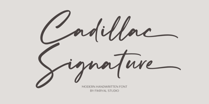 Cadillac Signature – is a modern handwritten font. This font is made in a modern style, very casual, and suitable for your various design needs. It’s perfect for logo, branding, title, social media posts, advertisements, product packaging, product designs, label, photography, watermark, special event, magazine, web designs, etc. Features : Cadillac Signature ( Uppercase, Lowercase ) Ending Swashes multilingual support Ligatures If you have any questions please don’t hesitate to contact me follow my Instagram: fkryall Thank you
 - Regnante by BustanType,
$19.00 Regnante was created with all of my heart. It has a luxury style, is stylish and lovely, and has a strong personality, so it will catch your attention. This font is ideal for a wide range of tasks including branding, logos, packaging, and more. Regnante includes 12 fonts, including 4 weight variations and Italic style. Regular and Alternate are come separately. You can make your selection based on your personal preferences and requirements.
 - Rogertt by Sulthan Studio,
$10.00 Hi true font connoisseur I introduced my second font Rogertt this is a modern handwriting that is unique and cute ... please try it is definitely fun and you will be happy. good luck.. With a style like this, this font will be suitable in use for logo's, branding projects, homeware designs, product packaging, mugs, quotes, posters, shopping bags, logo's, t-shirts, book covers, name card, invitation cards, greeting cards, and all your other lovely projects.
 - Yellow Balloon by Hanoded,
$15.00 Yellow Balloon is a typeface named after my two year old son's favorite book: The Yellow Balloon by Dutch author/illustrator Charlotte Dematons. Every night before he goes to sleep, he wants to read the book and manages to find the yellow balloon on every page. Yellow Balloon is a cartoonesque font with an uneven baseline. It would look great on book covers or posters. Yellow Balloon comes with extensive language support.
 - Exit Strategy by Hanoded,
$15.00 Every exit is an entry somewhere else. It’s a quote by British playwright Tom Stoppard and I really like it! Exit strategy is a rough brush font, which I made using Chinese ink (where would I be without my Chinese ink??) and the new batch of French paper I bought. Use this font to highlight all that is important, stick it on posters, slap it on book covers - it will definitely do the trick!
 - Colton by Kaer,
$19.00 Colton is condensed serif font. Perfect to use in elegant branding, luxury logos, wedding invitation, classic layout and more. What's included? * Uppercase and lowercase * Numbers * Symbols * Ligatures * Punctuation * Multilingual support I hope you enjoy this font. Follow my shop to receive updates of products and the very hottest news! If you have any question or issue, please contact me: kaer.pro@gmail.com Please request to add additional characters and glyphs if you need! Thank you!
 - Nakone by madeDeduk,
$14.00 Really excited to introduce Nakone, a luxury bold Serif with two styles: solid and stencil. A lot of stylish alternates will make this font suitable for your any design project. Features: UPPERCASE lowercase Number & Symbol International Glyphs Alternative Uppercase Alternative lowercase Ligatures If you need anything else just shoot me on email at: dedukvic@gmail.com or find more previews on my Instagram here : https://www.instagram.com/acekelgondolayu/?hl=en Hope you enjoy it.
 - March by Din Studio,
$25.00 March is a modern and clean display (Serif) font create from our talented font designer. The design of March will make your design more beautiful and inspiring. This font will suitable for any project, like branding, print template, logo and etc. The font also available in a rough version. Features: Accents (Multilingual characters) 66 Alternates PUA encoded Numerals and Punctuation (OpenType Standard) Thanks for visiting and purchasing my font! Donis M Din Studio
 - Peaky Rangers by Mega Type,
$12.00 Introducing "Peaky Rangers". Peaky Rangers is a handwritten script font in a modern calligraphy style, with a fun and modern look! Peaky Rangers are perfect for elegant home designs, wedding decorations, invitations, cricut projects, crafts, svg files, shirts, quotes, greating cards, branding, prints, logos, and more! Have fun using Peaky Rangers!!! I really hope you enjoy it! Feel free to follow, like and share. Thank you so much for checking out my shop!
 - Miss Demeanor by Typadelic,
$19.95 Miss Demeanor has a tendency to create her own rules due to her free-spirited nature. She conforms to every day typographic expectations but she wouldn’t like you to think so. She has unusual yet casual and eye catching shapes and makes the best of any situation. I hope you enjoy her pretty style! My inspiration for Miss Demeanor came from a specimen sheet of an american type style from the early 1930’s.
 - Catapult by Jonahfonts,
$39.00 Catapult is designed based on my popular condensed versions of Cornerstone / 8 styles, Cornerstone Pro / 10 styles and Cornerstone Flair / 8 styles. Catapult / 8 styles is wider with much detail to kerning and keeping the overall color in paragraphs at a minimum. Catapult also contains extra glyphs and new alternates. https://www.myfonts.com/search/cornerstone/ Applications include Headlines, logos, ads, invitations, captions, packaging, bulletins, posters, and greeting cards as well as short texts.
 - Travel Diary by Siddharth Dasari,
$9.95 The font was developed because of my pure interest in handwritten type. Handwritten type is more personal and works wonders to connect with people. Travel Diary is a handwritten display typeface with its bold graphic presence making it ideal for usage in informal postcards, invitations, travel and lifestyle magazines, wedding and informal event graphic work, display signages, packaging for various kinds of food, menus and leaflets for coffee shops and restaurants etc.
 - Junkwerk by PizzaDude.dk,
$20.00 Junkwerk is my heavy metal grunge font! It has got that feel like something that was stamped on, jumped on, shaken and headbanged for hours...just like how you would feel after hours of heavy metal! Comes with different upper- and lowercase letters, alternate letters and ligatures for both double letters and double numbers - and ofcourse it has got unique accented letters! You will need to use OpenType supporting applications to use the ligatures.
 - Rdn Sans by Top Type,
$9.00 Hi everybody! Introducing my newest product called RDN SANS. This font is a sans serif font. You can freely use this font for your work because this font is equipped with additional features such as Ligatures and Alternate characters. You can use this font to create presentations, wedding invitations, magazines, covers, banners and others. RDN SANS Features: - Upper case - Lower case - Ligatures - Alternate Characters Create your best work with RDN SANS. Thank You
 - Limoen by Hanoded,
$15.00 Limoen means 'lemon' in Dutch. Why did I call this font Limoen? Well, I guess I ran out of meaningful names, so I had to work with whatever popped in my head - which happened to be Limoen. Don't ask… Limoen is a very cute, very threedee-ish typeface. It works great in poster ads and as a display font. It comes with upper and lower case letters and a whole bunch of diacritics. Enjoy!
 - Jingle by Supfonts,
$15.00 This font was inspired by the game with different signature styles! The result is a light and nice, mono linear font that looks completely handdrawn. Jingle will look beautiful on Christmas and holiday invitations, wedding invites and stationery, logos, and more. I love using it for emphasis words and pairing it with sans serifs Includes: - Ligatures - Uppercase and lowercase - Numbers and punctuation - Foreign language support Check out my blog: - www.instagram.com/dmitriychirkov - pinterest.com/dmitriychirkov7
 - Chrysa by Christie,
$10.00Chrysa can be used to give a handwritten and child-friendly style in a funky way. - What was the inspiration for designing the font? My everyday need to use a typeface that looks handwritten but is also readable, charming and easy to use. - What are its main characteristics and features? Freedom, sketchiness and readability at the same time. - Usage recommendations It can be used in communication materials where the copy needs to look handwritten. - Alphard by BonjourType,
$12.00 The Alphard font is a cute script font designed by my daughter inspired by the name of the luxury vehicle she dreams of. Suitable for making packaging products, motivational quotes, social media, marriage, or simply used to reveal the words above background. Featured font: Uppercase, lowercase, digits, symbols, accents, and Alternative Style also supports multilingual Enjoy the font, feel free to leave a comment or feedback, send me a PM or an email. Thank you!


