4,426 search results
(0.009 seconds)
- Romp by Positype,
$30.00 With all ego aside, Romp was designed and influenced by my daughter, Angel. For some time now, she has wanted me to design a font based on her handwriting. But each time I sit down to do it, I run into more that she needs to do and redo. On a recent attempt, I ran into the same situation again. Instead of moving on to something else, I decided to whip out a sumi brush and start making letters...for me, type design is something a little ‘serious’ and never a time to just have fun. This typeface proved that notion wrong—it really was fun. As a result, each letter encouraged another and the design grew...and grew! The happy result spawned 3 separate sets of letters & numerals (small caps and some ligatures too!). Using the beauty of OpenType, these 3 sets have been fused into one, randomly generating font set. If you are using any type of OpenType enabled application, then the Romp Pro typeface is the way to go. They include everything found in the 3 separate variants for each style as well as entirely expanding offering of additional small cap and ligature sets.
 - Thievery by Hanoded,
$15.00 The idea behind Thievery… is that there is no idea behind it. Thievery is just a nice, legible, happy typeface. It is hand made, has lots of curly swirly bits and looks good as well. So… grab it and run!
 - LTC Keystone Ornaments by Lanston Type Co.,
$24.95 LTC Keystone Ornaments is a set of over 100 glyphs based on "running border" ornaments from Keystone Type Foundry of Philadelphia, circa 1903. These geometric dingbats can be used individually for decorative emphasis, or combined in repetitive lines or complex patterns.
 - Quirk Chick by Four Lines Std,
$15.00 Designed with graphic designers in mind, Quirk Chick font offers versatility and flexibility making it perfect for logos, branding, invitations, packaging, and so much more. Let your imagination run wild as you create eye-catching designs that leave a lasting impression.
 - Sumida Script by Hanoded,
$15.00 Sumida is a special ward in Tokyo AND the river running through the city. Sumida script is a nice, handwritten font, which was made using a sharpie pen. Sumida Script comes with double letter ligatures and an extensive language support.
 - MB TyranT - Personal use only

- Metal as in Heavy - Unknown license

- Venereal - Unknown license

- Angelin Love by Letterara,
$12.00 Angelin Love is a gorgeous script font, beautiful and romantic. This font looks perfect for Valentine’s Day designs, or for other romantically inclined styles and projects. To stay up to date for my latest job, follow me and let’s be friends because there will be many promos.
 - KG Payphone by Kimberly Geswein,
$5.00 This font was specifically created for my husband. He teaches 5th grade and wanted a font that was legible enough for students to read but still playful enough to add a touch of whimsy to his classroom. Legible enough for body text but fun enough for titles.
 - Bobgert by Oleg Gert,
$30.00 Bobgert – is a whimsical, optimistic and inspiring modern sans-serif font with a touch of monospace that is wonderful for headings and is perfect for posters, Instagram, magazines, print, branding, logos and anything else you can imagine. I hope my font will help you in your creativity.
 - Heart Strung by PizzaDude.dk,
$20.00 Simple, yet thrilling! Heart Strung is my handmade font! Useful for a wide range of things - such as invitations, greeting cards, headlines, notes and quotes ... and a lot of other things! Comes with swashes for uppercase and ligatures for double lettering - and some lovely swashy alternates! :)
 - MommieBrush by Hubert Jocham Type,
$29.90 MommieBrush is a brush script headline typeface. It is based on the Spencerian Mommie that won the 2008 TDC award. But as a brush script it works in a different area. Like my other brush script typefaces it is made for food packaging and product branding.
 - Rosestone by Supfonts,
$12.00 Rosestone is new signature script. This will give your text a unique and natural look. It is ideal for signatures, postcards, greetings, websites, blogs, and more. Includes: Uppercase and lowercase Numbers and punctuation Foreign language support Ligatures Check out my blog: https://www.instagram.com/zloillev pinterest.com/dmitriychirkov7 Enjoy
 - Monde Libre by Elyas Beria,
$12.00 Monde Libre is a display typeface that exudes optimism, joy, and whimsy. I designed this typeface based on a sign in a clip from some old film footage I saw somewhere. It stayed with me as a typeface that evokes the France of my dreams. Enjoy!
 - Nouveau Vaudeville by Jeff Levine,
$29.00 On the cover of the 1926 sheet music for “There Ain’t No Maybe in My Baby’s Eyes”, the title is rendered in Art Nouveau hand lettering; pen-drawn with rounded ends. The type design is now available as Nouveau Vaudeville JNL, in both regular and oblique versions.
 - Valis by AdultHumanMale,
$12.00 Valis is a thin, futurist, lightweight font, a sister font to my other design Ebdus. Valis has more of a 3D Angular feel. This font is an omnicase font, with capitals, capital-lowercase and lower case letters available. Lowercase letters are accessible through your Glyphs palette.
 - Liquid Amber by Hanoded,
$25.00 Liquidambar is actually a beautiful tree, native to America. I have one in my garden and I love its autumn colors! Liquid Amber is something else: it is a handmade all caps font that comes with oodles of diacritics, some swashes and some alternate glyphs. Enjoy!
 - Shibby by Hanoded,
$15.00 shibby adj (etc.). Used to indicate that something is “cool.” Apparently Shibby was first used in the 1999 movie Dude, Where’s My Car? I don’t think Shibby is THE cool word of the moment, but I think it is cool enough for this rather shibby font!
 - Crushland by Ditatype,
$29.00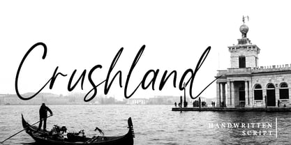 Crushland is a beautiful handwritten font. With a natural handwritten style, it brings a classy and beautiful typeface. Crushland is best used for branding, logotype, and quotes. Features: - Multilingual Support - Stylistics Set - Beautiful Ligatures - PUA Encoded - Numerals and Punctuation Thanks for visiting and purchasing my font!
 - Alt Ayame Long by ALT,
$10.00 A long version of my Ayame font. Ayame is a display font which looks great on posters, logos, and titles. Ayame Long is a 2-weight family with a heavy retro look. Works great with the regular version of Ayame you can check out the original.
 - Ice Cream Man by Hanoded,
$10.00 I was listening to an old Van Halen album when I made this font. I named it after one of my favorites: ‘Ice Cream Man’. Ice Cream Man is a happy, sloppy, wobbly kids font. Use it for your book covers, posters and ice cream packaging!
 - Night Michy by Zeenesia Studio,
$16.00 Have a great day! My new font was present, Night Michy!! Night Michy is a Bold vintage style serif font with strong character and soft features. modern and classic serif font with a clear and bold look. It’s a very versatile font that works great in large.
 - Hebrew Latino by Wiescher Design,
$39.50 Hebrew Latino was started out of frustration. I could not find a font that looked like Hebrew - actually I found one, but it had only capitals. So I decided to make my own. Strangely enough it looks a little bit Jugendstylish! Here it is. Shalom! Gert Wiescher
 - Nakata by Hanoded,
$15.00 Mr. Nakata is another one of my favorite Haruki Murakami characters. Nakata typeface is handwritten, sloppy and messy, but comes with intelligent features like alternates and ligatures, to make it look more like handwriting and less like a font. Of course, Nakata speaks most Roman-based languages.
 - Nue - Personal use only

- Nue Medium - Personal use only

- Mustang by Robert Arnow,
$21.99 Mustang is a powerfully expressive brush font that combines an edgy urban aesthetic with a smooth feminine flow. Some have suggested that Mustang is romantic. Some say it has something to do with speed or freedom. While precisely what Mustang expresses is up to debate, there’s no doubt that it’s expressing it with intensity. The style was born in my high school years, when I would wreck my notebooks with multiple layers of graffiti tags which would start in the margins and then creep in to cover the entire page. I developed a sensibility towards a very fast, expressive use of my hand, which later easily and naturally translated into brush. I used this style typographically on several projects throughout the years, and even turned it into a signature illustration style. Mustang is the second font, after Streetbrush, to use this brushwork as its inspiration. Mustang will be especially evocative at large sizes, where the details and sharpness of the shapes really come to life. It also holds together well for use as body copy, but may lose some of its aesthetic integrity at really small sizes.
 - Schnebel Sans Pro by URW Type Foundry,
$35.99 It took me 12 years to bring this extensive font family to completion. A lot has been changed, transformed, peeled and developed in all those years. For many of my projects I used it as my quarry and so it might have become something like a synthesis of all my imaginations and experiences. To me »Schnebel Sans« represents the optimal design of a contemporary grotesque that perfectly unites dynamics with statics. For copy text the typefaces are very legible, neutrally and remain in the background, but despite this generate the necessary tension when set as headlines. »Schnebel Sans« is available in 48 different styles. It is available as a Pro Font, containing West, East Greek, and Cyrillic or as the Schnebel Sans ME, also containing Arabic and Hebrew. The scripts include small caps and various figure sets. This big range of styles from Thin to Black and from Compressed to Expanded offer many possibilities for design and fulfill all requirements for a professional use. Because of the supplement of several non-Latin character sets, the »Schnebel Sans« is perfectly suitable for global services too. Volker Schnebel, 2016
 - Schnebel Sans ME by URW Type Foundry,
$35.99 It took me 12 years to bring this extensive font family to completion. A lot has been changed, transformed, peeled and developed in all those years. For many of my projects I used it as my quarry and so it might have become something like a synthesis of all my imaginations and experiences. To me »Schnebel Sans« represents the optimal design of a contemporary grotesque that perfectly unites dynamics with statics. For copy text the typefaces are very legible, neutrally and remain in the background, but despite this generate the necessary tension when set as headlines. »Schnebel Sans« is available in 48 different styles. It is available as a Pro Font, containing West, East Greek, and Cyrillic or as the Schnebel Sans ME, also containing Arabic and Hebrew. The scripts include small caps and various figure sets.This big range of styles from Thin to Black and from Compressed to Expanded offer many possibilities for design and fulfill all requirements for a professional use. Because of the supplement of several non-Latin character sets, the »Schnebel Sans« is perfectly suitable for global services too. Volker Schnebel, 2016
 - Petale by LomoHiber,
$15.00 Petale is my new elegant experimental typeface I'd love to present. At the beginning, I was intended to create a bold wide font, I started sketching options and came out with the letter 'M' design first. I thought it may be interesting and had continued developing the style with letters N, O, etc., spending hours on some letters to match the design and my vision. I liked how it looked (especially digits) and added different weighs. And it came out pretty stylish. You may like it to use in magazine designs, posters, websites, packaging, branding, logo, and so on. Petale can grant your work some graceful modern touch with a brutalist-feminine note. Works well with elegant and strict serif fonts. Also try to experiment with script fonts. I used my Stormy Youth font: https://www.myfonts.com/fonts/lomohiber/stormy-youth and Bodoni 72 Smallcaps If you have some issues or questions, please let me know: lhfonts@gmail.com Hope you'll enjoy using Petale! Language support: Afrikaans, Albanian, Bulgarian, Catalan, Croatian, Czech, Danish, Dutch, English, Estonian, Finnish, French, German, Hungarian, Icelandic, Italian, Latvian, Lithuanian, Maltese, Norwegian, Polish, Portuguese, Romanian, Russian (Русский), Slovak, Slovenian, Spanisch, Swedish, Turkish, Ukrainian (Украинский), Zulu
 - Fan Script by Sudtipos,
$99.00 A friend of mine says that sports are the ultimate popular drug. One of his favorite things to say is, “The sun’s always shining on a game somewhere.” It’s hard to argue with that. But that perspective is now the privilege of a society where technology is so high and mighty that it all but shapes such perspectives. These days I can, if I so choose, subscribe to nothing but sports on over a hundred TV channels and a thousand browser bookmarks. But it wasn't always like that. When I was growing up, long before the super-commercialization of the sport, I and other kids spent more than every spare minute of our time memorizing the names and positions of players, collecting team shirts and paraphernalia, making up game scenarios, and just being our generation’s entirely devoted fans. Argentina is one of the nations most obsessed with sports, especially "fútbol" (or soccer to North Americans). The running American joke was that we're all born with a football. When the national team is playing a game, stores actually close their doors, and Buenos Aires looks like a ghost town. Even on the local level, River Plate, my favorite team where I grew up, didn't normally have to worry about empty seats in its home stadium, even though attendance is charged at a high premium. There are things our senses absorb when we are children, yet we don't notice them until much later on in life. A sport’s collage of aesthetics is one of those things. When I was a kid I loved the teams and players that I loved, but I never really stopped to think what solidified them in my memory and made them instantly recognizable to me. Now, thirty-some years later, and after having had the fortune to experience many cultures other than my own, I can safely deduce that a sport’s aesthetic depends on the local or national culture as much as it depends on the sport itself. And the way all that gets molded in a single team’s identity becomes so intricate it is difficult to see where each part comes from to shape the whole. Although “futbol” is still in my blood as an Argentinean, I'm old enough to afford a little cynicism about how extremely corporate most popular sports are. Of course, nothing can now take away the joy I got from football in my childhood and early teens. But over the past few years I've been trying to perceive the sport itself in a global context, even alongside other popular sports in different areas of the world. Being a type designer, I naturally focus in my comparisons on the alphabets used in designing different sports experiences. And from that I've come to a few conclusions about my own taste in sports aesthetic, some of which surprised me. I think I like the baseball and basketball aesthetic better than football, hockey, volleyball, tennis, golf, cricket, rugby, and other sports. This of course is a biased opinion. I'm a lettering guy, and hand lettering is seen much more in baseball and basketball. But there’s a bit more to it than that. Even though all sports can be reduced to a bare-bones series of purposes and goals to reach, the rules and arrangements of baseball and basketball, in spite of their obvious tempo differences, are more suited for overall artistic motion than other sports. So when an application of swashed handlettering is used as part of a team’s identity in baseball or basketball, it becomes a natural fit. The swashes can almost be visual representation of a basketball curving in the air on its way to the hoop, or a baseball on its way out of the park. This expression is invariably backed by and connected to bold, sleak lettering, representing the driving force and precision (arms, bat) behind the artistic motion. It’s a simple and natural connective analysis to a designer, but the normal naked eye still marvels inexplicably at the beauty of such logos and wordmarks. That analytical simplicity was the divining rod behind Fan Script. My own ambitious brief was to build a readable yet very artistic sports script that can be a perfect fit for baseball or basketball identities, but which can also be implemented for other sports. The result turned out to be quite beautiful to my eyes, and I hope you find it satisfactory in your own work. Sports scripts like this one are rooted in showcard lettering models from the late 19th and early 20th century, like Detroit’s lettering teacher C. Strong’s — the same models that continue to influence book designers and sign painters for more than a century now. So as you can see, American turn-of-the-century calligraphy and its long-term influences still remain a subject of fascination to me. This fascination has been the engine of most of my work, and it shows clearly in Fan Script. Fan Script is a lively heavy brush face suitable for sports identities. It includes a variety of swashes of different shapes, both connective and non-connective, and contains a whole range of letter alternates. Users of this font will find a lot of casual freedom in playing with different combinations - a freedom backed by a solid technological undercurrent, where OpenType features provide immediate and logical solutions to problems common to this kind of script. One final thing bears mentioning: After the font design and production were completed, it was surprisingly delightful for me to notice, in the testing stage, that my background as a packaging designer seems to have left a mark on the way the font works overall. The modern improvements I applied to the letter forms have managed to induce a somewhat retro packaging appearance to the totality of the typeface. So I expect Fan Script will be just as useful in packaging as it would be in sports identity, logotype and merchandizing. Ale Paul
 - Leakpaint by Andrew Tomson,
$10.00 Hello friends! Drawing is a great way to pass the time. Sometimes, clumsy people can spill paint on paper or on an already completed drawing. What do we end up with? A ruined drawing or a new work of art? I think the latter. After all, every drawing is unique and a unique thing. Even if you are drawing a stick man! This font presents the opportunity to see what happens if invisible ink is spilled on it. This font is great for your new and unique projects for social media, lettering and just for home use! A little sloppy, a little bouncy, so it's so lively and magical! I wish you good luck and love!
 - Videomax by PizzaDude.dk,
$16.00 Videomax looks like something from the future - perhaps even something from a future where the world lies in ruins and is about to be taken over by hostile aliens. The worn letters represent the decades of war against the computers...or the aliens...or maybe the letters comes from a sign of a computer company from the eighties, which was recently found in an abandoned place. The speculations are many, but one thing is definitely true: Videomax got that grungy / computer / worldwar feeling! Write your text, and watch how the randomness of letters make your text look really good. I've put it 4 different versions of each letter, which makes it look really nice and worn!
 - Speedwriter - Personal use only

- Beef'd - 100% free

- Jon - Unknown license

- Thirsty Cream by PizzaDude.dk,
$20.00 Thirsty Cream is my handmade and slightly curly font. I had birthday greeting cards, invitations and products for kids. But I guess that it is useful for a good handful of other things. While the lowercase has it's curly moments, the UPPERCASE is quite steady and super legible
 - Eilis by Agnieszka Ewa Olszewska,
$25.00 Another modern, fun, and experimental display font in my library. Looks like made with a strong gesture. A bit constructive with cursive elements. Contains 2 uppercase sets, and some extra characters. You can play with them and mix them at your will. Contains European languages diacritics and punctuation signs.
 - Mollroy by Orenari,
$17.00 Please welcome Mollroy. A simple but special handwritting and it's perfect for quotes. Mollroy also fit for any range of your design projects. This font is naturally written by my self, so the flow of each characters became unique. Take your design project to the next level with Mollroy.


