10,000 search results
(0.017 seconds)
- Collager by Gilar Studio,
$16.00 Collager is a Modern Serif Family Font with 2 style Regular And Oblique.It's a very versatile font that works great in large and small sizes. Perfect for branding projects, Logo design, Clothing Branding, product packaging, magazine headers, or simply as a stylish text overlay to any background image. Collager variable allows fluid design across 18 weights,The font broadens its use by supplying weights all the way from Thin to Black We pushed the concept into a usability focused direction, to work as a bold tool and beautiful communicator.The natural curves, swells and sloping trunks, grow in character as the font gains weight. Whilst the thinner weights have lowered contrast and optical corrections to create a warm and gentle appearance. Check my other Font here : https://gilarstudio.com/
 - Honeypirls Regular by Tebaltipis Studio,
$20.00 I'm present to you, new retro serif called Honeypirls! Honeypirls is a stylish font that is both retro and bold font. It's thick curves give a 70s groovy vibe with the serifs bringing it slightly back to traditional Honeypirls fits perfectly into those nostalgic moodboards and vintage logos. It come with a unique lower and uppercase plus numbers, punctuation & multilingual letters. What you get Letters, numbers, punctuation, multilingual support, alternate and ligature Regular and Italic version Follow my shop for upcoming updates including additional glyphs and language support. And Please message me if you want your language included or If there are any features or glyph requests, feel free to send me a message, I would like to update it. Enjoy!
 - Blazing Furnace by Kitchen Table Type Foundry,
$16.00 At home we have a wood stove. Last year, I bought a whole bunch of tree trunks, which I cut up with a chainsaw and then chopped with my Swedish axe. In Holland we have a saying that firewood keeps you warm three times: when you cut the tree, when you chop the wood and when you burn it in the stove. Our stove is rather small, so it is not exactly a blazing furnace, but I liked the name because it seems to fit this font. Blazing Furnace was made with ink and a brush. It is a bit messy and rough, but it comes with multilingual support and a nice set of alternates for the lower case letters.
 - Meowtant Kittens by Hanoded,
$16.00 My youngest son Boris has his birthday in a week. He turns 8, and he loves to play with those Danish building blocks - you know what I’m talking about. Last year he developed an interest in Star Wars n(no idea how that came to be), so we bought him some Star Wars-themed blocks for his birthday. I am now watching the movies with him and it is fun to witness his enthusiasm. The only drawback is the fact that we now seem to have a Chewbacca in our home… Meowtant Kittens is a font I drew with a fineliner and then digitised. Of course the name was influenced by the movies I am watching with Boris, even though they don’t feature any Meowtant Kittens.
 - Speedy Space Goat Oddity by LomoHiber,
$12.00 Speedy Space Goat Oddity is the font with really interesting mood. My purpose was to transfer freedom, immediacy, and a bit of insanity with it. I've painted it with self-made paint and brush in a trippy environment. You can use Speedy Space Goat Oddity almost everywhere (not for body text). It's great for posters, clothes design, package design, music album covers. Also, with the right approach, you can use it as horror font. Speedy Space Goat Oddity Features: Pant texture 2 ligatures for tt and ff 14 contextual alternates for most common double letters Carefully tuned kerning (preview above doesn't show it for some reason) If you have some issues or questions, please let me know: lhfonts@gmail.com Hope you'll enjoy using Speedy Space Goat Oddity!
 - Gospel Script by Kaer,
$24.00 This time I touched another classic manuscript for my font. The Lindisfarne Gospels is an illuminated manuscript probably produced around the years 715–720 in the monastery at Lindisfarne, off the coast of Northumberland. It’s the work of a monk named Eadfrith. He was a highly trained calligrapher, and he used insular majuscule script in the manuscript. I’m happy to present you the Regular and Colored styles for your design. --- You can use color fonts in PS CC 2017+, AI CC 2018+, ID CC 2019+, macOS 10.14 Mojave+ Please note that the Canva & Corel & Affinity doesn't support color fonts! --- You’ll get: * Initials & Regular styles * Uppercase and lowercase * Multilingual support * Numbers * Symbols * Punctuation * Ligatures Please feel free to request any help you need: kaer.pro@gmail.com Thank you!
 - JP MultiColour by jpFonts,
$29.90 Multicolored Fonts Many years ago, when Xerox Corporation still had its own font department, I came to Los Angeles in 1985 to train the IKARUS program. One day Bill Kienzel, head of the Xerox font department at the time, said we should go to the Hollywood Hills together; he knew people there who were experimenting with multicolored fonts. After a little wandering through the winding streets of the many hills, we reached a somewhat overgrown, simple family house standing under trees. A group of very inspired designers were waiting for us there. They immediately showed us the works they created using photomechanical tricks. They were fascinating. The American colors and the whole look seemed noble and enchanting. The problem was that this process was very difficult to implement and required a lot of effort on individual letters. They dreamed of a colored font that could be used for normal typesetting. We thought back and forth about how to save the individually colored letters in a common font, but soon gave up because we didn't see a technical option. So this idea and the memory of the time in Hollywood lay dormant in the back of my mind for many years, until at the beginning of this year 2023 I received an order to produce an outline typeface and the story came back to me. Suddenly I knew how to solve the problem from back then: if only the areas that should have the same color in all letters were saved in their own separate fonts, they could be colored independently of each other and later placed on top of each other. I implemented this in the 5 fonts that are now available with the 3 variants “Outside”, “Middle” and “Inside”. Together with the background, 4 colors can be combined with each other. This method works in text programs such as Word or InDesign. In Photoshop or Illustrator, the individual surfaces can also be colored by converting them into paths if the additional “Complete” variants (which contain all 3 contours) are used. There is also a “Basic” variant that can be used to achieve special effects such as overlay, bleed, etc. The first 5 fonts in this series are all based on the principle of contouring. Anyone who claims that you don't need any special fonts because they can be created automatically from any font using common programs is wrong or is only telling only half the truth. Anyone who has ever dealt with this knows that many individual adjustments to the design are necessary after contouring. This has happened in the 5 fonts that are now available and have very different styles. The dream from back then has come true. The user can set any text, long or short, in multiple colors, freely design the color scheme and apply all the usual typographic settings. Volker Schnebel, November 2023
 - Preta by Lián Types,
$39.00 Preta, portuguese for a very pure kind of black, has its name very related to its concept: I wanted to make the fattest/darkest script ever. People who follow my work may notice its forms are very related to works of my past (1) but this time the challenge was to be very cautious with the white spaces between letters. Not only I followed some rules and ductus of the copperplate style of calligraphy but also I took a lot of inspiration in posters of the early Art Nouveau (specially in Alfred Roller of the Vienna Secession) where letters forms looked like black squares if not looked from a close distance. With Preta, I wanted to achieve that same idea of “darkness” and thanks to the always welcomed question -what if?- the font grew a lot. The result is a very fat font, that looks delicious. Due to possible customer needs, I designed Preta Small, so it can be used in smaller sizes. Preta Ao Sol (which literally means under the sun!) is a style with those lovely tiny details to give the sensation of bright. Preta Ao Sol Solo was made to be used as a layered font with Preta. Finally, Preta Capitals serves as a company for Preta. Hope you enjoy the font as much as I did when designing it: The fact that it’s full of alternates, swashes, ligatures and swirls makes it really pleasurable at the moment of using it. Give it a try and dance with Preta! TIPS For better results, use Preta with the ‘standard ligatures’ feature activated. NOTES (1) Beatle in 2014. Seventies in 2015.
 - Jalo by BRtype,
$19.00 Jalo is a playful font. Every single letter has own personality.
 - Deliscript by Alphabet Soup,
$29.00 Although initially inspired by the neon sign in front of Canter’s Delicatessen in Los Angeles, the design of Deliscript Upright and Deliscript Slant soon took on a life of its own–and its own distinctive look. Like its sibling Metroscript, Deliscript has many features that expand its usability such as the the variable length tails which can be accessed in 6 different styles, and the never before seen crossbars which can be extended outward in either direction from the lower case “t”. Throw in the special “WordLogos”, tons of ligatures and foreign accented characters, and you have a recipe for typesetting that approaches the look of hand-lettering. For a better understanding of its unique features please download The Deliscript User Manual—available in the Gallery section.
 - Donna Lucia Cyrillic by Ira Dvilyuk,
$17.00 Charming young Italian lady named Donna Lucia that is my handwritten script font. Donna Lucia is feminine and graceful calligraphic handwritten script font as plus a Symbols font with 52 lovely hand-drawn swashes and illustrations. Donna Lucia script is perfect for branding, logos, wedding stationery, social media, packaging, and other projects that require an elegant touch. Donna Lucia feminine font includes also Cyrillic glyphs. Uppercase lowercase and lowercase with flourishes. Donna Lucia script contains a full set of uppercase letters and 3 full sets of lowercase letters, (standard, alternative, and initial form) and 27 ligatures - which can be used to create a handwritten calligraphy look. Donna Lucia Symbols is a font with over 52 hand-drawn elements, illustrations, and swashes and can help to make your design more original. Combine and merge swashes and illustrations to create your own designs and make borders, frames, dividers, logos, and more (just use A-Z or a-z and 0-9 keys in the included Donna Lucia Symbols font). A different symbol is assigned to each uppercase or lowercase standard character, so you do not need graphics software, just type the letter you need. Multilingual Support for 31 languages: Latin glyphs for Afrikaans, Albanian, Basque, Bosnian, Catalan, Danish, Dutch, English, Estonian, Faroese, Filipino, Finnish, French, Galician, Indonesian, Irish, Italian, Malay, Norwegian Bokmål, Portuguese, Slovenian, Spanish, Swahili, Swedish, Turkish, Welsh, Zulu. And Cyrillic glyphs support for Russian, Belorussian, Bulgarian and Ukrainian languages.
 - Tipo Movin CDMX by Ixipcalli,
$- La versión propuesta por la SEMOVI (Secretaria de Movilidad) es un estilo más angosto y ortográfico, creadó con la finalidad de aligerar las aplicaciones tipográficas del sistema. Se emplea oficialmente en todas las aplicaciones del sistema de Movilidad Integrada de la Ciudad de México. El creador de la tipografía es Lance Wyman. En esta edición, los tipos minúsculas son una adaptación “no oficial” para el Tipo Movin CDMX, enriqueciendo la tipografía a un estilo visual de altas y bajas, por lo que se prescinde del diseño base como trabajo propio para enfatizar los tipos minúsculas exclusivamente, además de que se han añadido algunos caracteres de acentuación extendiendo su uso a otros lenguajes. Los tipos son una nueva propuesta por Ixipcalli en el presente año 2023. The version proposed by SEMOVI (Secretary of Mobility) is a narrower and more orthographic style, created with the purpose of lightening the typographic applications of the system. It is officially used in all the applications of the Integrated Mobility system of Mexico City. The creator of the typeface is Lance Wyman. In this edition, the lowercase types are an “unofficial” adaptation for the Tipo Movin CDMX, enriching the typography to a visual style of highs and lows, so the base design is dispensed with as my own work to emphasize the lowercase types exclusively, In addition, some accentuation characters have been added, extending their use to other languages. The types are a new proposal by Ixipcalli in the current year 2023.
 - Artful Nouveau JNL by Jeff Levine,
$29.00 Artful Nouveau JNL was modeled from the hand lettering on the sheet music cover for the 1910 song "Gee, But It's Great to Meet a Friend from Your Home Town".
 - Lido STF by Storm Type Foundry,
$39.00Times with a Human Face: In my article of the same name which appeared in the magazine Font, volume 2000 I described the long and trying story of an order for a typeface for the Czech periodical Lidové noviny (People’s Newspaper). My task was to design a modification of the existing Times. The work, however, finally resulted in the complete re-drawing of the typeface. The assignment, which was on the whole wisely formulated, was to design a typeface which would enable “a smooth flow of information in the reader’s eye”, therefore a typeface without any artistic ambitions, from which everything which obstructs legibility would be eliminated. A year later Lidové noviny had a different manager who in the spring of 2001 decided to resume the cooperation. The typeface itself definitely profited from this; I simplified everything which could be simplified, but it still was not “it”, because the other, and obviously more important, requirement of the investor held: “the typeface must look like Times”. And that is why the above-mentioned daily will continue to be printed by a system version of Times, negligently adjusted to local conditions, which is unfortunately a far cry from the original Times New Roman of Stanley Morison. When I was designing Lido, the cooperation with the head of production of Lidové noviny was of great use to me. Many tests were carried out directly on the newspaper rotary press during which numerous weak points of the earliest versions were revealed. The printing tests have proved that the basic design of this typeface is even more legible and economical than that of Times. The final appearance of Lido STF was, however, tuned up without regard to the original assignment – the merrier-looking italics and the more daring modelling of bold lower case letters have been retained. The typeface is suitable for all periodicals wishing to abandon inconspicuously the hideous system typefaces with their even more hideous accents and to change over to the contemporary level of graphic design. It is also most convenient for everyday work in text editors and office applications. It has a fairly large x-height of lower case letters, shortened serifs and simplified endings of rounded strokes. This is typical of the typefaces designed for use in small sizes. Our typeface, however, can sustain enlargement even to the size appropriate for a poster, an information table or a billboard, as it is not trite and at the same time is moderate in expression. Its three supplementary condensed designs correspond to approximately 80% compression and have been, of course, drawn quite separately. The intention to create condensed italics was abandoned; in the case of serif typefaces they always seem to be slightly strained. I named the typeface dutifully "Lido" (after the name of the newspaper) and included it in the retail catalog of my type foundry. In order to prevent being suspected of additionally turning a rejected work into cash, Lido STF in six designs is available free of charge. I should not like it if the issuing of this typeface were understood as an “act out of spite” aimed against the venerable Times. It is rather meant as a reminder that there really are now alternatives to all fonts in all price categories. - Goosebumps by Comicraft,
$19.00 Here's a font that'll send shivers down your spine, stand your hair up on end and turn your skin into gooseflesh. Hand lettered by rotten old Richard Starkings after we locked him up in the attic one dark, stormy night, these stressed out characters are a real scream!
 - Wed Dings by Design23,
$39.00 This font will help the beginner designer create their own wedding invitations.
 - Joe Mad by Comicraft,
$39.00 When Joe Madureira saw the custom font we'd created for Jim Lee, he called us up immediately and uttered the immortal words... "I Want One!" We were, of course, only too happy to oblige. Now, this very font, based upon Joe's own handwriting, is available. Think about it, where else can you get a World Famous Comic Book Artist like Joe Madureira to work for you for under a hundred bucks?
 - Kinemon by Mightyfire,
$10.00 Kinemon is a font that has modern minimalist looks but still has an uniqueness on it. Look at the letters, each letter has their own characteristic. Firm, clean and modern. Kinemon perfectly use for a magazine, book, headline or even a poster. We have three styles that can cover your needs. We hope and be honored if Kinemon can be the part of your special moment. Thank you! :)
 - Swithin by Scriptorium,
$24.00Swithin is based on hand lettering from the titles in a Victorian fairy tale collection. It has a playful look which seems just right for the holiday season, with some rough, hand-drawn variations which make make it feel more unique. It's conceptually similar to our Candlemas and Summerisle fonts, but has its own special personality. It ought to be excellent for holiday cards and other seasonal uses. - Robots ht by Huerta Tipográfica,
$25.00 The challenge was to build a family of robots for using assembled or separated into modules. This family consists of 7 styles: the first one contains ready-to-use robots, the other styles contain 387 modules grouped into: heads, torsos, arms & hands, legs & feet, extras (eyes, accessories) and arrows. A family for everyone’s wish. Ready-to-use or make-it-your-own: more than 2 million possible combinations!
 - We Love Nature Autumn Leaves by kapitza,
$69.00 We really enjoy going for long walks in the park in autumn, and the beautiful colours and shapes of the fallen leaves inspired us to create this font. We Love Nature Autumn Leaves is a picture font consisting of 52 highly detailed, hand drawn illustrations. The illustrations can be used on their own to create beautiful designs, or in combination with other illustrations in the We Love Nature font collection.
 - Koutura by Konstantine Studio,
$15.00 Everybody has their own message. Everybody's different, everybody wants to be remarkable. Eyes catch everything from first sight. Fashion is a statement. Elevate your persona higher, classier, with KOUTURA. A tailored high-fashioned font to put make-up on your visual works. Make your fashion branding, logo, poster, clothing, magazine, lookbook, mood board, boutique glam in a secs after you type out the words straight from your keyboard.
 - Hazel Clouds by Rillatype,
$12.00 Hazel Clouds is a script font that has modern looks. This font is perfect for you who needs modern script as this font is applicable for branding, headline, apparel, packaging. it also comes with more than 9 stylistic alternates to make you can choose your own style! Hazel Clouds also support multilingual language. To acces the underlines just type _ (underscore) + 1(one) or 2(two). example _1 _2
 - Diore by Olivetype,
$18.00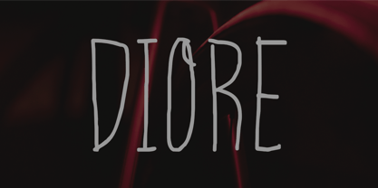 Meet Diore, a fun and playful handwritten font. It adds a unique and charming touch to your designs, with each stroke having its own personality. Use Diore in a range of projects, from social media graphics to website banners, - giving you so many creative possibilities. Diore features : Standard Latin Numbers, symbols, and punctuations Multilingual Support. Fully accessible without additional design software Simple Installations Works on PC & Mac Thank You.
 - Adverse Stencil JNL by Jeff Levine,
$29.00If you're old enough to remember having a lettering stencil in school, then you might have tried to save all of the waste paper punched out of the letters and numbers; hoping to do something with them later on. Jeff Levine took his Tramp Steamer JNL stencil font and gave it the look of those waste paper pieces - lined up to form erratic characters with a personality all their own. - Scamps by Spark Creative,
$39.00 I designed this font because it didn't exist - it’s based on hand rendered type created for black and white line marker scamps used in the advertising industry. I use it that way and it’s saved me a LOT of hand-rendering time over the years. Of course, Scamps works as an informal marker script in its own right too. I’ll be interested to see what you do with it.
 - FS Conrad by Fontsmith,
$50.00 Art into type In 2008, Fontsmith were approached by their friend, Jon Scott, to investigate whether a typeface could assume the aesthetic of one artist’s body of work. Jon’s not-for-profit charity, Measure, was organising an event for the artist, Conrad Shawcross, whose giant mechanical installation, entitled Chord, was going on public display in the long-disused Kingsway tram tunnel in Holborn. Chord explores the way we perceive time, as either a line or a cycle. Two enormous machines with dozens of rotating arms and moving in opposite directions, weave rope with almost infinite slowness. An unusual brief Phil Garnham visited Conrad in his Hackney studio to get a feel for his work and ideas. “Conrad is a very clever and philosophical guy. He struggled to see how typeface design had any relevance to him and his art. This was going to be a challenge.” The artist presented the type designer with a pile of rope and a huge diagram of sketches and mathematical workings. “This was, in essence, my brief.” Phil developed three concepts, the simplest of which ticked all the boxes. “The idea of the strokes in the letterforms appearing and ending at peaks or points of origin fitted perfectly with Conrad’s idea of time occurring and ending at two ends of the sculpture.” Two versions Phil planned modules for two versions of the typeface: one with five lines in the letterforms and one with seven. He then drew the modules on-screen and twisted and turned them to build the machine that is FS Conrad. “This is not a simple headline typeface,” says Phil. “It’s not a rigid structure. It has varying character widths, and it’s informed by real typographic insight and proportions so that it actually works as piece of functioning, harmonious type.”
 - Tescellations by Ingrimayne Type,
$9.95 Though there are many thousands of digital typefaces available, none seem to be made exclusively of letters that tessellate, a complete tessellating alphabet. This void is now filled with not one typeface, but a group of typefaces, the Tescellations kinship group. Even though I am aware of only one use for this typeface--writing about tessellations--that does not mean there are not hundreds or perhaps thousands of other uses. These typefaces are a byproduct of two maze books I designed, Puzzling Typography and Puzzling Typography A Sequel. I found the challenge of making mazes from tessellations, including letter tessellations, intriguing and these typefaces are a byproduct that endeavor. There are seven members of this typeface kinship group. I tried to select the the glyphs that fit together best to form Tescellations; it is the most readable of the lot. The reason for an Italics version is that I needed one for the maze project. In constructing it, I tried to include as many different lower-case glyphs as I could rather than just skew the regular version. A purist might insist that the tessellation deal with the counters. My approach was to worry only about the exterior of any letter that has an interior, but for anyone who who might object to the counters, versions with filled counters are included. What did not fit into Tescellations was dumped into Tescellations Two, which is somewhat of a ransom-note type of face. It comes in two styles, a regular version and a version in which the counters are removed. TescellationPatterns shows how many of the characters in these typefaces tessellate. It has over 100 tessellation patterns, each on only one character. Simply type several lines with any character and make sure the leading is the same as the font size, and you have an instant tessellation pattern of a letter.
 - ITC Aram by ITC,
$29.99Jana Nikolic was finishing her degree program at the Faculty of Applied Arts, in Belgrade, with a final project that would combine her two majors: type and book design. Three stories from William Saroyan's My Name Is Aram would provide the text for the book, to be set in a typeface that Nikolic would design. Nikolic knew something special was happening the moment she put pen to paper. The letters just emerged," she recalls. "I started to explore a few new pens and found one I loved. I was able to make its tip bend with pressure." Like the family Saroyan writes about, the design flowing from Nikolic's pen would be simple but a little quirky. "When there were a whole bunch of little black letters around me," continues Nikolic, "I saw that this was going to be a very interesting typeface family." Nikolic drew Latin and Cyrillic letters, lowercase and capital letters, wide letters and narrow letters. She was surprised at how quickly and easily the design came. "There were no badly written letters," she says. "I hardly had to rework them and they fit together remarkably well." ITC Aram's standard character complement consists of one set of lowercase letters and two sets of capitals: one narrow and the other wide. The wide caps can be used with the standard lowercase, or mixed with the narrow caps for a variation on "cap and small cap" copy. The ITC Aram create the opportunity to mix and combine the letters into playful typographic expressions. Words and sentences that twinkle; text that seems light and alive - one runs the risk of creating work that is both delightful and charming when setting copy in ITC Aram." - Valentina SG by Spiece Graphics,
$39.00 Here’s what happens when your trusty felt tip marker takes a trip to cartoonland. Each of Valentina’s plump characters has a rough and splotchy texture. Some letters even bounce up and down like a 3-year old. As cartoon faces go, Valentina is a bit on the imperfect side. But that’s normal for a funny face. Use it in a variety of comical situations. Make convincing captions under your own artwork or design greeting cards with it. You can even blow it up to huge sizes to create a wild and crazy look. Valentina Medium is now available in the OpenType Std format. Some new characters have been added to this OpenType version as stylistic alternates. This advanced feature works in current versions of Adobe Creative Suite InDesign, Creative Suite Illustrator, and Quark XPress. Check for OpenType advanced feature support in other applications as it gradually becomes available with upgrades.
 - Vesta by Linotype,
$29.99 In the late 1990s Gerard Unger won the assignment to design the signage system for the Holy Year celebrations to be held in Rome in 2000. The system he developed in cooperation with the design agency n|p|k used a classically inspired serif typeface, but the earlier proposals included a sans-serif, which became Vesta (2001). Vesta is a versatile family that can be used as a display face alongside Unger's serif faces Gulliver, Capitolium or Coranto; it can also be used on its own, even in longer texts. Vesta is narrower and therefore more economical than some commonly used sans serifs such as Arial and Helvetica; there is also a noticeable contrast between thick and thin parts, which makes it more lively. Vesta is to be extended with narrow versions, small capitals and old style numerals, along with some special versions for headlines.
 - Tasci Kursiv by Abdullah Tasci,
$30.00Tasci Kursiv is a typeface which is transformed from the designer’s own calligraphy. - Hiragino Sans Rounded by SCREEN Graphic Solutions,
$210.00 Hiragino Sans Rounded (Maru Gothic) is derived from the basic design of the Hiragino Sans (Kaku Gothic) with its wide counters and comfortable appearance. It features gentle typeface that provides graceful roundedness to the tips of all the strokes of a character. On the flip side of this gentle impression is the fact that every single element in the Hiragino Sans upon which this typeface is based has been carefully polished down in every respect in pursuit of an elegant roundness that makes it possible to handle carefully executed typesetting. That approach is clearly different from the general rounded typeface that makes full use of the body, and makes it possible to respond the requirement of professional typesetting. It is never-uninteresting design whose letterform is rooted in the traditions of traditional printing type. It is a font that of course can be used on its own and easily formatted just like Hiragino Sans while adding splendid coloring to the page. Furthermore, when used with other Hiragino fonts such as Hiragino Sans or Hiragino Serif (Mincho), the fact that all their designs are oriented on the same vector creates a multiplier effect. The user may be surprised at the sense of unity that cannot be experienced when combining it with other typefaces.
 - Hollywood 69 by Fonts of Chaos,
$10.00 This is not Hollywood. You may be surprised but I am not inspired by the famous Hollywood sign for this type but a grid on a roof of Barcelona. I walked down the street observing the architecture of buildings in the area of the Marina when I saw a grid on a roof. One of the workers put a board on them and the magic happen. Hollywood 69 is now free with 99 !
 - ITC Weber Hand by ITC,
$40.99LisaBeth Weber's eponymous typeface ITC Weber Hand is deceptively simple-looking. It's a handwriting face in a light, monolineal style with a slightly formal, almost angular appearance. Weber, who is an accomplished singer/songwriter as well as an artist and lettering artist, says she has always had an inherent sensibility with lettering." Her favorite subject in the first grade was penmanship, and when, as an adult, she got her first checkbook, "I thought it was very unfair that the signature always had to be consistently the same." She describes Weber Hand as "a natural progression of my handwriting style, a friendly and versatile font." Its letterfit is naturally loose, and it shows its character best when set with ample leading. In 1999, when LisaBeth Weber's ITC Weber Hand™ typeface was released, it soon became one of ITC's most popular handwriting fonts. A decade later she decided that is was time to update her single-weight design. A light weight would benefit from a bold companion, in addition to condensed variations for much greater versatility. This warm, friendly, and charming design is just as at home in Restaurant menus as it is in brochures, for advertising, and on packaging. With the new weights ITC Weber Hand will surely continue to be a popular handwriting type with broad appeal." - Arturo by Hackberry Font Foundry,
$24.95 Arturo is a brand new font family drawn from the original inspiration of an old alphabet in one of Dan Solo 's Dover Clip Art books. It has moved far away from those raw roots, however. Every character has been redrawn. For example, I had a light version that I never could get working. Arturo is based on that light style and called Arturo Book. The name comes from a good friend of mine in El Paso. He was the guinea pig upon whom I foisted off the beginnings of this style so many years ago. I did several marketing pieces for him using the raw drawings. I figured that he deserved to have the family named after him, at the very least. This is a normal font family for me in that it has caps, lowercase, small caps with the appropriate figures for each case. This font has all the OpenType features in the set for 2009. There are several ligatures for your fun and enjoyment: bb gg ff fi fl ffi ffl ffy fj ft tt ty Wh Th and more. Like all of my fonts, there are: caps, lowercase, small caps, proportional lining figures, proportional oldstyle figures, & small cap figures, plus numerators, denominators, superiors, inferiors, and a complete set of ordinals 1st through infinity. Enjoy!
 - Antoine by Anastasia Kuznetsova,
$19.00 Introducing Antoine — is a vintage retro display typeface. The three font combinations I launched are very compatible if for the victorian classic design concept. As for if the font was worn by itself, without combinations are also brave!! In addition to many get unique character, luxury, brave and elegant. You also have a collection ornament, very suitable if in the gradient. This font is also very easy to use with other design programs or with out design program. Antoine Typeface is perfect for beverage label design project. coffee label. logotype design, badges, classic wedding concept. victorian design concept and so on. gig poster, letterhead, droop cap, titles, and any artworks. Now it’s your time to go crazy and explore the uniqueness of this typeface!! I invite you to familiarize yourself with the preliminary images and hope that you will be imbued with my vision of this creative font, which, I am sure, will be suitable for all the interesting projects you are working on. Fonts can be opened and used in any software that can read standard fonts, even in MS Word. No special software is required to get started. It is recommended to use it in Adobe Illustrator or Adobe Photoshop. Made with love and magic ♡ Thank you for reading it, and do not hesitate to send me a message if you have any questions! ~ Anastasia
 - Kuschelfraktur by Catharsis Fonts,
$36.00 Kuschelfraktur is a unique, eye-catching take on the theme of blackletter that replaces the broad nib with a brush pen and achieves stroke modulation through stencil-like gaps. It combines the texture and dignity of blackletter with the human warmth of informal handwriting. Kuschelfraktur offers five separate sets of capital letters and several additional customization option via stylistic alternates. The degree of ornamentation in the blackletter capitals can be increased (SS02) or decreased (SS07), while SS04 and SS05 offer two simpler approaches to capital letters that bridge from blackletter to Roman letters (Antiqua). The default single-storey �a� can be replaced with a two-storey version in SS01, and SS08 offers a single-storey capital �A� for the simple capitals. Finally, SS03 restores some of the more unique letter shapes of the Fraktur style of blackletter. The old-style figures can be replaced with lining and/or tabular figures. All these stylistic sets are accessible via OpenType from the main font, Kuschelfraktur, whereas the spin-off fonts (Traditional, Verziert, Text, Schlicht, Antiqua) offer convenient access to those sets even in environments without OpenType support. I am grateful to the helpful souls on the TypeDrawers and Typographie.info forums for encouragement and constructive feedback, and to the Glyphs team for their fantastic type editor. Kuschelfraktur is dedicated to my son Marius.
 - Lalibela by CyberGraphics,
$43.00My motivation for designing the Lalibela family (which is based on Bodoni) was to pay homage to Ethiopic script. The script has been around for about 3 000 years, but I took artistic licence to deviate from the original model and add personal touches. I chose Bodoni as a historical model because of its display value and not its text size use because the extreme contrast made it difficult to read at small sizes. A Modern typeface characterized by consistently horizontal stress, flat and un-bracketed serifs, and a high contrast between thin and thick strokes, were the final step in typography two-hundred-year journey away from calligraphy. The austerity, simplicity and greater contrast style was perfected.Contrary to all the refinements in Bodoni, I have revisited calligraphy with the font Lalibela that mimics Ethiopic Script. It was drawn with a much larger x height and less geometric than Bodoni for its primary use as a display font. For example, a lot of italic serifs were added to the roman face as well as 16 additional ligatures to obtain more a feel of calligraphy. I made the serifs thicker and bracket one side with straight steps obtaining a reduced contrast to withstand breaking up at smaller sizes.An additional variant, "Lalibela Alternate" was designed to provide an interesting mixing possibilities with the Bold face for more expressive headlines. - String by Lián Types,
$45.00 Inspired by the sound of acoustic guitars, delicacy of harps and elegance of the engrossers script, String is a trendy monoline font which will for sure make unique layouts for your pieces of design. Combining String with String Hole in the same word is a good idea when a more playful rhythm is needed. The font works particularly well when standing on photographs, so be ready to use it in magazines with food, landscapes or super models. I like thinking of String as a distilled version of Erotica. A more “pure” relative of hers. When I designed Erotica, I was so in love with the spencerian style that I knew it'd be hard to just abandon it. With that in mind, this time my aim was to take the subtlety of it to the limit. So, in order to do that I had to find out what was actually the secret of its beauty. I found that the essence of Erotica, in other words, its ductus was the most responsible. The result is a font made of hairlines with a lot of emphasis on the pureness of the form and, (with a lot of inspiration in music) the sensation of continuity between its letters as if they were written with a string. Try String and its flowing melody.