10,000 search results
(0.016 seconds)
- Spicy Note by PizzaDude.dk,
$18.00 Here's my eye-catching alternative unicase font - build with a twist of grafitti and dash of pizzadude! Each letter has 5 slightly different versions and they automatically cycles as you type. A great way to make your text look naturally organic and dynamic!
 - Yumna by WAP Type,
$20.00 wap_std makes cute fonts for kids. I only remember some of the font characters. I think this new font is cute & fun for your fun projects. yumna is made with all my heart, I love it, and I hope you like it too.
 - Natural Blues by PizzaDude.dk,
$17.00 Natural Blues is my laid back handwriting font, and it is also the name of a song by Moby. Maybe I was inspired by that song … I can’t tell. But what I can tell is that having the blues is a natural thing!
 - Black Madness by Mirco Zett,
$12.00 Black Madness is a font inspired by blackletter typography, but instead of clean and accurate lines I gave it an more abstract and intuitive look. Like most of my fonts, Black Madness is made for logos, headlines and other typography related work.
 - Contra Flare by Wiescher Design,
$16.50 Contra Flare is the organic design of my Contra family of fonts. It has beautiful curved endings – not serifs – that make it look like it was made out of flowers leafs. But still the font has an elegant look to it. Enjoy!
 - Rockybilly by Letterara,
$14.00 Rockybilly font is a super handwritten brush font bursting with energy. It features extra attention to quick strokes and sharp details. To stay up to date for my latest job, follow me and let’s be friends because there will be many promos.
 - Ingrid Font by Enrich Design,
$24.95This font was created from the handwriting of my friend Ingrid. I always felt she had great handwriting and this font is proof of this. There are for styles to choose from, a great alternative to the common handwriting fonts seen everywhere. - Blober by LomoHiber,
$- I'm proud to present my Blober. He is a cute young font which will be helpful if you are going to design something cute and lovely. Fill him with pattern or texture and Blober will reflect the emotion in any way you want.
 - VTCTattooScriptTwo - Personal use only

- VTC-KomikaHeadLinerChewdUp - Personal use only

- Bonsai by Three Islands Press,
$29.00 Years ago, I developed an interest in the Japanese art of dwarfed potted trees, bonsai. I bought some books on the subject from Brooklyn Botanic Garden. In one -- Handbook on Bonsai: Special Techniques (seventh printing, February 1976) -- the type was bad. Old worn lead type, I suspect, spread wide in the tops of characters and disappearing on the bottoms. Two decades later, I came across my Brooklyn Botanic Garden collection and was struck again by this interesting type. Inspired, I made a typeface. Didn't take me long to decide on a name for it, either: a name with a double-meaning, based both on its look and its inspiration. Bonsai, the typeface, has two styles, a roman and a true italic.
 - Sunday Fish by PizzaDude.dk,
$15.00 I am not sure if there is such a thing as a Sunday Fish. But anyway, now you have a font with that name! My idea of a Sunday Fish is a lazy, goofy and kinda laid back one. One you'd like to play around with, and a friend for life - not that kind of fish that ends up on your plate! :) Sunday Fish has massive language support and 4 different versions of each lowercase letter, and these automatically cycle as you type! It comes in 4 different layered versions, which works well together - just play around with the layers and your favourite colours!
 - Southwark by Hanoded,
$15.00 London is one of my favourite cities, so it was about time I named a font after it. Well, technically, I named a font after one of London’s districts. Southwark comes from the Anglo-Saxon word Suthriganaweorc, which means ‘Fort of the men of Surrey’. The font Southwork is a handmade Clarendon. I used a Japanese brush pen to create the outlines. I gave the glyphs texture by filling them in with a brush and Chinese ink. Southwark, therefore, has an uneven look and a brushy texture. It looks good on just about anything, but posters, greeting cards and product packaging come to mind.
 - Tola by Agnieszka Ewa Olszewska,
$18.00 Tola is a modern, reversed-weight, experimental display font with a spirit of the 70s. Looks better in large sizes but in smaller thanks to the thick bottom makes also interesting effect. It’s based on my letter shape experiment. I was drawing one single letter in the hope to find interesting results. I started Tola font with the letter “G” and based on that shape I created the rest of the alphabet. Tola looks good in modern graphics. It contains uppercase, numbers, and some punctuation signs, and is multilingual. Perfect for logos, posters, and social media graphics that need a super superhero with a sentimental touch.
 - Twilight Brush by Hanzel Space,
$25.00 We present our new font "Twilight Font" This font was created with a touch of original handwriting using a brush pen. Has a natural and textured feel, and has a distinctive character and is different from other fonts. One more thing that is interesting is that this font is suitable for various kinds of your design needs, namely logos, brochures, posters, quotes, branding and so on. If you are interested in buying this font for your design needs, then you will get 3 types of files that will be installed on your computer. Thanks so much for checking out my shop! Happy creating! Cheers! Hanief - Hanzel Space
 - Carmel by Type Associates,
$24.95 This font has been on my drawing board since the late eighties. It was based on drawings provided to me by an old sign-painter family friend and we used it extensively as a caps-only font in the early 90s on a cellphone ad campaign. It loves to be tight set and stacked and provides real grunt when you need it. Small caps have been added and have been weight and proportion adjusted so as to complement the caps. At Type Associates we believe that a font is not complete until the spacing is optimal. Carmel is another example of quality through extensive experience, testing, adjusting and refining.
 - Wild About Myself JNL by Jeff Levine,
$29.00 Lettering found on the cover of the 1923 song "I Love Me (I'm Wild About Myself)" can take on various graphical possibilities. Although its design is Art Nouveau in concept, it is somewhat reminiscent of the "bubble letters" most school kids used to doodle on notebook and portfolio covers; yet the lettering style also evokes the 1960s-70s Hippie movement. As a sidebar, a couple of lines from the song's lyrics were used by Jeff Levine's late mother to chastise him as a youth when he got "a little too full of himself". The lyrics were: "I love me! I love me! I'm wild about myself! I love me! I love me! My picture's on the shelf!"
 - Zibryain by Ably Creative,
$12.00 Zibryain is a unique display font. Modern style created as a result of my experiments on letterforms, on the one hand I like the appearance of the individual curved lines, on the other hand they seem very strange, foreign and illogical. It was like looking into a microscope and seeing something strange. I wanted to develop and study these forms as something new, because I had never seen anything similar before. The result is a contrasting font that has sharp, smooth curves and lines. The Zibryain font is perfect for designing company logos, online game logos, magazine covers, biographies, business cards and all your design work of course. become more attractive in appearance.
 - Sztos by Borutta Group,
$39.00 Sztos (2018-2022) is a remix of one of the most famous grotesques used in Poland – Baccarat (published by Jan Idźkowski i S-ka in 1922). My version loosely refers to the original. On the one hand, I wanted to modernize the drawing and proportions, on the other hand, I did’t want to lose the historical flavour and details in which you can still feel traditional printing. In addition to the fairly wide version of the normal style, there is also a narrow version. Thanks to this contrast, Sztos gives the possibility of expressive combinations of different styles. The whole family consists of 10 weights, two widths and an additional slant version. Design Support: Małgorzata Bartosik, Karol Mularczyk
 - Burgues Script by Sudtipos,
$99.00 Burgues Script is an ode to the late 19th century American calligrapher Louis Madarasz, whose legendary pen has inspired schools of penmanship for over 100 years. His talent has caused some people to call him “the most skillful penman the world has ever known.” I use the word ‘ode’ in a colloquially ambitious manner. If I was an actual poet, my words would be about things I desire but cannot attain, objects of utter beauty that make me wallow in humility, or people of enormous talent who look down at me from the clouds of genius. But I don’t write poems. My work consists of letters drawn to fit together, that become an element of someone’s visual poetry. I am the poet’s assistant, so to speak. Once in a while, the assistant persists on what the subject of the poem will be. And occasionally, the poet gives in to the persistence. I hope you, visual poet, find my persistence justified in this case. The two main sources for Burgues were the calligraphy examples shown in Zaner Bloser’s The Secret of the Skill of Madarasz: His Philosophy and Penmanship Masterpieces, and C. W. Jones’s Lessons in Advanced Engraver’s Script Penmanship by L. Madarasz. These two references were the cornerstone for the concept I was trying to work with. I did have to change many of the letters in order to be able to produce digital calligraphy that can flow flexibly and offered the user a variety of options, while maintaining its attractive appearance. To this end, many ligatures and swashes were made, as well as full flourished sets of letters for use at the beginnings or endings of words and sentences. All of this has been tied together with OpenType and tested thoroughly within today’s standard design and desktop publishing software. After working with digital scripts for so long, at one point I thought that Burgues Script would become a bit of a chore to complete. I also thought that, like with most other scripts, the process would regularize itself after a while and be reduced to a mechanical habit. Surprisingly, and fortunately for me, this did not happen. The past holds as many surprises as the future. Madarasz’s method of penmanship was fascinating and challenging to translate into the strict, mathematically oriented language of the computer. It seems that the extremely high contrast of the forms, coupled with the required flow and connectivity of such lettering, will always be hard work for any visual artist to produce, even with the aide of a powerful machine. I can only imagine what steady nerves and discipline Madarasz must have had to be able to produce fully flourished and sublimely connected words and sentences on a whim. When I think of Madarasz producing a flourished calligraphic logotype in a few seconds, and try to reconcile that with the timelines of my or my colleagues’ work in identity and packaging design, the mind reels. Such blinding talent from over a hundred years ago. Burgues is the Spanish word for Bourgeois. In the end, I hope Burgues Script will serve you well when a flourished word or sentence is required for a design project. One of the wonders of the computer age is the ability to visually conjure up the past, serving both the present and the future. With Burgues, you have a piece of “the most skillful penman the world has ever known,” at your service. Burgues received important awards such as a Certificate of Excellence TDC2 2008 and a Certificate of Excellence at the Bienal Tipos Latinos 2008.
 - Art Lover JNL by Jeff Levine,
$29.00While browsing through a Dan Solo type reference book, Jeff Levine fell in love with the multiline stylings of one particular typeface, then sat down and re-drew from scratch his own interpretation of the design. Jeff's version is called Art Lover JNL - offering kudos to art in general, the Art Deco movement and (of course) type design. - DIVERGENT - Personal use only

- DM PopCap by DM Founts,
$20.00 DM PopCap is the third typeface released by DM Founts. It was created to accompany a 2013 LEGO-based project, which itself was inspired by the music video for Scream by Michael and Janet Jackson. I had to create the typeface in order to make title cards, as no such typeface appeared to exist. Although the resulting typeface looks similar to the text appearing in the music video, I also set myself the challenge of creating the remaining characters of the alphabet, as well as others that some would find useful. As suggested by the music video, the typeface would be ideal for a futuristic or technological setting, particularly concerning space travel. In the project I had paired this typeface with Myriad Pro. As with my other offerings, this font is intended for use heading or standalone title use - but it also appears to work on its own for small paragraphs of text.
 - Inglesa by Sudtipos,
$59.00 In the past, in Argentina, it was common to attend to calligraphy classes during the first years of high school. That experience left a mark on me that over the years mixed up with my practice as a type designer. “Caligrafía Inglesa” is, basically, the spanish translation for the copperplate calligraphic style. This was the initial idea that led the spirit of the project, but from the beginning it started to develop a typographic personality of its own. The new Inglesa font comes in 6 weights –from a skinny monolinear to an elegant black– with a companion set of roman caps. The harmony in both styles transmits as a result, a strong english spirit but with a fresh latin spice, assuring the perfect combination for any elegant design. Inglesa Script includes a vast amount of alternates, endings and swashes, allowing the designers to create infinite combinations making any design unique. The Inglesa family supports a wide range of Latin alphabet-based languages.
 - Omega Pixel by João Henrique Lopes,
$- OmegaPixel Font Description I created this font for the game Hyper Ninja Blast (but made it useful to all kinds of games!). While creating the game, I searched for pixel fonts, but could not find a suitable one. The fonts were generally ugly and lacking the basic variations (italic and bold). So I decided to create my own pixel font. Just as pixel art can be better than a high-resolution painting, so pixel fonts don’t need to be always worse than traditional fonts. In OmegaPixel I tried to achieve elegance, readability and flexibility within the limitations of a 6 pixel x-height. With 4 versions (regular, italic, bold and bold italic), and a neutral feel, OmegaPixel can be used in any genre of games. Considering the general lack of money among indie game devs, I’m giving the regular version for free! For inspiration, I often remebered Minion’s lowercase ‘a’, Galliard italic lowercase ‘g’, and the calligraphy of Chinese emperor Huizong.
 - Skeletal Wish by Hanoded,
$15.00 Skeletal Wish is a line from one of my favourite Opeth songs: Heir Apparent. The lyrics are pretty veiled and bleak, describing the destruction and downfall of something that once was beautiful. I am worried about what is happening with our planet: the Amazon forest is burning down, our oceans are full of plastic and the earth is warming up. I had to think of this when I created Skeletal Wish and I thought the title was perfect. Skeletal Wish is a heavy and scary halloween font. It comes with blobs, splatter, gore and whatever else you may need for your designs. It won’t help save the Amazon rainforest, nor will it stop the flow of marine plastic, but you could use it to create a protest sign. After all, the change begins with you.
 - Off Yer Trolley by Hanoded,
$10.00 I really like the UK and I quite enjoy the British slang. Off Yer Trolley is one such expression. It means ‘behaving in an unusual way or doing something silly’. It just popped in my head when I was looking for a name for this rather silly font. Off Yer Trolley is a handmade cartoon or kids font. As the name implies, this font certainly behaves in an unusual way and you can use it for something silly as well!
 - Centola by Supfonts,
$12.00 Centola - a perfect clean modern serif Font is an open type with clean shapes and precise kerning. Centola Font Features: - Full Set of standard alphabet and punctuation - Ligatures - PUA Encoded - no special software needed to access extra characters - Language support: All European languages - Multilingual Characters AÁĂÂÄÀĀĄÅÃÆBCĆČÇĊDÐĎĐEÉĚÊËĖÈĒĘẼFGĞĢĠḠHĦIIJÍÎÏİÌĪĮĨJKĶLĹĽĻŁMNŃŇŅÑ OÓÔÖÒŐŌØÕŒPÞQRŔŘŖSŚŠŞȘẞTŤŢȚUÚÛÜÙŰŪŲŮŨVWẂŴẄẀXYÝŶŸỲỸZŹŽŻ aáăâäàāąåãæbcćčçċdðďđeéěêëėèēęẽfgğģġḡhħiıíîïìijīįĩjȷkķlĺľļłmnńňņñoóôöòőōøõœpþ qrŕřŗsśšşșßtťţțuúûüùűūųůũvwẃŵẅẁxyýŷÿỳỹzźžż Thanks so much for checking out my shop, and please get in touch if you have any questions! Don't forget to subscribe so you don't miss out on the new awesome fonts Dima
 - Fabejan by Supfonts,
$12.00 Fabejan a perfect mixed calligraphy and modern serif Font is an open type with clean shapes and precise kerning. Fabejan Font Features: - Full Set of standard alphabet and punctuation - PUA Encoded - no special software needed to access extra characters - **Language support**: All European languages - Multilingual Characters AÁĂÂÄÀĀĄÅÃÆBCĆČÇĊDÐĎĐEÉĚÊËĖÈĒĘẼFGĞĢĠḠHĦIIJÍÎÏİÌĪĮĨJKĶLĹĽĻŁMNŃŇŅÑ OÓÔÖÒŐŌØÕŒPÞQRŔŘŖSŚŠŞȘẞTŤŢȚUÚÛÜÙŰŪŲŮŨVWẂŴẄẀXYÝŶŸỲỸZŹŽŻ aáăâäàāąåãæbcćčçċdðďđeéěêëėèēęẽfgğģġḡhħiıíîïìijīįĩjȷkķlĺľļłmnńňņñoóôöòőōøõœpþ qrŕřŗsśšşșßtťţțuúûüùűūųůũvwẃŵẅẁxyýŷÿỳỹzźžż Thanks so much for checking out my shop, and please get in touch if you have any questions! Don't forget to subscribe so you don't miss out on the new awesome fonts Dima
 - Inicia by Storm Type Foundry,
$39.00 A retro-style can be regarded as lack of original contemporary ideas. But also as passion for nostalgic time-traveling. Everyone wants to return to their youth at least for a moment. Inicia was one of my first designs (hence the name) from the mid-eighties. The original drawing was never finished because there were too many similar typefaces around. After three decades the shapes of the old designs suddenly became tempting to finish. Now restored and completed at Storm Type Foundry.
 - Glupsk by Hökarängens Bokstavsfabrik,
$19.00 Do you remember that kid from Lord of the Flies? Why do I even remember that kid, I’m too young for that. However, his name was Piggy, and I wanted to make a typeface that resembled him. So this is my tribute to Piggy who got killed by that falling plastic rock in the movie. May he live forever through this typeface, on birthday cards, or maybe some sweet candy packaging or why not through an graphic identity for a toy company?
 - Bannertype by Wiescher Design,
$10.00 Bannertype is – at least for my feeling – the most German of all fonts. It was used heavily mostly in newsprint and advertising in the early 1900s. I designed a dirty version of the narrow font in 4 stages of dirtiness, plus one free shadow font. Since the font has too many points I cannot generate a OTF-version, I am over the limit for that. But I have tried this TrueType version and it works like a jiffy in MacOS 10.8.2!
 - Hyldemoer by Hanoded,
$15.00 Hyldemoer (in Nordic folklore) is a tree spirit, or nymph, who lives in elder trees. H.C. Andersen also wrote a story about Hyldemoer (‘The Little Elder-Tree Mother’ in English). Hyldemoer font is based on my Mysterious font and the first letters of the Beowulf manuscript (Hwæt! We Gardena…). Hyldemoer is a jumpy fairytale font, which comes with some interesting alternate glyphs and ligatures, plus a harvest of diacritics. Use it for your book covers, product packaging, posters and art work.
 - Invocation AOE by Astigmatic,
$19.95 Made from a simple font incantation, the Invocation typeface was born. Inspired by an old Atari game called Necromancer where trees uprooted and came after the wizard, or something like that. The end result, a thematic typeface spawning roots. On darkened night, the moon eclipsed, a cryptic verse does pass my lips, from ancient parchment, edges worn, this Invoctation font is born... Sometimes we need an evil look for our designs, so why not summon this typeface into your hands today!
 - Magic Space by Flawlessandco,
$9.00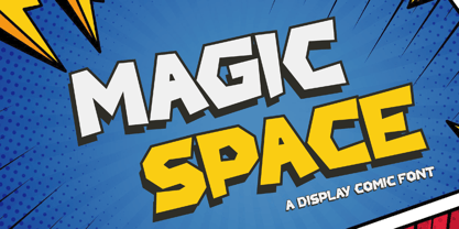 Magic Space is a Playful Comic Display Font. Embark on a whimsical journey through the cosmos with "Magic Space," a captivating comic display font that adds an enchanting touch to your designs. There's some connected letters and some alternates that suitable for any graphic designs. This font support for some multilingual. Also contains uppercase A-Z and lowercase a-z, alternate character, numbers 0-9, and some punctuation. If you need help, just write me! Thanks so much for checking out my shop!
 - Interstellar by Loshaj Foundry,
$10.00 Interstellar is inspired by science fiction movies and writings. My initial idea for the font was to be used for signage and user interfaces that would appear on spaceships and bases. However, Interstellar is very flexible and can be used in many creative ways. For example, it is perfectly suited for graphic design applications ranging from editorial, corporate, web, interaction, and product design. The font contains 400+ glyphs which includes uppercase letters, numbers, symbols, accented characters, and multiple language support. Check it out.
 - Jungle Mask by Ergibi Studio,
$21.00 Jungle Mask This typeface has been made carefully to make sure its premium quality and luxury feel. The many alternate character on serif makes this typeface unique and stands out rather than the regular sans font, perfectly for headlines, logos, posters, packaging, T-shirts,coffee shops, restaurants, magazine's headers, signs or gift/post cards,cafe's and weddings or any type of advertising purpose. If there is a problem, question, or anything about my fonts, don't hesitate to ask! Big Thanks Ergibi Studio
 - Blank Lemon by PizzaDude.dk,
$18.00 Blank Lemon is my heavy stroke handmade serif font. Yes, it is heavy and it's loud and is very noisy when it comes to making your headlines visible and the reason for this is that the shapes of the font is based on classic serif fonts. Blank Lemon comes with 7 different versions of each letter, and these automatically cycle as you type. Also there are fancy swashes of a, k, n, q and r - and of course multilingual support! Enjoy!
 - Gandhewa by Nirmalagraphics,
$14.00 Gandhewa is a font that I made in handwriting style. This font is inspired by my grandfather's writings. I made Gandhewa in a few steps that were long enough to finally become a beautiful font. Starting from rough sketches on paper using a ballpoint pen, I then redrawn and arranged the characters in the font creator. If you are looking for a natural, clean signature font, Gandhewa is perfect for you. Gandhewa is also equipped with 17 ligature and has multi-lingual support.
 - Boldina by DSType,
$19.00Boldina consists of 18 fonts with a lot of personality. This is a font to be mixed. That’s its purpose and that’s why it's designed as one single weight in so many different styles. My intent was to give designers a chance to use the same typeface in many different ways, putting together sans and serif, lots of italics and even Greek, Cyrillic and CE characters. The Ligatures and the Script versions give a more poetic and more accurate feeling to the text.


