5,852 search results
(0.019 seconds)
- Jules by DSType,
$45.00 At first glance, Jules, appears to be just one more Didonic variation, but a closer look starts revealing all the extraordinary features of this type family, specially designed for use in extremely big sizes. Jules reflect the last of the late 18th century and was inspired by several plates from a portuguese calligrapher named Antonio Jacintho de Araujo. Available in three different optical sizes: Big, Colossal and Epic, Jules has a plethora of ligatures and stylistic alternates, plus refined Italics and a super elegant Swashes version.
 - Seventies by Lián Types,
$37.00 'Meeeeoooow'! Seventies is another of my 'funkadelic' attempts (1) to fill the existing gap of seventyish looking fonts. In my opinion, that decade has a hidden treasure regarding type that remains unexplored: Only very few fonts rescue its 'groovy' essence, its ‘colourful’ qualities. But, don't have a cow man , and keep on truckin! With Seventies, my new foxy mama , your projects will stand out among the rest. Since there’s not much information available about this kind of lettering I had to get ideas from other styles: Nowadays it’s easy to find all kind of books or guides to understand and practice how different styles of calligraphy and lettering should be done. However, for some reason, 60s and 70s letters seemed to ignore/be free of rules... Was this suggesting the birth of postmodernism? I incorporated some ideas of the copperplate style of calligraphy: The ductus of its forms may be compared to the way letters are made in snell/engrosser’s script. Obviously, this is just the idea behind; the delicacy of thins is replaced here with the graceful imprint of really thick thicks with a brushy look and tons of good vibe . Seventies will work awesome in posters, brands, magazines, book-covers of any kind, due to its modern look adapted to our century. Well, catch you on the flip~side ! STYLES To make you more psyched , Seventies is a layered font! See examples in the posters using Seventies Shade, Seventies Shine and Seventies Printed. NOTES (1) My first one was with Beatle in 2014.
 - Cinnamon Peach by Abbasy Studio,
$8.50 Let me introduce my first ever product on my shop. Cinnamon Peach - Layered Font After 2 years of learning how to create a fonts, learn about the anatomy of typography, features of the OpenType fonts, and all of the experience on my collaborations with many friends, Finally I just launched my first personal product with the name Cinnamon Peach. Cinnamon Peach is beauty combinations of layered font. It has a Serif and Script style inside. Both of them are layered font, which is you can express the style on both of it. You can add shadow, inline or hatch on Serif style. Changing the color of the other layer as just easy as change standard color of the fonts but it’s more deep in detail. On the Script style, I give you more freedom of choosing which style do you want, if you want a deep style of layer, you can choose regular and inside with different color. but if you want the outline style, it also available as a single fonts. Looks like on the display that I Created, You can see the most of combinations font in there are perfectly matched even on script version doesn’t include the Uppercase character. Because of the strong characteristic of this fonts you can see the combinations are great with or without layer, monochrome or multi color, pastel or watercolour. It’s great for posters, display, logos, header website, magazine, animation text, etc. Thank You very much, hope you enjoy this fonts !
 - Heller Sans JNL by Jeff Levine,
$29.00 Heller Sans JNL is based on the main letterforms of an experimental alphabet designed by Steven Heller; noted author of over 170 books on design and visual culture. Some modifications were made in turning his design into a digital font. In his own words, here is the background to this typeface: “I recently recovered this from the junk heap. It is a yellowing photostat of my first and only typeface design (1969-70). Total folly! At the time I was smitten by Art Moderne lettering. I called it “Klaus Boobala Bold” because I liked the K and B. I’ve lost the letters S through Z, which were made. The letters were drawn with compass, Techno pen (that frequently clogged). as well as a triangle and T-square. The inline and outline made no real logical sense. I based the design, in part, on Kabel, Avant Garde and it was a product of whatever I could accomplish with those tools. The caps-only alphabet was photographed and produced as a film negative that was cut in foot-long strips and spliced to fit on a Typositor reel. Sadly, the negatives made for the font were too brittle and the splice snapped apart in the Typositor. I worked on it for well over a month and used the face only once. I realized with this attempt, like so many other times I attempted different challenges, that type design — indeed mechanical drawing — was not my strong suit.” Heller Sans JNL is available in both regular and oblique versions.
 - Interdimensional - 100% free

- Catholic Girls by Scholtz Fonts,
$21.00Catholic Girls is a timeless, handwriting-based, semi-calligraphic font that is highly readable yet has an informality combined with a quiet elegance. Above all else, Catholic Girls is well-behaved, ladylike, and can be expected to behave correctly and make the right impression in a wide range of situations. This "hand" is based on the style of handwriting taught at many Catholic Girls' Schools. It is feminine, elegant and readable. Use "Catholic Girls" for a great variety of applications, including: ? party invitations, wedding stationery, social event media, ? marketing material for seminars, property developments, leisure & lifestyle promotions, fashion, interior design, restaurants, florists, cosmetics ? publishing: magazines, books, children's books, greeting cards, ? packaging: girls' clothing, girls' toys, household consumables, cosmetics, fashion items, interior decor products - Nue - Personal use only

- Nue Medium - Personal use only

- Schnebel Sans Pro by URW Type Foundry,
$35.99 It took me 12 years to bring this extensive font family to completion. A lot has been changed, transformed, peeled and developed in all those years. For many of my projects I used it as my quarry and so it might have become something like a synthesis of all my imaginations and experiences. To me »Schnebel Sans« represents the optimal design of a contemporary grotesque that perfectly unites dynamics with statics. For copy text the typefaces are very legible, neutrally and remain in the background, but despite this generate the necessary tension when set as headlines. »Schnebel Sans« is available in 48 different styles. It is available as a Pro Font, containing West, East Greek, and Cyrillic or as the Schnebel Sans ME, also containing Arabic and Hebrew. The scripts include small caps and various figure sets. This big range of styles from Thin to Black and from Compressed to Expanded offer many possibilities for design and fulfill all requirements for a professional use. Because of the supplement of several non-Latin character sets, the »Schnebel Sans« is perfectly suitable for global services too. Volker Schnebel, 2016
 - Niemeyer by Latinotype,
$36.00 Oscar Niemeyer is one of the greatest architects of our time—his unique way of mixing straight lines and abstract curves gives rise to an unmistakable and characteristic style. This typeface is my own tribute to Brazilian architect Oscar Niemeyer. The design process started when my wife and I visited Brazil while she was running a series of workshops on calligraphy. In my spare time, I would walk through the streets of beautiful cities like Rio de Janeiro or São Paulo, enjoying the local architecture and urban life. I had also the opportunity to attend to some of the workshops during which I was able to observe the organic of calligraphy and people. Then, I started to draw some shapes that reflected everything about this beautiful place: Niemeyer’s architecture and work and, in his own words ‘the curves on the body of the beloved woman’. This versatile typeface comes in 8 weights with matching italics, alternative characters, oldstyle figures and much more! Niemeyer is well-suited for logotypes, advertising, publishing, branding and corporate use. Special thanks to everyone in the Latinotype Team (especially to César Araya) for their support, help with corrections and digital editing.
 - Schnebel Sans ME by URW Type Foundry,
$35.99 It took me 12 years to bring this extensive font family to completion. A lot has been changed, transformed, peeled and developed in all those years. For many of my projects I used it as my quarry and so it might have become something like a synthesis of all my imaginations and experiences. To me »Schnebel Sans« represents the optimal design of a contemporary grotesque that perfectly unites dynamics with statics. For copy text the typefaces are very legible, neutrally and remain in the background, but despite this generate the necessary tension when set as headlines. »Schnebel Sans« is available in 48 different styles. It is available as a Pro Font, containing West, East Greek, and Cyrillic or as the Schnebel Sans ME, also containing Arabic and Hebrew. The scripts include small caps and various figure sets.This big range of styles from Thin to Black and from Compressed to Expanded offer many possibilities for design and fulfill all requirements for a professional use. Because of the supplement of several non-Latin character sets, the »Schnebel Sans« is perfectly suitable for global services too. Volker Schnebel, 2016
 - Petale by LomoHiber,
$15.00 Petale is my new elegant experimental typeface I'd love to present. At the beginning, I was intended to create a bold wide font, I started sketching options and came out with the letter 'M' design first. I thought it may be interesting and had continued developing the style with letters N, O, etc., spending hours on some letters to match the design and my vision. I liked how it looked (especially digits) and added different weighs. And it came out pretty stylish. You may like it to use in magazine designs, posters, websites, packaging, branding, logo, and so on. Petale can grant your work some graceful modern touch with a brutalist-feminine note. Works well with elegant and strict serif fonts. Also try to experiment with script fonts. I used my Stormy Youth font: https://www.myfonts.com/fonts/lomohiber/stormy-youth and Bodoni 72 Smallcaps If you have some issues or questions, please let me know: lhfonts@gmail.com Hope you'll enjoy using Petale! Language support: Afrikaans, Albanian, Bulgarian, Catalan, Croatian, Czech, Danish, Dutch, English, Estonian, Finnish, French, German, Hungarian, Icelandic, Italian, Latvian, Lithuanian, Maltese, Norwegian, Polish, Portuguese, Romanian, Russian (Русский), Slovak, Slovenian, Spanisch, Swedish, Turkish, Ukrainian (Украинский), Zulu
 - MB TyranT - Personal use only

- Metal as in Heavy - Unknown license

- Venereal - Unknown license

- Angelin Love by Letterara,
$12.00 Angelin Love is a gorgeous script font, beautiful and romantic. This font looks perfect for Valentine’s Day designs, or for other romantically inclined styles and projects. To stay up to date for my latest job, follow me and let’s be friends because there will be many promos.
 - KG Payphone by Kimberly Geswein,
$5.00 This font was specifically created for my husband. He teaches 5th grade and wanted a font that was legible enough for students to read but still playful enough to add a touch of whimsy to his classroom. Legible enough for body text but fun enough for titles.
 - Bobgert by Oleg Gert,
$30.00 Bobgert – is a whimsical, optimistic and inspiring modern sans-serif font with a touch of monospace that is wonderful for headings and is perfect for posters, Instagram, magazines, print, branding, logos and anything else you can imagine. I hope my font will help you in your creativity.
 - Heart Strung by PizzaDude.dk,
$20.00 Simple, yet thrilling! Heart Strung is my handmade font! Useful for a wide range of things - such as invitations, greeting cards, headlines, notes and quotes ... and a lot of other things! Comes with swashes for uppercase and ligatures for double lettering - and some lovely swashy alternates! :)
 - MommieBrush by Hubert Jocham Type,
$29.90 MommieBrush is a brush script headline typeface. It is based on the Spencerian Mommie that won the 2008 TDC award. But as a brush script it works in a different area. Like my other brush script typefaces it is made for food packaging and product branding.
 - Rosestone by Supfonts,
$12.00 Rosestone is new signature script. This will give your text a unique and natural look. It is ideal for signatures, postcards, greetings, websites, blogs, and more. Includes: Uppercase and lowercase Numbers and punctuation Foreign language support Ligatures Check out my blog: https://www.instagram.com/zloillev pinterest.com/dmitriychirkov7 Enjoy
 - Monde Libre by Elyas Beria,
$12.00 Monde Libre is a display typeface that exudes optimism, joy, and whimsy. I designed this typeface based on a sign in a clip from some old film footage I saw somewhere. It stayed with me as a typeface that evokes the France of my dreams. Enjoy!
 - Nouveau Vaudeville by Jeff Levine,
$29.00 On the cover of the 1926 sheet music for “There Ain’t No Maybe in My Baby’s Eyes”, the title is rendered in Art Nouveau hand lettering; pen-drawn with rounded ends. The type design is now available as Nouveau Vaudeville JNL, in both regular and oblique versions.
 - Valis by AdultHumanMale,
$12.00 Valis is a thin, futurist, lightweight font, a sister font to my other design Ebdus. Valis has more of a 3D Angular feel. This font is an omnicase font, with capitals, capital-lowercase and lower case letters available. Lowercase letters are accessible through your Glyphs palette.
 - Liquid Amber by Hanoded,
$25.00 Liquidambar is actually a beautiful tree, native to America. I have one in my garden and I love its autumn colors! Liquid Amber is something else: it is a handmade all caps font that comes with oodles of diacritics, some swashes and some alternate glyphs. Enjoy!
 - Shibby by Hanoded,
$15.00 shibby adj (etc.). Used to indicate that something is “cool.” Apparently Shibby was first used in the 1999 movie Dude, Where’s My Car? I don’t think Shibby is THE cool word of the moment, but I think it is cool enough for this rather shibby font!
 - Crushland by Ditatype,
$29.00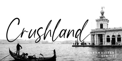 Crushland is a beautiful handwritten font. With a natural handwritten style, it brings a classy and beautiful typeface. Crushland is best used for branding, logotype, and quotes. Features: - Multilingual Support - Stylistics Set - Beautiful Ligatures - PUA Encoded - Numerals and Punctuation Thanks for visiting and purchasing my font!
 - Alt Ayame Long by ALT,
$10.00 A long version of my Ayame font. Ayame is a display font which looks great on posters, logos, and titles. Ayame Long is a 2-weight family with a heavy retro look. Works great with the regular version of Ayame you can check out the original.
 - Ice Cream Man by Hanoded,
$10.00 I was listening to an old Van Halen album when I made this font. I named it after one of my favorites: ‘Ice Cream Man’. Ice Cream Man is a happy, sloppy, wobbly kids font. Use it for your book covers, posters and ice cream packaging!
 - Night Michy by Zeenesia Studio,
$16.00 Have a great day! My new font was present, Night Michy!! Night Michy is a Bold vintage style serif font with strong character and soft features. modern and classic serif font with a clear and bold look. It’s a very versatile font that works great in large.
 - Hebrew Latino by Wiescher Design,
$39.50 Hebrew Latino was started out of frustration. I could not find a font that looked like Hebrew - actually I found one, but it had only capitals. So I decided to make my own. Strangely enough it looks a little bit Jugendstylish! Here it is. Shalom! Gert Wiescher
 - Nakata by Hanoded,
$15.00 Mr. Nakata is another one of my favorite Haruki Murakami characters. Nakata typeface is handwritten, sloppy and messy, but comes with intelligent features like alternates and ligatures, to make it look more like handwriting and less like a font. Of course, Nakata speaks most Roman-based languages.
 - Inka by CarnokyType,
$49.00 Inka is the name by which the closest-ones called my partner. Inka is also the name of a text typeface – in its form very friendly and welcoming. The same way as relationships develop through the life, text typefaces develop, too. I had started the work on this typeface about the same time as I met Inka, while reaching the final output has been a long and progressive process. Inka is a modern serif typeface with wide universality in functions (various editorial usages as books, magazines, annual reports…). The concept and the scope of the complete type family are based on the principle of optical sizes of the typeface designed for the particular use of the size of typesetting. Inka consists of several drawing variations for the typesetting of small sizes (Small), text typesetting (Text), larger typesetting sizes (Title), and headlines sizes (Display). Two constructive alternatives, differing in the height of the construction of the font signs, further extend the variability of the usage of the typeface. Inka A has classical proportions ideal for book typesetting. Inka B has lower ascenders and descenders, lower uppercase glyphs and numbers. Typeface with such construction allows us to use the typesetting efficiently while using tighter leading and still looking more contemporary. Each of the font set (Display, Title, Text, Small) consists of four weights (Regular, Medium, Bold, Black), each has wide character set and a lot of OpenType features. “Inka is dedicated to Inka.”
 - DT Skiart Lexiconic by Dragon Tongue Foundry,
$10.00 Apparently, Lexicon is the most expensive font in the world. ‘Skiart Lexiconic’ has been on a long growing path getting to where it is now. This font family was originally inspired by the san serif font ‘Skia’, by Mathew Carter for Apple. ‘Skiart’ was designed to feel more like a serifed font, but without any actual serifs. It took a small step between sans serif and serif fonts. Next on the path towards a serif font came Skiart Serif Mini, with tiny serifs added. This was a true serif font, although they were subtle. Then came ‘Skiart Serif Leaf’. and now... We present to you... DT Skiart Lexiconic. Having evolved from the Skiart family, we chose to give it the serifed styling of Lexicon. This is no way a copy or clone of Lexicon. It still has the basic bones of the original Skiart font, but the position, shape and size of the serifs were very much influenced by the world famous Lexicon font. DT Skiart Lexiconic is not the most expensive font in the world.
 - Rogue Serif by Device,
$29.00 Recently the Rogue family was designed as an accompaniment to Paralucent for Loaded, London's notorious lads-mag that had found its design being cloned by the competition and sought something unique to set it apart.
 - Holista by GlyphStyle,
$16.00 Holista is a casual calligraphy writing style, in a consistent bold-thin cursive. Beautiful and pretty font. This calligraphy font can be use for weddings, cosmetic product, photography logo, magazine, business cards, watermarks, etc. – Font feature Uppercase, Lowercase, Numerals & Punctuations, Stylistic alternate(ending), Ss01(ending), Ss02(beginning) Ligature, Swashes, Multilanguage
 - Ambassador Plus by Juraj Chrastina,
$39.00 Hairline display fonts are elegant and subtle with touch of luxury. They are the Champagne of type. Ambassador Plus Family represents a set of classy typefaces best suitable for magazines, cosmetics packaging, advertising or any kind of fine and sensitive design. The quality of spacing and kerning ensured by Igino Marini.
 - Dry Billow S by Tadiar,
$13.00 DryBillows Font is unusual decorative font carefully designed and well looking with Latin Extended character set. It is good for Text and Headers with lowercase and uppercase letters both! DryBillows ideally works in luxury, fashion, cosmetics, wine and food areas. Please see the large preview images to see how it works.
 - Retail Script by ITC,
$29.00Retail Script was designed by Vince Whitlock in 1987. It is a font with strong, dynamic base forms and very small ascenders and descenders, which makes a closed, solid overall image. The fine white lines which are traced within the figures make the font a bit more cheerful and the shading makes the figures look three dimensional. The energetic Retail Script is best used in headlines in larger point sizes in order to preserve the look of its fine details. - Kettering 205 by Talbot Type,
$12.99 Kettering 205 is a geometric slab-serif with Art Deco influences, such as lowered crossbars on many characters, and a crossed W. It includes old style non-aligning (lower case) numbers, both proportional and tabular as well as accented characters for Central European languages. It’s a highly individual looking font, but retains good legibility coupled with striking looks as a display font. The Kettering 205 family comprises of six weights and is closely related to Kettering 105, its less Deco flavoured cousin.


