1,641 search results
(0.022 seconds)
- Afternoon Edition JNL by Jeff Levine,
$29.00 Afternoon Edition JNL is another classic typeface (with Caslon influence) re-drawn from screen captures of vintage newspaper headlines. The font joins Final Edition JNL, Evening Paper JNL and Morning Paper JNL as a mini-collection of type styles used to grab a reader's attention in the 1930s, 1940s and 1950s.
 - Portada by TypeTogether,
$35.00 For everyone wishing for a modern serif that’s as clear and readable as a sans in restrictive digital environments, meet Portada by Veronika Burian and José Scaglione. Sans serifs are commonly used on small screens to save space and carry a modern tone. Serifs may appear fickle and unsteady, pixel grids change from one product to another, and space is at a premium. Portada now provides a serif option for these restrictive digital environments, putting that old trope to rest. The screen has met its serif match. Portada was created from and for the digital world — from e-ink or harsh grids to Retina capability — making it one of the few serifs of its kind. Portada’s text and titling styles were engineered for superlative performance, making great use of sturdy serifs, wide proportions, ample x-height, clear interior negative space, and its subservient personality. After all, words always take priority in text. It’s not all business, though. Portada’s italics contain an artefact of calligraphy in which the directionality of the instrokes and the returning curves of the outstrokes give the family a little unexpected brio. Yet even the terminals are stopped short of flourished self-absorption to retain their digital clarity. When printed these details are downright comforting. Portada’s titling styles enact slight changes while reducing the individual width of each character and keeping the internal space clear. Titling italics have increased expressiveness across a few characters rather than maxing out the personality in each individual glyph. Digital magazines, newspapers, your favourite novel, and all forms of continuous screen reading benefit from Portada’s features. This family can also cover many of the needs developers have: user interface, showing data intensive apps on screen, even one-word directives and dialogs. And, as a free download, an exhaustive set of dark and light icons is included to maintain Portada’s consistent presence, whether as a word or an image. The complete Portada family (eight text styles, ten titling styles, and one icon set) is designed for extensive, clear screen use — a rare serif on equal footing with a sans.
 - Wonderbear PB by Pink Broccoli,
$14.00 From the title screens and comic books of the Hair Bear Bunch comes the fun and funky Wonderbear typeface. All that 70’s flavor packed into a Caps/Alt Caps typestyle reminiscent of a lovable limited run cartoon show. The Hair Bears miss you as much as you miss them. Relive the laughter.
 - Churchward Lorina by BluHead Studio,
$25.00 Churchward Lorina is a four weight typeface family originally designed in 1996 by New Zealand type designer Joseph Churchward. A personable geometric sans serif, it possesses some of Churchward's trademark quirkiness but reamins highly legible and readable on screen as well as in print. The family includes Light, Regular, Bold and Black.
 - Zepto by d[esign],
$- Zepto is about as small as you can get with pixel fonts without sub-pixel rendering. Featured on Make: A tiny screen font you can actually download and use, free. For optimal use, please turn font anti-aliasing off and set at a size of 8px with image resolution set to 72ppi.
 - Unytour Display by NicolassFonts,
$25.00 Unytour Display is a modern sans-serif font family of 36 fonts. It includes nine weights with italics from Extra Light to Heavy. Each weight includes alternatives (A,G,I,R,a,l) and OpenType features. Unytour Display features excellent legibility for print, as it does for reproduction on TV screens and more.
 - Movie Matinee JNL by Jeff Levine,
$29.00 A 1926 trade ad for the silent comedy “The Nut-Cracker” starring Edward Everett Horton has the film’s title hand lettered in a decorative bold sans serif design complete with highlight lines and accent dots. This festive type face is now available digitally as Movie Matinee JNL in both regular and oblique versions.
 - Outr by Outerend,
$20.00 The fonts "Outr" were created with the concept of typography in motion. These display fonts look unique as movie titles, TV show logos, game titles, and many other products, especially with edgy and tech designs on screens. These are more suitable for and work very well in 2D and 3D motion graphics.
 - Zerno by Pepper Type,
$25.00 Zerno is a glyphic typeface with geometric roots. Its symmetrical flared serifs are reminiscent of stone carving techniques. With weights ranging from Thin to Black, it is versatile enough to be used in any environment - from screen to literal stone carving, as well as from posters to body copy that stands out.
 - Morning Paper JNL by Jeff Levine,
$29.00 Morning Paper JNL is part of a small series of fonts re-drawn from screen captures of original vintage newspaper headlines. The typefaces are classic wood and metal faces that were popular in all forms of print of the time. This sans is a companion to Final Edition JNL and Evening Paper JNL.
 - Norpeth by The Northern Block,
$32.00 A modern humanist sans serif typeface. The proportions of each character have a strong lateral dynamic that makes it ideal for on screen uses. Also consistent stroke contrast is used throughout each weight to maintain an optical balance. Details include 9 weights and italics, over 570 characters, manually edited kerning and opentype features.
 - Team Deco JNL by Jeff Levine,
$29.00 In an online edition of Modern Screen Magazine for March of 1936, many of the article headlines were set in a bold, slab serif inline font which (although possessing some Art Deco traits) could double as a sports font. This is now available as Team Deco JNL in both regular and oblique versions.
 - Rigo by Katatrad,
$33.00 Rigo™ is a flexible family of modern sans serif. Rigo is characterized by some humanistic characteristics, its open part of negative space and its overall width make it highly legible and readable at small to large size. The openness helps Rigo to be a good performer on the screen as well.
 - Hypnotica by Deniart Systems,
$15.00 Hypnotize your audience! For a truly unusual eye-catching experience, this modern-day series, containing 52 geometrical and optical mofifs, can bewitch and fool the eyes with unexpected shifts in focus. Whether your documents are for print or screen, these symbols are sure to add a little fun to all your presentations.
 - Lucida Console by Monotype,
$50.99 Kris Holmes and Charles Bigelow designed Lucida Console in 1993 for on-screen console and terminal emulation windows that needed monospaced fonts with sturdy letter shapes. Lucida Console has simple, clear, robust letterforms, a big x-height, and economical fitting. It looks large on-screen and in print but takes up less space than traditional typewriter and monospaced fonts. Its short capitals were originally technical adaptations to user interfaces on computers, but its compact look and active italic appeals to typographers and designers for a wide variety of uses, including in games and digital devices. The Lucida Console family has 675 glyphs in each font, and supports the WGL and W1G character sets. This includes the Extended Latin, Greek, and Cyrillic alphabets along with a generous set of symbols, box-draw, and graphical characters.
 - Zeitung Pro by Underware,
$50.00 Zeitung is a sans serif family which works equally well on print and web. First of all: Zeitung is a sans serif made according to contemporary standards: 8 weights, romans and italics, all equipped with small caps. Lots of OpenType features, like uppercase punctuation or 5 figure styles to make sure any of your mathematical or financial charts, tables and diagrams look cool. Zeitung’s typographic palette focuses on utility and legibility, but in the farthest corners you’ll discover a rich array of flavours: punchy black weights, fashionable thin styles, carefully hand crafted true italics, distinct small caps. But Zeitung has more to offer. Its optical sizes offer the best style for each size of your text. Zeitung fonts are devided to two optical families: Zeitung Standard and Zeitung Micro. Zeitung Standard works great in most sizes, while Zeitung Micro fonts are specially made for very small sizes in print and web. Zeitung Micro fonts are perfectly legible in web, where the same technical font styles have to survive in many environments, from older browsers to most up to date mobile screens. Next to that: the lightest weights also function as grades, because they share the same metrics. This can be very handy for selecting the optimal weight for your specific situation, especially on screens or when type is printed by a newspaper press. Letters are rendered in many various ways on different screens. Maybe the interface of your next app requires a different grade than your latest website? Zeitung allows you to change the weight of your text without any further consequence for the design. That is a welcome relief during the design process. Zeitung will help to bring your message across in many different circumstances, from large text in print to small type on screens.
 - Vivala Code by Johannes Hoffmann,
$16.99 The mono-spaced Vivala Code is designed specifically for programming. Each day developers spend hours looking at a screen. Vivala Code is aligned to their needs. It has a clear distinction between similar characters and owns an optimized punctuation, especially for source code. It's suitable for light text on a dark background at small sizes.
 - Deco Film Ad JNL by Jeff Levine,
$29.00 A ìthick and thinî Art Deco sans lettering design was found within the pages of the May, 1936 issue of Modern Screen magazine. This condensed typeface has rounded terminals, similar to that made by a round nib lettering pen. This is now available as Deco Film Ad JNL in both regular and oblique versions.
 - Aftika Soft by Graphite,
$18.00 Aftika Soft is the soft edged version of Aftika type family. It is a clean geometric sans serif family of seven weights. Characterised by a prominent x-height, it is well suited for advertising, packaging, editorial and publishing, logos, branding, posters, billboards, signage as well as for small text for print or digital screens.
 - Hoxton by The Northern Block,
$19.30 A modern humanistic san serif typeface. The horizontal structure of the font gives it a clean lateral dynamic that is ideal for on screen uses. Also the proportions have been condensed to maximize the use of space across various layouts. Details include seven weights, a full character set, manually edited kerning and Euro symbol.
 - CalliSans by 38-lineart,
$21.00 Introducing CalliSans : a revolution in typography. 14 fonts, 7 regular and 7 italic, seamlessly blend calligraphy's grace with sans-serif simplicity. Perfect for projects demanding elegance, from books to digital screens. Make a bold statement with its distinctive style. Timeless yet contemporary, it transcends trends. Your creative secret weapon. CalliSans Pro: where art meets design.
 - Quartz MS by Microsoft Corporation,
$39.00Quartz MS captures the display of text on an LCD (Liquid Crystal Display) and LED (Light Emitting Diode) screen. Quartz MS was designed by Terrance Weinzierl of Ascender Corporation for Microsoft. The Quartz MS has a technical, industrial quality. It can be used to good effect when a futuristic, scientific or technical impression is desired. - Monsal Gothic by The Northern Block,
$32.00 A contemporary gothic sans font family with simple and condensed proportions. The design pays close attention towards balance and expression of form, creating a functional yet elegant typeface suitable for extensive text-based publications in print and screen. Details include 680 characters, seven weights with true italics, small caps, manually edited kerning and Opentype features.
 - Ascender Serif by Ascender,
$92.99 Ascender Serif was designed by Steve Matteson as an originative, unique serif design that is metrically compatible with Times New Roman. Ascender Serif offers refined on-screen readability characteristics and the pan-European WGL character set and solves the needs of developers searching for width-compatible fonts to address document portability across various platforms.
 - Malabar eText by Linotype,
$103.99 A clear and enjoyable reading experience hinges on the legibility of text copy, especially when reading on screen. This is why Monotype has developed the eText collection of fonts specifically tailored for the text-heavy display environments of e-readers, tablets, mobile devices, and the Web. The original Malabar was designed by Dan Reynolds.
 - Long giraffe by Ask Foundry,
$19.00 Meet "Long giraffe," a condensed font inspired by a giraffe's elongated neck. It offers two font families, one displaying significant thickness contrast between horizontal and vertical strokes. Perfect for mobile screens and narrow spaces. Supports Western and Eastern European languages, making it versatile for diverse design needs. Embrace the elegance and functionality of Long giraffe.
 - Realstin by Ajibatype,
$19.00 Realstin is a luxurious serif with an elegant style. It seduces your eyes with its curves yet still manages to maintain its classy serenity, it’s perfect for branding, logos, invitations, long texts, and many more of your other needs.
 - Eshajori by Zenmurai,
$25.00 Eshajori is an elegant and soft serif font. The primary challenge in designing this font was finding a balance between complexity and simplicity, while ensuring it could be used on both computer screens and in print. Another challenge was achieving harmony between the characters, punctuation, and numerals, creating a visually appealing and playful visual vocabulary overall.
 - Quitador Sans by Linotype,
$57.99 The Quitador™ Sans family is a fresh and distinctive design with roots that go back to the original Quitador typeface. Like its slab serif relative, the Quitador Sans suite of typefaces is large with several weights of roman and italic designs, making it an excellent choice for a wide variety of print and on-screen projects.
 - Cirque De La Lune by Dawnland,
$9.00 Once a year Through mist and rain October soon to end Have no fear Beneath the full moon we gather. Welcome to the show! Now - Silence... Cirque de la Lune is an uppercase only poster/display/headline font in two variants - Eclipse (regular) & Fullmoon (outline). Alternate, nudged or slightly rotated uppercase letters are placed on the lower case keys!
 - ITC Galliard eText by ITC,
$29.00A clear and enjoyable reading experience hinges on the legibility of text copy, especially when reading on screen. This is why Monotype has developed the eText collection of fonts specifically tailored for the text-heavy display environments of e-readers, tablets, mobile devices, and the Web. Matthew Carter designed the original ITC Galliard. Carl Crossgrove created this eText version. - Burdigala X Sans by Asgeir Pedersen,
$24.99 Burdigala X Sans is an open and spacious typeface, ideal for larger amounts of (printed) texts in brochures, magazines and books. Being wider than usual, it works especially well in media intended for on-screen reading, such as in Pdf-documents, e-books, applications and so on. Burdigala is the ancient Roman name of the city of Bordeaux France.
 - Freud by Juraj Chrastina,
$29.00 Freud is a sans family of 9 weights ranging from hairline to extra bold (also available as a 5 styles Economy Pack). It’s a legible face with straightforward geometry spiced with lovely humanist terminals. Some strokes are cut at an angle to enhance its identity. Freud provides a strong partner both for screen and print projects.
 - Sadi Sans by Koray Özbey,
$19.00 Sadi Slab is designed to be used on small scales like book texts, newspapers, magazines etc. Also its large counters make the font suitable for digital screens. The anatomy of the typeface gives a formal appearance which is a more fitting choice for subjects like law, finance, medical science etc. Another member of Sadi family is Sadi Slab.
 - Qolling by Dora Typefoundry,
$17.00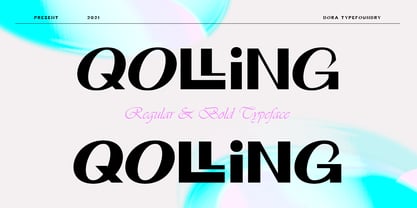 Introducing Qolling is a modern display font, designed for maximum visual and emotional impact. It has a classy and elegant look, Qolling gives your words a powerful sound and is fun to use in your graphic design and screen use projects such as branding, magazines, editorials. , wedding invitations, logo designs, posters, social media and more! Thank you
 - Aftika by Graphite,
$18.00 Aftika is a clean geometric sans serif family of seven weights. Characterised by a prominent x-height, it is well suited for advertising, packaging, editorial and publishing, logos, branding, posters, billboards, signage as well as for small text for print or digital screens. There is a soft edged version of Aftika as well, called Aftika Soft.
 - Flower Garden by Stripes Studio,
$19.99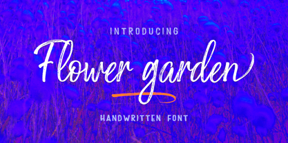 Flower Garden is a handwritten font that has a detailed texture, so it is perfect for your designs that want to look natural and attractive, this font also has alternatives and ligatures. Flower Garden is suitable for screen printing, business cards, brand projects, logos, product packaging, posters, invitations, greeting cards, news, blogs, everything including personal charm etc.
 - Zeitgeist by Monotype,
$29.99With Zeitgeist, designer Michael Johnson explored the limitations of early digital technology: the letters are built up in the style of low resolution bitmaps. The design was completely carried out on-screen. In additional to the standard lettershapes, the Zeitgeist family comes with a range of engaging and colorful alternative letters and swash characters for enhanced attention. - Ki by Mint Type,
$29.00 Ki is a monospaced display typeface inspired by older VCR / camcorder OSD (on-screen display) fonts. It is peculiar for its diagonal angles being restricted to 45°, which results in a specific textural effect perfectly legible in small type sizes. Ki comes in 7 weights with corresponding italics, and features extensive language support with over 500 glyphs, including Cyrillic.
 - Imported Goods JNL by Jeff Levine,
$29.00 In the December, 1947 issue of Modern Screen magazine, a feature article showcased actress Deborah Kerr with the title “Imported”. The typography used for the headline of the article was a hand lettered, extra-bold, sans serif stencil design. This lettering became the inspiration for Imported Goods JNL, which is now available in both regular and oblique versions.