10,000 search results
(0.015 seconds)
- JH Diwani Simplified Light by JH Fonts,
$120.00 JH Diwani Simplified Light is an advanced Arabic font simulating the Diwani Calligraphy with its finest details. Its typical usage: Wedding / greeting cards, headlines, poetry, and books. Please note that Arabic Kashida is not available for this font.
 - Black Cluster by Hanoded,
$15.00 First things first: I am really not a Star Trek fan. I did come up with this name, which I thought had a good ring to it. When I checked whether the name was already taken, I found out that Black Cluster is a term from Star Trek. Now you want to know what a Black Cluster is, so just check out poster 2 and read all about it. For me, Black Cluster is a handmade ink font, with a lot of jumping glyphs, a lot of diacritics and a handful of ligatures. It may be rough, but you will be pleasantly surprised by what it can do to a design! May the font be with you. Oh, no, that was from Star Wars…
 - Zydeco JNL by Jeff Levine,
$29.00Zydeco JNL gives the 'Latin' style spur serif treatment to Jeff Levine's Halavah Twist JNL, for a new and fun typeface named after the Louisiana French-Creole music popularized by accordion player Clifton Chenier in the 1950s. - Song Sheet JNL by Jeff Levine,
$29.00 Sheet music for the 1930s song "Josephine" had its title hand lettered in a simple, bold sans design that is recreated in Song Sheet JNL. This bold sans is perfect for titling wherever strong emphasis is necessary.
 - Square Spray by Blankids,
$22.00 Introducing of our new product the name is Square Spray Graffiti Font, Square Spray inspired by graffiti style with a fun theme very good for graffity poster, Hip Hop music, kids poster, flyer, childrenbook, cartoon, comic etc
 - Grostique by Aftertime Studio,
$20.00 Grostique is a bold and solemn sans serif font, perfectly suitable for daring projects that need an outstanding appearance. It works best on streetwear designs, logo branding, editorial designs, music posters, modern advertising campaigns, and many more.
 - Pinx Niera by Sitintahitam,
$20.00 Pinx Niera is a bold psychedelic typeface. Inspired by psychedelic music and visual. The typeface looks bold, clean, and unique form. Suitable for any graphic designs such as branding materials, t-shirt, print, logo, poster, packaging .etc
 - Bomber Throw by Blankids,
$21.00 Introducing of our new product the name is Bomber Throw Graffiti Font, Bomber Throw inspired by graffiti style with a fun theme very good for graffity poster, Hip Hop music, kids poster, flyer, childrenbook, cartoon, comic etc
 - Light Line Deco JNL by Jeff Levine,
$29.00 The unusual, thin line hand lettering on the cover of the sheet music for 1936's "If You Love Me" was the basis for Light Line Deco JNL, which is available in both regular and oblique versions.
 - Street Lord by Blankids,
$23.00 Introducing of our new product the name is Street Lord Graffiti Font, Street Lord inspired by graffiti style with a fun theme very good for graffity poster, Hip Hop music, kids poster, flyer, childrenbook, cartoon, comic etc
 - Neurotic Roman JNL by Jeff Levine,
$29.00 The free-form, Art Nouveau hand lettering on the cover of the sheet music for 1915's "She Was All That a Pal Ought to Be" inspired Neurotic Roman JNL; available in both regular and oblique versions.
 - Bubble Boom by Blankids,
$18.00 Bubble Boom is inspired by graffiti, and fits well for themes such as graffiti posters, Hip Hop music, kids posters, flyers, children books, cartoons, comics, and more. Features included: Uppercase Lowercase Number Punctuation Multilingual PUA Encode OpenType
 - Bay Area Nouveau JNL by Jeff Levine,
$29.00 Bay Area Nouveau JNL is an ultra bold, Art Nouveau headline font inspired by hand lettering on the cover of a piece of 1911 sheet music entitled "The Only Pal I Ever Had Came from 'Frisco Town'".
 - Adlm by Andfonts,
$14.00 Abxr is a cool, robotic styled display font. This font is ideal for logos\names and pretty much anything else that requires a unique touch. My opinion it can works perfectly in music, sport and art industry.
 - Rollik by Alit Design,
$19.00 Presenting the ✨Rollik Typeface✨ by alitdesign. Inspired by music posters of the 70s and 80s, the Rollik font was created in a calm and simple style but still gives it a uniquely retro and playful feel. Besides that, combined with a dynamic serif style makes the Rollik font more stylish and retro elegant, especially if the design to be made uses swash on alternative fonts for creativity, for example lettering or logotypes designed to make your design look cool and different. The Rollik font is very suitable for making designs with retro concepts, simple and playful designs, for example making magazine cover designs, music covers, YouTube thumbs, text headers, logotypes and so on with an elegant retort theme. Besides that this font is very easy to use both in design and non-design programs because everything changes and glyphs are supported by Unicode (PUA). The Rollik font has a total of 940 glyphs including symbol, multilingual and alternative glyphs. We really enjoyed the process of making the Rollik font, we hope you are also happy when using the Brolike font.
 - Afri by Krown Creative Factory,
$15.00 Afri is a funky Native typeface which in a way could be considered as a serif it features edged and freely expressed glyphs. It can be used to create a range of design projects like posters, advertising and marketing flyers and even to printed items. It just requires you to use your imaginative strength and your design projects will look more native and even better pass your message. With this typeface you can create a party poster, movie flyer, advertising and marketing posters, it can also be used on branding items, Native craft design, book covers, music cover arts, or any purpose of your choice to make your designs look African but not too tribal, feel free to play with this typeface.
 - Speedy Space Goat Oddity by LomoHiber,
$12.00 Speedy Space Goat Oddity is the font with really interesting mood. My purpose was to transfer freedom, immediacy, and a bit of insanity with it. I've painted it with self-made paint and brush in a trippy environment. You can use Speedy Space Goat Oddity almost everywhere (not for body text). It's great for posters, clothes design, package design, music album covers. Also, with the right approach, you can use it as horror font. Speedy Space Goat Oddity Features: Pant texture 2 ligatures for tt and ff 14 contextual alternates for most common double letters Carefully tuned kerning (preview above doesn't show it for some reason) If you have some issues or questions, please let me know: lhfonts@gmail.com Hope you'll enjoy using Speedy Space Goat Oddity!
 - Deco Days JNL by Jeff Levine,
$29.00 The hand lettered pre-Deco style title and songwriters' credits on the cover of the sheet music for 1929s "The Love Parade" were the models for Deco Days JNL, which is available in both regular and oblique versions.
 - Nouveau To Go JNL by Jeff Levine,
$29.00 Nouveau To Go JNL is the digital version of the hand lettered title found on the 1915 sheet music for the song "Don't Bite the Hand That's Feeding You", and is available in both regular and oblique versions.
 - Poster Pen JNL by Jeff Levine,
$29.00 The bold round point pen lettering on the cover of the 1934 sheet music for “New England in the Rain” was the model and inspiration for Poster Pen JNL, which is available in both regular and oblique versions.
 - Courtship JNL by Jeff Levine,
$29.00 The Art Nouveau hand lettered title on the sheet music for the 1909 composition "If the Wind Had Only Blown the Other Way" was the basis for Courtship JNL, which is available in both regular and oblique versions.
 - Westfield Nouveau JNL by Jeff Levine,
$29.00 The hand lettered song title on the sheet music for 1918’s ‘N’ Everything (from the Al Jolson show “Sinbad”) was the inspiration and model for Westfield Nouveau JNL, which is available in both regular and oblique versions.
 - Song Crafter JNL by Jeff Levine,
$29.00 Song Crafter JNL was modeled from the writer credits on the cover of the 1943 sheet music for "This Love of Mine", a tune popularized by Frank Sinatra. The typeface is available in both regular and oblique versions.
 - Ceuphoria by Atasi Studio,
$18.00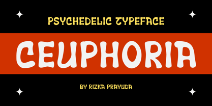 Ceuphoria is a display groovy font with a psychedelic look and trippy effect. Ceuphoria is ready and Perfectly fit for your logo designs, music projects & social media posts, event poster, brand imagery, product packaging, handwritten quotes, merchandise, etc.
 - Hollywood 69 by Fonts of Chaos,
$10.00 This is not Hollywood. You may be surprised but I am not inspired by the famous Hollywood sign for this type but a grid on a roof of Barcelona. I walked down the street observing the architecture of buildings in the area of the Marina when I saw a grid on a roof. One of the workers put a board on them and the magic happen. Hollywood 69 is now free with 99 !
 - XAirebesk by Ingrimayne Type,
$14.95 I am not sure exactly how to classify these geometrical ornaments. They resemble the arabesque ornamentation of medieval Islamic art, but also have similarities to Celtic knots and to some Chinese and Korean ornamentation. The bolder of the two only works well at very large point sizes, while the thinner is designed for use at smaller point sizes. There are usually similar ornaments on the same characters of the two, but not always.
 - ITC Static by ITC,
$29.99Static looks almost like it was stamped on paper: the black color is not evenly distributed and the background comes through the letters and consciously irregular forms reinforce the effect. The characters do not all have the same height, nor do they stand straight and regularly on the base line. Static is a robust font with bold, rounded serifs and is best used for headlines and short texts in point sizes of 12 and larger. - Armstrong by Device,
$39.00 An elegant geometric linking script that uses OpenType programming to intelligently substitute "beginning" and "ending" characters with uniquely designed variants. The family also includes swash alternates that can be toggled on or off in the Opentype panel. (Note: Please view the image above for correct end and beginning letters as they will appear in Indesign, Illustrator, etc. The Myfonts previews below are not Opentype savvy, and so these specially designed versions do not substitute themselves.)
 - Lubaline by Lián Types,
$39.00 Who haven't heard the phrase that ‘any past time was better’?. Although I sometimes find this phrase a little too pessimistic (because I try to think that the best is yet to come), it may be true regarding my passion, typography. I'm too young (29) unfortunately, and this means I did not have the pleasure of being contemporary with maybe the man who has influenced my work the most (1). The man that showed that letters are more than just letters to be read. Herb Lubalin (1918-1981), also called sometimes as ‘the rule basher’ (2), smashed the taboos and sacred rules of type design and gave it personality. He rejected the functionalist philosophy of europeans in favor of an eclectic and exuberant style. To him, letters were not merely vessels of form, they were objects of meaning. (3). Nowadays, when looking at his portfolio, who dares to deny that the term ‘typography’ and ‘beauty’ may go hand-in-hand without any problem? Ed Benguiat, one of Herb’s partners, still likes making jokes with the phrase “screw legibility, type should be beautiful” and what I understand of this is not to forget the rules, but to know and break them carefully. In an era of pure eclecticism, we, the lovers of flourishes and swashes, can't do nothing but admire all the legacy that Lubalin, this wonderful type-guru, left. My font Lubaline read as “the line of Lubalin” is my humble tribute to him. Those who know his work, may see the influences easily like in his ‘Beards’ (1976) and ‘The Sound of Music’ (1965) posters; the art-deco forms in many of his amazing logos and practically in all his creations where letters seem to be alive just like you and me. I really hope that the future finds me still learning more and more about type-design and letterforms, and like him, always willing to make innovations in my field: Because letters are not just letters to be read. NOTES (1) These are some of my fonts in which some of Lubalin’s influences can be seen (in order of creation): Reina, Aire, Erotica, String, Beatle, Heroe, Selfie, Model, Seventies, and many others that are still in progress. (2) (3) Steven Heller. Herb Lubalin: Rule Basher. U&lc (1998) http://www.printmag.com/imprint/my-favorite-lubalin/
 - Movie Star - Unknown license

- PR8 Charade - Unknown license

- WildWords Lower by Comicraft,
$49.00 WILD WORDS! WILD WORDS! Buh-Buh-Buh-DUH-DUH! WILD WORDS! Wild Words never lose it! Wild Words never chose this way… Wild Words never close their eyes… Wild Words always sh-- I'm sorry? WILD WORDS is NOT a song by Duran Duran? Really? But I got myself the Simon Le Bon ’80s haircut and my MAD MAX outfit and everything… It’s a font from Comicraft? Now available in lower case? Well that’s good too, right? Comicraft fonts are created BY comic book letterers FOR lettering comic books. Accept no substitutes! See the family related to WildWords Lower: Wild Words
 - Plain Stupid by PizzaDude.dk,
$17.00 Really, there is nothing stupid about this font. In some strange and weird way, I just thought that the name sounded like something eye-catching - in the same way that the font is eye-catching! It may look like your average comic font, but it's not! I carefully put a lot of funk, twist, comic and a spoonful of pizzadude into each and every letter. The result is a bouncy crazy looking comic font. Oh, I almost forgot - I topped the letters with a spoonful of grafitti mixed with the sounds of a party...that's the recipe for this lovely multilingual font! :)
 - Weiss Modern Gothic by Jvne77 Studio,
$25.00 Weiss Modern Gothic is the first digital re-creation with a lot of improvements of a late seventies well-known edited typeface by Bauer. At the time known as Weiss Initials Extra Bold or Weiß Modern Gothik, the design was inspired by the famous Weiß Initialen N°2 drawn by Emil Rudolf Weiß (1875-1942); also father of the non-less famous "Neuland" typeface. Strangely, this beauty seemed abandoned while sister-flared faces like Friz Quadrata, Flange, Serif Gothic or Romic are in a new wave of revival. Hoping this one will not again disappear... Happy new life.
 - Maduki by Hanoded,
$15.00 This time the font's name is meaningless. Maduki doesn't mean 'cool' in Swahili, nor does it mean 'cup cake' in Sranantongo. It is just a nice name. Maduki is a playful font, created with one of my 2 year old son's marker pens (the 'no stain, wash-out' variety), a couple of cups of coffee and a whole bunch of 'speculaas' cookies. Now you're wondering what speculaas is, right? I'll tell you later - in a couple of fonts... Anyway, there's not much meaningful to say about Maduki font. It is nice, it is cute and it comes with alternates!
 - Chez Moustache by PintassilgoPrints,
$29.00 Based on Irma La Douce film opening titles, Chez Moustache is a very eye-catching display font loaded with cool special effects. It is a unicase typeface with 2 versions for each letter, each easily accessible through upper and lower case keys. To prevent double letters from displaying the same glyph, just type the alternate glyph, or use the neat OpenType feature to make things even easier: just turn on the contextual alternates in any OpenType aware program and it's all done before you can say Jack Robinson. Did you push the stylistic alternates button instead of the contextual one? Voilà, so you've got a pocketful of flowers! There's a complete set of sweet stylistic alternates to instantly flourish your way. And it's not over yet: check out the cool initial and terminal forms for that extra twist. Pick your choices with a glyphs palette or just turn on the OpenType swash feature. Now go ahead, there's a lot to do Chez Moustache. But that's another story...
 - WEAR FAT SHIRT by TypoGraphicDesign,
$15.00 CONCEPT/ CHARACTERISTICS A display font that allows you to »Kleckern und Klotzen« (modified German proverb »to not take half-measures«) The fat and square character to the font, a bold and loud statement. The motto is square, practical, fat. The font styles ranging from high-contrast line difference "beanpole" over mediocrity "slim" to the fattest and blackest "okay" style. A font with humor ^^ APPLICATION AREA The modern, square lightweight »Fat Wear Shirt« would be happy as a display typeface in headline size on the following areas and would find this very real bold: Editorial Design (Magazine or Fanzine) or Webdesign (Headline Webfont for your website), party flyer, movie poster, music poster, clothing, fashion, t-shirts, music covers or webbanner. And and and… TECHNICAL SPECIFICATIONS Headline Font | Display Font | Fat Techno Font »Wear Fat Shirt« OpenType Font (Mac + Win) with 3 styles (okay, slim, beanpole) & 268 glyphs. Alternative letters and ligatures (with accents & €) Desktop Font (.otf) + Web Font (.svg, .eot, .woff) KONZEPT/BESONDERHEITEN Eine Display-Schrift bei der Kleckern und Klotzen erlaubt ist! (Verändertes deutsches Sprichwort »nicht kleckern sondern klotzen«) Der fette und eckige Charakter verleihen der Schrift eine plakative und laute Aussage. Das Motto lautet quadratisch, praktisch, fett. Die Schriftschnitte reichen von kontrastreichen Linienunterschied »beanpole«, über mittelmaß »slim« bis zum fettesten und schwärzesten »okay« Style. Eine Schrift mit Humor ^^ EINSATZGEBIETE Das moderne, quadratische Leichtgewicht »Wear Fat Shirt«, würde sich als Auszeichnungsschrift in Headlinegröße über folgende Einsatzgebiete sehr freuen und fände dies echt fett: Logos/Wortmarken aller Art, Flyer für fast jede Party, Platten Cover, CD-Cover und Icon Design, Plakat Design, Kleidung, T-Shirts, Comics und Graphicnovels, Game– und Videospiel Design aller Genres, als Headlineschrift für print und digitale Magazine, Bücher und Webseiten u.v.m. TECHNISCHE INFORMATIONEN Headline Font | Display Font | Fat Techno Font »Wear Fat Shirt« OpenType Font (Mac + Win) mit 3 Schriftschnitten (okay, slim, beanpole) & 268 Glyphen. Inkl. diakritisches Zeichen, alternative Buchstaben, Ligaturen & €. Desktop Font (.otf) + Web Font (.svg, .eot, .woff)
 - Kids Rule by PizzaDude.dk,
$13.00 Sometimes you need a lot of text, and that text needs a little bit extra something. Something sweet for the eye, but still legible and not too funky. Maybe that's where Kids Rule comes in. It's a bouncy, but super-legible handmade comic font. It has a lot of attitude, and I have added 5 different versions of each letter!
 - See You Again by Seemly Fonts,
$14.00 See You Again is a brand new and thin lettered display font. See You Again is perfectly suited for stationery, logos, t-shirt, paper, print design, website header, photo frame, flyer, music cover, poster, image slider, and much more.
 - Showmanship JNL by Jeff Levine,
$29.00 Despite the racially demeaning 1906 sheet music for "The Ghost of the Banjo Coon", the title's lettering provided an interesting hand-lettered sans serif that has been re-drawn digitally as Showmanship JNL in both regular and oblique versions.

