3,065 search results
(0.011 seconds)
- HG Marugothic by RICOH,
$199.00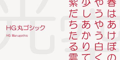 HG丸ゴシックは、リョービの書体「シリウス」を字母とする丸ゴシック体です。L、M、Bと、3つの太さがあります。線はやわらかで、全体的に明るく、あたたかさがあります。ふところは大きくとられていて、かつ、仮名も大きめに作られていて、判別もしやすくなっています。また、それらの特徴から、カジュアルな印象を強く与えますが、ややコントラストがあるため、すっきりとしていて、優しい印象も与えます。
 - Uranus by Supremat,
$12.00 Uranus is a futuristic font inspired by space and extraterrestrial civilizations. The proportions of the letters are wide, the elements of the letters have organic curves, reminiscent of the design of streamlined spaceships. What gives the font a special character is the excessive contrast between the upper element and the crossbar in letters such as A, B, E, F, K, P, R. In these letters, there is a barely noticeable intra-letter gap in the form of a line. Due to this contrast and rounded elements in these letters, a negative space of a triangular shape also turned out. Particular attention should be paid to the broad language support for the font. The font has support for Latin, extended Cyrillic, and Korean (2780 base syllables). Total glyphs: 3562. Uranus is well-suited for large typography, logos, and any other design related to futurism and space.
 - Ergonomique by Monotype,
$31.99 Ergonomique is a humanist sans serif typeface that has been designed to be efficient and comfortable to use across all applications. Ergonomique’s personality is defined by its spurless lowercase glyphs – the stems are truncated and blend into their adjoining arcs, as can be seen in the a/b/d/m/n/p/q/r/u characters. Ergonomique is ideal for branding and display purposes, but also performs well as body copy if you’re seeking a unique style for your text. With its nine weights and complementing italics, Ergonomique is highly versatile, especially when you consider that there are small caps and old style figures included, along with a Latin Extended character set. Key Features: • 18 font family – 9 weights in Roman and Italic • Small Caps, Ligatures, with Proportional, Old Style, and Small Cap figures, plus Fractions, Numerators, Denominators, Superiors, and Inferiors • Full European character set (Latin Extended) • 800+ glyphs per font.
 - Core Sans C by S-Core,
$20.00 Core Sans C family is a part of the Core Sans Series, such as N, M, E, A, D, G, R and B. Core Sans C is inspired by classic geometric sans (Futura, Avenir, Avant Garde etc.). It is based on geometric shapes, like near-perfect circle and square. It has a much higher x-height (height of lowercase letters), an effect which promotes readability especially at small print sizes. The Core Sans C Family consists of 9 weights (Thin, Extra Light, Light, Regular, Medium, Bold, Extra Bold, Heavy, Black) and Italics for each format. Core Sans C supports complete Basic Latin, Cyrillic, Greek, Central European, Turkish, Baltic character sets. Each font includes proportional figures, tabular figures, oldstyle figures, numerators, denominators, superscript, scientific inferiors, subscript, fractions and case features. Core Sans C is an ideal font family for use in magazines, web pages, screens, displays, and so on.
 - Terafile by Sudtipos,
$39.00 Terafile, a sans serif family designed by Raúl Plancarte who was inspired by hi-tech aesthetics. It is made up of eight weight variants with their respective italic versions. Ideally it works to capture in a graphic way the universe related to technology, sci-fi, industry and similar topics. It is a mixed family, because the construction of certain letters (as in "a", "f", "z", "B", "P", among others) is enriched with different finishes in structure to gain differentiation and plasticity. In other words, it moves away from an entirely academic design. Another important line in the creative concept of this typeface is the function of its ink traps, which, in addition to fulfilling their primary function, serve to gain gestuality in its use. This font is capable of covering complex design needs by enabling association with specific themes, which makes it highly competitive in its graphic line.
 - Kashi by Naghi Naghachian,
$64.00 Kashi is the Persian word for tile. This font is inspired from building decorations of 16th and 17th centuries in Iran. It is extremely legible even in very small size. Kasha design fulfills the following needs: A Explicitly crafted for use in electronic media fulfills the demands of electronic communication. B Suitability for multiple applications. Gives the widest potential acceptability. C Extreme legibility not only in small sizes, but also when the type is filtered or skewed, e.g., in Photoshop or Illustrator. Nima’s simplified forms may be artificial obliqued in InDesign or Illustrator, without any loss in quality for the effected text. D An attractive typographic image. Kasha was developed for multiple languages and writing conventions. Kashi supports Arabic, Persian and Urdu. It also includes proportional and tabular numerals for the supported languages. E The highest degree of calligraphic grace and the clarity of geometric typography.
 - Poruka by Tour De Force,
$30.00 Poruka is slanted script typeface with connected letters with gently condensed look. Letters are designed as monoline forms with decent dose of elegancy and stylistic uniformity. Poruka is imagined mainly as typeface for shorter texts or headlines, where text needs to stand out from other elements of content. It can be used successfully both as webfont and on printed materials – all kinds of invitations, labels, packages, posters and editorial use. Poruka comes with two Stylistic Sets – 01 which activates uppercase letters with full font height (from the top of ascender to the bottom of descender) and 02 – which activates handwritten forms on "b", "d", "h" and "l" letters. Also, Poruka is equipped with Swashes and Discretionary Ligatures which doesn't really represent classical pack of expected ligatures, but more as graphical version of a couple of words like "yes", "no", "wait", "ciao" and a few more.
 - Quadrim by Artisticandunique,
$40.00 Quadrim - Serif Font Family - Multilingual -12 Style (2020) On the basis of Quadrim, it is a mix of the old-fashioned Roman serif family. The old style serif combination combines, modern aesthetics with fantasy and Art Nouveau serif fonts, making Quadrim a versatile family that can be used in many different design projects. This font offers a wide variety of styles to help you discover the best mood for your projects, from body text to large titles, from classic styles to modern and bold styles. It is very suitable for book and magazines, magazine covers, editorial, titles, websites, logos, invitations, branding, advertising and more. CHARACTER RANGES : Basic Latin, Latin-1 Supplement, Latin Extended-A, Latin Extended-B, General Punctuation, Currency Symbols, CJK Symbols And Punctuation, Private Use Area (plane 0), With this font you can create your unique designs. If you have a question, please contact me. Have a good time.
 - Jack Stanislav by deFharo,
$22.00 Very condensed typography, thick line and fun look for headlines and advertising where you are looking for saving space and originality at the same time. The upper inclination of the letters, the combination of horizontal with inclined forms, the ascending and descending short, and the lower elongation of some antlers will allow you to print varied styles with a lot of movement according to the context of the design. I started drawing this font with the intention of creating a new decorative typeface Blackletter style but modernizing the strokes, after drawing several letters imitating the ductus of this type of fonts trying to simplify them, emerged all the DNA of the current Jack Stanislav, finally a retro typography without Serif of linear strokes that mimic the angle of a thick pen. Use the following keys to write the bitcoin symbol and the Jack icon: b #, a #
 - Bodoni Classic by Wiescher Design,
$55.00 I became interested in designing Bodoni Classic because of a lazy graphic designer at Jacques Damase publishing house. He had to change a single letter on a bookcover about J. B. BODONI. The French call him Jean Baptiste instead of Giambattista! And that unknown graphic designer just took any old “J” from some newly cut Bodoni. All the new Bodoni cuts have square serifs, whereas the originals had rounded serifs and slightly concave feet. The single letter “J” with the squared off serif was for me like a road sign to start redesigning the entire Bodoni family. That’s exactly what I started in 1993 and a dozen years later I am finished. Okay, I am still adding new Bodoni Classics, but those are my personal additions. Recently I designed a family of seven »Bodonian Script« fonts, that can be mixed with most of my Bodonis. Yours very retro, Gert Wiescher
 - Josefa Rounded Pro by Ingo,
$42.00 A sans serif without rough edges Josefa Rounded is a beautiful text typeface. It’s unostentatious forms and balanced narrow proportions along with the softened round edges make it to appear gentle and pleasing even in longer texts. modern very legible narrow proportions high x-height distinctive forms Dtermining for the personality of Josefa Rounded are also particular idiosyncratic letters. For instance B P and R is designed openly; the bars of E and F equal each other; lower case c and e are distinctly withdrawn in their lower zone; y is symmetrical. Short ascenders generate compact word images. Cap height is shorter than the ascenders, so capitals are only little higher than x-height. Josefa Rounded is provided in 7 weights including the corresponding italics. Tabular figures and proportional figures are available through the appropriate OpenType function as well as ligatures and discretionary ligatures.
 - Guaruja Neue by Tipogra Fio,
$- Get in touch with Tipogra Fio and get inspired by Guaruja Neue specimens. Guaruja Neue is a neo-grotesque typeface with additional industrial traits to it, such as open corners in diagonal glyphs and short curves. The semi-cursive italics shapes, more than an orthographic matter, give sea waves for the headlines and copies that Guaruja Neue will compose, since it is named after a city on the coast of São Paulo, Brazil. Stylistic alternates, ligatures, ordinals, arrows and emojis give extra personality for texts that cross millennial and modernist concepts, going from a comprehensive Latin script, including Vietnamese support, until a basic Cyrillic set. Brazilian music tells the graphic story of Guaruja Neue specimens, songs that speak about beaches and the city of Guarujá, as well as the inspiration of 50’s and 60’s modernist design and the music movement of Bossa Nova. This family is also an evolution of Guaruja Grotesk (2021), a typeface with four fonts —Regular, Italic, Bold and Bold Italic— developed as part of a design school project, that now in Neue gains professionalism, refinement and knowledge. Guaruja Grotesk took 18 months to make, and Neue took additional 12 months of redrawing and rethinking, as design as processes. Part of the project got feedback from the typeface designer Ulrike Raush, under the Alphabettes mentorship program. Overview and features: 8 weights and 8 italics; 2 free fonts: Guaruja Neue Regular and Guaruja Neue Italic; Extended Latin and basic Cyrillic; 800+ glyphs; Numbers: proportional, tabular, superscripts, subscripts, denominators, numerators and fractions; Greek for math; Case-Sensitive forms; Arrows; Standard and discretionary ligatures; SS01: one story a and SS02: two story g; Emojis and SS03: negative alternate emojis; Ligatures for English ordinals;
 - FS Kitty by Fontsmith,
$50.00 Cute FS Kitty is the type equivalent of Bagpuss: plump, cute, cuddly and not fond of exercise. So don’t go giving it a run-out on body copy; FS Kitty is an all-caps font made for showing off in posters and headlines, and on products, point-of sale and especially sweets. Blubber Kitty had been quietly curled up in Phil Garnham’s sketchbook for a year before he brought it out to be brushed up. “It was in the mix as a basic form when I started thinking about FS Lola. It was a twisted, bubbly beauty – quite squishable and huggable. The working file was called Blubber. “At that time it was a basic construction of strokes. I created the ‘A’ first, purely as a shape to play with, not as type. I flipped it for ‘V’, and copied that for a ‘W’. I flipped the ‘W’ for an ‘M’... I thought, ‘This looks a bit wacky, but I like it,’ and just carried on. The most tricky characters were the ‘B’ ‘P’ and ‘R’. I must have drawn about 20 kinds of B for this, just to get it to fit.” Variety “When the regular weight of Kitty had been designed,” says Jason Smith, “it just felt like a natural progression to go on and explore how far we could go with it: Light, Solid, Headline, Shadow.” Phil Garnham thinks there’s still more to come. “There are some really individual characters in this font that I think have yet to be exploited: the Greek Omega symbol, the strange face in the ampersand. Like Bagpuss, Kitty has kept a low profile so far. “We know people are using Kitty. In fact, it was the first of any of our fonts that we sold on the day it was released. But I still haven’t seen it out there in the wild. It’s going to be a exciting moment.”
 - FS Kitty Variable by Fontsmith,
$199.99Cute FS Kitty is the type equivalent of Bagpuss: plump, cute, cuddly and not fond of exercise. So don’t go giving it a run-out on body copy; FS Kitty is an all-caps font made for showing off in posters and headlines, and on products, point-of sale and especially sweets. Blubber Kitty had been quietly curled up in Phil Garnham’s sketchbook for a year before he brought it out to be brushed up. “It was in the mix as a basic form when I started thinking about FS Lola. It was a twisted, bubbly beauty – quite squishable and huggable. The working file was called Blubber. “At that time it was a basic construction of strokes. I created the ‘A’ first, purely as a shape to play with, not as type. I flipped it for ‘V’, and copied that for a ‘W’. I flipped the ‘W’ for an ‘M’... I thought, ‘This looks a bit wacky, but I like it,’ and just carried on. The most tricky characters were the ‘B’ ‘P’ and ‘R’. I must have drawn about 20 kinds of B for this, just to get it to fit.” Variety “When the regular weight of Kitty had been designed,” says Jason Smith, “it just felt like a natural progression to go on and explore how far we could go with it: Light, Solid, Headline, Shadow.” Phil Garnham thinks there’s still more to come. “There are some really individual characters in this font that I think have yet to be exploited: the Greek Omega symbol, the strange face in the ampersand. Like Bagpuss, Kitty has kept a low profile so far. “We know people are using Kitty. In fact, it was the first of any of our fonts that we sold on the day it was released. But I still haven’t seen it out there in the wild. It’s going to be a exciting moment.” - Daytona Variable by Monotype,
$209.99The Daytona™ typeface family grew out Jim Wasco’s desire to design a readable and legible typeface for video and on screen use. Because of its high levels of legibility, the Daytona family is additionally an ideal design for display usage in digital user interfaces and a wide range of print applications. Wasco drew each character with legibility as a primary goal, some of the letters having unique attributes to minimize the ambiguity. Daytona Variables are font files which are featuring two width axes and have a preset instance from Thin to Fat. - FF Sanuk by FontFont,
$57.99 French type designer Xavier Dupré created this sans FontFont in 2006. The family has 14 weights, ranging from Hairline to Fat (including italics) and is ideally suited for advertising and packaging, editorial and publishing, logo, branding and creative industries, poster and billboards as well as small text. FF Sanuk provides advanced typographical support with features such as ligatures, small capitals, alternate characters, case-sensitive forms, fractions, and super- and subscript characters. It comes with a complete range of figure set options – oldstyle and lining figures, each in tabular and proportional widths.
 - Leftover Crayon by Hanoded,
$15.00 My kids have a tin box filled with crayon and pencil leftovers: bits and pieces that have fallen or broken off, but are still good enough to use. For me it is a treasure trove, as I often find a nice bit of crayon to use for a new font. In this case, I created Leftover Crayon. Leftover Crayon is a fat, crumbling and seriously eroded crayon font. Completely hand made, completely legible and full of character. Use it for your bedtime stories, product packaging and invitations. Comes filled to the brim with diacritics.
 - WILK by Edyta Demurat,
$20.00 Do you need a hand-drawn, heavy, creative typeface? If so, WILK is perfect for you! This font was created specially for fairy tale "Little Red Riding Hood" and it was inspired by the fairy-tale's character of wolf . The typography is tight- knit and fat but also free and funny. It consists only of uppercases, but it has two up to five alternative gifs for each letter. This great choice of gifs makes WILK perfect for long texts but not only! It's also great in a large magnification.
 - Stubby by Tipos Pereira,
$12.00 Stubby is a display type family with 11 styles, was made for titles, headlines and also packages, posters and everything that provide space for a rude, fat and widish type. You should try Stubby in your text blocks if you're looking for an informal shape with some handwriting taste, there are eleven styles mixing from a narrowed thin to a sloppy ultrabold. Stubby has a tight spacing made to fit in squeeze places, not so elegant or clean but definitely an original choice for your real life project.
 - Twirrewyn by Hanoded,
$15.00 Twirrewyn is Frisian for ‘Whirlwind’. I have always liked the Frisian language; it’s like a crossover between English and Dutch. When I studied journalism in Zwolle (a city close to Fryslân) there were a lot of Frisian students and I did pick up a few words! Twirrewyn is a handmade font family: the fat version was made using a brush and ink; the light version was made using that same ink, but with a broken satay skewer instead of a brush. And yes, you have guessed right, we eat a lot of Satay! ;-)
 - Pagoda International by Poole,
$18.50Imagine there's an explosion in a comic book, the exclamation that follows is set in PAGODA INTERNATIONAL. This font is inspired by the graphics on one of Honolulu's 1950's skyscrapers - The Pagoda Hotel with the International Ballroom. Created by former wine label designer, Wesley Poole, Pagoda is the opposite of sophisticated elegance. "Big, fat, and horsy, that's what I was after. It's the wacky juxtaposition of these familiar shapes that makes it work. Just try a couple words. You'll be surprised! I'm glad this one's behind me. It's my first pancake." - Mafuta by Scholtz Fonts,
$19.00Mafuta is a round, happy font, named for the Zulu word for "fat". In tribal societies in Africa, where food was often scarce and almost never easily come by, it was considered desirable to appear "well fed". Roundness was a symbol of high status in the tribe, and a sign of wealth. The up-beat, bold outline of the font celebrates the confidence of people who feel comfortable being who they are. The font manages to be both contemporary and African. It is best used for posters and for headings. - Lemoo by Locomotype,
$15.00 Lemoo is a family of fat fonts made with irregular shapes to make it more dynamic and unusual. This font will give the impression of solid, strong and prominent. Suitable for headlines, posters and messages that want to stand out. There are two styles in each variant: clean and press. You can mix and match the Lemoo font family to get different results. The ligature feature makes some pairs of letters more interesting on your headline and posters. Lemoo fonts are available in OTF and TTF format, also multilingual support.
 - Encoder by District,
$20.00 This is not a stencil font. At least it isn't intended to be. The foundation for the entire font comes from a progression in experimental rules on stroke intersections (pinching, separating) while maintaining proportions and elements from a more conventional typeface. More latitude was given to the unicase "Fat" face but still retains the overall flavor of the original. The end result is a typeface that's hard to categorize as any one personality. Most likely a good candidate for logo, display, or headline work, the applications for Encoder are yet undeciphered.
 - Olivita by Plau,
$49.00 Innocent until proven otherwise, Olivita is a heavyweight interpretation of the Typewriter genre. Typewriter fonts have captivated generations of designers and found its way into infinite applications, including Milton Glaser’s classic I heart NY logo. Olivita is a fat-face take on the same idea. There’s a lot to negotiate in making type as bold as possible, with shapes having to contort and distort in order to make a cohesive whole. The x-height is tall yet ascenders and descenders are long. Super size it and see the rich, creamy texture come forward.
 - Beatle by Lián Types,
$30.00 What if Platt R. Spencer and Charles P. Zaner were born in mid-20th Century? What if they were fans of The Beatles or The Mamas & Papas? Beatle is what those masters would have made. Letters shouting for peace, like a true hippie does, with a lot of elegance. With Beatle I wanted to mix the delicacy of engrossers script with the exuberance of flower power. The result is a font designed with freedom, full of provocative alternates and fat tails. Enjoy it and of course, let it be.
 - Artificial Flavour by Kitchen Table Type Foundry,
$15.00 I do groceries a couple of times a week. When I am shopping for food, I always read the ingredients list; I don’t want too much sugar, nor palm oil, trans fats or a lot of E numbers. It used to be quite hard finding products that didn’t contain artificial flavours or colouring, but it is getting better. Artificial Flavour is an anti-ode to the time we couldn’t get enough of the stuff - it is a handmade, all caps font which comes with extensive language support and a sweet set of alternates.
 - Blastvader by Invasi Studio,
$19.00 Introducing a new collection of retro display fonts. Blastvader is a reverse contrast retro display font. The glyphs have a fat rounded shape. It's ideal for headlines, flyers, posters, greeting cards, product packaging, book covers, logotypes, and album covers, among other things. Ensuring carefully crafted styles result from the use of this font. The alternates in this font can add more fun to your projects. Its imperfections keep it casual while still providing legibility. Features: Total 209 Glyph Uppercase Numerals & Punctuation Alternates Multilanguage Supports 60+ Latin based languages
 - Gulp by Flavortype,
$18.00 GULP font is a playful and fun font inspired by pop art, hippie and comic book styles. It's groovy, funky and retro with an ultra-bold and fat appearance, making it perfect for eye-catching headers and short word texts. This font exudes modernity and fanciness, making it ideal for any purpose that requires a dominant and powerful impact. The italic style adds a touch of uniqueness, giving it a playful edge. However, GULP is not recommended for long text as it can be overpowering and may detract from the overall readability of your content.
 - Margarita by PampaType,
$60.00 Alejandro Lo Celso’s tribute to Bodoni takes the form of a humorous fat face for display use, in both solid and engraved forms. Four years after Bodoni’s death, Margherita, Giambattista’s widow, published the two volumes of the famous Manuale Tipografico, a significant catalogue even today. Margarita’s curves are extremely sensual, it should be set only at huge sizes. The typeface includes several ligatures both standard and discretionary, and a set of contemporary ornaments to set nice frames and patterns. We hope you enjoy working with this fancy type. See more at PampaType.com.
 - Rare Bird Specimen II by Rare Bird Font Foundry,
$100.00 RARE BIRD SPECIMEN II Specimen II is an elegant hand by Karla Lim of Written Word Calligraphy. It floats across the page on gossamer wings. Specimen II pairs well with classic typefaces like Baskerville, Garamond and Bodoni. OBSERVATIONS Specimen II is exquisitely delicate but not fragile. Best suited for unforgettable affairs. DEFINING CHARACTERISTICS Opentype programming, formal title & preposition wordart, 7 alternate ëandí options, Roman numerals, in and out-stroked letterforms at beginning and end of words, multiple alternate lowercase t cross-strokes, realistic double-letter ligatures, seamlessly connecting calligraphic letters, alternate capital letters, old style numerals, basic Latin encoding. POTENTIAL SIGHTINGS Wedding stationery suites, logo design, luxury product packaging, fragrance, wine labels.
 - Single Bound by Comicraft,
$19.00 Placed in a hastily designed spaceship and launched toward Earth, SINGLE BOUND was found by a passing motorist who was astounded by this font's feats of strength and agility! As this collection of tall and handsome characters matures, you will discover more of its abilities and perhaps use them for the benefit of all mankind. Even in its secret identity, SINGLE BOUND can lift many times its own body weight and leap great distances, much like its alter ego, UP UP AND AWAY! Single Bound includes weights from Light to Heavy, with clean ("modern") and worn ("vintage") versions, support for Western & Central Europe and Vietnamese, and an available Variable Font for precise control of weight & italic.
 - Blackberry by Los Andes,
$25.00 Blackberry is a display typographical family inspired on the design of vintage packaging, old fashion ads and show business marketing campaigns. This font brings back Woodtype characteristics such as angular serifs, and light and diagonal curves, which make it a fresh and current proposal for contemporary design needs. Blackberry has a dynamic system of layers that include 3D extrusions, shadows, outline and inline graphics, as well as a series of dingbats and flags. The system is supported for over 200 Latin-based languages. In total, the 10 Blackberry fonts provide a wide array of combinations and possibilities for high impact graphics, such as labels, packaging, posters, branding, record and movie covers, among others.
 - Printers Drawer JNL by Jeff Levine,
$29.00 Printers Drawer JNL continues building on a library of letterpress illustrations, cartoons, ad builders, Art Deco ad panels, ornaments, embellishments, and general miscellany. The images are re-drawn from vintage source material, and this font is jam-packed with 89 images spread throughout most all of the standard keyboard positions. This is officially the 1000th release from Jeff Levine Fonts since its inception in January of 2006. Jeff Levine Fonts aims to preserve the almost-lost artwork and lettering styles of the past within a digital type format, and often recreates the designs complete with their evident flaws, idiosyncrasies and eccentricities; allowing for a “real world” and nostalgic look to the computer generated art projects of today.
 - Old Miami Beach JNL by Jeff Levine,
$29.00 The grandeur of what was Miami Beach had its golden years peak in the 1940s. One of the grande dame hotels that stood at Collins Avenue and 23rd Street was the Roney Plaza; built in the 1920s and demolished around 1969. An online auction offered a pair of gummed labels provided by the hotel to be used by their guests for shipping souvenir packages back home, thus also giving the hotel a promotional plug. Jeff Levine not only created two typefaces from this hand-lettered label - Old Miami Beach JNL and Old Miami Beach Nights JNL (a solid black version), but painstakingly recreated the look of the label for the promotional flag and banner for the fonts.
 - Trinos by Arterfak Project,
$17.00 Trinos is a strong character font that combines racing style and techno with a slightly expanded letterform and sharp edges. The sharp spur on the top of letterforms, bold weight, and fully geometric represent strength, honor, and brave. Speed up your pulse with Trinos font available in Stencil and Solid style. This all-caps font is perfect for sports, great for automotive, and looks cool for techno themes. You can apply this font for jerseys, decals, flags, logos, posters, magazines, packaging, and many more! Not only that. Trinos is equipped with much of alternates characters, and elegant ligatures to boost your design look more powerful! What you'll get : Uppercase & smallcaps Numbers & punctuation Multilingual support Stylistic alternates Ligatures Sincerely, Ramz
 - Speedway SG by Spiece Graphics,
$39.00 Motoring at top speed calls for your own high-performance machine and a special racetrack font to run it on. Speedway was built with blacktop smooth caps to ease you through those short and dangerous curves. And its sleek, aerodynamic lowercase linking makes getting your speedy cruiser to the checkered flag a breeze. Developed in typeface alley for discriminating designers. And for the more adventurous, Speedway SG is now available in the OpenType Std format. Some new characters have been added to this OpenType version. Advanced features currently work in Adobe Creative Suite InDesign, Creative Suite Illustrator, and Quark XPress 7. Check for OpenType advanced feature support in other applications as it gradually becomes available with upgrades.
 - Lightron by Sensatype Studio,
$15.00 Newon is an Unique Neon Light Font with Floating shape make your design look unique and modern A new Display Font that we created special for Headline, Title and more stand out typography needs, with extra ligature that will add your variations. It's so perfect to add your style and headline overview. And specially for this font, we crafted for unique style and modern feels so enjoy to create any project that will show your main idea out. Newon Neon Light Font ready with: Any options to get creative variations (combination of Ligature Characters) Preview as a inspirations that you can do with this font Ready with Uppercase & Lowercase characters Wish you enjoy our font. :)
 - Aljaraz by Cuchi, qué tipo,
$9.95 Aljaraz (meaning “small bell” in english) is a curvy typeface inspired on the “Fat face" letters with an extremely bold design from the early 19th century, but with an insolent touch of brave and psychedelic distortions. Aljaraz has a regular and italic variable, and in both styles the capital letters have a swash alternative where the naughty touch reaches its maximum expression. It is ideal to recall the lysergic era of the 60s, write funny words, or simply to express small texts in a display way that powerfully attracts attention. Let Aljaraz inspire you groovy kind of love! Designed by Carlos Campos cuchi@cuchiquetipo.com Secondary typeface: 'Escuela', also by Carlos Campos _ Aljaraz (“campanita”) es una tipografía curvy inspirada en las letras con un diseño extremadamente grueso y atrevido de principios del siglo XIX (las “Fat face”), pero con un toque insolente de valientes distorsiones psicodélicas. Aljaraz tiene una variable regular y cursiva, y en ambos estilos las mayúsculas tienen una alternativa súper decorada donde el toque travieso alcanza su máxima expresión. Es ideal para rememorar la época lisérgica de los años 60, escribir palabras graciosas, o simplemente expresar textos graciosos de una forma visual que llame poderosamente la atención. ¡Deja que Aljaraz te inspire su maravilloso amor!
 - Posh by Lián Types,
$49.00 I've always been in love with fat didones. That’s the reason of Posh. In search of something unique, I started this family back in 2013 with the aim of creating the fattest yet readable bodonian typeface in the market: It was a challenge, because roman fonts need generous counters (or what some call white spaces) and taking them to the extreme of inexistence attempted against the construction of many glyphs. Ears, dots, terminals and serifs always need some extra space so I had to find the exact point of boldness to make characters which have those attributes work well in the middle of those which haven't. (1) After a while, I felt I was again ‘in my element’: Big contrasted letters, sexy and elegant curves, and that Lubalinesque feeling that characterise my fonts. (2) Words written with Posh are a explosion of elegance and sensuality due to the fact that its didone attributes were exaggerated. Since it’s full of alternate glyphs, one can change and choose them until a nice block of ‘‘black’’ is achieved. (3) To accompany the regular style, I designed Posh Inline, a font with the same quantity of glyphs than the regular one; an all caps style called Posh Capitals, and also a really playful Italic version. I hope you find this one delicious like I do! This font is dedicated to all who understand letters are not just meant to be read, but also to be appreciated in group and individually. Enjoy it. NOTES (1) In example, it can be easy to design a fat letter ‘n’ with almost no counter, but really tough to make a satisfactory letter ‘s’ with serifs to match that ‘n’. (2) Also, it wasn't my first attempt in fat didones. Take a look at my font Reina, made in 2012. (3) Posters above show many words with ball terminals that seem to dance above and below the words in order to fill those “undesired” blank spaces.