10,000 search results
(0.018 seconds)
- Merry Fleurons by Greater Albion Typefounders,
$3.95 Merry Fleurons is a bit of fun for Christmas, New Year and the holidays. It's ideal for decorating your own cards, party banners and any sort of Christmas publications. Need Holly? Christmas Trees? Baubles? Candy Canes? Angels? Merry Fleurons is just what you need.
 - Morris Sans by Linotype,
$40.99 Morris Sans is a newly revised and extended version of a small geometric family of typefaces originally produced by Morris Fuller Benton in 1930 for ATF. His initial design consisted of an alphabet of squared capital letters with a unique twist that characterized its appearance: corners with rounded exteriors and right-angle interiors. The types were intended for use in the fine print found on business cards, banking or financial forms, and contracts. But over the ensuing decades, this design became a popular element in all sorts of design environments, and several foundries revived the typeface in digital form. Since digital fonts are bicameral, with slots for both upper and lowercase letters, new cuts of the type opted filled the lowercase slots with small caps. In 2006, Linotype commissioned its own version of the typeface-an extension for 21st century use. Under the advisement of Linotype's type director Akira Kobayashi, Dan Reynolds redrew the uppercase and added an original lowercase for the first time. Additionally, a number of extras were brought into the fonts, including six figure styles (tabular and proportional lining figures, tabular and proportional oldstyle figures, and special tabular and proportional small cap" figures). Small caps, which have become an iconic element over time, are accessible in each font as an OpenType feature. To differentiate this version from the original, Linotype's new family is named Morris Sans, in honor of Morris Fuller Benton. All fonts in the Morris Sans family are OpenType Com fonts; they include a character set capable of setting 48 European languages that employ the Roman alphabet, including all Central and Eastern Europe languages, those from the Baltics, and Turkish. This glyph coverage extends to the small caps as well. Morris Sans is a wide typeface, especially in its regular widths; the condensed faces set a more conventional line of text. The new lowercase letters are less geometric than the uppercase, except for those that share the same basic forms (e.g., c, o, and s). Instead of following this geometric trend, the new lowercase tends to strengthen the humanist elements that were present in several characters from the original type, including the uppercase D and the figures 5, 6, and 9. Morris Sans also sports a number of glyphic flares, like the stroke found on the original uppercase Q. Morris Sans is a clean, modern design best suited for headlines, advertising, posters, expressive signage (especially on storefronts), and corporate identity work."
 - Castle On The Hill by Hanoded,
$15.00 When I started working on this font, I had the radio on. Ed Sheeran was singing his song ‘Castle On The Hill’ and when I looked at this new font of mine, I couldn’t help but notice it had a bit of a medieval look. So I named it Castle On The Hill. COTH is a very lively, messy handpainted serif. It was made with a Japanese brush pen. I actually had a different look in mind, but this is what came out of the pen and I quite liked its looks. It is especially useful for children’s book covers, apps and posters, but be my guest and use it as you like. All it needs is a designers’ touch, a nice tune and a sunset.
 - ILL oCtoBer - Unknown license

- ILL oMen - Unknown license

- The Mumbai Sticker by Roland Hüse Design,
$29.00 “The Mumbai Sticker” is a layered script font. I have created this font from the sticker I designed for my Mumbai trip for my friend’s wedding, you can watch a short video of the process and the story behind. https://youtu.be/bO8e9lQ0DNU instructions to use: • for smooth connections of v s, v r, v z, w s, w r, and w z please enable “standard ligatures” in open type features panel • Type a text with the “Regular” version, then copy and paste in back (cmd B) and switch to “Outline” version. Please make sure you give it a different color to make the main font visible. Looks best in Black and white as you can see in the poster image but feel free to play around! (Please refer to the PDF included within the downloadable .zip file. • • • For full version and commercial license please visit https://rolandhuse.com or contact@rolandhuse.com The full / commercial version contains Western and Eastern European accented characters and special characters, punctuation and ligatures. @rolandhusedesign Follow me on Instagram
 - Savia Filled Shadow - Personal use only

- MAWNS' Graffiti Filled - Personal use only

- Hall Fetica Wide - Unknown license

- Hall Fetica Italic - Unknown license

- Typewriter from hell - Unknown license

- Political Graft Fill - Unknown license

- MND Pinballer Fill - Unknown license

- Kill your darlings - Unknown license

- pills are good - Unknown license

- Hall Fetica Decompose - Unknown license

- Martian Hull Markings - Unknown license

- Hall Fetica Narrow - Unknown license

- Hall Fetica Upper - Unknown license

- Urban Scrawl Chill - Unknown license

- They Killed Kenny! - Unknown license

- Margarita Ville NF by Nick's Fonts,
$10.00A whimsical monoline slab-serif font with understated elegance, based on lettering from an old ad discovered by a friend in Spain. Both versions of this font contain the complete Unicode 1252 (Latin) and Unicode 1250 (Central European) character sets, with localization for Romanian and Moldovan. - SP Don Mills by Remote Inc,
$39.00A font family inspired by the twists and turns of North Americas first planned community. - Village Hall JNL by Jeff Levine,
$29.00 A 1918 poster issued during World War I from the YWCA encouraged women to pitch in to the war effort by joining the “United War Work Campaign”. The Art Nouveau hand lettering of that poster was a slight throwback to the “Western” or “Victorian” style of typography because of the characters having split serifs. This is now available as Village Hall JNL, in both regular and oblique versions
 - Hilly Handwriting Pro by SoftMaker,
$7.99 Digitized handwriting fonts are a perfect way to give documents the “very special touch”. Invitations look simply better when handwritten than when printed in bland Arial or Times New Roman. Short handwritten notes look authentic and appealing. There are numerous occasions where handwritten text makes a better impression. Hilly Handwriting Pro is a beautiful typeface that mimics true handwriting closely. Use Hilly Handwriting Pro to create stunningly beautiful designs easily. This typeface comes with many pre-made ligatures and alternative characters for sophisticated typography – all easily accessible as OpenType features. A “random” feature even allows for automated random switching between variations of the same character, resulting in type that looks authentically handwritten.
 - Borough Hall JNL by Jeff Levine,
$29.00Picture yourself on a New York subway station platform with the location name set into the tiles on the wall. Borough Hall JNL evokes the feeling of urban industrialism at its best. - LDJ Jill Bird by Illustration Ink,
$3.00 - Gill Sans Nova by Monotype,
$61.99 The Gill Sans® Nova typeface, by Monotype Studio designer George Ryan, expands the much-loved Gill Sans family from 18 to 43 fonts and features a coordinated range of roman and condensed designs. Several new display fonts are available, including a suite of six inline weights, shadowed outline fonts that were never digitized and Gill Sans Nova Deco that was previously withdrawn from the Monotype library. A variety of OpenType® features are supported that make it possible to include experimental characters from different points in Gill Sans’s long history, including pointed diagonals on ‘A’, ‘V’ and ‘W’ and alternatives for ‘b’, ‘d’, ‘p’ and ‘q.’ Proportional figures are also available as an alternative to the tabular designs. The Gill Sans Nova family has a large character set that supports Latin, Greek and Cyrillic languages. The display weights support Latin only. “Gill Sans was fast to strike a chord with people after its initial 1928 release and quickly became popular,” explains Ryan. “It’s been adapted for every publishing technology, from mechanical typesetting to digital imaging – always receiving the best treatment from Monotype in each iteration. This is especially true with all that we’ve added to the new series, while still retaining the familiarity of Gill Sans. My goal was to ensure clarity across digital environments, add missing weights, and bring more personality to the family with new display fonts, as well as Gill-inspired alternate characters.” The Gill Sans Nova typeface family is part of the new Eric Gill Series, drawing on Monotype's heritage to remaster and expand and revitalize Eric Gill’s body of work, with more weights, more characters and more languages to meet a wide range of design requirements. The Series also brings to life new elements inspired by some of Gill’s unreleased work, recently discovered in Monotype’s archive of original typeface drawings, designer correspondence and documents from the last century.
 - Gill Display Compressed by ITC,
$29.99The successful Gill Sans® was designed by the English artist and type designer Eric Gill and issued by Monotype in 1928 to 1930. The roots of Gill Sans can be traced to the typeface that Gill's teacher, Edward Johnston, designed for the signage of the London Underground Railway in 1918. Gill´s alphabet is more classical in proportion and contains what have become known as his signature flared capital R and eyeglass lowercase g. Gill Sans is a humanist sans serif with some geometric touches in its structures. It also has a distinctly British feel. Legible and modern though sometimes cheerfully idiosyncratic, the lighter weights work for text, and the bolder weights make for compelling display typography. Gill Sans is also available as Value Pack for Macintosh, PC or as Hybrid CD with both platforms. - Dusk Till Dawn by Comicraft,
$19.00 The Vampires have risen from their graves! Innocent young virgins (also goats, sheep, sheep dogs, cows and other sundry farmyard animals) may not see out the night. DUSK TILL DAWN has been exhumed, lightly dusted in dry earth and exsanguinated for your convenience. Bury your tombstones in Gothic Chic with a font that may very well be worth dying for. We cannot guarantee you will come back to life however. We waited to unleash this font until the midnight hour, so grab your wooden stakes, silver bullets, crossbows, slingshots and any supernatural weaponry you may have at hand. Garlic capsules and Holy Bibles are also recommended!
 - Bill Corporate Medium by OGJ Type Design,
$35.00 Bill Corporate is a geometric typeface with generous capitals. A modern classic, based on Max Bill’s lettering work, its straightforward and uncompromising construction can be both edgy and sublime. With minimalist letterforms, pointy apexes instead of flat ones, and archetypal proportions, this font family doesn’t follow any trends but strives to achieve a timeless formal vocabulary. The skeleton of its letters is based heavily on the famous primary shapes of the Bauhaus: square, circle, and triangle. This makes for quite wide uppercase and much narrower lowercase letters. The contrast between uppercase and lowercase benefits inexperienced users, who will be able to get appealing results quickly. At the same time, it’s a powerful tool for seasoned designers, who can employ either case selectively to set the desired typographic course. Bill Corporate Medium’s 16 styles (including a set of eight lighter-than-light fonts from “Two” to “ExtraLight”) are an excellent choice for editorial design, branding, headlines, and even short to mid-length copy in a wide range of applications and industries. The uppercase letters in particular—with their varied widths and lavish dimensions—are suitable for cosmopolitan and stylish logotypes and wordmarks. Whenever a timeless, staid, and classy look is demanded, choose Bill Corporate.
 - Mess Hall JNL by Jeff Levine,
$29.00Modeled from a set of individual painting stencils, Mess Hall JNL is named for the armed services cafeteria where thousands of enlisted men endured bland, boring meals day in and day out for years. - Top Billing JNL by Jeff Levine,
$29.00Sometimes the simplest ideas yield more than one result. The basic “dot matrix” design of aligned circles that was the basis for Transactive JNL also yielded Zera JNL (connected rings) and Pillow Puff JNL (fluffy and cloud-like lettering). One more design was originally cast aside. A separate file is available for filling in the letters with a colored background, however minute adjustments may be needed due to the fact that each drawing or design software program has its own characteristics and quirks. NOTE: DO NOT purchase the fill font as a “stand alone” type face because of the difference in spacing and alignment. For the dot matrix look in your work, please purchase Transactive JNL. - Bill Corporate Narrow by OGJ Type Design,
$35.00 Bill Corporate supports Central, Eastern European and Western European languages.
 - US Bill Sans by Unidaas,
$39.00 US Bill™ Sans A Humanist typefaces sans serif. US Bill Sans has 12 weights, ranging from Light to Extrabold (including italics) and is ideally suited for advertising and packaging, book text, logo, branding and creative industries, small text, wayfinding and signage as well as web and screen design. Provides with features such as ligatures, small capitals, alternate characters, fractions, and super—and subscript characters. It comes with a complete range of figure set options as well as Latin-based languages. Designed and produced by Firman Suci Ananda, Fajar Wahyu Pribadi & Irfan Ulya. Published under Unidaas® Std — Formatika Aksa IDN, 2018.
 - Dance Hall JNL by Jeff Levine,
$29.00 The hand-lettered title of a vintage piece of sheet music is the basis for Dance Hall JNL.
 - Hall Of Fun by Konstantine Studio,
$15.00 Hall of Fun, a fast dry brush handwriting script font, comes out with clean and brush version to fit for your needs. Included the Stylistic Alternates for every letters and Ligatures to seamlessly handwriting feels. Straight from the hands and will be a perfect pair for fashion branding, logo, social media marketing, presentation, vintage products, make yourself standout with the Hall of Fun right away!
 - Hila Dror MF by Masterfont,
$59.00 - Gill Kayo Condensed by ITC,
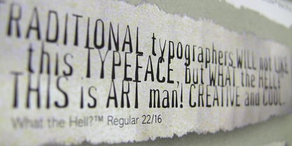
$40.99The successful Gill Sans® was designed by the English artist and type designer Eric Gill and issued by Monotype in 1928 to 1930. The roots of Gill Sans can be traced to the typeface that Gill's teacher, Edward Johnston, designed for the signage of the London Underground Railway in 1918. Gill´s alphabet is more classical in proportion and contains what have become known as his signature flared capital R and eyeglass lowercase g. Gill Sans is a humanist sans serif with some geometric touches in its structures. It also has a distinctly British feel. Legible and modern though sometimes cheerfully idiosyncratic, the lighter weights work for text, and the bolder weights make for compelling display typography. Gill Sans is also available as Value Pack for Macintosh, PC or as Hybrid CD with both platforms. - What The Hell by TypeArt Foundry,
$45.00