10,000 search results
(0.042 seconds)
- Mestre by Tipotecture,
$19.99 Mestre is a German & Dutch inspired geometric sans-serif designed. Its solid and formal shapes are embedded with a discreet humanist flair resulting in a very versatile contemporary hybrid and a highly functional and flexible font for many of today’s branding & UX requirements. With its rational forms and its large x-height, Mestre is perfect for long texts in small sizes allowing a comfortable reading. Its open forms, moderate & balanced proportions, neutral appearance and solid structure grant a high legibility on paper and on screens. With its extensive 8 weights and corresponding true italics, more than 900 glyphs per font, extended character set to support Central and Eastern European as well as Western European languages and a wide OpenType features set (small caps, case-sensitive forms, lining, tabular & old-style figures, scientific superior/inferior figures, fractions, a set of arrows, etcetera) it is meant to build visual hierarchies of any detail and complexity in editorial design or deliver the best performance for branding purposes. Mestre is a great choice for modern, contemporary and professional typography.
 - Bentara Script by Alpha Bento,
$12.00 Bentara Script is a calligraphy font that comes with beautiful alternative characters. Calligraphy of copper plate with handlettering style. Designed to convey stylish elegance. Bentara Script attracts like a typeface that is soft and luxurious, clean, feminine, sensual, glamorous, simple and very easy to read. Its classic style is very suitable to be applied to all kinds of formal items such as invitations, labels, menus, Logos, fashion, make up, stationery, letterpress, romantic novels, magazines, books, greeting / wedding cards, packaging, labels. Bentara Script including multiple language support. With OpenType features with stylistic alternates, ligatures and swash characters, that allows you to mix and match pairs of letters to fit your design To enable the OpenType Stylistic alternates, you need a program that supports OpenType features such as Adobe Illustrator CS, Adobe Indesign & CorelDraw X6-X7, Microsoft Word 2010 or later versions. (Windows), Font Book (Mac) or a software program such as PopChar (for Windows and Mac). If you need help or advice, please contact me by e-mail: alphabento.16@gmail.com Thank you, Alpha Bento
 - Ibrani by Arabetics,
$39.00 A completely isolated letters typeface design with an overall Hebrew look and feel. Glyphs were designed with an emphasis on isolation and vertical feel with a visual connectivity measure to help easy reading. The Ibrani (Arabic for Hebraic) font family has two members, regular and left-slanted italic styles. This font family design follows the guidelines of Mutamathil Taqlidi type style with one glyph for every basic Arabic Unicode character or letter, as defined in the latest Unicode Standards, and one additional final form glyph, for the freely-connecting letters in traditional Arabic cursive text. Ibrani employs variable x-height values. It includes only the Lam-Alif ligatures. Soft-vowel diacritic marks, harakat, are selectively positioned. Most of them appear by default on the same level, following a letter, to ensure that they would not interfere visually with letters. Tatweel is a zero-width glyph. Keying the tatweel key before Alif-Lam-Lam-Ha will display the Allah ligature. Ibrani includes both Arabic and Arabic-Indic numerals, in addition to standard punctuations.
 - Bandoeng by HRDR,
$19.00 Bandoeng was inspired by the cover of the 1920 Nebiolo book. It is perfect for product logo, signage, branding projects, headlines, posters, packaging, clothing brand logos, Vintage design and much more.
 - Duralith is a distinctive font created by Apostrophic Labs, a collective known for their innovative and diverse typefaces. Duralith stands out with its unique blend of stylized features and contempor...
- Geomatrix by Type Innovations,
$39.00 The font Geomatrix is an original design by Alex Kaczun. It is a dynamic stencil interpretation based on his extremely successful Contax Pro family of geometric sans typefaces. Geomatrix is a contemporary stencil typeface based on generous proportions and clean, crisp lines.The stencil treatment is balanced visually with the stem weight of the font which creates a uniformity and harmony within the design. Geomatrix makes for easy reading and is ideal for long lines of copy. It exudes a strong sense of sophistication for a true stencil design. However, this is no ordinary stencil typeface. That's putting it mildly. Geomatrix is a font on STEROIDS! This unique OpenType font incorporates hundreds of CAPITAL alternate letter forms and glyph substitutions, automatically and on the fly, within InDesign and other Open Type applications. To turn this feature on, just typeset ALL CAPS and go into InDesign's OpenType>Stylistic Sets and select Set 1 from the menu. Turn character kerning from Metrics to Optical, adjust tracking to minus 20-30, and start typing to create some visually interesting letter substitutions and unique word combinations. Geomatrix was specifically designed to take advantage of the OpenType format, allowing the Graphic Designer a unique tool to achieve the desired degree of possible visual typographic effects. And finally, the character sets in Geomatrix have been expanded to include old-style figures and all Eastern European accented glyphs. Strap in and hold on to your seats. A revolution in new font technologies has begun! GEOMATRIX IMPORTANT PLEASE READ HOW TO ACCESS "ALTERNATE" STYLISTIC "SET 1" LETTER FORMS: Geomatrix is a unique OpenType font which incorporates hundreds of CAPITAL alternate letter forms and glyph substitutions, automatically and on the fly, within InDesign and other OpenType applications. To turn this feature on, just typeset ALL CAPS and go into InDesign\'d5s OpenType>Stylistic Sets and select "Set 1" from the menu. Turn character kerning from Metrics to Optical, adjust tracking to minus 20-30, and start typing to create some visually interesting letter substitutions and unique word combinations. This feature "stylistic set 1" can be toggled "on" or "off" anytime, allowing you to go back and forth, or select only the letters that you want to change. Geomatrix was specifically designed to take advantage of the OpenType format, allowing the Graphic Designer a unique tool to achieve the desired degree of possible visual typographic effects. And finally, the character sets in Geomatrix have been expanded to include old-style figures and all Eastern European accented glyphs. Strap in and hold on to your seats. A revolution in new font technologies has begun!
 - Aphrosine by ParaType,
$30.00 Aphrosine is a font based on pointed pen script. A huge lot of alternatives and smart OpenType features allow it to look almost indistinguishable from real live handwriting. Aphrosine is something between handwriting and calligraphy: it took too much effort for being “just handwriting” but lacks seriousness and regularity comparing to true calligraphic fonts. That’s why it was called after a peculiar character from a children’s book: a witch who was very fond of dressing, makeup and writing letters. Aphrosine has three faces. But unlike most other type families, the glyphs from one face do not match exactly the glyphs from another one. The faces are based on writing with different nibs but by the same hand. The type is designed by Alexandra Korolkova and Alexander Lubovenko and released by ParaType in 2015.
 - Vtg Stencil Italy No. 2 by astype,
$29.00 The Vtg Stencil fonts from astype are based on real world stencils from several countries. The Italian stencils that I chose as a model for this font are roughly based on classic French stencil letters. Please compare the figures (numbers) with their French counterparts. However, the Italian stencils are made with a different production technique. The design of the letters is clearly not punch-cut into the plates, maybe they are drilled, milled or etched. Details such as the serifs look bold and clumsy, and when using the stencils as they are meant, with viscous sign paint, smaller details easily fade away. So I took my freedom to design a font close to the original design but adding several typographic tweaks to let it shine, hoping to get closer to the intended design idea of these Italian stencils. Enjoy the vintage!
 - Etruria by Dima Pole,
$34.00 Font Etruria is based on a real Etruscan inscriptions and realistic accurately simulates the writing of the Etruscans. The idea of the font Etruria is to give an opportunity for anyone to touch the past of mankind! The character of the Etruscan alphabet involves the creation of a font with only uppercase letters. However, I did not limit this font by that. Etruria has not only a lowercase is different from uppercase, but an additional sets of alternative characters. In General, the main characteristic of Etruscan writing is randomness and diversity of characters. Differs from lowercase to uppercase is only the first step on the road to make randomness effect. Next to the aid of the OT features. To recreate the randomness effect, in Etruria there are several OT features (Contextual Alternates, Stylistic Alternates and Stylistic Sets), which built a script to simulate randomness. Additionally, another script creates the effect of random positioning. Together they create incredibly realistic Etruscan inscription. Thus, any of these features can be disabled at will. I also used a small line spacing, because it is characteristic of the Etruscan writing. Actually the Etruscan writings is a mirror of the writings compared with the current European alphabets. I didn't use this feature all the letters, because this would make the font difficult to perceive, but to make the font characteristic of the Etruscan style, Etruria has a few letters in mirror image. However, if for someone it may seem unusual, mirrored letters can be disabled instead of them will appear more familiar to them. Another feature of Etruscan writing is the use instead of a space dotacentered. Font Etruria has this feature, there is a OT feature Stylistic set ss03. Naturally, it also can optionally be disabled. All these features can be used together, separately, or turn it off. The main goal achieved! The text typed in Etruria, creates full impression of these Etruscan inscriptions.
 - Canturiana by Latinotype,
$39.00 According to the Dictionary of the Spanish Royal Academy, «canturía» is the exercise of singing, and a way of singing musical compositions. Canturiana Type (derived from «canturía») has a romantic and musical air, as well as a clear sensuality thanks to its sinuous construction. The curves seduce us, conquer us, hypnotize us and the letters acquire a resounding lightness, and a very earthly presence that is complemented by a certain aerial, spiritual expressiveness. Canturiana Type is inspired by Canterbury, a font designed in the 1920s by the legendary American type designer and engineer Morris Fuller Benton and published by the American Type Founders (ATF). Canturiana Type collects all this heritage and transforms it into a digital typeface perfectly functional and adapted to the visual communication of the 21st century. Its elegant art deco essence provides it with a unique and heterodox imprint that works in very different media, giving them distinction and depth. The creative process of Canturiana Type has gone through various mutations to a point where each episode of its creation has left its mark, a multiple imprint that makes it unique, singular in its essence and plural in its possibilities. For this reason, Canturiana Type expresses itself with several voices without any variation in its essence. A conceptual ambiguity that makes it truly versatile. Canturiana Type is a typographic choir, a complex entity that has infinite nuances and tones. Classic and cool. Disruptive and romantic. Literary and musical. Canturiana Type is composed of 5 weights, and has a large number of swashes, alternate characters, ligatures and various visual elements to make compositions as titles or for use in short texts. Canturiana Type has more than a thousand glyphs and offers a wide range of languages that use the Latin alphabet.
 - Rigoletto by Sabrcreative,
$15.00 Introducing Rigoletto Font Duo, a stunning combination of a monoline script and Sans Serif fonts. This font duo offers a neat and clean monoline style, complemented by the versatility of the Sans Serif fonts, resulting in designs that are sophisticated, expensive, and elegant. With 70 alternates included, Rigoletto allows you to add decorative elements to your designs effortlessly. It supports a wide range of languages, including English, Danish, Dutch, Estonian, Faroese, Filipino, Finnish, French, German, Hungarian, Icelandic, Irish, Italian, Norwegian, Polish, Portuguese, Spanish, Swedish, and more. Unleash your creativity with Rigoletto Font Duo! It is perfect for various applications such as logotypes, wedding invitations, vintage labels, romantic cards, and much more. Its unique combination of monoline script and Sans Serif fonts adds a touch of elegance to any project.
 - Brave Gates by Din Studio,
$20.00 Have you been looking for a display brush font? Do you dream of creating headings that stand out and inspire creativity, imagination, and endless fun? Wait no more, we will give you the best choice. Brave Gates-A Display Brush Font Brave Gates is a gorgeous uppercase display brush font, designed with the modern vibe. This bold brush font is perfect for anything indie, adventurous, and direct. Every swash, stroke, and curve was created to entice happiness and elegance. A real head-turner for your presentation, designs, website illustrations, and much more. Brave Gates includes Multilingual Support to make your branding reach a global audience. Inspire your audience, clients, or guests with this beautiful, statement font. Features: Ligatures Stylistic Sets Swashes PUA Encoded Numerals and Punctuation Thank you for downloading premium fonts from Din Studio
 - Honey Vineyard by PeachCreme,
$23.00 Hey guys! Meet our new font "Honey Vineyard"! It's time to pick up on the wedding trend of script-style fonts, and Honey Vineyard's sophisticated and stylish design is perfect for announcing your elegant wedding. A unique wedding font featuring flourishes of creativity and a graceful design won't leave anyone indifferent. This font includes stunning swashes and ligatures that will make your design even more attractive! Some commonly used letters have multiple swashes, while some rarely used letters have none at all. We also would like to note that when creating this font, a purely calligraphic approach was used. This means that all the letters are not the same: some letters are much thicker and some are thinner, as is the case in real calligraphy! The font also includes the Cyrillic version.
 - Doodly by Luxfont,
$8.00 Introducing a funny, playful doodle font with soft sloppy glyphs. Easily turning text into handwritten. Font family is cool for complementing a design with a doodle or sketch illustration, the font does not have complex spelling of letters, therefore it is suitable for a children's audience and will complement a children's book, as well as fit into any design with a playful holiday theme, and much more. Family has 2 font styles with different interchangeable letters (different only uppercase and lowercase, other glyphs are identical) - can be used as alternate's. Family of 6 fonts is divided into 3 types: regular/basic, italic and outline. Features: 6 fonts 2 styles (Regular, Medium) with different interchangeable letters (different only uppercase and lowercase, other glyphs are identical) 3 types: Basic, Italic, Outline Kerning ld.luxfont@gmail.com
 - Crispy Thunder by Vishnu Sathyan,
$9.00 Introducing Crispy Thunder, a bold and electrifying font that will make your designs stand out with its unique and powerful look. Inspired by the raw energy and force of thunder, Crispy Thunder is a reimagining of this natural phenomenon with sharp, crisp lines that add a touch of modernity to the design. The result is a font that captures the essence of thunder with its strong, geometric shapes and a crisp design that gives it a cutting-edge feel. Every letter is crafted with care to reflect the power and intensity of a thunderstorm, making Crispy Thunder the perfect choice for designs that need a touch of drama and excitement. With its modern and futuristic look, Crispy Thunder is ideal for a range of applications, from branding and advertising to digital and print media. Its clean and minimalist design ensures that it is both easy to read and visually striking, making it a versatile font for any project. So whether you're looking to add a touch of thunderous energy to your next design project or simply want to make a bold statement, Crispy Thunder is the font for you. Download it now and experience the power of thunder in your designs.
 - Tropical Jungle by Colllab Studio,
$19.00 "Hi there, thank you for passing by. Colllab Studio is here. We crafted best collection of typefaces in a variety of styles to keep you covered for any project that comes your way! Tropical Jungle is a fun wild font, inspired by the wild life of the jungle. Inspired by the tropical rainforests of South America, Africa, and Asia, this font will inspire you to get out there and explore! Tropical Jungle is a bold, quirky typeface that captures the joyous spirit of life on earth or at least, of the parts we’re most familiar with: monkeys swinging through trees, tigers stalking their prey through the jungle, butterflies flitting from flower to flower. You can tell just from looking at it that this is going to be a fun-loving font that will bring a smile to your face and a bounce to your step. With over 500 glyphs, this stack of jungle animals will be a joy to use! We made sure our font was easy to read in any application so you don’t have to worry about your documents cluttering up. We know you can’t wait to get started using it in your next project. So go ahead! Grab Tropical Jungle now! A Million Thanks Colllab Studio www.colllabstudio.com
 - Promenade by Jen Wagner Co.,
$17.00 Introducing Promenade – a calligraphic serif that started on paper with a flat nib pen (see the 6th image), and blossomed into a full serif with italics. At its core, this font is just... beautiful. It's elegant, it's crisp, it's delicate, but can still hold its own. As I was creating the graphics, I just couldn't get over the flow of the letters – especially the italic. It's got class, but also isn't afraid to rock a pair of Doc Marten's. Funny enough, Jen from Tonic (they make beautiful websites) saw a preview of this font and said, "I'd take that font to prom." Which of course spurred a conversation about how this font would take a Mercedes G-Series instead of a limo, and wear Doc Marten's instead of heels, but still wear the most gorgeous dress, and that is 100% Promenade (and inspo for the name – thanks, Jen!). I've also been loving combining the regular and italic, especially for logos (see the "Friendfolk" logo) One thing to note about Promenade is the letter spacing. It was spaced for clean reading and intentional balance, so I recommend setting the spacing a little tighter if you want to create the display look found in many of the logo mockups(around -20 to -40 should do!).
 - Evoque Text by Monotype,
$40.00 Evoque Text is a humanist serif type family specifically designed for a comfortable reading experience. This has been achieved by optically adjusting the regular weights from my original Evoque family (released November 2021). You will notice a significantly reduced x-height and longer ascenders and descenders, complemented by adjustments to weight and spacing. This makes Evoque Text a perfect choice for any long passages of text. All OpenType features have been retained from Evoque. A plethora of swash alternates and discretionary ligatures enhance Evoque Text, giving you the opportunity to embellish your typography. Simply activate Stylistic Sets to start adding these flourishes to your text. Other useful features include Small Caps at the click of a button, and Old Style Figures are an option to the default proportional figure style. There are 14 fonts altogether over 7 weights in roman and italic, you can also avail of two variable fonts which allow you to fine tune the weight to your exact liking. Evoque Text has an extensive character set (900+ glyphs) that covers every Latin European language. Key features: 7 weights in both roman and italic 80 Alternates 26 Ligatures Small Caps Variable fonts included with full family Full European character set (Latin only) 900+ glyphs per font.
 - Gyllene Elgen by Mans Greback,
$69.00 Gyllene Elgen, created by Mans Greback, is a delicate and captivating handwriting font that exudes romance and charm. With its thin, beautiful lines, and loopy, decorative swirls, this typeface brings a touch of elegance and sophistication to your design projects. Perfect for invitations, personal notes, and other heartfelt communications, Gyllene Elgen captures the essence of delicate, handcrafted beauty. The font was inspired by the golden hues of the Swedish landscape during autumn, as well as the mythical golden elk that roams the forests. Mans Greback sought to bring this enchanting story to life through the graceful curves and fine details of Gyllene Elgen. The font is built with advanced OpenType functionality and has a guaranteed top-notch quality, containing stylistic and contextual alternates, ligatures, and more features; all to give you full control and customizability. It has extensive lingual support, covering all Latin-based languages, from Northern Europe to South Africa, from America to South-East Asia. It contains all characters and symbols you'll ever need, including all punctuation and numbers. Mans Greback is a Swedish typeface designer, celebrated for his innovative and diverse portfolio. With a keen eye for detail and innovative designs, Mans has earned a reputation for creating fonts that resonate with people across the globe, inspiring creativity and capturing the imagination.
 - Duwal Pro by Volcano Type,
$76.00 The careful balance between the emotional swings and shapes set in strong contrast such as the burly serifs, or generally vertical and orderly appearance within the Duwal Pro determine the special look of this Antiqua typeface. All characters of the Duwal Pro are designed to be open and accessible. The lowercase letters are designed with a large x-height, which is why they are ideal for small font sizes. Many striking details give Duwal Pro a defined and firmer appearance with increasing font size so it is also suitable for use in headlines and work marks. The deliberately constructed and emphasized design of the serifs give the font a strong position and at the same time force the reading direction. Using Duwal Pro in Bold weight, the serifs look clearly striking, the design language is concise and the typeface receives an additional sympathetic force. The Italic weight draws on the expressive but not intrusive design of the Regular, but appears sharper and is ideal for text passages. The font family contains italics, small caps, lots of ligatures, swashes, another format set, contextual alternatives and special characters as well as other open-type features which allow the use of Duwal Pro in 48 languages.
 - Campeno by Craft Supply Co,
$20.00 Geometric Precision Let’s step into the world of Campeno, a Geometric Sans Serif font that embodies precision and order. This font is the epitome of geometric perfection, making it an ideal choice for various editorial applications. Editorial Excellence Campeno’s geometric form is what sets it apart and makes it a top choice for editorial needs. Whether you’re working on magazines, long-form text, or other editorial projects, its geometric precision enhances readability and offers editorial excellence. Versatile Typography What makes Campeno even more exceptional is its versatility. It seamlessly adapts to diverse design contexts, ensuring that it can be used for a wide range of projects, from magazines to websites and beyond. Engaging Readability Beyond its geometric aesthetics, Campeno excels in providing engaging readability. It guides the reader through the content, focusing on the message while maintaining a visually appealing design. In Conclusion In summary, Campeno – Geometric Sans Serif is the font that brings precision and clarity to your editorial projects. Its geometric form ensures that your content is not only engaging but also visually appealing, catering to a broad readership while maintaining a high standard of clarity. Whether you’re working on magazines, websites, or other editorial endeavors, Campeno stands out as a font that combines aesthetics with functionality, offering editorial excellence for your projects.
 - Magola by Andinistas,
$39.95 Magola is a creamy flavor font family whose purpose is to season with emotions the reading of words and phrases formed by puffy glyphs coated with a caramel of empty spaces external and internal. Independently or in groups, members of the family serve to decorate and organize packaging or advertising material in letters apparently crafted for food or entertainment contexts. Its starting point was to draw letters like a ballon fish evolved into a black version with empty areas and microscopic contrasted with colorful inflated and filled areas. Then the challenge was based on the sum transferred between full and empty into a lighter caliber. In that vein, its overall design adapted skeletons of italics and Roman calligraphy. Therefore, its regular, bold and black files have great height "x" with upwards and downwards extremely short and large internal counterblocks to facilitate reading. In this regard, to strengthen its objective and capture the reader's attention, its kind of contrast and simulated auctions flat tip brush strokes, and amount of contrast between thick and thin in the black version is slightly inverted. Its sizes, smooth strokes and irregular lines reinforce its traditional spirit, so it is favorable to shine the information on posters or large-format media. In short, its optical conformation based on a non-literal way, in metrics similar in all family members to be easily exchanged without changing the ìxî height. It is therefore a striking and versatile tool, that besides being useful in large sizes, can be used in small sizes as well. And more importantly, its general concept is more profitable when its members are mixed to nest headings, subheadings and short paragraphs, designed according to size, position, color and location in logos, covers, posters, ads and flyers.
 - Nawin Arabic by Letterjuice,
$43.00 Nawin is an informal Arabic typeface inspired by handwriting. The idea behind this design is to create a type family attractive and ownable for children but at the same time a design that keeps excellent letter recognition for reading. Handwriting has been a great source of inspiration in this particular typeface. By emulating the movements of the pen, we have obtained letter shapes that express spontaneity. A bright group of letters create a lively and beautiful paragraph of text. To get closer to handwriting and the variety of letter shapes that we draw while writing, this typeface offers a large number of alternative characters, which differ slightly from the default ones. Because we have programed the «Contextual Alternate» feature in the fonts, these alternate characters appear automatically as you set a text on your computer. The proportions and letter shapes are flexible, escaping from tradition to increase expressivity and personality in the design. For instance, variability on vertical proportions between letters Alef and initial Lam, create movement in text and avoid the cold mechanical feel of repetition. Nawin is quirky and elegant at the same time. Letter recognition is relevant when reading continuous text. For this reason, we have added another contextual alternate feature with alternate characters that help to avoid confusion when letters with similar or the same shape repeat inside one word. For instance, this is the case of medial «beh and Yeh» repeated three times continuously in the same word. The alternate characters change in shape and length, facilitating distinction to the reader. Since this typeface is inspired by handwriting and the free movement of the hand while writing, we considered ligatures a good asset for this design. The typeface has a wide range of ligatures that enhance movement and fluidity in text making look text alive.
 - DT Skiart Serif Leaf by Dragon Tongue Foundry,
$10.00 ‘Skiart Serif Leaf’ has been on a long growing path getting to where it is now. Originally inspired by the san serif font ‘Skia’ by Mathew Carter for Apple. ‘Skiart’ was designed to feel more like a serifed font, but without any serifs. It took a step between sans serif and serif fonts. Next on the path towards a serif font came Skiart Serif Mini, with tiny serifs added. This was a true serif font, although they were subtle. This font ‘Skiart Serif Leaf’ is the next in the series. After many reiterations, ‘Skiart Serif Leaf’ was built and rebuilt many times until finally, this version deserved to be presented to the world. Style and flow had been added to this font. It remained fully readable and feels as clean and normal as any of the best body copy serifs, and yet has an original modern flair to it. The font feels strong and solid while having a subtle organic flow in its form. If compared to one of the more commonly used serifs like ‘Times New Roman’, the ‘Skiart Serif Leaf’ lowercase is more open with a taller x-height, increasing its readability and friendliness. The serifs are smaller and less distracting. They are not pretending to be ligatures. This font may be organic but is not in anyway script like. Where ‘Times’ makes its p q b d forms out of a barely touching oval and stem, the ‘Serif Leaf’ forms are much more firmly attached, appearing clearly as single letters. The standard setting for the a’s and g’s are round single story, feeling warmer and more inviting in the ‘Serif Leaf’ font. Much more friendly than the stuffy double storied versions in fonts like ‘Times’ etc. ‘Skiart Serif Font’ comes with a somewhat organic italic.
 - Gopixel by Ditatype,
$29.00 Go Pixel is an exciting game-themed display font designed in uppercase, capturing the essence of retro pixel art. The consistent proportions of this font create a harmonious and balanced visual experience. Each uppercase letter is crafted with precision, ensuring uniformity and maintaining the overall aesthetic appeal. This design choice guarantees that every character fits seamlessly together, resulting in a cohesive and visually pleasing typographic composition. The uneven borders of Go Pixel add a touch of vintage charm and quirkiness to the font. Each letter is outlined with varying thickness, mimicking the imperfections found in retro pixel art. This unique feature gives the font a distinct personality and captures the nostalgia of classic video games. With low contrast, it embraces a softer and more subtle approach to readability. The slight variation in stroke width allows for a smooth and comfortable reading experience. While the low contrast may be unconventional, it enhances the overall retro feel of the font, immersing your audience in the world of classic gaming. Enjoy the available features here. Features: Multilingual Supports PUA Encoded Numerals and Punctuations Go Pixel fits in headlines, logos, posters, titles, branding materials, print media, editorial layouts, website headers, and any projects that aim to evoke a sense of fun and nostalgia. Find out more ways to use this font by taking a look at the font preview. Thanks for purchasing our fonts. Hopefully, you have a great time using our font. Feel free to contact us anytime for further information or when you have trouble with the font. Thanks a lot and happy designing.
 - French Vanilla by BA Graphics,
$45.00 A creative design with modern styling. Available in plain or swash style. Great for Invitations, Fashion, Decorative Designs and much more. Just mix and match some swash characters for a little flare.
 - Orotund by Canada Type,
$24.95 This is the digitization and considerable expansion of the cheeky and enormously popular film type Eightball, one of the most widely used faces of the 1970s and 1980s. Round and happy like a bouncy ball, these are letters after a sign maker’s own heart. Seen everywhere in its film version, from bingo and pool hall parlor signs to comic books, now this computer version opens the door for the happy roundness to be used on a much larger scale by anyone who designs layouts on a computer. The original film type included a few alternates. We included them, but we added many more as well. So make sure to check out the various OpenType features in your program while using this font. Eightball is great for a variety of applications, including signage, rubber stamps, poster design, titling, cartoons, comics, and pretty much anything where happy and round fit in.
 - Terfens Contrast by insigne,
$35.00 Terfens draws influence from chancery scripts, updating it for the twenty-first century. Terfens Contrast is derived from Terfens' DNA and retains its humanist tone. It’s tall x-height gives it a friendly but not informal feel. With Terfen Contrast, calligraphy-inspired letterforms are rendered with a high contrast nib, lending raw vitality and expressivity. This juxtaposition gives the letters a sense of firmness and energy, but also of heavenly, delicate beauty. Terfens is a full-service branding and packaging solution, containing a lot of personality, combining the passion of a broad nib pen with the beauty of a brush. Terfens is a "workhorse typeface" comprising 48 typefaces in three widths and eight weights. There are ligatures and swashes in all weights, as well as support for more than 72 languages. Another powerful typeface to add to your collection of eye-catching fonts. Terfens draws influence from chancery scripts, updating it for the twenty-first century. Terfens Contrast is derived from Terfens' DNA and retains its humanist tone. It’s tall x-height gives it a friendly but not informal feel. With Terfen Contrast, calligraphy-inspired letterforms are rendered with a high contrast nib, lending raw vitality and expressivity. This juxtaposition gives the letters a sense of firmness and energy, but also of heavenly, delicate beauty. Terfens is a full-service branding and packaging solution, containing a lot of personality, combining the passion of a broad nib pen with the beauty of a brush. Terfens is a "workhorse typeface" comprising 48 typefaces in three widths and eight weights. There are ligatures and swashes in all weights, as well as support for more than 72 languages. Another powerful typeface to add to your collection of eye-catching fonts. • Recommended uses: modern branding and logo design, powerful editorial design, exciting packaging, and a wide range of additional jobs. • 54 font styles, including eight weights, eight italics, and three widths. • Each weight has 500+ glyphs. Useful Opentype features include: Access All Alternates, Discretionary Ligatures, Denominators, Fractions, Kerning, Standard Ligatures, Lining Figures, Numerators, Oldstyle Figures, Ordinals, Scientific Inferiors, Subscript and Superscript.
 - Rinstonia by Typia Nesia,
$20.00 Rinstonia is a signature style typeface. Rinstonia is a beautiful script font that is such a pleasure to work with! The perfect flow and easy signature style works perfectly on invitations, blog headers, branding, art quote, book / cover title, and so much more! Rinstonia typeface comes with upper and lowercase Standard Characters, Punctuation, Numerals. And other Glyphs variation of the OpenType features such as Standard Ligature, Stylistic Alternate and 5 Stylistic Set (ss01 - ss05). Typia Nesia Studio Malang - Indonesia
 - Casey by 50Fox,
$15.00 Say hello to Casey Typeface! A fancy and beautiful editorial serif with luxury ligatures, alternates glyphs and multilingual support - with a complementary italic version. It's a versatile font that looks great in big and small sizes. This has a wide variety of uses, including editorial projects, logo design, clothing branding, product packaging, magazine headers, and so much more. It's ideal for any type of graphic design project or as a stylish text overlay to any image.
 - Milea lover by Mega Type,
$12.00 Milea Lover is a beautiful script font with an irregular baseline. Milea Lover comes with a feminine and trendy style that gives a touch of love to your design projects. Milea Lover looks very beautiful for branding, logo, wedding invitations, greeting cards, fashion, book covers, posters, labels, quotes and other romantic projects. Have fun using Milea Lover!!! I really hope you enjoy it! Feel free to follow, like and share. Thank you so much for checking out my shop!
 - Super Crash by Flawlessandco,
$9.00 "Super Crash" is a Playful Display Comic Typeface. "Super Crash," a display comic typeface designed to infuse your designs with vibrant energy and lighthearted charm. There's some connected letters and some alternates that suitable for any graphic designs. This font support for some multilingual. Also contains uppercase A-Z and lowercase a-z, alternate character, numbers 0-9, and some punctuation. If you need help, just write me! Thanks so much for checking out my shop!
 - Bock by Latinotype,
$35.00 Is a recreational typography. Created from experimentation of the Slab Serif style with asymmetric lines. Bock is compact and stable, although having the quality of breaking the typographic rhythm, to benefit its use in short words as logotypes and lowering of text in editorials and publicity. The Fat variable was devised as an extension of the Bock concept, deleting the inner and outer space that surrounds a letter, creating a font with much weight and attitude.
 - Amanllor by Juncreative,
$15.00 Amanllor is a thin lettered and graceful script font. Fall for its ravishing style and use it to create gorgeous wedding invitations, beautiful stationary art, eye-catching social media posts, and much more! Amanllor is PUA encoded which means you can access all glyphs and swashes with ease! FEATURES Alternate Characters Uppercase and Lowercase letters Numbering and Punctuations Multilingual Support Works on PC or Mac Simple Installation Support Adobe Illustrator, Adobe Photoshop, Adobe InDesign, also works on Microsoft Word
 - Brutal Honesty by Olivetype,
$18.00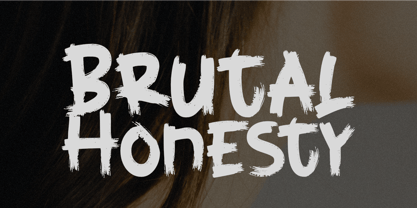 Brutal Honesty is a simple handwritten brush typeface. Carefully handcrafted to grab the attention of the viewers, this font is ideal for logos, posters, headlines, branding, apparel and so much more. This brush typeface is supporting Multi-Languages, which include: Afrikaans Albanian Catalan Danish Dutch English Estonian Finnish French German Italian Norwegian Portuguese Spanish Swedish Zulu. So what's included: Basic Latin A-Z & a-z. Numbers, symbols, and punctuations. Multilingual Support. Accented Characters : ÀÁÂÃÄÅÆÇÈÉÊËÌÍÎÏÑÒÓÔÕÖØŒŠÙÚÛÜŸÝŽàáâãäåæçèéêëìíîïñòóôõöøœšùúûüýÿžß Thank You.
 - DF Pommes by Dutchfonts,
$16.00 The Pommes font originates from my mid seventies potato punchcuttings at artschool. Since I’m living in a potato republic (NE of the province of Groningen) I got inspired to continue. I prepared this culinary alphabet as a tribute to this wonderful allround vegetable. Belgian and French recipies helped me in selecting and cutting/cooking the 6 styles. The Pommes-Dauphine Ultra Heavy (too much eggs added) can be used as a layer behind the Pommes-Dauphine.
 - Lavolta by Fauzistudio,
$10.00 Introducing - Lavolta is a fancy and functional serif font family, featuring two distinct style combinations. Lavolta has a mordern style, great for invitations, product branding, packaging, movie titles, book covers, magazines, websites and much more. Lavolta Swash has a slightly vintage style, there are 130+ alternative characters and is equipped with a contextual alternates (CALT) feature to make your life easier when using it on long texts. Lavolta Swash Decoratif with stars creates a lively and festive atmosphere.
 - Scrawl Cursive by Scrowleyfonts,
$45.00 Scrawl Cursive pushes the boundaries of OpenType contextual alternates to present a font which emulates natural, modern, casual handwriting. It includes 2006 glyphs, many of these lower case alternates so that there are minimal compromises when it comes to forming and joining letters naturally. Another unusual feature is that many capital letters also join when preceding lower case letters, which creates a much more realistic flow than is normally achieved. Please view with the contextual alternates option turned on.
 - Herben by Innire,
$14.00 The Herben - is a unique ligature serif font inspired by nature and autumn mood. It is perfect for logos (especially to word-mark logos), branding, invitation card, and much more; and well to emphasize your unique style, eco concept, or something else. 75 ligatures and 14 swashes will help create individual writing, thereby expanding the scope for creative expression. What's about details and features? Letters A-Z, a-z, 0-9 and punctuation (all in preview); 75 unique ligatures;
 - Modelist by Lucky Type,
$18.00 Modelist is a new modern brush font with a bold style and contemporary approach to design, naturally handmade, very suitable for use in title designs such as clothing, invitations, book titles, stationery designs, quotes, branding, logos, greeting cards, T-shirts, packaging designs, posters, and more. Complete with upper and lower case letters, and multi-language support, numbers, punctuation, and some perfect ligatures. Thank you very much for searching and let me know if you have any questions.