10,000 search results
(0.037 seconds)
- Miser by Saint Mislav,
$22.22 Smooth with the roughness and made from scratch, Miser sans serif font family was designed by Mislav Serdarušić and it's name is derived from designers name. Miser typeface blueprints were somewhere in the subconsciousness of the designer but have seen first light of the day in September, 2021. during the Covid pandemic. Inspiration comes from handwritten technical letters of designers parents and graffiti explorations. It comes in 12 styles (6 weights with pairing Italics) with all Latin European language characters which are in daily use(without Greek or Cyrillic). Designed in contemporary appearance with innovations on some letters. Basic ligature set is included. It is suitable for magazines, books and websites, various graphics and paragraphs. Miser has a taste of science, technology, design & architecture, sports and more, yet contemporary boldness but distinctive to regular and oval modern typeface shapes. A must have on your system.
 - Animus by Artisticandunique,
$25.00 Animus - Serif font family - Multilingual - 6 Styles Animus is a uniquely elegant serif font family.This font provides flexibility in all your projects with its aesthetic structure, multilingual options, 6 styles and 3 weight options. You will have the opportunity to enrich the content of your projects with its elegant structure. Depending on the purpose of use in the typographic composition you will create with 6 styles; you can enrich your titles in books or magazines and your logos for branding. You can benefit form the elegant structure of standard characters in your plain text. This font comes with uppercase, lowercase, punctuation, symbols and numbers, ligatures and multilingual supports. Ideal for books and magazines, editorials, headlines, websites, packaging, logos, branding, advertising, movie titles and more. This font family can meet your needs in all creative projects, modern and classic. With this font you can create your unique designs. Have a good time.
 - Whisky Trail by Vozzy,
$10.00 Introducing a vintage look label font named "Whisky Trail". All available characters you can see at the screenshot. This font have 7 styles - Regular, Full, Shadow, Light, Shadow FX, Light FX and Print. This font will good viewed on any retro design like poster, t-shirt, label, logo etc. For using effect layer: Type your text in Regular. Copy that and paste at the same position. Change the style to Light FX or Shadow FX. After that you can choose different colors for Regular font and Shadow or Light effects. For the catchwords type the word with space before and after word (for sample ' with ', or ' with2 ' for alternate view of catchword), 'Discretionary Ligatures' on the 'OpenType' tab must be turned on. Or paste it from 'Glyphs' tab in any place on your text. This in Illustrator. In Photoshop 'Discretionary Ligatures' you can find in the menu Type - OpenType. Thank you!
 - UniOpt by ParaType,
$25.00 An experimental font designed by Viktor Kharyk in Op Art style. UniOpt is based on free brush technique similar to experimental lettering of the early decades of the 20th century; for instance to ‘Graficheskaya Azbuka’ (‘Graphic ABC’) by Peter Miturich and works by Victor Vasareli. The face is legible even at small sizes and quite useful to an original display matter, initials and logos. The rigid double-wide structure allows to create complicated decorative works using vertical composition. Interesting that diacritical marks are also placed inside of character square fields and don’t destroy geometrical order. The decorative abilities of the font are increased by inverted versions of characters that may be used in different combinations including in color. The character set contains expanded Latin, Greek and Cyrillic ranges. UniOpt was awarded for type design excellence at TypeArt’05 Contest in Moscow. Licensed by ParaType in 2006.
 - Athelas by TypeTogether,
$65.00 An attempt to go back towards the beauty of fine book printing, inspired in Britain's literary classics. Athelas takes full advantage of the typographic silence, that white space in the margins, between the columns, the lines, the words, the lettershapes and finally, within the characters themselves. It is also intended to take advantage of the great advances and technical developments made in offset printing. Athelas shows its best side in finely crafted book editions and good printing conditions. Athelas has a large character set that covers most of the languages that use the Latin script. Although inspired in British literature, this typeface respects the cultural values behind different languages, where diacritic marks have an utterly important role. Athelas features four weights and about 800 characters per weight, including small caps, discretionary ligatures, fractions, a complete range of numerals for every use and a set of ornaments and arrows.
 - Timesquare by Campotype,
$25.00 The initial idea of timesquare typeface inspired by Helvetica when presenting the board information on a subway escalator in Time Square, Manhattan, New York. This confirms strength the legend of Helvetica is not lost amid rampant nice fonts in the site. Therefore it should not appropriate that this timesquare fonts come to rival the greatness of Helvetica. Fonts timesquare thrive (since 2008 for self used) of the basic forms of Helvetica to timesquare born in different shapes and sizes. The greatest challenge during development timesquare is both shape similarity to Helvetica directly, as well as to other fonts inspired by Helvetica. Timesquare's main characteristics are the wide character, modern touch and individually, can work well on a wide variety of applications in books, brochures and magazines as well as applications in advertising. This typeface has been developed on the Latin character sets. Hopefully useful.
 - Niedermann Grotesk by steve mehallo,
$19.14 With the printing of the Futurist poem “Zang Tumb Tuuum” in 1914, modern art had taken a typographic twist: “words in freedom” (parole in libertà) were now a major part of the art world. The avant garde followed suit. Niedermann Grotesk is based on the everyday type that appeared in early modernist collages, journals and manifestos. It is a peculiar style of lettering—which was originally inspired by the Sachplakat (object poster) work of Lucian Bernhard—and adapted for hot metal in 1908 by Heinz Hoffmann. 100 years ago, the style became a workhorse of the German printing industry. Niedermann Grotesk is an updated variant, referencing the original poster art, each letter carefully drawn with an old brush. Bumpy, bold and blunt—with a suite of alternate characters and a few dingbats—Niedermann Grotesk is perfect for advertising, packaging, poetry, art, protests and retro homage.
 - Slang by VP Creative Shop,
$20.00 Meet Slang, a Ligature Font in Regular and Outline. Slang is a bold, clean font with a regular and an outline version, loaded with alternate and ligature glyphs. It's a very versatile font that works great in large and small sizes. Slang is perfect for branding projects, home-ware designs, product packaging, magazine headers - or simply as a stylish text overlay to any background image. Uppercase, lowercase, numeral, punctuation and Symbols, Alternate glyphs, Ligature glyphs and has Multi-lingual support. How to access alternate glyphs? To access alternate glyphs in Adobe InDesign or Illustrator, choose Window Type & Tables Glyphs. In Photoshop, choose Window Glyphs. In the panel that opens, click the Show menu and choose Alternates for Selection. Double-click an alternate's thumbnail to swap them out. Feel free to contact me if you have any questions. Mock ups and backgrounds used are not included. Thank you and enjoy.
 - Rebelton by Konstantine Studio,
$7.00 note: it's an All-Caps font, so there's no Lowercase letters in this font. Fast-forward to the modern and futuristic era, a font with strong characters and a long versatility in any era is a must-have survival mode item. Rebelton family was born to company that mission on earth. A set of family fonts with special mood and characters in every single one. Team up with each other to make a strong vibe in your visual project. Because that's what family stands out for. Language Support: Albanian, Basque, Catalan, Cornish, Croatian, Czech, Danish, Dutch, English, Esperanto, Estonian, Faroese, Finnish Scots, French, Gaelic, Galician, German, Greek Transliterated, Hawaiian, Hungarian, Icelandic, Indonesian, Irish, Italian, Latvian, Lithuanian, Maltese, Nynorsk Bokmal Norwegian, Polish, Portuguese, Romanian, Slovak, Slovenian, Spanish, Swedish, Turkish, Welsh. If you doubt with it please type it out in the text box below, I hope it will support your language too :)
 - Monostep by YOKKMOKK,
$55.00 Monostep is not just another Typewriter. It can do so much more! It is available in five rigorously designed font styles; all of these come in Straight, Rounded and in Italics respectively. It contains geometric symbols as well as all of the characters of the Indo-European alphabet. What makes it so different, and thereby remarkable, are the 77 ligatures that combine letters in upper case, in upper case with lower-case letters and any combination of lower-case letters. Monostep is alive! It will be introduced into the typing script market with a highly characteristic corporate design. Various promotional gimmicks such as a specimen brochure, posters, a website, animations and a promo film with a distinct sound, including lyrics and a dance, make Monostep a truly recognizable label - they bring Monostep to life. That will make you want more: Let me see your Monostep! www.monostep.de
 - Lavire by Nathatype,
$29.00 Elevate your design projects with the distinctive and captivating Lavire. Lavire is an uppercase display serif font that is effortlessly made in a truly unique typographic masterpiece. Each uppercase letter in Lavire is a work of art in itself. The serifs, which are typically known for their traditional elegance, take on a modern and imaginative twist with Lavire's addition of artistic lines and flairs. The artistic lines and flairs in this font are carefully crafted to enhance the overall composition of each letter. They bring a sense of motion and dynamism to the font, making it particularly well-suited for projects that seek to convey a sense of movement or elegance. Lavire fits in headlines, logos, posters, flyers, branding materials, print media, editorial layouts, and many more designs. Find out more ways to use this font by taking a look at the font preview.
 - Mixcoatl Mono by URW Type Foundry,
$19.99 The Typeface «Mixcoatl» by Elia Salvisberg was developed as a part of a course at the Lucerne School of Design and Art in 2016. Based on the book «The Empire of the Inca», a display-font has been created, which is inspired by the graphic language of the South American Empire of the Incas. At the beginning, only capital letters were designed but there was the desire for a complete typeface – which is why the missing signs were added. The font is based on a grid, so the characters are constructed equivalently and a uniform geometric font arose. The name was adopted from the god of hunting who plays an important role in the mythology of the Aztecs and appears in various forms. The uppercase letters can also be represented and combined in two alternative character-sets, so there are a lot of opportunities to combine uppercase words in different forms.
 - Egyptian Hieroglyphics – Deities by Deniart Systems,
$30.00 Give your documents a sense of history. The study of the ancient Egyptian Hieroglyphics has been an ongoing fascination by scholars and Egyptology buffs for literally centuries. The discovery of the Rosetta stone in 1799 provided an incredible breakthrough in deciphering the hieroglyphs, however there continues to be conflicting opinions on the literal translation of both the phonetic and ideographic symbols. As such, the interpretation provided in this manual represents an assembly of the most popular transcriptions. This series contains 62 assorted gods and deities as well as a few well known kings or pharaoh's from the New Dynasty. It is important to note that most of the gods and deities were represented in many different forms throughout the centuries and regions of Ancient Egypt, and these are but some of these representations. NOTE: this font comes with an interpretation guide in pdf format.
 - Bistern by Letterhend,
$19.00 About the Product Bistern is a typeface which is inspired by vintage lettering sign and art. While this font has a victorian touch, it still looks bold and solid. Very suitable for for headline, logotype, apparel, invitation, branding, packaging, advertising etc with old school / retro theme. This typeface contains with beautiful decorative ornaments in vector format that ready to use to create a vintage lettering in sec. It also comes in uppercase, lowercase, punctuations, symbols & numerals, stylistic set alternate, ligatures, etc also support multilingual and already PUA encoded. Features : ornaments in vector format uppercase & lowercase numbers and punctuation multilingual alternates and ligatures swashes PUA encoded We highly recommend using a program that supports OpenType features and Glyphs panels like many of Adobe apps and Corel Draw, so you can see and access all Glyph variations. How to access opentype feature : letterhend.com/tutorials/using-opentype-feature-in-any-software/
 - Bigticy by Présence Typo,
$36.00Bigticy is a typeface with a "new-retro" feeling. Its square outline is tempered by rounded angles. This makes it suitable for a large range of applications in the domains of magazine headlines and posters. The Narrow version has been drawn from a title found in an example (dated from the 50's) of the French newspaper "Le Dauphiné Libéré". For the Maxi style, I have tried to reduce to their minimum the inner white spaces. I had in mind those amazing stone walls that one can see in the antique Inca cities in Peru. The stones are so tightly joined that it is impossible to slip a sheet of paper between them. The Plain version is an interpolation of the two other ones. It is a very useful style since I keeps the main quality of each parent: the weight of the Maxi and the narrowness of the Narrow. - Museum Fournier by T4 Foundry,
$16.00Museum Fournier is inspired by a set of Rococo capitals designed by Pierre Simon Fournier le Jeune circa 1760. The matrices are part of a set imported to Sweden by J.P. Lindh in 1818 from Breitkopf & Härtel in Leipzig, Germany. They are now in the Nordiska Museum in Stockholm. Type designer Torbjörn Olsson has expanded the original 31 lead matrices in the collection to 55 characters. Please note that the font contains capitals only, no lower case letters and no figures either. Museum Fournier is an OpenType creation, for both PC and Mac. Swedish type foundry T4 premiere new fonts every month. Museum Fournier is our ninth introduction. Museum Fournier is part of the growing Museum type family. Museum also includes three different border fonts, an ornament font with some of Granjon's arabesques and Museum Tertia Cursive, an exquisite 1700's typeface with modern additions. - Leaf by Journey's End,
$12.00This "Leaf" font has been swirling in my head for years - I remember my sister and I making letter formations like these when I was young. It was exciting to see the lettering look even better on paper than it did in my mind! "Leaf" surprised me by having two distinct looks: in size 24 or smaller, the look is delicate, because your eye doesn't see any space in the letters. In size 28 or larger, the eye can discern spaces, which gives a different facet to its personality. As much as I like this font when viewed on a monitor screen, it really shines when printed. The "Leaf" font is a perfect blend of quaint hand-written style mixed with crisp letter formations. This font has a very "happy" quality to it. May using it bring a little more happiness to your day! - Archie by Canada Type,
$39.95 Archie is a wide attention-grabber based on a simple geometric alphabet drawn in the early 1930s by Dutch calligrapher and lettering artist Martin Meijer. This digital family expands considerably on the original letters, adding biform shapes, small caps, italics across the board, and support for many Latin-based languages. Archie's eye-catching forms are meant for clear, seamless and strong message delivery. In its upright styles, strong vertical strokes emphasize the sense of confidence and importance, and in its italics, that emphasis is further affirmed by a natural sense of urgency. This kind of alphabet is perfect for display typography aiming at the glance-and-go crowd. When used properly and placed prominently, no eye can escape it. The basic Archie family is comprised of six basic fonts, while the Pro set combines all three uprights in one font and all three italics in another.
 - Lugano by Greater Albion Typefounders,
$14.00 Lugano has it’s inspiration in 1920s advertising material and is ideal for lively banner lettering, posters and cover design. Four typefaces are offered - Lugano comes in regular, alternate, striped and alternate striped forms. Try it out and inject a little fun into your work today!
 - Melts Script Rough by Estudio Calderon,
$20.00 Melts Script Rough by Estudio Calderón is the textured version of Melts Script. It has a texture design in high definition that runs very good in any size and concepts. Good news! It includes a free version of “Melts Script Rough Sanscript One”. Specimen
 - California Sans by BA Graphics,
$45.00 California Sans designed as a beautiful easy reading text face also works great in Headlines. It also has a matching drawn Italic which makes a great combination for all your needs. Even as a stand alone Italic font it works in so many designs.
 - EbuScript by Type-Ø-Tones,
$40.00 EbuScript by José Manuel Urós. OpenType, 1 style The very first font of Type-Ø-Tones, EbuScript, comes from the pen of José Manuel Urós —nicknamed Ebú in those times. Now it is still in our catalogue thanks to a completed and improved version.
 - Brastagi Signature by Sulthan Studio,
$12.00 Brastagi Signature is a beautiful signature writing font. Its casual charm makes it seem incredibly simple, easy to read, and, ultimately, incredibly versatile. Brastagi Signature will look amazing in any context, whether it's used in a busy background or as a stand-alone title!
 - Post Production JNL by Jeff Levine,
$29.00 A title card listing the supporting cast of the 1950 Humphrey Bogart and Gloria Grahame drama “In a Lonely Place” provided the hand lettered slab serif type design that served as the model for Post Production JNL – available in both regular and oblique versions.
 - Lily Wang by Dharma Type,
$19.99 Based on some script in the 19th century. Inky texture gives realistic handwriting appearance. Smooth writing feeling creates antiqued and nostalgic atmosphere. Big flourish and elegant script! There are two other script designed by in the same concept. -Daisy Lau -Lily Wang -Pansy Bo
 - Nymphe by Volcano Type,
$19.00Nymphe is a monoline typeface based on the form and character of an art nouveau illustration from 1907. It's somehow old fashioned but has modern influences that are reflected in irregular serifs in combination with decorative elements. Nymphe is best at sizes above 7 pt. - Marketing Stencil by Jeff Levine,
$29.00 Vintage (circa 1960s) packaging for Parker Cartridge Pen Erasers had the product description printed in bold stencil lettering featuring a squared look with rounded corners. This design has been recreated digitally as Marketing Stencil JNL, which is available in both regular and oblique versions.
 - Fajowy by Edyta Demurat,
$22.00 Fajowy is a hand drawn typeface. The family is available in 12 weights. Fajowy has only upper characters with up to three alternate glyphs. Build in OpenType Contextual Alternates feature will automatically set alternate glyphs depending on frequency of appearance of the same character.
 - Erratic Nouveau JNL by Jeff Levine,
$29.00 The title on the 1925 sheet music for “By the Light of the Stars” was hand lettered in an eccentric Art Nouveau type style with varying character shapes and line widths. This is now available as Erratic Nouveau JNL in both regular and oblique versions.
 - Paris ND by Neufville Digital,
$29.60 Paris was designed by Crous-Vidal in 1953 and is part of the Grafía Latina collection. Paris Bold originally had two alternative capital letters O, one with pronounced 45° stress; they are both incorporated in the ND version. París is a Trademark of BauerTypes SL
 - P22 Folk Art by P22 Type Foundry,
$24.95 Primarily based on the work of German settlers in Pennsylvania, this collection showcases a variety of needlework and folk art styles of the early United States. Produced in conjunction with the Philadelphia Museum of Art, this set is a digital recreation of homespun Americana.
 - Bealiva Vintage by Mevstory Studio,
$15.00 Bealiva is one of my fonts based on a hand lettering project in 2020. It was very inspired from the famous retro typography designs in late 60's until 70's. It includes the extrude look, so you will not have to add it later.
 - MBF Modifi by Moonbandit,
$15.00 Modifi is a straight cut modern monospace font. This typeface is inspired by the digital monotone living in urban lifestyle. Modifi has a few alternates to supply you with variety in your work and is perfect as a headline, title, branding, logo and many others.
 - P22 Sparrow by IHOF,
$24.95 P22 Sparow is based on handwritten lettering executed with a fine-pointed steel "crow-quill" pen. Designed for use in small sizes of continuous text setting such as poetry. This style was originally designed for a series of hand-crafted calligraphic booklets in 1963.
 - Balibong by Scratch Design,
$8.00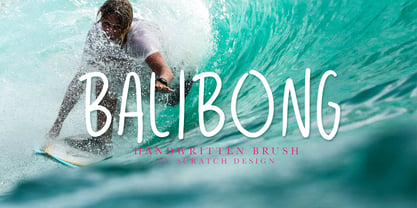 Balibong is a handwritten font with a casual look and vintage style. Balibong will be useful in your designs such as quotes, invitations, menu designs, logos, branding, clothing and some design for in a casual or vintage concept. Balibong also has Multi-Lingual support characters.
 - 9 Months by Tkachev,
$25.00 9 months is a decorative face with two font styles. It would look nice on candy and food package, in children's books and magazines. This work is devoted to the period in my wife's life when she was pregnant during 9 months with our daughter.
 - Stockville JNL by Jeff Levine,
$29.00 Stockville JNL is a total rebuild of the wood type design originally found in Arvada JNL. All angular lines were straightened to give the lettering a more classic look. Bold, brash and block style, this headline typeface is available in both regular and oblique styles.
 - Business Lunch JNL by Jeff Levine,
$29.00 Business Lunch JNL is an extra bold hairline serif font based on Monotype’s Falstaff, which in turn was greatly influenced by Bodoni Extra Bold. Great for posters, menu headers and other forms of headlining, Business Lunch JNL is available in both regular and oblique versions.
 - Quanticoverse by JK Typeface,
$12.00 Semi-condensed sans-serif with expressive curves on the outside and closed on the inside, with diagonal stems to convey modernity and a unique personality. Perfect for titles and headers in graphic and editorial design projects, as well as standing out in digital applications.
 - Jambo by Hanoded,
$15.00 Jambo ('hello' in Swahili) is a cute and bouncy typeface. I guess you can say that it is didone-ish in nature, but comic would also be an apt description. Jambo has generous curves, swirls and curls and comes with a jumbo amount of diacritics.