9,430 search results
(0.019 seconds)
- Pinky Stone by Yumna Type,
$15.00 Pinky Stone is a display font in thick weights and expresses feminim and fun nuances at the same time. It tends to be round in shapes with low contrasts. In addition, its line details are clean with the same letter proportions. Furthermore, Pinky Stone gives you a special bonus called the clipart. Use this font for big text sizes for a legibility reason and you can enjoy the interesting features available here as well. Features: Multilingual Supports PUA Encoded Numerals and Punctuations Pinky Stone fits for various design projects, such as posters, banners, logos, magazine covers, quotes, headings, printed products, merchandise, social media, etc. Find out more ways to use this font by taking a look at the font preview. Thanks for purchasing our fonts. Hopefully, you have a great experience using our font. Feel free to contact us for further information when you have a problem using the font. Thank you. Happy designing.
 - Honest Sky by Nathatype,
$29.00 Show your lovely, unique points of view with this font script. Honest Sky is a script font made from handwriting to show modern, elegant designs to any of your designs. The letters are created in interconnected cursive styles with a lot of curved wipes. The lines’ proportions and thickness are consistent enough. Use Honest Sky for big-sized texts for a legibility reason. Enjoy the available features in this font. Features: Stylistic Sets Ligatures Multilingual Supports PUA Encoded Numerals and Punctuations Honest Sky fits for various design projects, such as posters, banners, logos, magazine covers, quotes, headings, printed products, merchandise, social media, etc. Find out more ways to use this font by taking a look at the font preview. Thanks for purchasing our fonts. Hopefully, you have a great experience using our font. Feel free to contact us for further information when you have a problem using the font. Thank you. Happy designing.
 - Intelo by Kastelov,
$25.00 Intelo was created with the single idea of redefining what makes a functional grotesque typeface nowadays. Its large x-height and letterforms with subtle elliptical finish create a distinctive look that can help brands cater to an increasingly design savvy audience. To top it off, Intelo comes in two versions - an attention-grabbing original cut and an additional version with flat endings for a more streamlined effect. The family weights range from thin to extrabold with matching italics making it a versatile choice and perfectly suited for digital applications including web and interaction design as well as printed media such as editorial and corporate materials. When it comes to Opentype features, Intelo is loaded with stylistic alternates, tabular figures, fractions, ligatures, and more. In addition, the font family has an extended language support featuring Western, Eastern and Central European languages. To sum it up, the friendly and inviting letterforms of Intelo came as a solution to the need for more human fonts in our technology-oriented environment.
 - Rapuntaz by IbraCreative,
$17.00 Rapuntaz – A Handwritten Signature Script Font Rapuntaz is an exquisite handwritten signature script font that embodies elegance and sophistication. With its graceful strokes and fluid curves, each letter exudes a sense of personalized artistry, mimicking the nuanced movements of a pen gliding effortlessly across paper. The font captures the essence of a carefully crafted signature, adding a touch of refinement to any design or document. Rapuntaz seamlessly blends cursive elements with a contemporary flair, resulting in a timeless and versatile typeface that conveys both individuality and class. Whether used for formal documents, invitations, or branding, Rapuntaz lends an air of authenticity and style to every project it graces. Rapuntaz is perfect for branding projects, logo, wedding designs, social media posts, advertisements, product packaging, product designs, label, photography, watermark, invitation, stationery, game, fashion and any projects. Fonts include multilingual support for; Afrikaans, Albanian, Czech, Danish, Dutch, English, Estonian, Finnish, French, German, Hungarian, Italian, Latvian, Lithuanian, Norwegian, Polish, Portuguese, Slovak, Slovenian, Spanish, Swedish.
 - Maily by Nathatype,
$29.00 Maily is a display serif font to provide efficient quality, consistency and performance. It shows light, expressive, moving nuances in balanced function and creativity. The font’s main character is the hooks on each letters’ edges like other serif fonts. In addition, it is truly legible because of the wide spaces of the letters with which you may freely apply for any text sizes. You can also enjoy the available features in this font. Features: Stylistic Sets Multilingual Supports PUA Encoded Numerals and Punctuations Maily fits best for various design projects, such as posters, banners, logos, magazine covers, quotes, headings, printed products, invitations, name cards, merchandise, social media, etc. Find out more ways to use this font by taking a look at the font preview. Thanks for purchasing our fonts. Hopefully, you have a great time using our font. Feel free to contact us anytime for further information or when you have trouble with the font. Thanks a lot and happy designing.
 - Kaeswaii by insigne,
$29.99 Introducing Kaeswaii, a font that is ideal for anyone wishing to infuse their creations with a dash of inspiration and delight. It's ideal for producing fresh designs that will stand out thanks to its unique contrast and rounded serifs. It has a joyful feel because of its high x-height, and its playful serifs give it a funky touch. Kaeswaii has enough variety to help your project look better than the rest with forty-eight different styles. Select from nine weights and italics for the standard, condensed, and extended styles. It has rounded corners and a luscious texture and a squishy, gloopy vibe. Atarimae, the hint is to use Kaeswaii when you want to infuse your products with a dash of inspiration and delight. It has a happy feel with its high x-height and rounded serifs. It's ideal for producing fresh designs. Put a playful spin on your work with the unique personality of Kaeswaii's rounded terminals. Let Kaeswaii bring life to your ideas!
 - Marmellata Jar 01 by Fontscafe,
$39.00 When you think of marmalade or jam (that’s Marmellata in Italian), images of a happy breakfast table are conjured up into the mind, with of course the unforgettable emotive response accompanied. These emotions are exactly what our Marmellata fonts can conjure up for your designs as well (we agree, nothing can beat marmalade on a hot toast)! Our Jar 1 is ideal for all designs where you need to send across a feeling of care, childhood, comfort, motherhood or friendship...amongst all those ideas you will get on your own! With that classic breakfast table feel, you are sure to connect on a very comforting level with all those who view your designs using these fonts. May we suggest, these fonts go very well with unusually dull colours, and can add a spark of life to the most mundane of words! Try getting a taste of our Jar 2 if you want even more of the classic taste (sorry, touch!).
 - Sales Pitch JNL by Jeff Levine,
$29.00 Have you ever wanted to set a headline within a burst, but found the drawing of all of those angles was a bit too tedious? Sales Pitch JNL solves that problem by setting letters, numbers and punctuation inside individual sections which, when typed out, generates an extended burst pattern. For a flat sided pair of end caps, use the left or right bracket keys. For burst ends, use the left or right brace keys. A blank space is located on the equal sign keystroke, and a wider blank space is on the plus sign. Keep in mind the optical illusion in some program that shows line gaps between characters on the screen. All characters have equal sidebar settings, and are flush with each other. Sales Pitch JNL contains the basic A-Z and 0-9 characters as well as numerous punctuation. For a companion font with a more complete character set, use Prankster JNL, the same type design, but without the burst pattern.
 - Diverda Sans by Linotype,
$40.99Diverda Sans is a geometric family of typefaces that are all free from ornament. Swiss designer Daniel Lanz optimized Diverda Sans for maximum legibility. In contrast to many other modern typefaces, which try to squeeze the traditional rounder forms of the alphabet into square designs, and which often attempt to equalize the widths of the capital letters, Diverda Sans remains true to the proper proportions of the Roman alphabet. The x-heights of Diverda's characters are low, and the differences between curved, square, and triangular elements are very clear. Like the more calligraphic typefaces of the past, Diverda's strokes exhibit contrast that is inspired by movements of the pen on paper; down strokes are heavier than up strokes. Possible applications for the Diverda Sans include magazine design, as well as advertising for fashion, design, or architectural products. Because of its 10 different individual styles or weights, Diverda Sans is also a good fit for Corporate Identity solutions. - Band of Brothers by Asd Studio,
$14.00 Introducing the new font Band of Brother, simple, natural, and natural handwritten font. This font suitable for use in a variety of design fields, such as event advertisements, product promotions, book titles, activity titles, logos, adventure, and others. This font can when paired with serif font types will make your design project more beautiful and perfect. Features: - Uppercase - Lowercase - Number & punctuations - Multilingual - Ligatures and alternates character - PUA encoded I highly recommend using a program that supports OpenType featuresand Glyphs panels such as Adobe Illustrator, Adobe Photoshop CC, Adobe InDesign, or CorelDraw, so you can see and access all Glyph variations. This font is encoded with Unicode PUA, which allows full access toall additional characters without having special design software. Mac users can use Font Book, and Windows users can use Character Map to view and copy one of the extra characters to paste into your favorite text editor / application. I hope you enjoy the font, thank you.
 - TA Kirigirisu by Skill Information"S",
$99.00 TA-kirigirisu is the most popular designed font in Japanized font. TA-kirigirisu is one of the representative works designed by Yasushi Saikusa who is famous as a typographer in Japan. TA-kirigisu is used in book covers, flyers, POP advertising, TV commercials, and Web designs everywhere in Japan. It looks superficially imbalanced, but then it also projects an image of attachment. TAキリギリスは、日本語のデザイナーズフォントの中で一番人気の有るフォントです。 フォントのデザインは、有名な七種泰史がデザインした代表作品のフォントです。 日本国内では、本の表紙、フライヤー、POP、TVのCM、Webデザインなど至る所で使われています。 一見アンバランスに見えるデザインが愛着のある可愛らしさを伝えます。
 - Bach by Los Andes,
$39.00 We have grown a new flower in our Garden, but this time, in a more emotional way, capturing its vibrations and using them to create a fresh handmade typeface: ‘Bach’, a display type system inspired by the new lifestyle trends that look to go back to basics and increase the value of old natural healing methods. Bach comes in two styles: a 6-weight Serif font in regular and italic versions, and a 2-weight Script in regular and bold versions. Ornaments are also included! Bach Script is based on the calligraphic catchwords set (handcrafted with brush pen) and the Serif version of the Garden typeface. This font is the perfect choice for labelling, packaging, illustrated books and posters. Go back to nature and feel the vibration again, this time with Bach! Bach is a Mendoza Vergara Studio design with the collaboration of Cecilia Mendoza in digital editing, under the supervision of Luciano Vergara and Coto Mendoza.
 - Orchid Key by Missy Meyer,
$12.00 I built the Orchid Key font family from the ground up with the idea that there would be several different styles; the Inline Spurs style was the first to be built, which let me then subtract the spurs, inline slices, or both to make the other styles. I've never made a font quite like this before, which shows in the time it took - it's been over 5 months since I started construction! Each style contains the same character set, with 700 total glyphs. Each has the usual basics: letters, numbers, and punctuation; plus over 300 extended Latin characters for language support, and almost 200 alternates for tons of variety! There's a swash alternate for every uppercase letter, at least 6 alternates for every single lowercase letter, and a set of 10 extra swashes and flourishes so you can customize! Whether you're looking for a western or country look, a retro look, or a modern hipster look for your project, check out Orchid Key!
 - Belleson by Haksen,
$14.00 Hello Font Lovers! Introducing my script font called Belleson! Belleson is a luxury script that contains many characters and ligatures that will show elegant taste when you use this font. Belleson has many functions - logos, blogs, websites, and all everything that related to letters! How to use this font if I can’t operation of many software like as Photoshop, illustrator and anything? Please don’t worry about it :) You can use this font in all of software in your computer! With more than 40 glyphs of ligatures in this font, you will fall in love with this font. Belleson provides a handwritten look - natural but elegant in taste. Ligatures contain of : al ah at att ett ott itt ff ll tt il it am an ul th ch nt nl oi ct cl ot ol rr om on oo or ck gh of el ell et st sl ss sh op ee nn ant all ull oll
 - Korde by Alit Design,
$14.00 Introducing Korde Typeface Korde font is designed with a retro style concept that has a unique and cool shape. It is suitable for header text fonts, book covers and designs that have a retro elegant concept, besides that Korde font is also very good when used for body text. Korde font has 26 families from Thin to Heavy and Condensed. Sans Serif typefaces such as “Korde typeface” are very easy to apply to any design, especially those with an retro and classic concept, besides that this font is very easy to use both in design and non-design programs because everything changes and glyphs are supported by Unicode (PUA). The Korde typeface contains 549 glyphs with many unique and interesting alternative options. Plus, there's a cool sans serif font family for header and description text from thin to heavy and thin condensed to heavy condensed. In the poster preview all the letters are in the Korde typeface.
 - Boldest Romance by Nathatype,
$29.00 If you are looking for an aesthetically fun, legible font, Boldest Romance is the perfect choice. It is a thickly designed weight display font to be legible and beautiful at the same time. This is perfect to apply for serious, formal contents as it gives a strong impression. Furthermore, this legible font has regular structures easing readers to recognize every letter correctly. You can also enjoy interesting features available here. Features: Alternates Ligatures Multilingual Supports PUA Encoded Numerals and Punctuations Boldest Romance fits best for various design projects, such as brandings, posters, banners, logos, magazine covers, quotes, headings, printed products, greeting cards, merchandise, social media, etc. Find out more ways to use this font by taking a look at the font preview. Thanks for purchasing our fonts. Hopefully, you have a great time using our font. Feel free to contact us anytime for further information or when you have trouble with the font. Thanks a lot and happy designing.
 - D.I.Y. Time by Latinotype,
$19.00 D.I.Y. Time is a hand drawn type system designed by Luciano and Coto inspired by the DIY philosophy which has been transformed into a whole global counterculture movement, identifying the new generations that reprice the handwork, paying attention to quality, processes and materials used in the manufacture of goods and objects, food, clothing, furniture etc. This beautiful philosophy inspires us every day. Is present in our homes, in our lifestyle and this time we have given him way through a typeface family that mixes different styles but integrates them through language handmade. The result is a typeface based on hand lettering drawing with different brushes and pens on paper. With versions ranging from organic proposals as DIY time hand to other based on the classic proportions of Gill as DIY time sans. To accompany a set of compound words designed on the needs of small farmers and a set of ornaments illustrated, everything you need to begin to make your own.
 - Destra by Isaco Type,
$26.00 Destra is a contemporary, narrow serif family, suitable to save space and legible at small sizes. Its shapes are the result of a mix of styles. "Destra" is the Portuguese word for "right hand". The font has several OT features - fractions, old style-, lining-, tabular numbers, superiors/inferiors, alternative glyphs, dozens of ligatures (standard + discretionary) and an exclusive feature to convert Arabic to Roman numerals up to 1000 (download the “OT Features Guide” pdf). Moreover, Destra has an impeccable technical finish, with a systematic review of nodes, curves, spacing and internal data, eliminating the possibility of errors when using it. The family consists of 8 styles, 4 weights - Regular, Medium, Bold and Black, plus their respective italic versions. The fonts are available in OpenType PS/TT and have extended character set to support CE, Baltic, Turkish as well as Western European languages. You can test Destra downloading the free trial font in Medium version (TT only). This trial file supports only Western languages.
 - MFC Monarchy Initials by Monogram Fonts Co.,
$19.95 The inspiration source for Monarchy Initials is the 1934 Book of American Types by American Type Founders. In that specimen book, they had created a sophisticated two color initial design they called "Stationers Initials" which was only available in metal type at 24, 36, and 48 points. This wonderfully detailed initial style is now digitally recreated and revived for modern use. Monarchy Initials is only capable of initial or single letter monograms due to its unique design. The two color aspect of the original design has been preserved and made accessible within all programs. The Capital character slots contain the background color glyphs, and the lowercase slots hold the outline art for the letters. You can choose a color, type a capital letter, then switch to black and type a lowercase letter for the two color effect, or just tpe a lowercase letter on its own. It's that easy! Download and view the Monarchy Initials Guidebook if you would like to learn a little more.
 - Dolly Pro by Underware,
$50.00 Dolly Pro is a book typeface with a flourishing flavour. She’s suitable for classical book type setting as well as for more contemporary magazine designs. The family consists of four fonts: Dolly Regular is neutral and useful for long texts. Dolly Italic is narrower and lighter in colour than the Regular, and so it can be used to emphasize words within Regular text. Dolly Bold is also useful in emphasizing words within Regular text. It also works well as a display type. Dolly Small Caps is intended for setting whole words or strings of characters. With its relatively low contrast, Dolly is perfectly legible in really small sizes. When Dolly is applied in bigger sizes, such as book covers, more crispy details will show up. These four fonts provide a good basis for most of the problems of book typography. Dolly Pro fonts have Underware’s Latin Plus character set, supporting a total of 219 languages.
 - Surf Bum by Jeff Levine,
$29.00 The term “Surf Bum” was a slang phrase used to casually describe anyone who spent as much of their time as possible at the beach catching waves in the 1960s. The Revell Company was a well-established maker of plastic model kits such as military airplanes, monsters from Universal horror films and other such items when it hooked up with custom car designer Ed “Big Daddy” Roth to develop a model kit line capitalizing on the surfing fad that was sweeping the West Coast at the time. A number of crazy-looking hot rods, dune buggies and what-have-you were turned out, and one such kit (“Surfite”, with Figure) featured a futuristic one-person dune buggy. It was on the box for the model that the words “with Figure” appear in a casual, brush design type face. Those few letters were the inspiration for creating a new retro type face entitled Surf Bum JNL, which is available in both regular and oblique versions.
 - The Wayfaring Font by Set Sail Studios,
$13.99 Hey guys, I'm really excited to introduce The Wayfaring Font Duo! A hand-painted set of fonts designed to add a rustic and whimsical charm to your design projects. It's rough around the edges and not without imperfections - but aren't we all? With distinctive bold & playful brush strokes, The Wayfaring Font Duo is ideal for your logo designs, product packaging, wedding designs, book covers, social media posts, merchandise & more. The awesome thing about this typeface duo is that it's so easy to mix up the various font styles and create totally unique, hand-made looking words each time. Not only are there 2 sets of upper & lowercase characters, there is also a unique 'all-caps' version - which not only looks great as a supporting font, but can also be combined with the regular Wayfaring font to give you even more layout options. I'm serious! Just throw a small-caps character in the middle of a word, it's really fun to play around with.
 - Eragu by Twinletter,
$15.00 ERAGU is a display typeface that is unlike any other, both in terms of shape and the impression it gives when used in words or sentences. It also has a new and unusual appearance that makes it truly unique and quirky. All of your projects will be unique in the market if you use this font; it will pique the interest of everyone who sees it, and it will be simple to remember every message you will convey to the audience because, in just a few seconds, everyone will be interested in the appearance of your project if you use this font. Logotypes, food banners, branding, brochure, posters, movie titles, book titles, quotes, and more may all benefit from this font. Of course, using this font in your various design projects will make them excellent and outstanding; many viewers are drawn to the striking and unusual graphic display. Start utilizing this typeface in your projects to make them stand out.
 - The Imaginations by Asd Studio,
$14.00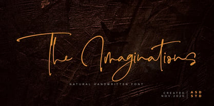 Introducing the new font The Imaginations, simple, natural, and natural handwritten font. This font suitable for use in a variety of design fields, such as event advertisements, product promotions, book titles, activity titles, logos, adventure, and others. This font can when paired with serif font types will make your design project more beautiful and perfect. Features: - Uppercase - Lowercase - Number & punctuations - Multilingual - Ligatures and alternates character - PUA encoded I highly recommend using a program that supports OpenType featuresand Glyphs panels such as Adobe Illustrator, Adobe Photoshop CC, Adobe InDesign, or CorelDraw, so you can see and access all Glyph variations. This font is encoded with Unicode PUA, which allows full access toall additional characters without having special design software. Mac users can use Font Book, and Windows users can use Character Map to view and copy one of the extra characters to paste into your favorite text editor / application. I hope you enjoy the font, thank you.
 - Linotype Mindline by Linotype,
$29.00Linotype Mindline is part of the Take Type Library, chosen from the entries of the Linotype-sponsored International Digital Type Design Contests of 1994 and 1997. With Mindline, the German designer Critzler plays with geometry and typefaces. Each character is basically a rectangle with a geometric form etched in it which happens to be a member of the alphabet. This formal style comes from the advertisement typefaces of the 1920s and is reminiscent of the constructivist posters of this time. The appearance of the characters take priority over the funcitonality and the eye can hardly recognize the forms of letters and numerals which meet it everyday. Linotype Mindline makes us take another look at forms which we see so often that we hardly notice them, only reading them for the information which they impart, and the font is therefore best used when the content of the text less important is than the impression its forms make. - Truecolor by Ditatype,
$29.00 Truecolor is a bold and distinctive brush font that commands attention. The characters in this font are characterized by their robust, square forms, which give the font a sense of solidity and reliability. Each letter is meticulously designed to maintain a cohesive and balanced appearance, adding an air of authority and visual impact to your text. It has the power to transform your text into a striking focal point, ensuring that every word is seen and remembered. In addition, you can also enjoy the features here. Features: Ligatures Stylistic Sets Multilingual Supports PUA Encoded Numerals and Punctuations Truecolor fits in headlines, logos, posters, flyers, branding materials, print media, editorial layouts, and many more designs. Find out more ways to use this font by taking a look at the font preview. Thanks for purchasing our fonts. Hopefully, you have a great time using our font. Feel free to contact us anytime for further information or when you have trouble with the font. Thanks a lot and happy designing.
 - Pokelor by Nathatype,
$29.00 Pokelor is a display serif font beautifully designed with harmony between function and beauty showing you elegant, modern yet less formal impressions. The little hooks’ continuity elements help the eyes to keep flowing from one letter to another. With wide spaces and easily noticeable letters, this font is truly legible with which you can apply for any text sizes. Furthermore, enjoy the interesting features available in this font. Features: Stylistic Sets Multilingual Supports PUA Encoded Numerals and Punctuations Pokelor fits best for various design projects, such as posters, banners, logos, magazine covers, quotes, headings, printed products, invitations, name cards, merchandise, social media, etc. Find out more ways to use this font by taking a look at the font preview. Thanks for purchasing our fonts. Hopefully, you have a great time using our font. Feel free to contact us anytime for further information or when you have trouble with the font. Thanks a lot and happy designing.
 - Hejira by Sudtipos,
$49.00 Hejira means “rupture” and this concept was the primary principle that guided the creation of this typeface: to escape conventions and take up the challenge of designing letters with an unusual and fresh approach. Unlike traditional typefaces, each member of this somewhat atypical family has its own distinct personality and formal features. A thin, spiky font that looks like its sharp serifs could pierce through. A more experimental sibling, based on the same skeleton but taken to the extreme, that is best suited to setting big titles. An odd-one-out, sans-serif style whose shapes mimic those generated by the movement of a calligraphic pen. And a quirky fat-face with a flair for combining round curves with pointy elements. Regardless of how different they may be, all four styles feel part of the same system and can be used alongside each other seamlessly. The Hejira set includes multiple ligatures and supports a wide variety of Latin alphabet-based languages.
 - Loscarlo by Ditatype,
$29.00 Loscarlo is a captivating serif font that seamlessly merges the timeless elegance of serif typography with the organic charm of brush details. The characters in Loscarlo showcase the classic structure of serifs, offering a sense of tradition and readability. What makes this font unique is the thoughtfully incorporated brush details, which add a dynamic and handcrafted quality to the letterforms. The result is a harmonious balance between refined aesthetics and a hint of expressive creativity. Enjoy the features here. Features: Multilingual Supports PUA Encoded Numerals and Punctuations Loscarlo fits in headlines, logos, posters, flyers, branding materials, greeting cards, print media, editorial layouts, and many more designs. Find out more ways to use this font by taking a look at the font preview. Thanks for purchasing our fonts. Hopefully, you have a great time using our font. Feel free to contact us anytime for further information or when you have trouble with the font. Thanks a lot and happy designing.
 - Ancient Astronaut by Comicraft,
$19.00 Are you in search of Ancient Astronauts? Extraterrestrial beings who came from the 12th planet to influence human cultures, technologies and religions? They're here! They visited our Earth prehistorically and they didn't just make contact with humans -- they gave birth to our entire race! Some believe they are a secret group of reptiloids who still control humanity! Their agents live amongst us disguised as George W. Bush, Queen Elizabeth II, Kris Kristofferson and Lady Gaga. It's true, we read it in Weekly World News. These ancient aliens established divine status over primitive men and compelled them to build Stonehenge, Pumapunku, the Moai of Easter Island, the Great Pyramid of Giza, and the ancient Baghdad electric batteries. After all, if you're stuck on Earth, you may as well have some big heads to look at and a source of power to jump start your flying saucer. And a font. Features: Three fonts (Regular, Bold & Alien) with alternate characters.
 - Framealot by Ingrimayne Type,
$14.95 Framealot is a frame or border or page divider construction kit. By choosing and mixing various elements, a wide variety of different geometric borders or frames or dividers are possible. The largest set is on the upper-case keys. There are two other sets on the lower case keys (plus the comma and period.) The characters above the number keys (the whole top row with shift, plus {}| keys are another set. And there are a couple of other small sets. Not all the sets allow vertical dividers. Outlined versions are available on the outline style, and the filled style either inverts the pattern or removes white interior sections for the outline version (and has some other differences compared to the other two versions). Use a character map to find all the parts of a set, type them out on your document, and then copy and paste to construct your border or frame. Have fun with it!
 - ITC Officina Serif by ITC,
$40.99 When ITC Officina was first released in 1990, as a paired family of serif and sans serif faces in two weights with italics, it was intended as a workhorse typeface for business correspondence. But the typeface proved popular in many more areas than correspondence. Erik Spiekermann, ITC Officina's designer: Once ITC Officina got picked up by the trendsetters to denote 'coolness,' it had lost its innocence. No pretending anymore that it only needed two weights for office correspondence. As a face used in magazines and advertising, it needed proper headline weights and one more weight in between the original Book and Bold." To add the new weights and small caps, Spiekermann collaborated with Ole Schaefer, director of typography and type design at MetaDesign. The extended ITC Officina family now includes Medium, Extra Bold, and Black weights with matching italics-all in both Sans and Serif -- as well as new small caps fonts for the original Book and Bold weights."
 - Calligraphica by Monotype,
$49.00Calligraphica was designed because there are very few inline fonts, and even fewer inline calligraphic fonts. The original forms were written with a split pen in a single stroke. The minuscules have a rougher look and the capitals have a smoother shape to imitate hand written calligraphy with more formal, decorative initial caps. The Calligraphica family contains 6 fonts: Calligraphica Regular and Italic are the regular upright roman true italic version of the font. The ascenders on this font are a bit higher than the capital letters--this is standard for most fonts. Calligraphica LX Regular and Italic are similar to the first 2 fonts except their ascenders are longer and reach high above the capital letters--giving these fonts a taller appearance. Calligraphica SX Regular and Italic are similar to the first 2 fonts except their ascenders are shorter and are the same height as the capital letters--giving these fonts a shorter appearance. - Frigga by Sudtipos,
$49.00 Frigga is a typeface that settles its roots in the Baroque Dutch tradition of text typefaces and northern european type forms. Carefully crafted for an optimum balance between its solid historic structure and a refreshing repertoire of organic forms, where blossoms its contemporary spirit and natural beauty. In the page, spread on long text settings a feeling of comfort and closeness, while in headlines and display use, it reveals itself more exuberant and plentiful of details. Is beautiful, timeless, lush, elegant and smooth like nordic mead. Fully equipped to realize your wildest editorial dreams, Frigga came in 20 styles, with more than a 1000 glyphs per style, alternates, ornaments and borders, old style and tabular figures, small caps and plenty of OpenType features to fulfill any type of editorial need. Named after the nordic goddess Frigga (also called Frejya), taking as a reference the romantic mythos of its cultural representation, the solemn presence and her warm, gentle embrace.
 - Delight Muffin by Nathatype,
$29.00 Delight Muffin is a display serif font in thickly designed weights for modern, friendly, and stylish design purposes. Generally, every letter of this font is in rounded shapes with a few spaces given. The top and the bottom parts of the letter are the thinnest ones with hardly invisible differences between the thick and the thin lines, which contrast the low lines. With Delight Muffin’s legibility, it is possible to use the font in various text sizes. Features: Stylistic Sets Ligatures Multilingual Supports PUA Encoded Numerals and Punctuations Delight Muffin fits for various design projects, such as posters, banners, logos, magazine covers, quotes, headings, printed products, invitations, name cards, merchandise, social media, etc. Find out more ways to use this font by taking a look at the font preview. Thanks for purchasing our fonts. Hopefully, you have a great experience using our font. Feel free to contact us for further information when you have a problem using the font. Thank you. Happy designing.
 - Bilcase by Ilham Herry,
$20.00 The Bilcase font family is a layered condensed font family that comes from vintage logos, labels, packages, and signage. This collection of styles has 5 type layers and vintage scrolls, panels, and ornaments. Combine these to create label designs, headlines, logotypes, signage, posters, greeting cards, letterheads, T-shirts... the applications are endless. This font family is available in 2 styles. Bilcase has font layers with contextual, stylistic alternates and ligatures. You will get special capital letters when you activate the contextual alternate feature. Bilcase Extras is the expanded version of the main font with panels, ribbons, and ornaments. You can access the ornaments by activating the ligature feature. Type the letter “p” for the panel, “r” for ribbon and “o” for ornament and add numbers to each code, e.g. “p1, p2, p11, r2, o2”. Complete information is in the pdf file. http://bit.ly/2OClGjY. You can also try it in the font tester below.
 - Elementis by Linotype,
$29.99German designer Hans-Jürgen Ellenberger originally developed the concept behind Elementis in 1975. Wanting to create an alternative typewriter script that was more round and natural, Elementis' design was born. True to its typewriter roots, Linotype's Elementis exhibits more character than one expects from that genre. The letters display a delightfully quirky nature, which is sure to lighten up any document. Elementis may be used in a number of point sizes: although the letters function best in large display settings, short passages of text in sizes of 12 point or less may also be created. This family has received a number of awards in various contests: Elementis was awarded an Honorable Mention in the 2003 International Type Design Contest, sponsored by Linotype GmbH. Additionally, Ellenberger received a Certificate of Typographic Excellence from the Type Directors Club in 2005; during their annual TDC2 type design competition, Elementis was selected as a "judge's choice." - Algarabia by Macizo.com.mx,
$30.00 • Algarabía "Joy" is a provocative and multilingual text face designed by Leonardo Vázquez. • It was created for a mexican magazine with the same name that uses it as the body text font, and now it's released for the public. • In 1397, Frederic Goudy's was asked to draw a face for the exclusive use of the University of California Press at Berkeley. The font was called California. In 1983 a digital version of this typeface was created by Aaron Burns and it was called ITC Berkeley. • Algarabía is inspired by ITC Berkeley, it keeps the calligraphic touch and weight, but it presents certain features in its design that might result unexpected, yet at the same time they are invisible when used as body text and provides the typeface its unique own personality. • Small Caps and Small caps italic, Included in each version. • Ideal for magazines, Art books or any editorial purposes where legibility and originality are needed.
 - Ribbonetter by Ingrimayne Type,
$5.00 Ribbonetter is an experimental font playing with the calt or contextual alternatives feature of OpenType. This feature alternates letters in ovals with letters in hourglass shapes to create a banner. The letters in the ovals will be determined by the start of the line, whether it starts by typing an upper-case or lower-case letter. Using layers, background color can be added (dot accent and ring characters) or the outline color can be changed (sterling and yen characters). The font may also be useful with the contextual alternatives turned off. Different amounts of character spacing may give interesting results. With default character spacing, ovals with will overlap. If you are typing numbers and want the start to be an oval, switch on OpenType style set 2. In at least one word processor (Pages 5 for Macintosh) the carriage return adds the shape assigned to the space character. If you encounter this, try adding a nonbreaking space (option-space on the Macintosh) before the carriage return.
 - Gelica by Eclectotype,
$30.00 When work started on the design of Gelica, there wasn't the same glut of retro-ish soft serifs there is today, and if I'd managed to complete it quicker, it might have been more trendsetter than bandwagon jumper, but that's the way it goes sometimes! I still think it's useful and unique enough to be a worthwhile addition to your typographic arsenal. Although obviously influenced by Cooper, it actually owes more to the lesser known Goudy Heavyface and Ludlow Black, particularly in the concave serifs. I wanted the family to be friendly and approachable, but not overly cutesy, and usability was always the prime concern. A nice weight range with matching italics was a must, along with useful OpenType features, and various figure styles. This is a display family first and foremost, but is also comfortable at smaller sizes for longer copy, and so works well in a supporting role to a more exuberant titling font.