10,000 search results
(0.044 seconds)
- Monarque by The Paper Town,
$27.00 Monarque is an elegant typeface. It is crafted with fine details that would make your typography stand out. Large x-height, high stroke contrast, rounded curves & long sharp serifs create together a dramatic look that would succeed in delivering a strong message with elegance. The true italic’s are designed to work harmoniously with the roman for a striking contrast within a line. Originally created to be an all-caps only, the font includes a lot of uppercase ligatures that are thought to flow in naturally and achieve a legible composition. OpenType features include a stylistic set of alternates, contextual alternates, discretionary and standard ligatures, old style figures, small caps and case-sensitive forms. The type family is available in 5 weights for a total of 10 fonts and supports over 200 Latin-based languages, making Monarque a solid powerful typeface ready for any kind of project from editorial design, branding, magazines, logos and more. As Monarque is only available as a display (for now) its full potential operates at its best with headlines or short to medium-length texts.
 - Cautions Brush by Fargun Studio,
$12.00 Thanks for checking out Cautions Brush! A fabulously fun yet elegant script font with tons of energy, allowing you to create beautiful hand-made typography in an instant. With extra bouncy curves & loops, Cautions Brush is guaranteed to make your text stand out - perfect for logos, printed quotes, invitations, cards, product packaging, headers and whatever your imagination holds. What's really awesome is that Cautions Brush comes with a complete set of lowercase alternates, which allows you to create even more authentic custom-feel text. Another great feature is the bonus ornaments font, which allows you to add some really unique and elegant finishing touches to your script text. Cautions Family includes 2 font files; Cautions Brush• A handwritten script font containing upper & lowercase characters, numerals and a large range of punctuation. Cautions extras • A set of hand-drawn swashes & doodles, the perfect finishing touch to underline your Cautions Brush text & doodles for perfect lettering logos. Simply install this as a separate font, select it from your font menu and type any A-Z, a-z & 0-9 character to create a swash & Doodles.
 - Grogie by Luhop Creative,
$16.00 Grogie font family consists of 06 families,is a high-contrast typography inspired by transitional and contemporary typography. Fonts extend their use by giving weights ranging from thin to black. The natural curve, a swollen and sloping stem, grows in character as the font gains weight. While the thinner weight has lowered contrast and optical correction to create a warm and soft look. Featuring beautiful, excellent weight and extensive language support. The elegant modern font creates a unique design and is sure to steal the eye of the design target audience. Besides being unique, the Grogie font also has a luxury simple character that makes the design charming and luxurious. Grogie excels in display settings such as headlines, titles, branding projects, Logo design, packaging, magazine headings, advertising, short or long text. Grogie Features: Multilanguange PUA Encoded Alternates Ligatures. Open Type LatPro To be able to access alternative fonts, make sure the software you use can support opentype features such as Microsoft Word, Paint, Adobe, Corel draw, Cricut and other applications. If you need help, please contact me :)
 - Guilloche A by Wiescher Design,
$80.00 Guilloches were – in the old days – used to make the falsification of banknotes more difficult. The engraving of these intricate lines was done by a highly specialized mechanical machine, which was operated by an equally highly specialized engraving artist. Once the settings for a specific curve were changed back to zero it was very difficult, if not impossible to set them back to the old design. I have designed a useful set of Guilloches that join to form ribbons that create a kind of op-art 3d effect. Under the keys A-U and a-u you find joining pieces. Under the keys V-Z and v-z I placed start- and endpieces. 0-4 are different lenght straight extensions and 5-9 are not quite so straight extensions. All other keys are corner pieces that can be used as stand-alones or put in rows to make for superb decoration. With a little bit of experimentation and maybe colored overlays you can achieve super-phantastic designs. Your elegant type designer Gert Wiescher.
 - Neo Tech by Monotype,
$29.00 Neo Sans began as an intriguing assignment from a branding agency. The agency’s client wanted an “ultra modern” type family that was "futuristic without being gimmicky or ephemeral.” When a bureaucratic decision cancelled the project, Monotype staff designer Sebastian Lester decided to finish the design on his own. “I was left with a sketchbook full of ideas,” he said, “and thought it would be a shame not to see what came of them.” Lester decided that the principal ingredient of an "ultra modern" typeface was simplicity of character structure: a carefully drawn, monoline form, open letter shapes and smooth, strong curves. By further amplifying these qualities, he crossed the line from modern to futuristic. Two highly functional and versatile typefaces emerged. These are Neo Sans and Neo Tech, designs Lester describes as "legible without being neutral, nuanced without being fussy, and expressive without being distracting." Both the Neo Sans and the more minimalist Neo Tech families are available in six weights, ranging from Light to Ultra, with companion italics. Neo Tech offers a suite of alternate characters.
 - Limon by Typesenses,
$49.00 Limon was entirely hand drawn and carefully digitised to get accurate curves but keeping the handmade look. The script fonts are smart scripts, plenty of alternates designed to preserve the calligraphic rhythm. Limon is a beautiful option for menus, magazine covers, wedding invitations, cards and all kind of stationery, packaging and labels. Default positional forms appear while you are writing when Standard Ligatures and Contextual Alternates features are on. Just keep them activated and let Limon Script do the rest. It warrants that all the connections will look good. Also, you can activate stylistic alternates, swash, titling and stylistic sets to have options for capitals, initials and terminals. Each Script Font reaches a total of more than 2900 glyphs (languages for every alternate included). Use professional software that widely support Open Type features. Otherwise, you may not have access to some glyphs. For further information about features and alternates, see the User Guide. Limon has extensive Western, Central and Eastern European language support. Limon Script matches very well with Dress and Chonky When life gives you Limon, make a beautiful design!
 - Lust Pro Didone by Positype,
$50.00 Confident and versatile, Lust Pro™ is an exercise in indulgence—an attempt to create something over the top and vastly useful. If Lust Pro seems both new and familiar, that’s because it is. The series unapologetically channels Herb Lubalin, but produced with a deliberate, contemporary twist. There is an intentional slyness infused in the letterforms—the extreme thick and thin lines flow effortlessly without becoming gratuitous. It’s always just enough, not too much. What makes the type series so appealing? The curves. When asked to describe the letterforms, most people unwittingly allude to the human form, using adjectives usually reserved for describing physical traits… creating all-too-familiar comparisons. Summerour has grown to accept this as unavoidable and reasonable given his acknowledgement of its influences and has provided nuances within the letterforms to accentuate that. Intended to be set large, the typeface boasts 3 widths and 5 weights and matching italics for both the Regular and Didone variants (that’s 60 fonts in total), making it perfect for editorial use and a highly flexible solution for any display need.
 - Love Story by Latinotype,
$29.00 Love story is a display hairline typeface for use in big sizes and short texts. It’s inspired by different kinds of love and specially designed for Valentine’s day. Its soft curves and sweet style give it a lovely personality. Designed by Luciano Vergara and his wife Guisela Mendoza who has been studying ornaments since 2007 and has done her best for each project. You can see in her dingbats specially Printa and Abel designed for generate patterns. Now she integrated her passion to the ornament in a clean set which includes dingbats, ornaments and patterns. Luciano Vergara has designed very strong fonts with a particular work in the lines study and close to the geometry since 2005, getting a structure style, you can see in his fonts specially Regia and Kahlo. Now he integrated his study of lines, in a hairline font delicate, continuous and beautiful. In this story both designers have been merged their worlds creating a gorgeous product. This is a romantic type story, a love story.
 - Houschka Pro by G-Type,
$72.00 Houschka was named after Georg Houschka, a sadly defunct confectioner’s shop in Salzburg, Austria, which had a wonderful 1930’s frontage and distinctively rounded letterforms in the sign above the door. Houschka Pro is the follow up to the original Houschka type family which first appeared back in 1999. Character shapes have been improved, kerning and spacing refined, and OpenType features include CE, Baltic, Turkish & Cyrillic language support plus small caps, 3 stylistic sets, contextual alternates, ligatures and 4 sets of numerals. Houschka is a clean and legible modern sans serif typeface which shares the humanist qualities of Gill Sans and Johnston but retains a uniquely charming character of its own (particularly in signature glyphs A, G, Q, W, u & w). The monolinear structure, rounded corners and rolling curves give Houschka a soft and friendly appearance. Houschka Alt Pro is a carbon copy of the Houschka Pro family with one key difference: the rounded signature glyphs A & W on the default positions swap places with their straight alternates.
 - Leo Arrow - 100% free

- AbbeyRoad - Personal use only

- Phoenix - Unknown license

- Nightmare Maker - Unknown license

- Kinryu_No14 - Unknown license

- Carpe Noctem by Hanoded,
$20.00 Carpe Noctem (Latin for ‘Seize The Night’), was a bit of a surprise. Someone asked me if I could create a lower case for my Closet Skeleton font. I began working on it and lo and behold, a beautiful font started taking shape. So, if you’re in need of a slightly scary fairytale font, complete with angled edges, swirly bits, a couple of alternate - even more curly - glyphs and an alternate medieval ampersand, then Carpe Noctem is your typeface!
 - Sirkle by Invasi Studio,
$19.00 Sirkle is a semi-serif typeface for display, constructed with sharp and curvy characters. All Letters are handcrafted and made to fit each other perfectly without exception, with a modern and edgy style that gives them a unique look. Sirkle comes with ligatures, alternates, and supports 60+ Latin-based languages. The Sirkle is ideal for logotype, signage, posters, packaging, and much more! Features: Uppercase & Lowercase Numerals & Punctuation Alternates and Ligatures Multilanguage Supports 60+ Latin based languages
 - MVB Greymantle by MVB,
$39.00Kanna Aoki had fairy tales in mind when she designed MVB Greymantle. She drew dots with a felt pen to build up the forms, giving them their particular rough character. The “Extras” font contains a set of whimsical illustrations, including a portrait of Greymantle—her 18-pound cat, a set of curly initial caps, and border parts. MVB Greymantle has been spotted on numerous children's books, in magazines, in salad dressing advertisements, and on food packaging. - Verdure by Sanyukt Foundry,
$12.00 The roundness of fresh Dewey leaves, the bending branches of canopy trees and the curvy luscious greens of dense forests; are all the things that inspire this clean display font. Its effortless and natural aesthetic makes it perfect for organic and luxurious brands. The strokes have a great contrast to give it a beautiful end to a long journey. The easy and elegant flow of the font brings one back right into the comforting arms of nature.
 - Fortunelimes by Maulana Creative,
$13.00 Fortunelimes is curvy casual script font, with felt-tip stroke, slant and fun character. It has Opentype features ligatures of character, To give you an extra creative work. Fortunelimes script font support multilingual more than 100+ language. This font is good for logo design, Social media, Movie Titles, Books Titles, a short text even a long text letter and good for your secondary text font with sans or serif. Make a stunning work with Fortunelimes font. Cheers, MaulanaCreative
 - Morge Knight by TypeClassHeroes,
$14.00 Morge Knight is a retro font come with curly and rounded old 80's retro style serif. You can explore and combine creating rhythm for comfortable reading. Vintage and refined use this font for any branding, product packaging, invitation, quotes, headline, label, poster, logo etc. Feature Uppercase & Lowercase Number & Symbol International Glyphs Multilingual support Alternative Ligature Feel free to drop us a message any time and follow my shop for upcoming updates Hope you enjoy it.
 - Reverb by Carmel Type Co.,
$15.00 Designed with the gig poster in mind, Reverb is a throwback to the Fillmore West golden age of psychedelic rock and summertime fun. With 5 distinct weights, this workhorse of a display face has you covered from light and airy to bold and curvy. Concave stems. short descenders with a tall x-height, and a generous helping of stroke contrast define this humanist sans face that's built to shine as a headliner or to spice up some secondary copy.
 - Cliquelly by Maulana Creative,
$12.00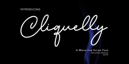 Cliquelly is a curvy script font, with a clean mono-line stroke, slanted and fun character. It has Opentype features ligatures of character, To give you an extra creative work. Cliquelly font support multilingual more than 100+ language. This font is good for logo design, Social media, Movie Titles, Books Titles, a short text even a long text letter and good for your secondary text font with sans or serif. Make a stunning work with Cliquelly font. Cheers, MaulanaCreative
 - House Soft by TypeUnion,
$30.00 House Soft is the curvy, fun little brother of House Sans. Its exaggerated rounded corners give it a playful feel that will bring happiness and joy wherever it’s used. Like its big brother, House Soft is also made up of 100 weights in 5 useful widths (Compressed to extended) that make it a versatile font. From big bold headlines to playful brands House Soft offers the flexibility and uniqueness you and your project deserve. Go soft or go home.
 - Postea by TypeTogether,
$47.00 The Postea font family is Veronika Burian and José Scaglione’s take on German geometric typefaces, reshaped with the right attributes for setting paragraphs and headings, and perfect for branding and text use. Some typefaces are a rough tool, like a pumice rock: abrasive to the senses, unforgiving, and unhelpful for most reading situations. Postea is an obsidian: smooth and classy, with attractive nuances in any light. The classic curves and purposeful details keep its individuality intact while allowing it to fit an incredible range of geometric font needs. Because of these qualities, Postea makes normal reading in paragraphs a cinch and your branding memorable. Compared to midcentury attributes of restraint and a sparse appearance, Postea’s deliberate play between character widths injects life and distinctiveness into its personality. The default ‘t, f’ have lyrical doses akin to a robust evening drink and are rounded out with a serpentine ‘s’ and rotund ‘o, g, b’. Another nice surprise awaits: spacing for the Hairline weight is tighter for optimal use in large headings and titles, while the regular weights have the expected, slightly looser spacing for text. Setting the test word ‘bogarts’ brings all this together nicely, invoking a balance between a constructed and human feel while brushing away the dust from a century of derivatives. Postea is opinionated and its modern stylistic sets allow it to be accommodating with softer, specially-designed alternative characters. SS01 replaces ‘b, f, M, m, t’, while SS02 changes only the lowercase ‘a’ to the round style, and SS03 swaps out the angled ‘y’ for a straight version. The fourth and sixth stylistic sets are packed with wallpaper-worthy geometric patterns, ornaments, arrows, and symbols aplenty. Postea’s 14 styles (seven upright and italic) and two variable fonts are accompanied by an all-new family of icons in three weights, which we developed a new, easy way to activate. Simply bookend the desired icon name with colons (:arrowUp: :chargingStation: :aid: :firstAid:), making sure to capitalise each word after the first word, then highlight and activate SS05. Icons include wayfinding, social interface, sanitary precautions like face masks, thermometers, and hand washing, and much more. Postea is resilient in the number of ways the family can be used, and its recognisable characters make it a prime selection for branding, signage, corporate typefaces, and magazines. Beginning with midcentury virtues, Postea is the rational response for text — a lyrical take on geometric sans serifs.
 - Airport Cyr - Unknown license

- Tapas by Fenotype,
$20.00 Tapas is a delicious multi type family with a little something for everyone's tastes and needs. The family consists of four distinct members that share same traits but communicate different aspects. Together they’ll create a bold and effortless mix of various flavors and accents. Naturally, the fonts can be used individually too. Use the Tapas type family in packaging, branding or editorial – wherever some delicious flavors are needed.
 - Incus by VladB,
$20.00 Incus is a modern sans serif geometric font, includes upper and lower case characters, Latin, Cyrillic, Latin Eastern Europe, Turkish, Baltic and other. The Incus family consists of 6 fonts, divided into 2 subgroups (according to the type of style - St, Cut), and have the 3 types of thickness in each subgroup. Incus fonts will be useful in developing a brand, creating posters and other graphic products, and for word processing
 - Impacta by Linotype,
$29.99Linotype Impacta is part of the Take Type Library, which features the winners of Linotype’s International Digital Type Design Contest from 1994 to 1997. Dutch artist Marc Lubbers designed Impacta with little contrast between strokes, rather, he depended on the slope of the strokes to give his font character. Impacta can be used in small or large point sizes and its constructed forms bring a modern feel to graphic design. - Escript by Linotype,
$29.99Linotype Escript is a part of the Take Type Library, which features winners of Linotype’s International Digital Type Design Contest. Hans-Jürgen Ellenberger designed this handwriting font with fresh, lively forms. Each letter has a slightly different character, yet all fit well together and this lack of concrete rules gives the font a spontaneous feel. Escript is well-suited to headlines, smaller texts, and initials when combined with constructed typefaces. - Lazycat by VladB,
$28.00 Lazycat is a modern sans serif geometric font, includes upper and lower case characters, Latin, Cyrillic, Latin Eastern Europe, Turkish, Baltic and other. The Lazycat family consists of 8 fonts, divided into 2 subgroups (according to the type of style - St, Rg), and have the 4 types of thickness in each subgroup. Lazycat fonts will be useful in developing a brand, creating posters and other graphic products, and for word processing.
 - Tent Show JNL by Jeff Levine,
$29.00 Call the lettering French Clarendon Condensed, call it circus lettering, wanted poster type or Old West letters, the style of this typeface is one of the most recognizable and evokes all of the above images and more. Tent Show JNL was re-drawn from examples of a vintage set of wood type, and contains all of the eccentricities that are present in these hand-routed classic letter forms.
 - Old Claude LP by LetterPerfect,
$39.00 Old Claude was drawn by Paul Shaw to simulate an old cut of the classic (Claude) Garamond type designs of the 16th & 17th centuries. The pronounced rough edges and coarse letter shapes create the effect of letterpress printing with old foundry type onto handmade paper. The companion Old Claude Expert includes small caps and old-style figures. This "antiqued" design works equally well for both text and display.
 - HT Profumeria by Dharma Type,
$19.99 HT Profumeria is a monoline and connected font with a thin line and a unique tail. Its simple and retro look is the best script for branding and packaging, but it may also be useful for headlines, publishing and advertising. Holiday Type Project offers retro hand drawing scripts. Inspired by retro script on shopfront lettering, wall paint advertisements in Italy around 1950s. Check out the script fonts from Holiday Type!
 - Turquoise Inline by Resistenza,
$49.00 Turquoise Inline is a new version of our bestseller Turquoise This version of roman capitals is more focused on display use, with the details of an inline roman type. This font can be used, for ads, labels, wine labels, logo and all kind of display uses. Open Type features needs to be activated for all the ligatures and alternates. Enjoy it! We recommend to combine Turquoise Inline with Nautica Sottile & Auster
 - Collect Em All BB by Blambot,
$12.00 Blambot’s first font featuring Contextual Alternates: COLLECT EM ALL BB! As you type, you'll discover six versions of every letter, three versions of every number, three versions of the exclamation point and question mark, auto-correction of serif-I per standard American comic book tradition, and if you type from three to six of any letter, you'll get a bouncy baseline! All this, plus a hefty set of European characters.
 - Tecnica Slab Stencil by Graviton,
$20.00 Tecnica Slab Stencil font family is the stencil version of Tecnica Slab font family, it has been designed for Graviton Font Foundry by Pablo Balcells in 2014. Tecnica Slab Stencil consists of 8 styles. The 4 “Stencil 1” styles contain a narrow stem for big sizes type and/or rigid materials printing, and the 4 “Stencil 2” styles contain a wide stem for small sizes type and/or light materials printing.
 - Lokko by VladB,
$20.00 Lokko is a modern sans serif geometric font, includes upper and lower case characters, Latin, Cyrillic, Latin Extended symbols and other. The Lokko family consists of 8 fonts, divided into 2 subgroups (according to the type of style - St, Cut), and have the 4 types of thickness in each subgroup. Lokko fonts will be useful in developing a brand, creating posters and other graphic products, and for word processing.
 - Library Book Initials JNL by Jeff Levine,
$29.00 Library Book Initials JNL was modeled from examples of Sidney Gaunt's Publicity Initials; originally sold in metal type by Barnhart Brothers and Spindler as a companion to the Publicity Gothic typeface. The smoothed-down lines of the original characters allow for these initials to balace better when set against complementary type faces. A regular version is on the upper case keys, with an oblique version on the lower case keys.
 - Tecnica Stencil by Graviton,
$20.00 Tecnica Stencil font family is the stencil version of Tecnica font family, it has been designed for Graviton Font Foundry by Pablo Balcells in 2014. Tecnica Stencil consists of 8 styles. The 4 “Stencil 1” styles contain a narrow stem for big sizes type and/or rigid materials printing, and the 4 “Stencil 2” styles contain a wide stem for small sizes type and/or light materials printing.
 - Wood Rounded JNL by Jeff Levine,
$29.00 This reinterpretation of Caslon Rounded showcases one of the early attempts of type foundries to create a novelty ‘rounded’ typeface for general use. While the lettering might easily convey a more modern look of 1960s or 1970s pop typography, its roots definitely lay in the later part of the 19th Century and the heyday of wood type design. Wood Rounded JNL is available in both regular and oblique versions.


