10,000 search results
(0.054 seconds)
- Dancing Brush by Letterara,
$16.00 Dancing Brush is a strong original handwritten font with a unique feel. Natural and elegant, cursive, legible script font which can be used on a wide variety of designs such as headlines, titles, headings, logos, branding, posters, books, and any other creative design. It will add a unique spark to any design project that you wish to create! This font is PUA encoded which means you can access all of the amazing glyphs and ligatures with ease!
 - Hollyfur by Maulana Creative,
$11.00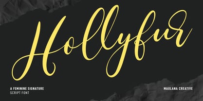 Hollyfur is a cursive beauty and feminine script font. With high contrast stroke, fun character with a bit of ligatures and alternates. To give you an extra creative work. Hollyfur font support multilingual more than 100+ language. This font is good for logo design, Social media, Movie Titles, Books Titles, a short text even a long text letter and good for your secondary text font with sans or serif. Make a stunning work with Hollyfur font. Cheers, MaulanaCreative
 - Hindyloft by Maulana Creative,
$12.00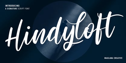 Hindyloft is a modern cursive script font. With high contrast stroke, fun character with a bit of ligatures and alternates. To give you an extra creative work. Hindyloft font support multilingual more than 100+ language. This font is good for logo design, Social media, Movie Titles, Books Titles, a short text even a long text letter and good for your secondary text font with sans or serif. Make a stunning work with Hindyloft font. Cheers, MaulanaCreative
 - Asutenan by Letterara,
$12.00 Asutenan is a strong original handwritten font with a unique feel. Natural and elegant, cursive, legible script font which can be used on a wide variety of designs such as headlines, titles, headings, logos, branding, posters, invitations, books, and any other creative design. It will add a unique spark to any design project that you wish to create! This font is PUA encoded which means you can access all of the amazing glyphs and ligatures with ease!
 - Australia Handwritten by Letterara,
$14.00 Australia Handwritten is a strong original handwritten font with a unique feel. Natural and elegant, cursive, legible script font which can be used on a wide variety of designs such as headlines, titles, headings, logos, branding, posters, invitations, books, and any other creative design. It will add a unique spark to any design project that you wish to create! This font is PUA encoded which means you can access all of the amazing glyphs and ligatures with ease!
 - Kheops by Tipo Pèpel,
$22.00 Kheops is a slab-serif style typeface, with a contemporary scent and designed for long texts, without giving up on big headlines, it is accompanied by an authentic cursive with a dynamic rhythm and a skeleton with humanist reminiscences, it also includes a set of ornaments based on in simple geometric shapes, and an extensive range of OpenType functionalities to meet the needs of the most demanding designer, an all-rounder that cannot be missing from your typographic palette.
 - Kumo Sans by EchadType,
$10.00 Kumo Sans is a clear and comprehensible font stylized to mimic marker pen handwriting. The idea was to interpret swift and negligent hand movement in a distinct and easy to read familiar glyph silhouette. Family comes in three weights and italic slant option. Shadow version with outline and shadow effect is perfect for short catchy phrases, brand names and headlines use. Font contains Latin diacritics, Hebrew cursive writing, Bitcoin, Indian Rupee, New Israeli Shekel symbols, fractions etc.
 - Professor by Three Islands Press,
$39.00 My father is retired from teaching after a distinguished career as a professor at the University of Texas (and other colleges). He's also retired from writing in longhand, ever since I digitized his script several years ago. Professor is a slightly modified version of my ol' dad's cursive hand -- a good, strong, helpful, friendly, personable hand, much like the man. Use Professor for all your casual handwriting needs: my father doesn't mind. Comes in a single, medium-weight style.
 - Castilock by Maulana Creative,
$14.00 Castilock is a casual cursive script font. With regular mono-line consist stroke, fun character with a bit of ligatures and alternates. To give you an extra creative work. Castilock font support multilingual more than 100+ language. This font is good for logo design, Social media, Movie Titles, Books Titles, a short text even a long text letter and good for your secondary text font with sans or serif. Make a stunning work with Castilock font. Cheers, Maulana Creative
 - Honeydew by Molly Suber Thorpe,
$17.99 Honeydew Script: Light, Whimsical, Soft & Bright Honeydew is a calligraphic font in a monoline script style. It is a modern twist on classic schoolhouse cursive, and is extremely versatile. Use this typeface for branding, social media, weddings, stationery, packaging, layout design, and advertising. The sky's the limit! Honeydew has 527 glyphs, including the complete Latin alphabet (upper and lowercase), numbers (lining, old style, fractions, and super/subscript), punctuation, and diacritics, and over 40 standard and discretionary ligatures.
 - Fresh Garden by Epiclinez,
$18.00 Fresh Garden is an elegant, cursive font. It's a great fit for any project you have in mind! Use it as your wedding invitation text or to create a logo design with a feminine touch. Whether you're taking on a fun project or tackling something serious the script font will always please and soothe your senses. So what’s included : Basic Latin Uppercase and Lowercase Numbers, symbols, and punctuations Ligatures Multilingual Support. Simple Installations Works on PC & Mac
 - Primaria by PeGGO Fonts,
$18.00 Primaria is a display font, inspired on the very first basic handwrite style teaching at primary school, designed in cursive and print styles in three weights each one: light, Regular and Bold, considering stylistic and typographic needs, it also contain OpenType initial lowercase alternative forms in order to get better links in those case where pairs of letters could be look better. Recommended playful and friendly design, teaching and learning stuff, children toys projects, food & drink and soft stuff.
 - Merick by Eurotypo,
$28.00 Merick is a modern and slightly condensed cursive, carefully drawn to obtain a very readable font. This font is a versatile and elegant script, based on the author’s calligraphy, the lower cases are connecting with lots of dynamic and vivacious swashes, ligatures and alternates. Merick is perfect for logotypes, posters, cards, menus, product packaging and other printables, as well as web applications.The swashes, tails and alternate letters will add a finishing touch to every logo or headline.
 - Boyflare by Maulana Creative,
$12.00 Boyflare is a cursive handwritten script font. With bold mono-line stroke, fun character with a bit of ligatures and alternates. To give you an extra creative work. Boyflare font support multilingual more than 100+ language. This font is good for logo design, Social media, Movie Titles, Books Titles, a short text even a long text letter and good for your secondary text font with sans or serif. Make a stunning work with Boyflare font. Cheers, Maulana Creative
 - Kalmiza Script by Nowlystudios,
$12.00 Kalmiza is a monoline script font with a cursive style, as many characters are smoothly connected. This lovely typeface is great for designers who are seeking a natural and authentic style in their creations! This gorgeous font includes all lowercase and uppercase characters, numbers, punctuation, alternate, an array of standard ligatures, and a selection of international characters as well. This font is PUA encoded which means you can access all of the amazing glyphs and ligatures with ease
 - Kerninator by Kern Club,
$10.00 Futuristic display font inspired by our favorite childhood film. Includes thick and thin version Thick Uppercase Character Set A-Z Thin Lowercase Character Set A-Z Numerals & Simple Punctuation OTF file format
 - Erpos by Baqoos,
$18.00 Erpos is a dynamic soften integral tech sans= apt for headline, editorial, branding, packaging, printed materials and typographic applications. 200+ glyphs with ligatures and fractions provided in opentype .otf and .woff format.
 - Mstov by Baqoos,
$18.00 Mstov is an alacritous kooky tech display typeface apt for headline, editorial, branding, packaging, printed materials and typographic applications. 220+ glyphs with ligatures and fractions provided in opentype .otf and .woff format.
 - Notebook Scribble by Mariess,
$7.00 A hand drawn font thats perfect for kids cards, scrap-booking and photo annotation etc.. Full set of alternative characters included. Comes with CSS and HTML code plus all web compatible formats.
 - Soin Sans by Stawix,
$30.00 Soin Sans is a geometric sans-serif typeface inspired by the design of Futura. (All packages including OTF & TTF file format) Soin Sans Pro Version : http://www.myfonts.com/fonts/stawix/soin-sans-pro
 - Maya Month Glyphs by Deniart Systems,
$15.00 Contains the 19 months of the Maya solar year (in outline and silhouette mode) as well as the 19 Maya numerals. NOTE: this font comes with an interpretation guide in pdf format.
 - Gazzetta by TipoType,
$24.00 Gazzetta is a condensed font family with a display character and neo-grotesque nature, friendly and energetic. It exhibits softened features and curves, very sharp joins between some strokes, and a slight reverse contrast in its thicker weight. Characteristics that give it a lot of personality and display capacity.The family is made up of 8 weight variables and their respective slanted versions, with substitutions in some glyphs that seek to maintain an italic flavor. It has a repertoire of OpenType features, including Stylistic Alternates, Case Sensitive Forms and Old Style Figures. In addition to decorative resources such as circled numbers, arrows and quotation marks. Its aesthetic and technical attributes can be used in the design of book covers, newspapers, magazines, posters, large format materials, websites and apps.
 - Weiss Rundgotisch by Linotype,
$67.99The German designer Emil Rudolf Weiss originally created Weiss Rundgotisch for the Bauer typefoundry in 1937. In their catalog for the typeface, Bauer began with this quote from Leonhard Wagner: The round gothic (rundgotisch) script is the most beautiful kind of script; she is called the mother and the queen of all the rest." While designing Weiss Rundgotisch, Weiss was inspired by Renaissance types cut by the Augsberg printer Erhard Ratdolt. Ratdolt had spent some time in Venice, which is most likely where he became familiar with round gothic letters. This sort of letterform was never as popular in Germany as Fraktur or Gotisch may have been, but round gothic types were used there for centuries to represent arts and craft feelings, as well as old-fashioned handwork. For a blackletter typeface, Weiss Rundgotisch is very similar to normal serif and sans serif designs, especially its uppercase letters, which seem to have some uncial influence in them as well. Therefore, Weiss Rundgotisch is more legible for contemporary readers, making this an excellent choice for anyone looking to set text, logos, or headlines with in blackletter. Weiss Rundgotisch was apparently quite a difficult typeface to design, even for a master designer like Weiss. He began work on the face in 1915; Weiss Rundgotisch's development took over 20 years to complete." - Broadside Text by Device,
$39.00 Broadside Text is a companion to Broadside, and is optimised for use at smaller sizes. More open counters, more generous letter-spacing and additional fractions increase legibility. The original Broadside family is suitable for headlines and larger sizes, and also comes with condensed and extended versions. Broadside is a versatile, authoritative and functional family inspired by the sans serifs seen on ’40s and ’50s patriotic posters and period advertising. It is available in seven weights across condensed, normal and extended widths, each with reweighed italics. The type from this period was very often hand-drawn, and so differs considerably from poster to poster. Many American examples of this period use a Photo-Lettering style called Murray Hill and its derivatives, although their UK counterparts, designed by such luminaries as Abram Games or Tom Eckersley, are more stylistically diverse. Even though no single model is available to base a digitisation on, there are certain recurring stylistic quirks that give the type its unique flavour, and so the most interesting examples from several sources were be combined for the final family. Alternate short descenders, allowing for tighter line spacing, can be toggled on or off in the Opentype panel of Indesign or Illustrator. Tabular and lining numerals and a single-story ‘a’ are also available in all weights and styles.
 - Mono Spec by Halbfett,
$30.00 Mono-Spec is a monospaced family of sans-serif type. At least in default settings, all characters across the typeface share a common width. That fixed setting is condensed, and the aesthetic style of Mono-Spec’s letterforms is very industrial. A sister family, called Mono-Spec Stencil, is also available. Its design strays away from the mechanical nature of Mono-Spec, and it channels the spirit of resistance and street culture. Mono-Spec ships in two different formats. Depending on your preference, you can install the typeface as a single Variable Font or use the family’s five static OpenType font files instead. Those weights run from Light through Bold. While the static-format fonts offer a good intermediary-step selection, users who install the Variable Font have vastly greater control over their text’s stroke width. The Mono-Spec Variable Font’s weight axis allows users to differentiate between almost 1,000 possible font weights. That enables you to fine-tune your text’s exact appearance on-screen or in print. Whatever format you choose, the Mono-Spec fonts are equipped with several OpenType features. The most striking of these can be activated via a Stylistic Set. That will replace several letters – like “B”, “E”, “F”, “H”, and “I” with double-width alternates. Those alternates take up as much space as two characters placed next to each other otherwise word. The effect of Mono-Spec’s double-width alternates is striking, and their use strikes a strong chord in any display typography applying them.
 - Ciutadella Slab by Emtype Foundry,
$69.00 The family keeps growing, Ciutadella Slab is the ‘serif’ counterpart of the popular Ciutadella font. The former alternate characters like 'a', 't' and '&' are now the default ones (and the former default characters are now the alternates), giving way for a typeface more suitable for texts. Thus, the new Ciutadella Slab is not only a great headline family, it will also work in texts of intermediate length and size. Especially appropriate for magazines, brochures or branding. This new addition provides even more versatility to the family started with Ciutadella and Ciutadella Rounded. It is available in Open Type format and includes Alternate Characters, Ligatures, Tabular Figures, Fractions, Numerators, Denominators, Superiors and Inferiors. It supports Central and Eastern European languages. As the sans version, the type family consists of 10 styles, 5 weights (Light, Regular, Medium, SemiBold and Bold) plus italics. For more details see the PDF.
 - LTC Athena by Lanston Type Co.,
$29.95 LTC Athena brings a somewhat “lost” hot-metal typeface back from obscurity into digital Opentype format. In fall 2012, printing historian Rich Hopkins contacted P22 type foundry regarding some inked type drawings he had just uncovered from his acquisition of the Baltimore-based “Baltotype” company some 20 years ago. It is a rare face whose original matrices were destroyed and thought fully lost. The drawings included a full upper and lower case set, numerals, basic punctuation, and alternate forms of some letters. The design is a narrow deco-flavored design from the 1950s with a curious avoidance of straight lines in the stems and main strokes. The face has been expanded to over 340 characters by Miranda Roth and includes ligatures as well as a full Pan-European character set. It is released through the Lanston division of P22 in consideration of its earlier incarnation as a metal typeface.
 - Inflate PTx by Pedro Teixeira,
$20.00 Introducing the Inflate PTx font family, a delightful and playful typeface collection that embodies the buoyant spirit of celebration and festivity. This font can be use in old and new apps that use/read fonts, because it's format (old school format :)), not OpenType SVG format. To install fast on the PC: right click in the OpenType file, then "Install". But if you want to open the file, please be pacient. It takes time to open and read the OpenType file depending of the capacity of your PC. The Inflate PTx font family is tailor-made for creative projects, from birthday party invitations and children's book illustrations to social media graphics for Instagram or themed event posters. Its rounded edges and bubbly forms infuse any design with an infectious sense of joy and lightheartedness, making it an ideal choice for those seeking a playful and festive typographic solution.
 - Volken by Phonnastudio,
$12.00 Volken is a heavy bold sans-serif font. This font is perfect for various projects, clean, and easy to read. what you get: · Alphabet · Number and Punctuation · Lettering format font · Include Multilingual support.
 - Moyers by Areatype,
$13.00 Moyers typeface is Vintage Design, old-fashioned, elegant. This font good for vintage design, Display, t-shirt, logo, labels, posters and etc. Features: -Uppercase -Lowercase -Numerals -Basic punctuations Available in OTF formats. Thanks!
 - Coranto 2 by TypeTogether,
$49.00 Now available as Opentype font with extended character set, Coranto 2. It is originally based on Unger’s typeface Paradox, and arose from a desire to transfer the elegance and refinement of that type to newsprint. Coranto 2 has a larger x-height and in many places has been made more robust. Over the past 25 years newspaper production has seen spectacular improvements in paper and print quality, the introduction of colour printing, and vastly better register. Newspaper production still demands a lot of letter forms, but advanced printing brings out details better and makes typography more appealing to readers. For text type the newspaper is no longer an environment in which survival is the chief assignment. Today, newspapers are not merely a matter of cheap grey paper, thin ink and super-fast rotary printing, and type design no longer has to focus on surviving the mechanical technology and providing elementary legibility. Now there is also room to create an ambience, to give a paper a clearer identity of its own; there is scope for precision and refinement. One consequence of this is that newspaper designers can now look beyond the traditional group of newsfaces. Conversely, a newsface can be used outside the newspaper — not an uncommon occurrence. The update to this beautiful font family, Coranto 2, includes the addition of over 250 glyphs featuring full Latin A language support, new ligatures, 4 sets of numerals, arbitrary fractions and superiors/inferiors. Furthermore, kerning was added and fine tuned for better performance.
 - Zena by Arabetics,
$39.00 Zena is an Arabetic typeface design with visually connected glyphs, named for designer’s younger daughter, Zena, for her twelfth birthday. Zena follows the guidelines of the Mutamathil Taqlidi type style with one glyph for every basic Arabic Unicode character or letter, as defined in Unicode Standards, and one additional final form glyph for each Arabic letter that can connect with other letters from both sides in traditional cursive Arabic strings. Zena employs variable x-height values. It includes all required Lam-Alif ligatures and selected marks. Tatweel (or Kashida) glyph is a zero width space. Keying it before any glyph will display that glyph isolated form, if desired. Keying Tatweel before Alif Lam Lam Ha will display the Allah ligature. The Zena typeface family includes both Arabic and Arabic-Indic numerals; all required diacritic marks, in addition to Standard English keyboard punctuations and major currency symbols. Zena is available in regular and italic (slated to the left) styles.
 - Sybilla Pro by Karandash,
$28.00 Sybilla Pro a humanist slab serif well suitable for broad range of design projects. Its unique, soft and almost cursive shapes help define a warm and friendly slab serif that is more legible and easier on the reader's eye. This newly developed extended type family consists of seven weights in three widths with complimentary true italics. It is ideally suited for advertising and packaging, editorial and publishing, logo, branding and creative industries, poster and billboards, small text and signage as well as web and screen design. Sybilla Pro provides a broad range of advanced typographical features such as small caps, case-sensitive forms, fractions, scientific inferiors, super- and subscript characters. It comes with a complete figure range set of oldstyle and lining figures, each in tabular and proportional widths. Sybilla Pro has extensive multilingual support, covering more than 70 Latin-based languages and specially designed Cyrillic that works harmoniously with its Latin counterparts - a perfect choice for projects that need both writing systems running side by side.
 - Naste by Tipo Pèpel,
$22.00 Tipo Pèpel strikes again with a lush splurge on pure basic geometrical shapes and sizes, those that inspired Paul Renner’s typographic milestone “Futura”. A new look to classic shapes, bringing them back plenty of delightfullly details as the lowercase cursive forms’ long tiles that break the supposed linearity expected from a purely geometrical font. Rhythm given by hidden details in each character of each weight, push “Naste” out of German geometric sobriety, will help us to easily create typographic hierarchies upon the many weights available and the many and accurate details. Excellent results with minimal effort. Wide ‘x’ height, restrained ascending and descending stems; thick but elegant, easy to read and in need of generous white space around, where it feels comfortable. More is better than less. As usual in Type Pépel, full sets of Opentype alternatives and Unicode support for 104 languages plus Cyrillic. 16 weights of typographic beauty in all its glory.
 - Fairwater by Laura Worthington,
$29.00 Fairwater’s aesthetic derives from the cursive handwriting styles popularized in the early to mid-1900s, the simplified, forgiving letterforms of tattoo lettering – and the pictorial themes that informed early-to-mid 20th-century naval tattoos. The Fairwater family includes a script and sans face in three weights, four decorative serif faces and an ornamental font: DIY Lines. As with many of my fonts, I couldn’t resist adding a plethora of 465 swashes and alternates to the script version, that include ending forms on all letters, 34 beginning and isolated letters, an unconnected version and contextual alternates. Fairwater also includes a powerful decorative font entitled DIY Lines: 250 ornamental characters of ships, anchors, oars, knots, rope, botanicals, diamonds, arrows and more. With strokes and proportions that perfectly complement the type. See what’s included! http://bit.ly/2cJMUoe These fonts have been specially coded for access of all the swashes, alternates and ornaments without the need for professional design software! Info and instructions here: http://lauraworthingtontype.com/faqs/
 - ITC Chino by ITC,
$40.99 ITC Chino is a type family (Display & Text) designed by Hannes von Döhren and Livius Dietzel. ITC Chino Pro brings legibility and distinction to text copy. It is also a friendly design that will invite readers into content at large or small sizes. It is a melding of soft brush stokes and crisp edges. This is readily apparent in the bolder italic weights where the straight stems provide a counterpoint to the cursive terminals. The Typefamily is highly legible in a wide range of sizes. The text side of the family contains five weights of roman, each with an italic companion. Ranging from Light to Black, ITC Chino Pro provides a rich typographic palette. The OpenType fonts have an extended character set to support Central and Eastern European as well as Western European languages. Each font includes small caps, fractions, old style-, lining-, tabular numbers, scientific superior/inferior figures and a set of arrows.
 - Altissimo by Soneri Type,
$32.00 Altissimo is a display type family, derived from the Ample typeface, it has large x-height, optical mono linear and a bit squarish in nature. It has a smooth curve instead of sharp angles formed by the junction of two strokes, which is a prominent feature of its design. It is designed to be a little eye-catching yet legible. It has clear and distinguishable letterforms, which helps to elaborate and emphasise the message. It is graphically strong and commands viewer's attention. The overall appearance of this type is suitable in setting it as heading, title, headline, etc. The type family consists of seven weights viz. Thin, ExLight, Light, Regular, Medium, Bold and ExBold. Altissimo is designed by Aakash Soneri in a period between 2017 and 2018.
 - Massif by Monotype,
$57.99 “Designers can’t help but be inspired by the things that surround them,” says Massif’s designer Steve Matteson. An avid mountain climber, Matteson found his inspiration for his text face family in the dramatic granite formations of North America’s Sierra Nevada Mountains. Most of Matteson’s type designs are custom projects designed with an end use or customer in mind. Massif, which had no customer or specific purpose, was probably his most personal typeface to date. “My goal was to embody, in Massif’s two-dimensional letterforms, the angular tension and smooth curvature characteristic of the rugged terrain of Yosemite National Park’s Half Dome, which was formed by eons of glacial and tectonic activity,” Matteson explains. The typeface’s striking design echoes the faults and fissures that define a massif formation, resulting in a rich texture when used for body text and revealing distinctive shapes and proportions at display sizes. The Massif family comes in six weights, from Light to ExtraBold, each with an italic companion. The OpenType Pro suite contains small caps, ligatures and old style figures, and offers a small set of decorative ornaments. Pro fonts also include an extended character set supporting most Central European and many Eastern European languages.
 - LHF Broadway Panels 3 by Letterhead Fonts,
$53.0036 expertly-crafted and unique panels from Golden Era Studios. Typing each letter generates a different design. Special Note: Due to the large file size of these fonts, they will not convert for use in Gerber Omega. Instead, Omega users may wish to use an alternate program to type the characters and import them into Omega as .eps files. CorelDraw users should use the "Weld" command rather than "Convert to Curves" command to convert these fonts to vector outlines. Otherwise, the program may crash due to the sheer number of points in some of the panels. - Editors Note by Jen Wagner Co.,
$17.00 Say hello to the Editor's Note Family, an editorial serif display that includes 16 fonts, regular and italic, from Hairline weight to Bold, and still has all the clean lines, tight curves, and trendy minimalist vibes! I've been loving the clean, editorial type trend happening in design right now (let's be real, there's always a place for timeless editorial type). Editor's Note is a stunningly crisp upper and lowercase typeface that looks incredible in both large settings as a display text (think big headers, pretty quotes, calls to action, etc.). I've been loving combining the regular and italic, especially in big, bold quotes.