9,572 search results
(0.021 seconds)
- New Letter Gothic by ParaType,
$30.00 New Letter Gothic was designed for ParaType by Gayaneh Bagdasaryan based on monospaced Letter Gothic font by Roger Roberson, 1956–62. Due to clear and easy-to-read lettershapes of Letter Gothic the font is rather popular now for display and advertising matters. The idea was to create a font similar to Letter Gothic in lettershapes but with proportional widths of letters. For use in both display and text setting. New Letter Gothic has been adjudged an Award for Excellence in Type Design at Kyrillitsa ’99 International Type Design competition in Moscow, 1999.
 - New Bodoni DT by DTP Types,
$49.00A revival design by Malcolm Wooden of DTP Types Limited with associated Small Capitals and Old Style Figures. - RM New Albion by Ray Meadows,
$19.00 A classic blackletter Which looks best at 16pt and above. Due to the modular nature of this design there may be a slight lack of smoothness to the curves at very large point sizes (around 100 pt and above).
 - 1906 French News by GLC,
$38.00 We have created this family from the numerous derivatives in use for newspapers since the middle of the 1800s to the 1970s, inspired by the well known Clarendon. Mainly, the patterns are those used to print Le Petit Journal, a popular French Newspaper of the era (published from 1863 to 1937). The present version contains Normal, Italic, Bold and Bold Italic styles, in two sub families: 1906 French News for texts and titlings with upper and lower case, and 1906 French News Caps (Caps, small caps, small numerals, for texts and titlings).
 - Metro New Two by JAB'M,
$15.00The main inspiration is from Art Nouveau which flourished in Europe at the end of the 19th and beginning of the 20th centuries. This design included furniture (Majorelle, Lalique) and architecture (Victor Horta, Henry Van de Velde, Gaudi, Alfons Mucha). But Hector Guimard remains the favorite for all aspects of its art and, of course, its typefaces used on the Parisian Metropolitan posters. In particular, the various kerning of the various letters he used to make the poster a whole design from singular designs, leading to numerous variations. As a designer, I initially worked a first version, called Metro New One, which is more geometric and traditional. This design "Two" has more flexible shapes and long vertical hooks. It can be used to enhance specific parts in letters and books in the context of Art, specially Art Nouveau and Art Deco of course, posters of any kind. - New Year Page by Hatftype,
$15.00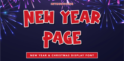 New Year Page - Display Font is a font with distinctive handwritten characters perfect for branding projects, logos, wedding designs, media posts, advertisements, product packaging, product designs, labels, photography, watermarks, invitations, stationery, and any project who need handwritten dishes. Features : • Character Set A-Z • Numerals & Punctuations (OpenType Standard) • Accents (Multilingual characters) • Ligature Multilingual Support : Afrikaans, Albanian, Asu, Basque, Bemba, Bena, Catalan, Chiga, Cornish, Danish, English, Estonian, Faroese, Filipino, Finnish, French, Friulian, Galician, German, Gusii, Icelandic, Indonesian, Irish, Italian, Kabuverdianu, Kalenjin, Kinyarwanda, Low German, Luo, Luxembourgish, Luyia, Machame, Makhuwa-Meetto, Makonde, Malagasy, Malay, Manx, Morisyen, North Ndebele, Norwegian Bokmål, Norwegian Nynorsk, Nyankole, Oromo, Portuguese, Romansh, Rombo, Rundi, Rwa, Samburu, Sango, Sangu, Scottish Gaelic, Sena, Shambala, Shona, Soga, Somali, Spanish, Swahili, Swedish, Swiss German, Taita, Teso, Vunjo, Zulu. There it is. I really hope you enjoy it.
 - Metro New One by JAB'M,
$15.00The main inspiration is from Art Nouveau which flourished in Europe at the end of the 19th and beginning of the 20th centuries. This design included furniture (Majorelle, Lalique) and architecture (Victor Horta, Henry Van de Velde, Gaudi, Alfons Mucha). But Hector Guimard remains the favorite for all aspects of its art and, of course, its typefaces used on the Parisian Metropolitan posters. In particular, the various kerning of the various letters he used to make the poster a whole design from singular designs, leading to numerous variations. As a designer, I first worked with the individual glyphs Hector Guimard designed and I discovered that they vary constantly from a poster to another, depending on the overall result he was looking for. Another difficulty in transferring his design to printing is that there was no lower case. I was excited to create the whole font from the original designs of Hector Guimard, incorporating its variations and "crazy kerning". After several attempts, it appeared to be impossible to include all variations and I slightly moved to my own new design as a complete font, upper and lower case, with kerning. I voluntarily limited the ascenders and descenders to the usual typography so that it can be used from 10 / 12 points. This version can be used to edit letters and books in the context of Art, specially Art Nouveau and Art Deco of course, posters of any kind. - Depot New Condensed by moretype,
$35.00 Depot New Condensed is the space-saving complement to Depot New. With a narrower footprint it still contains all the non nonsense sturdy appeal of Depot New, making it an ideal addition to any Designers font collection.
 - News No. 2 by Monotype,
$39.00 - Aldo New Roman by Indian Summer Studio,
$45.00 Aldo New Roman (1000+ glyphs, incl. medieval Latin, Cyrillic, some Greek, ornaments, small capitals, nut fractions...) Renaissance antiqua · Venetian types · Venetian serif · Humanist serif · Old style antiqua A modern version of the typeface cut by Francesco Griffo for Venetian printer Aldus Manutius around 1490 AD. Intentionally not the original Griffo / Aldus / Bembo — but the part of the large project on revival and further development (by drawing many additional glyphs, sometimes over 1000) of the 20th century's typewriters’ fonts. Triple pun here :: :: #1 Aldine Roman type; #2 Since it is equalized, modernized version — the parallel to the Times New Roman; #3 He called himself Aldus Pius Manutius Romanus — he was a new Roman during his Renaissance times.
 - Schuss News Poster by typic schuss,
$10.00 Schuss News Poster ist the very heavy headline font (titling/display/poster) of Schuss News. (No italic, no additional figures, no tabular figures, no small Caps, slyghtly different heights as the other font of the Schuss superfamily (Sans, Slab, News and Serif). The character set is different to the other styles. It is not developed for small text sizes.)
 - New Geneva Nine by NicePrice Font Collection,
$4.99 - Sampa New Symphony by Daniel Fontenele Saracho,
$95.00 The typography was created from the observed similarities between some musical symbols and the letters of the alphabet. Realizing that there were not typefaces which used this language, decided to implement this idea, providing a new typographic style closer to the musical symbolism.
 - Mic 32 New by moretype,
$25.00 Mic32 New is a revival of the of the original Mic32 released in 2004. Keeping its futuristic appeal, this popular font has been re-drawn from the ground up, with new spacing and kerning. A range of Opentype features have been added, and the new version includes small caps, tabular, proportional and old style numerals and ligatures.
 - Flores del Sol by Roland Hüse Design,
$25.00 Flores del Sol is a cursive, calligraphic script font with swashed characters, ligatures and full latin and cyrillic support. It is elegant yet friendly and playful and is perfect for logotypes, floral and boutique themes, products T-shirts, scrapbooking postcards or even weddings and name cards. Hope you like this one, good luck with your creative projects! Any questions, feedback or customiztion request please contact me. Cheers, Roland
 - News Event JNL by Jeff Levine,
$29.00 A vintage newspaper front page from June 6, 1944 proclaimed “France Invaded” in a bold, condensed wood type that has been revived as News Event JNL – available in both regular and oblique versions.
 - News Gothic SB by Scangraphic Digital Type Collection,
$26.00Since the release of these fonts most typefaces in the Scangraphic Type Collection appear in two versions. One is designed specifically for headline typesetting (SH: Scangraphic Headline Types) and one specifically for text typesetting (SB Scangraphic Bodytypes). The most obvious differentiation can be found in the spacing. That of the Bodytypes is adjusted for readability. That of the Headline Types is decidedly more narrow in order to do justice to the requirements of headline typesetting. The kerning tables, as well, have been individualized for each of these type varieties. In addition to the adjustment of spacing, there are also adjustments in the design. For the Bodytypes, fine spaces were created which prevented the smear effect on acute angles in small typesizes. For a number of Bodytypes, hairlines and serifs were thickened or the whole typeface was adjusted to meet the optical requirements for setting type in small sizes. For the German lower-case diacritical marks, all Headline Types complements contain alternative integrated accents which allow the compact setting of lower-case headlines. - New Comer Sans by ave,
$12.00 New Comer Sans is a combination of two ideas. First is my speed writing with flat acrylic marker on boards. And second is to make new bold font something like puffy «comic sans» font. Unstable stems (vertical main lines) give it some playful unserious character. The result is cute funny font. You can use it in short text blocks in huge and medium sizes. For example, for comic books or kids applications. NewComerSans includes: uppercase lowercase more than 480 glyphs which support Latin, Western European, Central European languages (Cyrillic is also included) Hope you are enjoying using New Comer Sans. Please do not hesitate to ask me any questions about the product. (c) Photo credit - Unsplash
 - News Gothic EF by Elsner+Flake,
$35.00 - New Son Gothic by Cadson Demak,
$29.00
- New Age Gothic by Type Innovations,
$39.00 New Age Gothic is an original design by Alex Kaczun. It is a contemporary gothic design based on generous proportions and clean crisp lines. Ideally suited for easy reading and long lines of copy. The concept for the design came from a previously successful font family Contax Pro. Alex felt that the skeleton for Contax Pro was ideally suited to modify the design into a true gothic companion typeface series. Numerous modifications where made to the body proportions, stems and shapes. Serifs where added reminiscent to Copperplate Gothic to solidify the overall design. The result is a truly unique modern gothic font. Unlike other typefaces, New Age Gothic incorporates uniform stems throughout the capitals, lower case and figures. This gives the design a uniform appearance in overall color and strength. There is a perfect visual balance between inter-letter spacing, stem weights and proportions. The large Pro font character set, which supports most Central European and many Eastern European languages, also include small caps to compliment the old style figures. As a result, the design is ideally suited for display copy as well as text composition. In the near future, Alex plans to expand the typeface to include a broad range of weights along with italics.
 - Sewing Patterns 3 by Lauren Ashpole,
$15.00 Sewing Patterns 3 is the latest installment in the Sewing Patterns font series and this time it's all menswear. This dingbat was inspired by men's fashions from the 1920s to the 1960s. Like it's predecessors, the numbers take a quick dive into children's styles from those eras.
 - Polish Dirty News by 066.FONT,
$9.99 Polish Dirty News is a display font that draws inspiration from the distinctive aesthetic of 90s zines, and exudes a varied and extravagant style that lends a certain nonchalance to projects. Its expressive and daring letters are perfect for creative projects such as posters, invitations or branding materials. Polish Dirty News perfectly captures the striking look and distinctive character of the text, which is associated with the unique spirit of that decade. Remastered in 2022.
 - News Ticker JNL by Jeff Levine,
$29.00 News Ticker JNL was inspired by some 1930s film footage of the famous electronic message sign that surrounded the New York Times building in Times Square. A blank panel is located on both the regular and broken vertical bars for use in spacing between words.
 - Schuss News Pro by typic schuss,
$42.56 I was working about 10 years exclusively for a type company. Based on my experiences, I built this superfamily. Schuss™ Sans PCG is a humanistic sans-serif with a little contrast. Small Caps, greek and cyrillic are included. Also tab, prop, lining, old style and small cap figures. It's a typeface with clear and open characters. All complicated shapes are cleaned and simplified with a bit elegance. Schuss™ Slab Pro is a slab serif, based on the Schuss™ Sans. Schuss™ News Pro is the modeled style between Schuss™ Slab Pro and Schuss™ Serif Pro. Schuss™ Serif Pro is the antiqua shape. Additionally all serifs are cleaned up. There is just one-side-serif in the "n" for example. Tab figures (except small caps), mathematical signs and currency symbols have a width system accross all styles and weights.
 - New York Point by Thomas Käding,
$1.00 - Big New Sign by Thaddeus Typographic Center,
$49.00 - ITC New Baskerville by ITC,
$34.99 ITC New Baskerville is one of many contemporary type families based on the work of John Baskerville (1706-1775), a writing master and printer from Birmingham, England, whose types were cut by the punchcutter John Handy. Baskerville produced a masterpiece folio Bible for Cambridge University, and today, his types are considered to be fine representations of eighteenth-century rationalism and neoclassicism. ITC New Baskerville is a late 20th-century interpretation of Baskerville’s style, designed by John Quaranda. It makes an excellent and very readable text face; its sharp, high-contrast forms make it suitable for elegant advertising settings as well. ITC New Baskerville® font field guide including best practices, font pairings and alternatives.
 - New Year Poster by FontaZY,
$10.00 This display font is perfect choice for the whole variety of New Year greeting cards, advertisements, posters and banners. It has alternative graphic symbols, that fills any word or line with holiday spirit.
 - Risthiya Brush (DEL) by Gatype,
$14.00 Risthiya Brush is textured brush font, contemporary approach to design, handmade natural with an irregular baseline. Suitable for use in title design. Such as apparel, invitations, books tittle, stationery design, quotes, branding, logos, greeting card, t-shirt, packaging design, poster and more. Risthiya Brush includes a complete set of uppercase and lowercase letters, as well as multi-language support, numbers, punctuation, ligatures. Thanks so much for looking and please let me know if you have any questions.
 - Comic Strip MN - Unknown license

- Letter Gothic MT by Monotype,
$29.99Letter Gothic font was designed by Roger Roberson for IBM sometime between 1956 and 1962. Inspired by Optima, the typeface originally had flared stems. A monospaced sans serif font designed for use on an IBM Selectric typewriter, Letter Gothic font is a good choice for tabular material. - Monotype Script MT by Monotype,
$29.99 - Monotype Modern MT by Monotype,
$29.99 Monotype Modern, the first typeface produced by Lanston Monotype, was released in 1896, the same year the company introduced its hot metal typeseting machine. It is a Victorian variation on the vertically stressed, high-contrast Bodoni model.
 - Goudy Ornate MT by Monotype,
$29.99Over the course of 50 years, the charismatic and enterprising Frederic W. Goudy designed more than 100 typefaces; he was the American master of type design in the first half of the twentieth century. Goudy Old Style, designed for American Type Founders in 1915-1916, is the best known of his designs, and forms the basis for a large family of variants. Goudy said he was initially inspired by the cap lettering on a Renaissance painting, but most of the flavor of this design reflects Goudy's own individualistic style. Recognizable Goudy-isms include the upward pointing ear of the g, the diamond-shaped dots over the i and j, and the roundish upward swelling of the horizontal strokes at the base of the E and L. The italic was completed by Goudy in 1918, and is notable for its minimal slope. Goudy Bold (1916-1919) and Goudy Extra Bold (1927) were drawn not by Goudy, but by Morris Fuller Benton, who was ATF's skillful in-house designer. Goudy Catalogue was drawn by Benton in 1919-1921 and was meant to be a medium weight of Goudy Old Style. Goudy Heavyface was designed by Goudy for Monotype in 1925, and was intended to be a rival to the successful Cooper Black. Goudy Modern was designed by Goudy in 1918; its small x-height, tall ascenders and shorter caps impart a spacious and elegant feeling. Benton designed Goudy Handtooled, the shaded version that has just a hairline of white through its bold strokes. The Goudy faces, especially the bolder weights, have long been popular for display and advertising design. They continue to pop up all over the world, and still look reassuring to our modern eyes." - Dorchester Script MT by Monotype,
$29.99Dorchester Script font, released in 1939 by Monotype, was widely accepted by high society for calling cards, announcements, and invitations. Dorchester Script is nearly upright with lowercase letters that have loops and generous ascenders and descenders and capitals with delicate, curly flourishes. Besides the usual job work, such as letterhead and business cards, Dorchester Script font can be used sparingly for serious display work. - Gill Sans MT by Monotype,
$45.99 Gill Sans is a humanistic sans serif family that, while is considered by many to be quintessentially British in tone and concept, has been used in virtually every country and in nearly every application imaginable. Gill Sans has reached this level of near-ubiquity for one simple—and very good—reason: it is an exceptionally distinctive design with a potential range of use that is almost limitless. This toolkit family includes a wide range of styles including the standards such as Light—which is open and elegant—and a Regular that, with its flat-bottomed d, flat-topped p and q and triangular-topped t, has a more compact and muscular appearance. Its Bold styles tend to echo the softer, more open style of the light while the extra bold and ultra bold have their own vivid personalities, but each of them would make for an eye-catching headline. Take into account the family’s many weights, including condensed and extra condensed designs, and extended language support and you have yourself a tool you’ll be thrilled to return to, time and again. Gill Sans was designed by Eric Gill: a versatile, brilliant, and prolifically successful designer of the early part of the last century. One of the main reasons for the enduring success of his namesake design is that it is based on Roman character shapes and proportions, making it unlike virtually any other sans serif out there. Gill also worked his own warmth and humanity into his design, resulting in a typeface in which each weight retains a distinct personality of its own. Pair with serif fonts like Gill's own Joanna; or more modern offerings like Frutiger® Serif, Malabar™, Syntax® Serif, FF Scala®, or DIN Next™ Slab.
 - Fumo Dropshadow MN by Mecanorma Collection,
$45.00 - Robam Khmer MT by Monotype,
$142.99 - De Futura - Unknown license


