933 search results
(0.014 seconds)
- Mr Lackboughs Pro by Sudtipos,
$45.00 The Charles Bluemlein Script Collection is an intriguing reminder of the heady days of hand lettering and calligraphy in the United States. From the early 1930s through World War II, there were about 200 professional hand letterers working in New York City alone. This occupation saw its demise with the advent of photo lettering, and after digital typography, became virtually extinct. The odd way in which the Bluemlein scripts were assembled and created - by collecting different signatures and then building complete alphabets from them - is a fascinating calligraphic adventure. Because the set of constructed designs looked nothing like the original signatures, fictitious names were assigned to the new script typefaces. The typeface styles were then showcased in Higgins Ink catalogs. Alejandro Paul and Sudtipos bring the Bluemlein scripts back to life in a set of expanded digital versions, reflecting the demands of today’s designer. Extreme care has been taken to render the original scripts authentically, keeping the fictitious names originally assigned to them by Bluemlein.
 - Mr Sopkin Pro by Sudtipos,
$45.00 The Charles Bluemlein Script Collection is an intriguing reminder of the heady days of hand lettering and calligraphy in the United States. From the early 1930s through World War II, there were about 200 professional hand letterers working in New York City alone. This occupation saw its demise with the advent of photo lettering, and after digital typography, became virtually extinct. The odd way in which the Bluemlein scripts were assembled and created - by collecting different signatures and then building complete alphabets from them - is a fascinating calligraphic adventure. Because the set of constructed designs looked nothing like the original signatures, fictitious names were assigned to the new script typefaces. The typeface styles were then showcased in Higgins Ink catalogs. Alejandro Paul and Sudtipos bring the Bluemlein scripts back to life in a set of expanded digital versions, reflecting the demands of today’s designer. Extreme care has been taken to render the original scripts authentically, keeping the fictitious names originally assigned to them by Bluemlein.
 - Mr Palker Dad by Letterhead Studio-YG,
$35.00 Mr Palker Dad — has appeared in a natural evolution of the Palker-Palkerson family. Its closest relative - grotesque Mr Palker Dadson. This generation is more stout than the previous one. One may even be brave enough to use them for composing small texts. Notably Mr Parker Dad has become one of the frequently sold typefaces on the «Peterburg. The city speaks» map as it is highly readable while remaining extremely tight. Mr Parker Dad has all the features of P&P’s family.
 - Mr Bedfort Pro by Sudtipos,
$45.00 The Charles Bluemlein Script Collection is an intriguing reminder of the heady days of hand lettering and calligraphy in the United States. From the early 1930s through World War II, there were about 200 professional hand letterers working in New York City alone. This occupation saw its demise with the advent of photo lettering, and after digital typography, became virtually extinct. The odd way in which the Bluemlein scripts were assembled and created - by collecting different signatures and then building complete alphabets from them - is a fascinating calligraphic adventure. Because the set of constructed designs looked nothing like the original signatures, fictitious names were assigned to the new script typefaces. The typeface styles were then showcased in Higgins Ink catalogs. Alejandro Paul and Sudtipos bring the Bluemlein scripts back to life in a set of expanded digital versions, reflecting the demands of today’s designer. Extreme care has been taken to render the original scripts authentically, keeping the fictitious names originally assigned to them by Bluemlein.
 - Mr J Smith by Volcano Type,
$29.00When there is no picture of a "most wanted" or "Missing Persons", photofit pictures are used. Once drawn by hand, they are now more and more substituted by photomontage. The personality is created with different modules like head, eyes, nose and mouth. The vague memory of a witness leads to the image of a "concrete" person. Sometimes different combinations of possible looks are attributed to a same person. This new virtual image finds itself soon in thousands of archives and data bases. Anyone can easily have access to those images by internet. To increase security and help track criminals, unknown death (Mr. Smith) or lost and kidnapped people, government asks citizen to help search those people. "Mr. J. Smith" is a font family consisting of 4 portrait-fonts and one letter-fonts. The portrait font "Mr. J. Smith" is a portrait-construction-kit. By layering the fonts "Head", "Eye", "Nose", "Mouth" one over the other, you can design over 7 million different faces. The font "Wanted" gives you the possibility to join names and registration numbers to the unknown or most wanted persons. What is nice about this font is the "surprise moment". Just write a word , "security" e.g., and you will get a nice shot of 8 different characters! - Mr Rafkin Pro by Sudtipos,
$45.00 The Charles Bluemlein Script Collection is an intriguing reminder of the heady days of hand lettering and calligraphy in the United States. From the early 1930s through World War II, there were about 200 professional hand letterers working in New York City alone. This occupation saw its demise with the advent of photo lettering, and after digital typography, became virtually extinct. The odd way in which the Bluemlein scripts were assembled and created - by collecting different signatures and then building complete alphabets from them - is a fascinating calligraphic adventure. Because the set of constructed designs looked nothing like the original signatures, fictitious names were assigned to the new script typefaces. The typeface styles were then showcased in Higgins Ink catalogs. Alejandro Paul and Sudtipos bring the Bluemlein scripts back to life in a set of expanded digital versions, reflecting the demands of today’s designer. Extreme care has been taken to render the original scripts authentically, keeping the fictitious names originally assigned to them by Bluemlein.
 - Mr Richmond Caps by Intellecta Design,
$11.90 a classic decoative caps from wood types era
 - Mr Dum Dum by Hipopotam Studio,
$60.00 Mr Dum Dum was designed for our game – Ba Ba Dum. In Ba Ba Dum players can learn words in different languages, so we needed a typeface that can support not only all latin characters but also Cyrillic, Greek and two Japanese syllabaries – Hiragana and Katakana. Eventually we wanted to add Chinese support so we designed 1314 Simplified Chinese characters – just enough to cover all words available in Ba Ba Dum plus necessary logograms to translate the games UI.
 - Mrs Blackfort Pro by Sudtipos,
$45.00 The Charles Bluemlein Script Collection is an intriguing reminder of the heady days of hand lettering and calligraphy in the United States. From the early 1930s through World War II, there were about 200 professional hand letterers working in New York City alone. This occupation saw its demise with the advent of photo lettering, and after digital typography, became virtually extinct. The odd way in which the Bluemlein scripts were assembled and created - by collecting different signatures and then building complete alphabets from them - is a fascinating calligraphic adventure. Because the set of constructed designs looked nothing like the original signatures, fictitious names were assigned to the new script typefaces. The typeface styles were then showcased in Higgins Ink catalogs. Alejandro Paul and Sudtipos bring the Bluemlein scripts back to life in a set of expanded digital versions, reflecting the demands of today’s designer. Extreme care has been taken to render the original scripts authentically, keeping the fictitious names originally assigned to them by Bluemlein.
 - Mr Eaves Modern by Emigre,
$59.00 Mr Eaves is the often requested and finally finished sans-serif companion to Mrs Eaves, one of Emigre’s classic typeface designs. Created by Zuzana Licko, this 2009 addition to the Emigre Type Library expands the versatility of the original Mrs Eaves with two complimentary families: Mr Eaves Sans and Mr Eaves Modern. Mr Eaves was based on the proportions of Mrs Eaves, but Licko took some liberty with its design. One of the main concerns was to avoid creating a typeface that looked like it simply had its serifs cut off. And while it matches Mrs Eaves in weight, color, and armature, Mr Eaves stands as its own typeface with many unique characteristics. The Sans version relates most directly to the original serif version, noticeably in the roman lower case letters a, e, and g, as well as in subtle details such as the angled lead in strokes, the counter forms of the b, d, p, and q, and the flared leg of the capital R, the tail of the Q. The distinctly loose-fitting letter spacing of Mrs Eaves was applied also to the Sans version. This, together with generous built-in line spacing due to a small x-height and extended ascenders and descenders, renders the same kind of lightness and airiness when setting text that is so characteristic of Mrs Eaves. Deviations from the original Mrs Eaves are evident in the overall decrease of contrast, as well as in details such as the flag and tail of the f and j, and the finial of the t, which were shortened to maintain a cleaner, sans serif look. And the lower case c had to be balanced out differently after it lost its top ball terminal. And with the loss of serifs, Mr Eaves set width is slightly narrower. Mr Eaves Italic also carries over many forms from its Mrs Eaves model, most notably the v, w, and z, which are unusually flamboyant for a sans italic design. It also utilizes lead in and terminal tails that are reminiscent of the serif italic. The biggest departure here is the width of the characters. The extra narrow gauge and delicate features seemed more appropriate for the Serif than the Sans. To allow for a comfortable fit, Mr Eaves Italic has a more robust design and wider character width. Meanwhile, the Modern family provides an overall less humanistic look, with simpler and more geometric-looking shapes, most noticeably in the squared-off terminals and symmetric lower case counters. This family has moved furthest from its roots, yet still contains some of Mrs Eaves’ DNA. The Modern Italic is free of tails, and overall the Modern exhibits more repetition of forms, projecting a cleaner look. This provides stronger differentiation from the serif version whenever a more contrasting look is desired. Each version (Sans and Modern) contains its own set of alternates providing unique options for applications such as headlines, word logos, letterheads, pull quotes, and other short text settings. Both the Sans and Modern come in six weights. The simpler forms of a sans-serif provide the opportunity of more weights than do serif letter forms, which are more complex in structure, making it difficult to accommodate additional weight without distortions. Regular and Bold match the original Mrs Eaves weights, while the Heavy provides an additional weight for extra emphasis.
 - Mr Dafoe Pro by Sudtipos,
$45.00 The Charles Bluemlein Script Collection is an intriguing reminder of the heady days of hand lettering and calligraphy in the United States. From the early 1930s through World War II, there were about 200 professional hand letterers working in New York City alone. This occupation saw its demise with the advent of photo lettering, and after digital typography, became virtually extinct. The odd way in which the Bluemlein scripts were assembled and created - by collecting different signatures and then building complete alphabets from them - is a fascinating calligraphic adventure. Because the set of constructed designs looked nothing like the original signatures, fictitious names were assigned to the new script typefaces. The typeface styles were then showcased in Higgins Ink catalogs. Alejandro Paul and Sudtipos bring the Bluemlein scripts back to life in a set of expanded digital versions, reflecting the demands of today’s designer. Extreme care has been taken to render the original scripts authentically, keeping the fictitious names originally assigned to them by Bluemlein.
 - Mr Leopolde Pro by Sudtipos,
$45.00 The Charles Bluemlein Script Collection is an intriguing reminder of the heady days of hand lettering and calligraphy in the United States. From the early 1930s through World War II, there were about 200 professional hand letterers working in New York City alone. This occupation saw its demise with the advent of photo lettering, and after digital typography, became virtually extinct. The odd way in which the Bluemlein scripts were assembled and created - by collecting different signatures and then building complete alphabets from them - is a fascinating calligraphic adventure. Because the set of constructed designs looked nothing like the original signatures, fictitious names were assigned to the new script typefaces. The typeface styles were then showcased in Higgins Ink catalogs. Alejandro Paul and Sudtipos bring the Bluemlein scripts back to life in a set of expanded digital versions, reflecting the demands of today’s designer. Extreme care has been taken to render the original scripts authentically, keeping the fictitious names originally assigned to them by Bluemlein.
 - Mr Benedict Pro by Sudtipos,
$45.00The Charles Bluemlein Script Collection is an intriguing reminder of the heady days of hand lettering and calligraphy in the United States. From the early 1930s through World War II, there were about 200 professional hand letterers working in New York City alone. This occupation saw its demise with the advent of photo lettering, and after digital typography, became virtually extinct. The odd way in which the Bluemlein scripts were assembled and created - by collecting different signatures and then building complete alphabets from them - is a fascinating calligraphic adventure. Because the set of constructed designs looked nothing like the original signatures, fictitious names were assigned to the new script typefaces. The typeface styles were then showcased in Higgins Ink catalogs. Alejandro Paul and Sudtipos bring the Bluemlein scripts back to life in a set of expanded digital versions, reflecting the demands of today’s designer. Extreme care has been taken to render the original scripts authentically, keeping the fictitious names originally assigned to them by Bluemlein. - Mr Dog Dog by Hipopotam Studio,
$20.00 We’re children’s book illustrators and Mr DogDog is a set of our 96 unique hand-drawn pictures (61 animals, 20 dialogue balloons and 15 other symbols). You can use it on invitations, mugs, posters, pillows, wallpapers, balloons and so much more.
 - Mr Eaves Sans by Emigre,
$59.00 Mr Eaves is the sans-serif companion to Mrs Eaves, one of Emigre’s classic typeface designs. Created by Zuzana Licko, this 2009 addition to the Emigre Type Library expands the versatility of the original Mrs Eaves with two complementary families: Mr Eaves Sans and Mr Eaves Modern. Mr Eaves was based on the proportions of Mrs Eaves, but Licko took some liberty with its design. One of the main concerns was to avoid creating a typeface that looked like it simply had its serifs cut off. And while it matches Mrs Eaves in weight, color, and armature, Mr Eaves stands as its own typeface with many unique characteristics. The Sans version relates most directly to the original serif version, noticeably in the roman lower case letters a, e, and g, as well as in subtle details such as the angled lead in strokes, the counter forms of the b, d, p, and q, and the flared leg of the capital R, the tail of the Q. The distinctly loose-fitting letter spacing of Mrs Eaves was applied also to the Sans version. This, together with generous built-in line spacing due to a small x-height and extended ascenders and descenders, renders the same kind of lightness and airiness when setting text that is so characteristic of Mrs Eaves. Deviations from the original Mrs Eaves are evident in the overall decrease of contrast, as well as in details such as the flag and tail of the f and j, and the finial of the t, which were shortened to maintain a cleaner, sans serif look. And the lower case c had to be balanced out differently after it lost its top ball terminal. And with the loss of serifs, Mr Eaves set width is slightly narrower. Mr Eaves Italic also carries over many forms from its Mrs Eaves model, most notably the v, w, and z, which are unusually flamboyant for a sans italic design. It also utilizes lead in and terminal tails that are reminiscent of the serif italic. The biggest departure here is the width of the characters. The extra narrow gauge and delicate features seemed more appropriate for the Serif than the Sans. To allow for a comfortable fit, Mr Eaves Italic has a more robust design and wider character width. Meanwhile, the Modern family provides an overall less humanistic look, with simpler and more geometric-looking shapes, most noticeably in the squared-off terminals and symmetric lower case counters. This family has moved furthest from its roots, yet still contains some of Mrs Eaves' DNA. The Modern Italic is free of tails, and overall the Modern exhibits more repetition of forms, projecting a cleaner look. This provides stronger differentiation from the serif version whenever a more contrasting look is desired. Each version (Sans and Modern) contains its own set of alternates providing unique options for applications such as headlines, word logos, letterheads, pull quotes, and other short text settings. Both the Sans and Modern come in three weights. The simpler forms of a sans-serif provide the opportunity of more weights than do serif letter forms, which are more complex in structure, making it difficult to accommodate additional weight without distortions. Regular and Bold match the original Mrs Eaves weights, while the Heavy provides an additional weight for extra emphasis.
 - Mrs Sheppards Pro by Sudtipos,
$45.00 The Charles Bluemlein Script Collection is an intriguing reminder of the heady days of hand lettering and calligraphy in the United States. From the early 1930s through World War II, there were about 200 professional hand letterers working in New York City alone. This occupation saw its demise with the advent of photo lettering, and after digital typography, became virtually extinct. The odd way in which the Bluemlein scripts were assembled and created - by collecting different signatures and then building complete alphabets from them - is a fascinating calligraphic adventure. Because the set of constructed designs looked nothing like the original signatures, fictitious names were assigned to the new script typefaces. The typeface styles were then showcased in Higgins Ink catalogs. Alejandro Paul and Sudtipos bring the Bluemlein scripts back to life in a set of expanded digital versions, reflecting the demands of today’s designer. Extreme care has been taken to render the original scripts authentically, keeping the fictitious names originally assigned to them by Bluemlein.
 - Mr Dj Signature by Attractype,
$17.00 Mr. Dj Signature is a script typeface specially designed for signature fonts. With a balanced thickness, it is also suitable for various lettering purposes, such as greeting cards, invitations, branding, crafts, wedding decorations, even looks good for text. Mr. Dj Signature comes in two variants, regular appearing like calligraphy and monoline with the same line thickness. both are equipped with several ligatures, alternates and 3 signature swashes placed under the underline character (_) . Happy designing with Mr. Dj Signature.
 - Mr Sheffield Pro by Sudtipos,
$45.00 The Charles Bluemlein Script Collection is an intriguing reminder of the heady days of hand lettering and calligraphy in the United States. From the early 1930s through World War II, there were about 200 professional hand letterers working in New York City alone. This occupation saw its demise with the advent of photo lettering, and after digital typography, became virtually extinct. The odd way in which the Bluemlein scripts were assembled and created - by collecting different signatures and then building complete alphabets from them - is a fascinating calligraphic adventure. Because the set of constructed designs looked nothing like the original signatures, fictitious names were assigned to the new script typefaces. The typeface styles were then showcased in Higgins Ink catalogs. Alejandro Paul and Sudtipos bring the Bluemlein scripts back to life in a set of expanded digital versions, reflecting the demands of today’s designer. Extreme care has been taken to render the original scripts authentically, keeping the fictitious names originally assigned to them by Bluemlein.
 - Mrs. Shmelding JNL by Jeff Levine,
$29.00Lighten things up and let your imagination run free with Mrs. Shmelding JNL, a lighthearted novelty font from Jeff Levine. - Mr Keningbeck Pro by Sudtipos,
$45.00 The Charles Bluemlein Script Collection is an intriguing reminder of the heady days of hand lettering and calligraphy in the United States. From the early 1930s through World War II, there were about 200 professional hand letterers working in New York City alone. This occupation saw its demise with the advent of photo lettering, and after digital typography, became virtually extinct. The odd way in which the Bluemlein scripts were assembled and created - by collecting different signatures and then building complete alphabets from them - is a fascinating calligraphic adventure. Because the set of constructed designs looked nothing like the original signatures, fictitious names were assigned to the new script typefaces. The typeface styles were then showcased in Higgins Ink catalogs. Alejandro Paul and Sudtipos bring the Bluemlein scripts back to life in a set of expanded digital versions, reflecting the demands of today’s designer. Extreme care has been taken to render the original scripts authentically, keeping the fictitious names originally assigned to them by Bluemlein.
 - Mr Palker Dadson by Letterhead Studio-YG,
$35.00 Mr Palker Dadson — has appeared in a natural evolution of the Palker-Palkerson family. Its closest relative - burly slab serif Mr Palker Dad. This generation is more stout than the previous one. One may even be brave enough to use them for composing small texts. Notably Mr Parker Dad has become one of the frequently sold typefaces on the «Peterburg. The city speaks» map as it is highly readable while remaining extremely tight. Mr Parker Dadson has all the features of P&P’s family.
 - Mr Donaldson Pro by Sudtipos,
$45.00 The Charles Bluemlein Script Collection is an intriguing reminder of the heady days of hand lettering and calligraphy in the United States. From the early 1930s through World War II, there were about 200 professional hand letterers working in New York City alone. This occupation saw its demise with the advent of photo lettering, and after digital typography, became virtually extinct. The odd way in which the Bluemlein scripts were assembled and created - by collecting different signatures and then building complete alphabets from them - is a fascinating calligraphic adventure. Because the set of constructed designs looked nothing like the original signatures, fictitious names were assigned to the new script typefaces. The typeface styles were then showcased in Higgins Ink catalogs. Alejandro Paul and Sudtipos bring the Bluemlein scripts back to life in a set of expanded digital versions, reflecting the demands of today’s designer. Extreme care has been taken to render the original scripts authentically, keeping the fictitious names originally assigned to them by Bluemlein.
 - Mr Canfields Pro by Sudtipos,
$45.00 The Charles Bluemlein Script Collection is an intriguing reminder of the heady days of hand lettering and calligraphy in the United States. From the early 1930s through World War II, there were about 200 professional hand letterers working in New York City alone. This occupation saw its demise with the advent of photo lettering, and after digital typography, became virtually extinct. The odd way in which the Bluemlein scripts were assembled and created - by collecting different signatures and then building complete alphabets from them - is a fascinating calligraphic adventure. Because the set of constructed designs looked nothing like the original signatures, fictitious names were assigned to the new script typefaces. The typeface styles were then showcased in Higgins Ink catalogs. Alejandro Paul and Sudtipos bring the Bluemlein scripts back to life in a set of expanded digital versions, reflecting the demands of today’s designer. Extreme care has been taken to render the original scripts authentically, keeping the fictitious names originally assigned to them by Bluemlein.
 - Mr Blaketon Pro by Sudtipos,
$45.00 The Charles Bluemlein Script Collection is an intriguing reminder of the heady days of hand lettering and calligraphy in the United States. From the early 1930s through World War II, there were about 200 professional hand letterers working in New York City alone. This occupation saw its demise with the advent of photo lettering, and after digital typography, became virtually extinct. The odd way in which the Bluemlein scripts were assembled and created - by collecting different signatures and then building complete alphabets from them - is a fascinating calligraphic adventure. Because the set of constructed designs looked nothing like the original signatures, fictitious names were assigned to the new script typefaces. The typeface styles were then showcased in Higgins Ink catalogs. Alejandro Paul and Sudtipos bring the Bluemlein scripts back to life in a set of expanded digital versions, reflecting the demands of today’s designer. Extreme care has been taken to render the original scripts authentically, keeping the fictitious names originally assigned to them by Bluemlein.
 - Pea Jenny - Unknown license

- Pixel Engine by Sronstudio,
$23.00 Unleash a nostalgic vibe with 'Pixel Engine', a font that pays homage to the golden era of gaming. This pixel-inspired typeface effortlessly blends the charm of retro aesthetics with a touch of modern design. Ideal for gaming logos, pixel art, or any project that craves a vintage arcade feel, 'Pixel Enginel' brings a playful nod to the past while staying firmly rooted in the present. Features: - Uppercase & Lowercase - Numeral & Punctuation - PUA Encoded - Multilingual support - Simple Installation - Work both on Mac and Windows Thank you very much :)
 - Industry & Engineering by Monotype,
$29.99 - Jenifer Malvia by Asd Studio,
$15.00 Jenifer Malvia is a script font created with love, sincerity, and patience. can be used to make invitation writing, lettering, and all graphic design needs. This font is equipped with 7 stylistic sets that will make your design look more attractive and beautiful. Thank you if you are interested in purchase and using this font.
 - Genki Desu by Hanoded,
$15.00 Genki Desu is one of those Japanese expressions that are used a lot and don’t really mean what you think they mean. You can use it as a greeting: O Genki Desu Ka? (お元気ですか - how are you), or to say you’re feeling fine (元気です - Genki Desu). The word Genki also means ‘energy’ or ‘vigor’. I am not an expert, in fact, there’s so much Japanese I can actually speak (shame on me), but Genki Desu is one of my favourites. Maybe just because it sounds so nice!
 - FG Jennie by YOFF,
$14.95 Jennie in a box - a very well flowing scriptfont that's appealing for almost any task.
 - Squid Junkie by Mans Greback,
$59.00 Squid Junkie is a bold and vibrant tribute to the funky, hippie-inspired designs of the past. With its playful, cartoonish aesthetic and playful use of line and color, this sans-serif font is the perfect choice for designers looking to inject a touch of retro fun and humor into their projects. With its versatile range of styles, including regular, light, and bold weights, each with its own italic counterpart, this font is designed to meet the needs of designers of all levels. But that's not all - Squid Junkie is also available as an outlined font, giving you even more options for making your designs stand out. The font is built with advanced OpenType functionality and has a guaranteed top-notch quality, containing stylistic and contextual alternates, ligatures and more features; all to give you full control and customizability. It has extensive lingual support, covering all Latin-based languages, from Northern Europe to South Africa, from America to South-East Asia. It contains all characters and symbols you'll ever need, including all punctuation and numbers.
 - Junky Rose by Forberas Club,
$16.00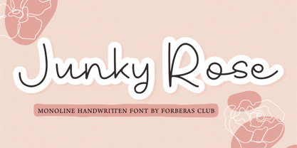 Introducing Junky Rose by Forberas Club Junky Rose is a Handwritten Script font that will make your designs look classic, Farmhouse, Boho, and Feminine. It is a great font for events, Wedding Project, fashion, apparel projects, signature, album covers, logos, branding, magazines, social media posts, advertisements, but it also works great for other projects. Add it to your fonts’ library, and it will enhance your creativity! Junky Rose is best for: - logos, branding, & Signatures. - Flyers, Album cover, Magazine, & Advertisements. - Website design , design blogs, & fashion. - Quote graphics for social media. - and also it works great for other projects. Whats included : - Character Set - Numerals and Punctuation (OpenType Standard) - Accents (Multilingual characters) If you have any questions, before or after purchase, please feel free to get in touch.
 - Jenifer Style by Sensatype Studio,
$15.00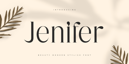 Jenifer is a Beauty Modern Stylish Font A new font that we created special for branding needs, with unique characters and awesome alternative characters are ready to add value of your brand. It so nice to leverage designer or product owner that need solutions to make their design look more beauty and modern. And specially for Salute font, We prepared any swash and any alternate characters to help you create unlimited variations for your creative needs. Jenifer is a Beauty Modern Stylish Font ready with: Any options to get creative variations (combination of Alternate) Preview as a inspirations that you can do with Jenifer font Ready with Lowercase and Uppercase characters Wish you enjoy our font. :)
 - Strawberry Junkies by Yumna Type,
$15.00 Choosing the right display font can make your designs look more attractive and stunning, so that your designs gain more popularity. This is the Strawberry Junkies for you. It is a rather circled display font of which prone circled letters express soft, fun nuances in order that the company becomes more easily recognized by customers and audience. This font’s main characters are the consistent geometry, proportion, and line thickness on every letter to make it legible for big text sizes. In addition, Strawberry Junkies provides an extra clipart as a special bonus. Furthermore, you can enjoy the available features here. Features: Multilingual Supports PUA Encoded Numerals and Punctuations Strawberry Junkies fits best for various design projects, such as brandings, posters, banners, headings, magazine covers, quotes, printed products, merchandise, social media, etc. Find out more ways to use this font by taking a look at the font preview. Thanks for purchasing our fonts. Hopefully, you have a great time using our font. Feel free to contact us anytime for further information or when you have trouble with the font. Thanks a lot and happy designing.
 - Allied Engine by T-26,
$29.00 - Jecki line by Sulthan Studio,
$12.00 Calligraphy fonts with single line or also with sketch style are very charming plus long swash and cute heart stitches make it look simple and extraordinary This font is equipped with upper and lower case letters, numbers, punctuation and also language support has also been coded PUA Thank You
 - Black Engine by Linecreative,
$14.00 The Black Engine condensed slab serif font is vintage-inspired with a touch of classic style but gives it a tough feel. This font is built on a solid foundation, strong visuals, vintage motion, and a modern minimalist style. Black Engine is perfect for Jersey, athletics, posters, branding projects, Logo design, Clothing Branding, product packaging, for magazine titles. for something sports themed, album title, etc What you get dear, you will get : Black Engine- A clean Slab serif font including Upper & Lowercase characters(ALL CAPS), Numbers and Punctuation Supports Multi linguage (Latin Western Europe), Numbers and Punctuation
 - Janky Action by Bogstav,
$15.00 First of all, let me get one thing straight: With Janky Action, I didn’t make any attempt on making a beautiful or good looking font! Janky Action is my humble attempt to recreate a sign I saw at a flea market. The sign was obviously made by someone who didn’t give a darn about the width of strokes, height of letters, and other “rules” when making a sign. I fell in love with the naive approach on how to make a sign. In order to create some randomness, I have added 4 different versions of each lowercase letter. I hope you find this font as enjoyable as I did while making it! :)
 - Jerky Tash by PizzaDude.dk,
$20.00Jerky Tash is supposed to look somewhat handwritten, that’s why it has got jumpy letters, different sized serifs and a loose kerning. The font is spaced to look okay when used without kerning, but the font definitely deserves to be viewed using the kerning pairs! - FF Engine by FontFont,
$47.99 Dutch type designer Alex Scholing created this display and sans FontFont in 1995. The family has 6 weights, ranging from Light to Bold (including italics) and is ideally suited for book text, editorial and publishing as well as software and gaming. FF Engine provides advanced typographical support with features such as small capitals, alternate characters, case-sensitive forms, fractions, super- and subscript characters, and stylistic alternates. It comes with a complete range of figure set options – oldstyle and lining figures, each in tabular and proportional widths.
