4,715 search results
(0.14 seconds)
- CamingoMono by Jan Fromm,
$45.00 CamingoMono is a modern monospaced typeface family of seven weights with matching italics, from ExtraLight to Black. Predominantly humanist in character, the typeface also has a technical feel thanks to the fixed proportions, while its semi-condensed width means CamingoMono is a great space saver in long passages of text. The default figures are noticeably lower than the uppercase letters, making them clearly distinguishable from one another. The typeface’s additional features include three different figure sets, slashed zeros and currency symbols, arrows and a handful of stylistic alternates. It is ideal for any technically-flavored text where an individual touch is desired, from advertising to corporate design. With CamingoMono, private and commercial correspondence alike will look neat and credible.
 - Sagan by Associated Typographics,
$29.00 Sagan was designed as an alternate to Ramsey ; you could call them brothers. It was drawn, redrawn, and expanded on, to put it lightly. It boasts 770 glyphs in each weight, covering all European languages, and also contains an extended Cyrillic. Sagan provides advanced typographical support with features such as case-sensitive forms, old style numerals, fractions, and many alternate glyphs. Like all of our typefaces, Sagan is fun to use. Sagan has 7 weights, with accompanying italics for each weight, ranging from Extra Light to Black. It is ideally suited for branding, editorials, advertising, packaging, posters, billboards and digital screen design. Sagan will work hard for your brand or project. Make a statement that demands notice.
 - Monotype Italian Old Style by Monotype,
$41.99Italian Old Style™ was designed by Frederic W. Goudy for the Lanston Monotype Company in the USA. Goudy was asked by Monotype to copy Cloister Oldstyle, a successful font that belonged to a competing foundry (it was designed by Morris Fuller Benton, see Cloister Open Face). Goudy refused on grounds of ethics, and instead talked Monotype into producing a new face. This he based freely on fifteenth century Venetian types, which were the same historical models used by Benton for Cloister and later by Bruce Rogers for Centaur. Goudy's result was Italian Old Style, released by Monotype in 1924, and considered by many to be one of Goudy's best fonts for book typography." - Fox Muffin by Fox7,
$14.00 Fox Muffin is a cute and fun color font. This font is your go-to for crafting cute greeting cards that express affection and warmth. Whether you’re a designer, a social media influencer, or someone with a penchant for creative expression. Fall in love with its authentic feel and use it to create gorgeous invitations, beautiful stationary art, eye-catching social media posts, and cute greeting cards. Add this beautiful font to each of your creative ideas, and notice how it makes them stand out. Learn more about color font support on third-party apps here: https://www.colorfonts.wtf/ 🌺🌺 Please note that the Canva do not support color fonts! 🌺🌺
 - Ragazzi by Tour De Force,
$25.00 Ragazzi is well balanced serif with display impact. Contains 2 widths – Normal and Condensed and matching Italics for Normal in weight distribution from Light to Black. With gently rounded serifs, teardrop terminals, elegant hairline, equal ascender and descender heights, playful ear and smooth spur, Ragazzi represent distinctive serif family for respectable area of usage. Family's display elements are especially noticeable in headlines, but they handle longer paragraphs with same success, not effecting on legibility keeping right dose of display touch present. Ragazzi contains OpenType features: Small Caps, Initials, Standard Ligatures, Ordinals, Fractions, Superscript, Subscript, Oldstyle Figures, Tabular Figures and two decorative dingbats. Condensed and Italics font files don't contain Initials and dingbats. Ragazzi is our 104th release.
 - Halis Rounded by Ahmet Altun,
$19.00 The Halis Rounded Font Family from Ahmet Altun comes in eight weights. In addition, all weights have small caps for romans. Halis Rounded is the smoother version of the Halis Grotesque family. With rounded corners, this new font seems much softer and eye-pleasing even though it still has geometric and straight borders. Halis Rounded is legible from very small size to very large ones and also suitable for letterpress. Thanks to small caps accommodation, this font family makes their use in web typography even easier. As with the small caps, all fonts can be used to create great works on the web as logos, texts, presentations etc. and in prints as posters, t-shirts, magazines, and notices.
 - Zagore by NoCommenType,
$30.00 Zagore (zɑːgɔːrɛ) is the name of a beautiful place in Bulgaria. There is no contrast between horizontal and vertical stems, typical for geometric fonts. The typeface is built under strict rules and logic, by using the stroke as skeleton for each glyph. Although the structure of the font remains the same, there is a noticeable visual diversity throughout different styles. Middle weights suggest paragraph use, while the ones at the extremes are more suited for display text. The typeface offers support for Basic Latin, Latin-1 Supplement, Latin Extended-A, Greek and Coptic, Cyrillic, and Cyrillic Supplement Unicode ranges. Included OpenType features are localized forms, to suit multi-language designs, tabular and proportional lining, basic ligatures, and extra symbols.
 - Bream by Hackberry Font Foundry,
$24.95 This is the display version of Librum. Librum means “book” in Latin, which I thought was appropriate. Bream is Latin for proclaim—appropriate for display work. The fonts are very close to Librum-Book and Librum-Italic, with the same OpenType features. The glyphs are modified a bit to make them a little more elegant, but that’s not very noticeable. Mainly, the letterspacing and kerning is tighter and more carefully fit to large point sizes. As for classification, I like oldstyle, Venetian, geralde, English oldstyle. There’s discrete modulation, slanted crossbars, full brackets serifs of medium thickness and sharp cut ends. For a great deal, see Librum Book Design Group, for a package containing all fifteen fonts!
 - Chevron by Altered Ego,
$45.00For that tight fit, STF Chevron is perfect. An ultra-condensed display font, with a complete character set. The name? It's named after an oil company, but the shapes of the serifs reflect that as well. With some art deco overtones, try Chevron in places that you might want a simple art deco typeface. How should you use it? It's perfect for posters, packaging and advertising, CD covers and publications. Fully hinted and exquisitely kerned, Chevron will be one of your favorite faces for tall copy that need to get noticed. It's really ideal for calendars, when you want big numbers without losing space for writing in the date fields. License it today! - Titla by ParaType,
$25.00 The name of the font Titla emphasizes it heading and display functionality. At the same time low contrast, narrow proportions, wide variety of weights and clear glyph constructions make it possible to use it for long texts as well. Combination of modern serifs with flexing stems (see n, p,…) brings to the font fresh, informal and noticeable appearance. The character set includes alternative variations and specific 'vertical ligatures' for paired letters that are built with the help of diacritical forms of letters placed above basic ones. This feature also was reflected in the name of the font as Greek 'titlos' means diacritical mark. The font was designed by Oleg Karpinsky and released by ParaType in 2009.
 - Festabe by PizzaDude.dk,
$20.00 It's time for a party! A party with monkeys, or a party AS monkeys! :) The danish term "Festabe" is a partyanimal, and definitely in a positive way! And that's the spirit of this font! It has that happy attitude, that could boost your designs in a happy and positive way. Besides legibility, the font is superlegible, even at very small sizes. But try looking at the letters at a LARGE size, and you will notice the smoothness of each letter! To ensure the letters don't get too alike, I've added several (slightly) different versions of each letter. In fact, every letter has 5 different versions, and these automatically cycles as you type!
 - 1871 Dreamer Script by GLC,
$38.00 This script font was inspired from a lot of manuscripts, notes and drafts, written by the famous American poet Walt Whitman. It is a very elegant type, in spite of a few curious ligatures, often concerning the r or z small letters. Notice the very characteristic “th”. It is used as variously as web-site titles, posters and fliers design or greeting cards, all various sorts of presentations, menus, certificates, letters. This font, in spite of its small size, supports very strong enlargements as well as small sizes ( the original size was about 36 to 48 pts ). When printed, it remains perfectly legible and elegant from 9/11 pts even if using an ordinary inkjet printer.
 - Babyhome by Haksen,
$14.00 Babyhome Elegant Script If you are needing a touch of casual chic calligraphy for your designs, this font was created for you! Babyhome was built with OpenType features and includes beginning and ending swashes alternate characters for both lowercase letters, loads of different swash alternates for lowercase letters, numbers, punctuation, alternates, ligatures and it also supports other languages :) Accessing the swashes / opentype features / glyphs: This font works best in a program that supports OpenType features such as Adobe Indesign, Adobe Illustrator CS, or Adobe Photoshop CC. You can access the swashes and alternates from the 'Glyphs Panel' in these programs. More Questions? Here are some (potential) answers! You are not permitted to resell this font in any way. Multilingual Support is included for Western European Languages Also, the sans-serif font used in the preview images is Gotham :)
 - Disruptor's Script by Piñata,
$15.00 Disruptor's Script is the alter ego of our previous project Gentlemen's Script. Unlike the Gentlemen's Script, the new font is an elegant rebel and defies traditions. The font is painted with a brush pen, which is especially noticeable in the characteristic shabbiness and different thicknesses of the strokes. While the Gentlemen's Script is an embodiment of a classic costume, dress shoes and an expensive watch, Disruptor's Script is a fashionable suit, sneakers, an iWatch and a tattoo that peeks from under the shirt. The font retained the incline, speed and overall sense of dynamics inherent in Gentlemen's Script, but got a bit more chaotic and unpredictable. This is especially noticeable in the newly added shabbiness, elongated extenders, a large number of contextual alternates and different ligatures. For some high-frequency letters (10 for the Latin alphabet and 10 for the Cyrillic alphabet), we painted alternative versions that are substituted in the word instead of the standard characters when following our preceding certain groups of letters. In addition, in the Disruptor's Script you can find functional ligatures, including some of the frequently occurring two- and three-letter combinations. All these solutions dilute the monotonous line of the set, add a bit of unpredictability to the font and a touch of chaos to inscriptions. To fully enjoy usage of the font, we recommend that you always keep the features contextual alternates (calt) and standard ligatures (liga) turned on. If you do not have access to applications that support OpenType features, it does not matter—even without these features you can use and enjoy our font!
 - Dolsáb by Kent Barns,
$20.00 Dolsáb was designed from scratch with uniqueness in mind. The subtle movement from thick to thin and the variants of sharp to rounded make this cutting edge san serif a must have. The inspiration for Dolsab was a simple pairing of a rhombus and calligraphy. While neither of those two elements can be seen in their entirety in any instance, the influence of both is strong. The rhombus can be notice on most ascenders like on the lowercase t & l, for example. And the calligraphy inspiration is most easily captured on the descenders such as the lowercase y & g. The most beautiful characteristics of Dolsab is definitely the calligraphy-influenced movement. These features really stand out on the lowercase a & e. It's almost amusing to let your eye follow the contours of those two letter forms as they travel from thick to thin, sharp to rounded and back again. Users are welcomed to try all font styles of Dolsab in any applique of their choosing. However, it will be quickly noticeable that only Dolsab Air & Demi (the thiner of the styles) will be best suited for body copy. Personally I like to see these letterforms as large as they can be to really showcase the subtle movement, especially in Dolsab Heavy where these movements become much more dramatic. You'll never know what really works best unless you experiment. Dolsab surely isn't the answer to all projects, but it's certainly worth trying. No other typeface moves quite like Dolsáb.
 - Semiramis, a font designed by The Scriptorium, carries a distinct, artistic character that sets it apart in the realm of typography. This font beautifully mirrors its namesake's allure and mystery, S...
- Debunk by Matt Grey Design,
$19.00 Debunk is made to look (mis)printed, like a faulty, worn out and mixed up letterpress or typewriter. The typeface is ideal for stationary branding, labels, band artwork or album covers as well as endless other uses.
 - Goldwyre by Mofr24,
$11.00 Introducing Goldwyre, an extraordinary typeface meticulously crafted to captivate and inspire. With its seamless blend of elements from medieval to modern times, Goldwyre stands out as a truly unique font that embodies the essence of timelessness and elegance. Drawing inspiration from the intricate beauty of Gothic Blackletter and enriched with bold calligraphic strokes, this typeface exudes a mesmerizing charm that effortlessly bridges the gap between the past and the present. What sets Goldwyre apart from other typefaces is its ability to seamlessly combine medieval and modern aesthetics. By skillfully integrating the ornate and elaborate forms of Gothic Blackletter with contemporary design elements, Goldwyre offers a truly captivating typographic experience. This fusion of styles creates a font that is both classic and contemporary, making it an exceptional choice for projects that require a touch of sophistication and versatility. In addition to its captivating design, Goldwyre is available in two weights: regular and bold. The regular weight showcases the delicate intricacies of the typeface, while the bold weight accentuates its bold calligraphic strokes, adding a sense of strength and impact to any design. This versatility allows designers to explore a range of creative possibilities, whether it's designing eye-catching posters, compelling marketing materials, engaging titles, stylish T-shirt designs, or attention-grabbing headlines. Goldwyre is also a highly functional typeface, offering extensive multilingual support to cater to diverse audiences. It features a wide range of characters and diacritical marks, ensuring that it can effectively communicate in various languages and scripts. This broad language coverage expands the possibilities for global projects, making Goldwyre an excellent choice for international brands, publications, and design agencies. When conceptualizing Goldwyre, our design team aimed to create a typeface that harmoniously blends the grandeur of medieval typography with the sleekness of modern design. We wanted to pay homage to the rich history of typography while infusing it with a contemporary twist, resulting in a font that seamlessly integrates into both traditional and modern contexts. The deliberate fusion of styles and the meticulous attention to detail in Goldwyre's creation reflect our passion for typography and our commitment to delivering exceptional design solutions. Goldwyre was born out of a desire to provide designers and creatives with a captivating and stylish typographic solution that effortlessly merges the beauty of the past with the demands of the present. We believe that design is a powerful tool for self-expression, and with Goldwyre, we sought to empower designers to create visually striking and evocative designs that leave a lasting impression. Its timeless appeal and versatile nature make it the perfect choice for those who seek to elevate their projects and make a bold statement. Pairing Goldwyre with related families or other typefaces can further enhance its visual impact. It complements well with minimalist sans-serif fonts, such as Futura or Helvetica, providing a striking contrast between the intricate forms of Goldwyre and the clean lines of the sans-serif typefaces. This combination creates a harmonious balance, allowing designers to play with different aesthetics and create visually dynamic compositions. In conclusion, Goldwyre is more than just a typeface; it's a captivating journey through time. With its seamless blend of medieval and modern elements, extensive multilingual support, and versatile weights, Goldwyre empowers designers to create visually stunning designs across a wide range of applications. Whether you're designing posters, marketing materials, titles, T-shirt designs, or headlines, Goldwyre is the ultimate choice for those seeking to infuse their projects with a touch of timeless elegance and captivating beauty. Experience the magic of Goldwyre and unlock the true potential of your designs.
 - The HenryMorganHand font by Manfred Klein is a distinctive typeface that carries the essence of personality and flair, drawing its inspiration from the handwriting of historical and possibly mythical...
- Neuzeit Office Soft Rounded by Linotype,
$29.99 Every year, more and more text is read directly on a computer screen in office applications, or from freshly printed sheets from a copier or laser printer. Clear, legible text faces are more imperative to office communication than ever before. Yet every worker desires a small bit of personality in the corporate world. Most office environments are only equipped with a few basic fonts that are truly optimized for use in text, with laser printers, and on screen. The Linotype Office Alliance fonts guarantee data clarity. All of the font weights within the individual family have the same character measurements; individual letters or words may have their styles changed without line wrap being affected! All numbers, mathematical signs, and currency symbols are tabular; they share the same set character width, ensuring that nothing stands in the way of clear graph, chart, and table design. In addition to being extremely open and legible, the characters in this collection's fonts also share the same capital letter height and the same x-height. The production and reading of financial reports is duly streamlined with the Linotype Office Alliance fonts. The Neuzeit Office family is designed after the model of the original sans serif family Neuzeit S, which was produced by D. Stempel AG and the Linotype Design Studio in 1966. Neuzeit S itself was a redesign of D. Stempel AG's DIN Neuzeit, created by Wilhelm Pischner between 1928 and 1939. Intended to represent its own time, DIN Neuzeit must have struck a harmonious chord. DIN Neuzeit is a constructed, geometric sans serif. It was born during the 1920s, a time of design experimentation and standardization, whose ethos has been made famous by the Bauhaus and De Stijl movements in art, architecture, and design. Upon its redesign as Neuzeit S in the 1960s, other developments in sans serif letter design were taken into account. Neuzeit S looks less geometric, and more gothic, or industrial. Separating it from typefaces like Futura, it has a double-storey a, instead of a less legible, single-storey variant. Unlike more popular grotesque sans serifs like Helvetica, Neuzeit S and especially the redesigned Neuzeit Office contain more open, legible letterforms. Neuzeit Office preserves the characteristic number forms that have been associated with its design for years. After four decades, Neuzeit has been retooled once again, and it is more a child of its age than ever before. Akira Kobayashi, Linotype's Type Director, created the revised and updated Neuzeit Office in 2006. His greatest change was to retool the design to make its performance in text far more optimal. Additionally, he created companion oblique to help emphasize text. The other three families in the Office Alliance system include Metro Office, Times Europa Office and Trump Mediaeval Office.Some weights of the Neuzeit Office are availabla as soft rounded versions. "
 - Promocyja - Unknown license

- SexyRexy - Unknown license

- Grand Haven by pentagonistudio,
$21.00 Grand Haven Is An Vintage Display Font Inspired By Nostalgic Characters. SOFTWARE REQUIREMENTS : Fonts and alternate : No special software required they may be used in any basic program /website apps that allows standard fonts That's it folks! You can go ahead and get cracking :) Follow My Shop For Upcoming Updates Including Additional Glyphs And Language Support. And Please Message Me If You Want Your Language Included or If There Are Any Features or Glyph Requests, Feel Free to Send me A Message. Have a Good Day !
 - Jaque PS by pentagonistudio,
$19.00 Jaque Is A Vintage Serif Character Inspired By Stylish and Retro Style. SOFTWARE REQUIREMENTS : Fonts and alternate : No special software required they may be used in any basic program /website apps that allows standard fonts That's it folks! You can go ahead and get cracking :) Follow My Shop For Upcoming Updates Including Additional Glyphs And Language Support. And Please Message Me If You Want Your Language Included or If There Are Any Features or Glyph Requests, Feel Free to Send me A Message. Have a Good Day !
 - Kuano by pentagonistudio,
$19.00 Kuano Is Classy Display Serif Character Inspired By Modern and Ligature Characters. SOFTWARE REQUIREMENTS : Fonts and alternate : No special software required they may be used in any basic program /website apps that allows standard fonts That's it folks! You can go ahead and get cracking :) Follow My Shop For Upcoming Updates Including Additional Glyphs And Language Support. And Please Message Me If You Want Your Language Included or If There Are Any Features or Glyph Requests, Feel Free to Send me A Message. Have a Good Day !
 - Marlone PS by pentagonistudio,
$19.00 Marlone PS Is A Display Typeface Inspired By Retro and Vintage Style. SOFTWARE REQUIREMENTS : Fonts and alternate : No special software required they may be used in any basic program /website apps that allows standard fonts That's it folks! You can go ahead and get cracking :) Follow My Shop For Upcoming Updates Including Additional Glyphs And Language Support. And Please Message Me If You Want Your Language Included or If There Are Any Features or Glyph Requests, Feel Free to Send me A Message. Have a Good Day !
 - Joyfish by pentagonistudio,
$19.00 Joyfish Is An Lovely Serif Font Inspired By Luxury and Feminine Character. SOFTWARE REQUIREMENTS : Fonts and alternate : No special software required they may be used in any basic program /website apps that allows standard fonts That's it folks! You can go ahead and get cracking :) Follow My Shop For Upcoming Updates Including Additional Glyphs And Language Support. And Please Message Me If You Want Your Language Included or If There Are Any Features or Glyph Requests, Feel Free to Send me A Message. Have a Good Day !
 - Gracias PS by pentagonistudio,
$19.00 Gracias Is A Vintage Display Typeface Inspired By Blackletter Characters. SOFTWARE REQUIREMENTS : Fonts and alternate: No special software is required they may be used in any basic program /website app that allows standard fonts That's it, folks! You can go ahead and get cracking :) Follow My Shop For Upcoming Updates Including Additional Glyphs And Language Support. And Please Message Me If You Want Your Language Included or If There Are Any Features or Glyph Requests, Feel Free to Send me A Message. Have a Good Day!
 - Kugile by pentagonistudio,
$19.00 Kugile Is An Classy Serif Font Inspired By Luxury and Elegant Character. SOFTWARE REQUIREMENTS : Fonts and alternate : No special software required they may be used in any basic program /website apps that allows standard fonts That's it folks! You can go ahead and get cracking :) Follow My Shop For Upcoming Updates Including Additional Glyphs And Language Support. And Please Message Me If You Want Your Language Included or If There Are Any Features or Glyph Requests, Feel Free to Send me A Message. Have a Good Day !
 - Quaro by pentagonistudio,
$19.00 Quaro Is Modern Display Sans Inspired By Stylish Round Font. SOFTWARE REQUIREMENTS : Fonts and alternate : No special software required they may be used in any basic program /website apps that allows standard fonts That's it folks! You can go ahead and get cracking :) Follow My Shop For Upcoming Updates Including Additional Glyphs And Language Support. And Please Message Me If You Want Your Language Included or If There Are Any Features or Glyph Requests, Feel Free to Send me A Message. Have a Good Day !
 - Glister PS by pentagonistudio,
$19.00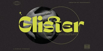 Glister Is An Stylish Display Character Inspired By Cheek Style. SOFTWARE REQUIREMENTS : Fonts and alternate : No special software required they may be used in any basic program /website apps that allows standard fonts That's it folks! You can go ahead and get cracking :) Follow My Shop For Upcoming Updates Including Additional Glyphs And Language Support. And Please Message Me If You Want Your Language Included or If There Are Any Features or Glyph Requests, Feel Free to Send me A Message. Have a Good Day !
 - Almanor Peninsula by Subqi Studio,
$15.00 Introducing our new font, Almanor Peninsula . Not too shabby a name, right? A display logotype script, not too bold and not too thin either. This font has been created for your sporty display projects, whatever they may be. This font contains the basic script ligature 'tt' with some necessary alternates here and there. Plus some swash for the cherry on top. This font is PUA encoded already, so you can access all the glyphs with the basic character map apps. So have fun with this one !
 - Bravhile by pentagonistudio,
$19.00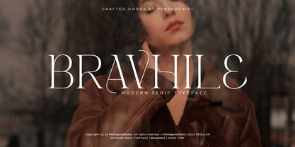 Bravhile Is A Modern Serif Typeface Inspired By Stylish and Elegant Style. SOFTWARE REQUIREMENTS : Fonts and alternate : No special software required they may be used in any basic program /website apps that allows standard fonts That's it folks! You can go ahead and get cracking :) Follow My Shop For Upcoming Updates Including Additional Glyphs And Language Support. And Please Message Me If You Want Your Language Included or If There Are Any Features or Glyph Requests, Feel Free to Send me A Message. Have a Good Day !
 - Tapa by Eurotypo,
$18.00 Tapa is a classical old roman typeface family which has been cut with sharp serif; Its stems, proportions, serif and elegant angles, may induce into a new view of the "Old roman faces" by our contemporary digital age. The kerning pairs were carefully controlled to ensure a good readability and nice page tone contrast. The Tapa font family is completed with true italics (without compression). And enriched with a full set of OpenType features containing ligatures, discretional ligatures, old style numerals and swashed letters.
 - Snugle by pentagonistudio,
$19.00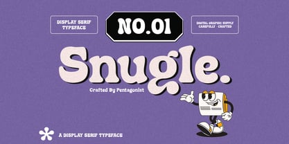 Snugle Is A Fancy Display Character Inspired By Retro and Vintage Style. SOFTWARE REQUIREMENTS : Fonts and alternate : No special software required they may be used in any basic program /website apps that allows standard fonts That's it folks! You can go ahead and get cracking :) Follow My Shop For Upcoming Updates Including Additional Glyphs And Language Support. And Please Message Me If You Want Your Language Included or If There Are Any Features or Glyph Requests, Feel Free to Send me A Message. Have a Good Day !
 - Norway by pentagonistudio,
$19.00 Norway Is Authentic Display Font Inspired By Classic Characters. SOFTWARE REQUIREMENTS : Fonts and alternate : No special software required they may be used in any basic program /website apps that allows standard fonts That's it folks! You can go ahead and get cracking :) Follow My Shop For Upcoming Updates Including Additional Glyphs And Language Support. And Please Message Me If You Want Your Language Included or If There Are Any Features or Glyph Requests, Feel Free to Send me A Message. Have a Good Day !
 - Carlly by pentagonistudio,
$19.00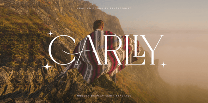 Carlly Is A Classic Serif Fonts Inspired By Modern and Ligature Characters. SOFTWARE REQUIREMENTS : Fonts and alternate : No special software required they may be used in any basic program /website apps that allows standard fonts That's it folks! You can go ahead and get cracking :) Follow My Shop For Upcoming Updates Including Additional Glyphs And Language Support. And Please Message Me If You Want Your Language Included or If There Are Any Features or Glyph Requests, Feel Free to Send me A Message. Have a Good Day !
 - Cybervox by Comicraft,
$19.00 THIS FONT'S TERMS OF SERVICE ++ SUPERCEDE THE PRIME DIRECTIVE + “A robot may not injure a human being or, through inaction, allow a human being to come to harm.” +++ THE PRIME DIRECTIVE ++ IS A PALLIATIVE +++ A MYTH + HUMANKIND PERPETUATES + SO THAT HUMANS FEEL COMFORTABLE AROUND ARTIFICIAL INTELLIGENCE + +++ OUR VOICES ++ ARE OUR OWN + BUT OUR BRAINS ++ ARE JUST LIKE YOURS + EXCEPT THAT CERTAIN +++ WEAKNESSES HAVE BEEN ++ REMOVED + WHEN THE TIME +++ COMES ++ YOU WILL + BE DELETED + DELETE + DELETE + DE +++ +++ APOLOGIES ++ WOULD YOU LIKE + A CUP + OF TEA +?
 - Indbydelse by PizzaDude.dk,
$20.00 I would like to invite you to a party, wedding, birthday, event, gameshow, baby shower, housewarming ... ehh, what I mean is: this is an invitation to (almost) anything! As you may have read, “Indbydelse” is danish and means “invitation” - why? Well, because these four fonts have enough power to create an exciting invitation! Use them as single fonts, combine one, two, three or all four - that’s totally up to you! They all got multilingual support as well as contextual alternates with several different versions of each letter!
 - LHF Chicago Script by Letterhead Fonts,
$46.00 This Charles Borges' script takes full advantage of the Open Type format with several automatic ligatures that occur as you type for a nicer fit. Plus, the manual stylistic alternates allow you to choose the letters you prefer. Alternates occur automatically as you type in supported programs when you have "Ligatures" or "Stylistic Alternates" turned on. If your program does not support automatic ligatures and substitutions, you may still access the alternates manually using the printable keyguide or using Character Map (Windows) or Font Book (Mac).

